【共创季稿事节】HarmonyOS NEXT 纯百分比布局实战:RelativeContainer + alignRules 多屏适配完全指南
HarmonyOS NEXT 纯百分比布局实战:RelativeContainer + alignRules 多屏适配完全指南
一、背景与痛点
在鸿蒙生态中,设备形态极其丰富:手机、折叠屏、平板、2-in-1 笔记本、智慧屏、车机……屏幕尺寸从 360vp 到 1440vp 不等。传统的 px / vp 固定值布局在多设备上要么被裁切,要么留大片空白,开发者往往需要写多套 @Styles 或媒体查询来适配。
HarmonyOS NEXT 提供的 RelativeContainer + 百分比 方案,正是为了解决这一痛点而生——一套代码,全屏适配。
传统的适配方式有哪些问题?
| 方式 | 问题 |
|---|---|
| 固定 vp/px | 换屏就崩,需要逐设备调试 |
| 媒体查询 @Media | 断点难定,多套布局维护成本高 |
| Flex 等比 | 一维排列尚可,二维复杂布局捉襟见肘 |
| Grid 栅格 | 学习成本高,嵌套场景写起来繁琐 |
RelativeContainer 的百分比方案,用纯声明式的方式实现了类似 Web 中 position: relative + percentage 的效果,但更强大——它支持跨组件锚定。
二、RelativeContainer 核心概念
2.1 什么是 RelativeContainer?
RelativeContainer 是 ArkUI 提供的相对定位容器组件。它允许子组件通过锚定(anchor)关系相对于容器或其他兄弟组件定位,同时支持百分比尺寸。
RelativeContainer ──┬── child A (锚定到容器左上角)
                    ├── child B (锚定到 A 的底部)
                    └── child C (锚定到容器右下角)
2.2 alignRules —— 定位规则的灵魂
alignRules 是每个子组件上的属性,它接受一个对象,定义该组件在六个方向上的锚定关系:
.alignRules({
  top:    { anchor: '__container__', align: VerticalAlign.Top    },  // 上边对齐容器顶部
  bottom: { anchor: '__container__', align: VerticalAlign.Bottom },  // 下边对齐容器底部
  left:   { anchor: '__container__', align: HorizontalAlign.Start},  // 左边对齐容器左侧
  right:  { anchor: '__container__', align: HorizontalAlign.End  },  // 右边对齐容器右侧
  center: { anchor: '__container__', align: VerticalAlign.Center },  // 垂直居中
  middle: { anchor: '__container__', align: HorizontalAlign.Center}   // 水平居中
})
关键规则:
anchor:可以是'__container__'(特殊字符串,代表父容器)或任意兄弟组件的idalign:定义本组件的哪条边去对齐锚点的哪条边
2.3 百分比尺寸
在 RelativeContainer 中,width 和 height 支持 '50%'、'30%' 这样的百分比字符串。这个百分比是相对于父容器尺寸计算的,因此在不同屏幕上会自动缩放。
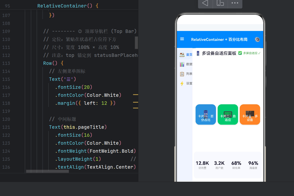
三、实战:三分栏 + 卡片网格布局
下面从一个完整的示例开始,逐步拆解每个区域的设计思路。
3.1 整体布局结构
┌────────────────────────────────┐   4% — 状态栏占位
├────────────────────────────────┤
│         TOP BAR (10%)          │   ← 蓝色导航栏
├──────┬─────────────────────────┤
│      │                         │
│ SIDE │     MAIN CONTENT        │   ← 侧边栏(18%) + 主内容区(剩余)
│ BAR  │   ┌───┐ ┌───┐ ┌───┐    │
│(18%) │   │ C1│ │ C2│ │ C3│    │   ← 三张卡片各 30%
│      │   └───┘ └───┘ └───┘    │
│      │   12.8K 3.2K 68% 96%    │   ← 统计条
├──────┴─────────────────────────┤
│    🏠    🔍    ❤️    👤       │   8% — 底部导航
└────────────────────────────────┘
所有尺寸均使用百分比,从上到下依次为:4% + 10% + 78%(自适应)+ 8% = 100%。
3.2 根容器:全屏占位
RelativeContainer() {
  // ... 所有子组件
}
.width('100%')
.height('100%')
.backgroundColor('#F5F7FA')
根容器填满屏幕,作为所有子组件的定位基准。
3.3 ① 状态栏占位
Column()
  .id('statusBarPlaceholder')
  .width('100%')
  .height('4%')
  .alignRules({
    top: { anchor: '__container__', align: VerticalAlign.Top },
    left: { anchor: '__container__', align: HorizontalAlign.Start }
  })
设计意图:给系统状态栏留出安全区域,避免后续内容被状态栏遮挡。
注意:这里 top 和 left 都锚定到 __container__ 的起始位置,所以它位于容器的最左上角。
3.4 ② 顶部导航栏
Row() {
  Text('☰')
  Text(this.pageTitle)
    .layoutWeight(1)   // 占据剩余空间,自动居中
  Text('⚙')
}
.id('topBar')
.width('100%')
.height('10%')
.backgroundColor('#3A86FF')
.alignRules({
  top: { anchor: 'statusBarPlaceholder', align: VerticalAlign.Bottom },
  left: { anchor: '__container__', align: HorizontalAlign.Start }
})
关键技巧:top 锚定到 statusBarPlaceholder 的 Bottom,实现"紧贴上一个组件底部"。这是 RelativeContainer 实现流式布局的核心手段——通过链式锚定,一个接一个往下排。
3.5 ③ 左侧边栏
Column() {
  this.sidebarItem('🏠', '首页', 0)
  this.sidebarItem('📊', '数据', 1)
  this.sidebarItem('📋', '列表', 2)
  this.sidebarItem('⚡', '设置', 3)
}
.id('sideBar')
.width('18%')
.backgroundColor('#F0F4FF')
.alignRules({
  top:    { anchor: 'topBar', align: VerticalAlign.Bottom },
  bottom: { anchor: 'footer', align: VerticalAlign.Top },
  left:   { anchor: '__container__', align: HorizontalAlign.Start }
})
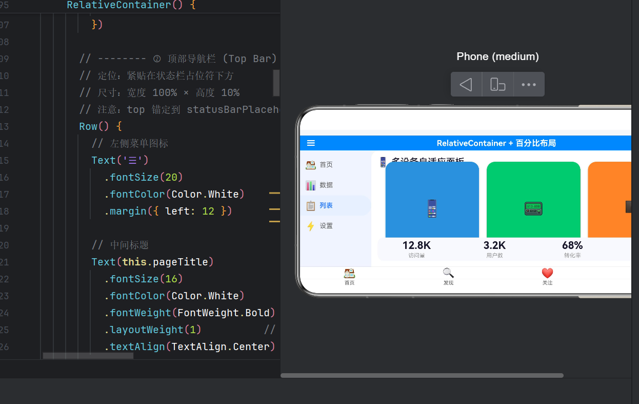
百分比四向拉伸:这里没有设 height——高度由 top + bottom 自动撑开。从 topBar 底部到 footer 顶部,中间区域全部填满。无论屏幕多高,侧边栏总是刚好从导航栏延伸到底部栏。
'18%' 的宽度在手机上约 65vp,平板上约 108vp,视觉比例始终协调。
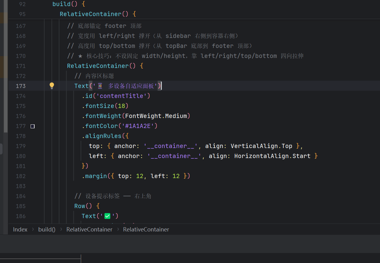
3.6 ④ 主内容区(核心)
RelativeContainer() {
  // 标题
  Text('📱 多设备自适应面板')
    .id('contentTitle')
    .alignRules({
      top:  { anchor: '__container__', align: VerticalAlign.Top },
      left: { anchor: '__container__', align: HorizontalAlign.Start }
    })
    .margin({ top: 12, left: 12 })

  // 设备提示标签 —— 右上角
  Row() {
    Text('✅')
    Text(this.deviceHint)
  }
  .id('deviceHintTag')
  .alignRules({
    top:   { anchor: '__container__', align: VerticalAlign.Top },
    right: { anchor: '__container__', align: HorizontalAlign.End }
  })
  .margin({ top: 12, right: 12 })

  // 卡片行
  Row() {
    ForEach(this.cardTitles, (title: string, index: number) => {
      this.cardItem(this.cardIcons[index], title, this.cardColors[index], index)
    })
  }
  .id('cardRow')
  .width('96%')
  .height('55%')
  .justifyContent(FlexAlign.SpaceEvenly)
  .alignRules({
    center: { anchor: '__container__', align: VerticalAlign.Center },
    middle: { anchor: '__container__', align: HorizontalAlign.Center }
  })

  // 统计条
  Row() {
    this.statItem('访问量', '12.8K')
    this.statItem('用户数', '3.2K')
    this.statItem('转化率', '68%')
    this.statItem('满意度', '96%')
  }
  .id('statBar')
  .width('96%')
  .height('20%')
  .backgroundColor('#F8F9FF')
  .borderRadius(12)
  .alignRules({
    bottom: { anchor: '__container__', align: VerticalAlign.Bottom },
    middle: { anchor: '__container__', align: HorizontalAlign.Center }
  })
  .margin({ bottom: 12 })
}
.id('mainContent')
.backgroundColor('#FFFFFF')
.borderRadius({ topLeft: 16, topRight: 16 })
.alignRules({
  top:    { anchor: 'topBar',  align: VerticalAlign.Bottom },
  bottom: { anchor: 'footer',  align: VerticalAlign.Top },
  left:   { anchor: 'sideBar', align: HorizontalAlign.End },
  right:  { anchor: '__container__', align: HorizontalAlign.End }
})
// ★ 注意:没有 width 和 height!靠 alignRules 四边拉伸
这是全文最核心的技巧——四边拉伸:
mainContent 没有设置 width 和 height,而是通过四个方向上的 alignRules 撑满剩余空间:
top→topBar的底部bottom→footer的顶部left→sideBar的右侧right→__container__的右侧
无论屏幕尺寸如何变化,mainContent 始终恰好填满侧边栏右侧到屏幕右侧、导航栏下方到底部栏上方的矩形区域。
在这个区域内,又嵌套了一个 RelativeContainer,其内部的三张卡片和统计条也使用百分比定位——形成了多级嵌套百分比的布局体系。
3.7 ⑤ 底部导航栏
Row() {
  ForEach(
    (['🏠 首页', '🔍 发现', '❤️ 关注', '👤 我的'] as string[]),
    (item: string) => {
      Column({ space: 2 }) {
        Text(item.substring(0, 2))
        Text(item.substring(3))
      }
      .layoutWeight(1)   // 四等分
    })
}
.id('footer')
.width('100%')
.height('8%')
.backgroundColor('#FFFFFF')
.alignRules({
  bottom: { anchor: '__container__', align: VerticalAlign.Bottom },
  left:   { anchor: '__container__', align: HorizontalAlign.Start }
})
.shadow({ radius: 4, color: '#1A000000', offsetY: -2 })
底部栏使用 layoutWeight(1) 将四个菜单项等分,无论屏幕多宽都能均匀分布。
四、@Builder 构建函数封装
4.1 侧边栏项
@Builder sidebarItem(icon: string, label: string, index: number) {
  Row({ space: 6 }) {
    Text(icon).fontSize(18)
    Text(label).fontSize(13)
      .fontColor(this.activeTabIndex === index ? '#3A86FF' : '#666666')
  }
  .width('100%').height(40)
  .padding({ left: 10 })
  .backgroundColor(this.activeTabIndex === index ? '#E8F0FF' : Color.Transparent)
  .borderRadius({ topRight: 20, bottomRight: 20 })
  .onClick(() => { this.activeTabIndex = index })
}
亮点:@State 驱动高亮切换,borderRadius 仅右侧圆角配合侧边栏边缘。
4.2 卡片
@Builder cardItem(icon: string, title: string, bgColor: ResourceColor, index: number) {
  RelativeContainer() {
    Text(icon).id(`cardIcon${index}`).fontSize(32)
      .alignRules({
        center: { anchor: '__container__', align: VerticalAlign.Center },
        middle: { anchor: '__container__', align: HorizontalAlign.Center }
      })
    Text(title).fontSize(13).fontColor(Color.White).width('90%')
      .alignRules({
        bottom: { anchor: '__container__', align: VerticalAlign.Bottom },
        middle: { anchor: '__container__', align: HorizontalAlign.Center }
      }).margin({ bottom: 12 })
  }
  .width('30%').aspectRatio(1.0).backgroundColor(bgColor).borderRadius(16)
}
核心:'30%' 三张卡片等宽,aspectRatio(1.0) 保持正方形。
4.3 统计项
@Builder statItem(label: string, value: string) {
  Column({ space: 2 }) {
    Text(value).fontSize(20).fontWeight(FontWeight.Bold)
    Text(label).fontSize(11).fontColor('#999999')
  }.layoutWeight(1).alignItems(HorizontalAlign.Center)
}
layoutWeight(1) 四等分,无需计算百分比。
五、ArkTS 严格模式的注意事项
ArkTS 编译器采用严格模式,与标准 TypeScript 有几点关键差异:
5.1 禁止对象字面量作为类型声明
// ❌ 错误:arkts-no-obj-literals-as-types
ForEach([...], (item: { icon: string; label: string }) => { ... })
// ✅ 正确:提前定义 interface
interface TabItem { icon: string; label: string }
ForEach([...], (item: TabItem) => { ... })
5.2 borderRadius 属性名
BorderRadiuses 属性名为 topLeft、topRight、bottomLeft、bottomRight,不是 right:
// ❌ .borderRadius({ right: 20 })
// ✅ .borderRadius({ topRight: 20, bottomRight: 20 })
5.3 ForEach 泛型
ArkTS 的 ForEach 不接受泛型参数,数组类型用 as 断言:
// ❌ ForEach<string>([...], ...)
// ✅ ForEach((['a', 'b'] as string[]), (item: string) => { ... })
六、多设备适配效果
手机(~360vp 宽)
| 区域 | 百分比 | 实际尺寸 |
|---|---|---|
| 侧边栏 | 18% | ≈ 65vp |
| 卡片 | 30% | ≈ 92vp |
| 统计条 | 96% | ≈ 346vp |
三张卡片恰好一屏排满,侧边栏比例舒适。
平板(~600vp 宽)
| 区域 | 百分比 | 实际尺寸 |
|---|---|---|
| 侧边栏 | 18% | ≈ 108vp |
| 卡片 | 30% | ≈ 162vp |
| 统计条 | 96% | ≈ 576vp |
屏幕更宽,卡片和内容更宽敞,但视觉比例完全一致。
折叠屏展开(~800vp 宽)
侧边栏保持 18% 比例,主内容区充裕,统计条四列数据显示清晰。
核心原则:所有容器尺寸用 %,不写 vp/fp 固定值(字体和交互高度除外)。这样屏幕越大,内容区域自然越大,始终保持一致的视觉比例。
七、RelativeContainer 与其他布局的对比
| 特性 | RelativeContainer | Flex/Column/Row | Grid |
|---|---|---|---|
| 百分比支持 | ★★★★★ 原生 | ★★★☆☆ 部分 | ★★★★☆ |
| 跨组件锚定 | ★★★★★ | ☆☆☆☆☆ | ☆☆☆☆☆ |
| 多屏适配 | ★★★★★ 一套代码 | ★★★☆☆ 需媒体查询 | ★★★★☆ |
最适合:复杂仪表盘、多栏布局、自适应卡片墙。不适合:纯粹列表流(用 List)、简单线性排列(用 Flex)。
八、完整源码与运行
核心结构如下(完整 430 行见 entry/src/main/ets/pages/Index.ets):
@Entry @Component struct Index {
  @State pageTitle: string = 'RelativeContainer + 百分比布局'
  build() {
    RelativeContainer() {
      // ① 状态栏占位 (4%) ② 顶部导航栏 (10%)
      // ③ 左侧边栏 (18%) ④ 主内容区 (嵌套)
      // ⑤ 底部导航栏 (8%)
    }.width('100%').height('100%')
  }
  @Builder sidebarItem(icon, label, index) { /* ... */ }
  @Builder cardItem(icon, title, bgColor, index) { /* ... */ }
  @Builder statItem(label, value) { /* ... */ }
}
color.json 需添加卡片色:card_blue #4A90D9、card_green #50C878、card_orange #FF8C42。
九、写在最后
RelativeContainer + 百分比布局是 HarmonyOS NEXT 多屏适配的最优解之一。它用声明式的锚定语法取代了繁琐的媒体查询和嵌套计算,让开发者专注于布局结构本身——一份代码,三屏适配,零媒体查询。

AtomGit 是由开放原子开源基金会联合 CSDN 等生态伙伴共同推出的新一代开源与人工智能协作平台。平台坚持“开放、中立、公益”的理念,把代码托管、模型共享、数据集托管、智能体开发体验和算力服务整合在一起,为开发者提供从开发、训练到部署的一站式体验。
更多推荐
 1
1 0
0- 0


 已为社区贡献17条内容

所有评论(0)