在鸿蒙上使用 flutter_adaptive_scaffold Flutter 包
插件介绍
flutter_adaptive_scaffold 是一个用于轻松构建自适应布局的 Flutter 包,特别适合需要在不同屏幕尺寸和平台上提供一致用户体验的应用。它实现了 Material 3 设计指南中的自适应布局原则,能够根据屏幕宽度和平台自动调整导航元素和内容布局。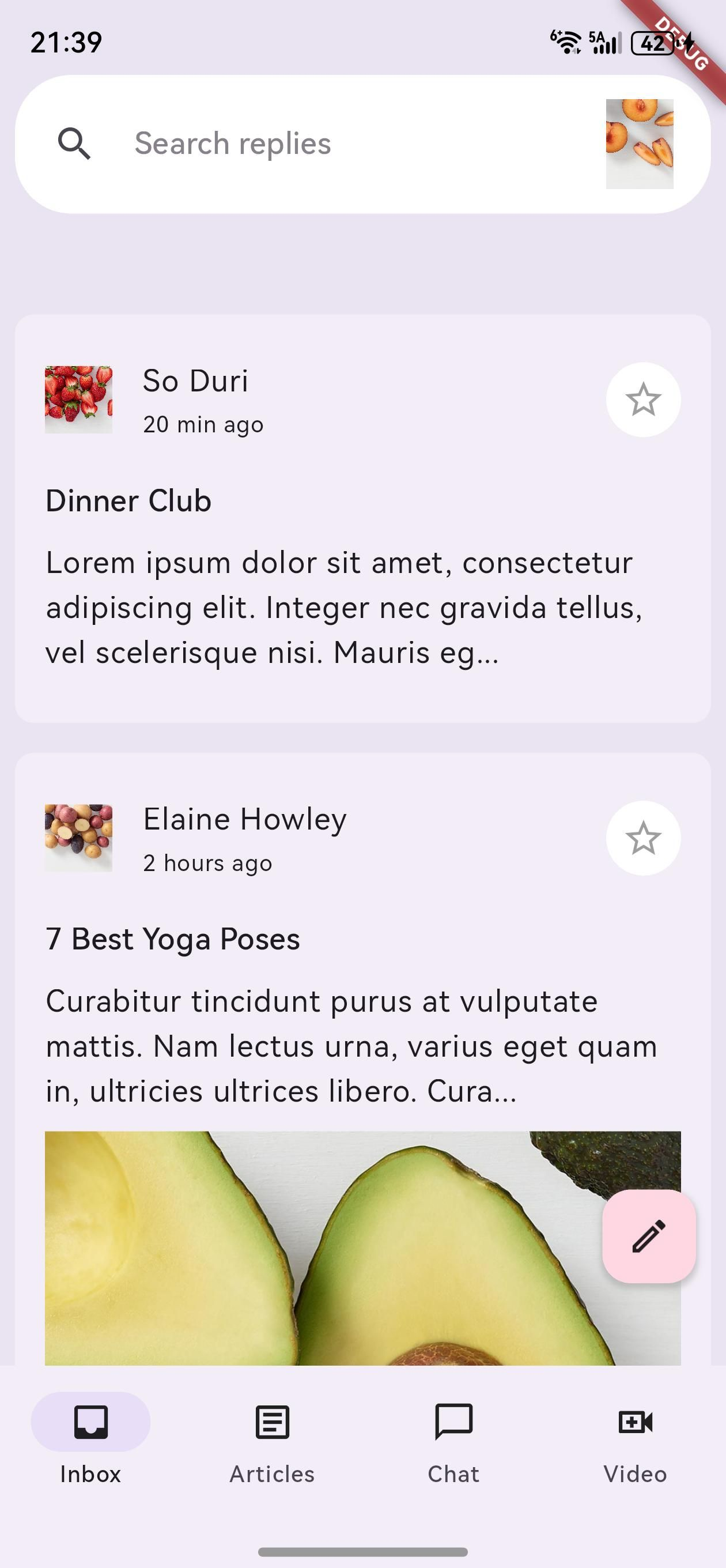
主要功能
- 自适应导航:根据屏幕尺寸自动切换导航形式(底部导航栏、侧边导航栏等)
- 响应式布局:根据不同断点(Breakpoints)调整内容布局
- 灵活的插槽系统:使用插槽(Slots)定义不同屏幕区域的内容
- 平滑过渡动画:在不同布局之间提供流畅的动画效果
- 高度可定制:支持自定义断点、导航元素和内容布局
核心组件
- AdaptiveScaffold:高层级组件,提供预设的自适应布局结构
- AdaptiveLayout:低层级组件,提供更灵活的布局控制
- SlotLayout:处理在不同断点下的组件切换和动画
- Breakpoint:定义布局适应的屏幕尺寸范围
鸿蒙平台支持
flutter_adaptive_scaffold 包完全支持鸿蒙平台,能够根据鸿蒙设备的屏幕尺寸和特性自动调整布局。无论是在手机、平板还是折叠屏设备上,都能提供最佳的用户体验。
如何使用插件
包的引入
由于这是一个为鸿蒙平台定制修改的版本,需要以 git 形式引入。在项目的 pubspec.yaml 文件中添加以下依赖配置:
dependencies:
  flutter_adaptive_scaffold:
    git:
      url: "https://gitcode.com/openharmony-tpc/flutter_packages.git"
      path: "packages/flutter_adaptive_scaffold"
添加依赖后,运行 flutter pub get 命令来获取包:
flutter pub get
导入包
在需要使用自适应布局的 Dart 文件中导入 flutter_adaptive_scaffold 包:
import 'package:flutter_adaptive_scaffold/flutter_adaptive_scaffold.dart';
API 调用
1. 使用 AdaptiveScaffold
AdaptiveScaffold 是最常用的组件,它提供了预设的自适应布局结构。以下是一个基本示例:
import 'package:flutter/material.dart';
import 'package:flutter_adaptive_scaffold/flutter_adaptive_scaffold.dart';
class MyHomePage extends StatefulWidget {
const MyHomePage({Key? key}) : super(key: key);
State<MyHomePage> createState() => _MyHomePageState();
}
class _MyHomePageState extends State<MyHomePage> {
int _selectedTab = 0;
Widget build(BuildContext context) {
// 定义不同断点下的内容
final List<Widget> children = <Widget>[
for (int i = 0; i < 10; i++)
Padding(
padding: const EdgeInsets.all(8.0),
child: Container(
color: const Color.fromARGB(255, 255, 201, 197),
height: 400,
),
)
];
return AdaptiveScaffold(
// 自定义断点
smallBreakpoint: const WidthPlatformBreakpoint(end: 700),
mediumBreakpoint: const WidthPlatformBreakpoint(begin: 700, end: 1000),
largeBreakpoint: const WidthPlatformBreakpoint(begin: 1000),
// 禁用抽屉
useDrawer: false,
// 导航配置
selectedIndex: _selectedTab,
onSelectedIndexChange: (int index) {
setState(() {
_selectedTab = index;
});
},
// 导航目的地
destinations: const <NavigationDestination>[
NavigationDestination(
icon: Icon(Icons.inbox_outlined),
selectedIcon: Icon(Icons.inbox),
label: '收件箱',
),
NavigationDestination(
icon: Icon(Icons.article_outlined),
selectedIcon: Icon(Icons.article),
label: '文章',
),
NavigationDestination(
icon: Icon(Icons.chat_outlined),
selectedIcon: Icon(Icons.chat),
label: '聊天',
),
NavigationDestination(
icon: Icon(Icons.video_call_outlined),
selectedIcon: Icon(Icons.video_call),
label: '视频',
),
],
// 主要内容区域
body: (_) => GridView.count(crossAxisCount: 2, children: children),
// 小屏幕下的主要内容区域
smallBody: (_) => ListView.builder(
itemCount: children.length,
itemBuilder: (_, int idx) => children[idx],
),
// 次要内容区域
secondaryBody: (_) => Container(
color: const Color.fromARGB(255, 234, 158, 192),
),
// 小屏幕下的次要内容区域
smallSecondaryBody: AdaptiveScaffold.emptyBuilder,
);
}
}
2. 使用 AdaptiveLayout
对于需要更高度自定义的场景,可以使用 AdaptiveLayout 组件:
import 'package:flutter/material.dart';
import 'package:flutter_adaptive_scaffold/flutter_adaptive_scaffold.dart';
class CustomAdaptivePage extends StatefulWidget {
const CustomAdaptivePage({Key? key}) : super(key: key);
State<CustomAdaptivePage> createState() => _CustomAdaptivePageState();
}
class _CustomAdaptivePageState extends State<CustomAdaptivePage> {
int selectedNavigation = 0;
Widget build(BuildContext context) {
// 定义导航目的地
final destinations = const <NavigationDestination>[
NavigationDestination(
icon: Icon(Icons.inbox_outlined),
selectedIcon: Icon(Icons.inbox),
label: '收件箱',
),
NavigationDestination(
icon: Icon(Icons.article_outlined),
selectedIcon: Icon(Icons.article),
label: '文章',
),
NavigationDestination(
icon: Icon(Icons.chat_outlined),
selectedIcon: Icon(Icons.chat),
label: '聊天',
),
];
// 定义内容
final List<Widget> children = <Widget>[
for (int i = 0; i < 10; i++)
Padding(
padding: const EdgeInsets.all(8.0),
child: Container(
color: const Color.fromARGB(255, 255, 201, 197),
height: 400,
),
)
];
return Scaffold(
body: AdaptiveLayout(
// 主导航配置
primaryNavigation: SlotLayout(
config: <Breakpoint, SlotLayoutConfig>{
Breakpoints.medium: SlotLayout.from(
inAnimation: AdaptiveScaffold.leftOutIn,
key: const Key('Primary Navigation Medium'),
builder: (_) => AdaptiveScaffold.standardNavigationRail(
selectedIndex: selectedNavigation,
onDestinationSelected: (int newIndex) {
setState(() {
selectedNavigation = newIndex;
});
},
leading: const Icon(Icons.menu),
destinations: destinations
.map((_) => AdaptiveScaffold.toRailDestination(_))
.toList(),
),
),
Breakpoints.large: SlotLayout.from(
key: const Key('Primary Navigation Large'),
inAnimation: AdaptiveScaffold.leftOutIn,
builder: (_) => AdaptiveScaffold.standardNavigationRail(
selectedIndex: selectedNavigation,
onDestinationSelected: (int newIndex) {
setState(() {
selectedNavigation = newIndex;
});
},
extended: true,
leading: const Row(
mainAxisAlignment: MainAxisAlignment.spaceAround,
children: <Widget>[
Text(
'REPLY',
style: TextStyle(color: Color.fromARGB(255, 255, 201, 197)),
),
Icon(Icons.menu_open)
],
),
destinations: destinations
.map((_) => AdaptiveScaffold.toRailDestination(_))
.toList(),
),
),
},
),
// 主体内容配置
body: SlotLayout(
config: <Breakpoint, SlotLayoutConfig>{
Breakpoints.small: SlotLayout.from(
key: const Key('Body Small'),
builder: (_) => ListView.builder(
itemCount: children.length,
itemBuilder: (BuildContext context, int index) => children[index],
),
),
Breakpoints.mediumAndUp: SlotLayout.from(
key: const Key('Body Medium'),
builder: (_) =>
GridView.count(crossAxisCount: 2, children: children),
)
},
),
// 底部导航配置
bottomNavigation: SlotLayout(
config: <Breakpoint, SlotLayoutConfig>{
Breakpoints.small: SlotLayout.from(
key: const Key('Bottom Navigation Small'),
inAnimation: AdaptiveScaffold.bottomToTop,
outAnimation: AdaptiveScaffold.topToBottom,
builder: (_) => AdaptiveScaffold.standardBottomNavigationBar(
destinations: destinations,
currentIndex: selectedNavigation,
onDestinationSelected: (int newIndex) {
setState(() {
selectedNavigation = newIndex;
});
},
),
)
},
),
),
);
}
}
3. 自定义断点
可以使用 WidthPlatformBreakpoint 自定义断点:
// 自定义断点
final smallBreakpoint = const WidthPlatformBreakpoint(end: 600);
final mediumBreakpoint = const WidthPlatformBreakpoint(begin: 600, end: 900);
final largeBreakpoint = const WidthPlatformBreakpoint(begin: 900);

return AdaptiveScaffold(
  smallBreakpoint: smallBreakpoint,
  mediumBreakpoint: mediumBreakpoint,
  largeBreakpoint: largeBreakpoint,
  // 其他配置...
);
4. 使用预定义断点
包中提供了一些预定义的断点,可以直接使用:
// 使用预定义断点
return AdaptiveLayout(
  primaryNavigation: SlotLayout(
    config: <Breakpoint, SlotLayoutConfig>{
      Breakpoints.medium: SlotLayout.from(
        // 配置...
      ),
      Breakpoints.large: SlotLayout.from(
        // 配置...
      ),
    },
  ),
  // 其他配置...
);
完整示例代码
以下是一个在鸿蒙应用中使用 flutter_adaptive_scaffold 包的完整示例:
import 'package:flutter/material.dart';
import 'package:flutter_adaptive_scaffold/flutter_adaptive_scaffold.dart';
void main() {
runApp(const AdaptiveScaffoldExampleApp());
}
class AdaptiveScaffoldExampleApp extends StatelessWidget {
const AdaptiveScaffoldExampleApp({Key? key}) : super(key: key);
Widget build(BuildContext context) {
return MaterialApp(
title: 'Adaptive Scaffold Example',
theme: ThemeData(
primarySwatch: Colors.blue,
useMaterial3: true,
),
home: const HomePage(),
);
}
}
class HomePage extends StatefulWidget {
const HomePage({Key? key}) : super(key: key);
State<HomePage> createState() => _HomePageState();
}
class _HomePageState extends State<HomePage> {
int _selectedTab = 0;
Widget build(BuildContext context) {
// 定义不同断点下的内容
final List<Widget> children = <Widget>[
for (int i = 0; i < 10; i++)
Padding(
padding: const EdgeInsets.all(8.0),
child: Container(
color: const Color.fromARGB(255, 255, 201, 197),
height: 200,
child: Center(
child: Text(
'项目 $i',
style: const TextStyle(
fontSize: 24,
fontWeight: FontWeight.bold,
color: Colors.white,
),
),
),
),
)
];
return AdaptiveScaffold(
// 自定义断点
smallBreakpoint: const WidthPlatformBreakpoint(end: 700),
mediumBreakpoint: const WidthPlatformBreakpoint(begin: 700, end: 1000),
largeBreakpoint: const WidthPlatformBreakpoint(begin: 1000),
useDrawer: false,
// 导航配置
selectedIndex: _selectedTab,
onSelectedIndexChange: (int index) {
setState(() {
_selectedTab = index;
});
},
// 导航目的地
destinations: const <NavigationDestination>[
NavigationDestination(
icon: Icon(Icons.home_outlined),
selectedIcon: Icon(Icons.home),
label: '首页',
),
NavigationDestination(
icon: Icon(Icons.shop_outlined),
selectedIcon: Icon(Icons.shop),
label: '商店',
),
NavigationDestination(
icon: Icon(Icons.favorite_outlined),
selectedIcon: Icon(Icons.favorite),
label: '收藏',
),
NavigationDestination(
icon: Icon(Icons.person_outlined),
selectedIcon: Icon(Icons.person),
label: '我的',
),
],
// 主要内容区域
body: (_) => GridView.count(
crossAxisCount: 2,
children: children,
padding: const EdgeInsets.all(8.0),
),
// 小屏幕下的主要内容区域
smallBody: (_) => ListView.builder(
itemCount: children.length,
itemBuilder: (_, int idx) => Padding(
padding: const EdgeInsets.all(8.0),
child: children[idx],
),
),
// 次要内容区域
secondaryBody: (_) => Container(
color: const Color.fromARGB(255, 234, 158, 192),
child: const Center(
child: Text(
'详情视图',
style: TextStyle(
fontSize: 24,
fontWeight: FontWeight.bold,
color: Colors.white,
),
),
),
),
// 小屏幕下的次要内容区域
smallSecondaryBody: AdaptiveScaffold.emptyBuilder,
);
}
}
注意事项
-
平台兼容性:
- 确保在鸿蒙平台上测试应用的布局效果
- 不同平台可能有不同的导航习惯,需要适当调整
-
性能考虑:
- 在处理大量内容时,使用惰性加载(如 ListView.builder)
- 避免在布局切换时重建过多组件
-
断点设置:
- 根据目标设备的屏幕尺寸设置合适的断点
- 考虑折叠屏设备的特殊布局需求
-
导航元素:
- 确保导航目的地在不同布局下都能清晰显示
- 为导航图标提供适当的标签
-
动画效果:
- 合理使用过渡动画,避免过度动画影响性能
- 确保动画在鸿蒙平台上流畅运行
总结
flutter_adaptive_scaffold 是一个功能强大的 Flutter 包,为开发者提供了构建自适应布局的便捷方式。通过使用这个包,开发者可以轻松创建在不同屏幕尺寸和平台上都能提供一致用户体验的应用。
在鸿蒙平台上使用 flutter_adaptive_scaffold 包的主要优势:
- 简化开发流程:提供了预设的自适应布局结构,减少了手动编写响应式布局的工作量
- 提升用户体验:根据设备特性自动调整布局,提供最佳的浏览体验
- 增强应用适应性:支持从手机到平板的各种屏幕尺寸,包括折叠屏设备
- 保持设计一致性:遵循 Material 3 设计指南,确保应用的视觉一致性
- 高度可定制:从高层级的
AdaptiveScaffold到低层级的AdaptiveLayout,提供了不同程度的定制选项
无论是构建简单的移动应用还是复杂的跨平台应用,flutter_adaptive_scaffold 都能为开发者提供强大的支持,帮助他们创建出既美观又实用的自适应布局。
在鸿蒙平台上使用这个包,开发者可以充分利用鸿蒙设备的特性,为用户提供更加优化的应用体验。通过合理配置断点和导航元素,可以确保应用在各种鸿蒙设备上都能呈现出最佳的布局效果。
欢迎加入开源鸿蒙跨平台社区: https://openharmonycrossplatform.csdn.net

AtomGit 是由开放原子开源基金会联合 CSDN 等生态伙伴共同推出的新一代开源与人工智能协作平台。平台坚持“开放、中立、公益”的理念,把代码托管、模型共享、数据集托管、智能体开发体验和算力服务整合在一起,为开发者提供从开发、训练到部署的一站式体验。
更多推荐

 3
3 0
0- 0


 已为社区贡献24条内容

所有评论(0)