Flutter 框架跨平台鸿蒙开发——ListView.custom高级应用完全指南
ListView.custom高级应用完全指南
一、ListView.custom组件概述
ListView.custom是Flutter中最灵活的列表组件。它允许开发者完全自定义列表的构建方式,通过SliverChildDelegate来控制列表项的创建和布局。相比ListView.builder,ListView.custom提供了更底层的控制能力,适合实现复杂的自定义效果和特殊的滚动行为。
ListView.custom的核心优势
ListView组件对比
| 特性 | ListView默认 | ListView.builder | ListView.custom | ListView.separated |
|---|---|---|---|---|
| 灵活性 | 低 | 中 | 极高 | 中 |
| 控制力 | 有限 | 良好 | 完全 | 良好 |
| 性能 | 一般 | 优秀 | 优秀 | 优秀 |
| 学习曲线 | 低 | 中 | 高 | 中 |
| 适用场景 | 简单列表 | 标准列表 | 复杂效果 | 带分隔符列表 |
| 代码复杂度 | 低 | 中 | 高 | 中 |
何时使用ListView.custom
- 需要完全自定义列表渲染逻辑
- 需要精细控制性能和内存
- 需要实现复杂的布局效果
- 需要自定义滚动行为
- 需要动态控制列表项的创建和销毁
- 需要实现特殊的视觉效果或动画
二、SliverChildDelegate详解
ListView.custom的核心是childrenDelegate参数,它接收一个SliverChildDelegate对象。SliverChildDelegate是一个抽象类,Flutter提供了几个常用的实现类。
1. SliverChildBuilderDelegate
最常用的delegate,基于builder模式创建列表项,提供了精细的控制能力。
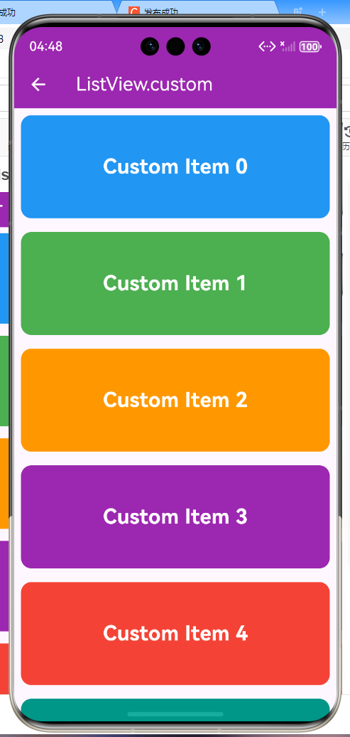
ListView.custom(
  childrenDelegate: SliverChildBuilderDelegate(
    (context, index) {
      return ListTile(title: Text('Item $index'));
    },
    childCount: 100,
    addAutomaticKeepAlives: true,
    addRepaintBoundaries: true,
    addSemanticIndexes: true,
  ),
)
SliverChildBuilderDelegate关键参数详解:
| 参数 | 类型 | 说明 | 默认值 | 使用场景 |
|---|---|---|---|---|
| builder | Widget Function(BuildContext, int) | 构建列表项的回调 | 必需 | 动态创建列表项 |
| childCount | int? | 子项数量,null表示无限 | null | 限制列表长度 |
| addAutomaticKeepAlives | bool | 是否自动保持子项状态 | true | 需要保持状态时 |
| addRepaintBoundaries | bool | 是否添加重绘边界 | true | 隔离重绘范围 |
| addSemanticIndexes | bool | 是否添加语义索引 | true | 无障碍支持 |
| semanticIndexCallback | int? Function(int) | 自定义语义索引 | null | 特殊语义需求 |
| semanticIndexOffset | int | 语义索引偏移量 | 0 | 多列表场景 |
addAutomaticKeepAlives详解:
// 开启自动保持状态(默认)
SliverChildBuilderDelegate(
  (context, index) => MyListItem(),
  addAutomaticKeepAlives: true,  // 自动保持列表项状态
)

// 关闭自动保持状态
SliverChildBuilderDelegate(
  (context, index) => MyListItem(),
  addAutomaticKeepAlives: false,  // 滚动时销毁,节省内存
)
何时关闭addAutomaticKeepAlives:
- 列表项数量非常大
- 列表项没有需要保持的状态
- 需要最大化内存效率
- 列表项重建成本低
addRepaintBoundaries详解:
// 开启重绘边界(默认)
SliverChildBuilderDelegate(
  (context, index) => ComplexListItem(),
  addRepaintBoundaries: true,  // 隔离每个列表项的重绘
)

// 关闭重绘边界
SliverChildBuilderDelegate(
  (context, index) => SimpleListItem(),
  addRepaintBoundaries: false,  // 不需要隔离重绘
)
2. SliverChildListDelegate
使用预构建的Widget列表,适用于静态列表或需要完全控制Widget树结构的场景。
ListView.custom(
  childrenDelegate: SliverChildListDelegate(
    [
      ListTile(title: Text('Item 1')),
      ListTile(title: Text('Item 2')),
      ListTile(title: Text('Item 3')),
    ],
    addAutomaticKeepAlives: true,
    addRepaintBoundaries: true,
    addSemanticIndexes: true,
  ),
)
SliverChildListDelegate vs SliverChildBuilderDelegate:
| 特性 | SliverChildListDelegate | SliverChildBuilderDelegate |
|---|---|---|
| 数据来源 | 预构建的Widget列表 | 动态创建Widget |
| 内存占用 | 较高 | 较低 |
| 性能 | 较差 | 优秀 |
| 灵活性 | 低 | 高 |
| 适用场景 | 少量静态列表 | 大量动态列表 |
三、自定义高度列表实现
1. 动态高度列表
class DynamicHeightList extends StatelessWidget {
final List<ContentItem> _items = List.generate(
50,
(index) => ContentItem(
id: index + 1,
title: '内容标题 ${index + 1}',
content: '这是第 ${index + 1} 个内容项的详细描述。\n' *
(1 + index % 3),
category: _getCategory(index),
likes: (index + 1) * 10,
views: (index + 1) * 100,
),
);
static String _getCategory(int index) {
final categories = ['技术', '生活', '娱乐', '学习'];
return categories[index % categories.length];
}
Widget build(BuildContext context) {
return Scaffold(
appBar: AppBar(
title: const Text('动态高度列表'),
backgroundColor: Colors.deepPurple,
foregroundColor: Colors.white,
),
body: ListView.custom(
padding: const EdgeInsets.all(8),
childrenDelegate: SliverChildBuilderDelegate(
(context, index) {
final item = _items[index];
return Card(
margin: const EdgeInsets.symmetric(horizontal: 12, vertical: 6),
elevation: 2,
child: Padding(
padding: const EdgeInsets.all(16),
child: Column(
crossAxisAlignment: CrossAxisAlignment.start,
children: [
// 标签和统计信息
Row(
children: [
Container(
padding: const EdgeInsets.symmetric(
horizontal: 8,
vertical: 4,
),
decoration: BoxDecoration(
color: Colors.deepPurple[100],
borderRadius: BorderRadius.circular(12),
),
child: Text(
item.category,
style: TextStyle(
color: Colors.deepPurple[700],
fontSize: 12,
fontWeight: FontWeight.w500,
),
),
),
const Spacer(),
Row(
children: [
Icon(
Icons.favorite_border,
size: 16,
color: Colors.red[400],
),
const SizedBox(width: 4),
Text(
'${item.likes}',
style: TextStyle(
fontSize: 13,
color: Colors.grey[600],
),
),
const SizedBox(width: 16),
Icon(
Icons.visibility,
size: 16,
color: Colors.blue[400],
),
const SizedBox(width: 4),
Text(
'${item.views}',
style: TextStyle(
fontSize: 13,
color: Colors.grey[600],
),
),
],
),
],
),
const SizedBox(height: 12),
// 标题
Text(
item.title,
style: const TextStyle(
fontSize: 18,
fontWeight: FontWeight.bold,
),
),
const SizedBox(height: 8),
// 内容(动态高度)
Text(
item.content,
style: TextStyle(
fontSize: 14,
color: Colors.grey[600],
height: 1.5,
),
),
const SizedBox(height: 12),
// 底部操作栏
Row(
children: [
Expanded(
child: OutlinedButton.icon(
onPressed: () {},
icon: const Icon(Icons.share, size: 16),
label: const Text('分享'),
style: OutlinedButton.styleFrom(
minimumSize: const Size(0, 32),
),
),
),
const SizedBox(width: 8),
Expanded(
child: OutlinedButton.icon(
onPressed: () {},
icon: const Icon(Icons.bookmark_border, size: 16),
label: const Text('收藏'),
style: OutlinedButton.styleFrom(
minimumSize: const Size(0, 32),
),
),
),
const SizedBox(width: 8),
Expanded(
child: ElevatedButton.icon(
onPressed: () {},
icon: const Icon(Icons.arrow_forward, size: 16),
label: const Text('详情'),
style: ElevatedButton.styleFrom(
minimumSize: const Size(0, 32),
),
),
),
],
),
],
),
),
);
},
childCount: _items.length,
addRepaintBoundaries: true,
),
),
);
}
}
class ContentItem {
final int id;
final String title;
final String content;
final String category;
final int likes;
final int views;
ContentItem({
required this.id,
required this.title,
required this.content,
required this.category,
required this.likes,
required this.views,
});
}
2. 固定高度列表优化
class FixedHeightList extends StatelessWidget {
Widget build(BuildContext context) {
return Scaffold(
appBar: AppBar(
title: const Text('固定高度列表'),
backgroundColor: Colors.cyan,
foregroundColor: Colors.white,
),
body: ListView.custom(
itemExtent: 80, // 固定每个列表项的高度
childrenDelegate: SliverChildBuilderDelegate(
(context, index) {
return Container(
height: 80,
decoration: BoxDecoration(
gradient: LinearGradient(
begin: Alignment.topLeft,
end: Alignment.bottomRight,
colors: [
Colors.cyan[100 * ((index % 9) + 1)]!,
Colors.cyan[100 * ((index % 9) + 2)]!,
],
),
),
child: Center(
child: Row(
mainAxisAlignment: MainAxisAlignment.center,
children: [
CircleAvatar(
radius: 24,
backgroundColor: Colors.white,
child: Text(
'${index + 1}',
style: TextStyle(
fontSize: 20,
fontWeight: FontWeight.bold,
color: Colors.cyan[700],
),
),
),
const SizedBox(width: 16),
Text(
'项目 $index',
style: const TextStyle(
fontSize: 24,
fontWeight: FontWeight.bold,
color: Colors.white,
),
),
],
),
),
);
},
childCount: 100,
),
),
);
}
}
itemExtent的优势:
- ListView可以精确计算滚动位置
- 减少布局计算开销
- 避免滚动时的重新测量
- 提升滚动流畅度
- 优化内存使用
四、自定义布局效果
1. 瀑布流布局
class WaterfallList extends StatelessWidget {
final List<PhotoItem> _photos = List.generate(
30,
(index) => PhotoItem(
id: index + 1,
height: 150.0 + (index % 5) * 50,
color: Colors.primaries[index % Colors.primaries.length],
likes: (index + 1) * 10,
),
);
Widget build(BuildContext context) {
return Scaffold(
appBar: AppBar(
title: const Text('瀑布流列表'),
backgroundColor: Colors.pink,
foregroundColor: Colors.white,
),
body: CustomScrollView(
slivers: [
SliverPadding(
padding: const EdgeInsets.all(8),
sliver: SliverList(
delegate: SliverChildBuilderDelegate(
(context, index) {
final photo = _photos[index];
final isEven = index.isEven;
return Card(
margin: EdgeInsets.only(
right: isEven ? 4 : 0,
left: isEven ? 0 : 4,
bottom: 8,
),
elevation: 4,
child: ClipRRect(
borderRadius: BorderRadius.circular(12),
child: InkWell(
onTap: () {
_showPhotoDetail(context, photo);
},
child: Container(
height: photo.height,
decoration: BoxDecoration(
gradient: LinearGradient(
begin: Alignment.topLeft,
end: Alignment.bottomRight,
colors: [
photo.color,
photo.color.withOpacity(0.7),
],
),
),
child: Column(
mainAxisAlignment: MainAxisAlignment.end,
children: [
Container(
width: double.infinity,
padding: const EdgeInsets.all(12),
decoration: BoxDecoration(
color: Colors.black.withOpacity(0.5),
),
child: Row(
children: [
const Icon(
Icons.photo,
color: Colors.white,
size: 20,
),
const SizedBox(width: 8),
Expanded(
child: Text(
'照片 ${photo.id}',
style: const TextStyle(
color: Colors.white,
fontWeight: FontWeight.w500,
fontSize: 16,
),
overflow: TextOverflow.ellipsis,
),
),
Icon(
Icons.favorite,
color: Colors.red[400],
size: 20,
),
const SizedBox(width: 4),
Text(
'${photo.likes}',
style: const TextStyle(
color: Colors.white,
fontSize: 14,
),
),
],
),
),
],
),
),
),
),
);
},
childCount: _photos.length,
),
),
),
],
),
);
}
void _showPhotoDetail(BuildContext context, PhotoItem photo) {
showModalBottomSheet(
context: context,
isScrollControlled: true,
builder: (context) => Container(
height: MediaQuery.of(context).size.height * 0.7,
decoration: BoxDecoration(
color: photo.color.withOpacity(0.1),
),
child: Column(
children: [
// 图片预览
Expanded(
child: Container(
width: double.infinity,
decoration: BoxDecoration(
gradient: LinearGradient(
begin: Alignment.topLeft,
end: Alignment.bottomRight,
colors: [
photo.color,
photo.color.withOpacity(0.5),
],
),
),
child: Center(
child: Icon(
Icons.photo,
size: 100,
color: Colors.white.withOpacity(0.8),
),
),
),
),
// 信息面板
Container(
padding: const EdgeInsets.all(24),
decoration: BoxDecoration(
color: Colors.white,
borderRadius: const BorderRadius.vertical(
top: Radius.circular(24),
),
boxShadow: [
BoxShadow(
color: Colors.black.withOpacity(0.1),
blurRadius: 10,
),
],
),
child: Column(
children: [
Row(
children: [
CircleAvatar(
radius: 30,
backgroundColor: photo.color.withOpacity(0.2),
child: Icon(
Icons.person,
color: photo.color,
),
),
const SizedBox(width: 16),
Expanded(
child: Column(
crossAxisAlignment: CrossAxisAlignment.start,
children: [
const Text(
'用户名',
style: TextStyle(
fontSize: 18,
fontWeight: FontWeight.bold,
),
),
Text(
'照片 ${photo.id}',
style: TextStyle(
color: Colors.grey[600],
),
),
],
),
),
IconButton(
icon: const Icon(Icons.bookmark_border),
onPressed: () {},
),
],
),
const SizedBox(height: 24),
Row(
mainAxisAlignment: MainAxisAlignment.spaceAround,
children: [
_buildStat(
Icons.favorite,
'${photo.likes}',
Colors.red,
),
_buildStat(
Icons.comment,
'${(photo.id * 3)}',
Colors.blue,
),
_buildStat(
Icons.share,
'分享',
Colors.green,
),
],
),
const SizedBox(height: 24),
Row(
children: [
Expanded(
child: ElevatedButton.icon(
onPressed: () {},
icon: const Icon(Icons.download),
label: const Text('保存'),
style: ElevatedButton.styleFrom(
backgroundColor: photo.color,
),
),
),
const SizedBox(width: 16),
Expanded(
child: OutlinedButton.icon(
onPressed: () => Navigator.pop(context),
icon: const Icon(Icons.close),
label: const Text('关闭'),
),
),
],
),
],
),
),
],
),
),
);
}
Widget _buildStat(IconData icon, String value, Color color) {
return Column(
children: [
Icon(icon, color: color, size: 24),
const SizedBox(height: 4),
Text(
value,
style: TextStyle(
fontWeight: FontWeight.bold,
),
),
],
);
}
}
class PhotoItem {
final int id;
final double height;
final Color color;
final int likes;
PhotoItem({
required this.id,
required this.height,
required this.color,
required this.likes,
});
}
2. 网格列表布局
class GridListLayout extends StatelessWidget {
final List<GridItem> _items = List.generate(
24,
(index) => GridItem(
id: index + 1,
title: '项目 ${index + 1}',
subtitle: '子项 ${index + 1}',
color: Colors.accents[index % Colors.accents.length],
icon: Icons.grid_view,
),
);
Widget build(BuildContext context) {
return Scaffold(
appBar: AppBar(
title: const Text('网格列表布局'),
backgroundColor: Colors.amber,
foregroundColor: Colors.white,
),
body: ListView.custom(
childrenDelegate: SliverChildBuilderDelegate(
(context, index) {
final item = _items[index];
final row = index ~/ 2;
final column = index % 2;
return Padding(
padding: EdgeInsets.only(
left: column == 0 ? 8 : 4,
right: column == 1 ? 8 : 4,
top: row == 0 ? 8 : 4,
bottom: row == (_items.length / 2 - 1).ceil() - 1 ? 8 : 4,
),
child: Card(
elevation: 4,
child: InkWell(
onTap: () {
_showItemDetail(context, item);
},
child: Container(
height: 150,
decoration: BoxDecoration(
color: item.color.withOpacity(0.1),
borderRadius: BorderRadius.circular(12),
),
child: Column(
mainAxisAlignment: MainAxisAlignment.center,
children: [
Container(
padding: const EdgeInsets.all(16),
decoration: BoxDecoration(
color: item.color.withOpacity(0.2),
shape: BoxShape.circle,
),
child: Icon(
item.icon,
size: 40,
color: item.color,
),
),
const SizedBox(height: 12),
Text(
item.title,
style: const TextStyle(
fontSize: 16,
fontWeight: FontWeight.bold,
),
),
const SizedBox(height: 4),
Text(
item.subtitle,
style: TextStyle(
fontSize: 12,
color: Colors.grey[600],
),
),
],
),
),
),
),
);
},
childCount: _items.length,
),
),
);
}
void _showItemDetail(BuildContext context, GridItem item) {
showModalBottomSheet(
context: context,
builder: (context) => Container(
padding: const EdgeInsets.all(24),
child: Column(
mainAxisSize: MainAxisSize.min,
children: [
Container(
padding: const EdgeInsets.all(24),
decoration: BoxDecoration(
color: item.color.withOpacity(0.2),
shape: BoxShape.circle,
),
child: Icon(
item.icon,
size: 60,
color: item.color,
),
),
const SizedBox(height: 24),
Text(
item.title,
style: const TextStyle(
fontSize: 24,
fontWeight: FontWeight.bold,
),
),
const SizedBox(height: 8),
Text(
item.subtitle,
style: TextStyle(
fontSize: 16,
color: Colors.grey[600],
),
),
const SizedBox(height: 24),
ElevatedButton(
onPressed: () => Navigator.pop(context),
style: ElevatedButton.styleFrom(
backgroundColor: item.color,
),
child: const Text('关闭'),
),
],
),
),
);
}
}
class GridItem {
final int id;
final String title;
final String subtitle;
final Color color;
final IconData icon;
GridItem({
required this.id,
required this.title,
required this.subtitle,
required this.color,
required this.icon,
});
}
五、性能优化深度解析
1. 使用AutomaticKeepAliveMixin
class KeepAliveListItem extends StatefulWidget {
final String title;
final String description;
const KeepAliveListItem({
super.key,
required this.title,
required this.description,
});
State<KeepAliveListItem> createState() => _KeepAliveListItemState();
}
class _KeepAliveListItemState extends State<KeepAliveListItem>
with AutomaticKeepAliveClientMixin {
bool _isFavorite = false;
int _counter = 0;
bool get wantKeepAlive => true; // 保持状态
Widget build(BuildContext context) {
super.build(context); // 必须调用
return Card(
child: ListTile(
title: Text(widget.title),
subtitle: Column(
crossAxisAlignment: CrossAxisAlignment.start,
children: [
Text(widget.description),
const SizedBox(height: 8),
Text('计数: $_counter'),
],
),
trailing: Row(
mainAxisSize: MainAxisSize.min,
children: [
IconButton(
icon: Icon(
_isFavorite ? Icons.favorite : Icons.favorite_border,
color: _isFavorite ? Colors.red : Colors.grey,
),
onPressed: () {
setState(() {
_isFavorite = !_isFavorite;
});
},
),
IconButton(
icon: const Icon(Icons.add),
onPressed: () {
setState(() {
_counter++;
});
},
),
],
),
),
);
}
}
2. 使用RepaintBoundary隔离重绘
ListView.custom(
  childrenDelegate: SliverChildBuilderDelegate(
    (context, index) {
      return RepaintBoundary(
        child: Card(
          elevation: 2,
          child: ListTile(
            title: Text('Item $index'),
            subtitle: Text('这是副标题内容'),
          ),
        ),
      );
    },
    childCount: 100,
  ),
)
RepaintBoundary的优势:
- 隔离每个列表项的重绘范围
- 避免不必要的父级Widget重绘
- 提升列表滚动性能
- 减少CPU和GPU负担
3. 性能优化对比表
| 优化技术 | 适用场景 | 性能提升 | 实现难度 | 优先级 |
|---|---|---|---|---|
| itemExtent | 固定高度列表 | 高 | 低 | 高 |
| AutomaticKeepAlive | 需要保持状态 | 中 | 中 | 中 |
| RepaintBoundary | 复杂列表项 | 中 | 低 | 高 |
| const构造函数 | 静态内容 | 中 | 低 | 中 |
| 预计算数据 | 动态计算多 | 高 | 中 | 中 |
| 懒加载图片 | 图片列表 | 高 | 低 | 高 |
| 关闭keepAlive | 无状态大列表 | 中 | 低 | 中 |
六、ListView.custom最佳实践
使用决策流程图
最佳实践清单
| 实践 | 说明 | 示例 | 优先级 |
|---|---|---|---|
| 合理使用itemExtent | 固定高度列表 | itemExtent: 80 |
高 |
| 使用const构造函数 | 静态子组件 | const ListTile(...) |
中 |
| 添加重绘边界 | 隔离重绘范围 | RepaintBoundary |
高 |
| 保持必要状态 | 使用AutomaticKeepAlive | with AutomaticKeepAliveClientMixin |
中 |
| 预计算数据 | 避免重复计算 | 提前计算高度、颜色等 | 中 |
| 分离组件 | 提取可复用Widget | 单独的Item组件类 | 高 |
| 监听滚动 | ScrollController | 实现滚动监听、控制 | 中 |
| 处理空状态 | 显示空状态提示 | itemCount: items.isEmpty ? 1 : items.length |
中 |
| 错误处理 | 友好的错误提示 | 错误状态Widget | 中 |
| 性能监控 | 使用Flutter DevTools | 分析性能瓶颈 | 低 |
常见问题与解决方案
| 问题 | 原因 | 解决方案 |
|---|---|---|
| 滚动卡顿 | 列表项过于复杂 | 简化布局,使用RepaintBoundary |
| 内存占用高 | keepAlive过多 | 关闭不必要的keepAlive |
| 状态丢失 | 没有使用AutomaticKeepAlive | 添加with AutomaticKeepAliveClientMixin |
| 动画不流畅 | AnimationController管理不当 | 正确管理AnimationController生命周期 |
| 布局跳动 | 动态高度计算错误 | 使用itemExtent或prototypeItem |
总结
ListView.custom提供了最强大的列表定制能力,适合实现复杂的布局和交互效果。通过SliverChildDelegate,开发者可以完全控制列表的创建和渲染过程。但同时,它的学习曲线也相对较陡峭,需要深入理解Flutter的滚动和渲染机制。
在实际开发中,应该根据需求选择合适的ListView构造方式:
- 简单列表 → ListView默认构造函数
- 标准列表 → ListView.builder
- 带分隔符 → ListView.separated
- 复杂效果 → ListView.custom
大多数情况下,ListView.builder已经足够使用了。只有在需要实现特殊效果或精细控制性能时,才需要使用ListView.custom。
记住,代码的可读性和可维护性同样重要。不要为了使用高级特性而过度设计,简单清晰才是最好的。
欢迎加入开源鸿蒙跨平台社区:https://openharmonycrossplatform.csdn.net

AtomGit 是由开放原子开源基金会联合 CSDN 等生态伙伴共同推出的新一代开源与人工智能协作平台。平台坚持“开放、中立、公益”的理念,把代码托管、模型共享、数据集托管、智能体开发体验和算力服务整合在一起,为开发者提供从开发、训练到部署的一站式体验。
更多推荐

 28
28 0
0- 0


 已为社区贡献20条内容

所有评论(0)