DevUI高频组件(Dialog 组件)深度用法与避坑指南
案例展示
一、前言
Dialog 对话框是 Web 应用中最常见的交互组件,用于展示重要信息、收集用户输入、确认操作等。在实际项目开发中,Dialog 经常与 Form 表单组件结合使用,形成"打开对话框 → 填写表单 → 提交数据"的完整交互流程。然而,很多开发者在使用 Dialog 时容易陷入坑点,如服务提供者配置错误、数据传递失败、按钮状态管理混乱、对话框无法正确关闭等。本文通过 DevUI Dialog 的实战案例,深入讲解对话框组件的深度用法和常见避坑技巧,帮助开发者快速掌握 Dialog 的正确使用方式。
二、核心概念:Dialog 组件结构
2.1 Dialog 服务配置与依赖注入
Dialog 组件需要通过 DialogService 来打开对话框。在 Angular 18 standalone 组件中,需要在组件级别提供服务。这是一个关键的配置步骤,很多开发者在这一步容易出错,导致 NullInjectorError 错误。正确的做法是在 @Component 装饰器中添加 providers 数组,并将 DialogService 添加到其中。这样可以避免复杂的全局依赖注入配置,同时保持代码的清晰性。
import { Component } from '@angular/core';
import { FormsModule } from '@angular/forms';
import { CommonModule } from '@angular/common';
import { ButtonModule } from 'ng-devui/button';
import { TextInputModule } from 'ng-devui/text-input';
import { FormModule } from 'ng-devui/form';
import { TextareaModule } from 'ng-devui/textarea';
import { DialogService } from 'ng-devui/modal';
import { ModalCasesComponent } from './modal-cases.component';

@Component({
  selector: 'app-root',
  standalone: true,
  imports: [
    FormsModule,
    CommonModule,
    ButtonModule,
    TextInputModule,
    FormModule,
    TextareaModule,
    ModalCasesComponent
  ],
  providers: [DialogService],
  templateUrl: './app.component.html',
  styleUrl: './app.component.css'
})
export class AppComponent {
  title = '标签创建表单 - DevUI Form + Dialog 深度使用';

  // 创建的标签列表
  createdTags: any[] = [];

  constructor(private dialogService: DialogService) {}
}
说明:在 @Component 装饰器中添加 providers: [DialogService] 是关键。这样可以在组件级别提供 DialogService,避免全局依赖注入的复杂性。DialogService 需要从 ng-devui/modal 导入。通过这种方式,每个使用 Dialog 的组件都有自己的 DialogService 实例,不会产生依赖注入链过长的问题。这是 Angular 18 standalone 组件的最佳实践。
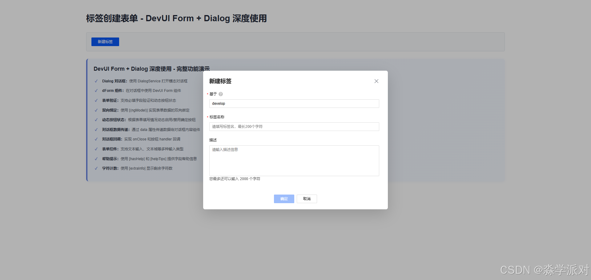
2.2 Dialog 对话框配置与打开方法
Dialog 对话框通过 dialogService.open() 方法打开,接收一个配置对象。这个方法返回一个 results 对象,包含 modalInstance 和 modalContentInstance 两个重要属性。modalInstance 用于控制对话框的生命周期(如关闭、更新按钮状态等),modalContentInstance 用于访问对话框内容组件的实例和方法。正确理解这两个属性的作用是使用 Dialog 的关键。
openStandardDialog(dialogtype?: string) {
  const results = this.dialogService.open({
    id: 'dialog-service',
    width: '600px',
    maxHeight: '600px',
    title: '新建标签',
    content: ModalCasesComponent,
    backdropCloseable: true,
    dialogtype: dialogtype,
    onClose: () => {
      console.log('on dialog closed');
    },
    buttons: [
      {
        cssClass: 'primary',
        text: '确定',
        disabled: true,
        handler: ($event: Event) => {
          const tagData = results.modalContentInstance.getTagData();
          this.createdTags.push(tagData);
          console.log('tag created:', tagData);
          results.modalInstance.hide();
        },
      },
      {
        id: 'btn-cancel',
        cssClass: 'common',
        text: '取消',
        handler: ($event: Event) => {
          results.modalInstance.hide();
        },
      },
    ],
    data: {
      canConfirm: (value: boolean) => {
        results.modalInstance.updateButtonOptions([{disabled: !value}]);
      }
    },
  });
  console.log(results.modalContentInstance);
}
说明:这个代码展示了 dialogService.open() 的完整配置。关键配置项包括:
id:对话框的唯一标识符,用于在多个对话框场景中区分不同的对话框width和maxHeight:控制对话框的尺寸,确保在不同屏幕上的显示效果title:对话框的标题,显示在对话框顶部content:对话框的内容组件,这里使用ModalCasesComponentbackdropCloseable:点击背景是否关闭对话框,设置为true提供更好的用户体验buttons:对话框的按钮配置,包括确定和取消按钮data:传递给内容组件的数据,通过@Input()接收onClose:对话框关闭时的回调函数
results 对象包含 modalInstance 和 modalContentInstance。通过 modalInstance.hide() 关闭对话框,通过 updateButtonOptions() 动态更新按钮状态。通过 modalContentInstance.getTagData() 获取对话框内容组件中的数据。这种设计模式使得父组件可以完全控制对话框的行为和数据流。
三、对话框内容组件
3.1 ModalCasesComponent 组件 - 对话框内容的实现
对话框的内容通过一个独立的组件来实现。这个组件接收来自父组件的数据,并提供方法供父组件调用。这种分离的设计使得对话框的内容逻辑与打开对话框的逻辑解耦,提高了代码的可维护性和可复用性。ModalCasesComponent 是一个 standalone 组件,包含表单的所有逻辑,包括数据绑定、验证和数据获取。
import { Component, Input } from '@angular/core';
import { FormsModule } from '@angular/forms';
import { CommonModule } from '@angular/common';
import { TextInputModule } from 'ng-devui/text-input';
import { FormModule, FormLayout } from 'ng-devui/form';
import { TextareaModule } from 'ng-devui/textarea';

@Component({
  selector: 'd-modal-cases',
  standalone: true,
  imports: [
    FormsModule,
    CommonModule,
    TextInputModule,
    FormModule,
    TextareaModule
  ],
  templateUrl: './modal-cases.component.html',
  styles: ['textarea { height: 100px; resize: none }'],
})
export class ModalCasesComponent {
  @Input() data: any;

  branch = 'develop';
  tagName = '';
  des = '';
  layoutDirection: FormLayout = FormLayout.Vertical;

  formChange() {
    if (this.branch && this.tagName) {
      this.data.canConfirm(true);
    } else {
      this.data.canConfirm(false);
    }
  }

  getTagData() {
    return {
      branch: this.branch,
      tagName: this.tagName,
      description: this.des
    };
  }
}
说明:这个组件展示了对话框内容组件的完整实现。关键点包括:
@Input() data:接收来自父组件的数据对象,包含canConfirm回调函数branch、tagName、des:表单的三个数据字段,分别对应分支、标签名和描述layoutDirection: FormLayout.Vertical:设置表单为垂直布局formChange()方法:在表单数据变化时调用,通过this.data.canConfirm()回调函数来动态更新对话框按钮的禁用状态。这实现了"表单有效时启用确定按钮,表单无效时禁用确定按钮"的交互逻辑getTagData()方法:返回表单数据供父组件使用,这是父组件获取用户输入数据的唯一途径
这种设计模式使得内容组件完全专注于表单逻辑,而不需要关心对话框的打开和关闭。
3.2 对话框内容模板
<div class="modal-cases-component">
  <form dForm [layout]="layoutDirection" ngForm>
    <d-form-item>
      <d-form-label [required]="true" [hasHelp]="true" [helpTips]="'请输入已有分支名'">基于</d-form-label>
      <d-form-control>
        <div>
          <input
            dTextInput
            autocomplete="off"
            name="branch"
            placeholder="请输入已有分支名"
            [(ngModel)]="branch"
            (ngModelChange)="formChange()"
          />
        </div>
      </d-form-control>
    </d-form-item>
    <d-form-item>
      <d-form-label [required]="true">标签名称</d-form-label>
      <d-form-control>
        <div>
          <input
            dTextInput
            autocomplete="off"
            name="tag"
            placeholder="请填写标签名,最长200个字符"
            maxlength="200"
            [(ngModel)]="tagName"
            (ngModelChange)="formChange()"
          />
        </div>
      </d-form-control>
    </d-form-item>
    <d-form-item>
      <d-form-label>描述</d-form-label>
      <d-form-control [extraInfo]="'您最多还可以输入 ' + (2000 - des.length) + ' 个字符'">
        <textarea dTextarea name="des" maxlength="2000" placeholder="请输入描述信息" [(ngModel)]="des"></textarea>
      </d-form-control>
    </d-form-item>
  </form>
</div>
说明:这个模板展示了在对话框中使用 DevUI Form 的完整方式。关键点包括:
dForm组件:DevUI 的表单容器,提供统一的表单样式和行为[layout]="layoutDirection":设置表单布局方向,这里使用垂直布局ngForm:Angular 的模板驱动表单指令,用于表单管理d-form-item和d-form-control:DevUI 的表单项和控制容器,用于组织表单字段[(ngModel)]="branch":实现双向数据绑定,用户输入自动更新组件属性(ngModelChange)="formChange()":监听数据变化,每次用户输入都会触发formChange()方法,从而更新对话框按钮的禁用状态[hasHelp]="true"和[helpTips]="'请输入已有分支名'":为字段提供帮助提示,提升用户体验[extraInfo]="'您最多还可以输入 ' + (2000 - des.length) + ' 个字符'":动态显示剩余字符数,帮助用户了解输入限制maxlength="200"和maxlength="2000":HTML 原生的长度限制,防止用户输入过长的内容
这种设计使得表单既有良好的用户体验,又能实现完整的数据验证和提示功能。
四、主模板和数据管理
4.1 打开对话框按钮
<div class="demo-container">
  <h1>{{ title }}</h1>

  <!-- 打开对话框按钮 -->
  <div class="button-section">
    <d-button bsStyle="primary" (click)="openStandardDialog('standard')">新建标签</d-button>
  </div>

  <!-- 创建的标签列表 -->
  <div class="tags-section" *ngIf="createdTags.length > 0">
    <div class="tags-header">
      <h2>创建的标签 ({{ createdTags.length }})</h2>
      <d-button bsStyle="common" (click)="clearTags()">清空所有</d-button>
    </div>
    <div class="tags-list">
      <div class="tag-item" *ngFor="let tag of createdTags; let i = index">
        <div class="tag-content">
          <p><strong>分支:</strong> {{ tag.branch }}</p>
          <p><strong>标签名:</strong> {{ tag.tagName }}</p>
          <p><strong>描述:</strong> {{ tag.description || '无' }}</p>
        </div>
        <d-button bsStyle="text" class="delete-btn" (click)="deleteTag(i)">删除</d-button>
      </div>
    </div>
  </div>
</div>
说明:这个模板展示了主组件的完整 UI 结构。关键点包括:
<d-button bsStyle="primary" (click)="openStandardDialog('standard')">新建标签</d-button>:主操作按钮,点击时打开对话框。bsStyle="primary"使用主色调,吸引用户注意*ngIf="createdTags.length > 0":条件渲染,只有当有标签时才显示标签列表,提高页面的清晰度*ngFor="let tag of createdTags; let i = index":遍历标签列表,let i = index获取当前索引,用于删除操作{{ tag.branch }}、{{ tag.tagName }}、{{ tag.description || '无' }}:显示标签的详细信息,使用|| '无'处理空值情况(click)="deleteTag(i)":删除单个标签,传递索引给删除方法(click)="clearTags()":清空所有标签,提供批量操作的便利
这种设计使得用户可以清楚地看到创建的标签,并能够轻松管理它们。
4.2 数据管理方法
// 删除标签
deleteTag(index: number): void {
  this.createdTags.splice(index, 1);
}

// 清空所有标签
clearTags(): void {
  this.createdTags = [];
}
说明:这两个方法提供了完整的数据管理能力:
deleteTag(index: number):删除指定索引的标签。使用splice(index, 1)从数组中移除单个元素。这个方法在用户点击标签项的"删除"按钮时调用,提供了逐个删除的灵活性clearTags():清空所有标签。直接将createdTags数组重新赋值为空数组。这个方法在用户点击"清空所有"按钮时调用,提供了批量删除的便利
这两个方法虽然简单,但充分展示了数据管理的核心逻辑。在实际项目中,可能需要添加确认对话框、日志记录、数据持久化等额外功能。
五、常见坑点和避坑技巧
| 坑点 | 原因 | 解决方案 |
|---|---|---|
| DialogService 注入失败 | 没有提供 DialogService | 在组件的 providers 数组中添加 DialogService |
| OverlayContainerRef 错误 | 依赖注入链不完整 | 在组件级别提供服务,避免全局配置 |
| 对话框数据传递失败 | 没有正确使用 data 属性 |
通过 data 属性传递数据,在内容组件中通过 @Input() 接收 |
| 按钮状态无法更新 | 没有使用 updateButtonOptions() |
通过 results.modalInstance.updateButtonOptions() 动态更新按钮 |
| 对话框无法关闭 | 没有调用 hide() 方法 |
在按钮 handler 中调用 results.modalInstance.hide() |
| 表单数据无法获取 | 没有提供获取数据的方法 | 在内容组件中实现 getTagData() 方法供父组件调用 |
| 对话框样式不正确 | 没有正确配置宽度和高度 | 设置 width 和 maxHeight 属性 |
| 回调函数无法执行 | 没有正确传递回调函数 | 通过 data 属性传递回调函数,在内容组件中调用 |
六、总结与最佳实践
DevUI Dialog 组件的深度使用需要关注以下几点:
6.1 核心要点
-
服务提供者配置 - 在组件级别提供 DialogService,避免全局依赖注入。这是解决
NullInjectorError的关键,也是 Angular 18 standalone 组件的最佳实践。 -
数据传递机制 - 通过
data属性传递数据给对话框内容组件。这种单向数据流的设计使得数据流向清晰,易于维护和调试。 -
按钮状态管理 - 使用
updateButtonOptions()动态更新按钮状态。通过回调函数实现表单验证与按钮状态的联动,提升用户体验。 -
对话框生命周期 - 正确处理
onClose回调和按钮 handler。确保对话框能够正确关闭,数据能够正确保存或丢弃。 -
表单验证 - 在内容组件中实现表单验证和数据获取方法。将表单逻辑封装在内容组件中,使得主组件只需关心对话框的打开和数据的处理。
6.2 实践建议
- 分离关注点:将对话框的打开逻辑与内容逻辑分离,使代码更易维护
- 提供良好的用户反馈:使用帮助提示、字符计数等功能提升用户体验
- 处理边界情况:考虑用户可能的各种操作,如点击背景关闭、按 ESC 键等
- 测试充分:对话框涉及多个组件的交互,需要充分的测试确保功能正确
掌握这些技巧和最佳实践,你就能开发出功能完整、用户体验良好的对话框,提升应用的交互质量和代码质量。
相关资源:

AtomGit 是由开放原子开源基金会联合 CSDN 等生态伙伴共同推出的新一代开源与人工智能协作平台。平台坚持“开放、中立、公益”的理念,把代码托管、模型共享、数据集托管、智能体开发体验和算力服务整合在一起,为开发者提供从开发、训练到部署的一站式体验。
更多推荐


 22
22 0
0- 0


 已为社区贡献21条内容

所有评论(0)