数据挖掘实战-基于Random Forest的血细胞异常检测模型
🤵♂️ 个人主页:@艾派森的个人主页
✍🏻作者简介:Python学习者
🐋 希望大家多多支持,我们一起进步!😄
如果文章对你有帮助的话,
欢迎评论 💬点赞👍🏻 收藏 📂加关注+
目录
1.项目背景
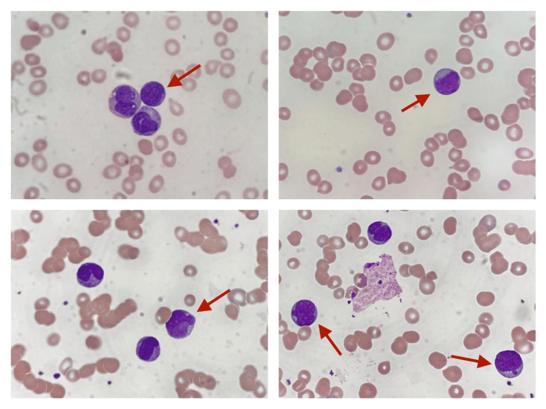
在临床医学中,血液检测是最基础也是最重要的诊断手段之一,医生通常需要通过显微镜观察血细胞的形态特征来判断是否存在异常情况,例如白血病、贫血或感染等疾病。但这种方式高度依赖专业经验,不仅耗时,而且在样本量较大时容易受到主观因素影响,稳定性和效率都存在一定局限。随着医疗数据逐步数字化,如何利用数据挖掘和机器学习方法对血细胞进行自动识别与异常检测,逐渐成为一个具有实际意义的研究方向。
在此背景下,结合包含多维特征的血细胞数据集,通过机器学习模型对细胞状态进行判别,不仅可以提高检测效率,还能够为医生提供辅助决策支持。本项目基于随机森林等多种分类模型,对血细胞的形态学特征、颜色信息以及血常规指标进行综合建模,实现对正常与异常细胞的自动识别。同时,通过模型对不同细胞类型的识别能力进行分析,有助于进一步探索数据特征与疾病之间的关系,为智能化医疗检测提供一定参考。
2.数据集介绍
本实验数据集来源于Kaggle,该数据集提供了19 种细胞类型共5,880 条血细胞记录,涵盖正常白细胞、红细胞和血小板,以及与白血病、贫血、感染和镰状细胞病相关的 12 种具有临床意义的异常细胞类型。
📊 功能(共 36 项)
- 形态学特征——直径、圆度、偏心率、分叶性、颗粒度、核面积、染色质密度
- 颜色——平均 RGB 值,染色强度(Wright-Giemsa 染色法)
- 临床血常规检查——白细胞计数、血红蛋白、血细胞比容、平均红细胞体积(MCV)、平均红细胞血红蛋白浓度(MCHC)、血小板计数
- 采集条件——显微镜型号、染色方案、放大倍数、分辨率
- AI评分——CytoDiffusion异常评分、分类置信度、标注者置信度
🧬 细胞类型
正常(7):中性粒细胞、淋巴细胞、单核细胞、嗜酸性粒细胞、嗜碱性粒细胞、正常红细胞、血小板
异常(12):
- 🔴白血病——原始细胞、前淋巴细胞
- 🟠贫血——椭圆形红细胞、裂形红细胞、球形红细胞、靶形红细胞
- 🟡镰状细胞贫血症— 镰状细胞贫血症
- 🟣感染— 高分叶中性粒细胞、毒性颗粒、反应性淋巴细胞
- ⚫神器— 污迹细胞,神器
🎯 建议任务
- 二元分类——正常与异常
- 多类别分类——19种细胞类型
- 疾病级别预测——白血病、贫血、感染
- 异常检测基准测试与 CytoDiffusion 对比(AUC = 0.990)
- 临床可解释性和特征重要性
3.技术工具
Python版本:3.9
代码编辑器:jupyter notebook
4.实验过程
4.1导入数据
在实验开始之前,首先需要导入项目中所使用的各类Python库,并读取血细胞异常检测相关的数据集。本部分主要完成环境准备和数据加载工作,涉及数据处理、可视化、机器学习建模以及模型评估等常用工具。同时,对绘图风格进行简单设置,使后续可视化结果更加清晰统一。最后,从Kaggle数据集中读取主数据表、细胞类型参考表以及基准对比数据,为后续的数据分析和建模打下基础。
# 导入数据处理与分析相关库
import pandas as pd
import numpy as np

# 导入数据可视化相关库
import matplotlib.pyplot as plt
import matplotlib.gridspec as gridspec
import seaborn as sns

# 导入机器学习相关模块
from sklearn.model_selection import train_test_split, StratifiedKFold, cross_val_score  # 数据划分与交叉验证
from sklearn.preprocessing import LabelEncoder, StandardScaler  # 标签编码与特征标准化
from sklearn.ensemble import RandomForestClassifier, GradientBoostingClassifier  # 集成学习模型
from sklearn.linear_model import LogisticRegression  # 逻辑回归模型

# 导入模型评估指标
from sklearn.metrics import (classification_report, confusion_matrix,
                              roc_auc_score, roc_curve, accuracy_score)

# 忽略警告信息,避免输出干扰
import warnings
warnings.filterwarnings('ignore')

# ==============================
# 设置可视化风格参数
# ==============================

# 自定义调色板
PALETTE = ['#2C3E50','#E74C3C','#3498DB','#2ECC71','#F39C12','#9B59B6','#1ABC9C']

# 设置背景颜色
BG, CARD = '#F8F9FA', '#FFFFFF'

# 更新matplotlib的全局绘图参数
plt.rcParams.update({
    'figure.facecolor': BG,          # 整体背景色
    'axes.facecolor': CARD,          # 子图背景色
    'axes.spines.top': False,        # 去掉上边框
    'axes.spines.right': False,      # 去掉右边框
    'grid.color': '#E9ECEF',         # 网格线颜色
    'grid.linewidth': 0.8,           # 网格线宽度
})

# ==============================
# 读取数据集
# ==============================

# 主数据集:血细胞异常检测数据
df = pd.read_csv('/kaggle/input/datasets/alitaqishah/blood-cell-anomaly-detection-2025/blood_cell_anomaly_detection.csv')

# 参考数据集:细胞类型说明
ref = pd.read_csv('/kaggle/input/datasets/alitaqishah/blood-cell-anomaly-detection-2025/cell_type_reference.csv')

# 基准数据集:其他方法的性能对比结果
bench = pd.read_csv('/kaggle/input/datasets/alitaqishah/blood-cell-anomaly-detection-2025/cytodiffusion_benchmark_scores.csv')
4.2数据可视化

(1)细胞类型与异常分布
在正式建模之前,先从整体上看看数据的基本结构,包括不同细胞类型的数量分布、异常与正常样本比例,以及疾病类别的分布情况。这一步的目的主要是建立对数据的直观认识,比如哪些类型样本多、异常样本占比如何,是否存在明显的不均衡问题。
fig, axes = plt.subplots(1, 3, figsize=(20, 6), facecolor=BG)
fig.suptitle('Cell Type & Disease Distribution', fontsize=15, fontweight='bold')

# ==============================
# 不同细胞类型的样本数量分布
# ==============================

# 统计每种细胞类型的数量并排序
vc = df['cell_type'].value_counts().sort_values()

# 根据是否异常设置颜色(红=异常,绿=正常)
colors = [PALETTE[1] if df[df.cell_type==c]['anomaly_label'].iloc[0]==1
          else PALETTE[2] for c in vc.index]

# 绘制水平柱状图
axes[0].barh(vc.index, vc.values, color=colors, edgecolor='none', height=0.65)
axes[0].set_title('Cell Type Count  (🔴 Anomaly  🟢 Normal)', fontweight='bold')
axes[0].set_xlabel('Count')

# ==============================
# 正常 vs 异常 样本比例
# ==============================

# 统计标签分布
counts = df['anomaly_label'].value_counts()

# 绘制饼图
axes[1].pie(counts.values, labels=['Normal','Anomaly'],
            colors=[PALETTE[2], PALETTE[1]], autopct='%1.1f%%',
            wedgeprops=dict(edgecolor='white', linewidth=2), startangle=90)
axes[1].set_title('Normal vs Anomaly', fontweight='bold')

# ==============================
# 不同疾病类别的样本分布
# ==============================

cat_c = df['disease_category'].value_counts()

# 设置颜色(正常类别为绿色,其余为红色)
axes[2].bar(cat_c.index, cat_c.values,
            color=[PALETTE[1] if c not in ['Normal_WBC','Normal_RBC','Normal_Platelet']
                   else PALETTE[2] for c in cat_c.index], edgecolor='none')

axes[2].set_title('Samples by Disease Category', fontweight='bold')
axes[2].tick_params(axis='x', rotation=35)

plt.tight_layout()
plt.show()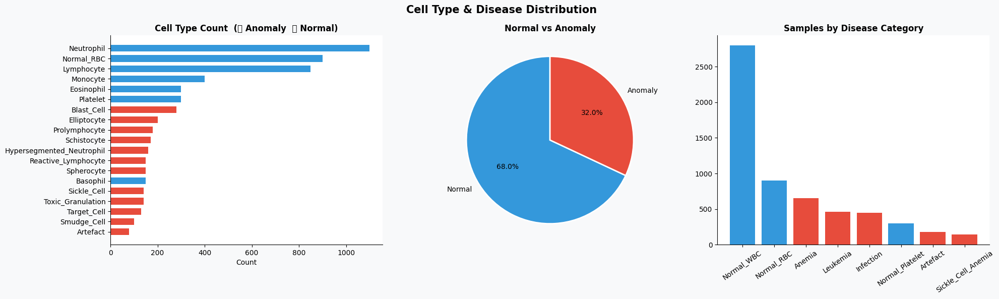
(2)疾病类别与年龄分布关系
在了解基本分布之后,可以进一步分析不同疾病类别在不同年龄段中的分布情况,从而观察是否存在某些疾病在特定年龄群体中更集中。
# 构建疾病类别与年龄分组的交叉表
ct = pd.crosstab(df['disease_category'], df['patient_age_group'])

# 绘制热力图
fig, ax = plt.subplots(figsize=(12, 5), facecolor=BG)
sns.heatmap(ct, annot=True, fmt='d', cmap='YlOrRd', ax=ax,
            linewidths=0.5, cbar_kws={'label':'Count'})

ax.set_title('Disease Category vs Patient Age Group', fontsize=13, fontweight='bold')

plt.tight_layout()
plt.show()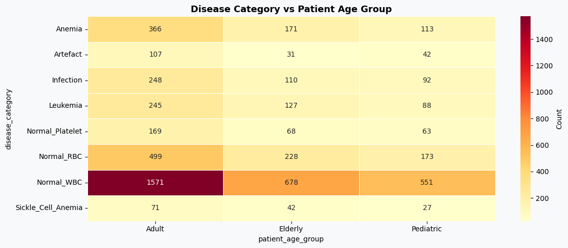
(3)形态学特征分布(正常 vs 异常)
接下来重点分析模型输入的核心特征,即血细胞的形态学指标,通过对比正常与异常样本在这些特征上的分布差异,可以判断哪些特征对分类更有区分度。
fig, axes = plt.subplots(2, 3, figsize=(20, 11), facecolor=BG)
fig.suptitle('Morphological Features — Normal vs Anomaly', fontsize=15, fontweight='bold')

# 选取需要分析的特征
features = ['cell_diameter_um','nucleus_area_pct','circularity',
            'eccentricity','granularity_score','lobularity_score']

titles   = ['Cell Diameter (μm)','Nucleus Area (%)','Circularity',
            'Eccentricity','Granularity Score','Lobularity Score']

# 绘制每个特征在正常与异常样本中的分布
for ax, feat, title in zip(axes.flatten(), features, titles):

    # 正常样本分布
    ax.hist(df[df.anomaly_label==0][feat], bins=40, alpha=0.65,
            color=PALETTE[2], label='Normal', edgecolor='none')

    # 异常样本分布
    ax.hist(df[df.anomaly_label==1][feat], bins=40, alpha=0.65,
            color=PALETTE[1], label='Anomaly', edgecolor='none')

    ax.set_title(title, fontweight='bold')
    ax.legend(fontsize=8)

plt.tight_layout()
plt.show()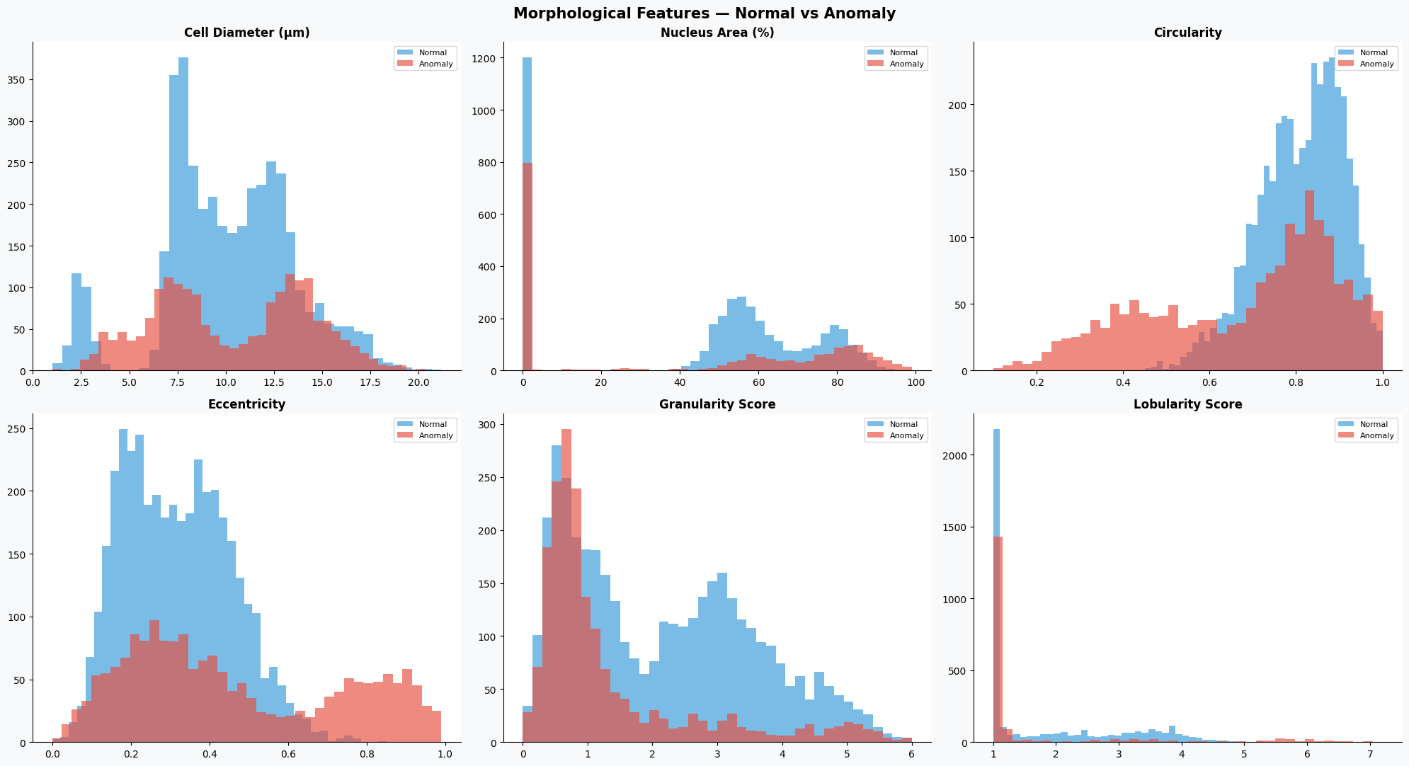
(4)特征相关性分析
为了避免特征之间存在较强的冗余关系,可以通过相关性矩阵查看各个数值特征之间的线性相关程度。
# 创建画布
fig, ax = plt.subplots(figsize=(12, 8), facecolor=BG)
# 选择数值特征列
num_cols = ['cell_diameter_um','nucleus_area_pct','circularity','eccentricity',
            'granularity_score','lobularity_score','chromatin_density',
            'cytodiffusion_anomaly_score','anomaly_label']

# 计算相关系数矩阵
corr = df[num_cols].corr()
# 创建上三角掩码,避免重复显示
mask = np.triu(np.ones_like(corr, dtype=bool))
# 绘制热力图
sns.heatmap(corr, mask=mask, annot=True, fmt='.2f', cmap='RdBu_r',
            center=0, ax=ax, linewidths=0.4, cbar_kws={'shrink':0.8})

ax.set_title('Feature Correlation Matrix', fontsize=13, fontweight='bold')
plt.tight_layout()
plt.show()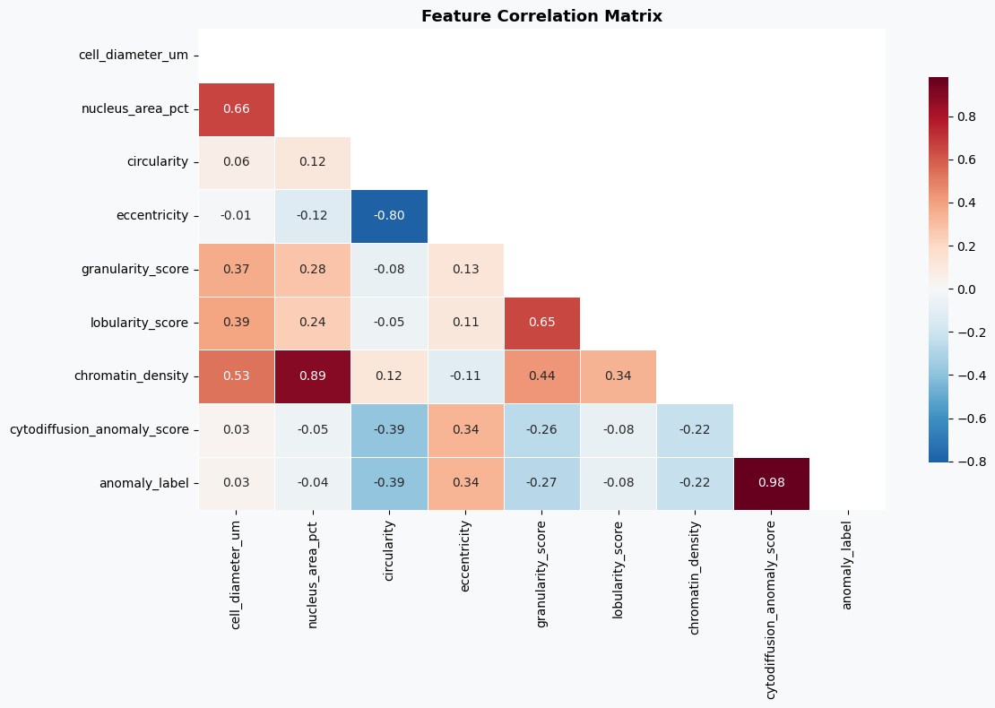
(5)异常评分分析
最后,对数据集中已有的异常评分进行分析,一方面观察其分布情况,另一方面查看不同细胞类型的平均异常评分,从侧面验证该评分的区分能力。
fig, axes = plt.subplots(1, 2, figsize=(18, 6), facecolor=BG)

# ==============================
# 异常评分分布
# ==============================

axes[0].hist(df[df.anomaly_label==0]['cytodiffusion_anomaly_score'], bins=50,
             alpha=0.7, color=PALETTE[2], label='Normal', edgecolor='none')

axes[0].hist(df[df.anomaly_label==1]['cytodiffusion_anomaly_score'], bins=50,
             alpha=0.7, color=PALETTE[1], label='Anomaly', edgecolor='none')

# 设置阈值参考线
axes[0].axvline(0.5, color='black', lw=2, ls='--', label='Threshold=0.5')

axes[0].set_xlabel('CytoDiffusion Anomaly Score')
axes[0].set_ylabel('Frequency')
axes[0].set_title('Anomaly Score Distribution\n(Paper AUC = 0.990)', fontweight='bold')
axes[0].legend(fontsize=9)

# ==============================
# 不同细胞类型的平均异常评分
# ==============================

ct_score = df.groupby('cell_type')['cytodiffusion_anomaly_score'].mean().sort_values()

# 设置颜色(异常为红,正常为绿)
colors_ct = [PALETTE[1] if df[df.cell_type==ct]['anomaly_label'].iloc[0]==1
             else PALETTE[2] for ct in ct_score.index]

axes[1].barh(ct_score.index, ct_score.values, color=colors_ct, edgecolor='none')

# 添加阈值线
axes[1].axvline(0.5, color='black', lw=1.5, ls='--')

axes[1].set_xlabel('Mean Anomaly Score')
axes[1].set_title('Mean CytoDiffusion Score by Cell Type', fontweight='bold')

plt.tight_layout()
plt.show()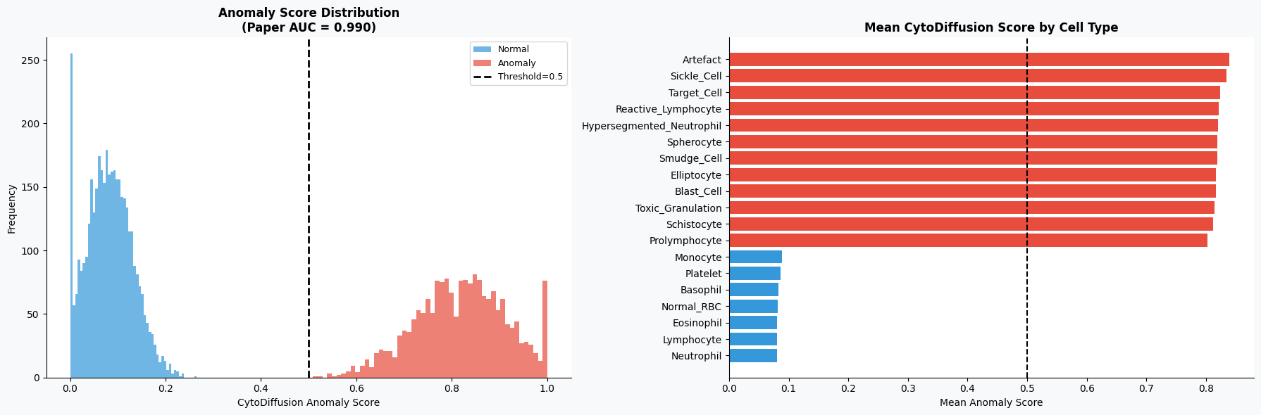
4.3特征工程
在完成数据探索之后,需要将原始数据整理为模型可以直接使用的输入形式。本部分主要包括特征选择、数据标准化以及训练集与测试集划分三个步骤。首先从数据集中筛选出与血细胞形态、生化指标以及图像特征相关的数值型变量作为模型输入特征;随后对特征进行标准化处理,以消除不同量纲之间的影响,使各特征处于同一尺度;最后按照一定比例将数据划分为训练集和测试集,并通过分层抽样保证不同类别样本分布的一致性,从而为后续模型训练和评估提供可靠的数据基础。
# ==============================
# 特征选择
# ==============================
# 定义用于建模的特征列(包含形态学特征、图像特征及血液指标等)
FEATURE_COLS = ['cell_diameter_um','nucleus_area_pct','chromatin_density',
                'cytoplasm_ratio','circularity','eccentricity','granularity_score',
                'lobularity_score','membrane_smoothness','cell_area_px','perimeter_px',
                'mean_r','mean_g','mean_b','stain_intensity',
                'wbc_count_per_ul','rbc_count_millions_per_ul','hemoglobin_g_dl',
                'hematocrit_pct','platelet_count_per_ul','mcv_fl','mchc_g_dl']

# 提取特征矩阵(X)和标签(y)
X = df[FEATURE_COLS].values          # 输入特征
y = df['anomaly_label'].values       # 目标变量(是否异常)
# ==============================
# 特征标准化
# ==============================
# 创建标准化对象(将特征缩放为均值为0、方差为1的分布)
scaler = StandardScaler()
# 对特征进行标准化处理
X_scaled = scaler.fit_transform(X)
# ==============================
# 划分训练集与测试集
# ==============================
# 按照8:2比例划分数据集
# stratify=y 表示按照标签分布进行分层抽样,保证训练集与测试集类别比例一致
X_train, X_test, y_train, y_test = train_test_split(
    X_scaled, y,
    test_size=0.20,          # 测试集占20%
    random_state=42,         # 固定随机种子,保证结果可复现
    stratify=y               # 分层抽样
)
4.4构建模型
在完成特征工程之后,接下来进入模型构建与训练阶段。本部分选取了三种常见的分类模型进行对比实验,分别是随机森林(Random Forest)、梯度提升树(Gradient Boosting)以及逻辑回归(Logistic Regression)。其中,随机森林和梯度提升属于集成学习方法,能够通过组合多个弱学习器提升模型性能,而逻辑回归作为基线模型,有助于对比复杂模型的效果提升情况。
在训练过程中,依次对每个模型进行拟合,并在测试集上进行预测。同时计算模型的预测概率,用于评估AUC(曲线下面积)指标,该指标在二分类任务中能够较好反映模型的区分能力。此外,还计算了分类准确率(Accuracy),用于衡量模型整体预测正确的比例。最终,将各模型的预测结果和评估指标统一存储,方便后续分析与比较。
# ==============================
# 定义模型
# =============================
# 构建多个模型用于对比实验
models = {
    'Random Forest'      : RandomForestClassifier(
        n_estimators=200,      # 决策树数量
        random_state=42,       # 随机种子,保证结果可复现
        n_jobs=-1              # 使用所有CPU核心加速训练
    ),

    'Gradient Boosting'  : GradientBoostingClassifier(
        n_estimators=150,      # 弱学习器数量
        random_state=42
    ),

    'Logistic Regression': LogisticRegression(
        max_iter=1000,         # 最大迭代次数,防止不收敛
        random_state=42
    ),
}

# ==============================
# 模型训练与评估
# ==============================

# 用于存储各模型的结果
results = {}
# 遍历每个模型进行训练与评估
for name, model in models.items():
    # 模型训练
    model.fit(X_train, y_train)
    # 在测试集上进行预测(类别)
    y_pred  = model.predict(X_test)
    # 获取预测概率(取正类的概率)
    y_proba = model.predict_proba(X_test)[:, 1]
    # 计算AUC指标(衡量模型区分能力)
    auc = roc_auc_score(y_test, y_proba)
    # 计算准确率
    acc = accuracy_score(y_test, y_pred)
    # 保存结果
    results[name] = {
        'model': model,
        'pred': y_pred,
        'proba': y_proba,
        'auc': auc,
        'acc': acc
    }
    # 输出每个模型的评估结果
    print(f'{name:25s} → AUC: {auc:.4f} | Accuracy: {acc:.4f}')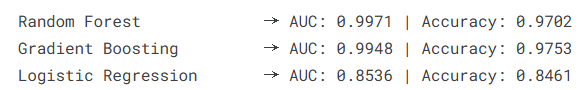
4.5模型评估
在模型训练完成之后,需要从多个角度对模型性能进行评估,以判断其在血细胞异常检测任务中的实际表现。本部分首先基于AUC指标选出表现最优的模型,并通过ROC曲线和混淆矩阵对其二分类效果进行分析;随后扩展到多分类任务,对不同细胞类型进行识别评估;最后结合随机森林模型的特征重要性,分析各输入特征对模型预测结果的贡献,从而提升模型的可解释性。
# ==============================
# 选择AUC最高的最佳模型
# ==============================
best_name = max(results, key=lambda k: results[k]['auc']) # 按AUC选最优模型
best = results[best_name]
# 创建画布
fig, axes = plt.subplots(1, 2, figsize=(16, 6), facecolor=BG)
# ==============================
# 绘制ROC曲线(所有模型对比)
# ==============================
for name, res in results.items():
# 计算ROC曲线坐标
fpr, tpr, _ = roc_curve(y_test, res['proba'])
# 绘制曲线
axes[0].plot(fpr, tpr, lw=2, label=f"{name} (AUC={res['auc']:.4f})")
# 绘制随机猜测参考线
axes[0].plot([0,1],[0,1], 'k--', lw=1)
# 添加参考敏感度线(对比基准方法)
axes[0].axhline(0.905, color='gray', ls=':', lw=1.5, label='CytoDiffusion Sensitivity=0.905')
# 设置坐标轴与标题
axes[0].set_xlabel('False Positive Rate')
axes[0].set_ylabel('True Positive Rate')
axes[0].set_title('ROC Curves — Anomaly Detection', fontweight='bold')
axes[0].legend(fontsize=8)
# ==============================
# 绘制最佳模型的混淆矩阵
# ==============================
# 计算混淆矩阵
cm = confusion_matrix(y_test, best['pred'])
# 使用热力图展示
sns.heatmap(cm, annot=True, fmt='d', cmap='Blues', ax=axes[1],
xticklabels=['Normal','Anomaly'],
yticklabels=['Normal','Anomaly'],
cbar_kws={'shrink':0.8})
# 设置标题与标签
axes[1].set_title(f'Confusion Matrix — {best_name}', fontweight='bold')
axes[1].set_xlabel('Predicted')
axes[1].set_ylabel('Actual')
plt.tight_layout()
plt.show()
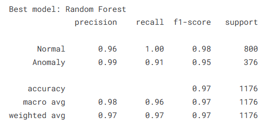
# 输出最佳模型名称及分类报告
print(f'\nBest model: {best_name}')
print(classification_report(y_test, best['pred'], target_names=['Normal','Anomaly']))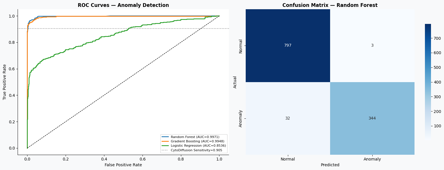
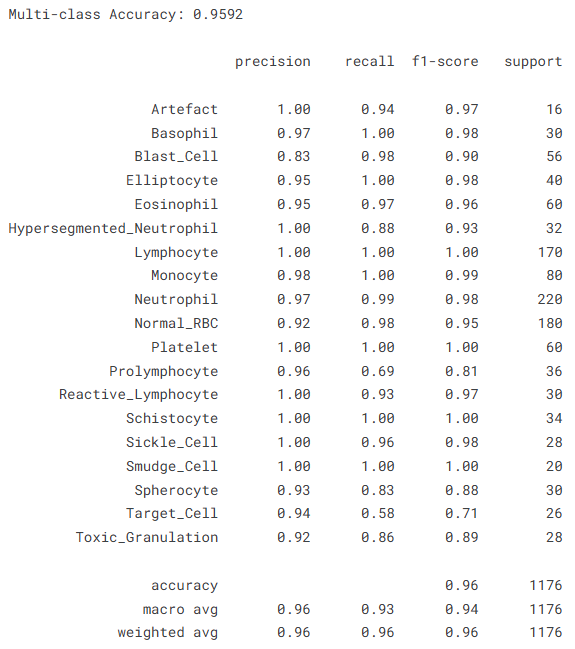
在完成二分类评估后,进一步扩展任务为多分类问题,对不同细胞类型进行识别,从而检验模型在更复杂任务下的表现。
# ==============================
# 多分类任务:细胞类型预测
# ==============================
# 对细胞类型标签进行编码
le = LabelEncoder()
y_multi = le.fit_transform(df['cell_type'])
# 划分训练集与测试集(分层抽样)
X_tr2, X_te2, y_tr2, y_te2 = train_test_split(
    X_scaled, y_multi,
    test_size=0.20,
    random_state=42,
    stratify=y_multi
)
# 构建随机森林多分类模型
rf_multi = RandomForestClassifier(
    n_estimators=300,
    random_state=42,
    n_jobs=-1
)
# 模型训练
rf_multi.fit(X_tr2, y_tr2)
# 预测
y_pred_multi = rf_multi.predict(X_te2)
# 计算准确率
acc_multi = accuracy_score(y_te2, y_pred_multi)
# 输出结果
print(f'Multi-class Accuracy: {acc_multi:.4f}')
print()
print(classification_report(
    y_te2, y_pred_multi,
    target_names=le.classes_
))
为了更直观地观察多分类预测结果,可以绘制对应的混淆矩阵,分析不同类别之间的误分类情况。
# ==============================
# 多分类混淆矩阵
# ==============================
# 计算混淆矩阵
cm_m = confusion_matrix(y_te2, y_pred_multi)
# 绘制热力图
fig, ax = plt.subplots(figsize=(14, 11), facecolor=BG)
sns.heatmap(cm_m, annot=True, fmt='d', cmap='Blues', ax=ax,
            xticklabels=le.classes_,
            yticklabels=le.classes_)
# 设置标题与显示格式
ax.set_title(f'Multi-class Confusion Matrix (Accuracy={acc_multi:.3f})',
              fontsize=13, fontweight='bold')
ax.tick_params(axis='x', rotation=45, labelsize=8)
ax.tick_params(axis='y', rotation=0, labelsize=8)

plt.tight_layout()
plt.show()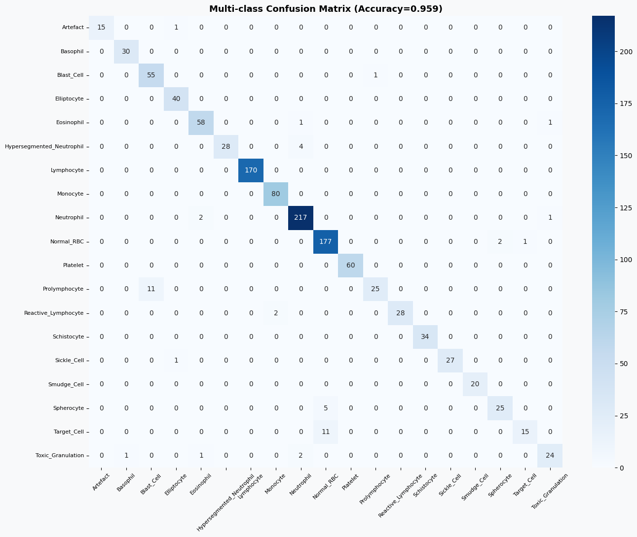
最后,通过分析随机森林模型的特征重要性,可以了解哪些特征在异常检测中起到了关键作用,从而增强模型的可解释性。
# ==============================
# 特征重要性分析(基于随机森林)
# ==============================
# 获取随机森林二分类模型
rf_binary = results['Random Forest']['model']
# 提取特征重要性并排序
imp = pd.Series(
rf_binary.feature_importances_,
index=FEATURE_COLS
).sort_values(ascending=True)
# 绘制特征重要性图
fig, ax = plt.subplots(figsize=(10, 9), facecolor=BG)
# 根据重要性大小设置颜色
colors_imp = [PALETTE[1] if v > imp.median() else PALETTE[2] for v in imp.values]
ax.barh(imp.index, imp.values, color=colors_imp, edgecolor='none')
# 添加中位数参考线
ax.axvline(imp.median(), color='black', lw=1.5, ls='--', label='Median Importance')
# 设置标题与标签
ax.set_xlabel('Feature Importance')
ax.set_title('Random Forest Feature Importance — Anomaly Detection', fontweight='bold')
ax.legend(fontsize=9)
plt.tight_layout()
plt.show()
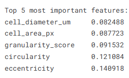
# 输出最重要的前5个特征
print('\nTop 5 most important features:')
print(imp.tail(5).to_string())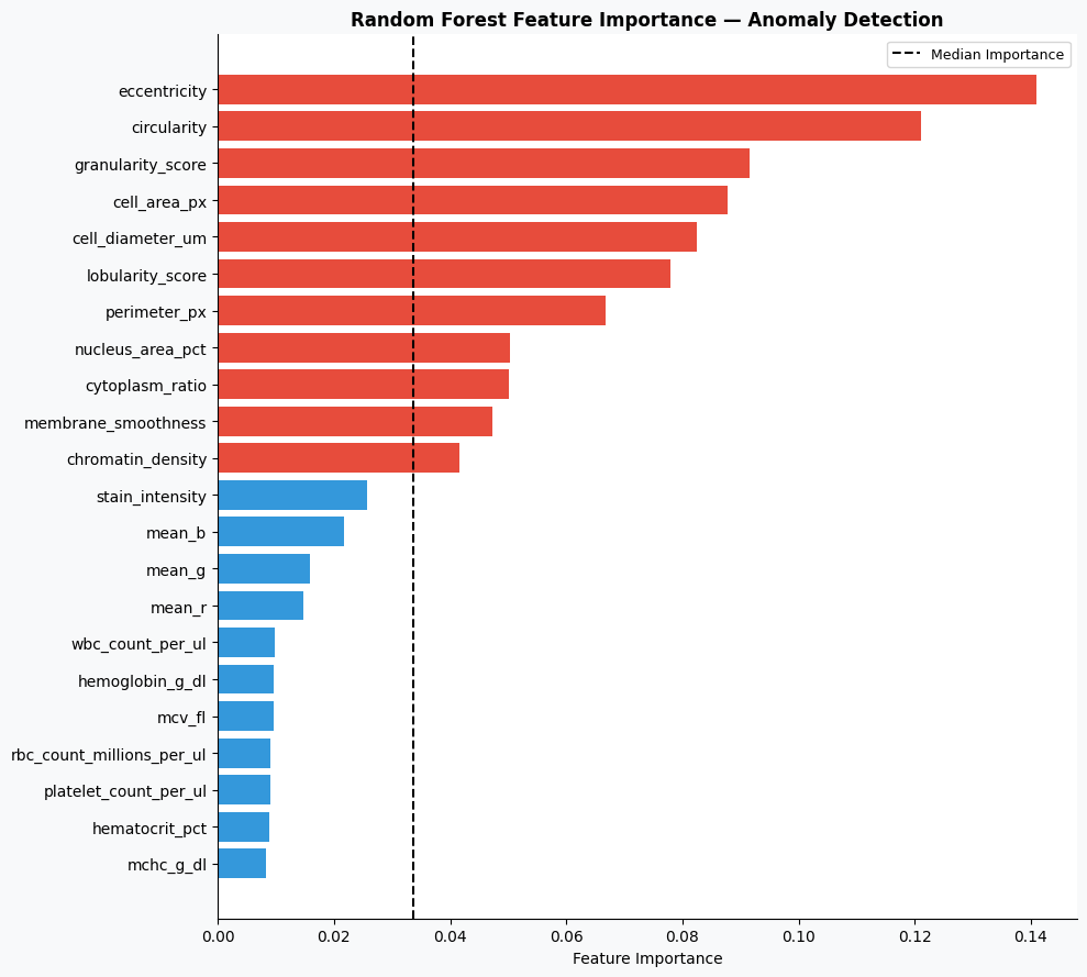
5.总结
本实验基于Kaggle血细胞异常检测数据集,围绕多源特征(形态学、颜色信息、血常规指标及AI评分)构建了异常检测模型,并对不同机器学习方法进行了系统对比。从结果来看,随机森林模型表现最优,在二分类任务中取得了0.9971的AUC和0.9702的准确率,能够较好地区分正常与异常细胞,其中对异常样本的识别也保持了较高的precision和recall,整体表现稳定可靠。相比之下,梯度提升模型性能接近,而逻辑回归则明显偏弱,说明该任务中非线性模型更具优势。
在多分类任务中,模型同样取得了0.9592的准确率,大多数细胞类型的识别效果较好,尤其是常见细胞类别如淋巴细胞、中性粒细胞和血小板,几乎可以实现精准识别。但在个别类别上仍存在一定混淆,例如Prolymphocyte和Target_Cell等类别的召回率相对较低,反映出部分细胞在形态特征上的相似性对模型造成了一定干扰。
从特征重要性分析结果来看,细胞直径、面积、颗粒度、圆度和偏心率等形态学特征在模型决策中起到了关键作用,说明血细胞的结构特征对于异常识别具有较强的判别能力。整体而言,该模型在血细胞异常检测任务中展现出了较高的准确性与稳定性,具备一定的实际应用价值,但在细粒度类别区分方面仍有进一步优化空间。
源代码
import pandas as pd
import numpy as np
import matplotlib.pyplot as plt
import matplotlib.gridspec as gridspec
import seaborn as sns
from sklearn.model_selection import train_test_split, StratifiedKFold, cross_val_score
from sklearn.preprocessing import LabelEncoder, StandardScaler
from sklearn.ensemble import RandomForestClassifier, GradientBoostingClassifier
from sklearn.linear_model import LogisticRegression
from sklearn.metrics import (classification_report, confusion_matrix,
                              roc_auc_score, roc_curve, accuracy_score)
import warnings
warnings.filterwarnings('ignore')
PALETTE = ['#2C3E50','#E74C3C','#3498DB','#2ECC71','#F39C12','#9B59B6','#1ABC9C']
BG, CARD = '#F8F9FA', '#FFFFFF'
plt.rcParams.update({
    'figure.facecolor': BG, 'axes.facecolor': CARD,
    'axes.spines.top': False, 'axes.spines.right': False,
    'grid.color': '#E9ECEF', 'grid.linewidth': 0.8,
})
# Load datasets
df    = pd.read_csv('/kaggle/input/datasets/alitaqishah/blood-cell-anomaly-detection-2025/blood_cell_anomaly_detection.csv')
ref   = pd.read_csv('/kaggle/input/datasets/alitaqishah/blood-cell-anomaly-detection-2025/cell_type_reference.csv')
bench = pd.read_csv('/kaggle/input/datasets/alitaqishah/blood-cell-anomaly-detection-2025/cytodiffusion_benchmark_scores.csv')
fig, axes = plt.subplots(1, 3, figsize=(20, 6), facecolor=BG)
fig.suptitle('Cell Type & Disease Distribution', fontsize=15, fontweight='bold')

# Cell type bar
vc = df['cell_type'].value_counts().sort_values()
colors = [PALETTE[1] if df[df.cell_type==c]['anomaly_label'].iloc[0]==1
          else PALETTE[2] for c in vc.index]
axes[0].barh(vc.index, vc.values, color=colors, edgecolor='none', height=0.65)
axes[0].set_title('Cell Type Count  (🔴 Anomaly  🟢 Normal)', fontweight='bold')
axes[0].set_xlabel('Count')

# Anomaly pie
counts = df['anomaly_label'].value_counts()
axes[1].pie(counts.values, labels=['Normal','Anomaly'],
            colors=[PALETTE[2], PALETTE[1]], autopct='%1.1f%%',
            wedgeprops=dict(edgecolor='white', linewidth=2), startangle=90)
axes[1].set_title('Normal vs Anomaly', fontweight='bold')

# Disease category
cat_c = df['disease_category'].value_counts()
axes[2].bar(cat_c.index, cat_c.values,
            color=[PALETTE[1] if c not in ['Normal_WBC','Normal_RBC','Normal_Platelet']
                   else PALETTE[2] for c in cat_c.index], edgecolor='none')
axes[2].set_title('Samples by Disease Category', fontweight='bold')
axes[2].tick_params(axis='x', rotation=35)

plt.tight_layout()
plt.show()
# Cross-tabulation: disease category vs patient age group
ct = pd.crosstab(df['disease_category'], df['patient_age_group'])
fig, ax = plt.subplots(figsize=(12, 5), facecolor=BG)
sns.heatmap(ct, annot=True, fmt='d', cmap='YlOrRd', ax=ax,
            linewidths=0.5, cbar_kws={'label':'Count'})
ax.set_title('Disease Category vs Patient Age Group', fontsize=13, fontweight='bold')
plt.tight_layout()
plt.show()
fig, axes = plt.subplots(2, 3, figsize=(20, 11), facecolor=BG)
fig.suptitle('Morphological Features — Normal vs Anomaly', fontsize=15, fontweight='bold')

features = ['cell_diameter_um','nucleus_area_pct','circularity',
            'eccentricity','granularity_score','lobularity_score']
titles   = ['Cell Diameter (μm)','Nucleus Area (%)','Circularity',
            'Eccentricity','Granularity Score','Lobularity Score']

for ax, feat, title in zip(axes.flatten(), features, titles):
    ax.hist(df[df.anomaly_label==0][feat], bins=40, alpha=0.65,
            color=PALETTE[2], label='Normal', edgecolor='none')
    ax.hist(df[df.anomaly_label==1][feat], bins=40, alpha=0.65,
            color=PALETTE[1], label='Anomaly', edgecolor='none')
    ax.set_title(title, fontweight='bold')
    ax.legend(fontsize=8)

plt.tight_layout()
plt.show()
# Feature correlation heatmap
fig, ax = plt.subplots(figsize=(12, 8), facecolor=BG)
num_cols = ['cell_diameter_um','nucleus_area_pct','circularity','eccentricity',
            'granularity_score','lobularity_score','chromatin_density',
            'cytodiffusion_anomaly_score','anomaly_label']
corr = df[num_cols].corr()
mask = np.triu(np.ones_like(corr, dtype=bool))
sns.heatmap(corr, mask=mask, annot=True, fmt='.2f', cmap='RdBu_r',
            center=0, ax=ax, linewidths=0.4, cbar_kws={'shrink':0.8})
ax.set_title('Feature Correlation Matrix', fontsize=13, fontweight='bold')
plt.tight_layout()
plt.show()
fig, axes = plt.subplots(1, 2, figsize=(18, 6), facecolor=BG)

# Score distribution
axes[0].hist(df[df.anomaly_label==0]['cytodiffusion_anomaly_score'], bins=50,
             alpha=0.7, color=PALETTE[2], label='Normal', edgecolor='none')
axes[0].hist(df[df.anomaly_label==1]['cytodiffusion_anomaly_score'], bins=50,
             alpha=0.7, color=PALETTE[1], label='Anomaly', edgecolor='none')
axes[0].axvline(0.5, color='black', lw=2, ls='--', label='Threshold=0.5')
axes[0].set_xlabel('CytoDiffusion Anomaly Score')
axes[0].set_ylabel('Frequency')
axes[0].set_title('Anomaly Score Distribution\n(Paper AUC = 0.990)', fontweight='bold')
axes[0].legend(fontsize=9)

# Score by cell type
ct_score = df.groupby('cell_type')['cytodiffusion_anomaly_score'].mean().sort_values()
colors_ct = [PALETTE[1] if df[df.cell_type==ct]['anomaly_label'].iloc[0]==1
             else PALETTE[2] for ct in ct_score.index]
axes[1].barh(ct_score.index, ct_score.values, color=colors_ct, edgecolor='none')
axes[1].axvline(0.5, color='black', lw=1.5, ls='--')
axes[1].set_xlabel('Mean Anomaly Score')
axes[1].set_title('Mean CytoDiffusion Score by Cell Type', fontweight='bold')

plt.tight_layout()
plt.show()
# Feature preparation
FEATURE_COLS = ['cell_diameter_um','nucleus_area_pct','chromatin_density',
                'cytoplasm_ratio','circularity','eccentricity','granularity_score',
                'lobularity_score','membrane_smoothness','cell_area_px','perimeter_px',
                'mean_r','mean_g','mean_b','stain_intensity',
                'wbc_count_per_ul','rbc_count_millions_per_ul','hemoglobin_g_dl',
                'hematocrit_pct','platelet_count_per_ul','mcv_fl','mchc_g_dl']

X = df[FEATURE_COLS].values
y = df['anomaly_label'].values

scaler = StandardScaler()
X_scaled = scaler.fit_transform(X)

X_train, X_test, y_train, y_test = train_test_split(
    X_scaled, y, test_size=0.20, random_state=42, stratify=y)
# Train models
models = {
    'Random Forest'      : RandomForestClassifier(n_estimators=200, random_state=42, n_jobs=-1),
    'Gradient Boosting'  : GradientBoostingClassifier(n_estimators=150, random_state=42),
    'Logistic Regression': LogisticRegression(max_iter=1000, random_state=42),
}

results = {}
for name, model in models.items():
    model.fit(X_train, y_train)
    y_pred  = model.predict(X_test)
    y_proba = model.predict_proba(X_test)[:, 1]
    auc = roc_auc_score(y_test, y_proba)
    acc = accuracy_score(y_test, y_pred)
    results[name] = {'model': model, 'pred': y_pred, 'proba': y_proba,
                     'auc': auc, 'acc': acc}
    print(f'{name:25s} → AUC: {auc:.4f} | Accuracy: {acc:.4f}')
# ROC curves + confusion matrix for best model
best_name = max(results, key=lambda k: results[k]['auc'])
best      = results[best_name]

fig, axes = plt.subplots(1, 2, figsize=(16, 6), facecolor=BG)

# ROC curves
for name, res in results.items():
    fpr, tpr, _ = roc_curve(y_test, res['proba'])
    axes[0].plot(fpr, tpr, lw=2, label=f"{name} (AUC={res['auc']:.4f})")
axes[0].plot([0,1],[0,1], 'k--', lw=1)
axes[0].axhline(0.905, color='gray', ls=':', lw=1.5, label='CytoDiffusion Sensitivity=0.905')
axes[0].set_xlabel('False Positive Rate'); axes[0].set_ylabel('True Positive Rate')
axes[0].set_title('ROC Curves — Anomaly Detection', fontweight='bold')
axes[0].legend(fontsize=8)

# Confusion matrix
cm = confusion_matrix(y_test, best['pred'])
sns.heatmap(cm, annot=True, fmt='d', cmap='Blues', ax=axes[1],
            xticklabels=['Normal','Anomaly'], yticklabels=['Normal','Anomaly'],
            cbar_kws={'shrink':0.8})
axes[1].set_title(f'Confusion Matrix — {best_name}', fontweight='bold')
axes[1].set_xlabel('Predicted'); axes[1].set_ylabel('Actual')

plt.tight_layout()
plt.show()
print(f'\nBest model: {best_name}')
print(classification_report(y_test, best['pred'], target_names=['Normal','Anomaly']))
le = LabelEncoder()
y_multi = le.fit_transform(df['cell_type'])

X_tr2, X_te2, y_tr2, y_te2 = train_test_split(
    X_scaled, y_multi, test_size=0.20, random_state=42, stratify=y_multi)

rf_multi = RandomForestClassifier(n_estimators=300, random_state=42, n_jobs=-1)
rf_multi.fit(X_tr2, y_tr2)
y_pred_multi = rf_multi.predict(X_te2)
acc_multi = accuracy_score(y_te2, y_pred_multi)
print(f'Multi-class Accuracy: {acc_multi:.4f}')
print()
print(classification_report(y_te2, y_pred_multi,
                             target_names=le.classes_))
# Confusion matrix (multi-class)
cm_m = confusion_matrix(y_te2, y_pred_multi)
fig, ax = plt.subplots(figsize=(14, 11), facecolor=BG)
sns.heatmap(cm_m, annot=True, fmt='d', cmap='Blues', ax=ax,
            xticklabels=le.classes_, yticklabels=le.classes_)
ax.set_title(f'Multi-class Confusion Matrix (Accuracy={acc_multi:.3f})',
              fontsize=13, fontweight='bold')
ax.tick_params(axis='x', rotation=45, labelsize=8)
ax.tick_params(axis='y', rotation=0, labelsize=8)
plt.tight_layout()
plt.show()
# Feature importance from best binary RF
rf_binary = results['Random Forest']['model']
imp = pd.Series(rf_binary.feature_importances_, index=FEATURE_COLS).sort_values(ascending=True)

fig, ax = plt.subplots(figsize=(10, 9), facecolor=BG)
colors_imp = [PALETTE[1] if v > imp.median() else PALETTE[2] for v in imp.values]
ax.barh(imp.index, imp.values, color=colors_imp, edgecolor='none')
ax.axvline(imp.median(), color='black', lw=1.5, ls='--', label='Median Importance')
ax.set_xlabel('Feature Importance')
ax.set_title('Random Forest Feature Importance — Anomaly Detection', fontweight='bold')
ax.legend(fontsize=9)
plt.tight_layout()
plt.show()

print('\nTop 5 most important features:')
print(imp.tail(5).to_string())
资料获取,更多粉丝福利,关注下方公众号获取


AtomGit 是由开放原子开源基金会联合 CSDN 等生态伙伴共同推出的新一代开源与人工智能协作平台。平台坚持“开放、中立、公益”的理念,把代码托管、模型共享、数据集托管、智能体开发体验和算力服务整合在一起,为开发者提供从开发、训练到部署的一站式体验。
更多推荐


 26
26 0
0- 0


 已为社区贡献3条内容

所有评论(0)