CSS3常用
弹性盒子模型
由弹性容器flex container和弹性子元素flex item组成
当内容需要随浏览器页面或设备变化而变化时,使用弹性盒子模型
父元素 需要display:flex来定义为弹性布局
决定子元素排列方式
flex-direction 默认row左对齐,横向排列 ;row-reverse右对齐,反转横向排列(倒排); column 纵向排列 column-reverse 反转纵向排列 向下对齐
justify-content内容对齐 垂直方向 flex-start flex-end center
align-items 水平对齐 flex-start flex-end center
flex-wrap 子元素何时换行 nowrap默认单行 超出溢出 wrap允许多行 超出换行 wrap-reverse 反转多行
子元素上的属性 flex分配水平方向所占空间
<body>
    <!-- 弹性盒子模型 -->
    <div class="flex-container">
        <div class="box1"></div>
        <div class="box2"></div>
        <div class="box3"></div>
    </div>
</body>
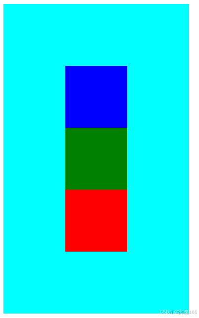
        .flex-container {
            display: flex;
            width: 300px;
            height: 500px;
            background-color: aqua;
            flex-direction: column-reverse;
            /* 垂直居中 */
            justify-content: center;
            /* 水平居中 */
            align-items: center;
        }

        .box1 {
            width: 100px;
            height: 100px;
            background-color: red;
        }

        .box2 {
            width: 100px;
            height: 100px;
            background-color: green;
        }

        .box3 {
            width: 100px;
            height: 100px;
            background-color: blue;
        }
浮动
float 增加一个浮层来放置内容 left right 脱离标准流,宽度不够显示在第二行
由于他设置浮动其他元素会受影响,他原来的位置会被新未浮动的元素占掉,而浮动元素在上面导致重合。
于是需要清除浮动
清除浮动
- 父元素设置高度 但没float的元素还是有问题
- 受影响元素clear:both清除效果
- 父元素overflow:hidden未float元素clear:both
- 伪对象方式 父元素::伪类after设置空内容,display:block,其他clear:both
.container::after { content:"", display:block }
<body>
    <!-- 清除浮动1 父元素设置高度 但没浮动的元素设置clear:both 高度就要重新设置了 没啥用-->
    <!-- 清除浮动2 受影响元素clear: both; -->
    <!-- 清除浮动3此方法用的最多 overflow 父元素加overflow: hidden;clear: both; 受影响元素加clear: both; -->
    <!-- 清除浮动4 伪对象 加伪类设置空内容;受影响元素加clear: both; -->
    <div class="contain">
        <div class="box1"></div>
        <div class="box2"></div>
        <div class="box3"></div>
        <div class="text">
        </div>
    </div>
</body>
	  div>div {
            width: 300px;
            height: 300px;
            margin: 5px;
        }

        .contain {
            width: 700px;
            /* height: 700px; */
            background-color: black;
            overflow: hidden;
        }

        /* .contain::after {
            content: "";
            display: block;
        } */

        .box1 {
            float: left;
            background-color: #555;
        }

        .box2 {
            float: left;
            background-color: aqua;
        }

        .box3 {
            float: left;
            background-color: blue;
        }

        .text {
            clear: both;
            background-color: red;
        }
未清除时 可看到红色的未浮动受前面浮动的影响它在第一个box浮动前的实际位置。
清除浮动后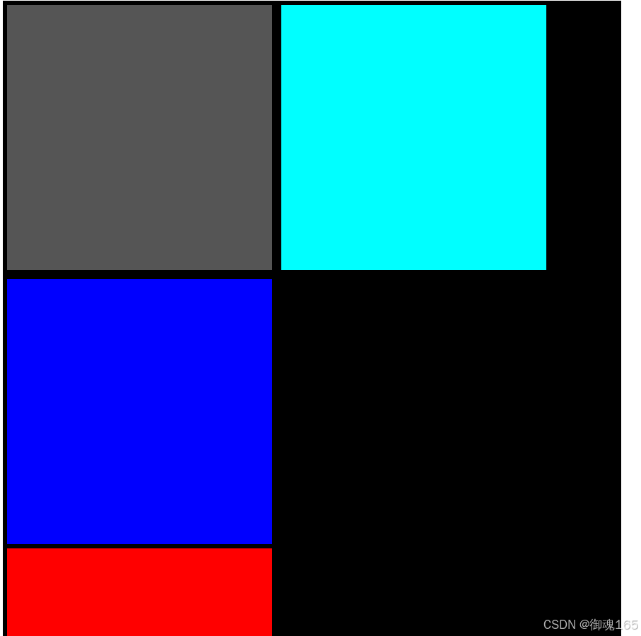
定位
- 相对定位
- 绝对定位
- 固定定位
绝对和固定定位都是加浮层,设置几个绝对和固定定位就有多少层浮层。
浮层显示顺序可用z-index来设置 100>10 100会覆盖10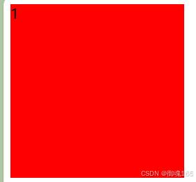
<body>
    <div class="one">1</div>
    <div class="two">2</div>
    <div class="three">3</div>
</body>
<style>
    .one {
        width: 200px;
        height: 200px;
        background-color: red;
        position: absolute;
        z-index: 100
    }

    .two {
        width: 200px;
        height: 200px;
        background-color: orange;
        position: absolute;
        z-index: 10;
    }

    .three {
        width: 200px;
        height: 200px;
        background-color: green;
        position: absolute;
        z-index: 0;
    }
</style>
没加z-index,三个div颜色显示从外到里,是绿色,橙色,红色,是按照div先后顺序渲染的。
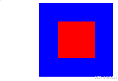
定位的位置是以什么为基准的,固定就是body,相对和绝对先看父级如果父级有position:relative/absolute就以父级为准,没有就逐级往上找,谁有以谁为基准,直到body。
当然position:relative为基准就会有间隙,因为relative本身就有空隙,absolute就没有,所以以他为基准也就没有空隙。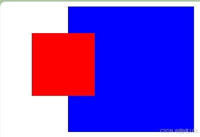
  <style>
        .container {
            width: 200px;
            height: 200px;
            background-color: blue;
            /* relative、absolute定位根据父级定位跑如没有,逐级向上寻找直到顶层文档 */
            /* 未加postiton:relative图一,图二是加了的 */
            position: relative;
            margin-left: 100px;
        }

        .box1 {
            width: 100px;
            height: 100px;
            background-color: red;
            /* 因此此父级没position:relative,于是向上寻找,找到了body,根据body定位 */
            position: absolute;
            left: 50px;
            top: 50px;
        }
    </style>
</head>

<body>
    <div class="container">
        <div class="box1"></div>
    </div>
</body>
圆角
border-radius:左上角 右上角 右下角 左下角 顺时针
一个值 就是都相同 50% 就是圆
两个值 左上、右下 右上、左下 对角
三个值 左上角 右上、左下角 右下角
阴影
box-shadow: h-shadow v-shadow blur color
h-shadow 水平阴影
v-shadow 垂直阴影
blur 模糊距离 color 阴影颜色
动画
@keyframes 动画名字 {
from {css样式}
precent{css样式}
to{css样式}
}
或者把from precent to 用百分比代替,当然里面的百分比,你想写多少个就写多少个,这个只是定义一个动画罢了。
@keyframes 动画名字 {
0% {css样式}
50% {css样式}
100%{css样式}
}
动画执行属性 animation : 动画名字 duration timing-function delay iteration-count direction;
duration 动画播放/持续时间 ms s 1s=1000ms 默认0
timing-function 速率 linear 匀速 ease-in 加速 ease逐渐慢速(默认) ease-in-out 先快后慢
delay 延迟时间 默认0
iteration-count 循环播放次数 infinite 无数次 1(默认一次)
direction 播放方向 normal(默认)从左到右 reverse 从右到左 alternate 左到右到左
还有一个播放状态属性 animation-play-state running 默认运行 paused停止
呼吸效果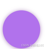
  <style>
        .box {
            width: 100px;
            height: 100px;
            margin: 40px auto;
            background-color: blueviolet;
            border-radius: 50%;
            box-shadow: 0 1px 2px rgba(0, 0, 0, 0.3);
            animation: breathe 1s ease-in-out infinite alternate;
        }

        @keyframes breathe {
            0% {
            	/*透明度opacity*/
                opacity: 0.2;
                box-shadow: 0 1px 2px rgba(255, 255, 255, 0.1);
            }

            50% {
                opacity: 0.5;
                box-shadow: 0 1px 2px rgba(86, 34, 84, 0.76);
            }

            100% {
                opacity: 1;
                box-shadow: 0 1px 30px rgba(138, 43, 226, 1);
            }
        }
    </style>
</head>

<body>
    <div class="box"></div>
</body>
字体图标
一个页面会有很多的图标,要是都是图片,数量太多,加载就会很慢,于是就出现了字体图标。
我们一般常用的是阿里字体图标库 阿里字体图标库
icon单个使用 png svg ai 适用于图标引用少,不需要维护的情况
然后就是三种引用方法 需要把你想要的图标都加入购物车,然后再购物车里下载代码,然后解压到自己的项目中。你可以运行其中的html文件,里面有各种方法的详细使用。
首先在阿里字体图标库下载代码到自己的项目中,然后在页面中引入下载里面的iconfont.css,
然后运行下载的html,根据里面的做。
html: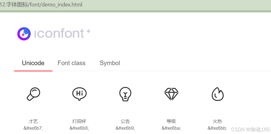
unicode 方法使用
页面引入iconfont.css
<link rel="stylesheet" href="./iconfont.css">
复制自己方式的图标代码
<span class="iconfont"></span>
font class 方式使用
<link rel="stylesheet" href="./iconfont.css">
<span class="iconfont icon-xxx"></span>
icon-xxx是从html中的font class展示的类名和一样
symobl 方式使用
<script src="./iconfont.js"></script>
设置类名icon的样式
<style>
.icon {
  width: 1em;
  height: 1em;
  vertical-align: -0.15em;
  fill: currentColor;
  overflow: hidden;
}
</style>
<svg class="icon" aria-hidden="true">
  <use xlink:href="#icon-xxx"></use>
</svg>
#icon-xxx和一样
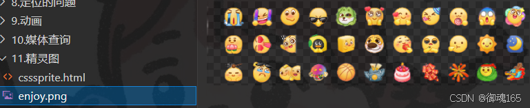
css精灵图(雪碧图)
网页图片处理方式,把页面涉及的零星图片放到一张图里,然后通过位置获取,减少图片字节,减少页面http请求,提高页面性能。
使用background-image 引入背景图片
background-position 移动到需要的位置 基本是负值
自己添加图片哦 有一个可以测量距离的工具叫做红绿小工具哦
 <style>
      .icon {
          display: block;
          width: 45px;
          height: 45px;
          background-image: url(./enjoy.png);
          background-position: -21px -12px;
      }

      .icon1 {
          display: block;
          width: 45px;
          height: 45px;
          background-image: url(./enjoy.png);
          background-position: -118px -102px;
      }
  </style>
</head>

<body>
  <span class="icon"></span>
  <span class="icon1"></span>
</body>
效果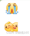

AtomGit 是由开放原子开源基金会联合 CSDN 等生态伙伴共同推出的新一代开源与人工智能协作平台。平台坚持“开放、中立、公益”的理念,把代码托管、模型共享、数据集托管、智能体开发体验和算力服务整合在一起,为开发者提供从开发、训练到部署的一站式体验。
更多推荐
 8
8 0
0- 0


 已为社区贡献1条内容

所有评论(0)