深入鸿蒙原生 ArkTS 布局:Column 自适应宽度约束完全指南
一、引言
在鸿蒙原生应用开发中,Column 是最基础也最常用的布局容器之一。然而,很多开发者对 Column 的宽度控制存在一个认知盲区:Column 的宽度什么时候由内容决定?什么时候由父容器决定?如何实现弹性自适应?
如果说"固定宽度约束"解决的是精度问题,那么"自适应宽度约束"解决的就是弹性问题。在实际项目中,自适应布局的需求远比固定布局更为普遍——我们需要 Column 在不同屏幕尺寸、不同内容长度下都能优雅地适应。
本文将以一个完整的实战示例为线索,深入剖析 Column 自适应宽度约束的四种核心模式:
- 内容撑开自适应 — Column 宽度由内部子组件决定
- 百分比宽度自适应 — Column 宽度与父容器宽度保持比例
- constraintSize 范围自适应 — 在最小值和最大值之间弹性伸缩
- layoutWeight 权重自适应 — 按比例分配父容器的剩余空间
并通过一个综合实战——自适应表单,展示这四种模式如何协同工作。
二、自适应宽度的本质
2.1 什么是自适应宽度?
自适应宽度是指 Column 的宽度不是由开发者硬编码的某个固定值,而是根据某种规则自动计算得出的。这个"规则"可以是:
- 内容规则:宽度由子组件的内容长度决定
- 比例规则:宽度与父容器宽度保持固定百分比
- 范围规则:宽度在预设的上下限范围内自由变化
- 分配规则:宽度由父容器的剩余空间按权重分配
2.2 为什么需要自适应宽度?
考虑以下真实场景:
| 场景 | 需求 | 自适应方案 |
|---|---|---|
| 多语言切换 | 按钮文字在英文/中文/阿拉伯语下长度不同 | 内容撑开自适应 |
| 响应式设计 | 同一页面在手机/平板/折叠屏上等比例缩放 | 百分比宽度 |
| 面板可伸缩 | 侧边栏可拖拽调整宽度,但有最小/最大限制 | constraintSize |
| 动态分栏 | 网格布局的列数随屏幕宽度变化 | layoutWeight |
2.3 Column 宽度计算的优先级
在 ArkTS 中,Column 宽度的最终值由以下优先级决定(从高到低):
width(固定值) > layoutWeight > width(百分比) > constraintSize > 内容撑开(默认)
理解这个优先级是掌握 Column 自适应宽度的关键。
三、准备工作:项目配置
3.1 SDK 版本确认
本文所有代码基于 HarmonyOS NEXT 6.1.1(API 24),在 build-profile.json5 中确认 SDK 版本:
{
  "app": {
    "products": [
      {
        "name": "default",
        "targetSdkVersion": "6.1.1(24)",
        "compatibleSdkVersion": "6.1.1(24)",
        "runtimeOS": "HarmonyOS"
      }
    ]
  }
}
3.2 页面路由与入口
在 main_pages.json 中注册页面:
{
  "src": [
    "pages/ColumnAdaptiveWidthPage"
  ]
}
在 EntryAbility.ets 中加载页面:
onWindowStageCreate(windowStage: window.WindowStage): void {
  windowStage.loadContent('pages/ColumnAdaptiveWidthPage', (err) => {
    if (err.code) {
      hilog.error(0x0000, 'App', 'Failed: %{public}s', JSON.stringify(err));
      return;
    }
  });
}
3.3 颜色系统定义
为了使代码整洁且易于维护,我们预先定义一个颜色系统。注意 ArkTS 严格模式下需要为对象字面量显式声明接口:
interface ColorsConfig {
  primary: string;
  primaryLight: string;
  secondary: string;
  secondaryLight: string;
  accent: string;
  accentLight: string;
  info: string;
  infoLight: string;
  textPrimary: string;
  textSecondary: string;
  textTertiary: string;
  cardBg: string;
  codeBg: string;
  pageBg: string;
  border: string;
  divider: string;
  shadow: string;
}

const COLORS: ColorsConfig = {
  primary: '#7C3AED',
  primaryLight: '#EDE9FE',
  secondary: '#0891B2',
  secondaryLight: '#CFFAFE',
  accent: '#D97706',
  accentLight: '#FEF3C7',
  info: '#059669',
  infoLight: '#D1FAE5',
  textPrimary: '#1F2937',
  textSecondary: '#4B5563',
  textTertiary: '#9CA3AF',
  cardBg: '#FFFFFF',
  codeBg: '#F3F4F6',
  pageBg: '#F9FAFB',
  border: '#E5E7EB',
  divider: '#D1D5CB',
  shadow: 'rgba(0, 0, 0, 0.08)',
};
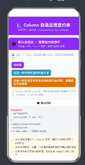
四、场景一:内容撑开自适应(默认行为)
4.1 原理
Column 的默认行为就是自适应宽度——当开发者没有通过任何方式(width、constraintSize、layoutWeight)明确指定宽度时,Column 的宽度由内部最宽的子组件决定。
公式:Column 宽度 = max(所有子组件宽度) + padding
4.2 代码演示
下面的代码创建了三个 Column,分别包含短、中、长三种长度的文本。三个 Column 都没有设置 width,它们的宽度完全由内容决定:
Column() {
  // 短内容 → 窄宽度
  Column() {
    Text('短内容')
      .fontSize(14)
      .fontWeight(FontWeight.Bold)
      .fontColor('#FFFFFF')
      .padding({ left: 10, right: 10 })
  }
  .padding({ top: 8, bottom: 8 })
  .backgroundColor('#7C3AED')
  .borderRadius(8)
  .margin({ bottom: 8 })
  // ↑ 未设 width → 宽度由"短内容"撑开,很窄

  // 中等内容 → 中等宽度
  Column() {
    Text('这是一段中等长度的内容文本')
      .fontSize(14)
      .fontWeight(FontWeight.Bold)
      .fontColor('#FFFFFF')
      .padding({ left: 10, right: 10 })
  }
  .padding({ top: 8, bottom: 8 })
  .backgroundColor('#0891B2')
  .borderRadius(8)
  .margin({ bottom: 8 })
  // ↑ 未设 width → 宽度中等

  // 长内容 → 最宽
  Column() {
    Text('这是一段非常非常非常非常长的文本内容')
      .fontSize(14)
      .fontWeight(FontWeight.Bold)
      .fontColor('#FFFFFF')
      .padding({ left: 10, right: 10 })
  }
  .padding({ top: 8, bottom: 8 })
  .backgroundColor('#D97706')
  .borderRadius(8)
  .margin({ bottom: 8 })
  // ↑ 未设 width → 宽度最宽
}
4.3 运行效果
在模拟器上运行上述代码,你将看到三个宽度明显不同的色块:
- 紫色块:窄,只包裹"短内容"三个字
- 青色块:中等宽度,包裹"这是一段中等长度的内容文本"
- 琥珀色块:最宽,包裹最长的那段文字
4.4 适用场景
| 场景 | 说明 |
|---|---|
| 标签/徽章 | 如「新品」「Hot」等提示标签,宽度随文字变化 |
| 气泡提示 | 工具提示的内容长度不固定 |
| 按钮 | 文字按钮的宽度由文字长度决定 |
| 内联元素 | 在流式布局中嵌入的不固定宽度元素 |
4.5 注意事项
- 内容撑开模式可能导致 Column 宽度超过父容器,造成溢出
- 如果不想让 Column 被内容撑得太宽,可以结合
constraintSize设置maxWidth - 内容撑开的 Column 配合
alignItems(HorizontalAlign.Start)可以实现左对齐标签效果
五、场景二:百分比宽度自适应
5.1 原理
百分比宽度是响应式布局的基础。通过 width('50%'),Column 的宽度被设置为父容器内容区宽度的 50%。当父容器宽度变化时(例如屏幕旋转),Column 宽度自动等比例缩放。
公式:Column 宽度 = 父容器内容区宽度 × 百分比
5.2 代码演示
以下代码在一个 Row 中放置了三个 Column,分别占 25%、50%、25% 的宽度:
Row() {
  // Column A: 25% 宽度
  Column() {
    Text('25%')
      .fontSize(14)
      .fontWeight(FontWeight.Bold)
      .fontColor('#FFFFFF')
      .textAlign(TextAlign.Center)
      .width('100%')
  }
  .alignItems(HorizontalAlign.Center)
  .justifyContent(FlexAlign.Center)
  .height(60)
  .backgroundColor('#7C3AED')
  .borderRadius(8)
  .width('25%')          // ← 占父容器 25%
  .margin({ right: 4 })

  // Column B: 50% 宽度
  Column() {
    Text('50%')
      .fontSize(18)
      .fontWeight(FontWeight.Bold)
      .fontColor('#FFFFFF')
      .textAlign(TextAlign.Center)
      .width('100%')
  }
  .alignItems(HorizontalAlign.Center)
  .justifyContent(FlexAlign.Center)
  .height(60)
  .backgroundColor('#0891B2')
  .borderRadius(8)
  .width('50%')          // ← 占父容器 50%
  .margin({ left: 4, right: 4 })

  // Column C: 25% 宽度
  Column() {
    Text('25%')
      .fontSize(14)
      .fontWeight(FontWeight.Bold)
      .fontColor('#FFFFFF')
      .textAlign(TextAlign.Center)
      .width('100%')
  }
  .alignItems(HorizontalAlign.Center)
  .justifyContent(FlexAlign.Center)
  .height(60)
  .backgroundColor('#D97706')
  .borderRadius(8)
  .width('25%')          // ← 占父容器 25%
  .margin({ left: 4 })
}
.width('100%')
.height(60)
5.3 百分比宽度的计算规则
百分比宽度的计算遵循以下规则:
- 相对于直接父容器的内容区宽度(不含 padding 和 border)
- 多个百分比列在同一行时,总和建议不超过 100%
- 如果总和超过 100%,子组件会溢出父容器
- margin 和 padding 占用父容器的额外空间,不参与百分比计算
5.4 百分比与固定宽度的混合
在实际开发中,百分比和固定宽度经常混合使用:
Row() {
  // 左侧固定宽度 80vp
  Column() {
    Text('图标')
  }
  .width(80)

  // 右侧自适应占满剩余空间
  Column() {
    Text('内容区域')
  }
  .width('100%')
}
5.5 width('100%') 的特殊意义
width('100%') 是最常用的自适应写法,它使 Column 的宽度等同于父容器的内容区宽度。这实际上等同于 “撑满父容器” 的效果,在很多场景下取代了固定宽度的需求。
六、场景三:constraintSize 范围自适应
6.1 原理
constraintSize 是 ArkTS 提供的布局约束 API,允许开发者设置组件宽度和高度的最小值和最大值。当父容器宽度在约束范围内变化时,Column 自由伸缩;一旦超出范围,Column 宽度被锁定在边界值。
公式:Column 宽度 = clamp(父容器宽度, minWidth, maxWidth)
其中 clamp 表示:如果父容器宽度小于最小宽度则取最小宽度,大于最大宽度则取最大宽度,在范围内则取父容器宽度。
6.2 参数说明
.constraintSize({
  minWidth: 100,     // 最小宽度(vp),默认 0
  maxWidth: 200,     // 最大宽度(vp),默认 Infinity
  minHeight: 0,      // 最小高度(vp),默认 0
  maxHeight: 500     // 最大高度(vp),默认 Infinity
})
6.3 代码演示
以下代码展示了 “左右固定 + 中间弹性” 的经典布局模式。左侧 Column 固定 120vp,右侧固定 100vp,中间 Column 在 100~200vp 范围内自适应:
Row() {
  // 左侧:固定宽度 120vp
  Column() {
    Text('固定\n120vp')
      .fontSize(12)
      .fontWeight(FontWeight.Bold)
      .fontColor('#FFFFFF')
      .textAlign(TextAlign.Center)
      .width('100%')
  }
  .alignItems(HorizontalAlign.Center)
  .justifyContent(FlexAlign.Center)
  .height(80)
  .backgroundColor('#7C3AED')
  .borderRadius(8)
  .width(120)                     // ← 固定宽度
  .margin({ right: 6 })

  // 中间:自适应范围 100~200vp
  Column() {
    Text('自适应')
      .fontSize(14)
      .fontWeight(FontWeight.Bold)
      .fontColor('#FFFFFF')
      .textAlign(TextAlign.Center)
      .width('100%')
    Text('100~200vp')
      .fontSize(10)
      .fontColor('#FDE68A')
      .textAlign(TextAlign.Center)
      .width('100%')
      .margin({ top: 4 })
  }
  .alignItems(HorizontalAlign.Center)
  .justifyContent(FlexAlign.Center)
  .height(80)
  .backgroundColor('#0891B2')
  .borderRadius(8)
  .constraintSize({               // ← 范围约束
    minWidth: 100,                //   最小 100vp
    maxWidth: 200                 //   最大 200vp
  })
  .margin({ left: 6, right: 6 })

  // 右侧:固定宽度 100vp
  Column() {
    Text('固定\n100vp')
      .fontSize(12)
      .fontWeight(FontWeight.Bold)
      .fontColor('#FFFFFF')
      .textAlign(TextAlign.Center)
      .width('100%')
  }
  .alignItems(HorizontalAlign.Center)
  .justifyContent(FlexAlign.Center)
  .height(80)
  .backgroundColor('#D97706')
  .borderRadius(8)
  .width(100)                     // ← 固定宽度
  .margin({ left: 6 })
}
.width('100%')
.height(80)
6.4 行为测试
在不同屏幕宽度下,观察中间 Column 的行为:
| 屏幕宽度 | 左右固定 | 中间 Column 实际宽度 |
|---|---|---|
| 360vp | 120 + 100 = 220vp | clamp(360-220-边距, 100, 200) = 100vp(锁定最小值) |
| 480vp | 220vp | clamp(480-220-边距, 100, 200) = 200vp(锁定最大值) |
| 600vp | 220vp | clamp(600-220-边距, 100, 200) = 200vp(锁定最大值) |
可以看到,当屏幕宽度较窄时,中间列自动缩小到最小值 100vp 以保证左右列的可读性;当屏幕宽度充裕时,中间列最大膨胀到 200vp 以充分利用空间。
6.5 width() + constraintSize 组合用法
width() 和 constraintSize() 可以组合使用,实现更精细的控制:
Column() {
  // 子组件内容
}
.width(150)                          // 首选宽度 150vp
.constraintSize({
  minWidth: 100,                     // 最小 100vp
  maxWidth: 250                      // 最大 250vp
})
此时 Column 的宽度行为如下:
- 正常情况下:150vp
- 父容器空间不足:最多缩小到 100vp
- 父容器空间充裕:最多扩展到 250vp
6.6 适用场景
| 场景 | 说明 |
|---|---|
| 可伸缩侧边栏 | 用户可通过拖拽调整宽度,但有上下限 |
| 响应式卡片 | 卡片在手机上一个宽度,平板另一个宽度 |
| 折叠面板 | 面板展开和折叠时宽度不同 |
| 自适应表格列 | 列宽在内容可读范围内变化 |
七、场景四:layoutWeight 权重自适应
7.1 原理
layoutWeight 是 ArkTS 中极具威力的空间分配工具。它的核心思想是:将父容器的剩余空间,按照各个子组件的权重值进行比例分配。
公式:
某 Column 宽度 = 该 Column 权重值 / 所有 Column 权重总和 × 剩余空间
其中:
剩余空间 = 父容器总宽度 - 所有固定宽度子组件 - 所有 margin - 所有 padding
7.2 与百分比宽度的区别
| 特性 | 百分比 width(‘%’) | layoutWeight |
|---|---|---|
| 计算基准 | 父容器总宽度 | 父容器剩余空间 |
| 受固定宽度影响 | 否,百分比独立计算 | 是,先扣除固定宽度再分配 |
| 权重可加性 | 百分比不能动态改变 | 权重值可任意调整 |
| 嵌套使用 | 不受布局层级影响 | 受父容器布局上下文影响 |
7.3 代码演示
以下代码在一个 Row 中放置三个 Column,分别设置 layoutWeight(1)、layoutWeight(2)、layoutWeight(3):
Row() {
  // Column A: layoutWeight(1)
  Column() {
    Text('A')
      .fontSize(20)
      .fontWeight(FontWeight.Bold)
      .fontColor('#FFFFFF')
      .textAlign(TextAlign.Center)
      .width('100%')
    Text('w=1')
      .fontSize(10)
      .fontColor('#DDD6FE')
      .textAlign(TextAlign.Center)
      .width('100%')
      .margin({ top: 4 })
    Text('1/6')
      .fontSize(10)
      .fontColor('#C4B5FD')
      .textAlign(TextAlign.Center)
      .width('100%')
      .margin({ top: 2 })
  }
  .alignItems(HorizontalAlign.Center)
  .justifyContent(FlexAlign.Center)
  .height(90)
  .backgroundColor('#7C3AED')
  .borderRadius(8)
  .layoutWeight(1)                  // ← 权重 1:占 1/6
  .margin({ right: 4 })

  // Column B: layoutWeight(2)
  Column() {
    Text('B')
      .fontSize(24)
      .fontWeight(FontWeight.Bold)
      .fontColor('#FFFFFF')
      .textAlign(TextAlign.Center)
      .width('100%')
    Text('w=2')
      .fontSize(10)
      .fontColor('#A5F3FC')
      .textAlign(TextAlign.Center)
      .width('100%')
      .margin({ top: 4 })
    Text('2/6')
      .fontSize(10)
      .fontColor('#67E8F9')
      .textAlign(TextAlign.Center)
      .width('100%')
      .margin({ top: 2 })
  }
  .alignItems(HorizontalAlign.Center)
  .justifyContent(FlexAlign.Center)
  .height(90)
  .backgroundColor('#0891B2')
  .borderRadius(8)
  .layoutWeight(2)                  // ← 权重 2:占 2/6
  .margin({ left: 4, right: 4 })

  // Column C: layoutWeight(3)
  Column() {
    Text('C')
      .fontSize(26)
      .fontWeight(FontWeight.Bold)
      .fontColor('#FFFFFF')
      .textAlign(TextAlign.Center)
      .width('100%')
    Text('w=3')
      .fontSize(10)
      .fontColor('#FDE68A')
      .textAlign(TextAlign.Center)
      .width('100%')
      .margin({ top: 4 })
    Text('3/6')
      .fontSize(10)
      .fontColor('#FCD34D')
      .textAlign(TextAlign.Center)
      .width('100%')
      .margin({ top: 2 })
  }
  .alignItems(HorizontalAlign.Center)
  .justifyContent(FlexAlign.Center)
  .height(90)
  .backgroundColor('#D97706')
  .borderRadius(8)
  .layoutWeight(3)                  // ← 权重 3:占 3/6
  .margin({ left: 4 })
}
.width('100%')
.height(90)
7.4 权重计算示例
假设 Row 总宽度为 360vp,margin 共消耗 16vp,padding 消耗 0vp,剩余可分配空间为 344vp。
| Column | 权重 | 占比 | 实际宽度 |
|---|---|---|---|
| A | 1 | 1/6 = 16.67% | 344 × 1/6 ≈ 57vp |
| B | 2 | 2/6 = 33.33% | 344 × 2/6 ≈ 115vp |
| C | 3 | 3/6 = 50.00% | 344 × 3/6 ≈ 172vp |
7.5 layoutWeight 的嵌套使用
layoutWeight 也可以嵌套使用,例如在 Column 的布局上下文中垂直分配高度:
Column() {
  // 顶部区域:占 1 份
  Column() {
    Text('顶部区域')
  }
  .layoutWeight(1)

  // 底部区域:占 2 份
  Column() {
    Text('底部区域(更大)')
  }
  .layoutWeight(2)
}
.height(300)
此时顶部区域占 1/3 的高度,底部区域占 2/3 的高度。
八、综合实战:自适应表单
8.1 场景描述
一个典型的信息登记表单,包含以下字段:
- 姓名:标签固定宽度 + 输入框自适应
- 邮箱:同上布局
- 手机:标签 + 区号选择器(固定)+ 号码输入(自适应)
- 备注:输入框有最小/最大宽度限制
- 操作按钮:取消(固定)+ 提交(自适应)
8.2 完整代码
Column() {
  // 表单标题
  Text('用户信息登记')
    .fontSize(15)
    .fontWeight(FontWeight.Bold)
    .fontColor('#1F2937')
    .margin({ bottom: 14 })

  // 输入行 1:姓名
  Row() {
    Text('姓名')
      .fontSize(13)
      .fontColor('#4B5563')
      .width(70)               // 标签固定宽度

    // 模拟输入框
    Row() {
      Text('请输入姓名')
        .fontSize(13)
        .fontColor('#9CA3AF')
        .margin({ left: 10 })
    }
    .alignItems(VerticalAlign.Center)
    .height(36)
    .backgroundColor('#F9FAFB')
    .borderRadius(6)
    .border({ width: 1, color: '#E5E7EB' })
    .layoutWeight(1)           // 输入框自适应撑满
  }
  .alignItems(VerticalAlign.Center)
  .width('100%')
  .margin({ bottom: 10 })

  // 输入行 2:邮箱(同上布局)
  Row() {
    Text('邮箱')
      .fontSize(13)
      .fontColor('#4B5563')
      .width(70)

    Row() {
      Text('example@mail.com')
        .fontSize(13)
        .fontColor('#9CA3AF')
        .margin({ left: 10 })
    }
    .alignItems(VerticalAlign.Center)
    .height(36)
    .backgroundColor('#F9FAFB')
    .borderRadius(6)
    .border({ width: 1, color: '#E5E7EB' })
    .layoutWeight(1)           // 输入框自适应撑满
  }
  .alignItems(VerticalAlign.Center)
  .width('100%')
  .margin({ bottom: 10 })

  // 输入行 3:手机(区号固定 + 号码自适应)
  Row() {
    Text('手机')
      .fontSize(13)
      .fontColor('#4B5563')
      .width(70)

    // 区号选择器(固定宽度 70vp)
    Row() {
      Text('+86')
        .fontSize(13)
        .fontColor('#1F2937')
        .fontWeight(FontWeight.Medium)
        .margin({ left: 10 })
      Text('▼')
        .fontSize(8)
        .fontColor('#9CA3AF')
        .margin({ left: 4 })
    }
    .alignItems(VerticalAlign.Center)
    .height(36)
    .backgroundColor('#F3F4F6')
    .borderRadius(6)
    .border({ width: 1, color: '#E5E7EB' })
    .width(70)                 // 区号固定宽度
    .margin({ left: 0 })

    // 号码输入(自适应撑满)
    Row() {
      Text('请输入手机号')
        .fontSize(13)
        .fontColor('#9CA3AF')
        .margin({ left: 10 })
    }
    .alignItems(VerticalAlign.Center)
    .height(36)
    .backgroundColor('#F9FAFB')
    .borderRadius(6)
    .border({ width: 1, color: '#E5E7EB' })
    .layoutWeight(1)           // 号码输入自适应
    .margin({ left: 6 })
  }
  .alignItems(VerticalAlign.Center)
  .width('100%')
  .margin({ bottom: 10 })

  // 输入行 4:备注(constraintSize 限制宽度范围)
  Row() {
    Text('备注')
      .fontSize(13)
      .fontColor('#4B5563')
      .width(70)

    Row() {
      Text('选填,不超过 200 字')
        .fontSize(13)
        .fontColor('#9CA3AF')
        .margin({ left: 10 })
    }
    .alignItems(VerticalAlign.Center)
    .height(36)
    .backgroundColor('#F9FAFB')
    .borderRadius(6)
    .border({ width: 1, color: '#E5E7EB' })
    .constraintSize({          // 宽度范围约束
      minWidth: 120,
      maxWidth: 300
    })
  }
  .alignItems(VerticalAlign.Center)
  .width('100%')
  .margin({ bottom: 14 })

  // 按钮行
  Row() {
    // 取消按钮(固定宽度)
    Button('取消')
      .width(80)
      .height(38)
      .backgroundColor('#FFFFFF')
      .fontColor('#4B5563')
      .fontSize(14)
      .borderRadius(8)
      .border({ width: 1, color: '#E5E7EB' })

    // 提交按钮(自适应宽度)
    Button('提交信息')
      .height(38)
      .backgroundColor('#7C3AED')
      .fontColor('#FFFFFF')
      .fontSize(14)
      .borderRadius(8)
      .layoutWeight(1)          // 提交按钮自适应撑满
      .margin({ left: 10 })
  }
  .width('100%')
  .height(38)
}
.alignItems(HorizontalAlign.Start)
.width('100%')
.padding(16)
.backgroundColor('#FFFFFF')
.borderRadius(10)
.border({ width: 1, color: '#E5E7EB' })
8.3 自适应策略分析
这张自适应表单运用了三种自适应技术,可以逐一分析:
1. layoutWeight 自适应输入框
姓名、邮箱和手机号码输入框使用 layoutWeight(1) 撑满标签右侧的剩余空间。当屏幕宽度变化时,输入框自动伸缩,标签宽度保持 70vp 不变。
2. 固定 + 自适应混合
手机号输入行的布局最为复杂:标签 70vp + 区号 70vp + 号码 layoutWeight(1)。区号和号码形成了一个 “固定 + 自适应” 的嵌套结构。
3. constraintSize 范围约束
备注输入框使用 constraintSize({ minWidth: 120, maxWidth: 300 }) 限制宽度范围。当屏幕较窄时,备注框不会缩到 120vp 以下;当屏幕很宽时,也不会超过 300vp。
九、四种自适应模式的对比与选型
9.1 技术对比表
| 特性 | 内容撑开 | 百分比 width(‘%’) | constraintSize | layoutWeight |
|---|---|---|---|---|
| 控制维度 | 内容长度 | 父容器比例 | 范围边界 | 剩余空间比例 |
| 弹性程度 | 完全由内容决定 | 按父容器等比缩放 | 在范围内自由 | 按权重动态分配 |
| 溢出风险 | 高(内容可能超宽) | 低(百分比可控) | 低(有 maxWidth) | 低(受父容器限制) |
| 设计复杂度 | 低 | 中 | 中 | 中高 |
| 典型场景 | 标签/徽章/气泡 | 响应式栅格 | 可伸缩面板 | 分栏/表格 |
9.2 选型决策树
问题:Column 的宽度应该如何自适应?
  │
  ├─ 宽度由内容决定 → 内容撑开(不设 width)
  │    例:标签文字、徽章数字
  │
  ├─ 宽度与父容器保持比例 → 百分比 width('%')
  │    例:栅格布局、响应式卡片
  │
  ├─ 宽度有边界限制 → constraintSize
  │    例:可伸缩面板、自适应侧边栏
  │
  └─ 宽度由空间分配决定 → layoutWeight
       例:分栏布局、动态仪表盘
9.3 混合使用的最佳实践
在实际项目中,这四种模式很少单独使用。以下是一些经典的混合使用模式:
模式一:百分比 + constraintSize
Column() {
  // 响应式卡片
}
.width('50%')
.constraintSize({ minWidth: 200, maxWidth: 400 })
在 50% 比例的基础上,限制极端情况下的最小和最大宽度。
模式二:内容撑开 + constraintSize
Column() {
  Text('动态内容标题')
}
.constraintSize({ maxWidth: 300 })
内容自适应宽度,但不允许超过 300vp,超出部分文本换行。
模式三:固定 + layoutWeight
Row() {
  Column().width(80)        // 固定图标区域
  Column().layoutWeight(1)  // 自适应内容区域
}
最常见的列表项布局:左侧固定宽度图标 + 右侧自适应文字。
十、ArkTS 编码最佳实践与踩坑记录
10.1 严格模式下的类型要求
HarmonyOS NEXT 6.1.1 默认启用 ArkTS 严格模式,以下规则需要特别注意:
规则一:对象字面量必须指定接口类型
// 错误 ❌
const CONFIG = { key: 'value' };

// 正确 ✅
interface Config { key: string; }
const CONFIG: Config = { key: 'value' };
规则二:@Component 属性不能使用 private
// 错误 ❌
@Component
struct MyComp {
  private title: string = '';  // 编译警告
}

// 正确 ✅
@Component
struct MyComp {
  title: string = '';
}
规则三:ForEach 必须提供 key 生成器
// 错误 ❌(缺少第三个参数)
ForEach(this.items, (item) => { Text(item) });

// 正确 ✅
ForEach(this.items, (item) => { Text(item) }, (item) => item);
10.2 名称易错点
ArkTS 中有一些容易混淆的 API 名称:
| 错误写法 | 正确写法 | 说明 |
|---|---|---|
constrainSize |
constraintSize |
带字母 t,完整拼写为 constraint |
background |
backgroundColor |
属性名是完整拼写 |
borderRadius(topLeft) |
borderRadius({ topLeft: 4 }) |
使用对象参数 |
onClick(()=>{}) |
.onClick(() => {}) |
链式调用方式 |
10.3 布局性能优化建议
- 避免在 build() 中创建大型对象:常量定义在 struct 外部,build() 中只做布局
- 合理使用 layoutWeight:比手动计算百分比更高效,框架内部做了优化
- constraintSize 优于嵌套布局:能用 constraintSize 解决的问题,不要用多层嵌套
- 避免过度使用 ForEach:如果子组件数量固定,直接写比 ForEach 更高效
- Column 内部不使用多余容器:能直接在 Column 中布局的,不要额外套一层 Row
十一、总结
11.1 核心要点回顾
本文围绕 Column 自适应宽度约束,详细讲解了四种核心技术:
- 内容撑开自适应 — 默认行为,宽度由内容决定,零配置即可使用
- 百分比宽度 — 通过
width('%')与父容器保持比例关系,响应式布局的基础 - constraintSize 范围约束 — 通过
constraintSize({ minWidth, maxWidth })设置弹性边界 - layoutWeight 权重分配 — 通过
layoutWeight(n)按比例瓜分剩余空间
11.2 自适应布局的哲学
自适应布局的核心思想是:不要写死宽度,而是描述宽度的约束规则,让框架帮你算出最终的宽度。
这与命令式编程的思维恰好相反——不是告诉 UI “你的宽度是 150”,而是告诉 UI “你的宽度是父容器的 50%,但不要小于 100,也不要大于 200”。ArkTS 的布局引擎会自动处理剩余的计算和重排。
11.3 下一步学习方向
掌握了 Column 自适应宽度之后,建议继续探索以下进阶主题:
- Row 的自适应高度:与 Column 对应的水平布局容器
- Flex 弹性布局:更灵活的弹性布局方案
- Grid 网格布局:二维布局的高级方案
- RelativeContainer:相对定位布局,适合复杂 UI
- 自适应字体与间距:结合
vp单位的完整自适应方案

AtomGit 是由开放原子开源基金会联合 CSDN 等生态伙伴共同推出的新一代开源与人工智能协作平台。平台坚持“开放、中立、公益”的理念,把代码托管、模型共享、数据集托管、智能体开发体验和算力服务整合在一起,为开发者提供从开发、训练到部署的一站式体验。
更多推荐

 2
2 0
0- 0


 已为社区贡献3条内容

所有评论(0)