HarmonyOS NEXT ArkTS Column 布局深度解析:从 Start 到 Stretch 的完整实战指南
一、引言
1.1 HarmonyOS NEXT 与 ArkUI 框架
2025 年,HarmonyOS NEXT 正式面向开发者全面开放,这不仅是华为在操作系统领域的里程碑,更是中国基础软件生态走向独立自主的关键一步。HarmonyOS NEXT 彻底剥离了 Android AOSP 代码,采用纯自研的鸿蒙内核,带来了全新的应用开发体验。
在应用开发层面,HarmonyOS NEXT 提供了 ArkUI(方舟UI框架),这是一套声明式 UI 开发框架,使用 ArkTS(基于 TypeScript 扩展的鸿蒙原生语言)作为开发语言。ArkUI 的设计理念与 SwiftUI、Jetpack Compose 类似,但有着自己独特的布局体系和组件模型。
本文基于 HarmonyOS NEXT 6.1.1(API 24) SDK,通过一个真实可运行的鸿蒙应用项目,深入剖析 ArkUI 中最基础也最重要的布局容器 —— Column 组件,重点讲解其 alignItems 属性的四种取值(Start、Center、End、Stretch)以及 justifyContent 的多种排列方式。
1.2 为什么选择 Column 作为切入点
在 ArkUI 中,布局是一切 UI 的基石。Column 作为最常用的垂直布局容器,其使用频率几乎覆盖了所有页面类型:
- 纵向信息流列表(新闻、动态、通知)
- 表单页面(登录、注册、反馈)
- 设置页面(菜单列表)
- 个人资料页面(头像 + 信息 + 统计数据)
- 资讯详情页(标题 + 正文 + 底部操作栏)
理解 Column 的布局机制,就掌握了 ArkUI 布局系统的半壁江山。而 alignItems 作为 Column 的核心属性,决定了子组件在水平方向的排列方式,是写出优雅、自适应布局的关键。
1.3 项目概览
我们的演示项目名为 MyApplication,是一个基于 Stage 模型(API 24)的标准 HarmonyOS NEXT 应用。项目包含两个主要页面:
| 页面文件 | 路由 | 核心演示内容 |
|---|---|---|
Index.ets | pages/Index | Column + alignItems(HorizontalAlign.Start) 左对齐布局,含 4 种 justifyContent 切换 |
ColumnStretch.ets | pages/ColumnStretch | Column + alignItems(ItemAlign.Stretch) 拉伸对齐布局,含 5 种业务场景 |
此外,从 Index.ets 的导航按钮可以看出,项目还预留了 ColumnCenter、ColumnEnd、ColumnBaseline 三个演示页面的路由入口,形成了一个完整的 Column 对齐方式系列教程。
二、项目架构与配置深度解读
2.1 分层级的模块配置
HarmonyOS NEXT 的项目配置体系分为三个层级,理解它们有助于把握应用的运行机制。
2.1.1 应用级配置:AppScope/app.json5
{
  "app": {
    "bundleName": "com.example.myapplication",
    "vendor": "example",
    "versionCode": 1000000,
    "versionName": "1.0.0",
    "buildVersion": "1",
    "icon": "$media:layered_image",
    "label": "$string:app_name"
  }
}
这里定义了应用的全局信息。特别注意 bundleName(包名)是应用的唯一标识,versionCode 使用整数表示版本号(1000000 对应 1.0.0),buildVersion 在 API 24 中用于标识构建版本。
2.1.2 工程级配置:build-profile.json5
{
  "app": {
    "signingConfigs": [],
    "products": [
      {
        "name": "default",
        "signingConfig": "default",
        "targetSdkVersion": "6.1.1(24)",
        "compatibleSdkVersion": "6.1.1(24)",
        "runtimeOS": "HarmonyOS",
        "buildOption": {
          "strictMode": {
            "caseSensitiveCheck": true,
            "useNormalizedOHMUrl": true
          }
        }
      }
    ],
    "buildModeSet": [
      { "name": "debug" },
      { "name": "release" }
    ]
  },
  "modules": [
    {
      "name": "entry",
      "srcPath": "./entry",
      "targets": [
        { "name": "default", "applyToProducts": ["default"] }
      ]
    }
  ]
}
关键点解读:
targetSdkVersion和compatibleSdkVersion都设为6.1.1(24):这意味着应用仅兼容 API 24 及以上版本,利用最新的 API 特性。strictMode中的caseSensitiveCheck: true:在 HarmonyOS NEXT 中,文件路径和资源引用默认区分大小写,这是与 Android 开发的一个重要区别。runtimeOS: "HarmonyOS":明确指定运行时操作系统,该参数在 OpenHarmony 与 HarmonyOS 的多平台场景下非常有用。
2.1.3 模块级配置:entry/build-profile.json5
{
  "apiType": "stageMode",
  "buildOption": {
    "resOptions": {
      "copyCodeResource": { "enable": false }
    }
  },
  "buildOptionSet": [
    {
      "name": "release",
      "arkOptions": {
        "obfuscation": {
          "ruleOptions": {
            "enable": false,
            "files": ["./obfuscation-rules.txt"]
          }
        }
      }
    }
  ],
  "targets": [
    { "name": "default" },
    { "name": "ohosTest" }
  ]
}
apiType: "stageMode" 表明我们使用的是 Stage 模型(相对于早期的 FA 模型)。Stage 模型是 HarmonyOS NEXT 推荐的应用开发模型,具有以下优势:
- 基于 Ability 的组件化架构:每个 Ability 是一个独立的功能单元
- Context 上下文机制:通过
this.context访问应用级能力 - 进程与线程隔离:UIAbility 运行在主线程,ExtensionAbility 运行在独立线程
- 前台后台生命周期明确:onForeground / onBackground 替代了传统的 Activity 生命周期
2.2 模块清单:module.json5 深度分析
{
  "module": {
    "name": "entry",
    "type": "entry",
    "description": "$string:module_desc",
    "mainElement": "EntryAbility",
    "deviceTypes": ["phone"],
    "deliveryWithInstall": true,
    "installationFree": false,
    "pages": "$profile:main_pages",
    "abilities": [
      {
        "name": "EntryAbility",
        "srcEntry": "./ets/entryability/EntryAbility.ets",
        "description": "$string:EntryAbility_desc",
        "icon": "$media:layered_image",
        "label": "$string:EntryAbility_label",
        "startWindowIcon": "$media:startIcon",
        "startWindowBackground": "$color:start_window_background",
        "exported": true,
        "skills": [
          {
            "entities": ["entity.system.home"],
            "actions": ["ohos.want.action.home"]
          }
        ]
      }
    ],
    "extensionAbilities": [
      {
        "name": "EntryBackupAbility",
        "srcEntry": "./ets/entrybackupability/EntryBackupAbility.ets",
        "type": "backup",
        "exported": false,
        "metadata": [
          {
            "name": "ohos.extension.backup",
            "resource": "$profile:backup_config"
          }
        ]
      }
    ]
  }
}
要点解析:
mainElement: "EntryAbility":指定应用启动时的主 Abilitytype: "entry":表示这是一个入口模块(相对于feature类型,用于 HAP 分包场景)deviceTypes: ["phone"]:虽然 HarmonyOS NEXT 支持多设备(平板、车机、智慧屏等),本项目仅针对手机形态skills中的actions:声明 Ability 可以处理的 Intent 动作,ohos.want.action.home表示这是桌面启动入口extensionAbilities中的type: "backup":注册备份扩展 Ability,用于应用数据的备份与恢复(HarmonyOS NEXT 的新特性)
2.3 页面路由注册:main_pages.json
{
  "src": [
    "pages/Index",
    "pages/ColumnStretch"
  ]
}
这是 ArkUI 的页面路由注册文件,所有可跳转的页面必须在此声明。注意:虽然 Index.ets 代码中有跳转到 ColumnCenter、ColumnEnd、ColumnBaseline 的按钮,但这些页面尚未创建,点击会触发路由错误——这也是我们后续可扩展的方向。
2.4 代码规范:code-linter.json5
项目还配置了代码检查工具:
{
  "files": ["**/*.ets"],
  "ignore": ["**/ohosTest/**/*", "**/test/**/*", "**/mock/**/*", "**/oh_modules/**/*", "**/.preview/**/*"],
  "ruleSet": [
    "plugin:@performance/recommended",
    "plugin:@typescript-eslint/recommended"
  ],
  "rules": {
    "@security/no-unsafe-aes": "error",
    "@security/no-unsafe-hash": "error",
    ...
  }
}
这体现了 HarmonyOS NEXT 开发中三个重要的代码质量维度:
- 性能检查(
@performance/recommended):ArkUI 特有的性能规则,如避免不必要的重新渲染 - 类型安全(
@typescript-eslint/recommended):ArkTS 基于 TypeScript,类型检查是代码质量的第一道防线 - 安全审计(
@security/no-unsafe-*):对加密算法使用的安全性进行静态检查
三、Ability 生命周期与入口分析
3.1 EntryAbility 详解
import { AbilityConstant, ConfigurationConstant, UIAbility, Want } from '@kit.AbilityKit';
import { hilog } from '@kit.PerformanceAnalysisKit';
import { window } from '@kit.ArkUI';

const DOMAIN = 0x0000;

export default class EntryAbility extends UIAbility {
  onCreate(want: Want, launchParam: AbilityConstant.LaunchParam): void {
    try {
      this.context.getApplicationContext().setColorMode(ConfigurationConstant.ColorMode.COLOR_MODE_NOT_SET);
    } catch (err) {
      hilog.error(DOMAIN, 'testTag', 'Failed to set colorMode. Cause: %{public}s', JSON.stringify(err));
    }
    hilog.info(DOMAIN, 'testTag', '%{public}s', 'Ability onCreate');
  }

  onDestroy(): void {
    hilog.info(DOMAIN, 'testTag', '%{public}s', 'Ability onDestroy');
  }

  onWindowStageCreate(windowStage: window.WindowStage): void {
    hilog.info(DOMAIN, 'testTag', '%{public}s', 'Ability onWindowStageCreate');
    windowStage.loadContent('pages/Index', (err) => {
      if (err.code) {
        hilog.error(DOMAIN, 'testTag', 'Failed to load the content. Cause: %{public}s', JSON.stringify(err));
        return;
      }
      hilog.info(DOMAIN, 'testTag', 'Succeeded in loading the content.');
    });
  }

  onWindowStageDestroy(): void {
    hilog.info(DOMAIN, 'testTag', '%{public}s', 'Ability onWindowStageDestroy');
  }

  onForeground(): void {
    hilog.info(DOMAIN, 'testTag', '%{public}s', 'Ability onForeground');
  }

  onBackground(): void {
    hilog.info(DOMAIN, 'testTag', '%{public}s', 'Ability onBackground');
  }
}
生命周期执行顺序
当用户点击桌面图标启动应用时,Ability 的生命周期回调按以下顺序执行:
onCreate → onWindowStageCreate → onForeground → (应用可见)
当用户按 Home 键回到桌面时:
onBackground → onWindowStageDestroy → onDestroy
当应用从后台被重新唤起时:
onCreate(如果进程被回收)→ onWindowStageCreate → onForeground
或
onForeground(如果进程存活)
关键 API 解析
setColorMode(COLOR_MODE_NOT_SET):在 onCreate 中设置颜色模式为"跟随系统"。在 HarmonyOS NEXT 中,ConfigurationConstant.ColorMode 有三个取值:
COLOR_MODE_NOT_SET:跟随系统设置COLOR_MODE_LIGHT:强制浅色模式COLOR_MODE_DARK:强制深色模式
hilog 的 %{public}s 占位符:HarmonyOS 的日志系统对隐私有严格保护。%{public}s 表示该参数可以公开输出(用于调试信息),而 %{private}s 表示敏感信息,在正式版本中会被脱敏处理。开发者应根据数据敏感性选择合适的占位符。
windowStage.loadContent:这是 ArkUI 页面加载的核心 API,第一个参数是页面路由字符串,必须与 main_pages.json 中注册的路径一致。
3.2 EntryBackupAbility 详解
import { hilog } from '@kit.PerformanceAnalysisKit';
import { BackupExtensionAbility, BundleVersion } from '@kit.CoreFileKit';

const DOMAIN = 0x0000;

export default class EntryBackupAbility extends BackupExtensionAbility {
  async onBackup() {
    hilog.info(DOMAIN, 'testTag', 'onBackup ok');
    await Promise.resolve();
  }

  async onRestore(bundleVersion: BundleVersion) {
    hilog.info(DOMAIN, 'testTag', 'onRestore ok %{public}s', JSON.stringify(bundleVersion));
    await Promise.resolve();
  }
}
这是一个备份扩展 Ability,是 HarmonyOS NEXT 中 ExtensionAbility 机制的典型应用。它通过 BackupExtensionAbility 基类提供了应用数据的自动备份与恢复能力。onBackup 在系统触发备份时调用,onRestore 在恢复时调用,参数 BundleVersion 包含了备份数据的版本信息。
四、Column + alignItems(Start) 布局深度解析
4.1 核心概念回顾
在 ArkUI 的布局体系中,Column 是一个沿垂直方向(主轴)排列子组件的容器。其核心布局属性有两个:
| 属性 | 作用轴 | 可取值 | 类比 CSS |
|---|---|---|---|
alignItems | 交叉轴(水平方向) | HorizontalAlign.Start / .Center / .End | align-items |
justifyContent | 主轴(垂直方向) | FlexAlign.Start / .Center / .End / .SpaceBetween / .SpaceAround / .SpaceEvenly | justify-content |
关键理解:Column 的 alignItems 控制子组件在水平方向的对齐方式,而 justifyContent 控制子组件在垂直方向的排列方式。这两个属性共同决定了子组件在 Column 中的最终位置。
4.2 Index.ets 页面整体结构
Index.ets 页面采用了经典的分层架构,最外层 Column 撑满全屏,内部按功能分为 5 个区域:
Column (width: 100%, height: 100%, backgroundColor: #eef2f7)
  ├── 区域1:页面标题栏(蓝色背景,圆角底部)
  ├── 区域2:justifyContent 切换按钮行(4个选项)
  ├── 区域3:核心演示区(Column + Start + justifyContent)
  │     ├── 信息流列表(3条 InfoCard)
  │     ├── 分隔线
  │     ├── 模拟表单(3个 FormRow)
  │     └── 提交按钮
  ├── 区域4:布局说明面板
  │     ├── 4个布局要点
  │     └── 核心代码演示块
  ├── 4个导航按钮(ColumnCenter / End / Baseline / Stretch)
  └── 浮动 Toast 消息栏
4.3 数据模型定义
interface InfoItem {
  title: string;
  desc: string;
}
这个接口定义了一个简单的信息项,包含标题和描述两个字段。在实际项目中,通常会有更复杂的结构,但演示的目的在于聚焦布局而非数据。
4.4 子组件:InfoCard — 卡片式列表项
@Component
struct InfoCard {
  title: string = '';
  desc: string = '';
  index: number = 0;

  build() {
    Column() {
      Text(this.title)
        .fontSize(16)
        .fontWeight(FontWeight.Bold)
        .fontColor('#1a1a2e')
        .lineHeight(22)

      Text(this.desc)
        .fontSize(13)
        .fontColor('#666666')
        .lineHeight(20)
        .margin({ top: 6 })
    }
    .alignItems(HorizontalAlign.Start)
    .width('100%')
    .padding(14)
    .backgroundColor('#f8f9fc')
    .borderRadius(10)
    .shadow({ radius: 4, color: '#20000000', offsetX: 0, offsetY: 2 })
    .margin({ bottom: 10 })
  }
}
设计亮点分析:
-
组件内也使用 alignItems(Start):InfoCard 内部也是一个 Column,同样设置了
.alignItems(HorizontalAlign.Start),这样内部的标题和描述文字都左对齐,与外部列表项保持一致。 -
.width('100%')手动撑满:由于 InfoCard 不在 Stretch 的 Column 中,所以需要手动设置宽度为 100%。 -
阴影效果:
.shadow({ radius: 4, color: '#20000000', offsetX: 0, offsetY: 2 })中的颜色使用了带透明度的十六进制色值#20000000——前两位20表示透明度约 12.5%(0x20/0xFF)。这种用透明度控制阴影深浅的方式在 ArkUI 中非常常见。 -
@Component装饰器:这是 ArkTS 声明式组件的标准装饰器,被装饰的 struct 具备组件化能力,可以在build()方法中声明 UI 结构。
4.5 子组件:FormRow — 表单行
@Component
struct FormRow {
  label: string = '';
  placeholder: string = '';
  @State private value: string = '';

  build() {
    Column() {
      Text(this.label)
        .fontSize(14)
        .fontWeight(500)
        .fontColor('#333333')

      TextInput({ placeholder: this.placeholder, text: this.value })
        .height(40)
        .width('100%')
        .backgroundColor('#ffffff')
        .borderRadius(6)
        .border({ width: 1, color: '#d9d9d9' })
        .padding({ left: 12 })
        .onChange((val: string) => {
          this.value = val;
        })
    }
    .alignItems(HorizontalAlign.Start)
    .width('100%')
    .margin({ bottom: 14 })
  }
}
@State 装饰器详解:
@State 是 ArkTS 中最重要的响应式装饰器之一。被 @State 修饰的属性发生变化时,ArkUI 框架会自动重新渲染依赖该属性的 UI 组件。
在 FormRow 中,@State private value: string = '' 用于绑定 TextInput 的输入值。当用户输入文字时,onChange 回调更新 this.value,但由于 value 通过 @State 装饰,TextInput 的值会随之自动更新——这形成了数据双向绑定的效果。
值得注意的是,ArkTS 中的 @State 与 React 的 useState 在概念上相似,但实现机制不同:ArkUI 使用基于 Proxy 的观察者模式,在属性赋值时自动触发更新,无需像 React 那样调用显式的 setter 函数。
4.6 子组件:ActionButton — 可复用按钮
@Component
struct ActionButton {
  text: string = '';
  private onClickAction: () => void = () => {};

  build() {
    Button(this.text)
      .width(140)
      .height(40)
      .backgroundColor('#3a7bd5')
      .fontColor('#ffffff')
      .borderRadius(8)
      .fontSize(14)
      .fontWeight(FontWeight.Medium)
      .onClick(() => {
        this.onClickAction();
      })
  }
}
这是一个简单的可复用按钮组件,接收 text 和 onClickAction 两个参数。在 ArkTS 中,组件参数的传递是类型安全的——onClickAction 被声明为 () => void 类型,编译器会确保传递的参数符合该签名。
4.7 主页面:ColumnStartDemo 的核心布局逻辑
@Entry
@Component
struct ColumnStartDemo {
  @State currentJustify: FlexAlign = FlexAlign.Start;
  @State selectedIndex: number = 0;
  @State toastMsg: string = '';

  private readonly justifyOptions: FlexAlign[] = [
    FlexAlign.Start,
    FlexAlign.Center,
    FlexAlign.End,
    FlexAlign.SpaceBetween,
  ];

  private readonly justifyLabels: string[] = [
    'Start(顶部对齐)',
    'Center(垂直居中)',
    'End(底部对齐)',
    'SpaceBetween(两端等距)',
  ];

  private readonly infoList: InfoItem[] = [
    { title: '📌 系统通知', desc: '您的鸿蒙应用已通过安全检测,点击查看详情。' },
    { title: '📊 数据报告', desc: '本周活跃用户较上周增长 12%,持续优化中。' },
    { title: '⚙️ 版本更新', desc: 'v3.2.0 发布:新增 ColumnStart 布局组件示例。' },
  ];
}
@Entry 装饰器:标识这是一个页面入口组件。被 @Entry 修饰的组件可以使用页面生命周期回调(如 onPageShow、onPageHide 等),并且会被打包成一个独立的页面。
核心交互逻辑:
private switchJustify(index: number): void {
  this.selectedIndex = index;
  this.currentJustify = this.justifyOptions[index];
  this.toastMsg = `切换至:${this.justifyLabels[index]}`;
  hilog.info(0x0000, TAG, 'switchJustify: %{public}s', this.justifyLabels[index]);
  setTimeout(() => {
    this.toastMsg = '';
  }, 2000);
}
当用户点击切换按钮时,switchJustify 被调用,更新 currentJustify 状态。由于 currentJustify 被 @State 装饰,Column 的 .justifyContent(this.currentJustify) 会自动生效,子组件重新排列——整个过程无需手动操作 DOM,完全由框架驱动。
4.8 四种 justifyContent 效果详解
4.8.1 FlexAlign.Start(顶部对齐)
┌──────────────────────────┐
│ 标题                      │
│ 信息卡片 1                │
│ 信息卡片 2                │
│ 信息卡片 3                │
│ ───── 分隔线 ─────       │
│ 表单标题                  │
│ 输入框 1                  │
│ 输入框 2                  │
│ 输入框 3                  │
│ [提交按钮]                │
│                          │  ← 底部留白
└──────────────────────────┘
所有子组件从 Column 的顶部开始依次排列,底部留有空白。这是最自然的阅读顺序,也是大多数列表页面的默认选择。
4.8.2 FlexAlign.Center(垂直居中)
┌──────────────────────────┐
│                          │  ← 顶部留白
│ 标题                      │
│ 信息卡片 1                │
│ 信息卡片 2                │
│ 信息卡片 3                │
│ ───── 分隔线 ─────       │
│ 表单标题                  │
│ 输入框 1                  │
│ 输入框 2                  │
│ 输入框 3                  │
│ [提交按钮]                │
│                          │  ← 底部留白
└──────────────────────────┘
所有子组件作为一个整体,在 Column 中垂直居中。顶部和底部的留白空间相等。这种布局在内容不足一屏时视觉效果较好,但在内容超出一屏时表现与 Start 无异。
4.8.3 FlexAlign.End(底部对齐)
┌──────────────────────────┐
│                          │  ← 大量留白
│                          │
│ 标题                      │
│ 信息卡片 1                │
│ 信息卡片 2                │
│ 信息卡片 3                │
│ ───── 分隔线 ─────       │
│ 表单标题                  │
│ 输入框 1                  │
│ 输入框 2                  │
│ 输入框 3                  │
│ [提交按钮]                │
└──────────────────────────┘
所有子组件整体在 Column 底部排列。这种布局常用于"消息提示"场景,如聊天界面中最新消息吸附在底部。
4.8.4 FlexAlign.SpaceBetween(两端等距)
┌──────────────────────────┐
│ 标题                      │
│ 信息卡片 1                │
│ 信息卡片 2                │
│ 信息卡片 3                │
│ ───── 分隔线 ─────       │
│ 表单标题                  │
│ 输入框 1                  │
│ 输入框 2                  │
│ 输入框 3                  │
│ [提交按钮]                │
└──────────────────────────┘
首个子组件紧贴顶部,最后一个子组件紧贴底部(如果有多个子组件且 Column 高度足够),子组件之间的间距均匀分布。但在本例中由于 Column 设置了 layoutWeight(1) 且 height(0),Column 的高度由子组件撑满,因此 SpaceBetween 的效果与 Start 看起来相似。
4.9 布局说明面板
页面底部还有一个详尽的技术说明面板,用纯 ArkTS 代码模拟了一个代码块展示区:
Column() {
  Text('Column() {')
    .fontSize(11)
    .fontColor('#2d5f8a')
    .fontFamily('Courier New')
  Text('  // 子组件列表...')
    .fontSize(11)
    .fontColor('#999')
    .fontFamily('Courier New')
  Text('}')
    .fontSize(11)
    .fontColor('#2d5f8a')
    .fontFamily('Courier New')
  Text('.alignItems(HorizontalAlign.Start)  // ← 关键')
    .fontSize(11)
    .fontColor('#c7254e')
    .fontWeight(FontWeight.Bold)
    .fontFamily('Courier New')
  Text('.justifyContent(FlexAlign.Start)')
    .fontSize(11)
    .fontColor('#2d5f8a')
    .fontFamily('Courier New')
}
.alignItems(HorizontalAlign.Start)
.width('100%')
.padding(12)
.backgroundColor('#f0f4f8')
.borderRadius(8)
这个设计体现了 ArkUI 的一个特点:所有 UI 元素都是代码生成,没有独立的模板文件。代码块展示本身也是 Column 组件,同样应用了 .alignItems(HorizontalAlign.Start) 来保持代码格式的左对齐。这种"布局展示自身"的模式,既证明了布局代码的有效性,也实现了教学目的。
五、Column + alignItems(Stretch) 布局深度解析
5.1 Stretch 的核心优势
Column 的 alignItems(ItemAlign.Stretch) 是生产环境中最常用的对齐方式。与 Start、Center、End 不同,Stretch 会强制所有直接子组件在水平方向拉伸至与 Column 等宽。
两种写法的对比:
传统写法(每个子组件手动设置宽度):
Column() {
  ChildComponent1().width('100%')
  ChildComponent2().width('100%')
  ChildComponent3().width('100%')
}
Stretch 写法(子组件自动拉伸):
Column() {
  ChildComponent1()  // 自动拉伸到 Column 宽度
  ChildComponent2()  // 自动拉伸到 Column 宽度
  ChildComponent3()  // 自动拉伸到 Column 宽度
}
.alignItems(ItemAlign.Stretch)
Stretch 的优势不仅仅是少写几行代码,更是语义化的表达——它明确告诉阅读代码的人:“这些子组件都应该是等宽的”。
5.2 ColumnStretch.ets 整体结构
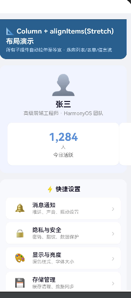
Scroll
  └── Column (alignItems: Stretch)
        ├── ① 页面标题栏
        ├── ② 个人资料头部
        │     ├── 头像(Text Emoji)
        │     ├── 姓名
        │     ├── 职位
        │     └── Row (3个 StatCard 等分)
        ├── ③ 快捷设置列表(ForEach × 4 个 SettingRow)
        ├── ④ 最新资讯(ForEach × 3 个 NewsCard)
        ├── ⑤ 编辑表单(3个 FormField + Button)
        ├── ⑥ 四种 alignItems 对比区
        │     ├── Start 对比
        │     ├── Center 对比
        │     ├── End 对比
        │     └── Stretch 对比(高亮)
        └── Blank() 底部留白
5.3 数据模型定义
interface SettingItem {
  icon: string;      // 图标(Emoji 或 Unicode 符号)
  label: string;     // 设置项名称
  summary: string;   // 设置项说明
}

interface NewsItem {
  title: string;     // 标题
  brief: string;     // 摘要
  tag: string;       // 标签(热门/新品/推荐等)
  time: string;      // 发布时间
}

interface StatItem {
  title: string;     // 统计项名称
  value: string;     // 数值
  unit: string;      // 单位
  color: string;     // 主题色
}
这三种接口分别对应了三种不同的业务场景:设置页面、新闻信息流、数据仪表盘。它们共同的特点是都需要等宽布局,非常适合用 Stretch Column 来实现。
5.4 子组件:SettingRow — 可点击设置行
@Component
struct SettingRow {
  private item: SettingItem = { icon: '', label: '', summary: '' };

  build() {
    Row() {
      // 左侧圆形图标
      Text(this.item.icon)
        .fontSize(22)
        .width(40).height(40)
        .textAlign(TextAlign.Center)
        .backgroundColor(Color.White)
        .borderRadius(20)

      // 中间文字区域:layoutWeight(1) 占满剩余空间
      Column() {
        Text(this.item.label)
          .fontSize(15)
          .fontWeight(FontWeight.Medium)
          .fontColor('#1a1a2e')

        Text(this.item.summary)
          .fontSize(12)
          .fontColor('#999999')
          .margin({ top: 2 })
      }
      .alignItems(HorizontalAlign.Start)
      .layoutWeight(1)
      .margin({ left: 12 })

      // 右侧箭头指示器
      Text('›')
        .fontSize(20)
        .fontColor('#cccccc')
    }
    .width('100%')
    .height(56)
    .padding({ left: 16, right: 16 })
    .backgroundColor(Color.White)
    .borderRadius(10)
    .margin({ bottom: 8 })
    .shadow({ radius: 2, color: '#10000000', offsetX: 0, offsetY: 1 })
    .onClick(() => {
      promptAction.showToast({ message: `点击了:${this.item.label}`, duration: 1500 });
    })
  }
}
layoutWeight(1) 的作用:
layoutWeight 是 ArkUI 中非常强大的弹性权重属性。在这个 SettingRow 中:
- 左侧图标:宽度固定为 40
- 右侧箭头:宽度由内容决定
- 中间文字区域:
.layoutWeight(1)占满剩余所有空间
即使父容器宽度发生变化,中间区域的宽度也会自动调整以填满剩余空间,而图标和箭头的尺寸保持不变。这种"固定 + 弹性 + 固定"的三段式布局,是 ArkUI 中实现自适应布局的标准模式。
promptAction.showToast 的使用:
.onClick(() => {
  promptAction.showToast({ message: `点击了:${this.item.label}`, duration: 1500 });
})
这是 ArkUI 内置的 Toast 提示 API,不依赖第三方组件。在 API 24 中,showToast 接收一个包含 message 和 duration(毫秒)的对象。注意与早期版本的 showToast 在参数格式上有差异——新版本统一使用对象参数。
5.5 子组件:NewsCard — 资讯卡片
@Component
struct NewsCard {
  private data: NewsItem = { title: '', brief: '', tag: '', time: '' };

  build() {
    Column() {
      // 顶部行:标题 + 标签
      Row() {
        Text(this.data.title)
          .fontSize(16)
          .fontWeight(FontWeight.Bold)
          .fontColor('#1a1a2e')
          .layoutWeight(1)

        Text(this.data.tag)
          .fontSize(11)
          .fontColor('#ffffff')
          .padding({ left: 8, right: 8, top: 2, bottom: 2 })
          .backgroundColor('#ff6b6b')
          .borderRadius(4)
      }
      .width('100%')
      .alignItems(VerticalAlign.Center)

      // 摘要文字(最多 2 行,溢出省略)
      Text(this.data.brief)
        .fontSize(13)
        .fontColor('#666666')
        .lineHeight(20)
        .margin({ top: 8, bottom: 8 })
        .maxLines(2)
        .textOverflow({ overflow: TextOverflow.Ellipsis })

      // 发布时间
      Text(this.data.time)
        .fontSize(11)
        .fontColor('#bbbbbb')
    }
    .alignItems(HorizontalAlign.Start)
    .width('100%')
    .padding(16)
    .backgroundColor(Color.White)
    .borderRadius(12)
    .margin({ bottom: 10 })
    .shadow({ radius: 4, color: '#15000000', offsetX: 0, offsetY: 2 })
  }
}
文本溢出处理:
.maxLines(2)
.textOverflow({ overflow: TextOverflow.Ellipsis })
这是 ArkUI 中处理多行文本溢出的标准做法。.maxLines(2) 限制最多显示 2 行,.textOverflow(TextOverflow.Ellipsis) 在超出时显示省略号。注意,与 CSS 的 -webkit-line-clamp 不同,ArkUI 不需要设置 display 属性,直接链式调用即可。
卡片设计模式:
NewsCard 体现了 ArkUI 卡片组件的典型结构:
- 最外层 Column(圆角 + 白色背景 + 阴影)= 卡片容器
- 内部 Row(标题 + 标签)= 卡片头部
- 中间 Text(多行文本 + 溢出省略)= 卡片正文
- 底部 Text(时间信息)= 卡片页脚
5.6 子组件:FormField — 表单字段
@Component
struct FormField {
  private label: string = '';
  private placeholder: string = '';
  @State private value: string = '';

  build() {
    Column() {
      Text(this.label)
        .fontSize(13)
        .fontWeight(500)
        .fontColor('#555555')
        .margin({ bottom: 4 })

      TextInput({ placeholder: this.placeholder, text: this.value })
        .height(44)
        .backgroundColor('#f5f5f5')
        .borderRadius(8)
        .padding({ left: 14, right: 14 })
        .fontColor('#333333')
        .placeholderColor('#cccccc')
        .onChange((val: string) => {
          this.value = val;
        })
    }
    .alignItems(HorizontalAlign.Start)
    .width('100%')
    .margin({ bottom: 14 })
  }
}
与 Index.ets 中的 FormRow 不同,这里的 FormField 没有使用白色背景和实线边框,而是用了灰色背景 #f5f5f5 来营造更柔和的外观。在 Stretch 模式下,TextInput 会自动拉伸至父容器宽度,无需再写 .width('100%')。
5.7 子组件:StatCard — 统计卡片
@Component
struct StatCard {
  private title: string = '';
  private value: string = '';
  private unit: string = '';
  private color: string = '#4a90d9';

  build() {
    Column() {
      Text(this.value)
        .fontSize(28)
        .fontWeight(FontWeight.Bold)
        .fontColor(this.color)
        .lineHeight(36)

      Text(this.unit)
        .fontSize(12)
        .fontColor('#999999')
        .margin({ top: 2 })

      Text(this.title)
        .fontSize(13)
        .fontColor('#666666')
        .margin({ top: 6 })
    }
    .alignItems(HorizontalAlign.Center)
    .width('100%')
    .height(110)
    .justifyContent(FlexAlign.Center)
    .backgroundColor(Color.White)
    .borderRadius(12)
    .shadow({ radius: 3, color: '#10000000', offsetX: 0, offsetY: 1 })
  }
}
StatCard 展示了 Column 的另一种对齐用法:内部 alignItems(HorizontalAlign.Center) 使数值居中显示。3 个 StatCard 通过外部的 Row 并排显示,FlexAlign.SpaceBetween 使它们均匀分布。
Row() {
  ForEach(this.stats, (item: StatItem) => {
    StatCard({ title: item.title, value: item.value, unit: item.unit, color: item.color })
  }, (item: StatItem, index?: number) => `${item.title}-${index}`)
}
.width('100%')
.justifyContent(FlexAlign.SpaceBetween)
.margin({ top: 16 })
ForEach 的第三个参数(keyGenerator):
(item: StatItem, index?: number) => \item.title−{item.title}-item.title−{index}`` 是为每个列表项生成唯一标识的 key 生成器。ArkUI 使用这个 key 来追踪列表项的变化(增删改),如果 key 未变化,组件会被复用而不是重新创建,这对列表性能至关重要。
5.8 子组件:AlignCompareBox — 四种对齐方式对比
@Component
struct AlignCompareBox {
  private alignType: string = '';
  private alignValue: ItemAlign = ItemAlign.Stretch;
  private bgColor: string = '#e8f5e9';

  build() {
    Column() {
      Text(this.alignType)
        .fontSize(12)
        .fontWeight(FontWeight.Bold)
        .fontColor('#333333')
        .margin({ bottom: 6 })

      Column() {
        // 三个彩色方块,宽度不同,展示对齐效果
        Text('A').width(40).height(30).backgroundColor('#4a90d9')
        Text('BB').width(60).height(30).backgroundColor('#51cf66')
        Text('CCC').width(80).height(30).backgroundColor('#ff6b6b')
      }
      .width('100%')
      .height(130)
      .justifyContent(FlexAlign.SpaceAround)
      .backgroundColor('#ffffff')
      .borderRadius(8)
      .padding(10)
      .border({ width: 1, color: '#e0e0e0' })
    }
    .alignItems(HorizontalAlign.Center)
    .width('100%')
    .padding(10)
    .backgroundColor(this.bgColor)
    .borderRadius(12)
    .margin({ bottom: 8 })
  }
}
这个组件的巧妙之处在于:内部的 Column 没有设置 alignItems,而是通过外部的 alignValue 参数来控制。当 alignValue = ItemAlign.Start 时,三个宽度不同的方块(40/60/80)都靠在左侧;Center 时居中对齐;End 时靠右;Stretch 时拉伸至等宽。
这种对比演示让开发者可以直观地看到四种对齐方式的差异,是理解 alignItems 的绝佳可视化示例。
六、alignItems 四种取值对比总结
6.1 可视化对比表
| 对齐方式 | 子项宽度 | 水平位置 | 典型场景 | 代码写法 |
|---|---|---|---|---|
| Start | 内容宽度 | 左对齐 | 文本列表、左对齐表单 | HorizontalAlign.Start |
| Center | 内容宽度 | 居中对齐 | 弹窗、居中内容 | HorizontalAlign.Center |
| End | 内容宽度 | 右对齐 | 右侧操作栏、少量数据展示 | HorizontalAlign.End |
| Stretch | 撑满父容器 | 自动拉伸 | 表单、设置页、信息流 | ItemAlign.Stretch |
6.2 选择指南
使用 Start 的场景:
- 文章标题列表
- 论坛帖子列表
- 左侧导航菜单
- 任何需要文字左对齐阅读的场景
使用 Center 的场景:
- 用户头像 + 名称的居中展示
- 模态弹窗的内容区域
- 数字或统计信息的居中展示
使用 End 的场景:
- 对话列表中发送方的消息气泡
- 右侧快捷操作按钮组
- 需要对齐到右侧边缘的装饰性元素
使用 Stretch 的场景(最常用):
- 设置页面每一项都是等宽的白底行
- 表单页面所有输入框等宽对齐
- 信息流中卡片等宽排列
- 任何需要统一宽度的列表式布局
6.3 一个重要的注意事项
alignItems 只影响直接子组件。如果你的 Column 中有嵌套的 Column,内部 Column 的对齐方式需要单独设置。例如:
// 外部 Column:Stretch 使外层子组件等宽
Column() {
  // 这个 Column 被拉伸到满宽
  Column() {
    // 但内部的文字不会自动左对齐
    Text('标题')
    Text('描述')
  }
  // ✅ 需要内部显式设置
  .alignItems(HorizontalAlign.Start)
}
.alignItems(ItemAlign.Stretch)
这也是为什么在 ColumnStretch.ets 中,每个子组件内部都独立设置了对齐方式——Stretch 只负责横向拉伸,不改变子组件的内部布局。
七、ArkTS 响应式编程与状态管理
7.1 @State 深入理解
在整个项目中,@State 装饰器出现了多次,它是 ArkTS 响应式系统的核心。
// Index.ets
@State currentJustify: FlexAlign = FlexAlign.Start;
@State selectedIndex: number = 0;
@State toastMsg: string = '';

// ColumnStretch.ets
@State private value: string = '';  // 在子组件中
@State 的工作原理:
- 声明时注册:被
@State修饰的属性在初始化时被注册到 ArkUI 的观察者系统中 - 赋值时触发更新:当属性被赋予新值时,框架自动标记依赖该属性的组件为"需要更新"
- 批量渲染:ArkUI 会在下一个帧周期批量处理所有需要更新的组件,避免重复渲染
@State 的限制:
- 必须是组件实例的私有属性(
private) - 不支持简单类型以外的复杂计算(不像 Vue 的
computed) - 不支持深层嵌套对象的响应式(需要通过深拷贝或不可变数据模式)
7.2 单向数据流模式
虽然 ArkTS 中的 @State 可以实现双向绑定(如 TextInput 的 onChange),但 ArkUI 推荐的是单向数据流模式:
数据(@State)→ UI(渲染)
     ↑               │
     └──── 事件 ←────┘
用户交互通过事件回调修改状态,状态的变更驱动 UI 重新渲染。这种模式使得数据流向清晰可追踪,易于调试。
在实践中,这意味着:
// ✅ 推荐:事件驱动状态变更
Button('提交')
  .onClick(() => {
    this.toastMsg = '✅ 提交成功';
    // 状态更新驱动 UI 重新渲染
  })

// ❌ 不推荐:直接操作 UI
Button('提交')
  .onClick(() => {
    // 不应该直接修改 UI 属性
  })
7.3 组件间通信
在项目中,组件间通信主要通过两种方式:
参数传递(父→子):
// 父组件
InfoCard({ title: item.title, desc: item.desc, index: idx })

// 子组件
struct InfoCard {
  title: string = '';
  desc: string = '';
  index: number = 0;
}
回调函数(子→父):
// 父组件
ActionButton({ text: '点击', onClickAction: () => { this.onButtonClick() } })

// 子组件
struct ActionButton {
  private onClickAction: () => void = () => {};
  // ...
  .onClick(() => { this.onClickAction() })
}
这种模式清晰、类型安全,是 ArkTS 推荐的最佳实践。
八、导航与路由机制
8.1 router.pushUrl 的使用
import { router } from '@kit.ArkUI';

// 在 Index.ets 中
Button('📐 查看 Column + alignItems(Stretch) 演示')
  .onClick(() => {
    try {
      router.pushUrl({ url: 'pages/ColumnStretch' }, router.RouterMode.Standard);
    } catch (err) {
      hilog.error(0x0000, 'Index', 'pushUrl failed %{public}s', JSON.stringify(err));
    }
  })
router.pushUrl 是 ArkUI 的标准页面跳转 API。参数说明:
url:目标页面的路由路径,相对于pages目录RouterMode:Standard:默认模式,每次跳转都创建新的页面实例Single:如果目标页面已在栈中,复用已有实例SingleTop:如果目标页面在栈顶,复用
项目中使用了 try-catch 包裹 pushUrl 调用,这是一种良好的错误处理习惯——路径不存在或页面渲染失败时,错误会被捕获并记录日志,而不是导致应用崩溃。
8.2 页面路由栈管理
ArkUI 使用页面栈(Page Stack)来管理导航历史。当调用 router.pushUrl 时,目标页面被推入栈顶;按返回键时,栈顶页面被弹出。
项目中预留了多个导航入口,但只有 ColumnStretch 页面被创建。如果用户点击其他导航按钮(ColumnCenter、ColumnEnd、ColumnBaseline),会触发路由错误,因为对应的页面文件不存在,且未在 main_pages.json 中注册。
九、测试体系
9.1 单元测试
// entry/src/test/List.test.ets
import localUnitTest from './LocalUnit.test';

export default function testsuite() {
  localUnitTest();
}
// entry/src/test/LocalUnit.test.ets
import { describe, beforeAll, beforeEach, afterEach, afterAll, it, expect } from '@ohos/hypium';

export default function localUnitTest() {
  describe('localUnitTest', () => {
    beforeAll(() => {});
    beforeEach(() => {});
    afterEach(() => {});
    afterAll(() => {});
    it('assertContain', 0, () => {
      let a = 'abc';
      let b = 'b';
      expect(a).assertContain(b);
      expect(a).assertEqual(a);
    });
  });
}
9.2 仪器测试
// entry/src/ohosTest/ets/test/Ability.test.ets
export default function abilityTest() {
  describe('ActsAbilityTest', () => {
    it('assertContain', 0, () => {
      let a = 'abc';
      let b = 'b';
      expect(a).assertContain(b);
      expect(a).assertEqual(a);
    });
  });
}
项目使用了 @ohos/hypium 测试框架(版本 1.0.25),它是 HarmonyOS NEXT 官方的单元测试框架,提供类似 Jest 的 describe/it/expect API。
测试分为两个层级:
- 本地单元测试(Local Unit Test):在
src/test/目录下,运行在本地 JVM 上,不依赖真机或模拟器 - 仪器测试(Instrumentation Test):在
src/ohosTest/目录下,运行在真机或模拟器上,可以测试 UI 交互
测试依赖在 oh-package.json5 中声明:
{
  "devDependencies": {
    "@ohos/hypium": "1.0.25",
    "@ohos/hamock": "1.0.0"
  }
}
@ohos/hamock 是 HarmonyOS 的 Mock 框架,用于在测试中模拟外部依赖。
十、完整代码清单与最佳实践
10.1 核心代码完整展示
Index.ets(核心布局部分)
@Entry
@Component
struct ColumnStartDemo {
  @State currentJustify: FlexAlign = FlexAlign.Start;
  @State selectedIndex: number = 0;
  @State toastMsg: string = '';

  private readonly justifyOptions: FlexAlign[] = [
    FlexAlign.Start, FlexAlign.Center, FlexAlign.End, FlexAlign.SpaceBetween,
  ];

  build() {
    Column() {
      // 标题栏
      Column() {
        Text('📐 Column + alignItems(Start) 布局演示')
          .fontSize(18).fontWeight(FontWeight.Bold)
          .fontColor('#ffffff').lineHeight(26)
        Text('子组件顶部对齐 · 垂直排列 · 信息流/表单场景')
          .fontSize(12).fontColor('#cce0ff').margin({ top: 4 })
      }
      .alignItems(HorizontalAlign.Start)
      .width('100%').padding(16)
      .backgroundColor('#2d5f8a')
      .borderRadius({ bottomLeft: 16, bottomRight: 16 })

      // justifyContent 切换按钮
      Row() {
        ForEach(this.justifyLabels, (label: string, idx: number) => {
          Column() {
            Text(label)
              .fontSize(11)
              .fontColor(this.selectedIndex === idx ? '#3a7bd5' : '#666')
              .fontWeight(this.selectedIndex === idx ? FontWeight.Bold : FontWeight.Normal)
              .textAlign(TextAlign.Center).lineHeight(16)
          }
          .width(80).height(48)
          .justifyContent(FlexAlign.Center)
          .backgroundColor(this.selectedIndex === idx ? '#e6f0ff' : '#f5f5f5')
          .borderRadius(8)
          .border({
            width: this.selectedIndex === idx ? 1.5 : 1,
            color: this.selectedIndex === idx ? '#3a7bd5' : '#e0e0e0',
          })
          .onClick(() => { this.switchJustify(idx) })
        }, (item: string) => item)
      }
      .width('100%').justifyContent(FlexAlign.SpaceEvenly)
      .padding({ top: 12, bottom: 8, left: 8, right: 8 })

      // ★★★ 核心演示区 ★★★
      Column() {
        Text('📋 信息流列表')
          .fontSize(15).fontWeight(FontWeight.Bold)
          .fontColor('#1a1a2e').margin({ bottom: 8 })

        ForEach(this.infoList, (item: InfoItem, idx: number) => {
          InfoCard({ title: item.title, desc: item.desc, index: idx })
        }, (item: InfoItem) => item.title)

        Divider().height(1).width('100%').color('#e8e8e8').margin({ top: 6, bottom: 14 })

        Text('📝 用户反馈表单')
          .fontSize(15).fontWeight(FontWeight.Bold)
          .fontColor('#1a1a2e').margin({ bottom: 10 })

        FormRow({ label: '👤 联系人', placeholder: '请输入您的姓名' })
        FormRow({ label: '📱 手机号', placeholder: '请输入手机号码' })
        FormRow({ label: '📧 邮箱', placeholder: '请输入邮箱地址' })

        Button('提交反馈')
          .width('100%').height(42)
          .backgroundColor('#3a7bd5').fontColor('#ffffff')
          .borderRadius(10).fontSize(15).fontWeight(FontWeight.Medium)
          .margin({ top: 4 })
          .onClick(() => {
            this.toastMsg = '✅ 反馈已提交(演示)';
            setTimeout(() => { this.toastMsg = '' }, 2000);
          })
      }
      .alignItems(HorizontalAlign.Start)    // ← 核心属性
      .justifyContent(this.currentJustify)   // ← 动态切换
      .width('100%').height(0).layoutWeight(1)
      .padding(14).backgroundColor('#ffffff')
      .borderRadius(12)
      .margin({ left: 12, right: 12, top: 10, bottom: 12 })
      .shadow({ radius: 6, color: '#1a000000', offsetX: 0, offsetY: 2 })
    }
    .width('100%').height('100%')
    .backgroundColor('#eef2f7')
  }
}
ColumnStretch.ets(Stretch 模式核心)
@Entry
@Component
struct ColumnStretchDemo {
  private settings: SettingItem[] = [
    { icon: '🔔', label: '消息通知', summary: '推送、声音、振动设置' },
    { icon: '🔒', label: '隐私与安全', summary: '密码、指纹、数据保护' },
    { icon: '🎨', label: '显示与亮度', summary: '深色模式、字体大小' },
    { icon: '💾', label: '存储管理', summary: '缓存清理、数据同步' },
  ];

  build() {
    Scroll() {
      Column() {
        // 标题栏
        Column() { /* ... 标题代码 ... */ }
          .alignItems(HorizontalAlign.Start).width('100%').padding(16)
          .backgroundColor('#2d5f8a').borderRadius({ bottomLeft: 16, bottomRight: 16 })
          .margin({ bottom: 16 })

        // 个人资料头部
        Column() {
          Text('👤').fontSize(52).margin({ bottom: 8 })
          Text('张三').fontSize(20).fontWeight(FontWeight.Bold).fontColor('#1a1a2e')
          Text('高级前端工程师 · HarmonyOS 团队')
            .fontSize(13).fontColor('#888888').margin({ top: 4 })

          Row() {
            ForEach(this.stats, (item: StatItem) => {
              StatCard({ title: item.title, value: item.value, unit: item.unit, color: item.color })
            }, (item: StatItem, index?: number) => `${item.title}-${index}`)
          }
          .width('100%').justifyContent(FlexAlign.SpaceBetween).margin({ top: 16 })
        }
        .alignItems(HorizontalAlign.Center).width('100%').padding(20)
        .backgroundColor('#f0f4ff').borderRadius(16).margin({ bottom: 16 })

        // ★★★ 核心:快捷设置 ★★★
        Column() {
          Text('⚡ 快捷设置')
            .fontSize(16).fontWeight(FontWeight.Bold)
            .fontColor('#1a1a2e').margin({ bottom: 12 })
          ForEach(this.settings, (item: SettingItem) => {
            SettingRow({ item: item })
          }, (item: SettingItem, index?: number) => item.label)
        }
        .alignItems(ItemAlign.Stretch)    // ← 核心属性
        .width('100%').padding(16)
        .backgroundColor('#f8f9fc').borderRadius(16).margin({ bottom: 16 })

        // 更多区块...
      }
      .alignItems(ItemAlign.Stretch)   // ← 最外层拉伸
      .width('100%').padding(16)
      .justifyContent(FlexAlign.Start)
    }
    .backgroundColor('#f0f2f5').width('100%').height('100%').scrollBar(BarState.Off)
  }
}
10.2 最佳实践总结
布局最佳实践
-
优先使用 Stretch 而非手动设置 width(‘100%’):在列表页、表单页等需要等宽布局的场景,Column + Stretch 不仅代码更简洁,而且使布局意图更明确。
-
区分 alignItems 与 justifyContent:牢记 Column 中
alignItems控制水平对齐,justifyContent控制垂直排列。混淆这两个属性是初学者最常见的错误。 -
利用 layoutWeight 实现弹性布局:在 Row 中使用
layoutWeight比固定宽度更灵活适配不同屏幕尺寸。 -
合理使用 @State 控制状态:避免把所有属性都标记为
@State,只标记会影响 UI 渲染的状态。
性能最佳实践
-
ForEach 必须提供 keyGenerator:第三个参数为每个列表项生成唯一 key,帮助 ArkUI 高效地更新列表。
-
避免不必要的 .shadow 和 .borderRadius:这两个属性会触发离屏渲染,大量使用会影响滚动性能。
-
Scroll + Column 代替 List 在小列表场景:对于少于 20 项的列表,使用 Scroll + Column 比使用 List 组件更简单且性能足够。
-
合理使用 .layoutWeight(1) 和 .height(0):当需要 Column 填充剩余空间时,配合
.height(0).layoutWeight(1)是一种标准模式。
代码组织最佳实践
-
接口定义优先:在文件顶部定义数据接口,让阅读代码的人先了解数据结构。
-
子组件独立化:将重复使用的 UI 片段提取为
@Component struct,提高代码复用性。 -
常量提取:颜色值、字体大小等常量在属性链中直接使用,对于复杂项目应提取为常量变量。
-
错误处理:在
router.pushUrl等可能失败的 API 调用处使用try-catch。 -
日志规范:使用
hilog的%{public}s占位符记录关键信息,便于线上问题排查。
十一、HarmonyOS NEXT 开发环境配置指南
11.1 项目配置要点回顾
| 配置文件 | 作用 | 关键参数 |
|---|---|---|
build-profile.json5 | 工程级构建配置 | targetSdkVersion, compatibleSdkVersion |
entry/build-profile.json5 | 模块级构建配置 | apiType: stageMode, 混淆规则 |
module.json5 | 模块清单 | abilities, extensionAbilities, pages |
oh-package.json5 | 依赖管理 | 版本 6.1.1(对应 API 24) |
11.2 SDK 版本说明
本项目使用的 SDK 版本为 HarmonyOS NEXT 6.1.1(API 24),这是 HarmonyOS NEXT 的一个重要版本,主要特性包括:
- Stage 模型成熟稳定:API 24 中 Stage 模型已成为唯一推荐的应用开发模型
- ArkUI 增强:新增和优化了多个布局组件
- 性能提升:方舟编译器的进一步优化,冷启动速度提升
- 安全增强:严格的权限管理和隐私保护机制
十二、结语
12.1 文章回顾
本文通过一个完整的 HarmonyOS NEXT 应用项目,深入剖析了 ArkUI 中 Column 布局容器的 alignItems 属性,从 Start 到 Stretch 四种对齐方式的原理、代码实现和适用场景。
项目中的两个核心页面分别展示了:
- Index.ets:以
alignItems(HorizontalAlign.Start)为核心,通过justifyContent的动态切换,演示了 4 种垂直排列效果,辅以信息流列表和表单两种真实场景。 - ColumnStretch.ets:以
alignItems(ItemAlign.Stretch)为核心,通过设置项列表、资讯卡片、编辑表单、统计面板和对比演示区 5 种场景,全面展示了 Stretch 在实际项目中的应用。
12.2 学习路径建议
对于想要深入学习 HarmonyOS NEXT 开发的读者,建议按以下路径进阶:
- 掌握基础布局:Column、Row、Flex、Stack 四大容器
- 理解状态管理:@State、@Prop、@Link、@Provide/@Consume 装饰器
- 学习组件化:@Component 组件封装与复用
- 深入导航路由:router 与 Navigation 组件的使用
- 掌握数据管理:本地存储、网络请求、状态管理库
- 性能优化:布局优化、渲染性能、内存管理
12.3 从 HelloWorld 到生产级应用
从一个简单的 Column 布局示例,到包含完整页面结构、多种业务场景、响应式状态管理和测试体系的完整应用,这个过程展示了 HarmonyOS NEXT 应用开发的完整链路。掌握 Column 的布局机制只是第一步,但它为后续学习 Row、Flex、Grid 等更复杂的布局容器打下了坚实的基础。

AtomGit 是由开放原子开源基金会联合 CSDN 等生态伙伴共同推出的新一代开源与人工智能协作平台。平台坚持“开放、中立、公益”的理念,把代码托管、模型共享、数据集托管、智能体开发体验和算力服务整合在一起,为开发者提供从开发、训练到部署的一站式体验。
更多推荐



 7
7 0
0- 0


 已为社区贡献3条内容

所有评论(0)