鸿蒙 ArkUI 五大布局+Swiper、Tabs组件详解
在鸿蒙(HarmonyOS)ArkUI开发中,布局容器是构建页面的核心。所有按钮、文字、图片、轮播、导航栏,全部依赖布局来完成排列、对齐、分布。
本文结合课堂实训截图与完整实战代码,系统讲解 ArkUI 五大核心布局:Column、Row、Stack、Flex、RelativeContainer,两个组件Swiper、Tabs,包含原理、代码示例、区别、使用场景,适配零基础学习。
一、Column 垂直线性布局(最常用)
核心特点:子组件从上到下垂直排列
Column 是整个鸿蒙开发中使用频率最高的布局,几乎所有页面的外层都是 Column。
主轴:垂直方向(控制上下分布)
交叉轴:水平方向(控制左右居中、靠左、靠右)
常用属性
-
space:子组件垂直间距
-
justifyContent:垂直方向分布(靠上、居中、均匀分布)
-
alignItems:水平对齐(左、中、右)
实战代码示例
@Entry
@Component
struct ColumnDemo{
  build() {
    Column({space:20}){
      Text('鸿蒙应用开发')
        .fontSize(22)
        .fontWeight(FontWeight.Bold)
      Text('ArkUI布局实训')
        .fontSize(22)
        .fontColor(Color.Red)
      Text('第一部分:基本布局')
        .fontSize(20)
        .fontColor(0x007dff)

    }
    .width('100%')
    .height('100%')
    .justifyContent(FlexAlign.SpaceEvenly)
    .alignItems(HorizontalAlign.Center)
    .backgroundColor(0xf5f5f5)
  }
}
效果
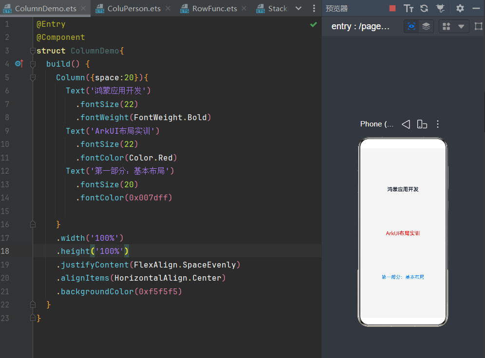
适用场景
个人中心、表单、文章页面、主页内容区、所有纵向页面结构。
二、Row 水平线性布局
核心特点:子组件从左到右水平排列
Row 专门用来做横向内容,和 Column 是互补关系。
主轴:水平方向(左右分布)
交叉轴:垂直方向(上下居中、靠上、靠下)
常用属性
-
space:水平组件间距
-
justifyContent:左对齐、居中、右对齐、两端均分
-
alignItems:垂直居中对齐
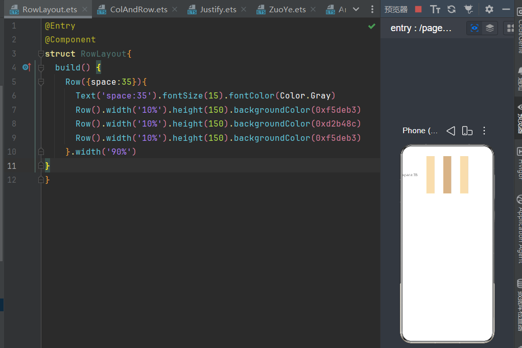
实战代码示例
@Entry
@Component
struct RowLayout{
  build() {
    Row({space:35}){
      Text('space:35').fontSize(15).fontColor(Color.Gray)
      Row().width('10%').height(150).backgroundColor(0xf5deb3)
      Row().width('10%').height(150).backgroundColor(0xd2b48c)
      Row().width('10%').height(150).backgroundColor(0xf5deb3)
    }.width('90%')
  }
}
效果
Row + Column 嵌套(页面万能结构)
外层 Column 管整体竖向结构,内层 Row 管每一行横向内容,是实训项目中最常用的页面搭建方式。
@Entry
@Component
struct RowCol{
  build() {
    Column({space:30}){
      Row({space:25}){
        Text('首页').fontSize(25)
        Text('课程').fontSize(25)
        Text('消息').fontSize(25)
        Text('我的').fontSize(25)
      }
      .width('100%')
      .height('15%')
      .justifyContent(FlexAlign.Center)
      .alignItems(VerticalAlign.Center)
      .backgroundColor(0x00f5f5)

      Row({space:15}){
        Button('左一').width(80).height(55).fontSize(22)
        Button('右一').width(80).height(55).fontSize(22)
      }
      .width('100%')
      .justifyContent(FlexAlign.Start)

      Row({space:15}){
        Button('左二').width(80).height(55).fontSize(22)
        Button('右二').width(80).height(55).fontSize(22)
      }
      .width('100%')
      .justifyContent(FlexAlign.Center)
      Row({space:15}){
        Button('左三').width(80).height(55).fontSize(22)
        Button('右三').width(80).height(55).fontSize(22)
      }
      .width('100%')
      .justifyContent(FlexAlign.End)

    }
    .height('100%')
    .width('100%')

  }
效果
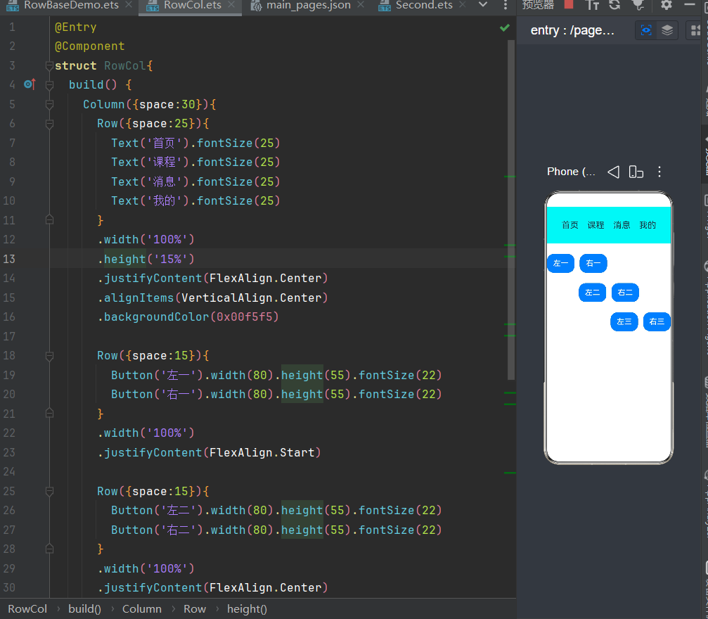
适用场景
顶部导航栏、按钮组、选项卡、横向菜单、并排按钮。
三、Stack 层叠布局(叠加效果)
核心特点:组件层层叠加,后写的覆盖在先写的上面
Stack 不分行列,所有子组件默认居中重叠,专门用来做叠加视觉效果,普通行列布局无法实现。
实战代码示例(课堂双层叠加案例)
@Entry
@Component
struct StackBase{
  build() {
    Stack(){
      Text()
        .width(220)
        .height(220)
        .backgroundColor(Color.Gray)
        .borderRadius(30)
      Text('你好')
        .fontSize(40)
        .fontColor(Color.Red)
        .width(120)
        .height(120)
        .backgroundColor(Color.Pink)
        .borderRadius(30)
        .padding({left:15,right:0,top:0,bottom:0})
    }
    .width('100%')
    .height('100%')
  }
}
效果
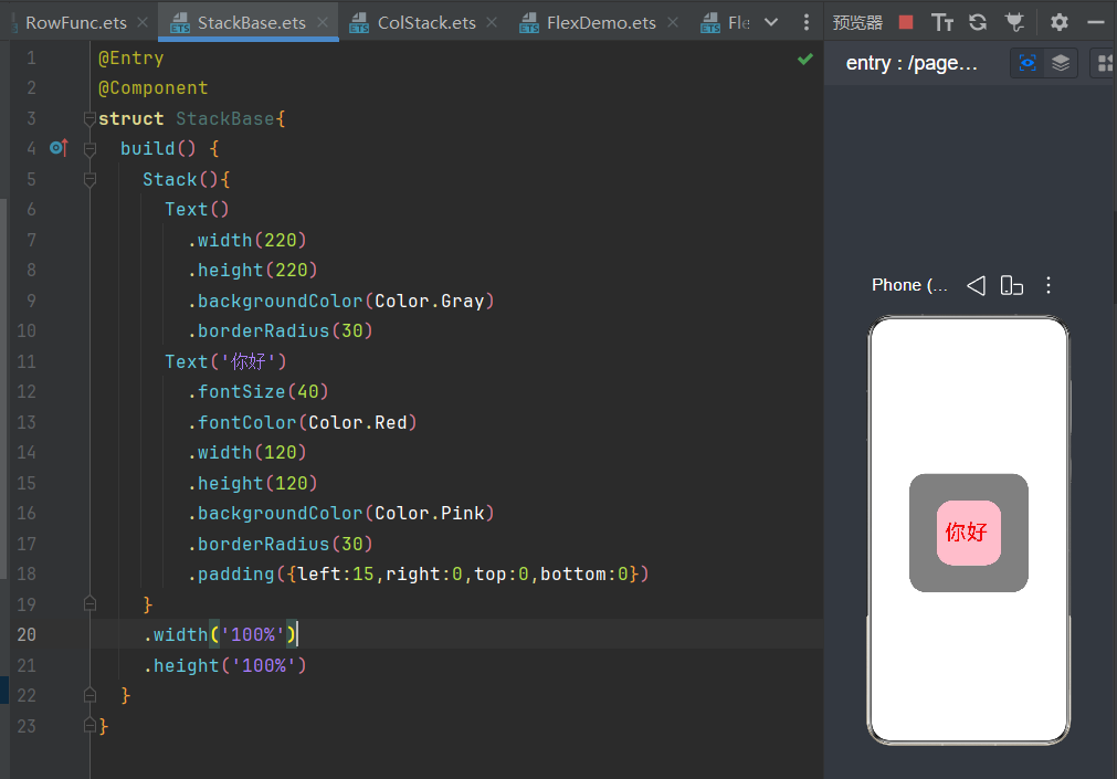
适用场景
-
头像框、双层卡片
-
浮标、角标、标签覆盖
-
背景层 + 内容层叠加
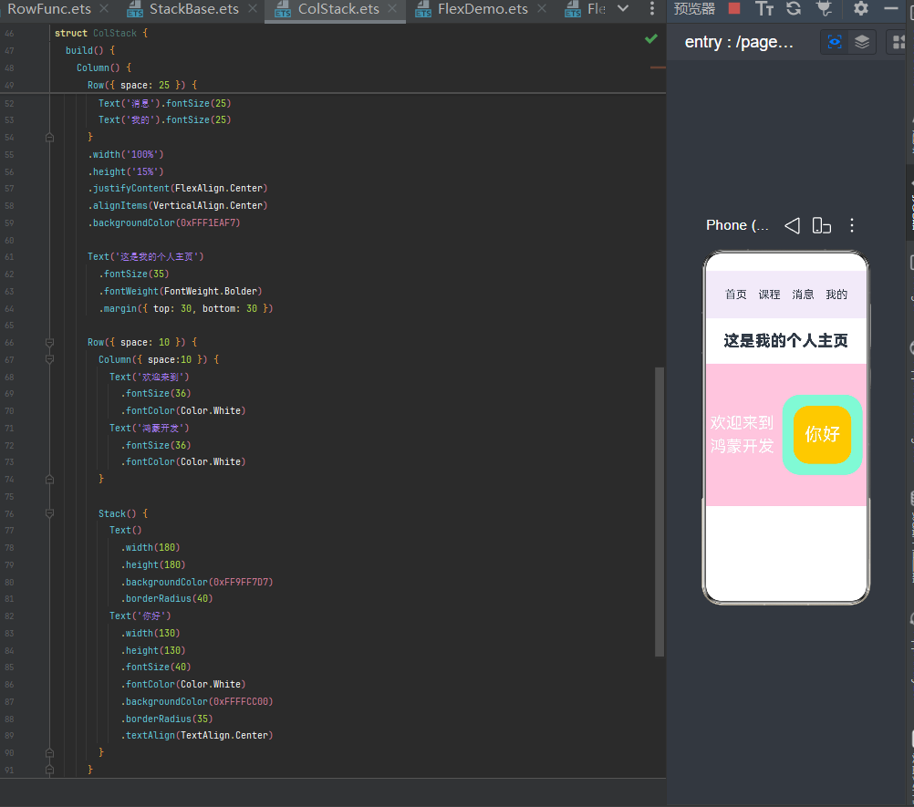
混合布局:Column + Row + Stack
复杂页面通常需要多种布局组合使用
实战代码示例
@Entry
@Component
struct ColStack {
  build() {
    Column() {
      Row({ space: 25 }) {
        Text('首页').fontSize(25)
        Text('课程').fontSize(25)
        Text('消息').fontSize(25)
        Text('我的').fontSize(25)
      }
      .width('100%')
      .height('15%')
      .justifyContent(FlexAlign.Center)
      .alignItems(VerticalAlign.Center)
      .backgroundColor(0xFFF1EAF7)

      Text('这是我的个人主页')
        .fontSize(35)
        .fontWeight(FontWeight.Bolder)
        .margin({ top: 30, bottom: 30 })

      Row({ space: 10 }) {
        Column({ space:10 }) {
          Text('欢迎来到')
            .fontSize(36)
            .fontColor(Color.White)
          Text('鸿蒙开发')
            .fontSize(36)
            .fontColor(Color.White)
        }

        Stack() {
          Text()
            .width(180)
            .height(180)
            .backgroundColor(0xFF9FF7D7)
            .borderRadius(40)
          Text('你好')
            .width(130)
            .height(130)
            .fontSize(40)
            .fontColor(Color.White)
            .backgroundColor(0xFFFFCC00)
            .borderRadius(35)
            .textAlign(TextAlign.Center)
        }
      }
      .width('100%')
      .height(320)
      .justifyContent(FlexAlign.SpaceAround)
      .alignItems(VerticalAlign.Center)
      .backgroundColor(0xFFFFC8DD)

    }
    .width('100%')
    .height('100%')
    .justifyContent(FlexAlign.Start)
    .backgroundColor(Color.White)
  }
}
效果
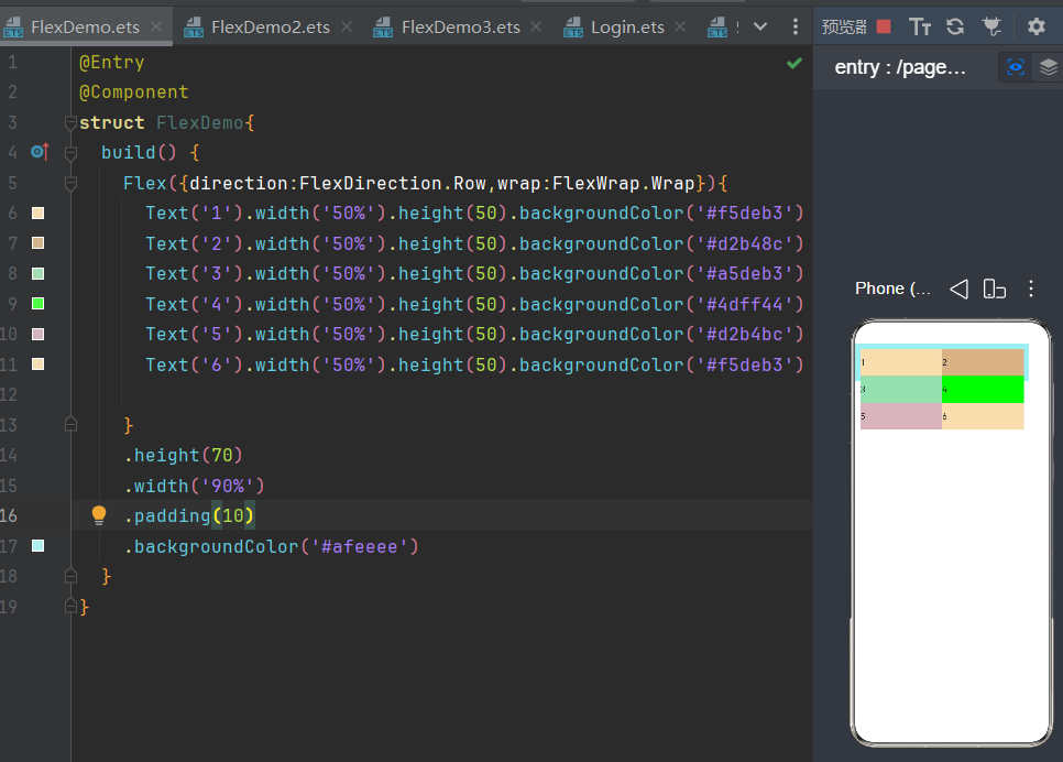
四、Flex 弹性布局(高级 Row)
核心特点:自动均分、自动换行、自适应屏幕
Row 不支持换行,内容过多会挤压变形;Flex 可以自动换行、自动分配空间,是 Row 的升级版,适配多端屏幕。
关键能力
-
wrap: FlexWrap.Wrap:内容超出自动换行
-
flexGrow:自动平分剩余空白空间
-
百分比宽度自适应布局
实战代码示例
@Entry
@Component
struct FlexDemo{
  build() {
    Flex({direction:FlexDirection.Row,wrap:FlexWrap.Wrap}){
      Text('1').width('50%').height(50).backgroundColor('#f5deb3')
      Text('2').width('50%').height(50).backgroundColor('#d2b48c')
      Text('3').width('50%').height(50).backgroundColor('#a5deb3')
      Text('4').width('50%').height(50).backgroundColor('#4dff44')
      Text('5').width('50%').height(50).backgroundColor('#d2b4bc')
      Text('6').width('50%').height(50).backgroundColor('#f5deb3')

    }
    .height(70)
    .width('90%')
    .padding(10)
    .backgroundColor('#afeeee')
  }
}
效果
五、RelativeContainer 相对布局(精准定位)
核心特点:组件互相参考定位,摆脱固定排列
Column、Row 是流水线顺序排列;RelativeContainer 是自由精准布局,可让组件相对其他组件、父容器任意定位,适配复杂非对称页面。
核心语法
-
给组件设置 .id('xxx') 唯一标识
-
通过 alignRules 配置相对定位规则
-
__container__ 代表父容器本身
实战代码示例
@Entry
@Component
struct RealtiveDemo{
  build() {
    RelativeContainer(){
      Text('相对布局页面设计')
        .fontSize(40)
        .fontWeight(FontWeight.Bolder)
        .id('title')
        .alignRules({
          top:{anchor:'__container__','align':VerticalAlign.Top},
          left:{anchor:'__container__','align':HorizontalAlign.Start}
        })
        .margin(15)
        .backgroundColor(Color.Red)
      Button('基础按钮')
        .width(150)
        .height(80)
        .fontSize(25)
        .id('buttonid')
        .alignRules({
          top:{anchor:'title',align:VerticalAlign.Bottom},
          middle:{anchor:'title',align:HorizontalAlign.Center}
        })
        .margin(20)
      Text('这个组件依赖于button')
        .fontSize(26)
        .fontColor(Color.Red)
        .id('textid')
        .alignRules({
          top:{anchor:'buttonid',align:VerticalAlign.Bottom},
          middle:{anchor:'buttonid',align:HorizontalAlign.Center}
        })
        .margin({top:20})

      Button('基础按钮1')
        .width(150)
        .height(80)
        .fontSize(25)
        .id('buttonid1')
        .alignRules({
          top:{anchor:'textid',align:VerticalAlign.Bottom},
          right:{anchor:'textid',align:HorizontalAlign.Center}
        })
        .margin(20)

      Button('基础按钮2')
        .width(150)
        .height(80)
        .fontSize(25)
        .id('buttonid2')
        .alignRules({
          top:{anchor:'buttonid1',align:VerticalAlign.Top},
          left:{anchor:'buttonid1',align:HorizontalAlign.End}
        })
        .margin({left:40})

      Image($r('app.media.4'))
        .width('97%')
        .id('image1')
        .alignRules({
          top:{anchor:'buttonid1',align:VerticalAlign.Bottom},
          left:{anchor:'buttonid1',align:HorizontalAlign.Start}
        })
        .margin({top:30})
    }
    .width('100%')
    .height('100%')
    // .backgroundColor(Color.Gray)
  }
}
效果
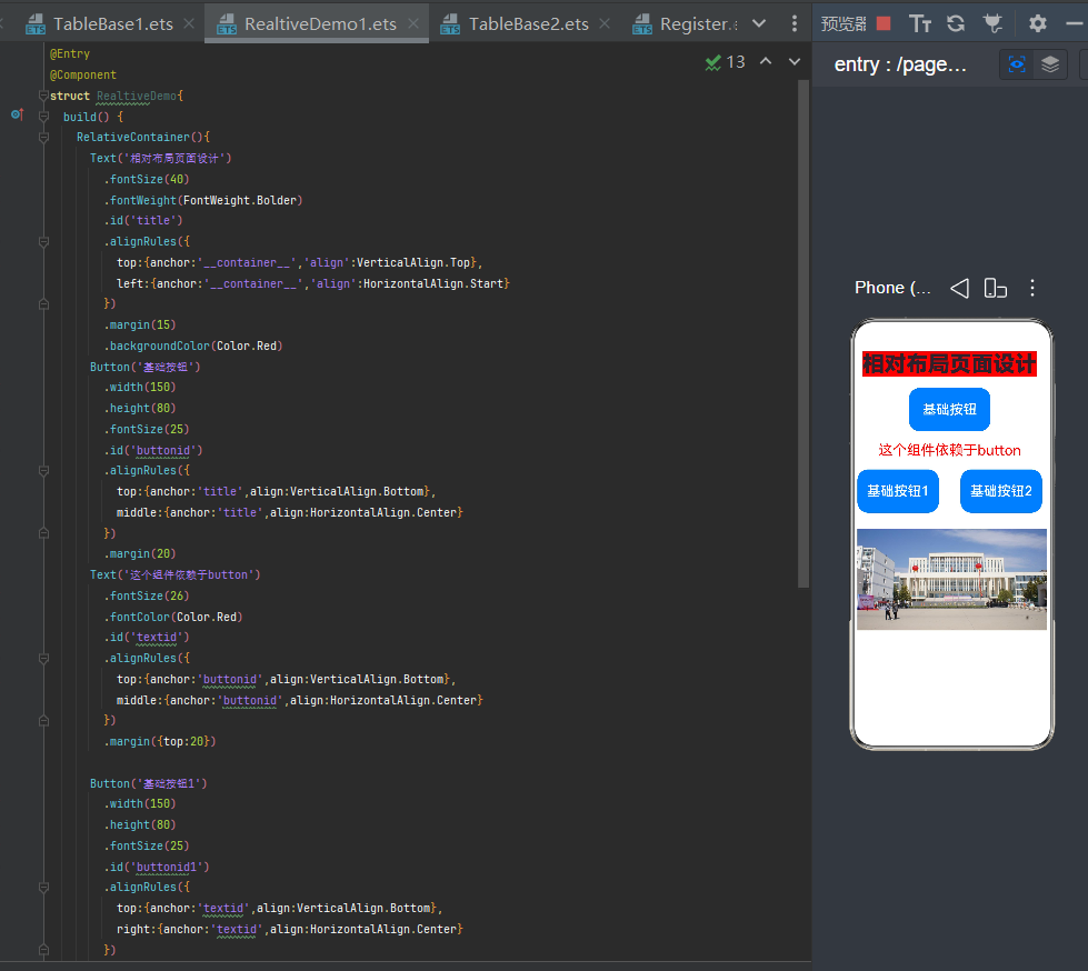
适用场景
复杂布局、非对称页面、按钮分散布局、自由排版页面。
六、Swiper 轮播图组件
核心特点:滑动切换、自动播放、循环轮播
Swiper 是鸿蒙官方专用轮播容器,无需手动写滑动逻辑,一键实现首页 Banner 轮播效果。
常用属性
-
autoPlay(true):自动播放
-
interval(3000):切换间隔(毫秒)
-
loop(true):无限循环
-
indicator(true):显示底部小圆点指示器
实战代码示例
@Entry
@Component
struct SwiperDemo2{
  private bannerList:Resource[]=[
    $r('app.media.1'),
    $r('app.media.2'),
    $r('app.media.3')
  ]
  build() {
    Column(){
      Swiper(){
       ForEach(this.bannerList,(item:Resource)=>{
         Image(item)
           .width('98%')
           .height('100%')
           .objectFit(ImageFit.Cover)

       })
      }
      .width('100%')
      .height('30%')
      .autoPlay(true) //自动播放
      .interval(2000) //时间间隔
      .loop(true) //是否循环播放


    }
  }
}
效果
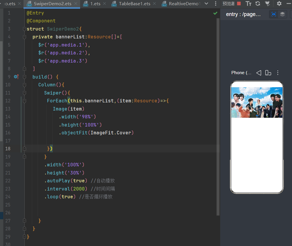
适用场景
首页轮播图、校园介绍滚动、广告 banner、多图滑动展示。
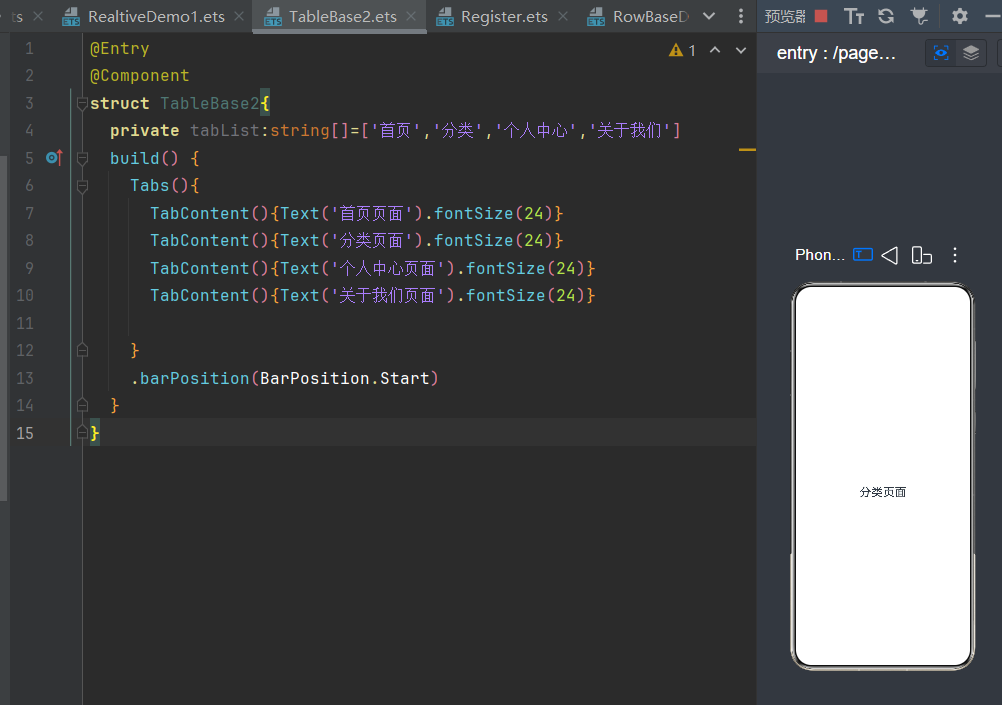
七、Tabs 标签页组件(页面切换)
核心特点:点击顶部标签,切换整个页面内容
Tabs + TabContent 是官方自带的页面切换方案,无需自定义点击事件,原生实现多页面切换。
结构规则
-
Tabs:外层容器,承载所有标签页面
-
TabContent:每一个标签对应的独立页面
-
.tabBar('文字'):设置顶部标签显示名称
实战代码示例
@Entry
@Component
struct TableBase2{
  private tabList:string[]=['首页','分类','个人中心','关于我们']
  build() {
    Tabs(){
      TabContent(){Text('首页页面').fontSize(24)}
      TabContent(){Text('分类页面').fontSize(24)}
      TabContent(){Text('个人中心页面').fontSize(24)}
      TabContent(){Text('关于我们页面').fontSize(24)}

    }
    .barPosition(BarPosition.Start)
  }
}
效果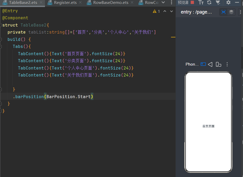
适用场景
学校简介/系部简介切换、首页/分类/我的、多页面切换系统。
布局实战总结
- 优先使用 Column/Row:简单的线性布局优先用 Column 和 Row,性能最好,代码也最简洁。
- 复杂组合用嵌套:Column 嵌套 Row 是最常用的组合,能实现大部分页面结构。
- 层叠效果用 Stack:需要叠加组件时,优先用 Stack,避免用 margin 做偏移,减少布局层级。
- 流式布局用 Flex:需要自动换行的场景,Flex 比 Row 更灵活。
- 多标签页用 Tabs:底部导航、顶部标签页直接用 Tabs,不用自己写切换逻辑。
- 复杂自定义布局用 RelativeContainer:当嵌套层级过多时,用 RelativeContainer 简化布局结构。

AtomGit 是由开放原子开源基金会联合 CSDN 等生态伙伴共同推出的新一代开源与人工智能协作平台。平台坚持“开放、中立、公益”的理念,把代码托管、模型共享、数据集托管、智能体开发体验和算力服务整合在一起,为开发者提供从开发、训练到部署的一站式体验。
更多推荐


 7
7 0
0- 0


 已为社区贡献1条内容

所有评论(0)