ArkTs中的几种布局
·
一、Ark的必要三要素
- @Entry:页面入口装饰器,标记当前自定义组件为页面入口,支持独立运行。
- @Component:组件装饰器,用于定义自定义 UI 组件,被标记的结构体可构建界面视图。
- build():组件构建方法,所有布局内容必须写在该方法内部
二、arkUI多种布局
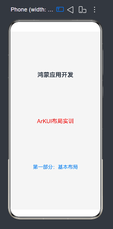
1. Column 垂直布局
Column容器内子元素按照垂直方向排列。
①常见属性
• space:统一设置子组件间距,替代手动margin • justifyContent:主轴(垂直)对齐,含居顶/居中/居底/均分
• alignItems:交叉轴(水平)对齐,含左/中/右对齐
• width/height:设置容器尺寸,铺满屏幕是布局基础
• backgroundColor:设置背景色,区分页面模块
• padding:设置容器内边距,控制子组件与边缘距离
• margin:设置容器外边距,控制与其他组件的距离
②举例代码
@Entry
@Component
struct ColumnDemo{
  build() {
    Column(){
      Text('鸿蒙应用开发')
        .fontSize(24)
        .fontWeight(FontWeight.Bold)
      Text('ArKUI布局实训')
        .fontSize(22)
        .fontColor(Color.Red)
      Text('第一部分:基本布局')
        .fontSize(20)
        .fontColor(0x007dff)
    }
    .width('100%')
    .height('100%')
    //主轴
    .justifyContent(FlexAlign.SpaceEvenly)
    //交叉轴
    .alignItems(HorizontalAlign.Center)
    .backgroundColor(0xf5f5f5)
  }
}
运行效果如图:
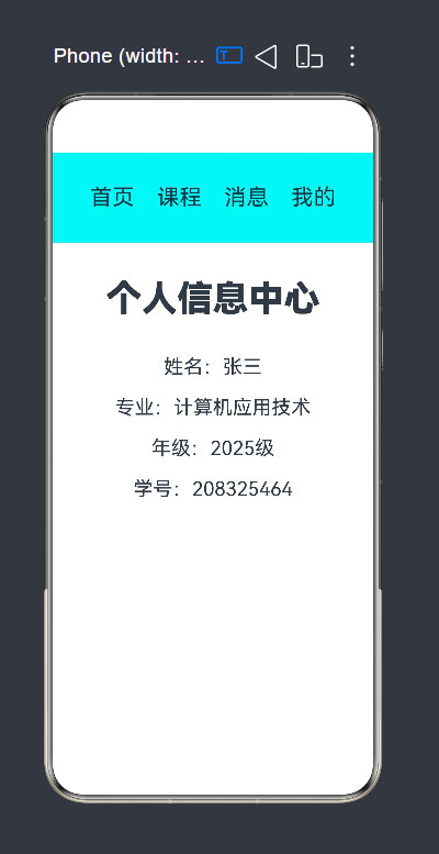
2.Row 水平布局
Row容器内子元素按照水平方向排列
子组件 从左至右依次排列 ,主轴为水平方向,交叉轴为垂直方向。
①常见属性
• space:设置子组件横向间距,替代手动margin
• justifyContent:主轴(水平)对齐,含居左/居中/居右/均分
• alignItems:交叉轴(垂直)对齐,含居顶/居中/居底/拉伸
• width/height:设置容器尺寸,铺满屏幕是布局基础
• backgroundColor:设置背景色,区分页面模块
②举例代码
@Entry
@Component
struct RowCol{
  build() {
   Column({space:30}){
     Row({space:25}){
       Text('首页').fontSize(25)
       Text('课程').fontSize(25)
       Text('消息').fontSize(25)
       Text('我的').fontSize(25)
     }
     .width('150%')
     .height('15%')
     .justifyContent(FlexAlign.Center)
     //.alignItems(VerticalAlign.Center)
     .backgroundColor(0X00F5F5)

     Text('个人信息中心')
       .fontSize(40)
       .fontWeight(FontWeight.Bolder)
       .margin(10)
     Column({space:20}) {
       Text('姓名:张三').fontSize(22)
       Text('专业:计算机应用技术').fontSize(22)
       Text('年级:2025级').fontSize(22)
       Text('学号:208325464').fontSize(22)
     }
     }
    .height('100%')
    .width('100%')
    .backgroundColor('0x00dada')
    .padding(20)
  }
}
运行效果如图:
3.Stack层叠布局
层叠布局(StackLayout)用于在屏幕上预留一块区域来显示组件中的元素,提供元素可以重叠的布局。
①常见属性
• alignContent:设置子组件层叠对齐方式,含左上/居中/右下等
• width/height:设置容器尺寸,铺满屏幕是布局基础
• backgroundColor:设置背景色,区分页面模块
• padding:设置容器内边距,控制子组件与边缘距离
• margin:设置容器外边距,控制与其他组件的距离
②举例代码
@Entry
@Component
struct StackBase {
  build() {
    Stack() {
      Text()
        .width(220)
        .height(220)
        .backgroundColor(Color.Grey)
        .borderRadius(30)

      Text('你好')
        .fontSize(40)
        .fontColor(Color.Red)
        .width(120)
        .height(120)
        .backgroundColor(Color.Blue)
        .borderRadius(30)
        .padding({left:15,right:0,top:0,bottom:0})
    }
    .width('100%')
    .height('100%')
  }
}
运行效果如图:
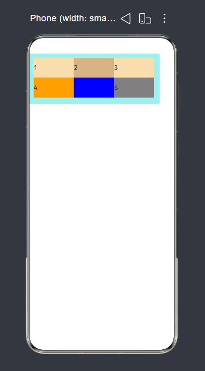
4.Flex弹性布局
弹性布局( Flex)提供更加有效的方式对容器中的子元素进行排列、对齐和分配剩余空间。
①常见属性
• direction:设置主轴方向,支持水平/垂直/反向排列
• justifyContent:主轴对齐,含居左/居中/居右/均分
• alignItems:交叉轴对齐,含顶/中/底/拉伸填充
• wrap:设置是否自动换行/列,适配多子组件场景
• width/height:设置容器尺寸,铺满屏幕是布局基础
• backgroundColor:设置背景色,区分页面模块
• padding:设置容器内边距,控制子组件与边缘距离
• margin:设置容器外边距,控制与其他组件的距离
②举例代码
@Entry
@Component
struct FlexDemo{
  build() {
    Flex({ direction:FlexDirection.Row,wrap:FlexWrap.Wrap}){
      Text('1').width('33%').height(50).backgroundColor('#F5DEB3')
      Text('2').width('33%').height(50).backgroundColor('#D2B48C')
      Text('3').width('33%').height(50).backgroundColor('#F5DEB3')
      Text('4').width('33%').height(50).backgroundColor(Color.Orange)
      Text('5').width('33%').height(50).backgroundColor(Color.Blue)
      Text('6').width('33%').height(50).backgroundColor(Color.Gray)
    }
    .height(125)
    .width('90%')
    .padding(10)
    .backgroundColor('#AFEEEE')
  }
}
运行效果如图:
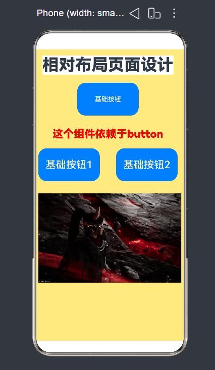
5.相对布局
RelativeContainer是一种采用相对布局的容器,支持容器内部的子元素设置相对位置关系,适用于处理界面复杂的场景,对多个子元素进行对齐和排列。
①常见属性
• 相对定位:子组件通过锚点,相对父容器或其他组件定位
• alignRules:设置子组件的对齐规则,实现上下左右相对关系
• width/height:设置容器尺寸,铺满屏幕是布局基础
• backgroundColor:设置背景色,区分页面模块
• padding:设置容器内边距,控制子组件与边缘距离
• margin:设置容器外边距,控制与其他组件的距离
②举例代码
@Entry
@Component
struct RelativeDemo{
  build() {
    RelativeContainer(){
      Text('相对布局页面设计')
        .fontSize(40)
        .fontWeight(FontWeight.Bolder)
        .id('title')
        .alignRules({
          top:{anchor:'__container__',align:VerticalAlign.Top},
          left:{anchor:'__container__','align':HorizontalAlign.Start}
        })
        .margin(15)
        .backgroundColor(Color.White)
      Button('基础按钮')
        .width(150)
        .height(80)
        .id('buttonid')
        .alignRules({
          top:{anchor:'title',align:VerticalAlign.Bottom},
          middle:{anchor:'title',align:HorizontalAlign.Center}
        })
        .margin(20)

      Text('这个组件依赖于button')
        .fontSize(26)
        .fontColor(Color.Red)
        .fontWeight(FontWeight.Bolder)
        .id('textid')
        .alignRules({
          top:{anchor:'buttonid',align:VerticalAlign.Bottom},
          middle:{anchor:'buttonid',align:HorizontalAlign.Center}
        })
        .margin({top:30})

      Button('基础按钮1')
        .width(150)
        .height(80)
        .fontSize(25)
        .id('buttonid1')
        .alignRules({
          top:{anchor:'textid',align:VerticalAlign.Bottom},
          right:{anchor:'textid',align:HorizontalAlign.Center}
        })
        .margin(20)

      Button('基础按钮2')
        .width(150)
        .height(80)
        .fontSize(25)
        .id('buttonid2')
        .alignRules({
          top:{anchor:'buttonid1',align:VerticalAlign.Top},
          left:{anchor:'buttonid1',align:HorizontalAlign.End}
        })
        .margin({left:40})

      Image($r('app.media.d'))
        .width('97%')
        .id('image1')
        .alignRules({
          top:{anchor:'buttonid1',align:VerticalAlign.Bottom},
          left:{anchor:'buttonid1',align:HorizontalAlign.Start}
        })
        .margin({top:30})
    }
    .width('100%')
    .height('100%')
    .backgroundColor('#80FFD700')
  }
}
运行效果如图:
6.轮播布局
Swiper组件提供滑动轮播显示的能力。Swiper本身是一个容器组件,当设置了多个子组件后,可以对这些子组件进行轮播显示。
①常见属性
• index:设置当前显示的轮播项索引
• loop:设置是否开启循环轮播
• autoPlay:设置是否自动播放轮播
• interval:设置自动轮播的切换间隔
• indicator:设置是否显示轮播指示器
• width/height:设置轮播容器尺寸,适配不同页面
• backgroundColor:设置轮播背景色,区分模块
②举例代码
@Entry
@Component
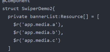
struct SwiperDemo2{
private bannerList:Resource[] = [
$r('app.media.a'),
$r('app.media.b'),
$r('app.media.c')
]
build() {
Column(){
Swiper(){
ForEach(this.bannerList,(Item:Resource)=>{
Image(Item)
.width('98%')
.height('100%')
.objectFit(ImageFit.Cover)
.borderRadius(20)
})
}
.width('100%')
.height('30%')
.autoPlay(true)
.interval(1000)
.loop(true)
}
}
}运行效果如图:
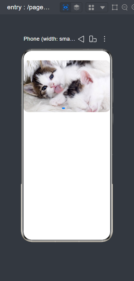
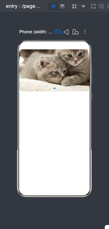
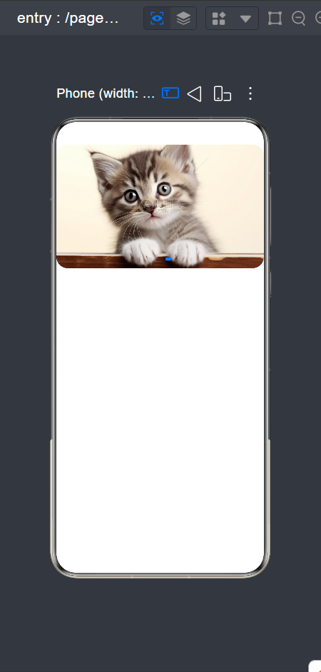
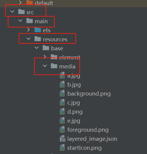
其中如图引用部分需在图二处添加图片文件
7.tabs标签页布局
①常见属性
• index:设置当前激活的标签页索引
• vertical:设置标签栏是否垂直排列
• barPosition:设置标签栏位置(顶部/底部/侧边)
• barWidth/barHeight:设置标签栏的尺寸
• animationDuration:设置页面切换动画时长
• width/height:设置Tabs容器尺寸,适配页面布局
• backgroundColor:设置背景色,区分不同模块
②举例代码
@Entry
@Component
struct TabBase1 {
  build() {
    Column() {
      Tabs() {
        TabContent() {
          Column() {
            Swiper() {
              Text('0')
                .backgroundColor(Color.Black)
                .fontSize(30)
              Text('1')
                .backgroundColor(Color.Blue)
                .fontSize(30)
              Text('2')
                .backgroundColor(Color.Brown)
                .fontSize(30)
              Text('3')
                .backgroundColor(Color.Green)
                .fontSize(30)
            }
            .width('100%')
            .height('30%')
            .autoPlay(true)
            .interval(2000)
            .loop(true)
          }
        }
        .tabBar("学校简介")

        TabContent() {
          Text('系部简介内容').fontSize(24)
        }
        .tabBar("系部简介")

        TabContent() {
          Text('班级介绍内容').fontSize(24)
        }
        .tabBar("班级介绍")

        TabContent() {
          Text('个人中心内容').fontSize(24)
        }
        .tabBar("个人中心")
      }
      .barPosition(BarPosition.Start)
    }
  }
}
运行效果如图:
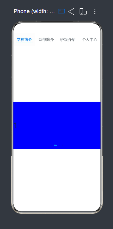
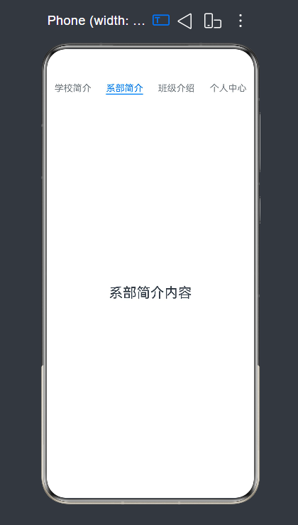
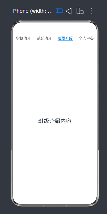
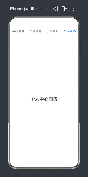
其中顶部标签点击后切换显示页面

AtomGit 是由开放原子开源基金会联合 CSDN 等生态伙伴共同推出的新一代开源与人工智能协作平台。平台坚持“开放、中立、公益”的理念,把代码托管、模型共享、数据集托管、智能体开发体验和算力服务整合在一起,为开发者提供从开发、训练到部署的一站式体验。
更多推荐
 7
7 0
0- 0


 已为社区贡献1条内容

所有评论(0)