鸿蒙PC Electron框架实战:UI组件开发与交互设计
·
欢迎加入开源鸿蒙PC社区:https://harmonypc.csdn.net/
atomgit仓库地址:https://atomgit.com/feng8403000/cms
一、引言
1.1 UI组件的重要性
在桌面应用开发中,UI组件是用户与应用交互的核心。一个优秀的组件系统应该具备:
- 可复用性:组件可以在应用的不同位置重复使用
- 可维护性:组件结构清晰,易于维护和扩展
- 一致性:视觉风格和交互行为保持一致
- 可访问性:支持键盘导航和屏幕阅读器
1.2 Electron中的UI开发
在Electron应用中开发UI组件需要考虑:
- 跨平台兼容性:在不同操作系统上保持一致的体验
- 性能优化:避免渲染性能问题
- 原生集成:与操作系统原生UI风格保持协调
1.3 本章概述
本章将详细介绍如何在鸿蒙PC Electron应用中开发UI组件,包括:
- 组件架构设计
- 核心组件实现
- 交互模式设计
- 响应式布局
- 动画效果实现
二、组件架构设计
2.1 组件分类
根据功能和复杂度,UI组件可以分为以下几类:
| 分类 | 描述 | 示例 |
|---|---|---|
| 基础组件 | 最基本的UI元素 | Button, Input, Label |
| 容器组件 | 用于组织和布局其他组件 | Card, Panel, Layout |
| 数据组件 | 用于展示和操作数据 | List, Table, Tree |
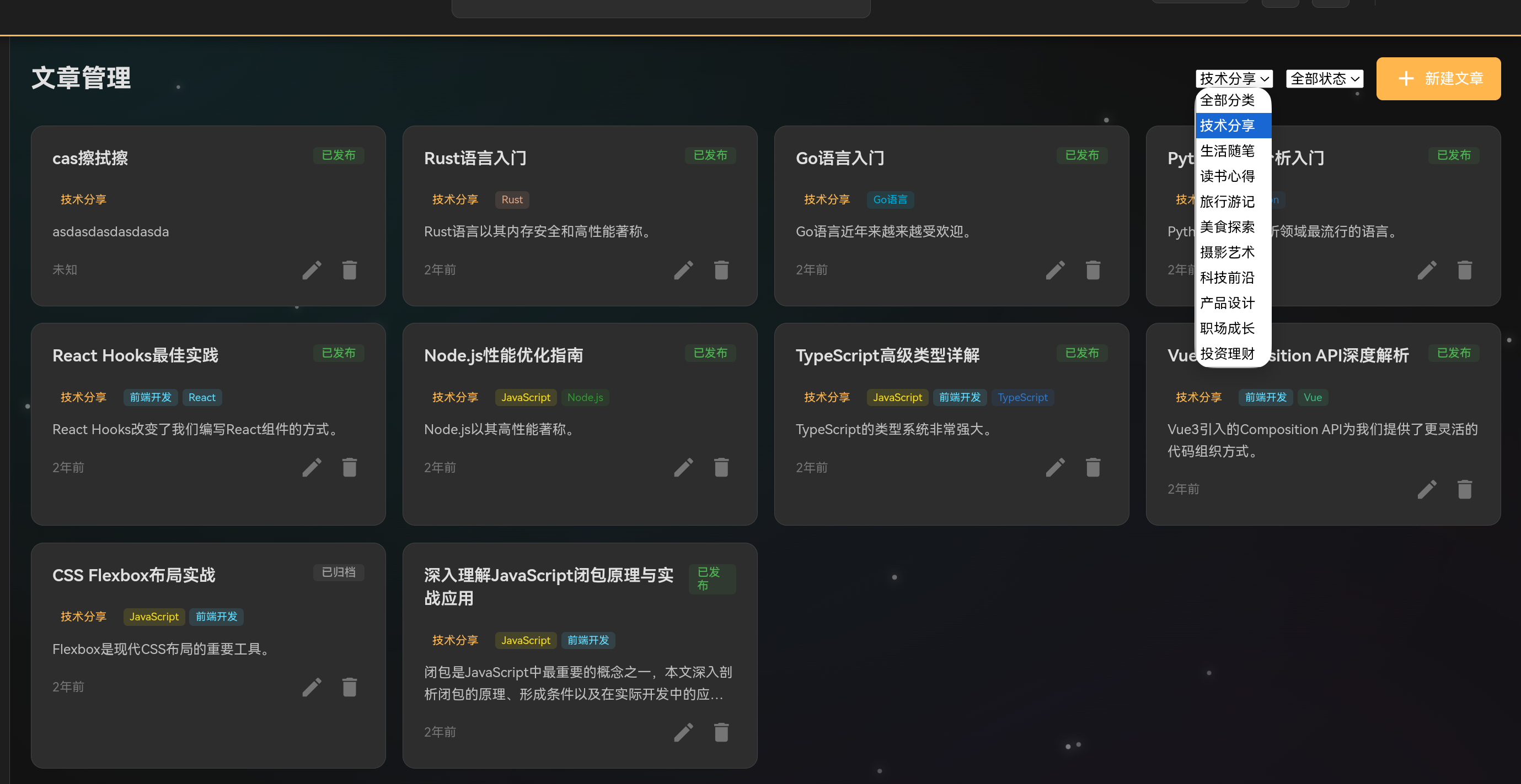
| 表单组件 | 用于用户输入和表单验证 | Form, Select, Checkbox |
| 反馈组件 | 用于向用户提供反馈 | Dialog, Toast, Progress |
| 导航组件 | 用于应用内导航 | Menu, Tab, Breadcrumb |
2.2 组件设计原则
// 组件基类
class UIComponent {
    constructor(options = {}) {
        this.element = null;
        this.options = {
            className: '',
            id: '',
            attributes: {},
            ...options
        };
        this.listeners = [];
    }

    render() {
        // 渲染组件
        throw new Error('render() must be implemented');
    }

    mount(parent) {
        // 挂载到DOM
        if (this.element && parent) {
            parent.appendChild(this.element);
        }
    }

    unmount() {
        // 从DOM移除
        if (this.element && this.element.parentNode) {
            this.element.parentNode.removeChild(this.element);
        }
        this.removeAllListeners();
    }

    on(event, callback) {
        // 添加事件监听
        if (this.element) {
            this.element.addEventListener(event, callback);
            this.listeners.push({ event, callback });
        }
    }

    off(event, callback) {
        // 移除事件监听
        if (this.element) {
            this.element.removeEventListener(event, callback);
            this.listeners = this.listeners.filter(
                l => !(l.event === event && l.callback === callback)
            );
        }
    }

    removeAllListeners() {
        // 移除所有事件监听
        this.listeners.forEach(({ event, callback }) => {
            if (this.element) {
                this.element.removeEventListener(event, callback);
            }
        });
        this.listeners = [];
    }

    setAttribute(name, value) {
        // 设置属性
        if (this.element) {
            this.element.setAttribute(name, value);
        }
    }

    getAttribute(name) {
        // 获取属性
        return this.element ? this.element.getAttribute(name) : null;
    }

    addClass(className) {
        // 添加CSS类
        if (this.element) {
            this.element.classList.add(className);
        }
    }

    removeClass(className) {
        // 移除CSS类
        if (this.element) {
            this.element.classList.remove(className);
        }
    }

    toggleClass(className, force) {
        // 切换CSS类
        if (this.element) {
            this.element.classList.toggle(className, force);
        }
    }
}
三、核心组件实现
3.1 Button组件
class Button extends UIComponent {
    constructor(options = {}) {
        super(options);
        this.type = options.type || 'default';
        this.size = options.size || 'normal';
        this.disabled = options.disabled || false;
        this.loading = options.loading || false;
        this.icon = options.icon || null;
        this.text = options.text || '';
        this.onClick = options.onClick || null;
    }

    render() {
        const button = document.createElement('button');

        // 设置基本属性
        button.type = 'button';
        button.className = this.getClassName();

        if (this.options.id) {
            button.id = this.options.id;
        }

        if (this.disabled) {
            button.disabled = true;
        }

        // 设置内部HTML
        button.innerHTML = this.getInnerHTML();

        // 添加点击事件
        if (this.onClick && !this.disabled) {
            button.addEventListener('click', this.onClick);
            this.listeners.push({ event: 'click', callback: this.onClick });
        }

        this.element = button;
        return this.element;
    }

    getClassName() {
        const classes = ['btn'];

        // 类型类
        classes.push(`btn-${this.type}`);

        // 大小类
        classes.push(`btn-${this.size}`);

        // 状态类
        if (this.disabled) {
            classes.push('btn-disabled');
        }

        if (this.loading) {
            classes.push('btn-loading');
        }

        // 自定义类
        if (this.options.className) {
            classes.push(this.options.className);
        }

        return classes.join(' ');
    }

    getInnerHTML() {
        let html = '';

        // 图标
        if (this.icon) {
            html += `<span class="btn-icon material-icons">${this.icon}</span>`;
        }

        // 文本
        if (this.text) {
            html += `<span class="btn-text">${this.text}</span>`;
        }

        // 加载状态
        if (this.loading) {
            html = '<span class="btn-spinner"></span>';
        }

        return html;
    }

    setText(text) {
        this.text = text;
        if (this.element) {
            const textElement = this.element.querySelector('.btn-text');
            if (textElement) {
                textElement.textContent = text;
            }
        }
    }

    setLoading(loading) {
        this.loading = loading;
        if (this.element) {
            if (loading) {
                this.element.classList.add('btn-loading');
                this.element.innerHTML = '<span class="btn-spinner"></span>';
            } else {
                this.element.classList.remove('btn-loading');
                this.element.innerHTML = this.getInnerHTML();
            }
        }
    }

    setDisabled(disabled) {
        this.disabled = disabled;
        if (this.element) {
            this.element.disabled = disabled;
            if (disabled) {
                this.element.classList.add('btn-disabled');
            } else {
                this.element.classList.remove('btn-disabled');
            }
        }
    }
}
/* Button组件样式 */
.btn {
    display: inline-flex;
    align-items: center;
    justify-content: center;
    gap: 8px;
    padding: 8px 16px;
    font-family: var(--font-family);
    font-size: 14px;
    font-weight: 500;
    border: none;
    border-radius: 8px;
    cursor: pointer;
    transition: all 0.25s ease;
    outline: none;
}

/* 默认按钮 */
.btn-default {
    background-color: var(--bg-card);
    color: var(--text-primary);
    border: 1px solid var(--border);
}

.btn-default:hover:not(:disabled) {
    background-color: var(--bg-hover);
    border-color: var(--border-light);
}

/* 主要按钮 */
.btn-primary {
    background-color: var(--primary);
    color: var(--bg-paper);
}

.btn-primary:hover:not(:disabled) {
    background-color: var(--primary-light);
}

/* 成功按钮 */
.btn-success {
    background-color: var(--success);
    color: white;
}

.btn-success:hover:not(:disabled) {
    background-color: #43a047;
}

/* 警告按钮 */
.btn-warning {
    background-color: var(--warning);
    color: white;
}

.btn-warning:hover:not(:disabled) {
    background-color: #fb8c00;
}

/* 危险按钮 */
.btn-danger {
    background-color: var(--error);
    color: white;
}

.btn-danger:hover:not(:disabled) {
    background-color: #e53935;
}

/* 按钮大小 */
.btn-sm {
    padding: 4px 12px;
    font-size: 12px;
}

.btn-normal {
    padding: 8px 16px;
    font-size: 14px;
}

.btn-lg {
    padding: 12px 24px;
    font-size: 16px;
}

/* 禁用状态 */
.btn-disabled {
    opacity: 0.5;
    cursor: not-allowed;
}

/* 加载状态 */
.btn-loading {
    pointer-events: none;
}

.btn-spinner {
    width: 16px;
    height: 16px;
    border: 2px solid rgba(255, 255, 255, 0.3);
    border-top-color: white;
    border-radius: 50%;
    animation: spin 0.8s linear infinite;
}

@keyframes spin {
    to { transform: rotate(360deg); }
}
3.2 Card组件
class Card extends UIComponent {
    constructor(options = {}) {
        super(options);
        this.header = options.header || null;
        this.footer = options.footer || null;
        this.content = options.content || null;
        this.hoverable = options.hoverable || false;
        this.clickable = options.clickable || false;
        this.onClick = options.onClick || null;
    }

    render() {
        const card = document.createElement('div');
        card.className = this.getClassName();

        if (this.options.id) {
            card.id = this.options.id;
        }

        // 头部
        if (this.header) {
            const header = document.createElement('div');
            header.className = 'card-header';
            header.innerHTML = this.header;
            card.appendChild(header);
        }

        // 内容区
        const content = document.createElement('div');
        content.className = 'card-content';

        if (this.content) {
            if (typeof this.content === 'string') {
                content.innerHTML = this.content;
            } else {
                content.appendChild(this.content);
            }
        }

        card.appendChild(content);

        // 底部
        if (this.footer) {
            const footer = document.createElement('div');
            footer.className = 'card-footer';
            footer.innerHTML = this.footer;
            card.appendChild(footer);
        }

        // 点击事件
        if (this.clickable && this.onClick) {
            card.style.cursor = 'pointer';
            card.addEventListener('click', this.onClick);
            this.listeners.push({ event: 'click', callback: this.onClick });
        }

        this.element = card;
        return this.element;
    }

    getClassName() {
        const classes = ['card'];

        if (this.hoverable) {
            classes.push('card-hoverable');
        }

        if (this.clickable) {
            classes.push('card-clickable');
        }

        if (this.options.className) {
            classes.push(this.options.className);
        }

        return classes.join(' ');
    }

    setContent(content) {
        this.content = content;
        if (this.element) {
            const contentElement = this.element.querySelector('.card-content');
            if (contentElement) {
                if (typeof content === 'string') {
                    contentElement.innerHTML = content;
                } else {
                    contentElement.innerHTML = '';
                    contentElement.appendChild(content);
                }
            }
        }
    }

    setHeader(header) {
        this.header = header;
        if (this.element) {
            const headerElement = this.element.querySelector('.card-header');
            if (headerElement) {
                headerElement.innerHTML = header;
            }
        }
    }

    setFooter(footer) {
        this.footer = footer;
        if (this.element) {
            const footerElement = this.element.querySelector('.card-footer');
            if (footerElement) {
                footerElement.innerHTML = footer;
            }
        }
    }
}
/* Card组件样式 */
.card {
    background-color: var(--bg-card);
    border: 1px solid var(--border);
    border-radius: 12px;
    overflow: hidden;
    transition: all 0.25s ease;
}

.card-header {
    display: flex;
    align-items: center;
    justify-content: space-between;
    padding: 16px;
    border-bottom: 1px solid var(--border);
    background-color: var(--bg-panel);
}

.card-content {
    padding: 16px;
}

.card-footer {
    padding: 12px 16px;
    border-top: 1px solid var(--border);
    background-color: var(--bg-panel);
}

.card-hoverable:hover {
    box-shadow: var(--shadow-lg);
    transform: translateY(-2px);
}

.card-clickable {
    cursor: pointer;
}

.card-clickable:hover {
    border-color: var(--primary);
}
3.3 Input组件
class Input extends UIComponent {
    constructor(options = {}) {
        super(options);
        this.type = options.type || 'text';
        this.placeholder = options.placeholder || '';
        this.value = options.value || '';
        this.label = options.label || null;
        this.required = options.required || false;
        this.disabled = options.disabled || false;
        this.error = options.error || null;
        this.icon = options.icon || null;
        this.onChange = options.onChange || null;
        this.onFocus = options.onFocus || null;
        this.onBlur = options.onBlur || null;
    }

    render() {
        const container = document.createElement('div');
        container.className = 'input-wrapper';

        if (this.options.id) {
            container.id = this.options.id;
        }

        // 标签
        if (this.label) {
            const label = document.createElement('label');
            label.className = 'input-label';
            label.textContent = this.label;

            if (this.required) {
                const requiredMark = document.createElement('span');
                requiredMark.className = 'required-mark';
                requiredMark.textContent = '*';
                label.appendChild(requiredMark);
            }

            container.appendChild(label);
        }

        // 输入框容器
        const inputContainer = document.createElement('div');
        inputContainer.className = 'input-container';

        // 前置图标
        if (this.icon) {
            const icon = document.createElement('span');
            icon.className = 'input-icon material-icons';
            icon.textContent = this.icon;
            inputContainer.appendChild(icon);
        }

        // 输入框
        const input = document.createElement('input');
        input.type = this.type;
        input.className = 'input-field';
        input.placeholder = this.placeholder;
        input.value = this.value;

        if (this.required) {
            input.required = true;
        }

        if (this.disabled) {
            input.disabled = true;
        }

        inputContainer.appendChild(input);

        container.appendChild(inputContainer);

        // 错误提示
        if (this.error) {
            const errorElement = document.createElement('span');
            errorElement.className = 'input-error';
            errorElement.textContent = this.error;
            container.appendChild(errorElement);
        }

        // 添加事件监听
        if (this.onChange) {
            input.addEventListener('input', this.onChange);
            this.listeners.push({ event: 'input', callback: this.onChange });
        }

        if (this.onFocus) {
            input.addEventListener('focus', this.onFocus);
            this.listeners.push({ event: 'focus', callback: this.onFocus });
        }

        if (this.onBlur) {
            input.addEventListener('blur', this.onBlur);
            this.listeners.push({ event: 'blur', callback: this.onBlur });
        }

        this.element = container;
        this.inputElement = input;
        return this.element;
    }

    getValue() {
        return this.inputElement ? this.inputElement.value : '';
    }

    setValue(value) {
        this.value = value;
        if (this.inputElement) {
            this.inputElement.value = value;
        }
    }

    setError(error) {
        this.error = error;
        if (this.element) {
            let errorElement = this.element.querySelector('.input-error');

            if (error) {
                if (!errorElement) {
                    errorElement = document.createElement('span');
                    errorElement.className = 'input-error';
                    this.element.appendChild(errorElement);
                }
                errorElement.textContent = error;
                this.element.classList.add('has-error');
            } else {
                if (errorElement) {
                    errorElement.remove();
                }
                this.element.classList.remove('has-error');
            }
        }
    }

    focus() {
        if (this.inputElement) {
            this.inputElement.focus();
        }
    }

    blur() {
        if (this.inputElement) {
            this.inputElement.blur();
        }
    }
}
/* Input组件样式 */
.input-wrapper {
    display: flex;
    flex-direction: column;
    gap: 4px;
}

.input-label {
    font-size: 13px;
    font-weight: 500;
    color: var(--text-primary);
    display: flex;
    align-items: center;
    gap: 4px;
}

.required-mark {
    color: var(--error);
}

.input-container {
    position: relative;
    display: flex;
    align-items: center;
}

.input-icon {
    position: absolute;
    left: 12px;
    color: var(--text-muted);
    font-size: 18px;
}

.input-field {
    width: 100%;
    padding: 10px 12px;
    padding-left: 40px;
    font-family: var(--font-family);
    font-size: 14px;
    color: var(--text-primary);
    background-color: var(--bg-panel);
    border: 1px solid var(--border);
    border-radius: 8px;
    outline: none;
    transition: all 0.2s ease;
}

.input-field:focus {
    border-color: var(--primary);
    box-shadow: 0 0 0 3px rgba(0, 217, 255, 0.1);
}

.input-field::placeholder {
    color: var(--text-muted);
}

.input-field:disabled {
    opacity: 0.5;
    cursor: not-allowed;
}

.input-error {
    font-size: 12px;
    color: var(--error);
}

.has-error .input-field {
    border-color: var(--error);
}
四、交互模式设计
4.1 对话框组件
class Dialog extends UIComponent {
    constructor(options = {}) {
        super(options);
        this.title = options.title || '';
        this.content = options.content || '';
        this.buttons = options.buttons || [];
        this.modal = options.modal || true;
        this.draggable = options.draggable || true;
        this.closable = options.closable || true;
        this.width = options.width || 400;
        this.onClose = options.onClose || null;
        this.onButtonClick = options.onButtonClick || null;
    }

    render() {
        // 创建遮罩层
        const overlay = document.createElement('div');
        overlay.className = 'modal-overlay';
        overlay.style.display = 'none';

        // 创建对话框
        const dialog = document.createElement('div');
        dialog.className = 'modal-dialog';
        dialog.style.width = `${this.width}px`;

        if (this.options.id) {
            dialog.id = this.options.id;
        }

        // 头部
        const header = document.createElement('div');
        header.className = 'modal-header';

        if (this.title) {
            const title = document.createElement('h3');
            title.className = 'modal-title';
            title.textContent = this.title;
            header.appendChild(title);
        }

        // 关闭按钮
        if (this.closable) {
            const closeBtn = document.createElement('button');
            closeBtn.className = 'modal-close-btn';
            closeBtn.innerHTML = '<span class="material-icons">close</span>';
            closeBtn.addEventListener('click', () => this.close());
            header.appendChild(closeBtn);
        }

        dialog.appendChild(header);

        // 内容区
        const content = document.createElement('div');
        content.className = 'modal-content';

        if (typeof this.content === 'string') {
            content.innerHTML = this.content;
        } else {
            content.appendChild(this.content);
        }

        dialog.appendChild(content);

        // 按钮区
        if (this.buttons.length > 0) {
            const footer = document.createElement('div');
            footer.className = 'modal-footer';

            this.buttons.forEach((btn, index) => {
                const button = document.createElement('button');
                button.className = `btn btn-${btn.type || 'default'}`;
                button.textContent = btn.text;

                if (btn.key) {
                    button.dataset.key = btn.key;
                }

                button.addEventListener('click', () => {
                    if (this.onButtonClick) {
                        this.onButtonClick(btn, index);
                    }

                    if (btn.close !== false) {
                        this.close();
                    }
                });

                footer.appendChild(button);
            });

            dialog.appendChild(footer);
        }

        overlay.appendChild(dialog);

        // 点击遮罩关闭
        if (this.modal) {
            overlay.addEventListener('click', (e) => {
                if (e.target === overlay) {
                    this.close();
                }
            });
        }

        this.element = overlay;
        this.dialog = dialog;

        return this.element;
    }

    open() {
        if (this.element) {
            this.element.style.display = 'flex';
            document.body.style.overflow = 'hidden';
        }
    }

    close() {
        if (this.element) {
            this.element.style.display = 'none';
            document.body.style.overflow = '';

            if (this.onClose) {
                this.onClose();
            }
        }
    }

    setContent(content) {
        this.content = content;
        if (this.dialog) {
            const contentElement = this.dialog.querySelector('.modal-content');
            if (contentElement) {
                if (typeof content === 'string') {
                    contentElement.innerHTML = content;
                } else {
                    contentElement.innerHTML = '';
                    contentElement.appendChild(content);
                }
            }
        }
    }
}
/* Dialog组件样式 */
.modal-overlay {
    position: fixed;
    top: 0;
    left: 0;
    right: 0;
    bottom: 0;
    background-color: rgba(0, 0, 0, 0.5);
    display: flex;
    align-items: center;
    justify-content: center;
    z-index: 1000;
    backdrop-filter: blur(4px);
}

.modal-dialog {
    background-color: var(--bg-card);
    border: 1px solid var(--border);
    border-radius: 12px;
    box-shadow: var(--shadow-lg);
    overflow: hidden;
    animation: modalIn 0.25s ease;
}

@keyframes modalIn {
    from {
        opacity: 0;
        transform: scale(0.95) translateY(-20px);
    }
    to {
        opacity: 1;
        transform: scale(1) translateY(0);
    }
}

.modal-header {
    display: flex;
    align-items: center;
    justify-content: space-between;
    padding: 16px;
    border-bottom: 1px solid var(--border);
    background-color: var(--bg-panel);
}

.modal-title {
    font-size: 16px;
    font-weight: 600;
    color: var(--text-primary);
    margin: 0;
}

.modal-close-btn {
    background: none;
    border: none;
    color: var(--text-secondary);
    cursor: pointer;
    padding: 4px;
    border-radius: 4px;
    transition: background-color 0.2s ease;
}

.modal-close-btn:hover {
    background-color: var(--bg-hover);
}

.modal-content {
    padding: 20px;
    max-height: 400px;
    overflow-y: auto;
}

.modal-footer {
    display: flex;
    justify-content: flex-end;
    gap: 8px;
    padding: 16px;
    border-top: 1px solid var(--border);
    background-color: var(--bg-panel);
}
4.2 Toast组件
class Toast extends UIComponent {
    constructor(options = {}) {
        super(options);
        this.type = options.type || 'info';
        this.message = options.message || '';
        this.duration = options.duration || 3000;
        this.position = options.position || 'bottom-right';
        this.onClose = options.onClose || null;
    }

    render() {
        const toast = document.createElement('div');
        toast.className = this.getClassName();

        if (this.options.id) {
            toast.id = this.options.id;
        }

        // 图标
        const icon = document.createElement('span');
        icon.className = `toast-icon material-icons ${this.type}`;
        icon.textContent = this.getIcon();
        toast.appendChild(icon);

        // 消息内容
        const message = document.createElement('span');
        message.className = 'toast-message';
        message.textContent = this.message;
        toast.appendChild(message);

        // 关闭按钮
        const closeBtn = document.createElement('button');
        closeBtn.className = 'toast-close-btn';
        closeBtn.innerHTML = '<span class="material-icons">close</span>';
        closeBtn.addEventListener('click', () => this.hide());
        toast.appendChild(closeBtn);

        this.element = toast;
        return this.element;
    }

    getClassName() {
        const classes = ['toast', `toast-${this.type}`, `toast-${this.position}`];

        if (this.options.className) {
            classes.push(this.options.className);
        }

        return classes.join(' ');
    }

    getIcon() {
        switch (this.type) {
            case 'success':
                return 'check_circle';
            case 'error':
                return 'error';
            case 'warning':
                return 'warning';
            case 'info':
            default:
                return 'info';
        }
    }

    show() {
        if (this.element) {
            document.body.appendChild(this.element);
            this.element.classList.add('toast-show');

            if (this.duration > 0) {
                setTimeout(() => {
                    this.hide();
                }, this.duration);
            }
        }
    }

    hide() {
        if (this.element) {
            this.element.classList.remove('toast-show');

            setTimeout(() => {
                if (this.element && this.element.parentNode) {
                    this.element.parentNode.removeChild(this.element);
                }

                if (this.onClose) {
                    this.onClose();
                }
            }, 300);
        }
    }

    static show(options) {
        const toast = new Toast(options);
        toast.render();
        toast.show();
        return toast;
    }
}
/* Toast组件样式 */
.toast {
    position: fixed;
    display: flex;
    align-items: center;
    gap: 12px;
    padding: 12px 16px;
    background-color: var(--bg-card);
    border: 1px solid var(--border);
    border-radius: 8px;
    box-shadow: var(--shadow);
    z-index: 1001;
    opacity: 0;
    transform: translateX(100%);
    transition: all 0.3s ease;
}

.toast-show {
    opacity: 1;
    transform: translateX(0);
}

/* 位置 */
.toast-bottom-right {
    right: 20px;
    bottom: 20px;
}

.toast-bottom-left {
    left: 20px;
    bottom: 20px;
}

.toast-top-right {
    right: 20px;
    top: 20px;
}

.toast-top-left {
    left: 20px;
    top: 20px;
}

.toast-top-center {
    top: 20px;
    left: 50%;
    transform: translateX(-50%);
}

.toast-bottom-center {
    bottom: 20px;
    left: 50%;
    transform: translateX(-50%);
}

/* 类型 */
.toast-info {
    border-left: 4px solid var(--info);
}

.toast-success {
    border-left: 4px solid var(--success);
}

.toast-warning {
    border-left: 4px solid var(--warning);
}

.toast-error {
    border-left: 4px solid var(--error);
}

.toast-icon {
    font-size: 20px;
}

.toast-icon.info {
    color: var(--info);
}

.toast-icon.success {
    color: var(--success);
}

.toast-icon.warning {
    color: var(--warning);
}

.toast-icon.error {
    color: var(--error);
}

.toast-message {
    font-size: 14px;
    color: var(--text-primary);
    flex: 1;
}

.toast-close-btn {
    background: none;
    border: none;
    color: var(--text-secondary);
    cursor: pointer;
    padding: 2px;
    border-radius: 4px;
    transition: background-color 0.2s ease;
}

.toast-close-btn:hover {
    background-color: var(--bg-hover);
}
五、响应式布局
5.1 栅格系统
/* 响应式栅格系统 */
.grid-container {
    display: grid;
    gap: 16px;
}

/* 默认布局 - 桌面端 */
.grid-1 { grid-template-columns: repeat(1, 1fr); }
.grid-2 { grid-template-columns: repeat(2, 1fr); }
.grid-3 { grid-template-columns: repeat(3, 1fr); }
.grid-4 { grid-template-columns: repeat(4, 1fr); }
.grid-5 { grid-template-columns: repeat(5, 1fr); }
.grid-6 { grid-template-columns: repeat(6, 1fr); }

/* 平板端 */
@media (max-width: 1024px) {
    .grid-3 { grid-template-columns: repeat(2, 1fr); }
    .grid-4 { grid-template-columns: repeat(2, 1fr); }
    .grid-5 { grid-template-columns: repeat(3, 1fr); }
    .grid-6 { grid-template-columns: repeat(3, 1fr); }
}

/* 移动端 */
@media (max-width: 768px) {
    .grid-2 { grid-template-columns: repeat(1, 1fr); }
    .grid-3 { grid-template-columns: repeat(1, 1fr); }
    .grid-4 { grid-template-columns: repeat(1, 1fr); }
    .grid-5 { grid-template-columns: repeat(1, 1fr); }
    .grid-6 { grid-template-columns: repeat(1, 1fr); }
}

/* 响应式列偏移 */
.grid-offset-1 { margin-left: calc(100% / 12); }
.grid-offset-2 { margin-left: calc(200% / 12); }
.grid-offset-3 { margin-left: calc(300% / 12); }
5.2 弹性布局组件
class FlexLayout extends UIComponent {
    constructor(options = {}) {
        super(options);
        this.direction = options.direction || 'row';
        this.justifyContent = options.justifyContent || 'flex-start';
        this.alignItems = options.alignItems || 'stretch';
        this.wrap = options.wrap || false;
        this.gap = options.gap || 0;
        this.children = options.children || [];
    }

    render() {
        const container = document.createElement('div');
        container.className = this.getClassName();

        if (this.options.id) {
            container.id = this.options.id;
        }

        // 设置样式
        container.style.flexDirection = this.direction;
        container.style.justifyContent = this.justifyContent;
        container.style.alignItems = this.alignItems;
        container.style.flexWrap = this.wrap ? 'wrap' : 'nowrap';
        container.style.gap = `${this.gap}px`;

        // 添加子元素
        this.children.forEach(child => {
            if (child instanceof UIComponent) {
                child.render();
                container.appendChild(child.element);
            } else if (typeof child === 'string') {
                const textNode = document.createTextNode(child);
                container.appendChild(textNode);
            } else if (child instanceof HTMLElement) {
                container.appendChild(child);
            }
        });

        this.element = container;
        return this.element;
    }

    getClassName() {
        const classes = ['flex-layout'];

        if (this.options.className) {
            classes.push(this.options.className);
        }

        return classes.join(' ');
    }

    addChild(child) {
        this.children.push(child);

        if (this.element) {
            if (child instanceof UIComponent) {
                child.render();
                this.element.appendChild(child.element);
            } else if (typeof child === 'string') {
                const textNode = document.createTextNode(child);
                this.element.appendChild(textNode);
            } else if (child instanceof HTMLElement) {
                this.element.appendChild(child);
            }
        }
    }

    removeChild(child) {
        const index = this.children.indexOf(child);

        if (index !== -1) {
            this.children.splice(index, 1);

            if (this.element && child instanceof UIComponent && child.element) {
                this.element.removeChild(child.element);
            }
        }
    }
}
六、动画效果实现
6.1 CSS动画库
/* 动画类 */
.animate-fade-in {
    animation: fadeIn 0.3s ease forwards;
}

@keyframes fadeIn {
    from { opacity: 0; }
    to { opacity: 1; }
}

.animate-slide-in-right {
    animation: slideInRight 0.3s ease forwards;
}

@keyframes slideInRight {
    from {
        opacity: 0;
        transform: translateX(20px);
    }
    to {
        opacity: 1;
        transform: translateX(0);
    }
}

.animate-slide-in-left {
    animation: slideInLeft 0.3s ease forwards;
}

@keyframes slideInLeft {
    from {
        opacity: 0;
        transform: translateX(-20px);
    }
    to {
        opacity: 1;
        transform: translateX(0);
    }
}

.animate-slide-in-up {
    animation: slideInUp 0.3s ease forwards;
}

@keyframes slideInUp {
    from {
        opacity: 0;
        transform: translateY(20px);
    }
    to {
        opacity: 1;
        transform: translateY(0);
    }
}

.animate-scale-in {
    animation: scaleIn 0.25s ease forwards;
}

@keyframes scaleIn {
    from {
        opacity: 0;
        transform: scale(0.95);
    }
    to {
        opacity: 1;
        transform: scale(1);
    }
}

.animate-bounce {
    animation: bounce 0.5s ease;
}

@keyframes bounce {
    0%, 100% {
        transform: translateY(0);
    }
    50% {
        transform: translateY(-10px);
    }
}

.animate-pulse {
    animation: pulse 2s ease-in-out infinite;
}

@keyframes pulse {
    0%, 100% {
        opacity: 1;
    }
    50% {
        opacity: 0.7;
    }
}

/* 过渡动画 */
.transition-fast {
    transition: all 0.15s ease;
}

.transition-normal {
    transition: all 0.25s ease;
}

.transition-slow {
    transition: all 0.35s ease;
}
6.2 交互动画
class AnimationManager {
    constructor() {
        this.animations = [];
    }

    animate(element, animationClass, options = {}) {
        const {
            delay = 0,
            duration = 300,
            onComplete = null
        } = options;

        return new Promise((resolve) => {
            setTimeout(() => {
                element.classList.add(animationClass);

                setTimeout(() => {
                    element.classList.remove(animationClass);

                    if (onComplete) {
                        onComplete();
                    }

                    resolve();
                }, duration);
            }, delay);
        });
    }

    fadeIn(element, options = {}) {
        return this.animate(element, 'animate-fade-in', options);
    }

    slideInRight(element, options = {}) {
        return this.animate(element, 'animate-slide-in-right', options);
    }

    slideInLeft(element, options = {}) {
        return this.animate(element, 'animate-slide-in-left', options);
    }

    slideInUp(element, options = {}) {
        return this.animate(element, 'animate-slide-in-up', options);
    }

    scaleIn(element, options = {}) {
        return this.animate(element, 'animate-scale-in', options);
    }

    bounce(element, options = {}) {
        return this.animate(element, 'animate-bounce', { ...options, duration: 500 });
    }

    pulse(element, options = {}) {
        const { duration = 2000, iterations = Infinity } = options;

        element.classList.add('animate-pulse');

        if (iterations !== Infinity) {
            setTimeout(() => {
                element.classList.remove('animate-pulse');
            }, duration * iterations);
        }

        return {
            stop: () => {
                element.classList.remove('animate-pulse');
            }
        };
    }

    parallax(element, options = {}) {
        const { speed = 0.5 } = options;

        const handleScroll = () => {
            const scrollTop = window.scrollY;
            element.style.transform = `translateY(${scrollTop * speed}px)`;
        };

        window.addEventListener('scroll', handleScroll);

        return {
            stop: () => {
                window.removeEventListener('scroll', handleScroll);
            }
        };
    }

    stagger(elements, animationClass, options = {}) {
        const { delay = 50 } = options;

        return Promise.all(
            elements.map((element, index) =>
                this.animate(element, animationClass, { delay: index * delay })
            )
        );
    }
}
七、总结与展望
7.1 功能回顾
本章详细介绍了UI组件开发与交互设计的实现,包括:
- 组件架构:组件基类设计和组件分类
- 核心组件:Button、Card、Input、Dialog、Toast等组件
- 交互模式:对话框、提示框等交互组件
- 响应式布局:栅格系统和弹性布局
- 动画效果:CSS动画和JavaScript动画管理
7.2 技术亮点
- 组件化设计:模块化、可复用的组件系统
- 统一风格:使用CSS变量实现主题一致性
- 交互反馈:完善的用户交互反馈机制
- 响应式设计:适配不同屏幕尺寸
- 动画效果:丰富的动画提升用户体验
7.3 未来扩展
未来可以考虑添加以下功能:
- 组件库:更丰富的组件集合
- 拖拽功能:支持组件拖拽排序
- 虚拟滚动:优化大数据列表渲染
- 无障碍支持:增强可访问性
- 国际化支持:多语言组件

AtomGit 是由开放原子开源基金会联合 CSDN 等生态伙伴共同推出的新一代开源与人工智能协作平台。平台坚持“开放、中立、公益”的理念,把代码托管、模型共享、数据集托管、智能体开发体验和算力服务整合在一起,为开发者提供从开发、训练到部署的一站式体验。
更多推荐
 2
2 0
0- 0


 已为社区贡献72条内容

所有评论(0)