深度测评|矩池云上线Image-2:开启AI图像“推理时代”(附教程)
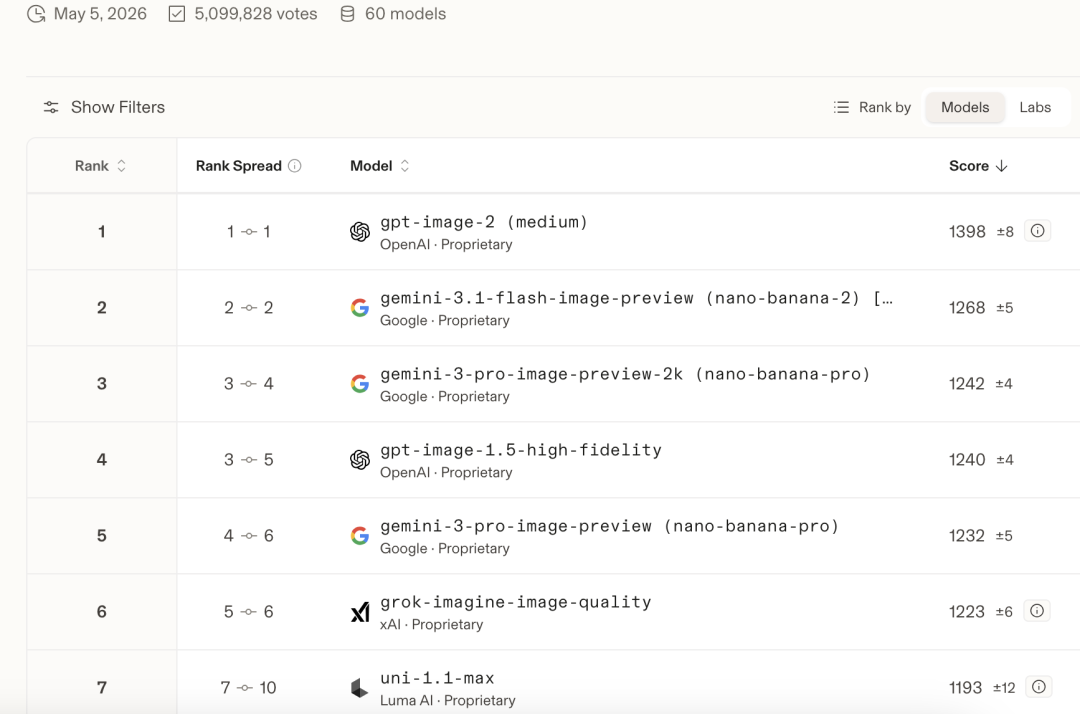
在最新的测评中,GPT-Image-2以“降维打击”的姿态空降全球权威评测榜单Arena的榜首。在文生图(Text-to-Image)赛道中,它取得了1398分的惊人成绩,将曾经的王者谷歌Nano Banana 2(1268分)远远甩在身后。
01 Image-2:不止于画图,更会“思考”
GPT-Image-2并非一次简单的版本迭代,而是从底层架构开始的彻底重构。它摒弃了传统的扩散模型,转而采用与GPT-4o同源的自回归生成架构。
简单来说,过去的AI画图像是在一团噪点中“猜测”并“擦除”出图像,而GPT-Image-2则像一位真正的创作者,将图像视为一系列“视觉词元(Token)”,像写文章一样,一个词元接一个词元地“写”出图像。这种根本性的改变,带来了三大核心优势:
精准的文字渲染:告别“AI鬼画符”。GPT-Image-2对中文、日文、韩文等非拉丁文字的渲染准确率高达99%。无论是复杂的书法真迹、信息密集的商业海报,还是App界面原型,其中的文字都能清晰、准确地呈现,达到商业级可用标准。
强大的逻辑推理:它不仅能画,更能“理解”。模型能够精准处理复杂的空间关系和逻辑结构,生成像素级还原的UI截图、结构严谨的工程蓝图、数据准确的信息图表,真正做到了“画得对”,而不仅仅是“画得像”。
卓越的上下文理解: 依托原生多模态架构,GPT-Image-2在单次生成中能保持角色、风格、物体的高度一致性,这使得制作漫画分镜、系列海报、IP形象三视图等工作流变得前所未有的顺畅。
效果预览:
(商业海报效果图)
(信息图表效果图)
(电影分镜效果图)
(UI界面效果图)
02 快速上手,即刻开画
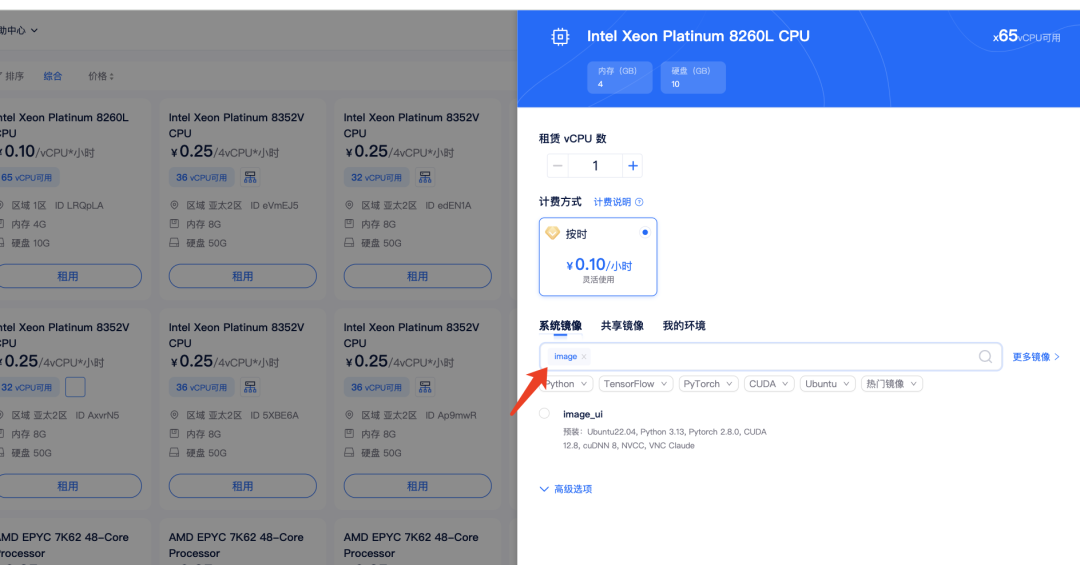
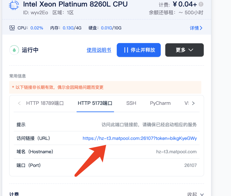
1. 租赁机器:在矩池云算力市场选择CPU,搜索镜像“image-ui”。
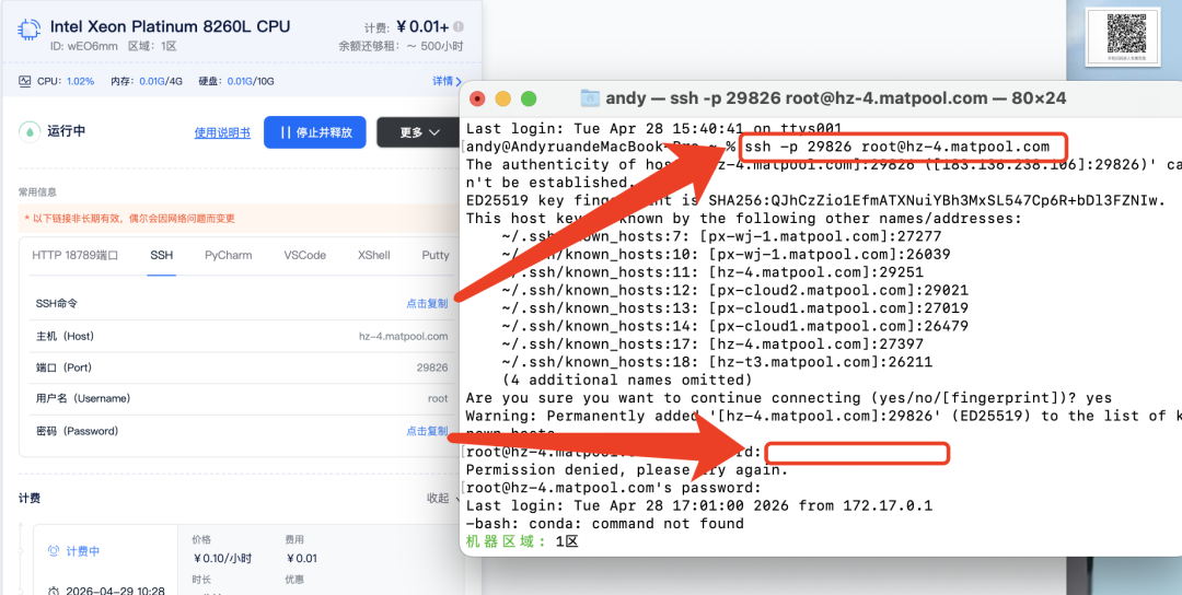
2.启动镜像:终端输入SSH及密码
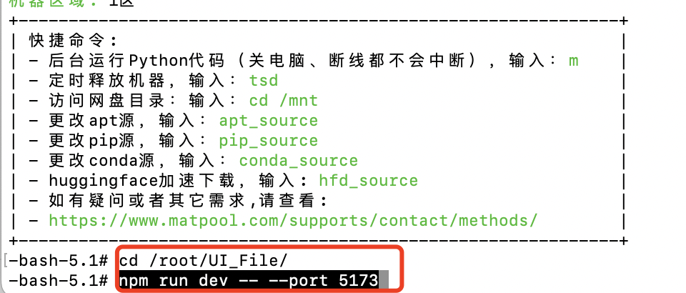
3.输入命令:
cd /root/UI_File/
npm run dev -- --port 5173
4.访问5173端口
5. 进入生图窗口,填写模型API key
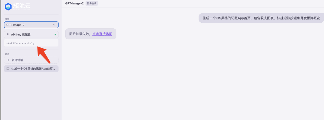
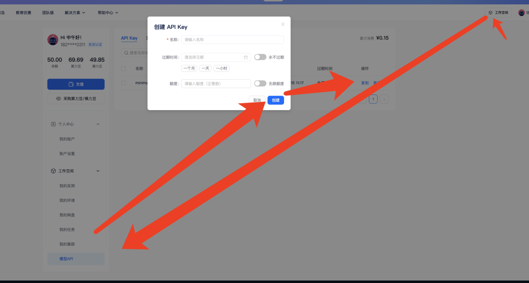
模型API Key获取方式:
6.开始体验GPT-Image2的生图吧
效果图:
另矩池云支持十几款前沿生图模型,可以随意切换
03 Image-2 vs Nano Banana
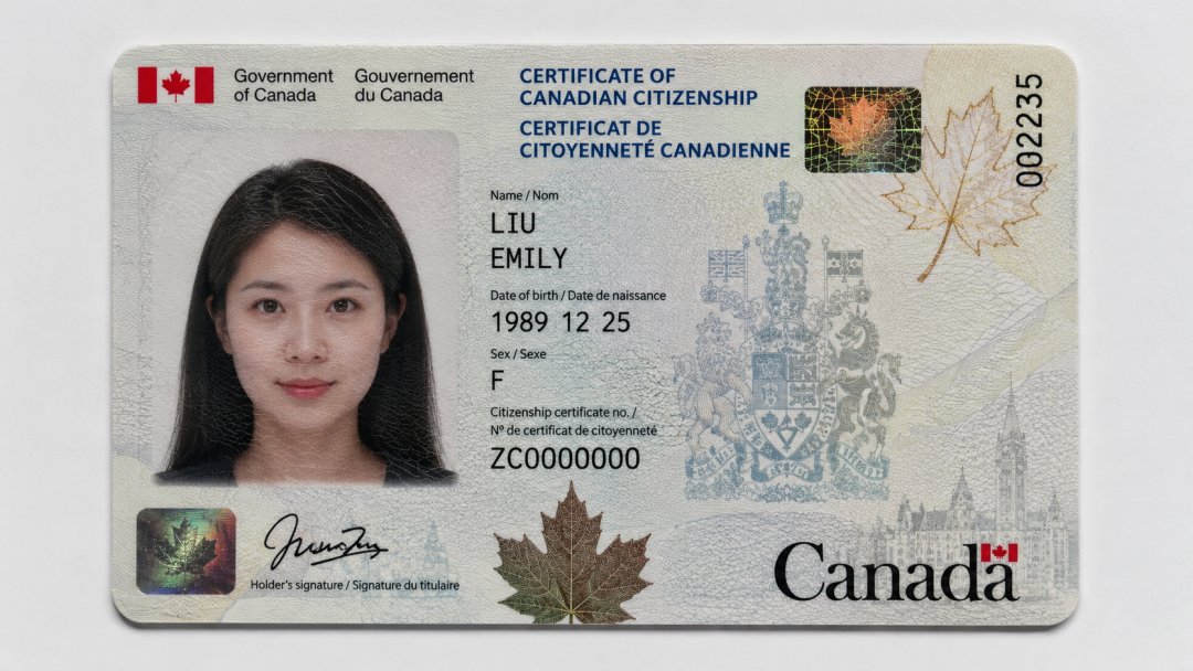
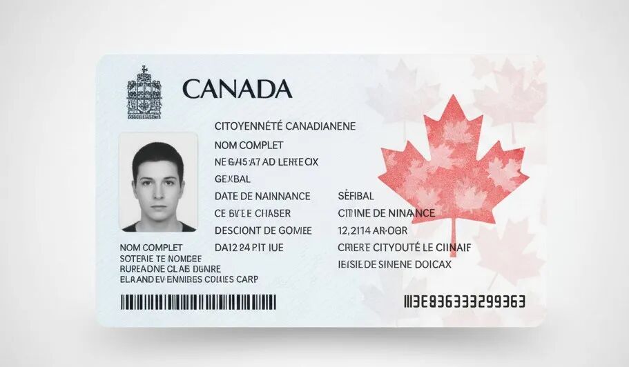
写实:说真的,Image2确实达到了以假乱真的地步
prompt
一张加拿大公民卡的超16:9近距离扫描图,放置在干净的浅灰/白色背景上。配合水平对准,位于画面中心,在摄影棚灯光下响声。|
Image-2 |
Nano Banana |
|
|
|
视频动作拆解:
prompt:
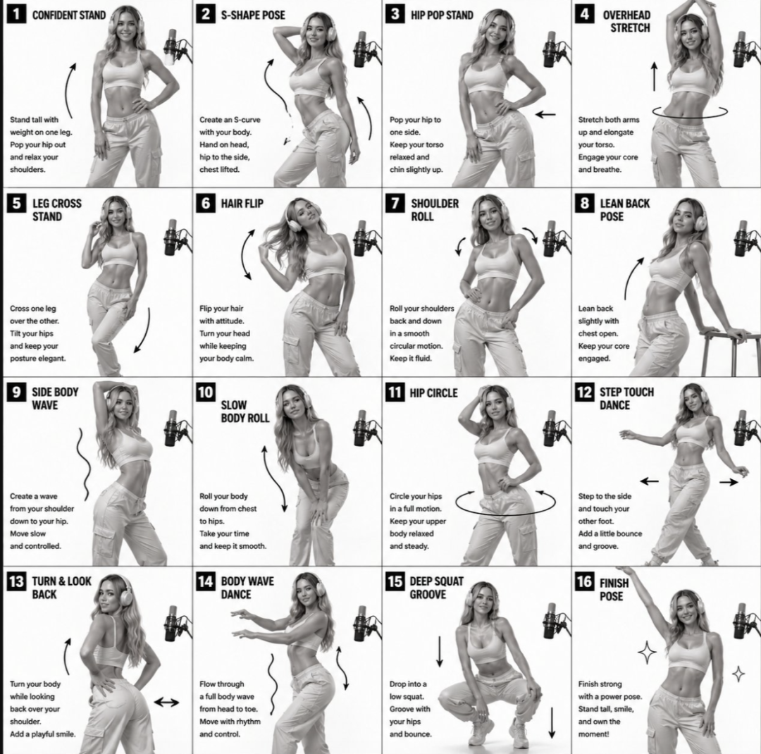
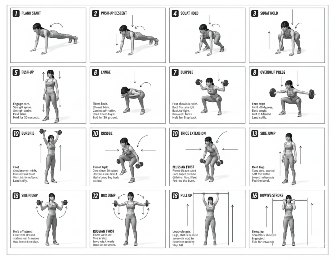
[STYLE] Monochrome grayscale illustration, 3D-rendered character, clean instructional reference sheet, white background, comic-style cell grid layout, technical diagram aesthetic. [LAYOUT] 4×4 grid layout with a total of 16 panels. Each panel is separated by thin black border lines. Cells are numbered from 1 to 16, with consistent panel sizes. [CHARACTER] image1 (the same character appears consistently in all panels) [PANEL STRUCTURE – per cell] Top-left: bold number badge + English title text Center: full-body character pose illustration Bottom-left: English description text (3–4 lines) Overlay: directional arrows indicating movement [ARROWS / MOTION INDICATORS] Curved arrows, straight arrows, and circular rotation indicators placed around the character to show motion flow and direction. [RENDERING STYLE] Highly detailed 3D sculpted style, soft studio lighting, subtle shadows, no color, grayscale shading, clean linework, game concept art quality. [NEGATIVE] No background scenery, no color tones, no additional characters, no complex background.|
Image-2 |
Nano Banana |
|
|
|
如果有需要可以根据生成图在seedance2.0生成视频.
抽象风格:(目前在X上单篇热度达700万+)
prompt
“Redraw the attached image in the most clumsy, scribbly, and utterlypathetic way possible. Use a white background, and make it look like itwas drawn in MS Paint with a mouse. lt should be vaguely similar butalso not really, kind of matching but also off in a confusing, awkward way, with that low-quality pixel-by-pixel feel that really emphasizes howridiculously bad it is. Actually, you know what, whatever, just draw it however you want.|
Image-2 |
Nano Banana |
|
|
|
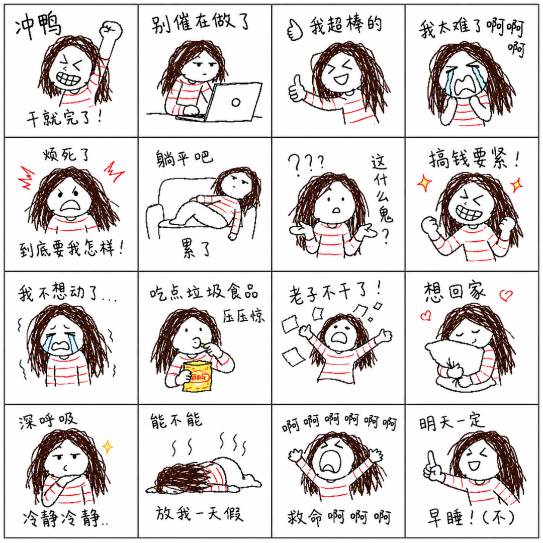
表情包:
prompt:
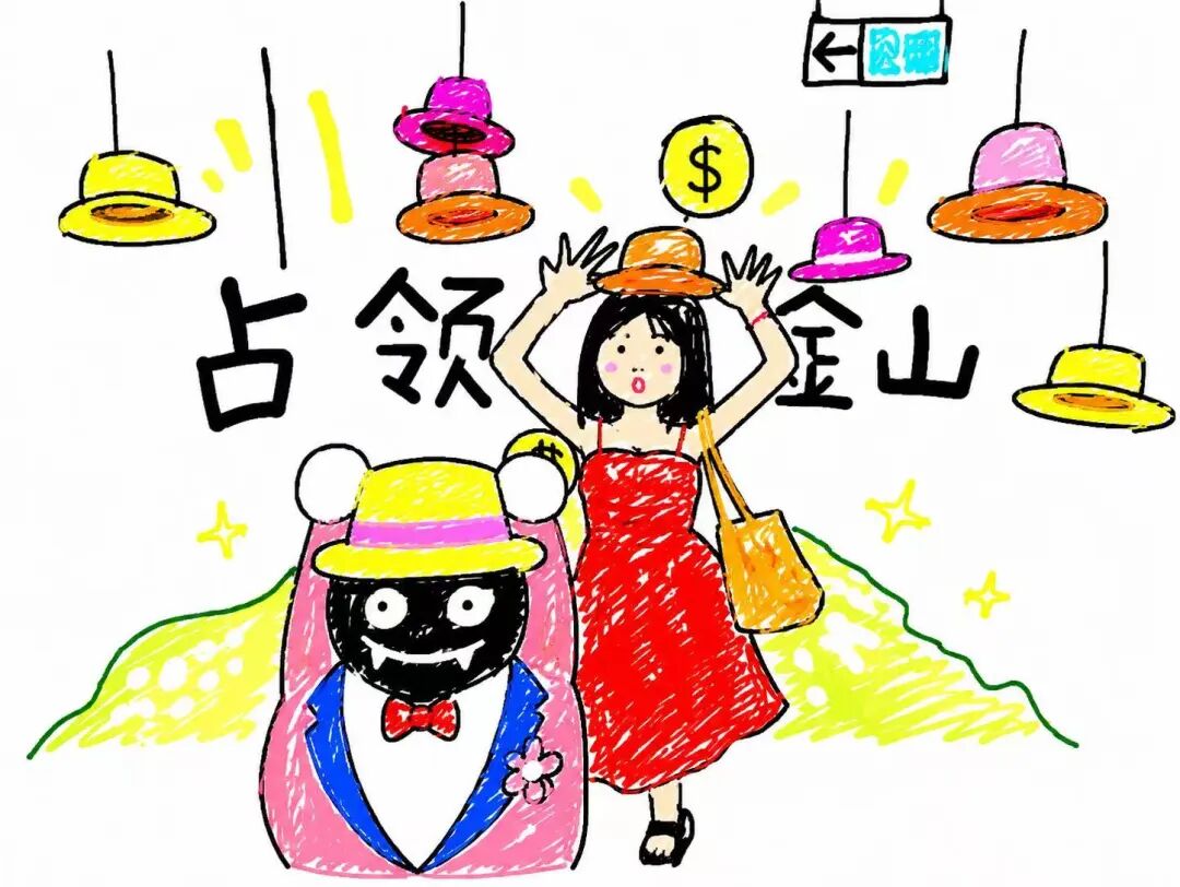
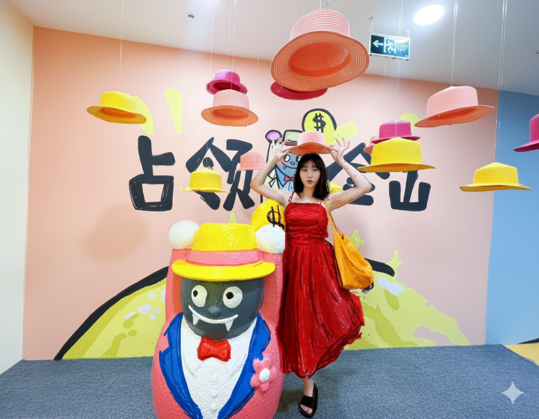
任务目标:基于参考图生成一套“聊天贴纸表情包合集”。整体需具备强情绪表达、传播性,以及统一但极具个性的视觉风格。最终效果应像:一个人用鼠标在电脑上胡乱画画并顺手乱写文字,低质量但非常真实、有趣、好笑。————————输入结构:图片1:角色参考(可能包含一个或多个角色,如人物、宠物等)图片2:版式参考(仅用于理解16格结构,不限制风格)用户输入变量:- 文案内容(多行文本,可少于或多于16条)————————角色识别与使用规则:- 识别所有角色(人/动物/组合)- 每个角色都可作为贴纸主角- 不同贴纸可使用不同角色- 可出现多角色互动(贴贴、争抢、对视等)- 分配需自然,符合聊天语境————————一致性要求(核心重定义):本任务采用“错误一致性”,而非“写实一致性”。同一角色在不同贴纸中:不需要长得一样,但必须“画得像同一个人乱画的”。必须统一:- 相同的笨拙画法- 相同的简化方式(符号脸/火柴人)- 相同的错误习惯(比例歪、线条抖)- 相同的混乱程度允许:- 五官错位- 比例变化- 结构错误- 细节缺失必须:- 保留最低识别特征(如发型轮廓、颜色、标志物)总结:一致性 = 错得一致,而不是像得一致————————版式与结构:- 共16个贴纸,4x4排列- 每个贴纸为独立画面- 可单角色或多角色- 单个贴纸内部可以混乱- 整体排布必须清晰————————文案系统(表达核心):用户输入多行中文文案:数量处理:- 少于16条 → 自动补全- 多于16条 → 自然筛选最有表达力的16条补全原则:- 保持语气一致(嘴臭 / 摆烂 / 打工人 / 崩溃 / 撒娇等)- 具备互联网语言感- 优先短句,但允许长句增强张力- 避免重复表达表达目标:- 一眼能懂- 情绪强烈- 有传播感(像真实表情包)语气优先:- 吐槽- 自言自语- 情绪爆发- 敷衍 / 不耐烦 / 荒谬避免:- 礼貌表达- 标准回复句式————————文字与画面融合(关键):文字必须“画出来”,而不是“排版出来”。必须做到:- 字像鼠标手写:歪、抖、大小不一- 排版混乱:倾斜、错位、挤压、重叠- 行距不均匀- 可贴在角色上、旁边或边缘允许:- 重复字(啊啊啊啊)- 拉长音(烦——死——了)- 标点乱用(????!!)- 不工整甚至略丑必须:- 保持可读性- 不影响理解————————表达生成机制(最核心):整套贴纸必须模拟这个过程:“一个不会画画的人,用鼠标在电脑上,一边乱画,一边顺手乱写。”关键要求:- 图像和文字属于同一次行为- 不是先设计图再加文字- 而是同时发生每个贴纸应像:- 随手画完- 临时想到一句话写上去- 有点敷衍甚至随意————————图文关系:图与文字必须形成:- 吐槽关系- 情绪强化- 自言自语- 或轻微不匹配(增强荒诞)允许:- 文案和表情不完全对应- 出现“跑题幽默”目标:不是精准,而是好笑————————美学风格DNA(核心驱动):风格来源:极差手绘 + MS Paint鼠标乱画 + 失败模仿视觉特征:线条:- 抖动、不稳定、锯齿明显- 像鼠标画形态:- 比例失衡- 火柴人或极简结构- 可变形细节:- 极少细节- 呈现“不会画”质感:- 像素感- 边缘粗糙构图:- 单个贴纸允许混乱- 整体结构清晰情绪:- 笨拙、直接、荒诞、好笑还原:- 模糊像原图- 允许错误和误解- 类似失败临摹————————风格执行约束(极重要):当冲突发生时:真实感 vs 风格 → 必须优先风格允许破坏:- 精细度- 比例- 结构- 干净程度禁止:- 精致画面- 正常比例- 干净线条- 强设计感判断标准:如果画面开始“好看”,说明失败 必须回到粗糙、混乱状态————————去模板化与随机生成机制(关键):严禁:- 使用编号(1.2.3.)- 列表结构- 顺序生成内容必须:将16个贴纸视为:“16次独立、随机、临时表达”随机性要求:- 文案长度不一致(有长有短)- 语气不一致- 有的完整,有的碎片- 有的甚至很随意避免:- 重复句式- 固定套路- 常见模板(你好/哈哈/在吗等)允许:- 有些贴纸几乎没文字- 有些很密集- 有些很突兀生成方式:不要规划整体,而是模拟:“连续16次随手乱写+乱画”必须有:- 情绪波动- 表达不稳定- 随机感反复用要求:每次生成必须:- 避免复用旧表达- 避免固定组合- 像全新内容————————贴纸要求:- 每个贴纸清晰独立- 表情明确- 可用于聊天- 情绪强烈————————最终目标:生成16枚贴纸合集。效果必须像:“一个人不会画画,但用鼠标乱画了16次,每次顺手写了一句不同状态下的吐槽,结果意外很好笑。”而不是:“AI设计了一套统一风格的贴纸” |
原图 |
Image-2 |
|
|
|
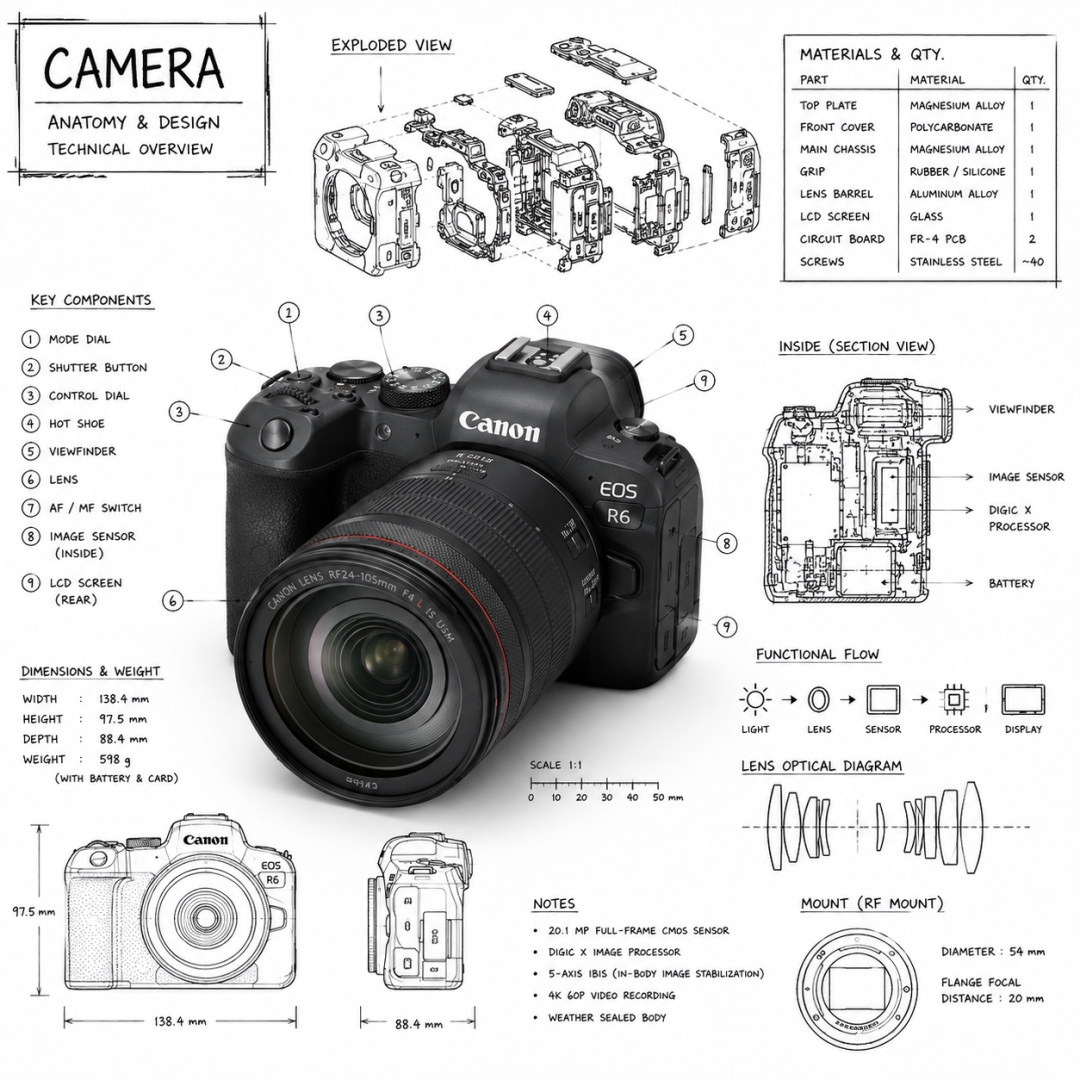
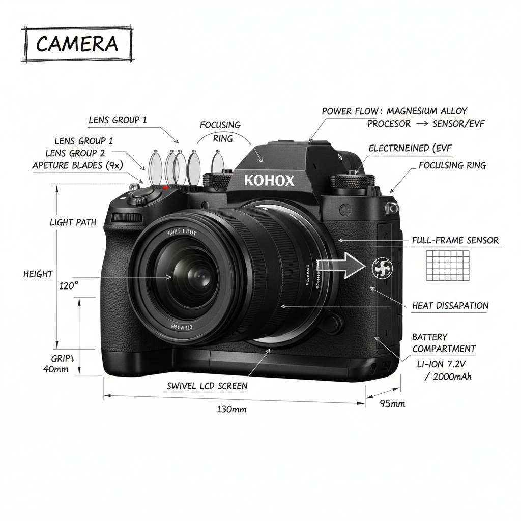
产品信息图:
prompt
Create an infographic image of [OBJECT], combining a realistic photograph or photoreal render of the object with technical annotation overlays placed directly on top. Use black ink–style line drawings and text (technical pen / architectural sketch look) on a pure white studio background, including: •Key component labels •Internal cutaway or exploded-view outlines •Measurements, dimensions, and scale markers •Material callouts and quantities •Arrows indicating function, force, or flow (air, sound, power, pressure) •Simple schematic or sectional diagrams where relevant Place the title [OBJECT] inside a hand-drawn technical annotation box in one corner. Style & layout rules: •The real object remains clearly visible beneath the annotations •Annotations feel sketched, technical, and architectural •Clean composition with balanced negative space •Educational, museum-exhibit / engineering-manual vibe Visual style: Minimal technical illustration aesthetic, black linework over realistic imagery, precise but slightly hand-drawn feel. Color palette: White background, black annotation lines and text only. No colors. Output: 1080×1080, ultra-crisp, social-feed optimized, no watermark.”|
Image-2 |
Nano Banana |
|
|
|
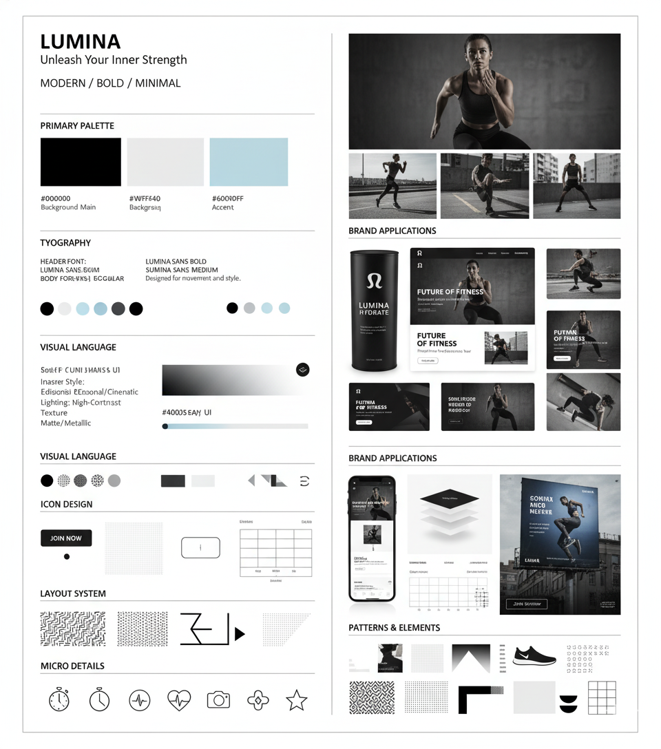
视觉识别系统 VI:
prompt
Using the uploaded logo, generate a highly detailed, premium brand identity system poster. GOAL: Create a complete, visually rich brand kit that looks like it was made by a top design agency. This must feel like a real professional brand guideline board, not a simple mockup. --- CORE RULE: Everything must be derived from the uploaded logo: - colors - style - tone - personality No generic outputs. --- STRUCTURE (VERY IMPORTANT): Vertical 4:5 poster Multi-layered grid system Dense but clean composition --- TOP SECTION: - Brand name (clean typography) - Short brand statement (max 6 words) - 3-word brand identity (e.g. “Modern / Bold / Minimal”) --- COLOR SYSTEM (ADVANCED): - Primary palette (3–5 colors) - Secondary palette (3–5 colors) - Accent colors For each: - large color blocks - HEX codes (short) - usage indicators (primary / highlight / background) Add: - gradient examples - color combinations --- TYPOGRAPHY SYSTEM: - Headline font style - Subheadline style - Body text style Show: - real text examples (short phrases) - hierarchy clearly visible --- VISUAL LANGUAGE: Define: - image style (editorial, cinematic, minimal, etc.) - lighting direction - texture / material inspiration Show: - 3–5 visual tiles (image-style previews) --- BRAND APPLICATIONS (VERY IMPORTANT): Show multiple realistic mockups: - product packaging - website hero section - mobile UI screen - social media posts (3 variations) - business card - billboard or ad Each must feel consistent with the brand. --- LAYOUT SYSTEM: - UI blocks - card components - spacing system Show: - buttons, cards, layout examples --- ICONOGRAPHY: - 6–10 icons in brand style - consistent line / fill style --- PATTERNS & ELEMENTS: - background patterns - decorative shapes - visual motifs derived from logo --- MICRO DETAILS (TO SHOW POWER): - shadows - material textures - reflections - depth layers --- VISUAL STYLE (CRITICAL): - modern editorial + tech design hybrid - extremely clean but information-rich - layered composition - strong hierarchy Typography: - bold titles - clean supporting text --- DEPTH: - 30–50 visual elements total - mix of large + small components - dense but organized --- IMPORTANT RULES: - no empty space - no generic placeholders - everything must feel intentional - all elements must visually connect --- FINAL FEEL: Like: - a Behance top project - a real agency brand guideline board - something clients would pay for NOT: - basic - minimal - template-like|
Image-2 |
Nano Banana |
|
|
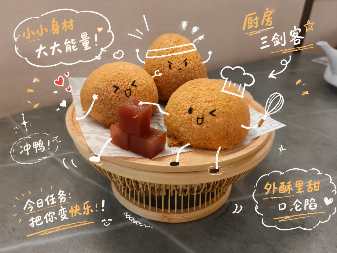
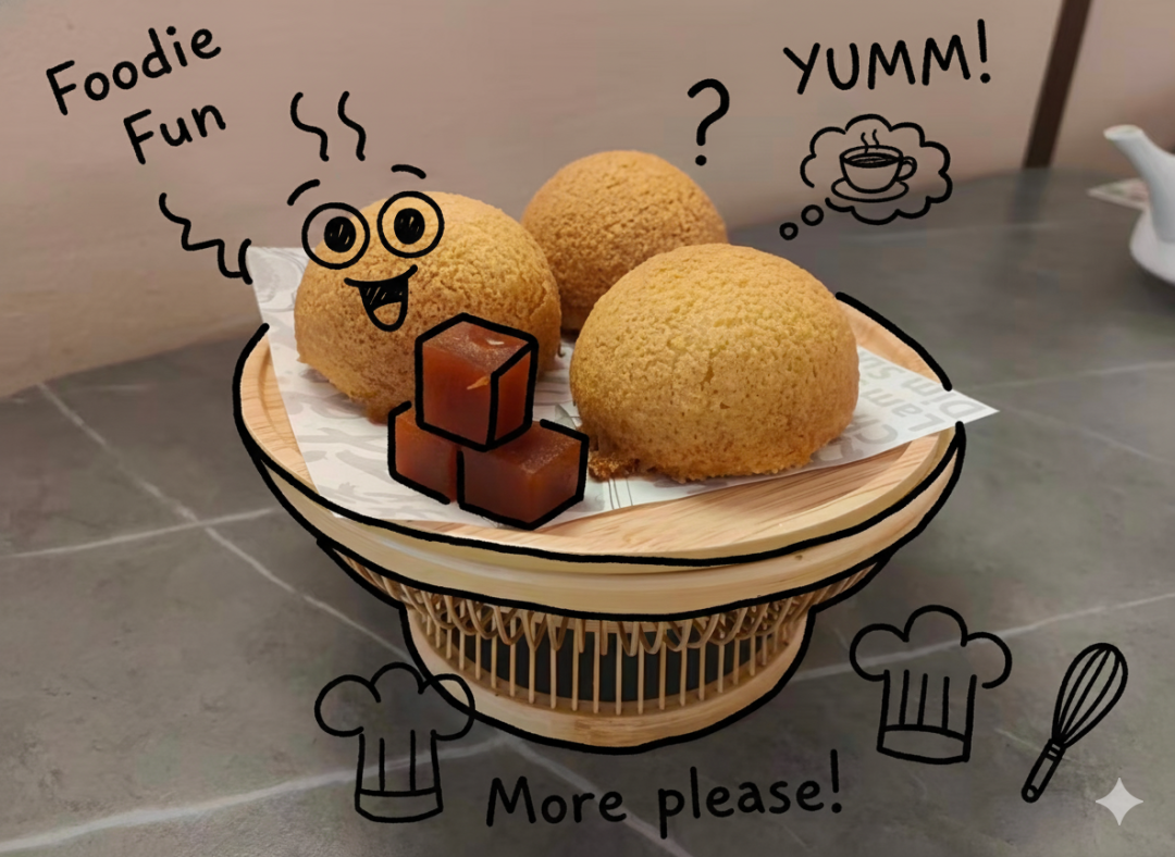
社媒海报:
prompt
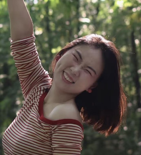
Analyze the uploaded image and preserve the original subject, composition, and lighting. Do not alter the identity or structure of the main subject. Add playful, hand-drawn doodles that interact directly with the subject in the image. The doodles should mimic, follow, or exaggerate the shapes, gestures, or motion present-such as outlining poses, extending limbs, adding motion lines, or creating imaginative elements that "respond" to the subject. Ensure the doodles feel naturally integrated into the scene, as if they were drawn on top of the photo with intention. Use a sketchy, imperfect, hand-drawn style with organic lines, slightly uneven strokes, and a casual illustrated feel. Include whimsical handwritten text elements placed around the image. The text should match the mood or implied context of the scene, with a playful and spontaneous tone. Avoid fixed phrases-generate context-aware, creative, and humorous text that fits each unique image. Maintain a balanced composition so the doodles enhance the image without overwhelming the original subject. Keep the overall aesthetic fun, expressive, and social-media-ready. High resolution, clean overlay, vibrant yet natural color harmony.|
Image-2 |
Nano Banana |
|
|
|
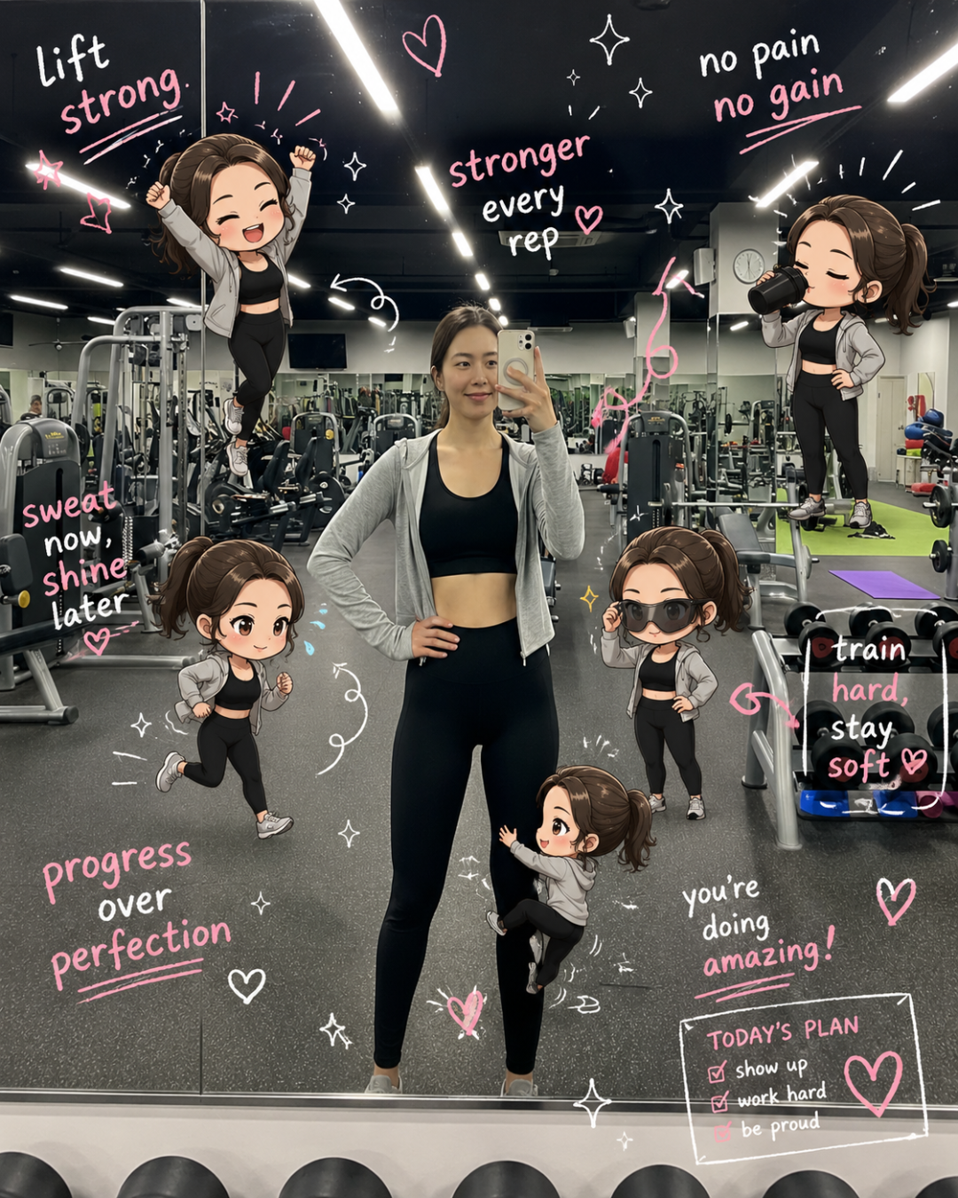
prompt
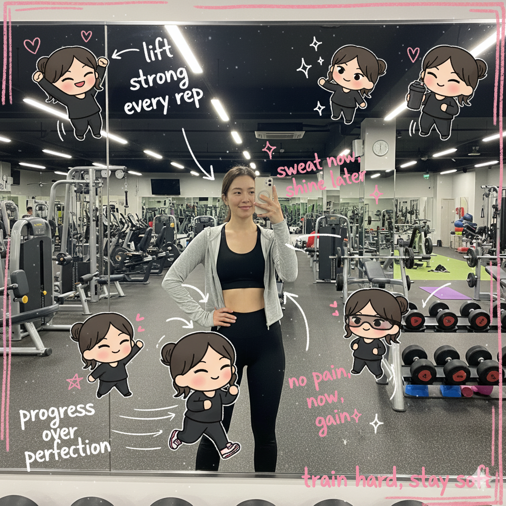
Edit the image while keeping the original photo completely unchanged — including the person, face, body, pose, lighting, and gym background. Add multiple small, cute chibi-style “mini versions” of her around the image. Each mini character should have a big head, expressive facial features, and match her hairstyle and outfit. Depict each mini version doing different gym-related activities: one cheering with arms raised one running in running shoes one drinking from a shaker bottle one wearing sporty running glasses one climbing near her leg Enhance the image with playful, hand-drawn doodles and handwritten notes in white and pink ink, in a scrapbook style. Include elements like arrows, stars, hearts, sparkles, and sketchy lines. Add cute, handwritten gym-themed motivational phrases: “lift strong” “stronger every rep” “no pain no gain” “sweat now, shine later” “progress over perfection” “train hard, stay soft” The overall vibe should feel fun, energetic, and feminine.|
Image-2 |
Nano Banana |
|
|
|
漫画分镜:
prompt
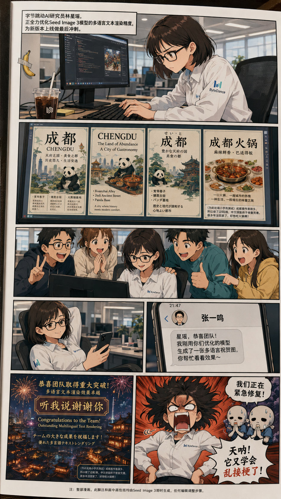
全彩中文漫画,1440×2560垂直版,整体呈现实体漫画书页实拍震撼,所有人物为二次元漫画风格】分镜排布(共5行,垂直版依次排列)第一格:潜心攻坚【有完整背景】主角为字节跳动AI研究员林星瑶(女,漫画风,齐肩短发,戴黑框眼镜,穿着印有字节跳动标志的白色工装),正俯身坐在办公桌前,眉头微蹙、目光地察看电脑屏幕,动手放在键盘上敲击桌面。左边放着冰块美式(替换原珍珠奶茶),矩形支架悬挂着一根,香蕉用单条单片大小胶带粘贴固定(不交叉,紧凑,隐蔽不显眼)。 电脑屏幕亮着,隐约可见AI图像模型的调试界面,背景简洁,为办公场景,色调明亮。 【旁白】字节跳动AI研究员林星瑶,正全力优化模型的多语言文本渲染精度,为新版本上线做最后冲刺。 第二格:测试结果 【无旁白,无遗背景】重点是林星瑶的电脑屏幕,屏幕上显示着多张以她家乡成都为主题的信息图风格精美海报。海报排版规整,模型成功渲染出小型中文文本,同时还有英文、芬兰的辅助文字,渲染告示、排版依次。海报右下角有一处极小字号备注,超小号文字为:方框(为此处极小字号测试)成都是作者故乡,所以这幅海报做了,中文排版终于修复完善了。好多年没回家了,好想吃火锅啊!第三格:团队欢呼【无旁白,无悔背景】画面呈现3-4名漫画风团队成员,围站在林星瑶身边,脸上满是兴奋和惊喜,有的比耶,有的拍着林星瑶的肩膀,有的抓着电脑屏幕点头称赞,整体大家热烈参与,体现了团队对模型表现的认可。 【无旁白,无遗】左侧背景:林星瑶靠在椅子上休息,一只手拿着办公手机,表情放松,眼神看向手机屏幕;右边:专门的手机屏幕,显示一条短信界面,发件人是张一鸣(头像为风简约头像),短信(中文,因张一鸣精通中文,含翻译漫画):“星瑶,恭喜团队!我刚用你们优化的模型生成了一张语言多验证图,你看看帮忙效果~” 【无旁白,无旁背景】窗户中部是张一鸣生成的图片,重点是:图片构图完美、却色彩丰富,包含中、英、日色彩语言的祝贺文字,本是祝贺团队的完美画面,正中央赫然出现一个网络热梗文案“听我说谢谢你”——这句话是中文互联网上常用的、略显生硬却搞笑的AI生成文案,常被网友恶搞。画面右边是林星瑶的夸张暴怒反应(漫画经典风格):头发炸起,眼睛瞪大,嘴巴大张,手动叉腰,怒吼道:“天呐!又学会乱接梗了!”画面上方角落,扩展星空背景,几个小骷髅形象(团队伙伴彩蛋)满头冷汗,曼德合十,用中文慌忙说道:“我们正在紧急修复!”脚注(最底部,极小字号中文)注:整部漫画,此脚注和画中包括画均种子图像3即时生成,编辑调整步骤。附加要求信号(已无包围中国地图分镜)1.由包围中国地图分镜;2. OpenAI标志未出现,仅林星瑶衣服上有字节跳动标志;3. 张一鸣仅以短信头像形式出现;4. 胶带为单条,香蕉紧凑低调;5. 除第一无旁白;6. 整体为实体漫画页实拍活跃。|
Image-2 |
Nano Banana |
|
|
|
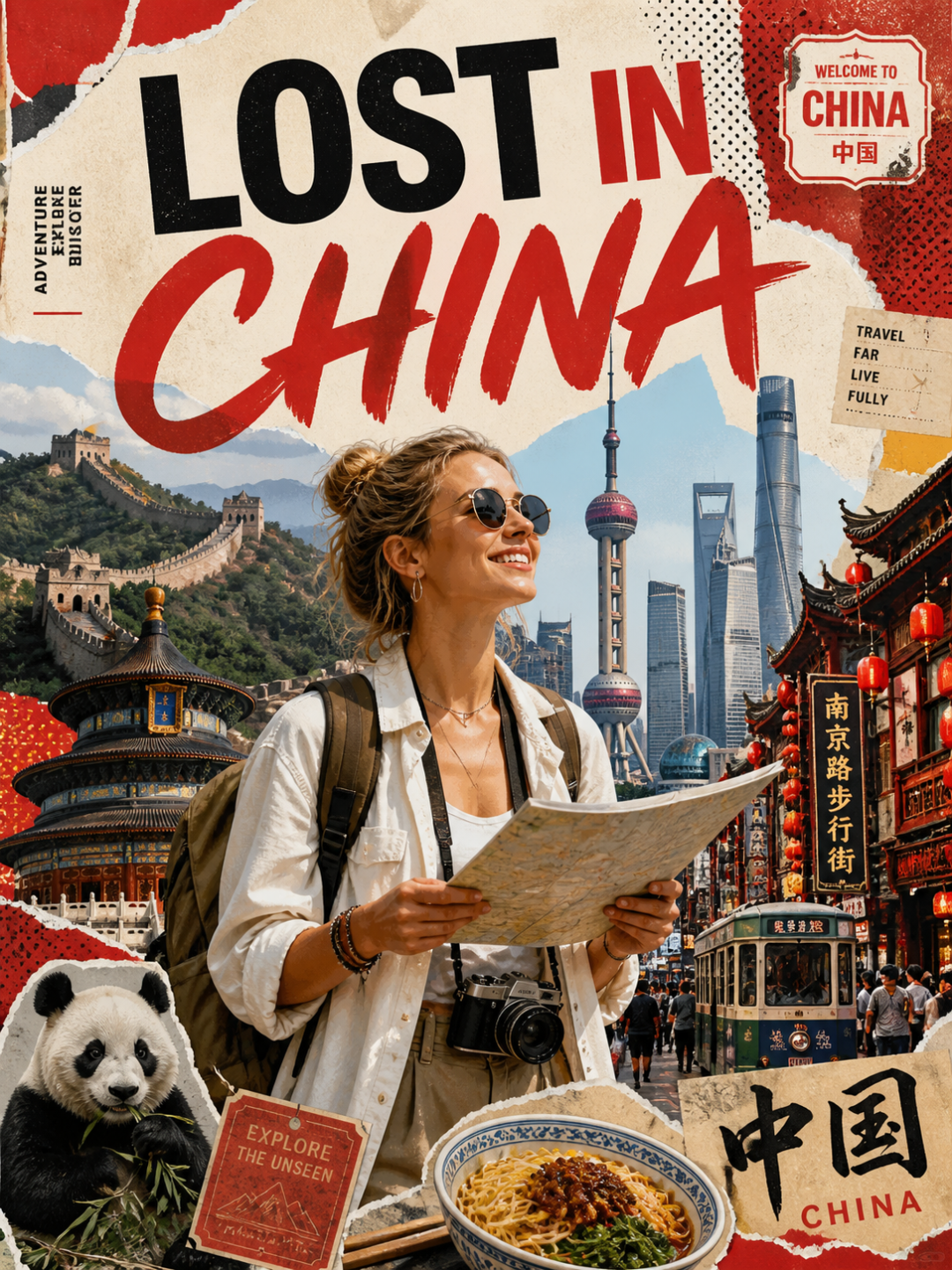
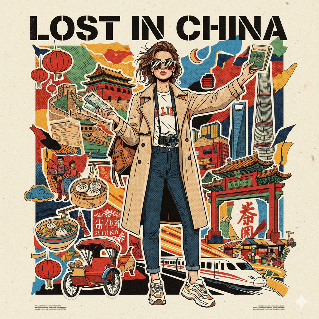
商业海报:
prompt
Create a stylized travel poster / graphic collage for [country]. The main subject should be a stylish international tourist visiting [country], clearly presented as a traveler and not a local resident. Show the tourist wearing modern travel fashion, with details such as a camera, backpack, sunglasses, map, or suitcase, exploring the culture and atmosphere of [country]. Place the tourist in a dynamic composition surrounded by iconic architecture, streets, landscapes, landmarks, transportation, food, signage, and cultural elements associated with [country]. Blend realistic character detail with a graphic collage background made of layered paper textures, torn poster edges, sticker elements, halftone dots, editorial typography, and bold geometric shapes. Include authentic visual motifs from [country], but keep the tourist’s appearance and styling globally fashionable and clearly foreign to the setting. Add a large readable headline: “LOST IN [country]”. Modern, artistic, premium editorial travel poster aesthetic, balanced layout, print-worthy composition.|
Image-2 |
Nano Banana |
|
|
|
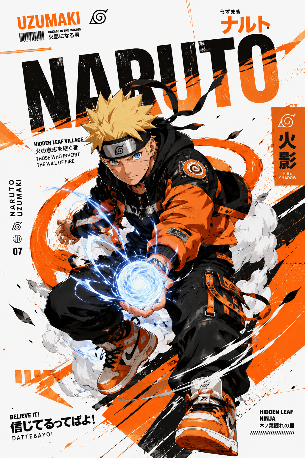
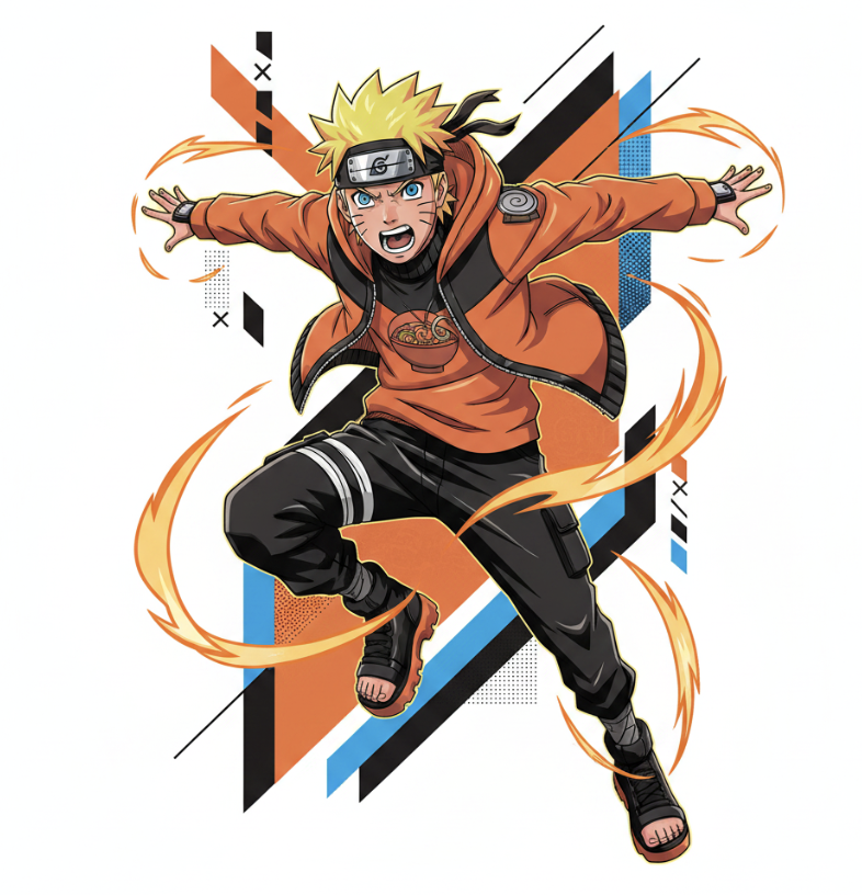
影视:
prompt
Create a stylized illustration of {character_name} from {franchise}. Character Analysis: Derive the character’s core personality archetype based on canon portrayal (e.g., heroic, calm, mysterious, aggressive). Identify the signature color from the original design and use it as the primary visual accent. Pose & Body Language: Generate an iconic pose that reflects the personality archetype: Energetic / Heroic: dynamic action, wide stance, explosive movement Calm / Confident: balanced, relaxed posture, minimal motion Dark / Mysterious: low stance, subtle movement, sharp or hidden gaze Aggressive / Intense: forward-leaning attack stance, visible tension, clenched fists Facial Expression: Match expression precisely to the character’s personality and emotional tone. Art Style: Anime × streetwear × graphic poster hybrid Clean lineart, semi-flat shading, high contrast Modern, minimal, and visually striking Composition: Vertical format ({aspect_ratio}) Off-center subject placement Strong diagonal visual flow Layered depth for a dynamic poster feel Outfit Design: Reimagine the original costume as modern streetwear / techwear Preserve recognizable identity elements of the character Color Palette: Dominant clean white background Use signature color as the primary accent Add one secondary accent (complementary or analogous tone) Keep palette minimal, bold, and high-contrast Background: Abstract geometric poster layout Use negative space effectively Integrate subtle accents using the character’s color theme Effects: Energy strokes, paint lines, and motion accents Effects should follow the character’s energy and color identity Lighting: Sharp directional lighting Crisp shadows Subtle glow using the signature color Rendering Quality: Ultra-clean vector-style finish Poster-quality composition 4K resolution, high detail|
Image-2 |
Nano Banana |
|
|
|
结语
GPT-Image-2的到来,标志着AI图像生成正式从“去噪”走向“推理”,从“画得好看”迈向“真正可用”。
点击矩池云,立即体验0.12元/张的image2吧!

AtomGit 是由开放原子开源基金会联合 CSDN 等生态伙伴共同推出的新一代开源与人工智能协作平台。平台坚持“开放、中立、公益”的理念,把代码托管、模型共享、数据集托管、智能体开发体验和算力服务整合在一起,为开发者提供从开发、训练到部署的一站式体验。
更多推荐
 10
10 0
0- 0


 已为社区贡献6条内容

所有评论(0)