Flutter鸿蒙 抽屉菜单组件实现详解
Flutter 抽屉菜单组件实现详解
欢迎加入开源鸿蒙跨平台社区→ https://openharmonycrosplatform.csdn.net
一、组件概述
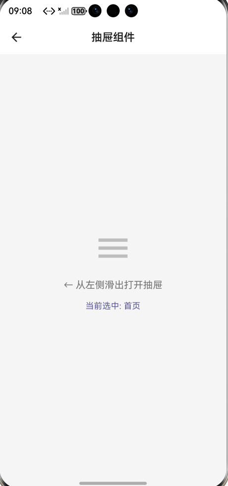
抽屉菜单(Drawer)是移动应用中常见的导航模式,通常从屏幕左侧滑出,提供应用的主要导航功能。本文将详细介绍如何在 Flutter 中实现一个功能完善、高度可定制的抽屉菜单组件,支持暗色模式、动画效果和丰富的自定义选项。
二、核心功能特性
本组件具备以下核心特性:
自定义头部区域 :支持头像、标题、副标题的组合展示,也可以完全自定义头部组件。
菜单项配置 :每个菜单项支持图标、标题、副标题、自定义颜色、选中状态等属性。
选中状态高亮 :当前选中的菜单项会有明显的视觉反馈,包括背景色变化和右侧指示条。
底部区域 :支持添加自定义底部内容,如退出登录按钮。
暗色模式适配 :组件会自动根据系统主题切换颜色方案。
动画效果 :使用 flutter_animate 库实现流畅的入场动画。
三、数据模型设计
首先定义菜单项的数据模型:
class DrawerMenuItem {
  final IconData icon;
  final String title;
  final String? subtitle;
  final VoidCallback? onTap;
  final Color? iconColor;
  final bool isSelected;

  const DrawerMenuItem({
    required this.icon,
    required this.title,
    this.subtitle,
    this.onTap,
    this.iconColor,
    this.isSelected = false,
  });
}
这个数据类包含了菜单项所需的所有属性。其中 icon 和 title 是必填项,其他属性可根据需要配置。isSelected 属性用于标识当前选中项,组件会据此应用不同的样式。
四、组件主体实现
组件主体继承自 StatelessWidget,通过构造函数接收各种配置参数:
class CustomDrawer extends
StatelessWidget {
  final Widget? header;
  final String? title;
  final String? subtitle;
  final Widget? avatar;
  final List<DrawerMenuItem>
  menuItems;
  final Widget? footer;
  final Color? backgroundColor;
  final double width;
  final double itemHeight;

  const CustomDrawer({
    super.key,
    this.header,
    this.title,
    this.subtitle,
    this.avatar,
    required this.menuItems,
    this.footer,
    this.backgroundColor,
    this.width = 280,
    this.itemHeight = 56,
  });
参数说明:header 用于完全自定义头部;title、subtitle、avatar 用于快速配置标准头部;menuItems 是菜单项列表;footer 是底部区域;backgroundColor 可自定义背景色;width 控制抽屉宽度;itemHeight 控制菜单项高度。
五、构建方法详解
组件的 build 方法负责整体布局:
@override
Widget build(BuildContext context) {
  final isDark = Theme.of(context).
  brightness == Brightness.dark;
  final bgColor =
  backgroundColor ?? (isDark ?
  const Color(0xFF1E1E1E) : Colors.
  white);

  return Container(
    width: width,
    height: double.infinity,
    decoration: BoxDecoration
    (color: bgColor),
    child: SafeArea(
      child: Column(
        children: [
          if (header != null)
          header!,
          if (header == null &&
          (title != null ||
          subtitle != null ||
          avatar != null))
            _buildHeader(isDark),
          const Divider(height: 1),
          Expanded(
            child: ListView.builder(
              padding: const
              EdgeInsets.symmetric
              (vertical: 8),
              itemCount: menuItems.
              length,
              itemBuilder:
              (context, index) {
                return
                _buildMenuItem
                (menuItems[index],
                isDark, context);
              },
            ),
          ),
          if (footer != null)
          footer!,
        ],
      ),
    ),
  );
}
布局采用 Column 结构,从上到下依次是头部区域、分隔线、菜单列表、底部区域。SafeArea 确保内容不会被系统状态栏遮挡。菜单列表使用 ListView.builder 构建,支持大量菜单项时的滚动。
六、头部区域实现
头部区域展示用户信息和头像:
Widget _buildHeader(bool isDark) {
  return Container(
    padding: const EdgeInsets.all
    (20),
    child: Row(
      children: [
        if (avatar != null) ...[
          avatar!,
          const SizedBox(width: 16),
        ],
        Expanded(
          child: Column(
            crossAxisAlignment:
            CrossAxisAlignment.
            start,
            children: [
              if (title != null)
                Text(
                  title!,
                  style: TextStyle(
                    fontSize: 18,
                    fontWeight:
                    FontWeight.bold,
                    color: isDark ?
                    Colors.white :
                    Colors.black87,
                  ),
                ),
              if (subtitle != null)
                Text(
                  subtitle!,
                  style: TextStyle(
                    fontSize: 13,
                    color: isDark ?
                    Colors.grey
                    [400] : Colors.
                    grey[600],
                  ),
                ),
            ],
          ),
        ),
      ],
    ),
  ).animate().fadeIn().slideX
  (begin: -0.2, end: 0);
}
头部使用 Row 布局,左侧是头像,右侧是标题和副标题。通过 flutter_animate 添加了淡入和横向滑动的入场动画,增强用户体验。
七、菜单项实现
菜单项是组件的核心部分:
Widget _buildMenuItem
(DrawerMenuItem item, bool isDark,
BuildContext context) {
  final themeColor = Theme.of
  (context).colorScheme.primary;

  return Material(
    color: item.isSelected ?
    themeColor.withOpacity(0.1) :
    Colors.transparent,
    child: InkWell(
      onTap: item.onTap,
      child: Container(
        height: itemHeight,
        padding: const EdgeInsets.
        symmetric(horizontal: 16),
        child: Row(
          children: [
            Icon(
              item.icon,
              size: 22,
              color: item.isSelected
                  ? themeColor
                  : (item.
                  iconColor ??
                  (isDark ? Colors.
                  grey[400] :
                  Colors.grey
                  [600])),
            ),
            const SizedBox(width:
            16),
            Expanded(
              child: Column(
                mainAxisAlignment:
                MainAxisAlignment.
                center,
                crossAxisAlignment:
                CrossAxisAlignment.
                start,
                children: [
                  Text(
                    item.title,
                    style: TextStyle
                    (
                      fontSize: 15,
                      fontWeight:
                      item.
                      isSelected ?
                      FontWeight.
                      w600 :
                      FontWeight.
                      normal,
                      color: item.
                      isSelected
                          ?
                          themeColor
                          :
                          (isDark ?
                          Colors.
                          white :
                          Colors.
                          black87),
                    ),
                  ),
                  if (item.subtitle
                  != null)
                    Text(
                      item.
                      subtitle!,
                      style:
                      TextStyle(
                        fontSize:
                        12,
                        color:
                        isDark ?
                        Colors.grey
                        [500] :
                        Colors.grey
                        [500],
                      ),
                    ),
                ],
              ),
            ),
            if (item.isSelected)
              Container(
                width: 3,
                height: 24,
                decoration:
                BoxDecoration(
                  color: themeColor,
                  borderRadius:
                  BorderRadius.
                  circular(2),
                ),
              ),
          ],
        ),
      ),
    ),
  ).animate().fadeIn(delay: Duration
  (milliseconds: 50)).slideX(begin:
  0.1, end: 0);
}
菜单项使用 Material 和 InkWell 组合实现点击涟漪效果。选中状态下,背景色会变为主题色的半透明版本,图标和文字颜色变为主题色,右侧出现竖向指示条。每个菜单项都有延迟递增的入场动画,形成依次出现的效果。
八、使用示例
在页面中使用该组件非常简单:
Scaffold(
  drawer: CustomDrawer(
    title: '张三',
    subtitle: 'zhangsan@example.
    com',
    avatar: CircleAvatar(
      backgroundColor: Theme.of
      (context).colorScheme.primary,
      child: const Icon(Icons.
      person, color: Colors.white),
    ),
    menuItems: [
      DrawerMenuItem(
        icon: Icons.home,
        title: '首页',
        isSelected: _selectedIndex
        == 0,
        onTap: () => _onMenuTap(0),
      ),
      DrawerMenuItem(
        icon: Icons.category,
        title: '分类',
        subtitle: '查看所有分类',
        isSelected: _selectedIndex
        == 1,
        onTap: () => _onMenuTap(1),
      ),
      DrawerMenuItem(
        icon: Icons.favorite,
        title: '收藏',
        iconColor: Colors.red,
        isSelected: _selectedIndex
        == 2,
        onTap: () => _onMenuTap(2),
      ),
    ],
    footer: Container(
      padding: const EdgeInsets.all
      (16),
      child: Row(
        children: [
          Icon(Icons.logout, size:
          20, color: Colors.grey),
          const SizedBox(width: 16),
          Text('退出登录', style:
          TextStyle(color: Colors.
          grey)),
        ],
      ),
    ),
  ),
  body: YourBodyWidget(),
)
九、最佳实践建议
状态管理 :建议使用状态管理方案(如 Provider、Riverpod)来管理选中状态,避免在页面中手动维护。
路由管理 :可以将路由配置与菜单项结合,实现声明式的导航配置。
性能优化 :对于菜单项较多的情况,可以考虑使用 const 构造函数和缓存策略。
无障碍支持 :可以为菜单项添加语义标签,提升无障碍体验。
十、总结
本文实现了一个功能完善的 Flutter 抽屉菜单组件,涵盖了数据模型设计、组件架构、样式定制、动画效果等多个方面。该组件具有良好的可扩展性,可以根据实际需求进行二次开发。通过合理的参数设计和默认值配置,既保证了易用性,又提供了足够的定制空间。

AtomGit 是由开放原子开源基金会联合 CSDN 等生态伙伴共同推出的新一代开源与人工智能协作平台。平台坚持“开放、中立、公益”的理念,把代码托管、模型共享、数据集托管、智能体开发体验和算力服务整合在一起,为开发者提供从开发、训练到部署的一站式体验。
更多推荐


 4
4 0
0- 0


 已为社区贡献57条内容

所有评论(0)