基于大模型的个人消费分析和理财助手:开发日志 2
主要开发内容
- 页面骨架搭建
- 主页底部导航栏
- 仅首次启动APP时展示权限授予页
- 权限授予支持跳过
主页底部导航栏
最终样式预览: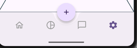
中部的按钮用于后续跳转到添加账单页面,加号按钮对整个导航栏还有一个挖槽的效果。
目前 APP 设计有四个页面,从左至右分别是:主页、数据统计页、AI 聊天页、设置页
点击底部导航栏的各项后将跳转到对应页面,同时在页面上左右滑动也可切换页面(参考微信的交互方式)。
底部导航栏切换选中项时将展示动画,该动画是 bounceInOut 曲线的缩放动画。
挖槽实现
首先是中部加号按钮的挖槽效果实现,利用了 Scaffold 组件的 floatingActionButtonLocation 属性,和 BottomAppBar 的 shape 属性共同实现:
// app_frame_page.dart
Widget build(BuildContext context) {
return Scaffold(
// 省略...
floatingActionButton: FloatingActionButton(
// 省略..
),
// centerDocked 将 floatingButton 置于中央靠下的位置
floatingActionButtonLocation: FloatingActionButtonLocation.centerDocked,
bottomNavigationBar: MyBottomAppBar(
// 省略
),
);
}
// my_bottom_app_bar.dart
Widget build(BuildContext context) {
return BottomAppBar(
shape: CircularNotchedRectangle(),
// 控制挖槽边缘离 floatingButton 边缘的距离
notchMargin: 10,
child: Row(
mainAxisAlignment: MainAxisAlignment.spaceAround,
children: _buildChildren(context),
),
);
}
底部导航栏项切换以及动画实现
由于需要同时支持手指左右滑动切换页面,所以我们需要把状态提到父组件进行管理,MyBottomAppBar 应该设计成一个 StatelessWidget,通过父组件改变传入的当前选中项索引来更新自己,并向父组件提供一个回调函数,让父组件决定点击导航栏项的动作。
实现代码如下:
class MyBottomAppBar extends StatelessWidget {
  const MyBottomAppBar({
    super.key,
    required this.selectedIndex,
    required this.bottomBarItems,
    required this.onPressed,
  });

  final int selectedIndex;
  final List<MyBottomBarItem> bottomBarItems;
  final Function(int index) onPressed;

  Widget _buildIconButton({
    required BuildContext context,
    required int index,
    required IconData icon,
    IconData? activeIcon,
  }) {
    final isSelected = selectedIndex == index;

    return IconButton(
      onPressed: () {
        onPressed(index);
      },
      icon: AnimatedSwitcher(
        duration: Duration(milliseconds: 200),
        transitionBuilder: (child, animation) => ScaleTransition(scale: CurvedAnimation(parent: animation, curve: Curves.bounceInOut), child: child),
        child: Icon(
          isSelected ? (activeIcon ?? icon) : icon,
          key: ValueKey<int>(isSelected ? 1 : 0),
          color: isSelected
              ? Theme.of(context).colorScheme.primary
              : Colors.grey,
          size: 30,
        ),
      ),
    );
  }
  // 省略...
}

class MyBottomBarItem {
  const MyBottomBarItem({required this.icon, this.activeIcon});

  final IconData icon;
  final IconData? activeIcon;
}
除了 MyBottomAppBar 组件本身,我们还定义了 MyBottomBarItem 类,来承载每个导航栏项的有关配置,例如图标和选中时的图标。
在MyBottomAppBar的构造函数中,我们定义了三个参数:
- selectedIndex:当前选中项的索引,该值由父组件管理
- bottomBarItems:导航栏项的配置,注意该列表的长度与最终显示出来的导航栏项的个数是相同的
- onPressed:点击导航栏项后的回调,该回调将传入被点击的导航栏项的索引供父组件处理
其中_buildIconButton方法是关键,我们构建了一个 IconButton,并在该 Button 被点击时调用父组件传入的回调函数,并且还使用了 AnimatedSwitcher 来切换选中和未选中的图标风格,注意要给 Icon 组件不同选中状态下指定不同的 key,这是因为 AnimatedSwitcher 是以 key 的不同为依据来判断是否执行动画的,如果 key 没有或者不变,那么将不会执行动画,
AnimatedSwitcher 的动画默认是 Fading 样式,也就是透明度渐变,不符合我们缩放动画的要求,我们可以通过其 transitionBuilder 参数来自定义动画,该参数接受一个回调函数,我们可以在回调函数中返回自己的动画类型,并自定义一些动画的参数,例如动画曲线、速度、值的变化范围等等。该回调函数的参数 animation 是 Animation<double> 类型,一个普通的 double 值变化,我们可以将其映射成其他类型(使用 Tween,例如 ColorTween,可以映射成颜色值变化,但是这里我们不需要),以及修改动画曲线(使用 CurvedAnimation 类)
页面切换实现以及自定义底部导航栏的使用
写好底部导航栏后,就可以开始实现页面的切换了,考虑到页面切换我们也需要有动画,以及要和底部导航栏的状态进行联动,我们采用 PageView 来实现,我们可以通过实例化一个 PageController 并传入 PageView,来控制 PageView 的翻页,以及通过 PageView 提供的 onPageChanged 回调函数来更新底部导航栏的状态,关键代码实现:
class _AppFramePageState extends State<AppFramePage> {
final _pageController = PageController();
int _currentIndex = 0;
final List<Widget> _pages = [
Placeholder(),
Placeholder(),
Placeholder(),
Placeholder(),
];
Widget build(BuildContext context) {
return Scaffold(
appBar: AppBar(title: Text("记账")),
body: PageView(
controller: _pageController,
onPageChanged: (index) {
setState(() {
_currentIndex = index;
});
},
children: _pages,
),
// 省略...
bottomNavigationBar: MyBottomAppBar(
selectedIndex: _currentIndex,
bottomBarItems: [
MyBottomBarItem(
icon: Icons.home_outlined,
activeIcon: Icons.home_filled,
),
MyBottomBarItem(
icon: Icons.pie_chart_outline,
activeIcon: Icons.pie_chart,
),
MyBottomBarItem(
icon: Icons.chat_bubble_outline,
activeIcon: Icons.chat_bubble_outlined,
),
MyBottomBarItem(
icon: Icons.settings_outlined,
activeIcon: Icons.settings,
),
],
onPressed: (index) {
_pageController.animateToPage(
index,
duration: Duration(milliseconds: 200),
curve: Curves.easeInOut,
);
},
),
);
}
}
由于具体的页面还未实现,所以在_page 列表中,我们创建了四个 Placeholder 来占位,将_pages 列表和_pageController 传入PageView 中,并传入一个回调函数,当页码有更新时,同步更新我们维护的_currentIndex 状态,并用 setState 函数进行 UI 更新。
在导航栏的使用上,传入导航栏项不必多说,主要是 onPressed 回调函数的代码,我们使用_pageController 的 animateTo 方法来跳转到指定索引的页面,并定义了跳转的动画曲线和动画时间。
权限授予页相关修改
记录首次启动 APP
我们采用 SharedPreferences 来记录 APP 是否是首次启动,启动 APP 时将从 SharedPreferences 中读取键为"firstLaunch"的值,如果有该值,那么说明 APP 不是首次启动,如果没有该值,说明 APP 是首次启动,在首次启动的情况下,将展示权限授予页面。要注意的是,当 APP 的本地数据被用户清空时,也将算作首次启动。
为了方便同步磁盘数据和内存数据以及控制 UI 更新,考虑使用 GetxController 来实现数据同步和 UI 控制。实现代码如下:
class AppSettingsController extends GetxController {
Completer<void>? _loadingCompleter;
Future? get loadingFuture => _loadingCompleter?.future;
final firstLaunch = true.obs;
Future<void> _loadSettingsFromDisk() async {
firstLaunch.value = StoreUtils.pref.getBool(StoreKeys.FIRST_LAUNCH) ?? true;
}
/// 将当前设置项的值保存到本地
Future<void> saveToDisk() async {
await StoreUtils.pref.setBool(StoreKeys.FIRST_LAUNCH, firstLaunch.value);
}
void onInit() {
super.onInit();
_loadingCompleter = Completer();
_loadSettingsFromDisk().then((_) {
_loadingCompleter?.complete();
_loadingCompleter = null;
});
}
}
我将该类命名为 AppSettingsController,后续应用的一些设置也可以通过这个类来进行管理,不仅是首次启动这个标志数据。
由于从本地读取数据的是异步行为,为了实现在读取完本地数据后再展示 UI 界面,我们这里使用了 Flutter 中非常方便的一个类 Completer,该类可以让我们自己控制 Future 的完成时机,当开始加载数据时,创建一个 Completer 并将其保存起来,在其他地方就可以通过 await _loadingCompleter.future 来等待该 Future 完成,完成的时机是在_loadSettingsFromDisk函数的 then 回调中,而此时磁盘数据已经全部加载完毕。同时也需要考虑 API 安全性,我将_loadingCompleter设计为了私有,通过 loadingFuture 方法暴露其 Future 对象,防止外部修改。
接下来只需要在 main 函数中,启动 APP 前先 await loadingFuture,等待数据从磁盘加载完毕后再启动 UI 界面:
Future<void> main() async {
  // 省略无关代码...
  // 加载 APP 设置
  final appSettingsController = Get.put(AppSettingsController());
  // 等待加载完毕
  await appSettingsController.loadingFuture;
  runApp(const MyApp());
}
除此之外,还实现了几个用来访问本地磁盘数据的工具类,这个比较简单就不赘述了

AtomGit 是由开放原子开源基金会联合 CSDN 等生态伙伴共同推出的新一代开源与人工智能协作平台。平台坚持“开放、中立、公益”的理念,把代码托管、模型共享、数据集托管、智能体开发体验和算力服务整合在一起,为开发者提供从开发、训练到部署的一站式体验。
更多推荐
 11
11 0
0- 0


 已为社区贡献8条内容

所有评论(0)