CSS盒模型原理:从像素精确到布局革命
面试官:一个宽度设置为
width: 300px的<div>,在Chrome和IE8中实际占据的宽度一样吗?为什么会有差异?
这个问题曾经是前端开发的"世纪难题",也催生了著名的CSS重置代码* { box-sizing: border-box; }。但盒模型的秘密远不止于此。你是否遇到过:
- 设置了
width: 100%的元素,在添加padding后却出现了水平滚动条? - 明明设置了
height: 100%,元素却没有占据整个视口高度? - 为什么有时候
margin会"合并"(折叠)?
这一切的背后,都是CSS盒模型在"作祟"。今天,让我们彻底揭开它的神秘面纱。
一、基础概念:什么是CSS盒模型?
1.1 盒模型的定义与历史
CSS盒模型是CSS布局的基础概念,它定义了每个HTML元素在页面中占据的空间。每个元素都被视为一个矩形盒子,由内到外包括:
内容区(content) → 内边距(padding) → 边框(border) → 外边距(margin)
盒模型的历史演变:
- 传统盒模型(IE怪异模式):
width = content + padding + border - 标准盒模型(W3C标准):
width = content - 现代盒模型:
box-sizing属性统一控制
为什么需要盒模型?
- 精确控制元素尺寸和间距
- 实现响应式布局的基础
- 浏览器渲染页面的计算依据
1.2 盒模型的结构图解
┌─────────────────────────────────────┐ ← 外边距边界(margin edge)
│         外边距 (margin)              │
│  ┌───────────────────────────────┐  │ ← 边框边界(border edge)
│  │        边框 (border)           │  │
│  │  ┌─────────────────────────┐  │  │ ← 内边距边界(padding edge)
│  │  │      内边距 (padding)    │  │  │
│  │  │  ┌─────────────────┐   │  │  │ ← 内容边界(content edge)
│  │  │  │   内容 (content)  │   │  │  │
│  │  │  │    width × height │  │  │  │
│  │  │  └─────────────────┘   │  │  │
│  │  └─────────────────────────┘  │  │
│  └───────────────────────────────┘  │
└─────────────────────────────────────┘
二、两种盒模型详解
2.1 标准盒模型 (content-box)
计算规则:
总宽度 = width + padding-left + padding-right + border-left + border-right + margin-left + margin-right
总高度 = height + padding-top + padding-bottom + border-top + border-bottom + margin-top + margin-bottom
示例代码:
<!DOCTYPE html>
<html lang="zh-CN">
<head>
<meta charset="UTF-8">
<meta name="viewport" content="width=device-width, initial-scale=1.0">
<title>标准盒模型示例</title>
<style>
.box {
  /* 盒模型设置 */
  box-sizing: content-box; /* 默认值 */

  /* 内容尺寸 */
  width: 300px;
  height: 200px;

  /* 内边距 */
  padding: 20px;

  /* 边框 */
  border: 10px solid #3498db;

  /* 外边距 */
  margin: 30px;

  /* 视觉效果 */
  background: #f0f8ff;
  color: #333;
  font-family: Arial, sans-serif;
  position: relative;
}

/* 尺寸标注 */
.box::before {
  content: '总宽度: 300 + 20×2 + 10×2 = 360px';
  position: absolute;
  top: -40px;
  left: 0;
  width: 100%;
  text-align: center;
  font-size: 12px;
  color: #666;
}

.box::after {
  content: '总高度: 200 + 20×2 + 10×2 = 280px';
  position: absolute;
  bottom: -40px;
  left: 0;
  width: 100%;
  text-align: center;
  font-size: 12px;
  color: #666;
}
</style>
</head>
<body>
<div class="box">
  内容区域: 300px × 200px
</div>
</body>
</html>
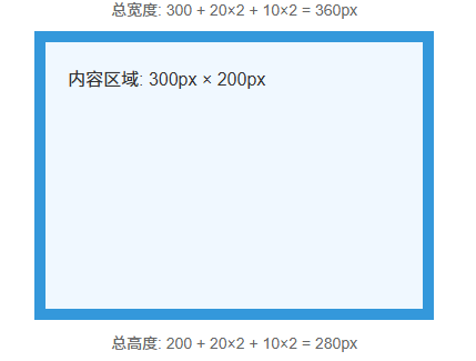
计算过程:
实际占据宽度 = 300(width) + 20×2(padding) + 10×2(border) = 360px
实际占据高度 = 200(height) + 20×2(padding) + 10×2(border) = 280px
运行结果:
2.2 替代盒模型 (border-box)
计算规则:
总宽度 = width (已包含padding和border)
总高度 = height (已包含padding和border)
示例代码:
<!DOCTYPE html>
<html lang="zh-CN">
<head>
<meta charset="UTF-8">
<meta name="viewport" content="width=device-width, initial-scale=1.0">
<title>border-box盒模型示例</title>
<style>
.box {
  /* 盒模型设置 */
  box-sizing: border-box; /* 替代盒模型 */

  /* 总尺寸 */
  width: 300px;
  height: 200px;

  /* 内边距 */
  padding: 20px;

  /* 边框 */
  border: 10px solid #e74c3c;

  /* 外边距 */
  margin: 30px;

  /* 视觉效果 */
  background: #ffeaea;
  color: #333;
  font-family: Arial, sans-serif;
  position: relative;
}

/* 尺寸标注 */
.box::before {
  content: '内容宽度: 300 - 20×2 - 10×2 = 240px';
  position: absolute;
  top: -40px;
  left: 0;
  width: 100%;
  text-align: center;
  font-size: 12px;
  color: #666;
}

.box::after {
  content: '内容高度: 200 - 20×2 - 10×2 = 140px';
  position: absolute;
  bottom: -40px;
  left: 0;
  width: 100%;
  text-align: center;
  font-size: 12px;
  color: #666;
}
</style>
</head>
<body>
<div class="box">
  内容区域: 240px × 140px
</div>
</body>
</html>
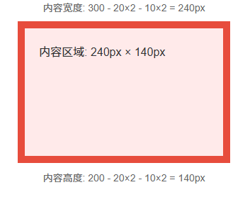
计算过程:
实际内容宽度 = 300(width) - 20×2(padding) - 10×2(border) = 240px
实际内容高度 = 200(height) - 20×2(padding) - 10×2(border) = 140px
运行结果:
三、box-sizing属性详解
3.1 语法与取值
/* 语法 */
box-sizing: content-box | border-box | inherit | initial | unset;

/* 默认值 */
box-sizing: content-box; /* 标准盒模型 */

/* 推荐值 */
box-sizing: border-box; /* 替代盒模型 */
3.2 浏览器兼容性
| 浏览器 | 支持版本 | 前缀需求 | 备注 |
|---|---|---|---|
| Chrome | 10+ | -webkit- (旧版) | Chrome 10-28需-webkit- |
| Safari | 5.1+ | -webkit- (旧版) | Safari 5.1-6需-webkit- |
| Firefox | 29+ | -moz- (旧版) | Firefox 1-28需-moz- |
| Edge | 12+ | 无 | IE8部分支持 |
| IE | 8+ | 无 | IE8仅支持content-box/border-box |
兼容性处理方案:
/* 企业级重置代码 */
*, *::before, *::after {
  /* 支持所有浏览器 */
  box-sizing: border-box;
  -webkit-box-sizing: border-box;
  -moz-box-sizing: border-box;
}

/* 或者使用现代方案 */
:where(*, *::before, *::after) {
  box-sizing: border-box;
}
四、浏览器渲染中的盒模型处理
4.1 渲染流程中的盒模型
DOM树 + CSSOM树
    ↓
渲染树构建
    ↓
布局计算(盒模型计算)
    ↓
分层
    ↓
绘制
    ↓
合成
布局计算阶段:
- 根据
box-sizing确定计算方式 - 计算每个盒子的最终尺寸
- 处理外边距折叠
- 计算包含块关系
4.2 性能影响
触发重排的操作:
- 改变
width/height - 改变
padding/margin - 改变
border-width - 改变
box-sizing
优化建议:
/* 避免频繁改变尺寸 */
.element {
  /* 使用transform代替width/height变化 */
  transition: transform 0.3s ease; /* 不触发重排 */
  /* 而不是 */
  transition: width 0.3s ease; /* 触发重排 */
}

/* 使用will-change优化 */
.box {
  will-change: transform; /* 提示浏览器提前优化 */
}
五、外边距折叠(Margin Collapsing)
5.1 什么是外边距折叠?
定义:相邻的垂直外边距会合并(折叠)成一个外边距,其大小为两者中的较大者。
发生条件:
- 相邻兄弟元素
- 父元素与第一个/最后一个子元素之间
- 空元素
5.2 折叠规则示例
<!DOCTYPE html>
<html lang="zh-CN">
<head>
<meta charset="UTF-8">
<meta name="viewport" content="width=device-width, initial-scale=1.0">
<title>外边距折叠示例</title>
<style>
body {
margin: 0;
padding: 20px;
background: #f5f5f5;
font-family: Arial, sans-serif;
}
.container {
background: white;
border: 1px solid #ddd;
padding: 20px;
}
.sibling {
background: #e3f2fd;
padding: 20px;
margin: 30px 0;
border: 2px dashed #2196f3;
}
.sibling-1 {
margin-bottom: 30px;
}
.sibling-2 {
margin-top: 50px; /* 会与上面的30px折叠,取较大的50px */
}
.parent {
background: #fff3e0;
margin-top: 40px;
padding: 0; /* 注意:有padding会阻止折叠 */
}
.child {
background: #ffecb3;
margin-top: 60px; /* 会与父元素的40px折叠,取较大的60px */
height: 100px;
border: 2px dashed #ff9800;
}
/* 阻止折叠的方法 */
.no-collapse {
padding: 1px; /* 方法1:添加内边距 */
overflow: auto; /* 方法2:创建BFC */
border-top: 1px solid transparent; /* 方法3:添加边框 */
}
</style>
</head>
<body>
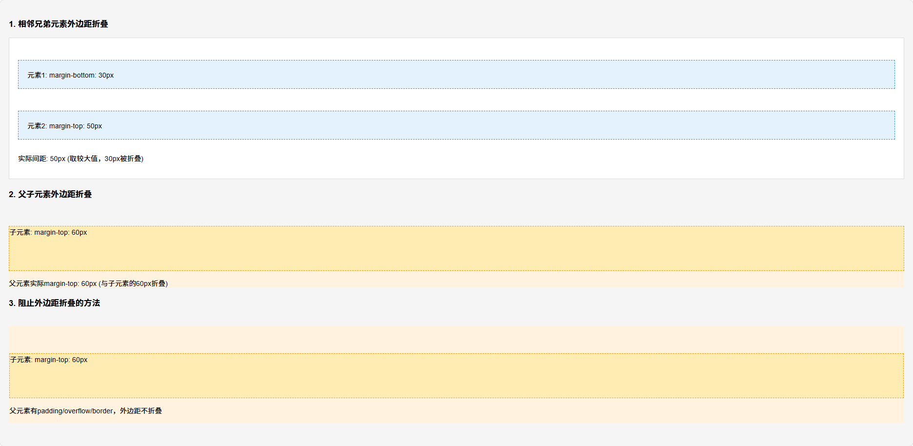
<h3>1. 相邻兄弟元素外边距折叠</h3>
<div class="container">
<div class="sibling sibling-1">元素1: margin-bottom: 30px</div>
<div class="sibling sibling-2">元素2: margin-top: 50px</div>
<p>实际间距: 50px (取较大值,30px被折叠)</p>
</div>
<h3>2. 父子元素外边距折叠</h3>
<div class="parent">
<div class="child">子元素: margin-top: 60px</div>
<p>父元素实际margin-top: 60px (与子元素的60px折叠)</p>
</div>
<h3>3. 阻止外边距折叠的方法</h3>
<div class="parent no-collapse">
<div class="child">子元素: margin-top: 60px</div>
<p>父元素有padding/overflow/border,外边距不折叠</p>
</div>
</body>
</html>
运行结果:
5.3 阻止外边距折叠的方法
- 添加边框或内边距
- 创建BFC(块级格式化上下文)
- 使用flex/grid布局
- 使用绝对定位
/* 创建BFC的方法 */
.parent {
  overflow: auto;      /* 方法1 */
  display: flow-root;  /* 方法2(推荐) */
  display: flex;       /* 方法3 */
  display: grid;       /* 方法4 */
  position: absolute;  /* 方法5 */
}
六、常见误区与澄清
误区1:width: 100%等于父元素宽度
/* 错误理解 */
.parent { width: 300px; padding: 20px; }
.child { width: 100%; } /* 认为child宽度是300px */

/* 实际情况(标准盒模型下) */
.child {
  width: 100%; /* 实际宽度是300px(父元素内容宽度) */
  /* 如果加上padding: 20px; 总宽度变成340px,会溢出! */
}
误区2:height: 100%总是有效
/* 错误用法 */
.parent { height: auto; }
.child { height: 100%; } /* 可能无效! */

/* 正确用法 */
.parent {
  height: 500px; /* 或明确的数值 */
}
.child {
  height: 100%; /* 现在有效了 */
}
误区3:所有元素都有盒模型
/* 特殊元素 */
img, input, textarea, video, canvas {
  /* 这些元素是替换元素,有自己的内在尺寸 */
  box-sizing: content-box; /* 默认,但行为可能不同 */
}
七、实战场景应用
场景1:电商网站商品网格布局
业务需求:商品卡片等宽排列,有间距,响应式适配
<!DOCTYPE html>
<html lang="zh-CN">
<head>
<meta charset="UTF-8">
<meta name="viewport" content="width=device-width, initial-scale=1.0">
<title>电商商品网格布局</title>
<style>
/* 全局盒模型设置 */
*, *::before, *::after {
box-sizing: border-box;
margin: 0;
padding: 0;
}
.container {
max-width: 1200px;
margin: 0 auto;
padding: 20px;
}
/* 网格布局 */
.product-grid {
display: grid;
grid-template-columns: repeat(auto-fill, minmax(280px, 1fr));
gap: 20px; /* 替代margin,不会折叠 */
margin-bottom: 40px;
}
/* 商品卡片 - border-box的优势 */
.product-card {
/* 固定总宽度,内部可自由设置padding */
width: 100%; /* 网格项自动分配宽度 */
background: white;
border-radius: 12px;
overflow: hidden;
box-shadow: 0 4px 12px rgba(0,0,0,0.1);
transition: transform 0.3s ease, box-shadow 0.3s ease;
display: flex;
flex-direction: column;
}
/* 图片容器 - 固定比例 */
.product-image {
position: relative;
padding-top: 100%; /* 1:1宽高比 */
background: #f5f5f5;
overflow: hidden;
}
.product-image img {
position: absolute;
top: 0;
left: 0;
width: 100%;
height: 100%;
object-fit: cover;
transition: transform 0.5s ease;
}
.product-card:hover .product-image img {
transform: scale(1.05);
}
/* 商品信息 */
.product-info {
padding: 20px; /* 使用border-box,padding包含在总高度内 */
display: flex;
flex-direction: column;
flex-grow: 1;
}
.product-title {
font-size: 16px;
line-height: 1.4;
margin-bottom: 8px;
color: #333;
display: -webkit-box;
-webkit-line-clamp: 2;
-webkit-box-orient: vertical;
overflow: hidden;
flex-grow: 1;
}
.product-price {
font-size: 20px;
font-weight: bold;
color: #e53935;
margin-top: auto;
padding-top: 12px;
border-top: 1px solid #eee;
}
/* 响应式调整 */
@media (max-width: 768px) {
.product-grid {
grid-template-columns: repeat(auto-fill, minmax(240px, 1fr));
gap: 15px;
}
.product-info {
padding: 15px;
}
}
</style>
</head>
<body>
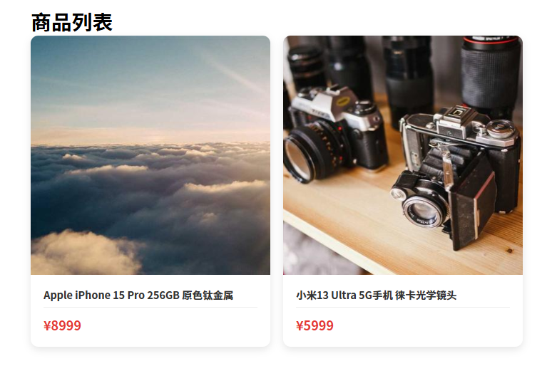
<div class="container">
<h1>商品列表</h1>
<div class="product-grid">
<!-- 商品卡片1 -->
<div class="product-card">
<div class="product-image">
<img src="https://picsum.photos/400/400" alt="商品图片">
</div>
<div class="product-info">
<h3 class="product-title">Apple iPhone 15 Pro 256GB 原色钛金属</h3>
<div class="product-price">¥8999</div>
</div>
</div>
<!-- 商品卡片2 -->
<div class="product-card">
<div class="product-image">
<img src="https://picsum.photos/400/401" alt="商品图片">
</div>
<div class="product-info">
<h3 class="product-title">小米13 Ultra 5G手机 徕卡光学镜头</h3>
<div class="product-price">¥5999</div>
</div>
</div>
<!-- 更多商品卡片... -->
</div>
</div>
</body>
</html>
设计优势:
- 使用
border-box确保padding不影响布局 - 使用
gap避免外边距折叠问题 - 固定比例图片容器保持视觉一致性
- 响应式设计适应不同屏幕
运行结果:
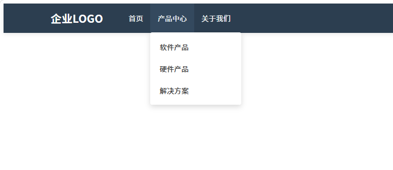
场景2:企业官网导航栏实现
业务需求:响应式导航,精确控制间距,支持子菜单
<!DOCTYPE html>
<html lang="zh-CN">
<head>
<meta charset="UTF-8">
<meta name="viewport" content="width=device-width, initial-scale=1.0">
<title>企业官网导航栏</title>
<style>
/* 全局设置 */
* {
  box-sizing: border-box;
}

/* 导航栏容器 */
.navbar {
  background: #2c3e50;
  color: white;
  padding: 0 5%; /* 使用百分比padding响应式 */
  display: flex;
  align-items: center;
  height: 64px; /* 固定高度,border-box确保包含padding */
  position: relative;
  box-shadow: 0 2px 10px rgba(0,0,0,0.1);
}

/* Logo区域 */
.navbar-brand {
  font-size: 24px;
  font-weight: bold;
  text-decoration: none;
  color: white;
  padding: 16px 0; /* 垂直padding控制点击区域 */
  margin-right: 40px; /* 固定间距 */
}

/* 导航菜单 */
.navbar-menu {
  display: flex;
  list-style: none;
  margin: 0;
  padding: 0;
  flex-grow: 1;
}

/* 导航项 */
.nav-item {
  position: relative;
}

.nav-link {
  display: block;
  color: #ecf0f1;
  text-decoration: none;
  padding: 20px 16px; /* 增大点击区域 */
  transition: background 0.3s;
  height: 100%; /* 继承父元素高度 */
  display: flex;
  align-items: center;
}

.nav-link:hover {
  background: #34495e;
}

/* 下拉菜单 */
.dropdown-menu {
  position: absolute;
  top: 100%; /* 紧贴导航项下方 */
  left: 0;
  background: white;
  min-width: 200px;
  box-shadow: 0 4px 12px rgba(0,0,0,0.15);
  border-radius: 4px;
  opacity: 0;
  visibility: hidden;
  transform: translateY(-10px);
  transition: all 0.3s ease;
  padding: 8px 0; /* 统一内边距 */
  margin: 0; /* 避免外边距折叠 */
}

.nav-item:hover .dropdown-menu {
  opacity: 1;
  visibility: visible;
  transform: translateY(0);
}

.dropdown-item {
  display: block;
  padding: 12px 20px;
  color: #333;
  text-decoration: none;
  transition: background 0.2s;
}

.dropdown-item:hover {
  background: #f5f5f5;
}

/* 响应式设计 */
@media (max-width: 768px) {
  .navbar {
    height: auto;
    flex-wrap: wrap;
    padding: 0 20px;
  }

  .navbar-menu {
    width: 100%;
    flex-direction: column;
    display: none; /* 移动端隐藏 */
  }

  .nav-link {
    padding: 12px 0;
  }
}
</style>
</head>
<body>
<nav class="navbar">
  <a href="/" class="navbar-brand">企业LOGO</a>

  <ul class="navbar-menu">
    <li class="nav-item">
      <a href="/" class="nav-link">首页</a>
    </li>
    <li class="nav-item">
      <a href="/products" class="nav-link">产品中心</a>
      <div class="dropdown-menu">
        <a href="/products/software" class="dropdown-item">软件产品</a>
        <a href="/products/hardware" class="dropdown-item">硬件产品</a>
        <a href="/products/solutions" class="dropdown-item">解决方案</a>
      </div>
    </li>
    <li class="nav-item">
      <a href="/about" class="nav-link">关于我们</a>
    </li>
  </ul>
</nav>
</body>
</html>
关键技术点:
- 使用
border-box精确控制导航栏高度 - 通过
padding创建舒适的点击区域 - 下拉菜单使用
top: 100%精确定位 - 避免外边距折叠影响布局
运行结果:
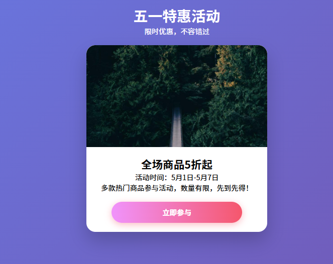
场景3:移动端H5活动页布局
业务需求:全屏布局,适配各种手机屏幕
<!DOCTYPE html>
<html lang="zh-CN">
<head>
<meta charset="UTF-8">
<meta name="viewport" content="width=device-width, initial-scale=1.0, maximum-scale=1.0, user-scalable=no">
<title>移动端H5活动页</title>
<style>
/* 移动端盒模型最佳实践 */
* {
  box-sizing: border-box;
  margin: 0;
  padding: 0;
  -webkit-tap-highlight-color: transparent; /* 移除点击高亮 */
}

html, body {
  width: 100%;
  height: 100%;
  overflow-x: hidden; /* 防止水平滚动 */
}

/* 全屏容器 */
.activity-container {
  min-height: 100vh; /* 最小高度为视口高度 */
  background: linear-gradient(135deg, #667eea 0%, #764ba2 100%);
  display: flex;
  flex-direction: column;
  position: relative;
}

/* 页面头部 */
.activity-header {
  padding: 20px 16px; /* 移动端使用rem/px,避免vw单位 */
  text-align: center;
  color: white;
  position: relative;
  z-index: 2;
}

/* 主内容区域 */
.activity-main {
  flex: 1; /* 填充剩余空间 */
  padding: 0 16px 20px;
  display: flex;
  flex-direction: column;
  align-items: center;
  position: relative;
}

/* 卡片容器 */
.activity-card {
  width: 100%;
  max-width: 400px; /* 移动端最大宽度 */
  background: white;
  border-radius: 20px;
  overflow: hidden;
  box-shadow: 0 20px 40px rgba(0,0,0,0.2);
  margin-bottom: 20px;
}

/* 图片区域 - 固定比例 */
.card-image {
  position: relative;
  padding-top: 56.25%; /* 16:9宽高比 */
  background: #f0f0f0;
  overflow: hidden;
}

.card-image img {
  position: absolute;
  top: 0;
  left: 0;
  width: 100%;
  height: 100%;
  object-fit: cover;
}

/* 内容区域 */
.card-content {
  padding: 20px; /* 使用border-box,padding不影响总尺寸 */
  text-align: center;
}

/* 按钮 */
.btn {
  display: inline-block;
  background: linear-gradient(to right, #f093fb 0%, #f5576c 100%);
  color: white;
  text-decoration: none;
  padding: 12px 32px;
  border-radius: 50px;
  font-weight: bold;
  font-size: 16px;
  box-shadow: 0 4px 15px rgba(245, 87, 108, 0.4);
  transition: transform 0.3s, box-shadow 0.3s;
  border: none;
  cursor: pointer;
  width: 80%; /* 百分比宽度 */
  max-width: 300px; /* 最大宽度限制 */
  text-align: center;
  margin: 20px auto 0;
}

.btn:active {
  transform: translateY(2px);
  box-shadow: 0 2px 8px rgba(245, 87, 108, 0.4);
}

/* 安全区域适配 */
@supports (padding: env(safe-area-inset-bottom)) {
  .activity-container {
    padding-bottom: env(safe-area-inset-bottom);
  }
}

/* 深色模式适配 */
@media (prefers-color-scheme: dark) {
  .activity-card {
    background: #1e1e1e;
    color: white;
  }
}
</style>
</head>
<body>
<div class="activity-container">
  <header class="activity-header">
    <h1>五一特惠活动</h1>
    <p>限时优惠,不容错过</p>
  </header>

  <main class="activity-main">
    <div class="activity-card">
      <div class="card-image">
        <img src="https://picsum.photos/800/450" alt="活动海报">
      </div>
      <div class="card-content">
        <h2>全场商品5折起</h2>
        <p>活动时间:5月1日-5月7日</p>
        <p>多款热门商品参与活动,数量有限,先到先得!</p>
        <button class="btn">立即参与</button>
      </div>
    </div>
  </main>
</div>
</body>
</html>
移动端优化:
- 使用
min-height: 100vh实现全屏 - 固定比例容器避免内容闪烁
- 安全区域适配
- 触摸反馈优化
运行结果:
八、企业级最佳实践
8.1 团队CSS规范
/* 1. 全局盒模型设置 */
:root {
  --box-model: border-box;
}

*,
*::before,
*::after {
  box-sizing: var(--box-model);
  -webkit-box-sizing: var(--box-model);
  -moz-box-sizing: var(--box-model);
}

/* 2. 组件开发规范 */
.component {
  /* 使用border-box */
  box-sizing: border-box;

  /* 明确设置display */
  display: block; /* 或 flex/grid/inline-block */

  /* 避免意外外边距折叠 */
  margin: 0;
  padding: 0;

  /* 明确设置宽度计算方式 */
  width: 100%; /* 或固定值 */
  max-width: 100%; /* 防止溢出 */
}

/* 3. 工具类 */
.u-border-box { box-sizing: border-box; }
.u-content-box { box-sizing: content-box; }
8.2 常见问题解决方案
问题1:子元素宽度超出父容器
/* 错误 */
.parent { width: 300px; padding: 20px; }
.child { width: 100%; padding: 20px; } /* 实际宽度340px,溢出! */

/* 解决方案1:使用border-box */
.child {
  box-sizing: border-box;
  width: 100%;
  padding: 20px; /* 现在宽度正确为300px */
}

/* 解决方案2:使用calc */
.child {
  width: calc(100% - 40px); /* 减去padding */
  padding: 20px;
}
问题2:高度塌陷
/* 问题:父元素高度为0 */
.parent { border: 1px solid red; }
.child { float: left; height: 100px; }

/* 解决方案1:清除浮动 */
.parent::after {
  content: '';
  display: table;
  clear: both;
}

/* 解决方案2:创建BFC */
.parent { overflow: auto; }
/* 或 */
.parent { display: flow-root; }
九、性能与可访问性
9.1 性能优化
减少重排:
/* 差:多次触发重排 */
.element {
  width: 100px;
  padding: 20px; /* 触发重排 */
  border: 1px solid; /* 触发重排 */
}

/* 好:一次性修改 */
.element {
  /* 使用transform代替几何属性变化 */
  transform: translateX(100px); /* 触发合成,不触发重排 */
}

/* 使用contain属性优化 */
.container {
  contain: layout; /* 告诉浏览器子元素不影响外部布局 */
}
9.2 可访问性考虑
/* 确保足够的点击区域 */
.button {
  min-height: 44px; /* iOS推荐最小点击区域 */
  min-width: 44px;
  padding: 12px 24px; /* 增加内边距 */
}

/* 焦点状态可见 */
.button:focus {
  outline: 2px solid #4d90fe;
  outline-offset: 2px;
}

/* 高对比度模式支持 */
@media (forced-colors: active) {
  .button {
    border: 1px solid ButtonText; /* 使用系统颜色 */
  }
}
十、延伸思考与挑战
思考题1:盒模型与Flex/Grid布局
.container {
  display: flex;
  width: 1000px;
  padding: 20px;
  gap: 20px;
}

.item {
  flex: 1;
  padding: 20px;
  border: 10px solid;
}
/* 问题:.item的实际内容宽度是多少? */
答案:在border-box下,flex: 1分配的剩余空间是减去padding和border后的空间。
思考题2:盒模型与百分比计算
.parent {
  width: 500px;
  padding-left: 100px;
}

.child {
  width: 50%; /* 是多少? */
  padding: 10%; /* 是多少? */
}
答案:
width: 50%→ 250px (相对于父元素内容宽度)padding: 10%→ 50px (相对于父元素内容宽度)
实战挑战:实现等高卡片
/* 使用现代CSS实现等高卡片 */
.card-grid {
  display: grid;
  grid-auto-flow: column;
  grid-template-rows: 1fr; /* 等高行 */
  gap: 20px;
}

/* 或使用flex */
.card-container {
  display: flex;
  align-items: stretch; /* 拉伸子元素 */
}

.card {
  display: flex;
  flex-direction: column;
  flex: 1;
}
关键要点总结
- 盒模型选择:现代开发统一使用
border-box - 外边距折叠:理解其原理,学会控制
- 响应式设计:结合
box-sizing实现精确布局 - 性能优化:避免不必要的重排
- 移动端适配:注意安全区域和触摸友好
进一步学习
-
CSS Box Model Module Level 3
- 包含
box-sizing、margin-trim等新特性 - 草案中:
aspect-ratio属性
- 包含
-
CSS Containment
- 通过
contain属性优化布局性能 - 特别适合复杂组件和无限列表
- 通过
-
CSS逻辑属性
- 支持RTL布局和逻辑方向
- 如
margin-inline-start替代margin-left
工具推荐:
- Chrome DevTools盒模型查看器
- CSS Triggers(查看属性触发什么渲染阶段)
- caniuse.com(检查兼容性)
掌握盒模型是CSS布局的基石,理解它的原理能让你在开发中少走很多弯路。

AtomGit 是由开放原子开源基金会联合 CSDN 等生态伙伴共同推出的新一代开源与人工智能协作平台。平台坚持“开放、中立、公益”的理念,把代码托管、模型共享、数据集托管、智能体开发体验和算力服务整合在一起,为开发者提供从开发、训练到部署的一站式体验。
更多推荐

 19
19 0
0- 0


 已为社区贡献3条内容

所有评论(0)