Android 四大布局项目实战与详解
·
Android 四大布局项目实战与详解
本文将结合
LinearLayout、RelativeLayout、TableLayout、NeonLamp四个实战项目,详细介绍 Android 布局资源的四种核心类型,并附上项目运行效果与代码解析。
一、项目导入与运行说明
本次实战的四个项目均为 Android 基础布局练习,分别对应线性布局、相对布局、表格布局和帧布局:
LinearLayout:线性布局项目RelativeLayout:相对布局项目TableLayout:表格布局项目NeonLamp:帧布局(霓虹灯效果)项目
导入与运行步骤
- 打开 Android Studio →
File→Open,选择对应项目文件夹 - 等待 Gradle 同步完成(若遇到依赖下载问题,可配置国内镜像或离线模式)
- 连接真机 / 启动模拟器 → 点击绿色运行按钮 ▶
- 截取运行界面截图,用于后续博客展示
二、四大布局项目实战解析
1. LinearLayout(线性布局)
运行截图:
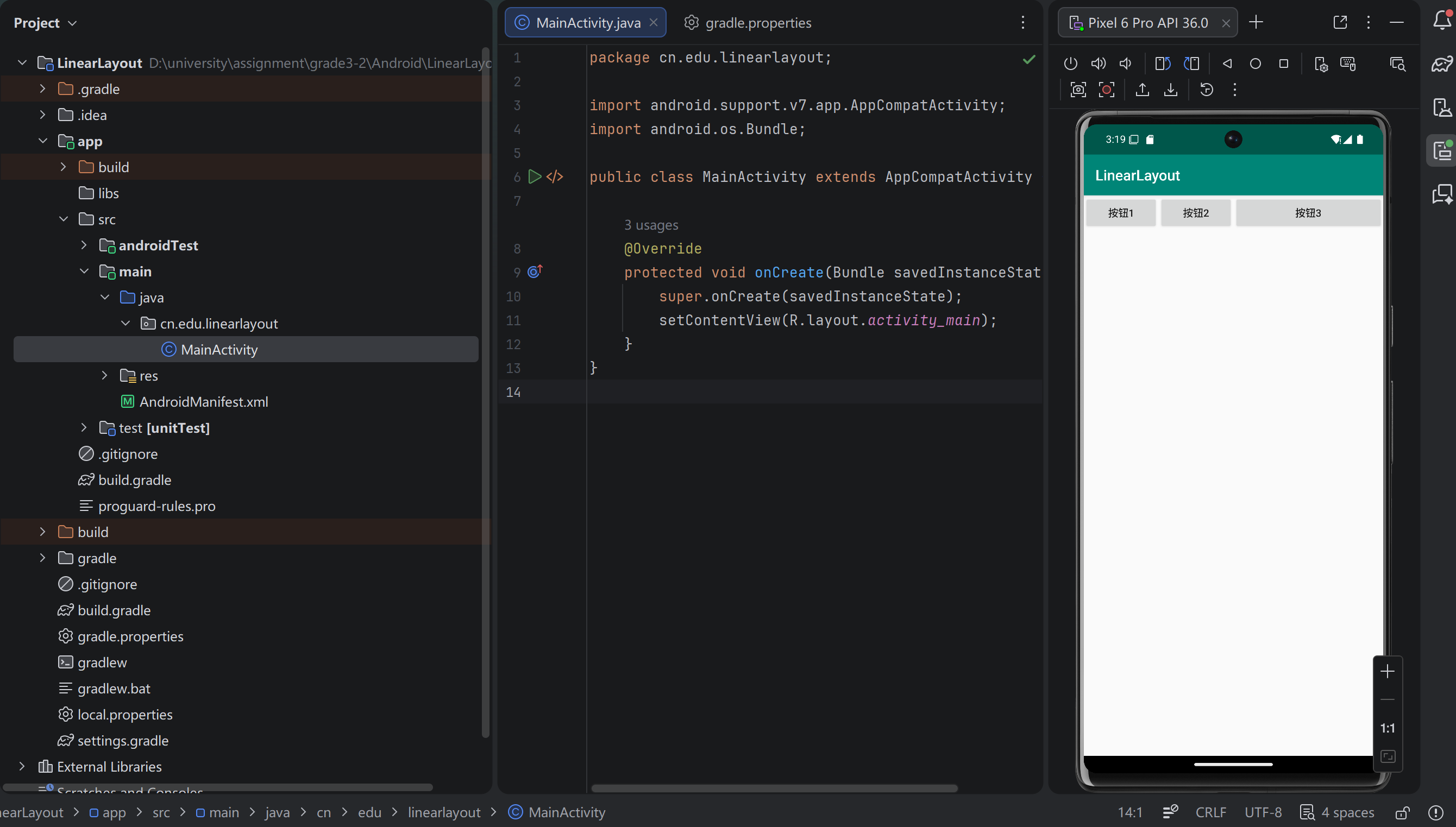
核心特点:
- 子控件按 水平(horizontal) 或 垂直(vertical) 方向线性排列
- 通过
android:layout_weight属性实现按比例分配剩余空间 - 适合简单线性界面,如登录表单、设置项列表
关键代码示例:
xml
<LinearLayout
    android:layout_width="match_parent"
    android:layout_height="wrap_content"
    android:orientation="vertical"
    android:padding="16dp">

    <TextView
        android:layout_width="match_parent"
        android:layout_height="wrap_content"
        android:text="用户名"
        android:textSize="16sp"/>

    <EditText
        android:layout_width="match_parent"
        android:layout_height="wrap_content"
        android:hint="请输入用户名"/>

    <Button
        android:layout_width="match_parent"
        android:layout_height="wrap_content"
        android:text="登录"
        android:layout_marginTop="16dp"/>

</LinearLayout>
2. RelativeLayout(相对布局)
运行截图:
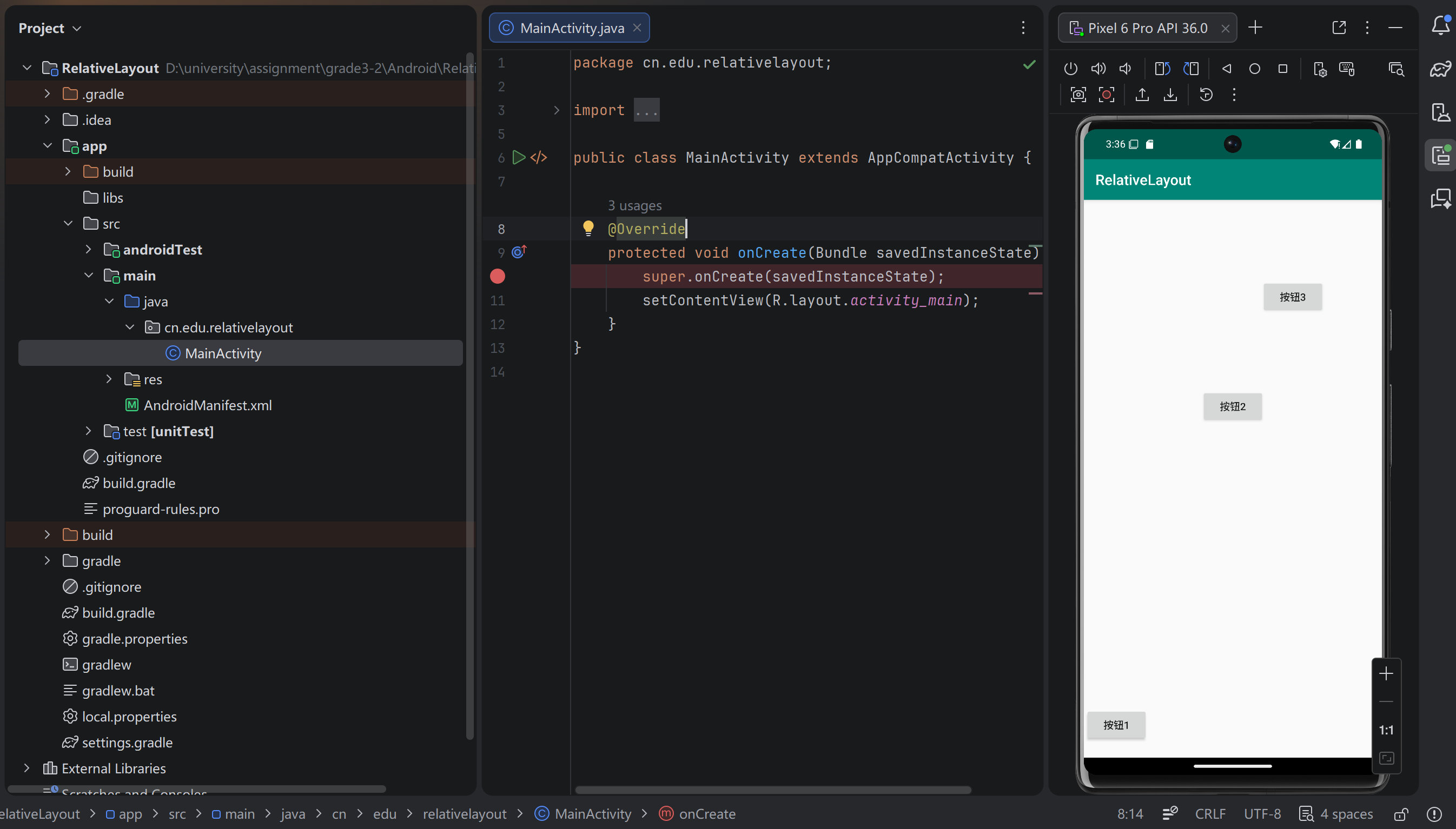
核心特点:
- 子控件通过 相对位置关系(相对于父容器或其他控件)定位
- 灵活性高,可实现复杂不规则布局,减少嵌套层级
- 适合需要控件对齐的界面,如个人信息页、商品详情页
关键代码示例:
xml
<RelativeLayout
    android:layout_width="match_parent"
    android:layout_height="wrap_content"
    android:padding="16dp">

    <ImageView
        android:id="@+id/iv_avatar"
        android:layout_width="80dp"
        android:layout_height="80dp"
        android:src="@drawable/ic_avatar"/>

    <TextView
        android:id="@+id/tv_name"
        android:layout_width="wrap_content"
        android:layout_height="wrap_content"
        android:text="用户名"
        android:textSize="18sp"
        android:layout_toRightOf="@id/iv_avatar"
        android:layout_marginLeft="16dp"
        android:layout_alignTop="@id/iv_avatar"/>

    <TextView
        android:id="@+id/tv_desc"
        android:layout_width="wrap_content"
        android:layout_height="wrap_content"
        android:text="个人简介"
        android:textSize="14sp"
        android:layout_below="@id/tv_name"
        android:layout_toRightOf="@id/iv_avatar"
        android:layout_marginLeft="16dp"
        android:layout_marginTop="8dp"/>

</RelativeLayout>
3. TableLayout(表格布局)
运行截图:
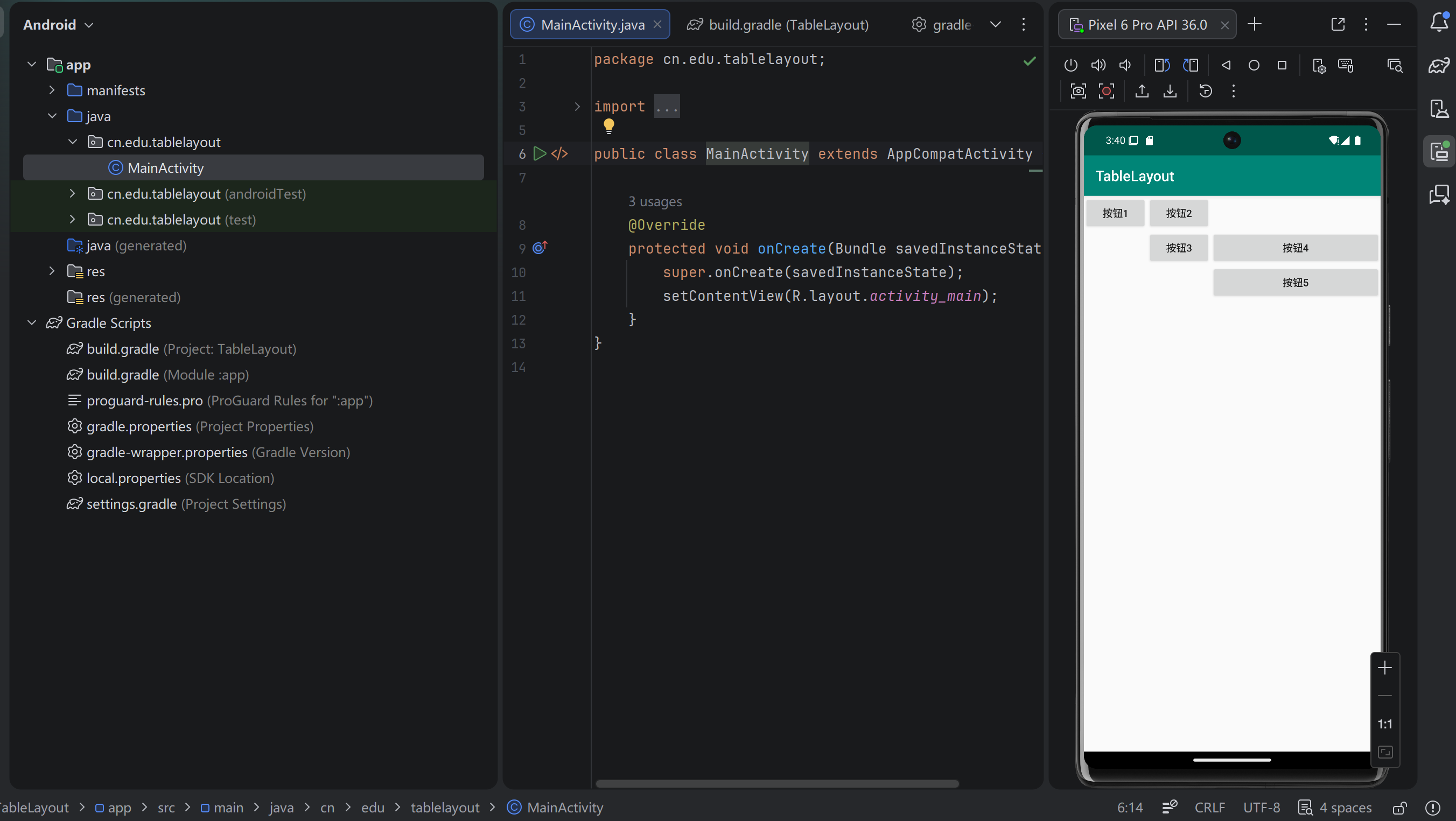
核心特点:
- 以 行(TableRow) 和 列 的形式排列子控件,自动适配列宽
- 支持合并单元格,适合结构化数据展示
- 典型场景:计算器界面、成绩表、表单表格
关键代码示例:
xml
<TableLayout
    android:layout_width="match_parent"
    android:layout_height="wrap_content"
    android:padding="16dp"
    android:stretchColumns="*">

    <TableRow>
        <TextView
            android:layout_width="wrap_content"
            android:layout_height="wrap_content"
            android:text="科目"
            android:padding="8dp"
            android:background="@drawable/border"/>
        <TextView
            android:layout_width="wrap_content"
            android:layout_height="wrap_content"
            android:text="成绩"
            android:padding="8dp"
            android:background="@drawable/border"/>
    </TableRow>

    <TableRow>
        <TextView
            android:layout_width="wrap_content"
            android:layout_height="wrap_content"
            android:text="语文"
            android:padding="8dp"
            android:background="@drawable/border"/>
        <TextView
            android:layout_width="wrap_content"
            android:layout_height="wrap_content"
            android:text="90"
            android:padding="8dp"
            android:background="@drawable/border"/>
    </TableRow>

</TableLayout>
4. NeonLamp(FrameLayout 帧布局)
运行截图:
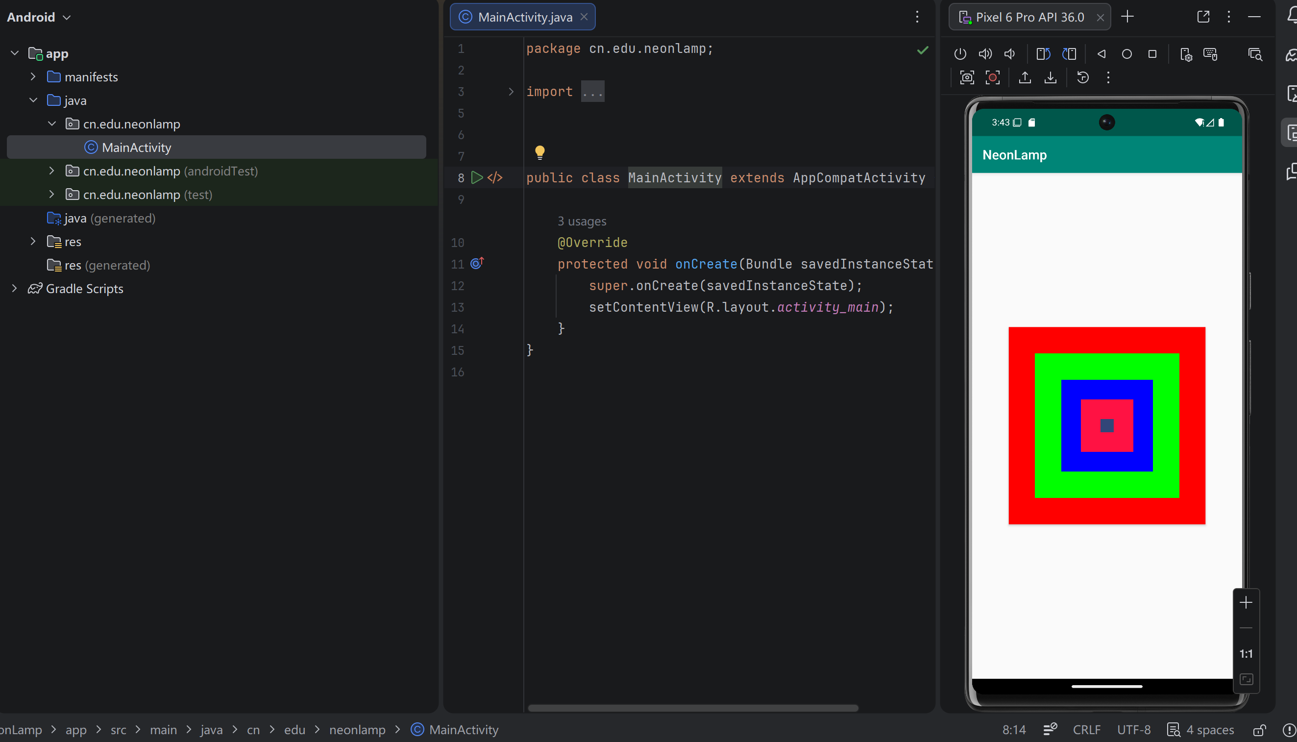
核心特点:
- 子控件默认 叠加在左上角,后添加的控件会覆盖先添加的控件
- 通过
android:layout_gravity控制子控件对齐方式 - 适合层叠效果、Fragment 容器、加载动画、霓虹灯等场景
关键代码示例:
xml
<FrameLayout
    android:layout_width="match_parent"
    android:layout_height="match_parent">

    <ImageView
        android:layout_width="match_parent"
        android:layout_height="match_parent"
        android:src="@drawable/bg_neon"/>

    <TextView
        android:layout_width="wrap_content"
        android:layout_height="wrap_content"
        android:text="霓虹灯效果"
        android:textSize="24sp"
        android:textColor="@color/white"
        android:layout_gravity="center"/>

    <ProgressBar
        android:layout_width="wrap_content"
        android:layout_height="wrap_content"
        android:layout_gravity="bottom|center_horizontal"
        android:layout_marginBottom="32dp"/>

</FrameLayout>
三、四大布局对比总结
表格
| 布局类型 | 核心特点 | 适用场景 |
|---|---|---|
| LinearLayout | 线性排列,支持比例分配 | 简单线性界面、表单、列表项 |
| RelativeLayout | 相对位置定位,灵活性高 | 复杂不规则界面、信息展示页 |
| TableLayout | 表格形式排列,自动适配列宽 | 数据表格、计算器等结构化界面 |
| FrameLayout | 层叠叠加,控制对齐方式 | 层叠效果、Fragment 容器、动画 |
开发建议
- 简单线性布局优先使用
LinearLayout,实现高效且易维护 - 复杂界面推荐使用
RelativeLayout或现代的ConstraintLayout,减少布局嵌套 - 数据展示类场景可使用
TableLayout,保证结构清晰 - 层叠 / 动画效果优先使用
FrameLayout,性能更优
四、总结
通过这四个项目的实战,我们掌握了 Android 四种核心布局的使用场景、代码实现与优缺点对比。在现代 Android 开发中,ConstraintLayout 是更推荐的布局方案,它能替代以上四种布局,实现扁平化、高性能的界面构建,但理解基础布局是学习 Android UI 开发的必经之路。
后续将更新 Android Studio相关学习资料,敬请关注~

AtomGit 是由开放原子开源基金会联合 CSDN 等生态伙伴共同推出的新一代开源与人工智能协作平台。平台坚持“开放、中立、公益”的理念,把代码托管、模型共享、数据集托管、智能体开发体验和算力服务整合在一起,为开发者提供从开发、训练到部署的一站式体验。
更多推荐

 4
4 0
0- 0


 已为社区贡献2条内容

所有评论(0)