QML 组件化开发:自定义控件与复用最佳实践
一、为什么要组件化?
在开发 QML 应用时,你可能会遇到这样的情况:应用里有多个相似的按钮、卡片、输入框……如果每次都重新写一遍相同的代码,不仅效率低,而且一旦需要修改样式,就要改几十个地方,非常痛苦。
组件化的核心思想:把重复的 UI 元素封装成独立的、可复用的组件,就像搭积木一样拼装界面。
组件化带来的好处
| 好处 | 说明 |
|---|---|
| 代码复用 | 一次编写,多处使用,减少代码量 |
| 统一维护 | 修改一处,所有使用的地方自动更新 |
| 分工协作 | 不同成员可以独立开发不同组件 |
| 易于测试 | 可以单独测试每个组件的功能 |
| 提升可读性 | 主界面代码变得简洁,像文档一样清晰 |
二、创建你的第一个自定义组件
2.1 最简单的组件:单文件组件
在 QML 中,一个 .qml 文件就是一个组件。文件名的首字母必须大写,例如 MyButton.qml。
第一步:创建组件文件 MyButton.qml
qml
// MyButton.qml
import QtQuick 2.12
import QtQuick.Controls 2.12
Rectangle {
width: 120
height: 40
radius: 8
color: "lightblue"
Text {
text: "按钮"
anchors.centerIn: parent
font.pixelSize: 16
}
MouseArea {
anchors.fill: parent
onClicked: {
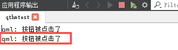
console.log("按钮被点击了")
}
}
}第二步:在 main.qml 中使用这个组件
qml
// main.qml
import QtQuick 2.12
import QtQuick.Window 2.12

Window {
    width: 400
    height: 300
    visible: true
    title: "组件化示例"

    // 直接使用组件名,就像使用内置控件一样
    MyButton {
        anchors.centerIn: parent
    }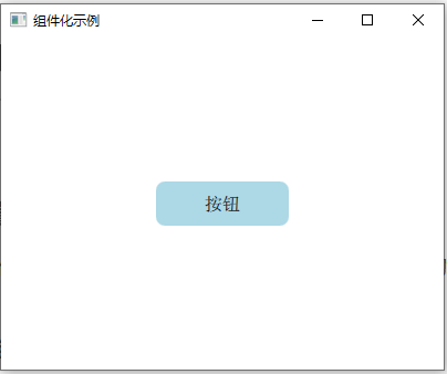
}运行效果:屏幕中央显示一个浅蓝色的圆角矩形,中间写着“按钮”,点击时控制台输出日志。
三、让组件可配置:属性接口
上面的组件虽然能用,但太死板了——按钮的文字固定,颜色固定。真正的组件应该像“填空题”,让使用者来填写内容。
3.1 使用 property 定义可配置属性
qml
// CustomButton.qml
import QtQuick 2.12
import QtQuick.Controls 2.12
Rectangle {
// 定义可配置的属性
property string buttonText: "按钮" // 按钮文字
property color buttonColor: "lightblue" // 按钮颜色
property int textSize: 16 // 文字大小
width: 120
height: 40
radius: 8
color: buttonColor // 使用属性
Text {
text: buttonText // 使用属性
anchors.centerIn: parent
font.pixelSize: textSize
color: "white"
}
MouseArea {
anchors.fill: parent
onClicked: {
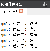
console.log("点击了:", buttonText)
}
}
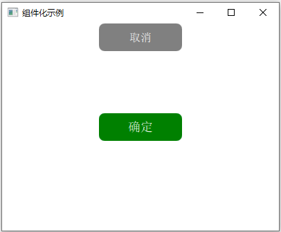
}使用方式:
qml
CustomButton {
    buttonText: "确定"
    buttonColor: "green"
    textSize: 18
    anchors.centerIn: parent
}

CustomButton {
    buttonText: "取消"
    buttonColor: "gray"
    anchors.top: parent.center
    anchors.topMargin: 60
    anchors.horizontalCenter: parent.horizontalCenter
}
3.2 属性别名(alias):暴露内部组件属性
有时候,你需要让外部直接修改组件内部的某个属性,而不是重新定义一遍。这时就用 property alias。
qml
// EditableLabel.qml
import QtQuick 2.12

Rectangle {
    width: 200
    height: 50
    border.color: "gray"
    border.width: 1

    // 将内部的 text 属性暴露给外部
    property alias text: label.text
    property alias textColor: label.color

    TextInput {
        id: label
        anchors.fill: parent
        anchors.margins: 5
        font.pixelSize: 16
        verticalAlignment: Text.AlignVCenter
    }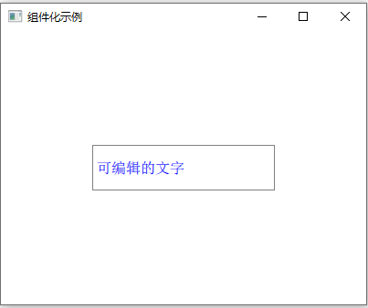
}使用方式:
qml
EditableLabel {
    text: "可编辑的文字"
    textColor: "blue"
    anchors.centerIn: parent
}
3.3 属性变化信号
当你自定义属性时,QML 会自动生成 on<PropertyName>Changed 信号,你可以在外部监听属性的变化:
qml
CustomButton {
    buttonText: "计数器"
    onButtonTextChanged: {
        console.log("按钮文字变成了:", buttonText)
    }
}
四、让组件向外传递消息:信号与槽
组件不仅要能接收外部配置,还要能通知外部发生了什么事。这就像组件“举手报告”:我被点击了!数值变化了!
4.1 自定义信号
qml
// ToggleSwitch.qml
import QtQuick 2.12
Rectangle {
width: 60
height: 30
radius: 15
color: switchOn ? "green" : "gray"
// 自定义属性
property bool switchOn: false
// 自定义信号
signal toggled(bool isOn)
// 内部的滑块圆点
Rectangle {
width: 26
height: 26
radius: 13
color: "white"
x: switchOn ? parent.width - width - 2 : 2
y: 2
Behavior on x {
NumberAnimation { duration: 200 }
}
}
MouseArea {
anchors.fill: parent
onClicked: {
switchOn = !switchOn
toggled(switchOn) // 发射信号,告诉外部状态变化了
}
}
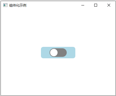
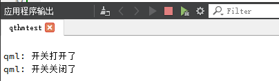
}使用方式:
qml
ToggleSwitch {
    anchors.centerIn: parent
    onToggled: {
        if (isOn) {
            console.log("开关打开了")
        } else {
            console.log("开关关闭了")
        }
    }
}
4.2 连接多个信号
qml
Button {
    text: "重置"
    onClicked: {
        mySwitch.switchOn = false  // 从外部控制其他组件
    }
}

ToggleSwitch {
    id: mySwitch
    onToggled: {
        statusText.text = isOn ? "开启中" : "已关闭"
    }
}
五、组件嵌套与组合
复杂的组件往往是由多个基础组件组合而成的。这就是“组合优于继承”的思想。
5.1 创建一个卡片组件
qml
import QtQuick 2.12
import QtGraphicalEffects 1.12
import QtQuick.Controls 2.12
Rectangle {
property string cardTitle: "标题"
property string cardContent: "这里是内容"
property string buttonText: "查看详情"
width: 280
height: 180
radius: 10
color: "white"
border.color: "#e0e0e0"
border.width: 1
layer.enabled: true
layer.effect: DropShadow {
transparentBorder: true
radius: 8
samples: 16
color: "#80000000"
}
Column {
anchors.fill: parent
anchors.margins: 12
spacing: 8
Text {
text: cardTitle
font.pixelSize: 18 // 修正拼写
font.bold: true
}
Text {
text: cardContent
font.pixelSize: 14 // 修正拼写
color: "#666"
wrapMode: Text.WordWrap
width: parent.width
}
Rectangle {
width: parent.width
height: 1
color: "#eee" // 修正引号
}
CustomButton {
buttonText: parent.parent.buttonText
buttonColor: "#2196F3"
width: 100
height: 32
onClicked: {
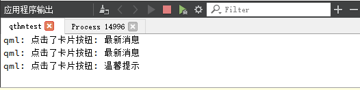
console.log("点击了卡片按钮:", cardTitle) // 修正括号和逗号
}
}
}
}
//CustomButton.qml
import QtQuick 2.12
import QtQuick.Controls 2.12

Button {
    property string buttonText: "按钮"
    property color buttonColor: "lightblue"

    text: buttonText
    background: Rectangle {
        color: buttonColor
        radius: 8
    }

}
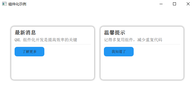
使用方式:
qml
    Row {
        anchors.centerIn: parent
        spacing: 20

        InfoCard {
            cardTitle: "最新消息"
            cardContent: "QML 组件化开发是提高效率的关键"
            buttonText: "了解更多"
        }

        InfoCard {
            cardTitle: "温馨提示"
            cardContent: "记得多复用组件,减少重复代码"
            buttonText: "我知道了"
        }
    }
六、组件库的组织方式
当项目变大,组件变多时,需要合理组织组件文件。
6.1 目录结构推荐
text
project/
├── main.qml
├── components/           # 通用组件目录
│   ├── CustomButton.qml
│   ├── InfoCard.qml
│   ├── ToggleSwitch.qml
│   └── form/
│       ├── TextInputField.qml
│       └── ComboBoxField.qml
├── pages/                # 页面组件
│   ├── HomePage.qml
│   └── SettingsPage.qml
└── qml.qrc              # 资源文件
6.2 在 qml.qrc 中注册资源
xml
<!DOCTYPE RCC>
<RCC version="1.0">
    <qresource prefix="/">
        <file>main.qml</file>
        <file>components/CustomButton.qml</file>
        <file>components/InfoCard.qml</file>
        <file>components/ToggleSwitch.qml</file>
        <file>components/form/TextInputField.qml</file>
    </qresource>
</RCC>
6.3 使用 qmldir 文件(高级)
对于大型组件库,可以使用 qmldir 文件来管理模块:
components/qmldir
text
module MyComponents
CustomButton 1.0 CustomButton.qml
InfoCard 1.0 InfoCard.qml
ToggleSwitch 1.0 ToggleSwitch.qml
在 main.qml 中导入模块
qml
import QtQuick 2.12
import QtQuick.Window 2.12
import MyComponents 1.0

Window {
    visible: true
    width: 400
    height: 300

    CustomButton {
        buttonText: "导入的按钮"
        anchors.centerIn: parent
    }
}
七、最佳实践与常见坑
7.1 命名规范
| 类型 | 规范 | 示例 |
|---|---|---|
| 组件文件名 | 首字母大写 | MyButton.qml |
| 组件内部 ID | 小驼峰 | myButton |
| 自定义属性 | 小驼峰 | buttonText |
| 信号名 | 小驼峰 | buttonClicked |
7.2 组件职责单一
每个组件只做一件事,不要在一个组件里堆砌太多功能。
qml
// ❌ 不推荐:一个组件做了太多事
SuperWidget {
    // 包含了按钮、表单、图表、所有功能...
}

// ✅ 推荐:拆分成多个小组件
Column {
    SearchBar {}
    DataChart {}
    ActionButtons {}
}
7.3 避免深层嵌套
qml
// ❌ 不推荐:属性访问链太长
Text {
    text: parent.parent.parent.dataModel.name
}

// ✅ 推荐:使用属性暴露
Item {
    property string displayName: dataModel ? dataModel.name : ""
    Text {
        text: parent.displayName
    }
}
7.4 性能注意事项
qml
// ❌ 不推荐:在属性绑定中使用复杂计算
Text {
    text: {
        // 每次重绘都执行复杂计算
        let result = 0;
        for (let i = 0; i < 10000; i++) result += i;
        return "结果:" + result;
    }
}

// ✅ 推荐:计算一次,存储结果
Item {
    property int calculatedResult: {
        let result = 0;
        for (let i = 0; i < 10000; i++) result += i;
        return result;
    }
    Text {
        text: "结果:" + parent.calculatedResult
    }
}
7.5 组件版本控制
为组件添加版本号,方便后续升级:
qml
// CustomButton.qml
pragma ComponentBehavior: Bound
// 或在 qmldir 中指定版本
八、实战案例:制作一套表单组件
8.1 文本输入框组件
// FormTextField.qml
import QtQuick 2.12
import QtQuick.Controls 2.12

Rectangle {
    property string labelText: ""
    property string placeholder: ""
    property alias text: input.text
    property int echoMode: TextInput.Normal   // 新增:回显模式

    width: 250
    height: 70
    color: "transparent"

    Text {
        id: label
        text: labelText
        font.pixelSize: 14
        color: "#333"
        anchors.top: parent.top
        anchors.left: parent.left
    }

    Rectangle {
        id: inputBg
        anchors.top: label.bottom
        anchors.topMargin: 5
        anchors.left: parent.left
        anchors.right: parent.right
        height: 36
        radius: 4
        border.color: input.activeFocus ? "#2196F3" : "#ddd"
        border.width: input.activeFocus ? 2 : 1
        color: "white"

        TextInput {
            id: input
            anchors.fill: parent
            anchors.margins: 8
            font.pixelSize: 14
            verticalAlignment: Text.AlignVCenter
            selectByMouse: true
            echoMode: parent.parent.echoMode   // 绑定外部属性

            Text {
                text: placeholder
                color: "#aaa"
                visible: !input.text && !input.activeFocus
                anchors.fill: parent
                verticalAlignment: Text.AlignVCenter
            }
        }
    }
}
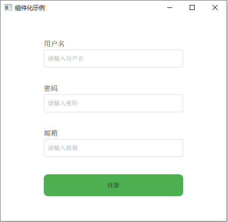
8.2 在页面中使用
qml
// main.qml
import QtQuick 2.12
import QtQuick.Window 2.12

Window {
    width: 400
    height: 500
    visible: true
    title: "注册表单"

    Column {
        anchors.centerIn: parent
        spacing: 20

        FormTextField {
            labelText: "用户名"
            placeholder: "请输入用户名"
            width: 280
        }

        FormTextField {
            labelText: "密码"
            placeholder: "请输入密码"
            width: 280
            echoMode: TextInput.Password
        }

        FormTextField {
            labelText: "邮箱"
            placeholder: "请输入邮箱"
            width: 280
        }

        CustomButton {
            buttonText: "注册"
            buttonColor: "#4CAF50"
            width: 280
            height: 44
            onClicked: {
                console.log("注册信息已提交")
            }
        }
    }
}
九、总结
QML 组件化开发的核心要点:
| 要点 | 说明 |
|---|---|
| 单文件组件 | 每个 .qml 文件就是一个可复用的组件 |
| 属性接口 | 用 property 让组件可配置,用 alias 暴露内部属性 |
| 信号通信 | 用自定义信号让组件向外传递事件 |
| 组件组合 | 用基础组件搭建复杂组件,实现“搭积木”式开发 |
| 合理组织 | 用目录和 qmldir 管理组件库 |
| 性能优化 | 避免深层嵌套,简化属性绑定中的计算 |
当你掌握了组件化开发,QML 编程就会变得像搭乐高积木一样简单:先做出一块块标准积木(基础组件),然后根据需要快速拼装出各种造型(界面)。
关注提供完整代码
下一章预告:QML 与 C++ 交互实战,让 UI 与后端逻辑无缝结合。

AtomGit 是由开放原子开源基金会联合 CSDN 等生态伙伴共同推出的新一代开源与人工智能协作平台。平台坚持“开放、中立、公益”的理念,把代码托管、模型共享、数据集托管、智能体开发体验和算力服务整合在一起,为开发者提供从开发、训练到部署的一站式体验。
更多推荐
 11
11 0
0- 0


 已为社区贡献7条内容

所有评论(0)