小白3天精通跨平台React Native鸿蒙开发:TextInput表单输入手机号功能
TextInput 是一个允许用户在应用中通过键盘输入文本的基本组件。本组件的属性提供了多种特性的配置,譬如自动完成、自动大小写、占位文字,以及多种不同的键盘类型(如纯数字键盘)等等。
React Native 的 TextInput 是用于文本输入的基础组件,支持多种键盘类型和输入控制。
最简单的用法就是丢一个TextInput到应用里,然后订阅它的onChangeText事件来读取用户的输入。注意,从 TextInput 里取值这就是目前唯一的做法!也就是使用在onChangeText中用setState把用户的输入写入到 state 中,然后在需要取值的地方从 this.state 中取出值。它还有一些其它的事件,譬如onSubmitEditing和onFocus。
核心特性
基本属性
- onChangeText:监听文本变化,通过 setState 存储输入值
- onSubmitEditing:提交文本时触发
- maxLength:限制输入字符数
- placeholder:占位文本提示
平台差异处理
- Android:默认有底部边框和 padding,设置 padding: 0 可使样式与 iOS 一致
- iOS:父容器的 alignItems 可能失效,需要额外处理
常见问题解决方案
键盘遮挡问题,使用 KeyboardAvoidingView 组件自动处理键盘弹出时的布局调整:
<KeyboardAvoidingView
  style={{flex: 1}}
  behavior="padding"
  keyboardVerticalOffset={64}
>
  <ScrollView style={{flex: 1}}>
    {/* 页面内容 */}
  </ScrollView>
</KeyboardAvoidingView>
中文输入字数限制,直接使用 maxLength 在中文输入时会出现拼音字符被计入的问题,建议通过 onChangeText 自定义字数验证逻辑。
建议:在开发表单页面时,优先使用 KeyboardAvoidingView 包裹整个页面结构,避免键盘遮挡输入框影响用户体验。
有些属性仅在multiline为 true 或者为 false 的时候有效。此外,当multiline=false时,为元素的某一个边添加边框样式(例如:borderBottomColor,borderLeftWidth等)将不会生效。为了能够实现效果你可以使用一个View来包裹TextInput。
import React from 'react';
import { View, Text, Dimensions, StyleSheet, Image, TextInput } from 'react-native';
//获取屏幕的宽高
const screenWidth =Math.round( Dimensions.get('window').width);
const screenHight =Math.round( Dimensions.get('window').height);
const AppStyles = StyleSheet.create({
wrap: {
width: '100%',
height: screenHight,
backgroundColor: '#85BDFF'
},
title: {
width: '100%',
height: 72,
fontFamily: 'OPPOSans, OPPOSans',
fontWeight: 'normal',
paddingTop: 50,
fontSize: 36,
color: '#304057',
lineHeight: 72,
textAlign: 'center',
fontStyle: 'normal'
},
banner: {
paddingTop: 50,
paddingRight: 32,
paddingLeft: 32,
},
bannerItem: {
paddingTop: 10,
display: 'flex',
flexDirection:'row',
alignItems: 'center',
justifyContent: 'center',
width: '50%',
}
})
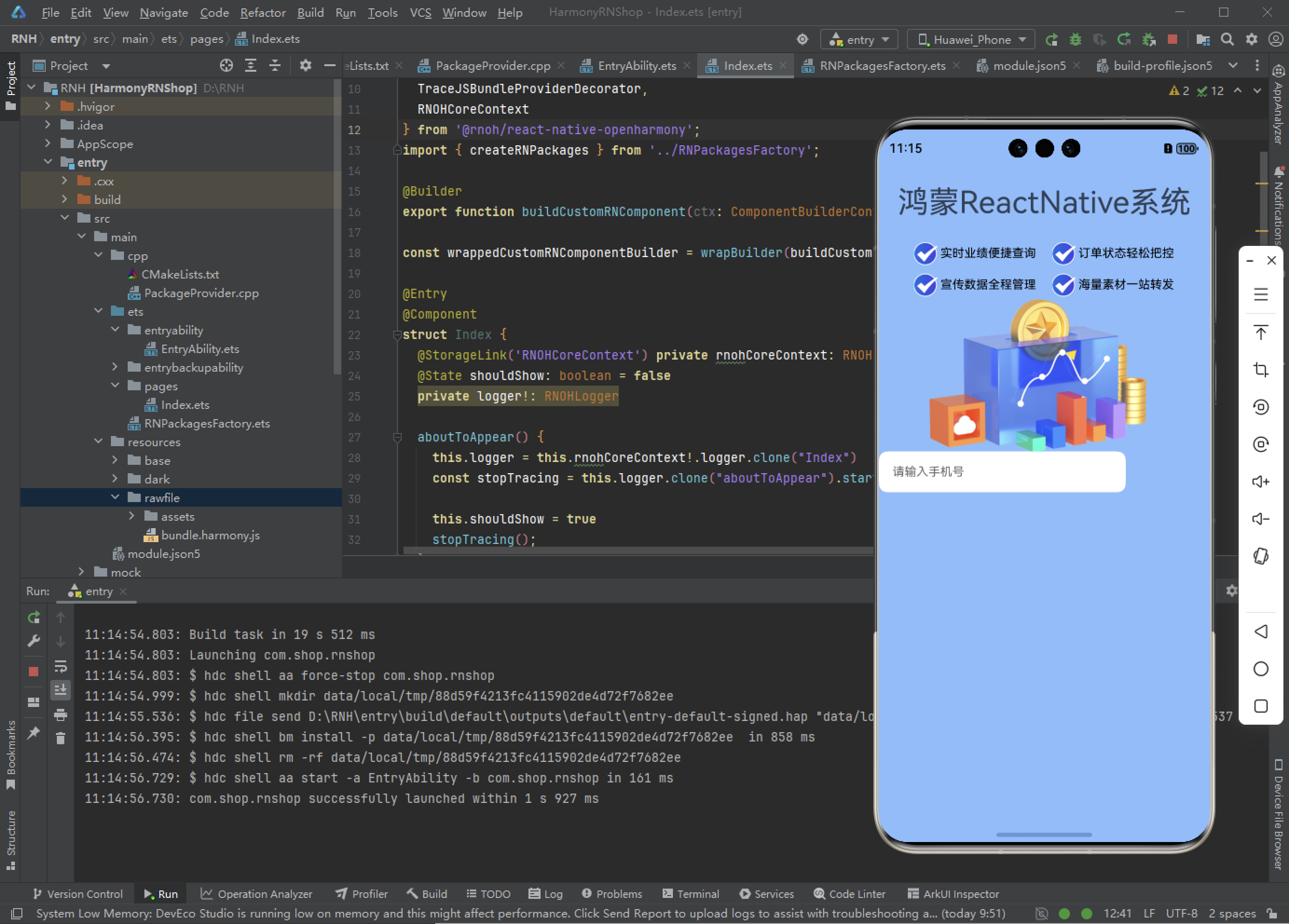
function App() {
return (
<View style={AppStyles.wrap}>
<Text style={AppStyles.title}>鸿蒙ReactNative系统</Text>
<View style={AppStyles.banner}>
<View style={{display:'flex',flexDirection:'row',justifyContent:'space-between'}}>
<View style={AppStyles.bannerItem}>
<Image style={{width:27,height:27}} source={require('./images/checked.png')}></Image>
<Text style={{paddingLeft: 4}}>实时业绩便捷查询</Text>
</View>
<View style={AppStyles.bannerItem}>
<Image style={{width:27,height:27}} source={require('./images/checked.png')}></Image>
<Text style={{paddingLeft: 4}}>订单状态轻松把控</Text>
</View>
</View>
<View style={{display:'flex',flexDirection:'row',justifyContent:'space-between'}}>
<View style={AppStyles.bannerItem}>
<Image style={{width:27,height:27}} source={require('./images/checked.png')}></Image>
<Text style={{paddingLeft: 4}}>宣传数据全程管理</Text>
</View>
<View style={AppStyles.bannerItem}>
<Image style={{width:27,height:27}} source={require('./images/checked.png')}></Image>
<Text style={{paddingLeft: 4}}>海量素材一站转发</Text>
</View>
</View>
</View>
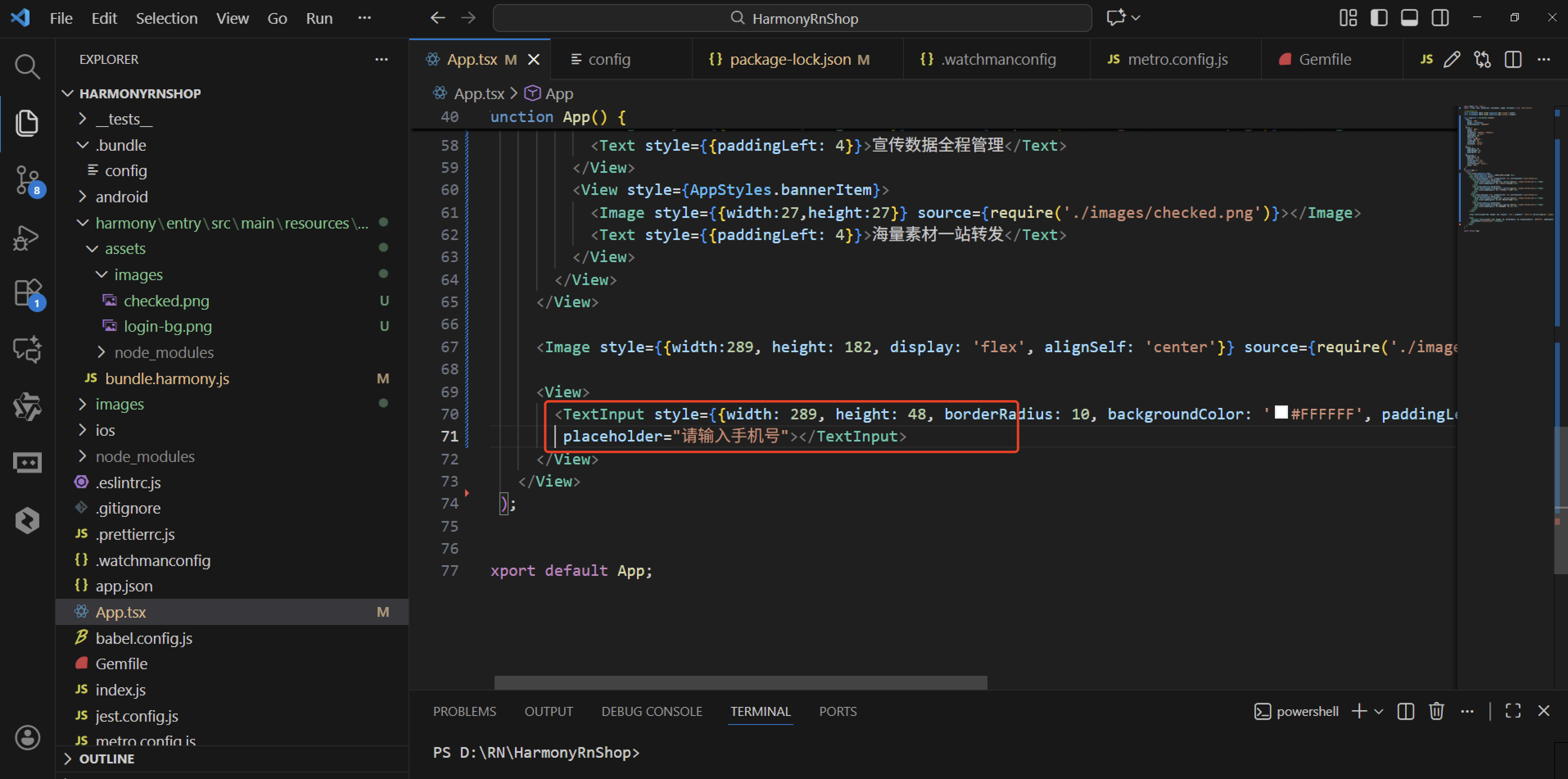
<Image style={{width:289, height: 182, display: 'flex', alignSelf: 'center'}} source={require('./images/login-bg.png')}></Image>
<View>
<TextInput style={{width: 289, height: 48, borderRadius: 10, backgroundColor: '#FFFFFF', paddingLeft: 16, paddingRight: 16, fontSize: 14, color: '#304057'}} placeholder="请输入手机号"></TextInput>
</View>
</View>
);
}
export default App;
TextInput 是一个用于文本输入的基础组件,具备 onChangeText 和 onSubmitEditing 属性。它允许用户输入文本,并在输入变化和提交时触发相应的事件。这是一个在React Native应用中非常基础且常用的组件。
TextInput 文本输入框:
- React Native中的文本输入框使用和鸿蒙比较相近,可能是因为 RN 首先封装鸿蒙端的缘故(这点对鸿蒙开发者来说是个好消息)
- TextInput也是继承自 View,所以 View 的属性 TextInput 也能使用,一些样式类的属性可以参照 View 的相关属性
欢迎大家加入开源鸿蒙跨平台开发者社区,一起共建开源鸿蒙跨平台生态。

AtomGit 是由开放原子开源基金会联合 CSDN 等生态伙伴共同推出的新一代开源与人工智能协作平台。平台坚持“开放、中立、公益”的理念,把代码托管、模型共享、数据集托管、智能体开发体验和算力服务整合在一起,为开发者提供从开发、训练到部署的一站式体验。
更多推荐

 5
5 0
0- 0


 已为社区贡献42条内容

所有评论(0)