React Native for OpenHarmony 实战:随机数生成实现
随机数在很多场景下都有用,抽奖、分组、测试数据生成等等。今天我们用 React Native 实现一个随机数生成器,支持自定义范围和批量生成,还加入了一些有趣的动画效果。
功能需求分析
这个随机数生成器需要满足以下需求:
- 用户可以设置最小值和最大值
- 支持一次生成多个随机数
- 生成结果要有动画效果,增加趣味性
- 界面要简洁直观
看起来不复杂,但要做好用户体验还是需要花点心思的。
组件结构和状态定义
先来看组件的基本结构:
import React, { useState, useRef } from 'react';
import { View, Text, TextInput, TouchableOpacity, StyleSheet, Animated, ScrollView } from 'react-native';

export const RandomGenerator: React.FC = () => {
  const [min, setMin] = useState('1');
  const [max, setMax] = useState('100');
  const [count, setCount] = useState('1');
  const [results, setResults] = useState<number[]>([]);

  const buttonScale = useRef(new Animated.Value(1)).current;
  const shakeAnim = useRef(new Animated.Value(0)).current;
  const resultAnims = useRef<Animated.Value[]>([]).current;
状态变量说明:
min和max是范围的最小值和最大值,用字符串存储方便和 TextInput 绑定count是要生成的随机数个数results存储生成的随机数数组
动画值有三个:
buttonScale控制按钮的缩放效果shakeAnim控制按钮的摇晃效果resultAnims是一个数组,每个结果项都有自己的动画值
鸿蒙 ArkTS 对比:状态定义
@Entry
@Component
struct RandomGenerator {
  @State min: string = '1'
  @State max: string = '100'
  @State count: string = '1'
  @State results: number[] = []
  @State buttonScale: number = 1
  @State shakeAngle: number = 0
ArkTS 中动画值直接用普通的状态变量表示,配合 animateTo 函数实现动画。React Native 需要创建 Animated.Value 对象,两种方式各有特点。
核心生成逻辑
生成随机数的函数是整个组件的核心:
  const generate = () => {
    // 按钮动画
    Animated.sequence([
      Animated.timing(buttonScale, { toValue: 0.9, duration: 100, useNativeDriver: true }),
      Animated.spring(buttonScale, { toValue: 1, friction: 3, useNativeDriver: true }),
    ]).start();

    // 摇晃动画
    Animated.sequence([
      Animated.timing(shakeAnim, { toValue: 1, duration: 50, useNativeDriver: true }),
      Animated.timing(shakeAnim, { toValue: -1, duration: 50, useNativeDriver: true }),
      Animated.timing(shakeAnim, { toValue: 1, duration: 50, useNativeDriver: true }),
      Animated.timing(shakeAnim, { toValue: 0, duration: 50, useNativeDriver: true }),
    ]).start();

    const minNum = parseInt(min) || 0;
    const maxNum = parseInt(max) || 100;
    const countNum = Math.min(parseInt(count) || 1, 20);
    const nums: number[] = [];

    // 清空并重新创建动画值
    resultAnims.length = 0;

    for (let i = 0; i < countNum; i++) {
      nums.push(Math.floor(Math.random() * (maxNum - minNum + 1)) + minNum);
      resultAnims.push(new Animated.Value(0));
    }
    setResults(nums);
点击生成按钮时,先触发两个动画:按钮缩放和摇晃。摇晃动画用 Animated.sequence 串联四个 timing 动画,让按钮左右摇摆两次。
随机数生成用的是经典公式:Math.floor(Math.random() * (max - min + 1)) + min。这个公式能生成 [min, max] 范围内的整数,包含两端。
注意 countNum 做了限制,最多生成 20 个,防止用户输入过大的数字导致性能问题。
结果动画实现
生成结果后,每个数字依次弹出:
    // 依次弹出动画
    resultAnims.forEach((anim, index) => {
      setTimeout(() => {
        Animated.spring(anim, {
          toValue: 1,
          friction: 4,
          tension: 100,
          useNativeDriver: true,
        }).start();
      }, index * 100);
    });
  };
用 setTimeout 给每个动画加上延迟,第一个立即开始,第二个延迟 100ms,第三个延迟 200ms,以此类推。这样就形成了依次弹出的效果。
鸿蒙 ArkTS 对比:动画实现
generate() {
  // 按钮缩放动画
  animateTo({ duration: 100 }, () => {
    this.buttonScale = 0.9
  })
  setTimeout(() => {
    animateTo({
      duration: 200,
      curve: Curve.EaseOut
    }, () => {
      this.buttonScale = 1
    })
  }, 100)

  // 生成随机数
  let minNum = parseInt(this.min) || 0
  let maxNum = parseInt(this.max) || 100
  let countNum = Math.min(parseInt(this.count) || 1, 20)

  this.results = []
  for (let i = 0; i < countNum; i++) {
    this.results.push(Math.floor(Math.random() * (maxNum - minNum + 1)) + minNum)
  }
}
ArkTS 的动画写法更直接,但要实现依次弹出的效果需要更多的代码。React Native 的 Animated API 在处理复杂动画序列时更灵活。
摇晃动画插值
摇晃效果需要把动画值转换成旋转角度:
  const shake = shakeAnim.interpolate({
    inputRange: [-1, 0, 1],
    outputRange: ['-5deg', '0deg', '5deg'],
  });
interpolate 方法把 -1 到 1 的数值映射成 -5 度到 5 度的旋转角度。当 shakeAnim 的值在 -1、0、1 之间变化时,按钮就会左右摇摆。
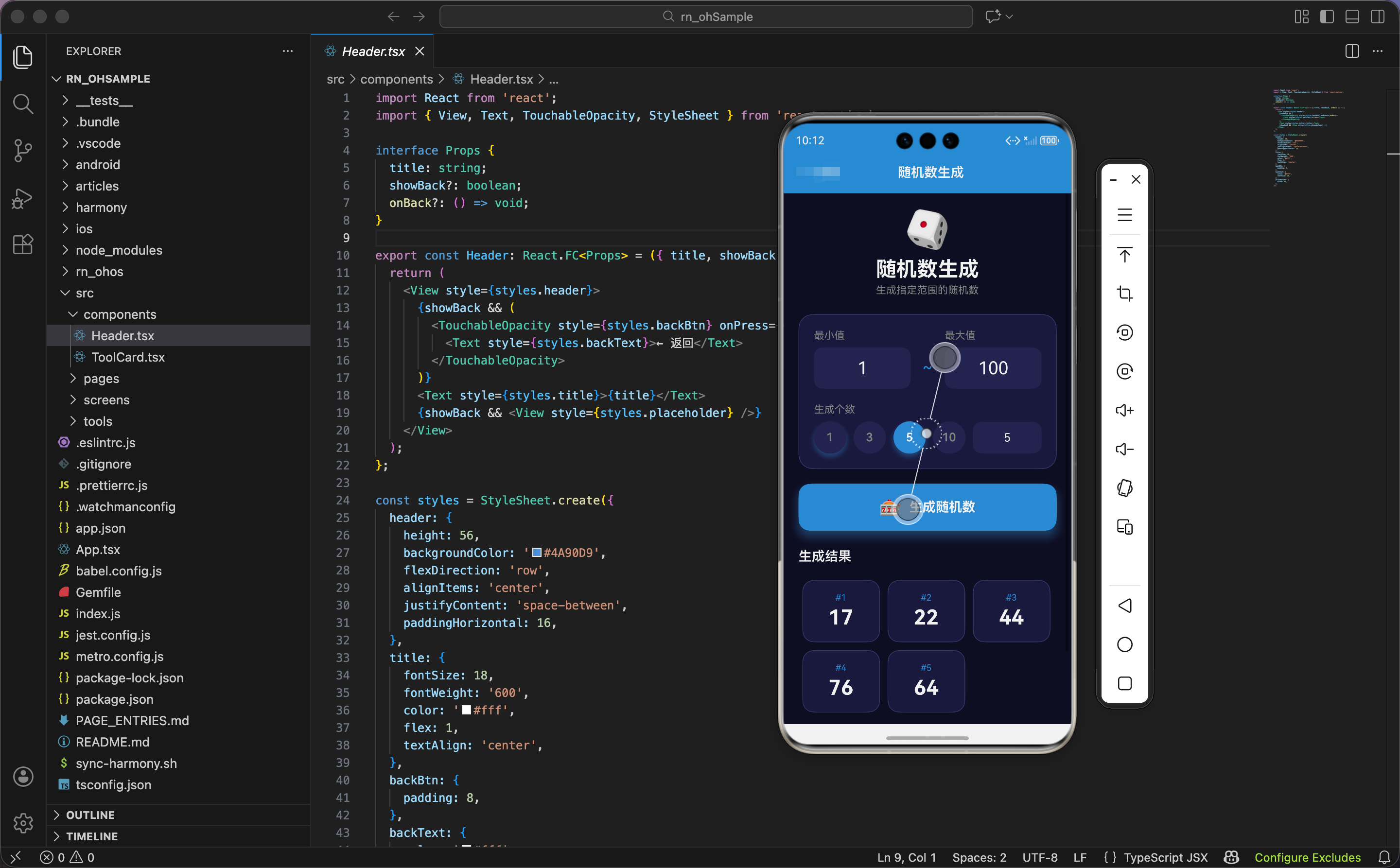
界面渲染:头部和输入区域
  return (
    <ScrollView style={styles.container}>
      <View style={styles.header}>
        <Text style={styles.headerIcon}>🎲</Text>
        <Text style={styles.headerTitle}>随机数生成</Text>
        <Text style={styles.headerSubtitle}>生成指定范围的随机数</Text>
      </View>

      <View style={styles.inputCard}>
        <View style={styles.inputRow}>
          <View style={styles.inputGroup}>
            <Text style={styles.label}>最小值</Text>
            <View style={styles.inputWrapper}>
              <TextInput
                style={styles.input}
                value={min}
                onChangeText={setMin}
                keyboardType="numeric"
                placeholderTextColor="#666"
              />
            </View>
          </View>
          <View style={styles.inputDivider}>
            <Text style={styles.dividerText}>~</Text>
          </View>
          <View style={styles.inputGroup}>
            <Text style={styles.label}>最大值</Text>
            <View style={styles.inputWrapper}>
              <TextInput
                style={styles.input}
                value={max}
                onChangeText={setMax}
                keyboardType="numeric"
                placeholderTextColor="#666"
              />
            </View>
          </View>
        </View>
输入区域用 Flexbox 布局,最小值和最大值并排显示,中间用波浪号分隔。keyboardType="numeric" 确保弹出数字键盘。
生成个数选择
        <View style={styles.countSection}>
          <Text style={styles.label}>生成个数</Text>
          <View style={styles.countRow}>
            {[1, 3, 5, 10].map(n => (
              <TouchableOpacity
                key={n}
                style={[styles.countBtn, count === String(n) && styles.countBtnActive]}
                onPress={() => setCount(String(n))}
              >
                <Text style={[styles.countText, count === String(n) && styles.countTextActive]}>{n}</Text>
              </TouchableOpacity>
            ))}
            <View style={styles.customCount}>
              <TextInput
                style={styles.countInput}
                value={count}
                onChangeText={setCount}
                keyboardType="numeric"
                placeholder="自定义"
                placeholderTextColor="#666"
              />
            </View>
          </View>
        </View>
      </View>
提供了 1、3、5、10 四个快捷选项,用户也可以在输入框里自定义数量。快捷按钮用圆形设计,选中状态加蓝色背景和阴影。
鸿蒙 ArkTS 对比:快捷按钮
Row() {
  ForEach([1, 3, 5, 10], (n: number) => {
    Button(n.toString())
      .width(44)
      .height(44)
      .borderRadius(22)
      .backgroundColor(this.count === n.toString() ? '#4A90D9' : '#252550')
      .fontColor(this.count === n.toString() ? Color.White : '#888888')
      .onClick(() => {
        this.count = n.toString()
      })
  })

  TextInput({ placeholder: '自定义' })
    .backgroundColor('#252550')
    .borderRadius(12)
    .onChange((value: string) => {
      this.count = value
    })
}
ArkTS 的写法更紧凑,样式直接链式调用。React Native 需要通过 style 数组来组合样式,代码稍微长一些但结构更清晰。
生成按钮
      <Animated.View style={{ transform: [{ scale: buttonScale }] }}>
        <TouchableOpacity style={styles.btn} onPress={generate} activeOpacity={0.8}>
          <Animated.View style={[styles.btnInner, { transform: [{ rotate: shake }] }]}>
            <Text style={styles.btnIcon}>🎰</Text>
            <Text style={styles.btnText}>生成随机数</Text>
          </Animated.View>
        </TouchableOpacity>
      </Animated.View>
按钮用两层 Animated.View 包裹:外层控制缩放,内层控制旋转。这样两个动画可以同时进行,互不干扰。
结果显示区域
      {results.length > 0 && (
        <View style={styles.resultsContainer}>
          <Text style={styles.resultsTitle}>生成结果</Text>
          <View style={styles.results}>
            {results.map((num, i) => (
              <Animated.View
                key={i}
                style={[
                  styles.resultItem,
                  {
                    transform: [
                      { scale: resultAnims[i] || new Animated.Value(1) },
                      { perspective: 1000 },
                      {
                        rotateY: (resultAnims[i] || new Animated.Value(1)).interpolate({
                          inputRange: [0, 1],
                          outputRange: ['90deg', '0deg'],
                        }),
                      },
                    ],
                  },
                ]}
              >
                <View style={styles.resultInner}>
                  <Text style={styles.resultIndex}>#{i + 1}</Text>
                  <Text style={styles.resultText}>{num}</Text>
                </View>
              </Animated.View>
            ))}
          </View>
        </View>
      )}
每个结果项都有 3D 翻转效果:从 Y 轴旋转 90 度(侧面)翻转到 0 度(正面),配合缩放动画,看起来像是卡片翻开的效果。
perspective: 1000 设置透视距离,让 3D 效果更真实。数值越小,透视效果越强烈。
提示信息
      <View style={styles.tips}>
        <Text style={styles.tipsTitle}>💡 提示</Text>
        <Text style={styles.tipsText}>• 最多可生成20个随机数</Text>
        <Text style={styles.tipsText}>• 支持负数范围</Text>
      </View>
    </ScrollView>
  );
};
底部加一个提示区域,告诉用户一些使用限制和功能说明。
样式定义
const styles = StyleSheet.create({
  container: { flex: 1, backgroundColor: '#0f0f23', padding: 20 },
  header: { alignItems: 'center', marginBottom: 24 },
  headerIcon: { fontSize: 50, marginBottom: 8 },
  headerTitle: { fontSize: 28, fontWeight: '700', color: '#fff' },
  headerSubtitle: { fontSize: 14, color: '#888', marginTop: 4 },
  inputCard: {
    backgroundColor: '#1a1a3e',
    borderRadius: 20,
    padding: 20,
    marginBottom: 20,
    borderWidth: 1,
    borderColor: '#3a3a6a',
  },
  inputRow: { flexDirection: 'row', alignItems: 'flex-end' },
  inputGroup: { flex: 1 },
  label: { color: '#888', fontSize: 14, marginBottom: 8 },
  inputWrapper: {
    backgroundColor: '#252550',
    borderRadius: 12,
    overflow: 'hidden',
  },
  input: {
    padding: 14,
    fontSize: 24,
    color: '#fff',
    textAlign: 'center',
  },
  inputDivider: { paddingHorizontal: 16, paddingBottom: 14 },
  dividerText: { color: '#4A90D9', fontSize: 24 },
输入框用深色背景 #252550,和卡片背景 #1a1a3e 形成层次。文字居中显示,字号较大方便查看。
更多样式
  countSection: { marginTop: 20 },
  countRow: { flexDirection: 'row', alignItems: 'center' },
  countBtn: {
    width: 44,
    height: 44,
    borderRadius: 22,
    backgroundColor: '#252550',
    justifyContent: 'center',
    alignItems: 'center',
    marginRight: 10,
  },
  countBtnActive: {
    backgroundColor: '#4A90D9',
    shadowColor: '#4A90D9',
    shadowOffset: { width: 0, height: 4 },
    shadowOpacity: 0.4,
    shadowRadius: 8,
  },
  countText: { color: '#888', fontSize: 16, fontWeight: '600' },
  countTextActive: { color: '#fff' },
  customCount: { flex: 1 },
  countInput: {
    backgroundColor: '#252550',
    borderRadius: 12,
    padding: 12,
    color: '#fff',
    fontSize: 16,
    textAlign: 'center',
  },
  btn: {
    backgroundColor: '#4A90D9',
    borderRadius: 16,
    marginBottom: 24,
    shadowColor: '#4A90D9',
    shadowOffset: { width: 0, height: 8 },
    shadowOpacity: 0.4,
    shadowRadius: 15,
    elevation: 10,
  },
  btnInner: {
    flexDirection: 'row',
    alignItems: 'center',
    justifyContent: 'center',
    paddingVertical: 18,
  },
  btnIcon: { fontSize: 24, marginRight: 10 },
  btnText: { color: '#fff', fontSize: 18, fontWeight: '700' },
生成按钮用蓝色背景和蓝色阴影,让它成为页面的视觉焦点。elevation: 10 是 Android 上的阴影属性,在 OpenHarmony 上也能正常工作。
结果区域样式
  resultsContainer: { marginBottom: 20 },
  resultsTitle: { color: '#fff', fontSize: 18, fontWeight: '600', marginBottom: 16 },
  results: { flexDirection: 'row', flexWrap: 'wrap' },
  resultItem: { width: '30%', margin: '1.5%' },
  resultInner: {
    backgroundColor: '#1a1a3e',
    borderRadius: 16,
    padding: 16,
    alignItems: 'center',
    borderWidth: 1,
    borderColor: '#3a3a6a',
  },
  resultIndex: { color: '#4A90D9', fontSize: 12, marginBottom: 4 },
  resultText: { color: '#fff', fontSize: 28, fontWeight: '700' },
  tips: {
    backgroundColor: '#1a1a3e',
    borderRadius: 16,
    padding: 16,
    borderWidth: 1,
    borderColor: '#3a3a6a',
  },
  tipsTitle: { color: '#fff', fontSize: 16, fontWeight: '600', marginBottom: 8 },
  tipsText: { color: '#888', fontSize: 14, lineHeight: 22 },
});
结果项用 width: '30%' 实现三列布局,flexWrap: 'wrap' 让超出的项自动换行。每个结果卡片显示序号和数值,序号用蓝色小字,数值用白色大字。
小结
这个随机数生成器虽然功能简单,但通过动画效果让用户体验变得有趣。按钮的缩放和摇晃、结果的 3D 翻转,这些细节让工具不再枯燥。
在 OpenHarmony 平台上,React Native 的 Animated API 能够正常工作,3D 变换效果也能正确渲染。开发时不需要针对鸿蒙做特殊处理,代码可以直接复用。
欢迎加入开源鸿蒙跨平台社区:https://openharmonycrossplatform.csdn.net

AtomGit 是由开放原子开源基金会联合 CSDN 等生态伙伴共同推出的新一代开源与人工智能协作平台。平台坚持“开放、中立、公益”的理念,把代码托管、模型共享、数据集托管、智能体开发体验和算力服务整合在一起,为开发者提供从开发、训练到部署的一站式体验。
更多推荐
 19
19 0
0- 0


 已为社区贡献19条内容

所有评论(0)