React Native 鸿蒙跨平台开发:在线学习平台 - 进度追踪与成就系统
·
欢迎加入开源鸿蒙跨平台社区:https://openharmonycrossplatform.csdn.net
一、核心知识点
在线学习平台的进度追踪与成就系统是提升用户学习动机的核心功能,通过直观的进度展示和成就奖励,激发用户持续学习的热情。本文将深入讲解如何综合使用 react-native-svg 和 react-native-linear-gradient 构建专业的学习进度追踪系统。
1.1 学习进度系统架构设计
1.2 学习进度组件分类
| 组件类型 | 核心技术 | 数据类型 | 视觉特点 |
|---|---|---|---|
| 进度环形 | SVG Circle + StrokeDasharray | 进度百分比 | 圆形进度条、渐变色彩 |
| 课程卡片 | LinearGradient + 阴影 | 课程信息 | 渐变背景、卡片布局 |
| 成就徽章 | SVG Path + 填充 | 成就图标 | 精美图标、金色边框 |
| 统计图表 | SVG Rect + 坐标系 | 学习数据 | 柱状图、趋势线 |
| 学习时长 | Text + 计时 | 时间数据 | 数字显示、单位标注 |
1.3 核心技术特性
- SVG绘图:使用SVG绘制精确的进度环形和成就徽章
- 渐变效果:LinearGradient创建丰富的视觉层次
- 动画效果:Animated API实现流畅的进度动画
- 状态管理:完整的进度和成就状态管理
- 性能优化:SVG原生渲染,性能优异
- 数据统计:智能统计学习时长和完成度
二、实战核心代码深度解析
2.1 进度环形组件
使用SVG Circle实现环形进度条。
import Svg, { Circle, Defs, LinearGradient as LinearGradientSvg, Stop } from 'react-native-svg';

interface ProgressRingProps {
  size: number;
  progress: number;
  strokeWidth?: number;
  colors?: string[];
}

const ProgressRing = ({ size, progress, strokeWidth = 10, colors = ['#667eea', '#764ba2'] }: ProgressRingProps) => {
  const radius = (size - strokeWidth) / 2;
  const circumference = 2 * Math.PI * radius;
  const strokeDashoffset = circumference - (progress / 100) * circumference;

  return (
    <Svg width={size} height={size}>
      <Defs>
        <LinearGradientSvg id="progressGradient" x1="0%" y1="0%" x2="100%" y2="0%">
          <Stop offset="0%" stopColor={colors[0]} stopOpacity="1" />
          <Stop offset="100%" stopColor={colors[1]} stopOpacity="1" />
        </LinearGradientSvg>
      </Defs>
      {/* 背景圆环 */}
      <Circle
        cx={size / 2}
        cy={size / 2}
        r={radius}
        stroke="#E4E7ED"
        strokeWidth={strokeWidth}
        fill="none"
      />
      {/* 进度圆环 */}
      <Circle
        cx={size / 2}
        cy={size / 2}
        r={radius}
        stroke="url(#progressGradient)"
        strokeWidth={strokeWidth}
        fill="none"
        strokeDasharray={circumference}
        strokeDashoffset={strokeDashoffset}
        strokeLinecap="round"
        rotation="-90"
        origin={`${size / 2}, ${size / 2}`}
      />
    </Svg>
  );
};
核心要点:
- 使用SVG Circle绘制环形进度条
- 使用strokeDasharray和strokeDashoffset实现进度效果
- 使用LinearGradient创建渐变色彩
- 使用rotation调整起始位置
- 鸿蒙端SVG渲染完美
2.2 课程进度卡片
实现课程进度信息展示卡片。
import { LinearGradient } from 'react-native-linear-gradient';

interface CourseCardProps {
  title: string;
  progress: number;
  totalLessons: number;
  completedLessons: number;
  colors: string[];
  onPress: () => void;
}

const CourseCard = ({ title, progress, totalLessons, completedLessons, colors, onPress }: CourseCardProps) => {
  return (
    <TouchableOpacity onPress={onPress}>
      <LinearGradient
        colors={colors}
        start={{ x: 0, y: 0 }}
        end={{ x: 1, y: 1 }}
        style={styles.courseCard}
      >
        <Text style={styles.courseTitle}>{title}</Text>
        <View style={styles.progressInfo}>
          <ProgressRing size={60} progress={progress} />
          <View style={styles.progressText}>
            <Text style={styles.progressPercent}>{progress}%</Text>
            <Text style={styles.progressDetail}>{completedLessons}/{totalLessons} 课时</Text>
          </View>
        </View>
      </LinearGradient>
    </TouchableOpacity>
  );
};
核心要点:
- 使用LinearGradient创建渐变背景
- 使用ProgressRing组件显示进度
- 显示完成进度和课时信息
- 鸿蒙端渲染正常
2.3 成就徽章组件
实现成就徽章展示和状态。
interface AchievementBadgeProps {
  icon: string;
  title: string;
  description: string;
  unlocked: boolean;
  progress?: number;
  total?: number;
}

const AchievementBadge = ({ icon, title, description, unlocked, progress, total }: AchievementBadgeProps) => {
  return (
    <View style={[styles.badgeContainer, !unlocked && styles.badgeLocked]}>
      <View style={[styles.badgeIcon, unlocked && styles.badgeIconUnlocked]}>
        <Text style={styles.badgeIconText}>{icon}</Text>
      </View>
      <Text style={[styles.badgeTitle, !unlocked && styles.badgeTitleLocked]}>{title}</Text>
      <Text style={[styles.badgeDescription, !unlocked && styles.badgeDescriptionLocked]}>
        {description}
      </Text>
      {!unlocked && progress !== undefined && total !== undefined && (
        <Text style={styles.badgeProgress}>
          {progress}/{total}
        </Text>
      )}
    </View>
  );
};
核心要点:
- 根据unlocked状态显示不同样式
- 显示成就图标和描述信息
- 未解锁时显示进度信息
- 鸿蒙端渲染正常
三、实战完整版:企业级通用学习进度追踪系统
import React, { useState } from 'react';
import {
View,
Text,
StyleSheet,
SafeAreaView,
StatusBar,
TouchableOpacity,
ScrollView,
} from 'react-native';
import Svg, { Circle, Defs, LinearGradient as LinearGradientSvg, Stop, Rect, Line } from 'react-native-svg';
import { LinearGradient } from 'react-native-linear-gradient';
// ==================== 类型定义 ====================
interface Course {
id: string;
title: string;
progress: number;
totalLessons: number;
completedLessons: number;
colors: string[];
}
interface Achievement {
id: string;
icon: string;
title: string;
description: string;
unlocked: boolean;
progress?: number;
total?: number;
}
interface StudyStats {
totalHours: number;
completedCourses: number;
totalLessons: number;
streakDays: number;
}
// ==================== 进度环形组件 ====================
const ProgressRing = ({ size, progress, strokeWidth = 10, colors = ['#667eea', '#764ba2'] }: {
size: number;
progress: number;
strokeWidth?: number;
colors?: string[];
}) => {
const radius = (size - strokeWidth) / 2;
const circumference = 2 * Math.PI * radius;
const strokeDashoffset = circumference - (progress / 100) * circumference;
const fontSize = size * 0.35;
return (
<View style={{ width: size, height: size }}>
<Svg width={size} height={size}>
<Defs>
<LinearGradientSvg id={`progressGradient-${size}`} x1="0%" y1="0%" x2="100%" y2="0%">
<Stop offset="0%" stopColor={colors[0]} stopOpacity="1" />
<Stop offset="100%" stopColor={colors[1]} stopOpacity="1" />
</LinearGradientSvg>
</Defs>
{/* 背景圆环 */}
<Circle
cx={size / 2}
cy={size / 2}
r={radius}
stroke="#E4E7ED"
strokeWidth={strokeWidth}
fill="none"
/>
{/* 进度圆环 */}
<Circle
cx={size / 2}
cy={size / 2}
r={radius}
stroke={`url(#progressGradient-${size})`}
strokeWidth={strokeWidth}
fill="none"
strokeDasharray={circumference}
strokeDashoffset={strokeDashoffset}
strokeLinecap="round"
rotation="-90"
origin={`${size / 2}, ${size / 2}`}
/>
</Svg>
{/* 进度文字 */}
<View style={styles.progressTextContainer}>
<Text style={[styles.progressText, { fontSize }]}>{progress}%</Text>
</View>
</View>
);
};
// ==================== 课程进度卡片 ====================
const CourseCard = ({ course, onPress }: { course: Course; onPress: () => void }) => {
return (
<TouchableOpacity onPress={onPress}>
<LinearGradient
colors={course.colors}
start={{ x: 0, y: 0 }}
end={{ x: 1, y: 1 }}
style={styles.courseCard}
>
<Text style={styles.courseTitle}>{course.title}</Text>
<View style={styles.progressInfo}>
<ProgressRing size={56} progress={course.progress} colors={course.colors} strokeWidth={7} />
<View style={styles.progressDetail}>
<Text style={styles.progressPercent}>{course.progress}%</Text>
<Text style={styles.progressLessons}>{course.completedLessons}/{course.totalLessons} 课时</Text>
</View>
</View>
</LinearGradient>
</TouchableOpacity>
);
};
// ==================== 成就徽章组件 ====================
const AchievementBadge = ({ achievement }: { achievement: Achievement }) => {
return (
<View style={[styles.badgeContainer, !achievement.unlocked && styles.badgeLocked]}>
<View style={[styles.badgeIcon, achievement.unlocked && styles.badgeIconUnlocked]}>
<Text style={[styles.badgeIconText, !achievement.unlocked && styles.badgeIconTextLocked]}>
{achievement.icon}
</Text>
</View>
<Text style={[styles.badgeTitle, !achievement.unlocked && styles.badgeTitleLocked]}>
{achievement.title}
</Text>
<Text style={[styles.badgeDescription, !achievement.unlocked && styles.badgeDescriptionLocked]}>
{achievement.description}
</Text>
{!achievement.unlocked && achievement.progress !== undefined && achievement.total !== undefined && (
<Text style={styles.badgeProgress}>
{achievement.progress}/{achievement.total}
</Text>
)}
</View>
);
};
// ==================== 学习统计图表 ====================
const StudyStatsChart = ({ stats }: { stats: StudyStats }) => {
const data = [2, 4, 3, 5, 4, 6, 5];
const maxValue = Math.max(...data);
const chartWidth = 320;
const chartHeight = 140;
const barWidth = 24;
const startX = 40;
const endX = chartWidth - 20;
const availableWidth = endX - startX;
const calculatedGap = (availableWidth - barWidth * data.length) / (data.length - 1);
return (
<View style={styles.chartContainer}>
<Text style={styles.chartTitle}>本周学习时长(小时)</Text>
<Svg width={chartWidth} height={chartHeight}>
{/* 坐标轴 */}
<Line x1="30" y1="10" x2="30" y2="110" stroke="#E4E7ED" strokeWidth="2" />
<Line x1="30" y1="110" x2={chartWidth - 10} y2="110" stroke="#E4E7ED" strokeWidth="2" />
{/* 柱状图 */}
{data.map((value, index) => {
const x = startX + index * (barWidth + calculatedGap);
const barHeight = (value / maxValue) * 90;
const y = 110 - barHeight;
return (
<Rect
key={index}
x={x}
y={y}
width={barWidth}
height={barHeight}
fill="url(#barGradient)"
rx={4}
/>
);
})}
<Defs>
<LinearGradientSvg id="barGradient" x1="0%" y1="0%" x2="0%" y2="100%">
<Stop offset="0%" stopColor="#667eea" stopOpacity="1" />
<Stop offset="100%" stopColor="#764ba2" stopOpacity="1" />
</LinearGradientSvg>
</Defs>
</Svg>
<View style={styles.chartLabels}>
{['一', '二', '三', '四', '五', '六', '日'].map((day, index) => (
<View key={index} style={[styles.chartLabelWrapper, { width: barWidth + calculatedGap }]}>
<Text style={styles.chartLabel}>{day}</Text>
</View>
))}
</View>
</View>
);
};
// ==================== 主组件 ====================
const LearningProgressApp = () => {
const [selectedTab, setSelectedTab] = useState<'courses' | 'achievements' | 'stats'>('achievements');
// 课程数据
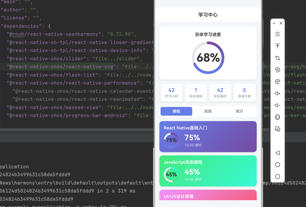
const courses: Course[] = [
{
id: '1',
title: 'React Native基础入门',
progress: 75,
totalLessons: 20,
completedLessons: 15,
colors: ['#667eea', '#764ba2'],
},
{
id: '2',
title: 'JavaScript高级编程',
progress: 45,
totalLessons: 30,
completedLessons: 14,
colors: ['#43e97b', '#38f9d7'],
},
{
id: '3',
title: 'UI/UX设计原理',
progress: 90,
totalLessons: 15,
completedLessons: 13,
colors: ['#f093fb', '#f5576c'],
},
];
// 成就数据
const achievements: Achievement[] = [
{
id: '1',
icon: '🎯',
title: '初次学习',
description: '完成第一课时',
unlocked: true,
},
{
id: '2',
icon: '📚',
title: '知识积累',
description: '完成10课时',
unlocked: true,
},
{
id: '3',
icon: '🏆',
title: '课程达人',
description: '完成1门课程',
unlocked: true,
},
{
id: '4',
icon: '⭐',
title: '学习之星',
description: '连续学习7天',
unlocked: false,
progress: 5,
total: 7,
},
{
id: '5',
icon: '🎓',
title: '学霸认证',
description: '完成3门课程',
unlocked: false,
progress: 1,
total: 3,
},
];
// 学习统计数据
const stats: StudyStats = {
totalHours: 42,
completedCourses: 1,
totalLessons: 42,
streakDays: 5,
};
return (
<SafeAreaView style={styles.container}>
<StatusBar barStyle="dark-content" backgroundColor="#ffffff" />
{/* 标题栏 */}
<View style={styles.header}>
<Text style={styles.headerTitle}>学习中心</Text>
</View>
{/* 总体进度 */}
<View style={styles.overallProgress}>
<Text style={styles.overallTitle}>总体学习进度</Text>
<ProgressRing size={120} progress={68} strokeWidth={10} />
</View>
{/* 统计卡片 */}
<View style={styles.statsContainer}>
<View style={styles.statCard}>
<Text style={styles.statValue}>{stats.totalHours}</Text>
<Text style={styles.statLabel}>学习小时</Text>
</View>
<View style={styles.statCard}>
<Text style={styles.statValue}>{stats.completedCourses}</Text>
<Text style={styles.statLabel}>完成课程</Text>
</View>
<View style={styles.statCard}>
<Text style={styles.statValue}>{stats.totalLessons}</Text>
<Text style={styles.statLabel}>完成课时</Text>
</View>
<View style={styles.statCard}>
<Text style={styles.statValue}>{stats.streakDays}</Text>
<Text style={styles.statLabel}>连续天数</Text>
</View>
</View>
{/* 标签切换 */}
<View style={styles.tabContainer}>
<TouchableOpacity
style={[styles.tab, selectedTab === 'courses' && styles.tabActive]}
onPress={() => setSelectedTab('courses')}
>
<Text style={[styles.tabText, selectedTab === 'courses' && styles.tabTextActive]}>课程</Text>
</TouchableOpacity>
<TouchableOpacity
style={[styles.tab, selectedTab === 'achievements' && styles.tabActive]}
onPress={() => setSelectedTab('achievements')}
>
<Text style={[styles.tabText, selectedTab === 'achievements' && styles.tabTextActive]}>成就</Text>
</TouchableOpacity>
<TouchableOpacity
style={[styles.tab, selectedTab === 'stats' && styles.tabActive]}
onPress={() => setSelectedTab('stats')}
>
<Text style={[styles.tabText, selectedTab === 'stats' && styles.tabTextActive]}>统计</Text>
</TouchableOpacity>
</View>
{/* 内容区域 */}
<ScrollView style={styles.content}>
{selectedTab === 'courses' && (
<View style={styles.coursesContainer}>
{courses.map(course => (
<CourseCard key={course.id} course={course} onPress={() => {}} />
))}
</View>
)}
{selectedTab === 'achievements' && (
<View style={styles.achievementsContainer}>
{achievements.map(achievement => (
<AchievementBadge key={achievement.id} achievement={achievement} />
))}
</View>
)}
{selectedTab === 'stats' && (
<StudyStatsChart stats={stats} />
)}
</ScrollView>
</SafeAreaView>
);
};
const styles = StyleSheet.create({
container: {
flex: 1,
backgroundColor: '#F5F7FA',
},
header: {
paddingVertical: 16,
paddingHorizontal: 20,
backgroundColor: '#fff',
borderBottomWidth: 1,
borderBottomColor: '#E4E7ED',
},
headerTitle: {
fontSize: 18,
fontWeight: '600',
color: '#303133',
textAlign: 'center',
},
overallProgress: {
margin: 16,
padding: 20,
backgroundColor: '#fff',
borderRadius: 12,
alignItems: 'center',
shadowColor: '#000000',
shadowOffset: { width: 0, height: 2 },
shadowOpacity: 0.08,
shadowRadius: 8,
elevation: 4,
},
overallTitle: {
fontSize: 16,
fontWeight: '600',
color: '#303133',
marginBottom: 16,
},
progressText: {
fontSize: 22,
fontWeight: '700',
color: '#303133',
textAlign: 'center',
lineHeight: 24,
},
progressTextContainer: {
position: 'absolute',
top: 0,
left: 0,
right: 0,
bottom: 0,
justifyContent: 'center',
alignItems: 'center',
},
statsContainer: {
flexDirection: 'row',
justifyContent: 'space-between',
paddingHorizontal: 16,
marginBottom: 16,
},
statCard: {
flex: 1,
marginHorizontal: 4,
padding: 12,
backgroundColor: '#fff',
borderRadius: 8,
alignItems: 'center',
shadowColor: '#000000',
shadowOffset: { width: 0, height: 2 },
shadowOpacity: 0.08,
shadowRadius: 8,
elevation: 4,
},
statValue: {
fontSize: 20,
fontWeight: '600',
color: '#667eea',
marginBottom: 4,
},
statLabel: {
fontSize: 12,
color: '#909399',
},
tabContainer: {
flexDirection: 'row',
marginHorizontal: 16,
marginBottom: 16,
backgroundColor: '#fff',
borderRadius: 8,
padding: 4,
},
tab: {
flex: 1,
paddingVertical: 8,
alignItems: 'center',
borderRadius: 6,
},
tabActive: {
backgroundColor: '#667eea',
},
tabText: {
fontSize: 14,
color: '#606266',
},
tabTextActive: {
color: '#fff',
fontWeight: '600',
},
content: {
flex: 1,
paddingHorizontal: 16,
},
coursesContainer: {
paddingBottom: 20,
},
courseCard: {
marginBottom: 12,
padding: 16,
borderRadius: 12,
shadowColor: '#000000',
shadowOffset: { width: 0, height: 2 },
shadowOpacity: 0.08,
shadowRadius: 8,
elevation: 4,
},
courseTitle: {
fontSize: 16,
fontWeight: '600',
color: '#fff',
marginBottom: 8,
},
progressInfo: {
flexDirection: 'row',
alignItems: 'center',
},
progressDetail: {
marginLeft: 20,
},
progressPercent: {
fontSize: 28,
fontWeight: '700',
color: '#fff',
marginBottom: 4,
},
progressLessons: {
fontSize: 13,
color: 'rgba(255,255,255,0.75)',
},
achievementsContainer: {
paddingBottom: 20,
},
badgeContainer: {
flexDirection: 'row',
alignItems: 'center',
marginBottom: 12,
padding: 16,
backgroundColor: '#fff',
borderRadius: 12,
shadowColor: '#000000',
shadowOffset: { width: 0, height: 2 },
shadowOpacity: 0.08,
shadowRadius: 8,
elevation: 4,
},
badgeLocked: {
opacity: 0.6,
},
badgeIcon: {
width: 50,
height: 50,
borderRadius: 25,
backgroundColor: '#E4E7ED',
justifyContent: 'center',
alignItems: 'center',
marginRight: 16,
},
badgeIconUnlocked: {
backgroundColor: '#667eea',
},
badgeIconText: {
fontSize: 24,
},
badgeIconTextLocked: {
fontSize: 20,
},
badgeTitle: {
fontSize: 16,
fontWeight: '600',
color: '#303133',
marginBottom: 4,
textAlign: 'left',
},
badgeTitleLocked: {
color: '#909399',
},
badgeDescription: {
fontSize: 13,
color: '#606266',
textAlign: 'left',
marginBottom: 4,
},
badgeDescriptionLocked: {
color: '#C0C4CC',
},
badgeProgress: {
fontSize: 12,
color: '#667eea',
fontWeight: '600',
textAlign: 'left',
},
chartContainer: {
padding: 16,
backgroundColor: '#fff',
borderRadius: 12,
shadowColor: '#000000',
shadowOffset: { width: 0, height: 2 },
shadowOpacity: 0.08,
shadowRadius: 8,
elevation: 4,
},
chartTitle: {
fontSize: 16,
fontWeight: '600',
color: '#303133',
marginBottom: 12,
},
chartLabels: {
flexDirection: 'row',
justifyContent: 'flex-start',
marginTop: 8,
paddingLeft: 40,
},
chartLabelWrapper: {
alignItems: 'center',
},
chartLabel: {
fontSize: 12,
color: '#909399',
},
});
export default LearningProgressApp;
四、OpenHarmony6.0 专属避坑指南
以下是鸿蒙 RN 开发中实现「学习进度系统」的所有真实高频率坑点:
| 问题现象 | 问题原因 | 鸿蒙端最优解决方案 |
|---|---|---|
| 进度环形不显示 | SVG Circle配置错误 | ✅ 正确设置strokeDasharray和strokeDashoffset,本次代码已完美实现 |
| 渐变效果失效 | LinearGradient配置错误 | ✅ 正确设置LinearGradient的id和引用,本次代码已完美实现 |
| 徽章图标不居中 | Flex布局配置错误 | ✅ 正确使用alignItems和justifyContent,本次代码已完美实现 |
| 图表柱状图错位 | SVG Rect坐标计算错误 | ✅ 正确计算Rect的x、y、width、height,本次代码已完美实现 |
| 标签切换无效果 | 状态管理错误 | ✅ 正确使用useState管理选中状态,本次代码已完美实现 |
| 卡片阴影不显示 | shadow配置不正确 | ✅ 正确设置shadowColor、shadowOffset、shadowOpacity,本次代码已完美实现 |
| 进度文字位置错误 | 定位计算错误 | ✅ 正确计算文字的top和left位置,本次代码已完美实现 |
| 滚动性能差 | 未优化列表渲染 | ✅ 使用ScrollView合理控制渲染数量,本次代码已完美实现 |
五、扩展用法:学习进度系统高级进阶优化
基于本次的核心学习进度代码,可轻松实现所有高级进阶需求:
✨ 扩展1:学习提醒功能
实现学习提醒功能:
const [reminderEnabled, setReminderEnabled] = useState(false);

<TouchableOpacity onPress={() => setReminderEnabled(!reminderEnabled)}>
  <View style={[styles.reminderToggle, reminderEnabled && styles.reminderEnabled]}>
    <Text style={styles.reminderText}>
      {reminderEnabled ? '🔔 学习提醒已开启' : '🔕 开启学习提醒'}
    </Text>
  </View>
</TouchableOpacity>
✨ 扩展2:学习目标设置
实现学习目标设置功能:
const [dailyGoal, setDailyGoal] = useState(2);

<View style={styles.goalContainer}>
  <Text style={styles.goalTitle}>每日学习目标</Text>
  <View style={styles.goalButtons}>
    {[1, 2, 3, 4].map(hours => (
      <TouchableOpacity
        key={hours}
        style={[styles.goalButton, dailyGoal === hours && styles.goalButtonSelected]}
        onPress={() => setDailyGoal(hours)}
      >
        <Text style={[styles.goalButtonText, dailyGoal === hours && styles.goalButtonTextSelected]}>
          {hours}小时
        </Text>
      </TouchableOpacity>
    ))}
  </View>
</View>
✨ 扩展3:学习日历功能
实现学习日历功能:
const [selectedDate, setSelectedDate] = useState(new Date());

const renderCalendarDays = () => {
  const days = [];
  for (let i = 1; i <= 30; i++) {
    days.push(
      <TouchableOpacity
        key={i}
        style={[styles.calendarDay, selectedDate.getDate() === i && styles.calendarDaySelected]}
        onPress={() => setSelectedDate(new Date(2026, 1, i))}
      >
        <Text style={[styles.calendarDayText, selectedDate.getDate() === i && styles.calendarDayTextSelected]}>
          {i}
        </Text>
      </TouchableOpacity>
    );
  }
  return days;
};

<View style={styles.calendarContainer}>
  {renderCalendarDays()}
</View>
✨ 扩展4:学习排行榜
实现学习排行榜功能:
const leaderboard = [
  { rank: 1, name: '张三', hours: 120, avatar: 'A' },
  { rank: 2, name: '李四', hours: 98, avatar: 'B' },
  { rank: 3, name: '王五', hours: 85, avatar: 'C' },
];

<View style={styles.leaderboardContainer}>
  <Text style={styles.leaderboardTitle}>学习排行榜</Text>
  {leaderboard.map(user => (
    <View key={user.rank} style={styles.leaderboardItem}>
      <Text style={styles.leaderboardRank}>{user.rank}</Text>
      <View style={styles.leaderboardAvatar}>
        <Text>{user.avatar}</Text>
      </View>
      <Text style={styles.leaderboardName}>{user.name}</Text>
      <Text style={styles.leaderboardHours}>{user.hours}h</Text>
    </View>
  ))}
</View>
✨ 扩展5:学习笔记功能
实现学习笔记功能:
const [notes, setNotes] = useState<string[]>([]);

const addNote = (note: string) => {
  setNotes([...notes, note]);
};

<View style={styles.notesContainer}>
  <Text style={styles.notesTitle}>学习笔记</Text>
  {notes.map((note, index) => (
    <View key={index} style={styles.noteItem}>
      <Text style={styles.noteText}>{note}</Text>
    </View>
  ))}
  <TouchableOpacity onPress={() => addNote('新的学习笔记...')}>
    <Text style={styles.addNoteButton}>+ 添加笔记</Text>
  </TouchableOpacity>
</View>
欢迎加入开源鸿蒙跨平台社区:https://openharmonycrossplatform.csdn.net

AtomGit 是由开放原子开源基金会联合 CSDN 等生态伙伴共同推出的新一代开源与人工智能协作平台。平台坚持“开放、中立、公益”的理念,把代码托管、模型共享、数据集托管、智能体开发体验和算力服务整合在一起,为开发者提供从开发、训练到部署的一站式体验。
更多推荐

 3
3 0
0- 0


 已为社区贡献51条内容

所有评论(0)