React Native 鸿蒙跨平台开发:炫酷卡片设计与渐变遮罩实战
·
欢迎加入开源鸿蒙跨平台社区:https://openharmonycrossplatform.csdn.net
一、核心知识点
卡片是移动应用中最常用的 UI 组件之一,精美的卡片设计能显著提升应用的视觉品质和用户体验。本文将深入讲解如何使用 @react-native-masked-view/masked-view、react-native-linear-gradient 和 @react-native-ohos/progress-bar-android 创建炫酷的卡片设计和渐变遮罩效果。
1.1 卡片设计核心原则
1.2 卡片类型对比
| 卡片类型 | 核心技术 | 适用场景 | 视觉特点 |
|---|---|---|---|
| 品牌卡片 | 渐变 Logo | 应用首页、启动页 | 品牌色渐变 |
| 进度卡片 | ProgressBar + 遮罩 | 任务列表、下载管理 | 进度可视化 |
| 状态卡片 | 动态颜色 | 监控面板、健康应用 | 状态指示 |
| 信息卡片 | 多层次设计 | 新闻列表、商品卡片 | 信息层次清晰 |
| 交互卡片 | 动画效果 | 功能入口、快捷操作 | 交互反馈 |
1.3 核心技术特性
- 渐变遮罩:使用 MaskedView 实现文字/图标渐变填充
- 多层设计:通过层次结构建立清晰的信息架构
- 动态颜色:根据状态动态调整卡片颜色
- 进度显示:集成 ProgressBar 显示任务进度
- 动画效果:使用 Animated API 创建流畅的交互
- 性能优化:原生组件,性能优异
二、实战核心代码深度解析
2.1 品牌渐变卡片
import React from 'react';
import { View, Text, StyleSheet, TouchableOpacity } from 'react-native';
import MaskedView from '@react-native-masked-view/masked-view';
import { LinearGradient } from 'react-native-linear-gradient';

interface BrandCardProps {
  title: string;
  subtitle: string;
  colors: string[];
  icon?: string;
  onPress?: () => void;
}

const BrandGradientCard = ({ title, subtitle, colors, icon, onPress }: BrandCardProps) => {
  return (
    <TouchableOpacity
      style={styles.cardContainer}
      onPress={onPress}
      activeOpacity={0.9}
    >
      {/* 渐变背景 */}
      <LinearGradient
        colors={colors}
        start={{ x: 0, y: 0 }}
        end={{ x: 1, y: 1 }}
        style={styles.gradient}
      >
        {/* 内容遮罩层 */}
        <View style={styles.contentContainer}>
          {/* 图标 */}
          {icon && (
            <Text style={styles.icon}>{icon}</Text>
          )}

          {/* 标题遮罩 */}
          <MaskedView
            style={styles.titleMaskedView}
            maskElement={
              <View style={styles.titleMaskContainer}>
                <Text style={styles.title}>{title}</Text>
              </View>
            }
          >
            <LinearGradient
              colors={['#FFFFFF', 'rgba(255,255,255,0.7)']}
              start={{ x: 0, y: 0 }}
              end={{ x: 1, y: 0 }}
              style={styles.gradient}
            />
          </MaskedView>

          {/* 副标题 */}
          <Text style={styles.subtitle}>{subtitle}</Text>
        </View>

        {/* 装饰元素 */}
        <View style={styles.decoration} />
      </LinearGradient>
    </TouchableOpacity>
  );
};

// 使用示例
const App = () => {
  return (
    <View style={{ padding: 16 }}>
      <BrandGradientCard
        title="BRAND"
        subtitle="品牌故事"
        colors={['#667eea', '#764ba2']}
        icon="🎨"
      />
      <BrandGradientCard
        title="LOGO"
        subtitle="设计理念"
        colors={['#f093fb', '#f5576c']}
        icon="✨"
      />
    </View>
  );
};
技术深度解析:
- 渐变背景:LinearGradient 创建丰富的背景渐变
- 文字遮罩:MaskedView 让标题文字呈现渐变效果
- 装饰元素:圆形装饰增加视觉层次
- 阴影效果:elevation 和 shadowColor 提升立体感
- 交互反馈:activeOpacity 提供点击反馈
2.2 进度任务卡片
import React, { useState, useEffect } from 'react';
import { ProgressBar } from '@react-native-community/progress-bar-android';

interface TaskCardProps {
  title: string;
  progress: number;
  colors: string[];
  onProgressChange?: (progress: number) => void;
}

const TaskProgressCard = ({ title, progress, colors, onProgressChange }: TaskCardProps) => {
  const [isRunning, setIsRunning] = useState(false);

  const startTask = () => {
    setIsRunning(true);
    let currentProgress = progress;
    const interval = setInterval(() => {
      currentProgress += Math.random() * 5;
      if (currentProgress >= 100) {
        currentProgress = 100;
        clearInterval(interval);
        setIsRunning(false);
      }
      onProgressChange?.(currentProgress);
    }, 200);

    return () => clearInterval(interval);
  };

  return (
    <View style={styles.taskCard}>
      {/* 卡片头部 */}
      <View style={styles.taskHeader}>
        <Text style={styles.taskTitle}>{title}</Text>
        <View style={styles.taskStatus}>
          <View style={[styles.statusDot, { backgroundColor: colors[0] }]} />
          <Text style={styles.statusText}>
            {isRunning ? '进行中' : progress === 100 ? '已完成' : '待处理'}
          </Text>
        </View>
      </View>

      {/* 进度遮罩 */}
      <MaskedView
        style={styles.taskMaskedView}
        maskElement={
          <View style={styles.taskMaskContainer}>
            <Text style={styles.taskProgressText}>
              {Math.round(progress)}%
            </Text>
          </View>
        }
      >
        <LinearGradient
          colors={colors}
          start={{ x: 0, y: 0 }}
          end={{ x: 1, y: 0 }}
          style={styles.gradient}
        />
      </MaskedView>

      {/* 进度条 */}
      <ProgressBar
        styleAttr="Horizontal"
        indeterminate={false}
        progress={progress / 100}
        animating={true}
        color={colors[0]}
        style={styles.taskProgressBar}
      />

      {/* 操作按钮 */}
      <TouchableOpacity
        style={[styles.taskButton, isRunning && styles.taskButtonDisabled]}
        onPress={startTask}
        disabled={isRunning || progress === 100}
      >
        <Text style={styles.taskButtonText}>
          {isRunning ? '运行中...' : progress === 100 ? '已完成' : '开始任务'}
        </Text>
      </TouchableOpacity>
    </View>
  );
};
技术深度解析:
- 状态管理:isRunning 和 progress 双重状态
- 进度遮罩:百分比数字呈现渐变效果
- 操作反馈:按钮状态随任务进度变化
- 视觉指示:状态点颜色随状态变化
- 定时器管理:使用 useEffect 清理定时器
2.3 状态监控卡片
const StatusMonitorCard = ({
  name,
  value,
  unit,
  status
}: {
  name: string;
  value: number;
  unit: string;
  status: 'normal' | 'warning' | 'critical'
}) => {
  const getStatusColors = () => {
    switch (status) {
      case 'critical': return ['#FF6B6B', '#FF8E8E'];
      case 'warning': return ['#F4A261', '#E9C46A'];
      default: return ['#2A9D8F', '#264653'];
    }
  };

  const getStatusIcon = () => {
    switch (status) {
      case 'critical': return '⚠️';
      case 'warning': return '🔔';
      default: return '✓';
    }
  };

  const colors = getStatusColors();

  return (
    <View style={styles.monitorCard}>
      {/* 状态指示器 */}
      <View style={styles.statusIndicator}>
        <Text style={styles.statusIcon}>{getStatusIcon()}</Text>
        <Text style={[styles.statusLabel, { color: colors[0] }]}>
          {status.toUpperCase()}
        </Text>
      </View>

      {/* 数值显示 */}
      <MaskedView
        style={styles.monitorMaskedView}
        maskElement={
          <View style={styles.monitorMaskContainer}>
            <Text style={styles.monitorValue}>
              {value}
            </Text>
          </View>
        }
      >
        <LinearGradient
          colors={colors}
          start={{ x: 0, y: 0 }}
          end={{ x: 1, y: 0 }}
          style={styles.gradient}
        />
      </MaskedView>

      {/* 单位 */}
      <Text style={styles.monitorUnit}>{unit}</Text>

      {/* 名称 */}
      <Text style={styles.monitorName}>{name}</Text>

      {/* 进度条 */}
      <ProgressBar
        styleAttr="Horizontal"
        indeterminate={false}
        progress={value / 100}
        animating={true}
        color={colors[0]}
      />
    </View>
  );
};
技术深度解析:
- 状态映射:根据 status 自动选择颜色和图标
- 数值遮罩:大号数值呈现渐变效果
- 单位显示:清晰标注数值单位
- 进度指示:底部进度条显示相对值
- 视觉层次:通过大小和颜色建立层次
2.4 交互式卡片
import React, { useRef } from 'react';
import { Animated, PanResponder } from 'react-native';

const InteractiveCard = ({ title, content, colors }: any) => {
  const scaleAnim = useRef(new Animated.Value(1)).current;
  const rotateAnim = useRef(new Animated.Value(0)).current;

  const panResponder = useRef(
    PanResponder.create({
      onStartShouldSetPanResponder: () => true,
      onMoveShouldSetPanResponder: () => true,
      onPanResponderGrant: () => {
        Animated.spring(scaleAnim, {
          toValue: 1.05,
          friction: 4,
          useNativeDriver: true,
        }).start();
      },
      onPanResponderRelease: () => {
        Animated.spring(scaleAnim, {
          toValue: 1,
          friction: 4,
          useNativeDriver: true,
        }).start();
      },
    })
  ).current;

  return (
    <Animated.View
      style={[
        styles.interactiveCard,
        {
          transform: [
            { scale: scaleAnim },
            { rotate: rotateAnim.interpolate({
              inputRange: [0, 1],
              outputRange: ['0deg', '5deg'],
            }) },
          ],
        },
      ]}
      {...panResponder.panHandlers}
    >
      <LinearGradient
        colors={colors}
        start={{ x: 0, y: 0 }}
        end={{ x: 1, y: 1 }}
        style={styles.gradient}
      >
        <MaskedView
          style={styles.interactiveMaskedView}
          maskElement={
            <View style={styles.interactiveMaskContainer}>
              <Text style={styles.interactiveTitle}>{title}</Text>
            </View>
          }
        >
          <LinearGradient
            colors={['#FFFFFF', 'rgba(255,255,255,0.8)']}
            start={{ x: 0, y: 0 }}
            end={{ x: 1, y: 0 }}
            style={styles.gradient}
          />
        </MaskedView>

        <Text style={styles.interactiveContent}>{content}</Text>
      </LinearGradient>
    </Animated.View>
  );
};
技术深度解析:
- 手势响应:PanResponder 实现交互效果
- 缩放动画:按下时卡片放大,释放时恢复
- 旋转动画:轻微旋转增加趣味性
- 原生驱动:useNativeDriver 提升性能
- 流畅交互:弹簧动画提供自然的手感
三、实战完整版:炫酷卡片系统
import React, { useState, useEffect } from 'react';
import {
View,
Text,
StyleSheet,
SafeAreaView,
ScrollView,
StatusBar,
TouchableOpacity,
Animated,
PanResponder,
} from 'react-native';
import MaskedView from '@react-native-masked-view/masked-view';
import { LinearGradient } from 'react-native-linear-gradient';
import { ProgressBar } from '@react-native-community/progress-bar-android';
// ==================== 组件定义 ====================
// 品牌渐变卡片
const BrandGradientCard = ({ title, subtitle, colors, icon, onPress }: any) => {
return (
<TouchableOpacity
style={styles.cardContainer}
onPress={onPress}
activeOpacity={0.9}
>
{/* 渐变背景 */}
<LinearGradient
colors={colors}
start={{ x: 0, y: 0 }}
end={{ x: 1, y: 1 }}
style={styles.gradient}
>
{/* 内容遮罩层 */}
<View style={styles.contentContainer}>
{/* 图标 */}
{icon && (
<Text style={styles.icon}>{icon}</Text>
)}
{/* 标题遮罩 */}
<MaskedView
style={styles.titleMaskedView}
maskElement={
<View style={styles.titleMaskContainer}>
<Text style={styles.title}>{title}</Text>
</View>
}
>
<LinearGradient
colors={['#FFFFFF', 'rgba(255,255,255,0.7)']}
start={{ x: 0, y: 0 }}
end={{ x: 1, y: 0 }}
style={styles.gradient}
/>
</MaskedView>
{/* 副标题 */}
<Text style={styles.subtitle}>{subtitle}</Text>
</View>
{/* 装饰元素 */}
<View style={styles.decoration} />
</LinearGradient>
</TouchableOpacity>
);
};
// 任务进度卡片
const TaskProgressCard = ({ title, progress, colors, onProgressChange }: { title: string; progress: number; colors: string[]; onProgressChange: (progress: number) => void }) => {
const [isRunning, setIsRunning] = useState(false);
const startTask = () => {
setIsRunning(true);
let currentProgress = progress;
const interval = setInterval(() => {
currentProgress += Math.random() * 5;
if (currentProgress >= 100) {
currentProgress = 100;
clearInterval(interval);
setIsRunning(false);
}
onProgressChange?.(currentProgress);
}, 200);
return () => clearInterval(interval);
};
return (
<View style={styles.taskCard}>
{/* 卡片头部 */}
<View style={styles.taskHeader}>
<Text style={styles.taskTitle}>{title}</Text>
<View style={styles.taskStatus}>
<View style={[styles.statusDot, { backgroundColor: colors[0] }]} />
<Text style={styles.statusText}>
{isRunning ? '进行中' : progress === 100 ? '已完成' : '待处理'}
</Text>
</View>
</View>
{/* 进度遮罩 */}
<MaskedView
style={styles.taskMaskedView}
maskElement={
<View style={styles.taskMaskContainer}>
<Text style={styles.taskProgressText}>
{Math.round(progress)}%
</Text>
</View>
}
>
<LinearGradient
colors={colors}
start={{ x: 0, y: 0 }}
end={{ x: 1, y: 0 }}
style={styles.gradient}
/>
</MaskedView>
{/* 进度条 */}
<ProgressBar
styleAttr="Horizontal"
indeterminate={false}
progress={progress / 100}
animating={true}
color={colors[0]}
style={styles.taskProgressBar}
/>
{/* 操作按钮 */}
<TouchableOpacity
style={[styles.taskButton, isRunning && styles.taskButtonDisabled]}
onPress={startTask}
disabled={isRunning || progress === 100}
>
<Text style={styles.taskButtonText}>
{isRunning ? '运行中...' : progress === 100 ? '已完成' : '开始任务'}
</Text>
</TouchableOpacity>
</View>
);
};
// 状态监控卡片
const StatusMonitorCard = ({
name,
value,
unit,
status
}: {
name: string;
value: number;
unit: string;
status: 'normal' | 'warning' | 'critical'
}) => {
const getStatusColors = () => {
switch (status) {
case 'critical': return ['#FF6B6B', '#FF8E8E'];
case 'warning': return ['#F4A261', '#E9C46A'];
default: return ['#2A9D8F', '#264653'];
}
};
const getStatusIcon = () => {
switch (status) {
case 'critical': return '⚠️';
case 'warning': return '🔔';
default: return '✓';
}
};
const colors = getStatusColors();
return (
<View style={styles.monitorCard}>
{/* 状态指示器 */}
<View style={styles.statusIndicator}>
<Text style={styles.statusIcon}>{getStatusIcon()}</Text>
<Text style={[styles.statusLabel, { color: colors[0] }]}>
{status.toUpperCase()}
</Text>
</View>
{/* 数值显示 */}
<MaskedView
style={styles.monitorMaskedView}
maskElement={
<View style={styles.monitorMaskContainer}>
<Text style={styles.monitorValue}>
{value}
</Text>
</View>
}
>
<LinearGradient
colors={colors}
start={{ x: 0, y: 0 }}
end={{ x: 1, y: 0 }}
style={styles.gradient}
/>
</MaskedView>
{/* 单位 */}
<Text style={styles.monitorUnit}>{unit}</Text>
{/* 名称 */}
<Text style={styles.monitorName}>{name}</Text>
{/* 进度条 */}
<ProgressBar
styleAttr="Horizontal"
indeterminate={false}
progress={value / 100}
animating={true}
color={colors[0]}
/>
</View>
);
};
// 交互式卡片
const InteractiveCard = ({ title, content, colors }: any) => {
const scaleAnim = React.useRef(new Animated.Value(1)).current;
const rotateAnim = React.useRef(new Animated.Value(0)).current;
const panResponder = React.useRef(
PanResponder.create({
onStartShouldSetPanResponder: () => true,
onMoveShouldSetPanResponder: () => true,
onPanResponderGrant: () => {
Animated.spring(scaleAnim, {
toValue: 1.05,
friction: 4,
useNativeDriver: true,
}).start();
},
onPanResponderRelease: () => {
Animated.spring(scaleAnim, {
toValue: 1,
friction: 4,
useNativeDriver: true,
}).start();
},
})
).current;
return (
<Animated.View
style={[
styles.interactiveCard,
{
transform: [
{ scale: scaleAnim },
{ rotate: rotateAnim.interpolate({
inputRange: [0, 1],
outputRange: ['0deg', '5deg'],
}) },
],
},
]}
{...panResponder.panHandlers}
>
<LinearGradient
colors={colors}
start={{ x: 0, y: 0 }}
end={{ x: 1, y: 1 }}
style={styles.gradient}
>
<MaskedView
style={styles.interactiveMaskedView}
maskElement={
<View style={styles.interactiveMaskContainer}>
<Text style={styles.interactiveTitle}>{title}</Text>
</View>
}
>
<LinearGradient
colors={['#FFFFFF', 'rgba(255,255,255,0.8)']}
start={{ x: 0, y: 0 }}
end={{ x: 1, y: 0 }}
style={styles.interactiveGradient}
/>
</MaskedView>
<Text style={styles.interactiveContent}>{content}</Text>
</LinearGradient>
</Animated.View>
);
};
// ==================== 主组件 ====================
const CoolCardsScreen = () => {
// 任务数据
const [tasks, setTasks] = useState([
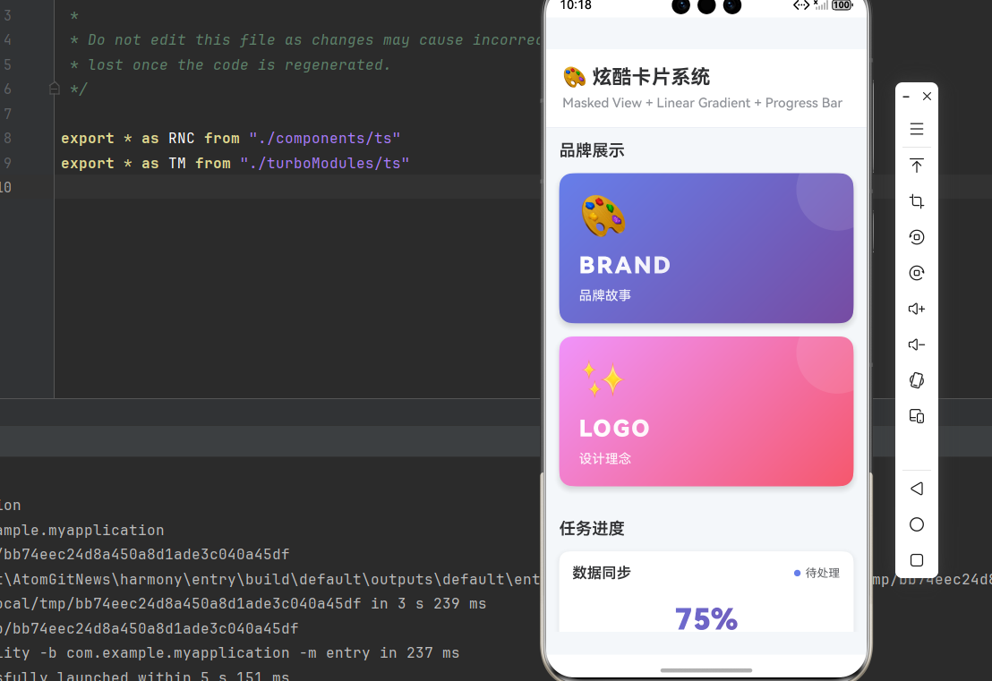
{ id: 1, title: '数据同步', progress: 75, colors: ['#667eea', '#764ba2'] },
{ id: 2, title: '文件上传', progress: 45, colors: ['#f093fb', '#f5576c'] },
{ id: 3, title: '系统更新', progress: 90, colors: ['#4FACFE', '#00F2FE'] },
]);
// 监控数据
const [monitors, setMonitors] = useState([
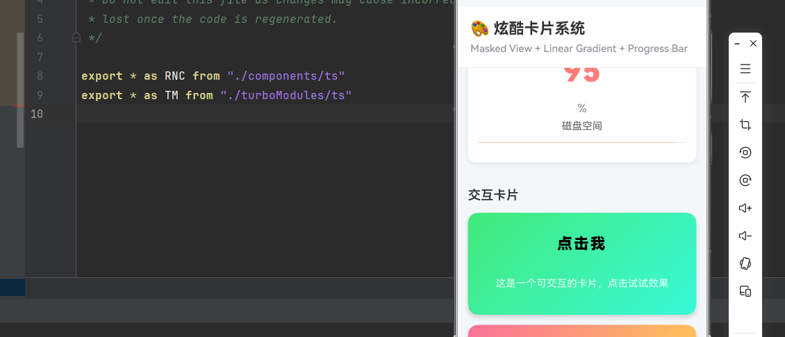
{ id: 1, name: 'CPU 使用率', value: 65, unit: '%', status: 'normal' as const },
{ id: 2, name: '内存占用', value: 85, unit: '%', status: 'warning' as const },
{ id: 3, name: '磁盘空间', value: 95, unit: '%', status: 'critical' as const },
]);
// 更新任务进度
const updateTaskProgress = (taskId: number, progress: number) => {
setTasks(prev => prev.map(task =>
task.id === taskId ? { ...task, progress } : task
));
};
return (
<SafeAreaView style={styles.container}>
<StatusBar barStyle="dark-content" backgroundColor="#ffffff" />
<View style={styles.header}>
<Text style={styles.headerTitle}>🎨 炫酷卡片系统</Text>
<Text style={styles.headerSubtitle}>
Masked View + Linear Gradient + Progress Bar
</Text>
</View>
<ScrollView style={styles.content}>
{/* 品牌卡片 */}
<View style={styles.section}>
<Text style={styles.sectionTitle}>品牌展示</Text>
<BrandGradientCard
title="BRAND"
subtitle="品牌故事"
colors={['#667eea', '#764ba2']}
icon="🎨"
/>
<BrandGradientCard
title="LOGO"
subtitle="设计理念"
colors={['#f093fb', '#f5576c']}
icon="✨"
/>
</View>
{/* 任务卡片 */}
<View style={styles.section}>
<Text style={styles.sectionTitle}>任务进度</Text>
{tasks.map(task => (
<TaskProgressCard
key={task.id}
title={task.title}
progress={task.progress}
colors={task.colors}
onProgressChange={(progress) => updateTaskProgress(task.id, progress)}
/>
))}
</View>
{/* 监控卡片 */}
<View style={styles.section}>
<Text style={styles.sectionTitle}>状态监控</Text>
{monitors.map(monitor => (
<StatusMonitorCard
key={monitor.id}
name={monitor.name}
value={monitor.value}
unit={monitor.unit}
status={monitor.status}
/>
))}
</View>
{/* 交互卡片 */}
<View style={styles.section}>
<Text style={styles.sectionTitle}>交互卡片</Text>
<InteractiveCard
title="点击我"
content="这是一个可交互的卡片,点击试试效果"
colors={['#43e97b', '#38f9d7']}
/>
<InteractiveCard
title="拖动我"
content="支持拖动交互,体验流畅的手感"
colors={['#fa709a', '#fee140']}
/>
</View>
{/* 设计说明 */}
<View style={styles.infoCard}>
<Text style={styles.infoTitle}>💡 设计要点</Text>
<Text style={styles.infoText}>
• 渐变遮罩: MaskedView 实现文字/图标渐变填充
</Text>
<Text style={styles.infoText}>
• 多层次设计: 通过大小、颜色、位置建立视觉层次
</Text>
<Text style={styles.infoText}>
• 动态颜色: 根据状态自动选择合适的颜色方案
</Text>
<Text style={styles.infoText}>
• 交互反馈: 按压、拖动等多种交互效果
</Text>
<Text style={styles.infoText}>
• 性能优化: 使用原生驱动,流畅不卡顿
</Text>
<View style={styles.tipBox}>
<Text style={[styles.infoText, styles.tipText]}>
💡 提示: 所有卡片效果在鸿蒙端完美支持
</Text>
</View>
</View>
</ScrollView>
</SafeAreaView>
);
};
const styles = StyleSheet.create({
// ==================== BrandGradientCard 样式 ====================
cardContainer: {
borderRadius: 16,
marginBottom: 16,
overflow: 'hidden',
elevation: 8,
shadowColor: '#000000',
shadowOffset: { width: 0, height: 4 },
shadowOpacity: 0.15,
shadowRadius: 8,
},
gradient: {
padding: 24,
minHeight: 140,
},
contentContainer: {
flex: 1,
justifyContent: 'center',
},
icon: {
fontSize: 48,
marginBottom: 12,
},
titleMaskedView: {
height: 40,
marginBottom: 8,
},
titleMaskContainer: {
backgroundColor: 'transparent',
justifyContent: 'center',
height: '100%',
},
title: {
fontSize: 28,
fontWeight: '900',
color: '#000000',
letterSpacing: 2,
},
subtitle: {
fontSize: 16,
color: 'rgba(255,255,255,0.9)',
fontWeight: '500',
},
decoration: {
position: 'absolute',
top: 0,
right: 0,
width: 100,
height: 100,
backgroundColor: 'rgba(255,255,255,0.1)',
borderRadius: 50,
transform: [{ translateX: 30 }, { translateY: -30 }],
},
// ==================== TaskProgressCard 样式 ====================
taskCard: {
backgroundColor: '#FFFFFF',
borderRadius: 12,
marginBottom: 16,
padding: 16,
shadowColor: '#000000',
shadowOffset: { width: 0, height: 2 },
shadowOpacity: 0.08,
shadowRadius: 8,
elevation: 4,
},
taskHeader: {
flexDirection: 'row',
justifyContent: 'space-between',
alignItems: 'center',
marginBottom: 16,
},
taskTitle: {
fontSize: 18,
fontWeight: '600',
color: '#303133',
},
taskStatus: {
flexDirection: 'row',
alignItems: 'center',
},
statusDot: {
width: 8,
height: 8,
borderRadius: 4,
marginRight: 6,
},
statusText: {
fontSize: 14,
color: '#606266',
},
taskMaskedView: {
height: 60,
marginBottom: 16,
},
taskMaskContainer: {
backgroundColor: 'transparent',
alignItems: 'center',
justifyContent: 'center',
height: '100%',
},
taskProgressText: {
fontSize: 36,
fontWeight: '900',
color: '#000000',
},
taskProgressBar: {
marginBottom: 16,
},
taskButton: {
backgroundColor: '#409EFF',
borderRadius: 8,
padding: 12,
alignItems: 'center',
},
taskButtonDisabled: {
backgroundColor: '#C0C4CC',
},
taskButtonText: {
fontSize: 16,
color: '#FFFFFF',
fontWeight: '600',
},
// ==================== StatusMonitorCard 样式 ====================
monitorCard: {
backgroundColor: '#FFFFFF',
borderRadius: 12,
marginBottom: 16,
padding: 16,
shadowColor: '#000000',
shadowOffset: { width: 0, height: 2 },
shadowOpacity: 0.08,
shadowRadius: 8,
elevation: 4,
},
statusIndicator: {
flexDirection: 'row',
alignItems: 'center',
marginBottom: 16,
},
statusIcon: {
fontSize: 20,
marginRight: 8,
},
statusLabel: {
fontSize: 14,
fontWeight: '600',
},
monitorMaskedView: {
height: 80,
marginBottom: 8,
},
monitorMaskContainer: {
backgroundColor: 'transparent',
alignItems: 'center',
justifyContent: 'center',
height: '100%',
},
monitorValue: {
fontSize: 48,
fontWeight: '900',
color: '#000000',
},
monitorUnit: {
fontSize: 18,
color: '#909399',
textAlign: 'center',
marginBottom: 8,
},
monitorName: {
fontSize: 16,
color: '#606266',
textAlign: 'center',
marginBottom: 16,
},
// ==================== InteractiveCard 样式 ====================
interactiveCard: {
borderRadius: 16,
marginBottom: 16,
overflow: 'hidden',
elevation: 8,
shadowColor: '#000000',
shadowOffset: { width: 0, height: 4 },
shadowOpacity: 0.15,
shadowRadius: 8,
},
interactiveMaskedView: {
height: 50,
marginBottom: 12,
},
interactiveMaskContainer: {
backgroundColor: 'transparent',
alignItems: 'center',
justifyContent: 'center',
height: '100%',
},
interactiveTitle: {
fontSize: 24,
fontWeight: '900',
color: '#000000',
letterSpacing: 2,
},
interactiveContent: {
fontSize: 16,
color: 'rgba(255,255,255,0.9)',
textAlign: 'center',
padding: 16,
},
interactiveGradient: {
width: '100%',
},
// ==================== CoolCardsScreen 样式 ====================
container: {
flex: 1,
backgroundColor: '#F5F7FA',
},
header: {
padding: 20,
backgroundColor: '#FFFFFF',
borderBottomWidth: 1,
borderBottomColor: '#EBEEF5',
},
headerTitle: {
fontSize: 24,
fontWeight: '700',
color: '#303133',
marginBottom: 8,
},
headerSubtitle: {
fontSize: 16,
fontWeight: '500',
color: '#909399',
},
content: {
flex: 1,
padding: 16,
},
section: {
marginBottom: 24,
},
sectionTitle: {
fontSize: 20,
fontWeight: '600',
color: '#303133',
marginBottom: 16,
},
infoCard: {
backgroundColor: '#FFFFFF',
borderRadius: 12,
padding: 16,
shadowColor: '#000000',
shadowOffset: { width: 0, height: 2 },
shadowOpacity: 0.08,
shadowRadius: 8,
elevation: 4,
},
infoTitle: {
fontSize: 18,
fontWeight: '600',
color: '#303133',
marginBottom: 12,
},
infoText: {
fontSize: 14,
lineHeight: 24,
marginBottom: 8,
color: '#606266',
},
tipBox: {
backgroundColor: '#ECF5FF',
borderRadius: 8,
padding: 12,
marginTop: 12,
},
tipText: {
color: '#409EFF',
fontWeight: '600',
},
});
export default CoolCardsScreen;
四、高级应用场景
4.1 卡片瀑布流
const CardWaterfall = () => {
  const cards = [
    { id: 1, title: '设计', content: '优秀的设计', colors: ['#667eea', '#764ba2'], height: 180 },
    { id: 2, title: '开发', content: '高效的开发', colors: ['#f093fb', '#f5576c'], height: 220 },
    { id: 3, title: '测试', content: '全面的测试', colors: ['#4FACFE', '#00F2FE'], height: 160 },
    { id: 4, title: '部署', content: '安全的部署', colors: ['#43e97b', '#38f9d7'], height: 200 },
  ];

  return (
    <View style={styles.waterfallContainer}>
      {cards.map(card => (
        <View key={card.id} style={[styles.waterfallCard, { height: card.height }]}>
          <LinearGradient
            colors={card.colors}
            start={{ x: 0, y: 0 }}
            end={{ x: 1, y: 1 }}
            style={styles.gradient}
          >
            <MaskedView
              style={styles.waterfallMaskedView}
              maskElement={
                <View style={styles.waterfallMaskContainer}>
                  <Text style={styles.waterfallTitle}>{card.title}</Text>
                </View>
              }
            >
              <LinearGradient
                colors={['#FFFFFF', 'rgba(255,255,255,0.7)']}
                start={{ x: 0, y: 0 }}
                end={{ x: 1, y: 0 }}
                style={styles.gradient}
              />
            </MaskedView>

            <Text style={styles.waterfallContent}>{card.content}</Text>
          </LinearGradient>
        </View>
      ))}
    </View>
  );
};
4.2 卡片滑动轮播
const CardCarousel = () => {
  const [currentIndex, setCurrentIndex] = useState(0);
  const carouselData = [
    { title: '卡片 1', subtitle: '第一个卡片', colors: ['#667eea', '#764ba2'] },
    { title: '卡片 2', subtitle: '第二个卡片', colors: ['#f093fb', '#f5576c'] },
    { title: '卡片 3', subtitle: '第三个卡片', colors: ['#4FACFE', '#00F2FE'] },
  ];

  return (
    <View style={styles.carouselContainer}>
      <ScrollView
        horizontal
        pagingEnabled
        showsHorizontalScrollIndicator={false}
        onMomentumScrollEnd={(event) => {
          const index = Math.round(event.nativeEvent.contentOffset.x / 320);
          setCurrentIndex(index);
        }}
      >
        {carouselData.map((card, index) => (
          <View key={index} style={styles.carouselItem}>
            <BrandGradientCard
              title={card.title}
              subtitle={card.subtitle}
              colors={card.colors}
            />
          </View>
        ))}
      </ScrollView>

      {/* 指示器 */}
      <View style={styles.indicatorContainer}>
        {carouselData.map((_, index) => (
          <View
            key={index}
            style={[
              styles.indicator,
              index === currentIndex && styles.indicatorActive,
            ]}
          />
        ))}
      </View>
    </View>
  );
};
4.3 卡片展开动画
const ExpandableCard = ({ title, content, colors }: any) => {
  const [expanded, setExpanded] = useState(false);
  const heightAnim = useRef(new Animated.Value(140)).current;

  const toggleExpand = () => {
    setExpanded(!expanded);
    Animated.timing(heightAnim, {
      toValue: expanded ? 140 : 300,
      duration: 300,
      useNativeDriver: false,
    }).start();
  };

  return (
    <Animated.View style={[styles.expandableCard, { height: heightAnim }]}>
      <LinearGradient
        colors={colors}
        start={{ x: 0, y: 0 }}
        end={{ x: 1, y: 1 }}
        style={styles.gradient}
      >
        <MaskedView
          style={styles.expandableMaskedView}
          maskElement={
            <View style={styles.expandableMaskContainer}>
              <Text style={styles.expandableTitle}>{title}</Text>
            </View>
          }
        >
          <LinearGradient
            colors={['#FFFFFF', 'rgba(255,255,255,0.7)']}
            start={{ x: 0, y: 0 }}
            end={{ x: 1, y: 0 }}
            style={styles.gradient}
          />
        </MaskedView>

        <Text style={styles.expandableContent} numberOfLines={expanded ? undefined : 2}>
          {content}
        </Text>

        <TouchableOpacity
          style={styles.expandButton}
          onPress={toggleExpand}
        >
          <Text style={styles.expandButtonText}>
            {expanded ? '收起 ▲' : '展开 ▼'}
          </Text>
        </TouchableOpacity>
      </LinearGradient>
    </Animated.View>
  );
};
五、总结
本文深入讲解了如何使用 MaskedView、LinearGradient 和 ProgressBar 创建炫酷的卡片设计和渐变遮罩效果。
核心技术要点:
| 卡片类型 | 核心技术 | 关键特性 |
|---|---|---|
| 品牌卡片 | 渐变背景 + 文字遮罩 | 品牌色渐变、装饰元素 |
| 进度卡片 | ProgressBar + 状态管理 | 任务进度、状态指示 |
| 监控卡片 | 动态颜色 + 数值显示 | 状态映射、视觉反馈 |
| 交互卡片 | PanResponder + 动画 | 手势响应、流畅交互 |
| 瀑布流 | 多列布局 + 高度控制 | 瀑布流式、错落有致 |
设计原则:
- 视觉层次:通过大小、颜色、位置建立清晰的信息层次
- 色彩统一:使用品牌色保持视觉一致性
- 交互反馈:提供清晰的点击、按压、拖动反馈
- 动画流畅:使用原生驱动和合适的缓动函数
- 性能优化:避免过度渲染,使用 memo 优化
- 跨平台一致:确保三端表现一致
扩展建议:
- 添加更多交互效果(长按、双击)
- 支持自定义主题和配色
- 集成更多动画效果(翻转、旋转)
- 支持卡片拖拽排序
- 添加卡片编辑功能
通过本文的学习,你应该能够:
- 创建各种类型的炫酷卡片
- 实现渐变遮罩效果
- 设计清晰的视觉层次
- 添加流畅的交互动画
- 优化性能和用户体验
在鸿蒙平台上,这些技术得到了完美支持,可以轻松实现与 iOS/Android 平台一致的卡片设计体验。

AtomGit 是由开放原子开源基金会联合 CSDN 等生态伙伴共同推出的新一代开源与人工智能协作平台。平台坚持“开放、中立、公益”的理念,把代码托管、模型共享、数据集托管、智能体开发体验和算力服务整合在一起,为开发者提供从开发、训练到部署的一站式体验。
更多推荐
 10
10 0
0- 0


 已为社区贡献51条内容

所有评论(0)