Flutter × OpenHarmony 实战 | 打造画栈平台的顶部横幅组件
文章目录
Flutter × OpenHarmony 实战 | 打造画栈平台的顶部横幅组件
前言
在跨端移动应用开发中,用户界面的视觉呈现直接影响用户体验和平台价值。对于创意类平台,如「画栈」——一个专业画师接稿平台——顶部横幅(Header Banner)是首屏用户看到的核心元素,它不仅承载品牌形象,也承载用户行动引导(CTA)。
本文将分享如何在 Flutter × OpenHarmony 跨端开发环境下,构建一个高颜值、高交互性的顶部横幅组件,并对核心代码进行逐行解析,帮助你快速掌握跨端 UI 实战技巧。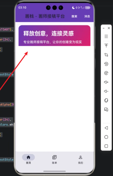
背景
「画栈」平台的定位是连接创意与画师。顶部横幅的设计目标包括:
- 视觉吸引:渐变色背景 + 圆角设计让用户眼前一亮。
- 信息传达:标题和副标题清晰表达平台定位。
- 操作引导:通过两个 CTA 按钮——“发布需求”和“寻找画师”——让用户快速进入核心功能。
在 Flutter + OpenHarmony 的跨端环境下,我们不仅可以一次性开发移动端和 PC 端,还能利用 Flutter 的强大布局系统和 OpenHarmony 的跨端适配能力,实现流畅体验。
Flutter × OpenHarmony 跨端开发介绍
Flutter 是 Google 开源的 UI 框架,通过 Dart 语言实现跨端应用开发,支持 iOS、Android、Windows、Linux、Web 等多端。
OpenHarmony 是华为开源的分布式操作系统,支持手机、平板、电视、IoT 等多端设备,提供 ArkUI 跨端 UI 框架。
通过 Flutter × OpenHarmony 结合,我们可以:
- 统一代码库,减少多端重复开发。
- 充分利用 Flutter 丰富的 UI 组件体系。
- 借助 OpenHarmony 的跨设备适配,实现屏幕适配和多终端一致体验。
在实际开发中,Header Banner 是典型的 UI 组件,涉及 Container 布局、渐变背景、文字样式、按钮样式和响应事件 等核心知识点。
开发核心代码与详细解析
下面是顶部横幅组件的完整实现:
/// 构建顶部横幅
Widget _buildHeaderBanner(ThemeData theme) {
  return Container(
    width: double.infinity,
    height: 180,
    decoration: BoxDecoration(
      borderRadius: BorderRadius.circular(16),
      gradient: const LinearGradient(
        begin: Alignment.topLeft,
        end: Alignment.bottomRight,
        colors: [
          Color(0xFF673AB7),
          Color(0xFFE91E63),
        ],
      ),
    ),
    padding: const EdgeInsets.all(24),
    child: Column(
      crossAxisAlignment: CrossAxisAlignment.start,
      mainAxisAlignment: MainAxisAlignment.center,
      children: [
        Text(
          '释放创意,连接灵感',
          style: theme.textTheme.titleLarge?.copyWith(
            color: Colors.white,
            fontWeight: FontWeight.bold,
            fontSize: 28,
          ),
        ),
        const SizedBox(height: 12),
        Text(
          '专业画师接稿平台,让你的创意变为现实',
          style: theme.textTheme.bodyMedium?.copyWith(
            color: Colors.white,
            fontSize: 16,
          ),
        ),
        const SizedBox(height: 20),
        Row(
          children: [
            TextButton(
              onPressed: () {},
              style: TextButton.styleFrom(
                backgroundColor: Colors.white,
                foregroundColor: const Color(0xFF673AB7),
                shape: RoundedRectangleBorder(
                  borderRadius: BorderRadius.circular(24),
                ),
                padding: const EdgeInsets.symmetric(
                  horizontal: 28,
                  vertical: 10,
                ),
              ),
              child: const Text('发布需求', style: TextStyle(fontWeight: FontWeight.bold)),
            ),
            const SizedBox(width: 12),
            TextButton(
              onPressed: () {},
              style: TextButton.styleFrom(
                backgroundColor: Colors.white.withAlpha(20),
                foregroundColor: Colors.white,
                shape: RoundedRectangleBorder(
                  borderRadius: BorderRadius.circular(24),
                  side: const BorderSide(color: Colors.white, width: 2),
                ),
                padding: const EdgeInsets.symmetric(
                  horizontal: 28,
                  vertical: 10,
                ),
              ),
              child: const Text('寻找画师', style: TextStyle(fontWeight: FontWeight.bold)),
            ),
          ],
        ),
      ],
    ),
  );
}
下面我们拆分逐行解析:
1️⃣ 外层容器 Container
return Container(
  width: double.infinity,
  height: 180,
width: double.infinity:宽度撑满父容器,确保横幅全屏显示。height: 180:固定高度,让横幅视觉突出。
2️⃣ 背景装饰 BoxDecoration
decoration: BoxDecoration(
  borderRadius: BorderRadius.circular(16),
  gradient: const LinearGradient(
    begin: Alignment.topLeft,
    end: Alignment.bottomRight,
    colors: [
      Color(0xFF673AB7),
      Color(0xFFE91E63),
    ],
  ),
),
borderRadius:圆角设计,16px 半径柔和边缘。LinearGradient:渐变色,从紫色到粉色,让横幅更有层次感。begin和end定义渐变方向。
3️⃣ 内边距 Padding
padding: const EdgeInsets.all(24),
- 为内容留出 24px 的内边距,保证文字和按钮不贴边。
4️⃣ 内容布局 Column
child: Column(
  crossAxisAlignment: CrossAxisAlignment.start,
  mainAxisAlignment: MainAxisAlignment.center,
  children: [
crossAxisAlignment: start:子元素左对齐。mainAxisAlignment: center:纵向居中排列,使视觉更平衡。
5️⃣ 标题 Text
Text(
  '释放创意,连接灵感',
  style: theme.textTheme.titleLarge?.copyWith(
    color: Colors.white,
    fontWeight: FontWeight.bold,
    fontSize: 28,
  ),
),
- 使用
theme.textTheme.titleLarge保持全局主题一致性。 copyWith自定义字体颜色、粗细和字号。
6️⃣ 副标题 Text
Text(
  '专业画师接稿平台,让你的创意变为现实',
  style: theme.textTheme.bodyMedium?.copyWith(
    color: Colors.white,
    fontSize: 16,
  ),
),
- 副标题更小,更轻,提供补充信息。
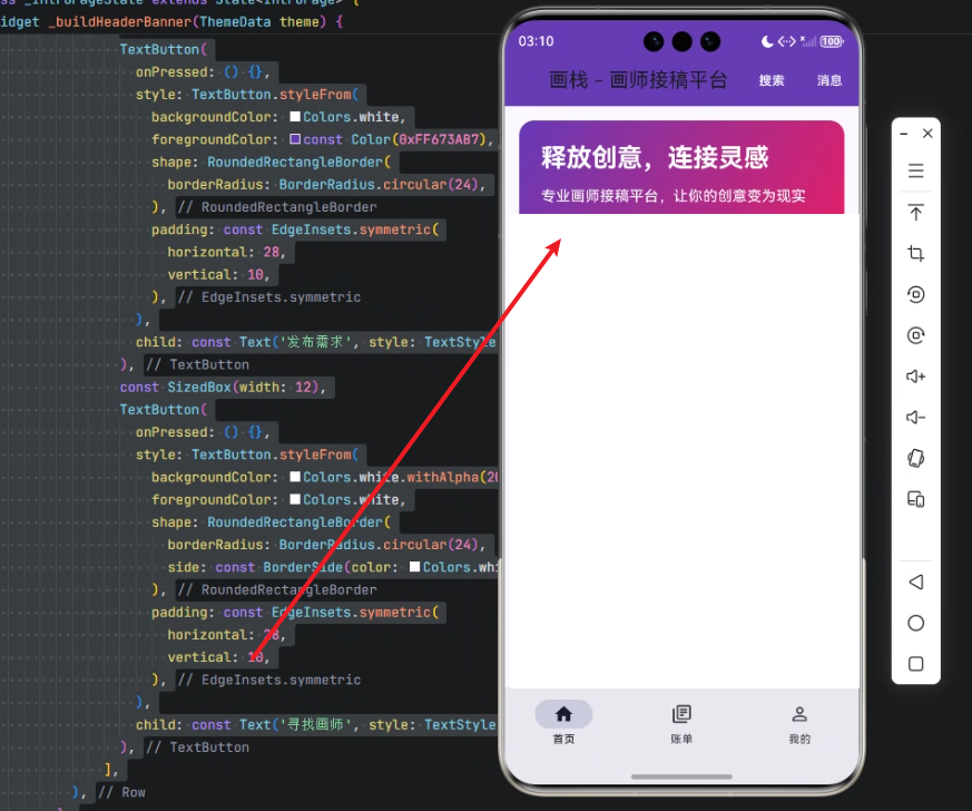
7️⃣ 按钮 Row
Row(
  children: [
    TextButton(
      onPressed: () {},
      style: TextButton.styleFrom(
        backgroundColor: Colors.white,
        foregroundColor: const Color(0xFF673AB7),
        shape: RoundedRectangleBorder(
          borderRadius: BorderRadius.circular(24),
        ),
        padding: const EdgeInsets.symmetric(
          horizontal: 28,
          vertical: 10,
        ),
      ),
      child: const Text('发布需求', style: TextStyle(fontWeight: FontWeight.bold)),
    ),
- 第一个按钮为主 CTA,白底紫字。
RoundedRectangleBorder圆角按钮。padding增加点击面积,提高交互体验。
8️⃣ 第二个按钮
TextButton(
  onPressed: () {},
  style: TextButton.styleFrom(
    backgroundColor: Colors.white.withAlpha(20),
    foregroundColor: Colors.white,
    shape: RoundedRectangleBorder(
      borderRadius: BorderRadius.circular(24),
      side: const BorderSide(color: Colors.white, width: 2),
    ),
    padding: const EdgeInsets.symmetric(
      horizontal: 28,
      vertical: 10,
    ),
  ),
  child: const Text('寻找画师', style: TextStyle(fontWeight: FontWeight.bold)),
),
- 第二个按钮为次级 CTA,半透明白底 + 白色边框。
- 保持整体色调统一,但弱化视觉权重。
心得
- 渐变与圆角是提升视觉质感的利器。
- 主题统一:尽量使用
ThemeData配合copyWith,保证全局样式一致。 - 按钮设计:主次按钮区分清晰,引导用户操作。
- 跨端适配:Flutter + OpenHarmony 组合可以一次性满足移动端和桌面端需求。
总结
通过本次开发实践,我们实现了一个视觉美观、功能明确、可复用的顶部横幅组件。
在 Flutter × OpenHarmony 跨端环境中,组件化、主题化和响应式布局是核心设计原则。
未来可以进一步优化:
- 添加动态背景(如渐变动画)。
- 支持横幅点击跳转、滑动轮播。
- 对不同屏幕尺寸自适应布局。
这个顶部横幅不仅是 UI 元素,更是平台品牌和用户体验的关键承载。
本次开发实践通过 Flutter × OpenHarmony 构建了「画栈」平台的顶部横幅组件,实现了视觉吸引力强、信息传达清晰、操作引导明确的效果。通过渐变背景、圆角设计和主题化文字样式,提升了界面美感;通过主次按钮区分,引导用户快速进入核心功能。同时,Flutter × OpenHarmony 的跨端特性让这一组件可以在多终端复用,提高开发效率和一致性。整体来看,这个横幅不仅提升了用户体验,也为平台品牌形象加分,体现了跨端 UI 设计的实用价值。
欢迎加入开源鸿蒙跨平台社区:https://openharmonycrossplatform.csdn.net

AtomGit 是由开放原子开源基金会联合 CSDN 等生态伙伴共同推出的新一代开源与人工智能协作平台。平台坚持“开放、中立、公益”的理念,把代码托管、模型共享、数据集托管、智能体开发体验和算力服务整合在一起,为开发者提供从开发、训练到部署的一站式体验。
更多推荐
 3
3 0
0- 0


 已为社区贡献34条内容

所有评论(0)