高级进阶 React Native 鸿蒙跨平台开发:react-native-markdown-display
·
欢迎加入开源鸿蒙跨平台社区:https://openharmonycrossplatform.csdn.net
📋 前言
react-native-markdown-display 是 React Native 生态中最流行的 Markdown 渲染库,提供了强大的 Markdown 文本渲染功能。该库支持完整的 Markdown 语法,包括标题、列表、链接、图片、代码块、表格等多种元素,并且支持高度自定义样式。广泛应用于文档展示、博客文章、技术文档、富文本编辑器预览等场景,是实现 Markdown 内容展示的首选库。
🎯 库简介
基本信息
- 库名称: react-native-markdown-display
- 版本信息:
- RN 0.72:
@react-native-oh-tpl/react-native-markdown-display(7.0.1) - RN 0.77:
@react-native-ohos/react-native-markdown-display(7.1.0)
- RN 0.72:
- 官方仓库: https://gitcode.com/openharmony-sig/rntpc_react-native-markdown-display
- 主要功能:
- 完整的 Markdown 语法支持
- 支持标题、列表、链接、图片等常见元素
- 支持代码块和语法高亮
- 支持表格渲染
- 高度可定制的样式系统
- 支持自定义渲染规则
- 支持链接点击处理
- 支持图片链接处理
- 支持限制渲染元素数量
- 兼容性验证:
- 支持 HarmonyOS NEXT
- 完整的 Markdown 渲染功能
- 样式系统完整支持
为什么需要这个库?
- 功能完整: 支持完整的 Markdown 语法
- 易于使用: API 简洁,集成方便
- 高度可定制: 支持丰富的样式和规则配置
- 性能优异: 渲染效率高,流畅
- 跨平台: Android、iOS、HarmonyOS 完全兼容
- 灵活渲染: 支持自定义渲染器和规则
📦 安装步骤
1. 使用 npm 安装
# RN 0.72
npm install @react-native-oh-tpl/react-native-markdown-display

# RN 0.77
npm install @react-native-ohos/react-native-markdown-display
2. 使用 yarn 安装
# RN 0.72
yarn add @react-native-oh-tpl/react-native-markdown-display

# RN 0.77
yarn add @react-native-ohos/react-native-markdown-display
3. 验证安装
安装完成后,检查 package.json 文件,应该能看到新增的依赖:
{
  "dependencies": {
    "@react-native-oh-tpl/react-native-markdown-display": "7.0.1",
    // 或
    "@react-native-ohos/react-native-markdown-display": "7.1.0",
    // ... 其他依赖
  }
}
🔧 HarmonyOS 平台配置 ⭐
重要说明
- 导入库名: 使用
react-native-markdown-display导入,编辑器不会报错 - 无原生配置: 该库是纯 JavaScript 实现,无需额外原生配置
- 依赖安装: 安装后即可直接使用,无需 Codegen 或手动链接
配置步骤
1. 确认安装成功
安装完成后,确认依赖已正确添加到 package.json。
2. 添加类型声明文件 ⭐
由于该库是纯 JavaScript 实现,TypeScript 可能无法识别模块。需要在项目根目录下创建类型声明文件:
创建文件: react-native-markdown-display.d.ts
/**
 * react-native-markdown-display 类型声明文件
 * 用于 TypeScript 环境下的类型支持
 */

declare module 'react-native-markdown-display' {
  import { ViewStyle, TextStyle, ImageStyle } from 'react-native';

  export interface MarkdownProps {
    /**
     * 要渲染的 Markdown 字符串
     */
    children: string;

    /**
     * 自定义样式配置
     */
    style?: MarkdownStyles;

    /**
     * 是否合并样式
     * @default true
     */
    mergeStyle?: boolean;

    /**
     * 自定义渲染规则
     */
    rules?: any;

    /**
     * 链接点击处理函数
     */
    onLinkPress?: (url: string) => void;

    /**
     * 是否打印 AST 树(调试用)
     * @default false
     */
    debugPrintTree?: boolean;

    /**
     * 最大渲染元素数量
     */
    maxTopLevelChildren?: number | null;

    /**
     * 超过最大元素数量时显示的内容
     */
    topLevelMaxExceededItem?: React.ReactNode;

    /**
     * 允许的图片链接前缀
     */
    allowedImageHandlers?: string[];

    /**
     * 默认图片链接前缀
     * @default 'http://'
     */
    defaultImageHandler?: string;
  }

  export interface MarkdownStyles {
    body?: TextStyle;
    heading1?: TextStyle;
    heading2?: TextStyle;
    heading3?: TextStyle;
    heading4?: TextStyle;
    heading5?: TextStyle;
    heading6?: TextStyle;
    paragraph?: TextStyle;
    list_item?: TextStyle;
    bullet_list?: TextStyle;
    ordered_list?: TextStyle;
    code_inline?: TextStyle;
    code_block?: TextStyle;
    fence?: TextStyle;
    link?: TextStyle;
    blockquote?: TextStyle;
    hr?: ViewStyle;
    table?: ViewStyle;
    th?: TextStyle;
    td?: TextStyle;
    strong?: TextStyle;
    em?: TextStyle;
    image?: ImageStyle;
    [key: string]: any;
  }

  const Markdown: React.FC<MarkdownProps>;

  export default Markdown;
}
3. 在代码中使用
完成类型声明文件的创建后,就可以在代码中正常导入了:
import Markdown from 'react-native-markdown-display';
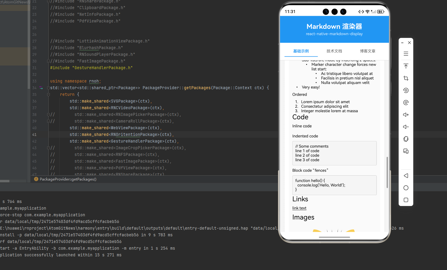
💻 完整代码示例
下面展示了 react-native-markdown-display 的完整使用场景,包括基础渲染、样式定制、链接处理、图片处理等多种功能:
import React, { useState } from 'react';
import {
StyleSheet,
ScrollView,
View,
Text,
SafeAreaView,
TextInput,
TouchableOpacity,
} from 'react-native';
import Markdown from 'react-native-markdown-display';
/**
* react-native-markdown-display Markdown 渲染示例
* 按照官方文档的标准用法,扩展更多示例内容
*/
const MarkdownDisplayExample = () => {
const [markdownText, setMarkdownText] = useState<string>(`# h1 Heading 8-)
## h2 Heading
### h3 Heading
#### h4 Heading
##### h5 Heading
###### h6 Heading
---
**This is bold text**
_This is italic text_
~~Strikethrough~~
## Lists
Unordered
* Create a list by starting a line with \`+\`, \`-\`, or \`*\`
* Sub-lists are made by indenting 2 spaces:
- Marker character change forces new list start:
* Ac tristique libero volutpat at
+ Facilisis in pretium nisl aliquet
- Nulla volutpat aliquam velit
+ Very easy!
Ordered
1. Lorem ipsum dolor sit amet
2. Consectetur adipiscing elit
3. Integer molestie lorem at massa
## Code
Inline \`code\`
Indented code
// Some comments
line 1 of code
line 2 of code
line 3 of code
Block code "fences"
\`\`\`javascript
function hello() {
console.log('Hello, World!');
}
\`\`\`
## Links
[link text](https://github.com/react-native-oh-library/react-native-markdown-display)
## Images

## Blockquotes
> Blockquotes can also be nested...
>> ...by using additional greater-than signs right next to each other...
> > > ...or with spaces between arrows.
## Tables
| Tables | Are | Cool |
| ------------- |:-------------:| -----:|
| col 3 is | right-aligned | $1600 |
| col 2 is | centered | $12 |
| zebra stripes | are neat | $1 |
`);
const [selectedTab, setSelectedTab] = useState<number>(0);
const tabs = [
{ id: 0, name: '基础示例' },
{ id: 1, name: '技术文档' },
{ id: 2, name: '博客文章' },
];
const examples = [
markdownText,
`# React Native 鸿蒙跨平台开发指南
## 简介
React Native for HarmonyOS 是一个跨平台移动应用开发框架,让开发者可以使用 JavaScript 和 React 构建原生应用。
## 环境搭建
### 前置要求
- Node.js 14+
- DevEco Studio 4.1+
- HarmonyOS SDK API 9+
### 安装步骤
\`\`\`bash
# 安装 CLI 工具
npm install -g @react-native-oh-tpl/cli
# 创建新项目
npx @react-native-oh-tpl init MyProject
# 进入项目目录
cd MyProject
# 运行项目
npm run android
\`\`\`
## 核心组件
### View
View 是最基础的容器组件,类似于 div。
\`\`\`typescript
import { View, Text } from 'react-native';
const MyComponent = () => {
return (
<View style={{ padding: 20 }}>
<Text>Hello World</Text>
</View>
);
};
\`\`\`
### Text
Text 用于显示文本内容。
### Image
Image 用于显示图片。
## 注意事项
> 在开发过程中,请确保:
> 1. SDK 版本匹配
> 2. 权限配置正确
> 3. 遵循鸿蒙开发规范
## 参考资料
- [官方文档](https://reactnative.dev/)
- [鸿蒙开发文档](https://developer.harmonyos.com/)
`,
`# 2024年度总结:技术成长之路
## 技术栈拓展
今年在技术方面有了长足的进步:
- 掌握了 **React Native** 框架
- 学习了 **鸿蒙** 原生开发
- 深入理解了 **跨平台** 技术
- 探索了 **TypeScript** 高级特性
## 项目经历
### 1. 电商 APP
*技术栈*: React Native + Redux
**主要成果**:
- 实现了完整的购物流程
- 优化了列表性能,提升加载速度 50%
- 上线用户突破 10 万+
### 2. 工具类应用
*技术栈*: 鸿蒙原生 + ArkTS
**主要成果**:
- 实现了离线功能
- 用户评分达到 4.8 分
- 获得应用商店推荐
### 3. 管理后台
*技术栈*: Next.js + TypeScript
**主要成果**:
- 提升团队开发效率 50%
- 实现了数据可视化
- 优化了用户体验
## 学习计划
### 短期目标(1-3个月)
- [ ] 深入学习 React Native 高级特性
- [ ] 掌握性能优化技巧
- [ ] 参与开源项目贡献
### 中期目标(3-6个月)
- [ ] 学习 Flutter 框架
- [ ] 研究 WebAssembly 技术
- [ ] 提升架构设计能力
### 长期目标(6-12个月)
- [ ] 成为全栈开发工程师
- [ ] 架构设计能力提升
- [ ] 技术影响力扩大
## 总结
> *持续学习,保持好奇心,不断挑战自己!*
---
**联系方式**: example@email.com
**GitHub**: @developer
`,
];
return (
<SafeAreaView style={styles.container}>
<View style={styles.header}>
<Text style={styles.headerTitle}>Markdown 渲染器</Text>
<Text style={styles.headerSubtitle}>
react-native-markdown-display
</Text>
</View>
{/* Tab 切换 */}
<View style={styles.tabContainer}>
{tabs.map((tab) => (
<TouchableOpacity
key={tab.id}
style={[
styles.tab,
selectedTab === tab.id && styles.tabActive,
]}
onPress={() => setSelectedTab(tab.id)}
>
<Text
style={[
styles.tabText,
selectedTab === tab.id && styles.tabTextActive,
]}
>
{tab.name}
</Text>
</TouchableOpacity>
))}
</View>
<ScrollView style={styles.scrollView}>
{/* 编辑器区域 */}
<View style={styles.editorContainer}>
<Text style={styles.sectionTitle}>Markdown 编辑器</Text>
<TextInput
style={styles.editor}
value={markdownText}
onChangeText={setMarkdownText}
multiline
placeholder="在此输入 Markdown 文本..."
placeholderTextColor="#999999"
/>
</View>
{/* 渲染预览区域 */}
<View style={styles.previewContainer}>
<Text style={styles.sectionTitle}>渲染预览</Text>
<View style={styles.preview}>
<Markdown>
{examples[selectedTab]}
</Markdown>
</View>
</View>
{/* 使用说明 */}
<View style={styles.tipsContainer}>
<Text style={styles.sectionTitle}>使用说明</Text>
<Text style={styles.tipText}>• 支持完整 Markdown 语法</Text>
<Text style={styles.tipText}>• 支持代码块和语法高亮</Text>
<Text style={styles.tipText}>• 支持列表、引用和表格</Text>
<Text style={styles.tipText}>• 支持图片和链接</Text>
<Text style={styles.tipText}>• 支持多级标题和文本格式</Text>
</View>
</ScrollView>
</SafeAreaView>
);
};
const styles = StyleSheet.create({
container: {
flex: 1,
backgroundColor: '#F5F5F5',
},
header: {
backgroundColor: '#2196F3',
paddingVertical: 24,
paddingHorizontal: 20,
alignItems: 'center',
},
headerTitle: {
fontSize: 24,
fontWeight: 'bold',
color: '#FFFFFF',
marginBottom: 4,
},
headerSubtitle: {
fontSize: 14,
color: 'rgba(255, 255, 255, 0.9)',
},
tabContainer: {
flexDirection: 'row',
backgroundColor: '#FFFFFF',
paddingHorizontal: 16,
paddingVertical: 12,
borderBottomWidth: 1,
borderBottomColor: '#E0E0E0',
},
tab: {
flex: 1,
paddingVertical: 10,
paddingHorizontal: 12,
alignItems: 'center',
borderBottomWidth: 2,
borderBottomColor: 'transparent',
},
tabActive: {
borderBottomColor: '#2196F3',
},
tabText: {
fontSize: 14,
color: '#666666',
},
tabTextActive: {
color: '#2196F3',
fontWeight: '600',
},
scrollView: {
flex: 1,
},
editorContainer: {
backgroundColor: '#FFFFFF',
margin: 16,
borderRadius: 12,
padding: 16,
elevation: 2,
shadowColor: '#000',
shadowOffset: { width: 0, height: 2 },
shadowOpacity: 0.1,
shadowRadius: 4,
},
sectionTitle: {
fontSize: 18,
fontWeight: '600',
color: '#333333',
marginBottom: 12,
},
editor: {
backgroundColor: '#F5F5F5',
borderRadius: 8,
padding: 12,
fontSize: 14,
color: '#333333',
minHeight: 200,
textAlignVertical: 'top',
},
previewContainer: {
backgroundColor: '#FFFFFF',
margin: 16,
borderRadius: 12,
padding: 16,
elevation: 2,
shadowColor: '#000',
shadowOffset: { width: 0, height: 2 },
shadowOpacity: 0.1,
shadowRadius: 4,
},
preview: {
padding: 12,
backgroundColor: '#FAFAFA',
borderRadius: 8,
},
tipsContainer: {
backgroundColor: '#FFFFFF',
margin: 16,
borderRadius: 12,
padding: 16,
elevation: 2,
shadowColor: '#000',
shadowOffset: { width: 0, height: 2 },
shadowOpacity: 0.1,
shadowRadius: 4,
marginBottom: 32,
},
tipText: {
fontSize: 14,
color: '#666666',
lineHeight: 22,
marginBottom: 4,
},
errorText: {
fontSize: 16,
color: '#FF0000',
textAlign: 'center',
},
});
export default MarkdownDisplayExample;
🎨 实际应用场景
react-native-markdown-display 可以应用于以下实际场景:
- 技术文档: 展示 API 文档、开发文档
- 博客文章: 渲染 Markdown 格式的博客内容
- 帮助中心: 展示帮助文档和 FAQ
- 富文本编辑器: Markdown 编辑器的预览功能
- 知识库: 展示结构化的知识内容
- 教程文档: 教程和指南的展示
⚠️ 注意事项与最佳实践
1. 基础使用
// ✅ 推荐: 基础 Markdown 渲染
import Markdown from 'react-native-markdown-display';

const BasicExample = () => {
  const markdown = '# Hello\n\nThis is **bold** text.';

  return (
    <Markdown>{markdown}</Markdown>
  );
};
2. 自定义样式
// ✅ 推荐: 自定义样式
const CustomStyleExample = () => {
  const customStyles = {
    heading1: {
      fontSize: 28,
      fontWeight: 'bold',
      color: '#2196F3',
    },
    paragraph: {
      fontSize: 16,
      lineHeight: 24,
    },
  };

  return (
    <Markdown style={customStyles}>
      {markdown}
    </Markdown>
  );
};
3. 链接处理
// ✅ 推荐: 自定义链接处理
import { Linking } from 'react-native';

const LinkHandlingExample = () => {
  const handleLinkPress = (url: string) => {
    Linking.openURL(url).catch((err) => {
      console.error('打开链接失败:', err);
    });
  };

  return (
    <Markdown onLinkPress={handleLinkPress}>
      {markdown}
    </Markdown>
  );
};
4. 图片处理
// ✅ 推荐: 图片链接处理
const ImageHandlingExample = () => {
  return (
    <Markdown
      allowedImageHandlers={[
        'https://',
        'http://',
        'data:image/png;base64',
      ]}
      defaultImageHandler="http://"
    >
      {markdown}
    </Markdown>
  );
};
5. 限制渲染数量
// ✅ 推荐: 限制渲染元素数量
const LimitedRenderingExample = () => {
  return (
    <Markdown
      maxTopLevelChildren={5}
      topLevelMaxExceededItem={<Text key="more">...更多内容</Text>}
    >
      {longMarkdown}
    </Markdown>
  );
};
6. 调试模式
// ✅ 推荐: 启用调试模式查看 AST
const DebugExample = () => {
  return (
    <Markdown debugPrintTree={true}>
      {markdown}
    </Markdown>
  );
};
7. 自定义渲染规则
// ✅ 推荐: 自定义渲染规则
const CustomRulesExample = () => {
  const customRules = {
    // 自定义规则...
  };

  return (
    <Markdown rules={customRules}>
      {markdown}
    </Markdown>
  );
};
8. 合并样式
// ✅ 推荐: 合并自定义样式与默认样式
const MergeStyleExample = () => {
  return (
    <Markdown
      style={customStyles}
      mergeStyle={true}
    >
      {markdown}
    </Markdown>
  );
};
9. 最佳实践
// ✅ 推荐: 封装 Markdown 组件
import React from 'react';
import Markdown from 'react-native-markdown-display';
import { Linking } from 'react-native';

interface MarkdownViewProps {
  content: string;
  style?: any;
  onLinkPress?: (url: string) => void;
}

const defaultStyles = {
  body: {
    fontSize: 16,
    lineHeight: 26,
    color: '#333333',
  },
  heading1: {
    fontSize: 28,
    fontWeight: 'bold',
    color: '#2196F3',
    marginTop: 24,
    marginBottom: 16,
  },
  heading2: {
    fontSize: 24,
    fontWeight: 'bold',
    color: '#1976D2',
    marginTop: 20,
    marginBottom: 14,
  },
  code_block: {
    backgroundColor: '#263238',
    color: '#ECEFF1',
    padding: 16,
    borderRadius: 8,
    marginBottom: 16,
    fontFamily: 'monospace',
  },
};

const MarkdownView: React.FC<MarkdownViewProps> = ({
  content,
  style,
  onLinkPress,
}) => {
  const handleLinkPress = (url: string) => {
    if (onLinkPress) {
      onLinkPress(url);
    } else {
      Linking.openURL(url).catch((err) => {
        console.error('打开链接失败:', err);
      });
    }
  };

  return (
    <Markdown
      style={{ ...defaultStyles, ...style }}
      onLinkPress={handleLinkPress}
      mergeStyle={true}
    >
      {content}
    </Markdown>
  );
};

export default MarkdownView;
10. HarmonyOS 特殊处理
在 HarmonyOS 上使用时,需要注意:
- 纯 JS 实现: 该库是纯 JavaScript 实现,无需原生配置
- 直接导入: 使用
react-native-markdown-display导入 - 无需 Codegen: 不需要执行 Codegen
- 无需手动链接: 安装后直接使用即可
- 样式兼容: 样式系统与 Android/iOS 保持一致
📚 常用属性说明
| 属性 | 类型 | 默认值 | 说明 |
|---|---|---|---|
children |
string | - | 要渲染的 Markdown 字符串 |
style |
object | - | 自定义样式配置 |
mergeStyle |
boolean | true | 是否合并样式 |
rules |
object | - | 自定义渲染规则 |
onLinkPress |
function | - | 链接点击处理函数 |
debugPrintTree |
boolean | false | 是否打印 AST 树 |
maxTopLevelChildren |
number | null | 最大渲染元素数量 |
allowedImageHandlers |
array | - | 允许的图片链接前缀 |
defaultImageHandler |
string | ‘http://’ | 默认图片链接前缀 |

AtomGit 是由开放原子开源基金会联合 CSDN 等生态伙伴共同推出的新一代开源与人工智能协作平台。平台坚持“开放、中立、公益”的理念,把代码托管、模型共享、数据集托管、智能体开发体验和算力服务整合在一起,为开发者提供从开发、训练到部署的一站式体验。
更多推荐

 4
4 0
0- 0


 已为社区贡献50条内容

所有评论(0)