Flutter for OpenHarmony 身体健康状况记录App实战 - 体重详情实现
前言
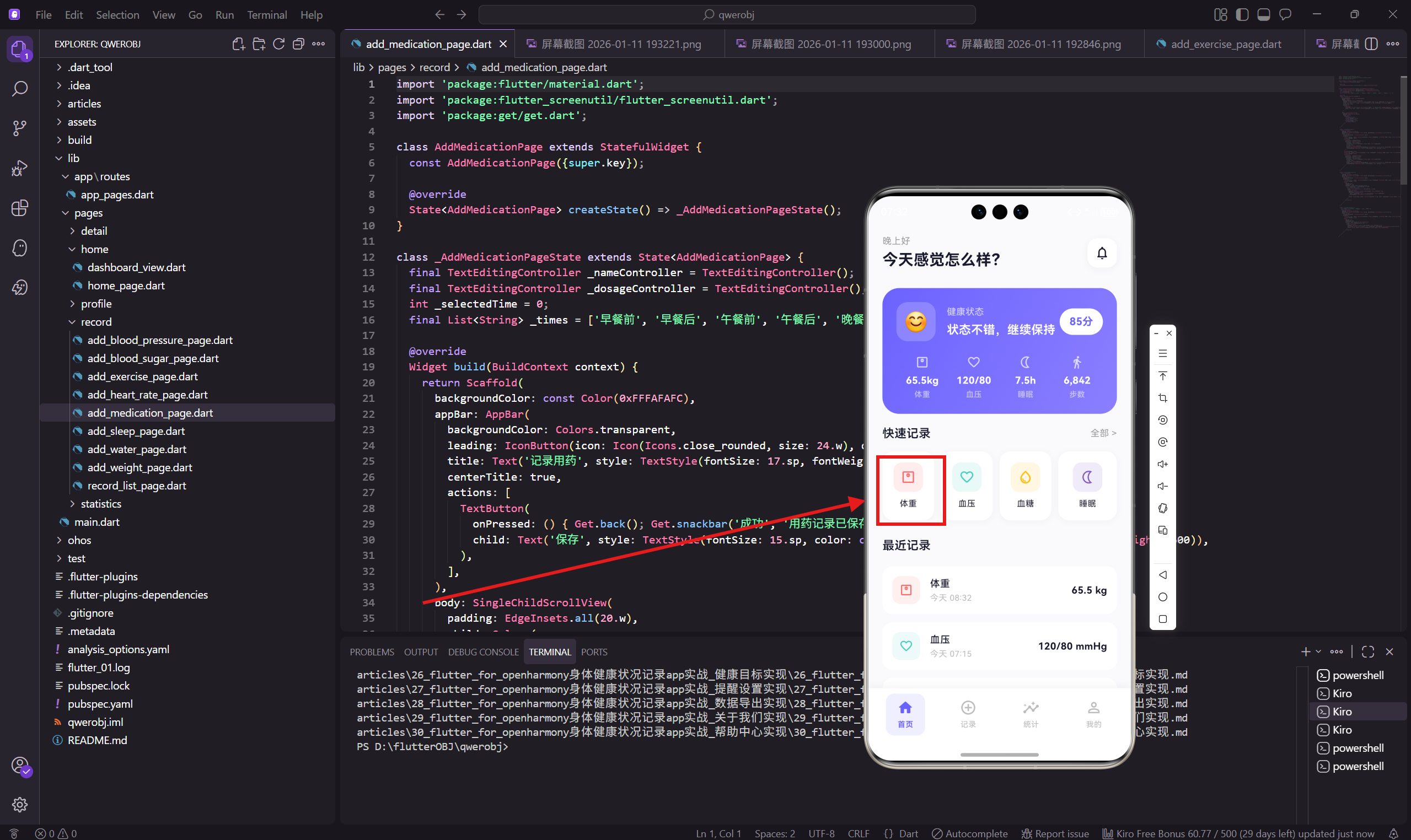
体重详情页面展示用户的体重数据,包括当前体重、目标体重、BMI、趋势图表和历史记录。这是一个典型的数据展示页面,会用到 fl_chart 库来绘制折线图。
这篇文章会讲解如何组织数据展示页面的结构,以及如何使用图表库。
页面结构
详情页面分为三个部分:当前数据卡片、趋势图表、历史记录列表。
class WeightDetailPage extends StatelessWidget {
const WeightDetailPage({super.key});
Widget build(BuildContext context) {
return Scaffold(
backgroundColor: const Color(0xFFFAFAFC),
appBar: AppBar(
backgroundColor: Colors.transparent,
leading: IconButton(
icon: Icon(Icons.arrow_back_ios_rounded, size: 20.w),
onPressed: () => Get.back()
),
title: Text('体重详情', style: TextStyle(
fontSize: 17.sp,
fontWeight: FontWeight.w600
)),
centerTitle: true,
),
body: SingleChildScrollView(
padding: EdgeInsets.all(20.w),
child: Column(
children: [
_buildCurrentWeight(),
SizedBox(height: 20.h),
_buildChart(),
SizedBox(height: 20.h),
_buildHistory(),
],
),
),
);
}
详情页面用返回箭头而不是关闭图标,因为这是一个查看页面而不是编辑页面。arrow_back_ios_rounded 是 iOS 风格的返回箭头。
当前体重卡片
用渐变背景的卡片突出显示当前体重和相关指标。
  Widget _buildCurrentWeight() {
    return Container(
      width: double.infinity,
      padding: EdgeInsets.all(24.w),
      decoration: BoxDecoration(
        gradient: const LinearGradient(
          colors: [Color(0xFFFF6B6B), Color(0xFFFF8E8E)]
        ),
        borderRadius: BorderRadius.circular(24.r),
      ),
      child: Column(
        children: [
          Text('当前体重', style: TextStyle(
            fontSize: 13.sp,
            color: Colors.white70
          )),
          SizedBox(height: 8.h),
          Row(
            mainAxisAlignment: MainAxisAlignment.center,
            crossAxisAlignment: CrossAxisAlignment.end,
            children: [
              Text('65.5', style: TextStyle(
                fontSize: 48.sp,
                fontWeight: FontWeight.w700,
                color: Colors.white
              )),
              Padding(
                padding: EdgeInsets.only(bottom: 8.h),
                child: Text(' kg', style: TextStyle(
                  fontSize: 18.sp,
                  color: Colors.white70
                )),
              ),
            ],
          ),
红色渐变是体重在整个App中的主题色。48sp 的大字号让体重数值成为视觉焦点。
辅助指标
在体重下方显示目标、BMI、本周变化三个辅助指标。
          SizedBox(height: 12.h),
          Row(
            mainAxisAlignment: MainAxisAlignment.center,
            children: [
              _buildStatItem('目标', '63 kg'),
              Container(
                width: 1,
                height: 24.h,
                color: Colors.white24,
                margin: EdgeInsets.symmetric(horizontal: 24.w)
              ),
              _buildStatItem('BMI', '21.4'),
              Container(
                width: 1,
                height: 24.h,
                color: Colors.white24,
                margin: EdgeInsets.symmetric(horizontal: 24.w)
              ),
              _buildStatItem('本周', '-0.3 kg'),
            ],
          ),
        ],
      ),
    );
  }

  Widget _buildStatItem(String label, String value) {
    return Column(
      children: [
        Text(value, style: TextStyle(
          fontSize: 15.sp,
          fontWeight: FontWeight.w600,
          color: Colors.white
        )),
        SizedBox(height: 2.h),
        Text(label, style: TextStyle(
          fontSize: 11.sp,
          color: Colors.white60
        )),
      ],
    );
  }
用竖线分隔三个指标,Colors.white24 是 24% 透明度的白色,在渐变背景上不会太突兀。
BMI(Body Mass Index)= 体重(kg) / 身高(m)²,21.4 属于正常范围(18.5-24.9)。
趋势图表
用 fl_chart 库绘制体重变化的折线图。
  Widget _buildChart() {
    return Container(
      padding: EdgeInsets.all(20.w),
      decoration: BoxDecoration(
        color: Colors.white,
        borderRadius: BorderRadius.circular(20.r)
      ),
      child: Column(
        crossAxisAlignment: CrossAxisAlignment.start,
        children: [
          Text('趋势图', style: TextStyle(
            fontSize: 16.sp,
            fontWeight: FontWeight.w600,
            color: const Color(0xFF1A1A2E)
          )),
          SizedBox(height: 20.h),
          SizedBox(
            height: 180.h,
            child: LineChart(
              LineChartData(
                gridData: FlGridData(show: false),
                titlesData: FlTitlesData(
                  rightTitles: AxisTitles(sideTitles: SideTitles(showTitles: false)),
                  topTitles: AxisTitles(sideTitles: SideTitles(showTitles: false)),
                  leftTitles: AxisTitles(sideTitles: SideTitles(showTitles: false)),
                  bottomTitles: AxisTitles(
                    sideTitles: SideTitles(
                      showTitles: true,
                      getTitlesWidget: (v, m) => Padding(
                        padding: EdgeInsets.only(top: 8.h),
                        child: Text(
                          ['1/5', '1/6', '1/7', '1/8', '1/9', '1/10', '1/11'][v.toInt() % 7],
                          style: TextStyle(fontSize: 10.sp, color: Colors.grey[400])
                        )
                      )
                    )
                  ),
                ),
                borderData: FlBorderData(show: false),
                lineBarsData: [
                  LineChartBarData(
                    spots: const [
                      FlSpot(0, 66.2), FlSpot(1, 65.8), FlSpot(2, 66.0),
                      FlSpot(3, 65.5), FlSpot(4, 65.7), FlSpot(5, 65.3), FlSpot(6, 65.5)
                    ],
                    isCurved: true,
                    color: const Color(0xFFFF6B6B),
                    barWidth: 3,
                    dotData: FlDotData(
                      show: true,
                      getDotPainter: (s, p, b, i) => FlDotCirclePainter(
                        radius: 4,
                        color: Colors.white,
                        strokeWidth: 2,
                        strokeColor: const Color(0xFFFF6B6B)
                      )
                    ),
                    belowBarData: BarAreaData(
                      show: true,
                      color: const Color(0xFFFF6B6B).withOpacity(0.1)
                    ),
                  ),
                ],
                minY: 64, maxY: 68,
              ),
            ),
          ),
        ],
      ),
    );
  }
FlGridData(show: false) 隐藏网格线,让图表更简洁。isCurved: true 让折线变成平滑的曲线。
belowBarData 在曲线下方填充一层淡色,增加视觉层次感。minY 和 maxY 设置 Y 轴范围,让数据变化更明显。
历史记录列表
显示最近几天的体重记录,包括日期、时间、数值和变化量。
  Widget _buildHistory() {
    final history = [
      {'date': '1月11日', 'time': '08:32', 'value': '65.5 kg', 'change': '-0.2'},
      {'date': '1月10日', 'time': '08:15', 'value': '65.7 kg', 'change': '+0.4'},
      {'date': '1月9日', 'time': '08:20', 'value': '65.3 kg', 'change': '-0.2'},
      {'date': '1月8日', 'time': '08:10', 'value': '65.5 kg', 'change': '-0.5'},
      {'date': '1月7日', 'time': '08:25', 'value': '66.0 kg', 'change': '+0.2'},
    ];

    return Container(
      padding: EdgeInsets.all(20.w),
      decoration: BoxDecoration(
        color: Colors.white,
        borderRadius: BorderRadius.circular(20.r)
      ),
      child: Column(
        crossAxisAlignment: CrossAxisAlignment.start,
        children: [
          Text('历史记录', style: TextStyle(
            fontSize: 16.sp,
            fontWeight: FontWeight.w600,
            color: const Color(0xFF1A1A2E)
          )),
          SizedBox(height: 16.h),
          ...history.map((item) => Padding(
            padding: EdgeInsets.only(bottom: 14.h),
            child: Row(
              children: [
                Expanded(
                  child: Column(
                    crossAxisAlignment: CrossAxisAlignment.start,
                    children: [
                      Text(item['date']!, style: TextStyle(
                        fontSize: 14.sp,
                        fontWeight: FontWeight.w500,
                        color: const Color(0xFF1A1A2E)
                      )),
                      SizedBox(height: 2.h),
                      Text(item['time']!, style: TextStyle(
                        fontSize: 12.sp,
                        color: Colors.grey[400]
                      )),
                    ],
                  ),
                ),
                Text(item['value']!, style: TextStyle(
                  fontSize: 15.sp,
                  fontWeight: FontWeight.w600,
                  color: const Color(0xFF1A1A2E)
                )),
                SizedBox(width: 12.w),
                Container(
                  padding: EdgeInsets.symmetric(horizontal: 8.w, vertical: 2.h),
                  decoration: BoxDecoration(
                    color: item['change']!.startsWith('-')
                      ? const Color(0xFF00C9A7).withOpacity(0.12)
                      : const Color(0xFFFF6B6B).withOpacity(0.12),
                    borderRadius: BorderRadius.circular(6.r),
                  ),
                  child: Text(item['change']!, style: TextStyle(
                    fontSize: 11.sp,
                    color: item['change']!.startsWith('-')
                      ? const Color(0xFF00C9A7)
                      : const Color(0xFFFF6B6B)
                  )),
                ),
              ],
            ),
          )),
        ],
      ),
    );
  }
}
变化量用颜色区分:减少用绿色(好事),增加用红色(需要注意)。这个颜色逻辑假设用户的目标是减重,如果是增重目标,颜色应该反过来。
...history.map() 用展开运算符把 Iterable<Widget> 展开成多个 Widget,放入 Column 的 children 列表中。
小结
体重详情页面的特点:
- 渐变卡片突出显示当前体重
- 辅助指标(目标、BMI、本周变化)提供更多信息
- 折线图展示趋势变化
- 历史记录列表显示详细数据
这种"卡片 + 图表 + 列表"的结构在数据展示页面中很常见,可以复用到其他详情页面。
下一篇会讲血压详情页面,血压需要同时展示收缩压和舒张压两条曲线。
欢迎加入开源鸿蒙跨平台社区:https://openharmonycrossplatform.csdn.net

AtomGit 是由开放原子开源基金会联合 CSDN 等生态伙伴共同推出的新一代开源与人工智能协作平台。平台坚持“开放、中立、公益”的理念,把代码托管、模型共享、数据集托管、智能体开发体验和算力服务整合在一起,为开发者提供从开发、训练到部署的一站式体验。
更多推荐


 12
12 0
0- 0


 已为社区贡献30条内容

所有评论(0)