Flutter for OpenHarmony 音乐播放器App实战 - 登录实现
前言
登录功能是大多数App的标配,用户登录后可以同步收藏、播放记录等个人数据。本篇我们来实现一个手机验证码登录页面,包含手机号输入、验证码获取与倒计时、第三方登录入口等常见功能。整个页面采用渐变背景设计,视觉上更有层次感。
需求梳理
登录页面需要实现以下功能:手机号输入框、验证码输入框、获取验证码按钮(带60秒倒计时)、登录按钮、第三方登录入口(微信、Apple、邮箱)、用户协议和隐私政策提示。页面顶部还需要一个关闭按钮,方便用户返回上一页。
页面框架搭建
登录页面涉及到输入框状态和倒计时逻辑,所以我们使用 StatefulWidget 来实现:
class LoginPage extends StatefulWidget {
const LoginPage({super.key});
State<LoginPage> createState() => _LoginPageState();
}
在状态类中,我们需要定义几个关键变量来管理页面状态:
class _LoginPageState extends State<LoginPage> {
  final _phoneController = TextEditingController();
  final _codeController = TextEditingController();
  bool _isCodeSent = false;
  int _countdown = 0;
_phoneController 和 _codeController 分别用于获取手机号和验证码输入框的内容。_isCodeSent 标记验证码是否已发送,_countdown 用于倒计时显示。使用 TextEditingController 可以方便地读取和清空输入框内容。
别忘了在页面销毁时释放控制器资源:
void dispose() {
_phoneController.dispose();
_codeController.dispose();
super.dispose();
}
这是个好习惯,可以避免内存泄漏。
渐变背景设计
登录页面使用渐变背景,从顶部的粉色渐变到底部的深色,营造出沉浸式的视觉效果:
Widget build(BuildContext context) {
return Scaffold(
body: Container(
decoration: BoxDecoration(
gradient: LinearGradient(
begin: Alignment.topCenter,
end: Alignment.bottomCenter,
colors: [
const Color(0xFFE91E63).withOpacity(0.3),
const Color(0xFF121212)
]
)
),
LinearGradient 创建线性渐变,begin 和 end 指定渐变方向为从上到下。顶部使用主题色的30%透明度,底部使用深灰色,过渡自然柔和。
        child: SafeArea(
          child: SingleChildScrollView(
            padding: const EdgeInsets.all(24),
            child: Column(
              crossAxisAlignment: CrossAxisAlignment.start,
              children: [
                IconButton(icon: const Icon(Icons.close), onPressed: () => Get.back()),
                const SizedBox(height: 40),
SafeArea 确保内容不会被状态栏遮挡。SingleChildScrollView 让页面在键盘弹出时可以滚动,避免输入框被遮挡。顶部的关闭按钮使用 Get.back() 返回上一页。
Logo和欢迎语
页面中央展示App的Logo和欢迎语,给用户一个友好的第一印象:
                const Center(
                  child: Icon(Icons.music_note, size: 80, color: Color(0xFFE91E63))
                ),
                const SizedBox(height: 16),
                const Center(
                  child: Text('音乐播放器',
                    style: TextStyle(fontSize: 28, fontWeight: FontWeight.bold))
                ),
                const SizedBox(height: 8),
                const Center(
                  child: Text('登录后享受更多功能', style: TextStyle(color: Colors.grey))
                ),
                const SizedBox(height: 60),
Logo使用音符图标,大小设为80像素,颜色为主题粉色。标题使用28号粗体字,副标题使用灰色小字。这种布局简洁大方,符合现代App的设计风格。
手机号输入框
手机号输入框是登录的第一步,我们把它封装成独立的方法:
  Widget _buildPhoneInput() {
    return TextField(
      controller: _phoneController,
      keyboardType: TextInputType.phone,
      decoration: InputDecoration(
        hintText: '请输入手机号',
        prefixIcon: const Icon(Icons.phone_android, color: Colors.grey),
        filled: true,
        fillColor: const Color(0xFF1E1E1E),
        border: OutlineInputBorder(
          borderRadius: BorderRadius.circular(12),
          borderSide: BorderSide.none
        ),
      ),
    );
  }
keyboardType: TextInputType.phone 让系统弹出数字键盘,方便用户输入手机号。prefixIcon 在输入框左侧显示手机图标,增强视觉提示。filled: true 配合 fillColor 设置输入框背景色为深灰色,与整体深色主题协调。borderSide: BorderSide.none 去掉边框线,让输入框看起来更简洁。
验证码输入框
验证码输入框比手机号输入框多了一个获取验证码按钮:
  Widget _buildCodeInput() {
    return TextField(
      controller: _codeController,
      keyboardType: TextInputType.number,
      decoration: InputDecoration(
        hintText: '请输入验证码',
        prefixIcon: const Icon(Icons.lock_outline, color: Colors.grey),
        suffixIcon: TextButton(
          onPressed: _countdown > 0 ? null : _sendCode,
          child: Text(
            _countdown > 0 ? '${_countdown}s' : '获取验证码',
            style: TextStyle(
              color: _countdown > 0 ? Colors.grey : const Color(0xFFE91E63)
            )
          ),
        ),
        filled: true,
        fillColor: const Color(0xFF1E1E1E),
        border: OutlineInputBorder(
          borderRadius: BorderRadius.circular(12),
          borderSide: BorderSide.none
        ),
      ),
    );
  }
suffixIcon 放置获取验证码按钮。当 _countdown > 0 时,按钮显示倒计时秒数并禁用点击;倒计时结束后显示"获取验证码"文字并恢复点击。按钮颜色也会根据状态变化,倒计时中显示灰色,可点击时显示粉色。
登录按钮
登录按钮使用圆角胶囊形状,宽度撑满整个屏幕:
  Widget _buildLoginButton() {
    return SizedBox(
      width: double.infinity,
      height: 50,
      child: ElevatedButton(
        style: ElevatedButton.styleFrom(
          backgroundColor: const Color(0xFFE91E63),
          shape: RoundedRectangleBorder(borderRadius: BorderRadius.circular(25))
        ),
        onPressed: () {},
        child: const Text('登录', style: TextStyle(fontSize: 18, color: Colors.white)),
      ),
    );
  }
width: double.infinity 让按钮宽度填满父容器。borderRadius: BorderRadius.circular(25) 配合50像素的高度,形成完美的胶囊形状。按钮背景使用主题粉色,文字使用白色,对比鲜明。
第三方登录
第三方登录区域包含分割线和三个社交登录按钮:
  Widget _buildOtherLogin() {
    return Column(
      children: [
        const Row(
          children: [
            Expanded(child: Divider(color: Colors.grey)),
            Padding(
              padding: EdgeInsets.symmetric(horizontal: 16),
              child: Text('其他登录方式', style: TextStyle(color: Colors.grey))
            ),
            Expanded(child: Divider(color: Colors.grey))
          ]
        ),
        const SizedBox(height: 24),
分割线使用 Row 布局,两边是 Expanded 包裹的 Divider,中间是文字说明。这种设计在登录页面很常见,清晰地划分了主要登录方式和备选方式。
        Row(
          mainAxisAlignment: MainAxisAlignment.center,
          children: [
            _buildSocialButton(Icons.wechat, Colors.green, '微信'),
            const SizedBox(width: 40),
            _buildSocialButton(Icons.apple, Colors.white, 'Apple'),
            const SizedBox(width: 40),
            _buildSocialButton(Icons.email, Colors.blue, '邮箱'),
          ],
        ),
      ],
    );
  }
三个社交登录按钮水平排列,间距40像素。每个按钮使用不同的图标和颜色,微信用绿色,Apple用白色,邮箱用蓝色。
社交登录按钮的实现:
  Widget _buildSocialButton(IconData icon, Color color, String label) {
    return Column(
      children: [
        Container(
          width: 50, height: 50,
          decoration: BoxDecoration(
            color: const Color(0xFF1E1E1E),
            shape: BoxShape.circle
          ),
          child: Icon(icon, color: color),
        ),
        const SizedBox(height: 8),
        Text(label, style: const TextStyle(color: Colors.grey, fontSize: 12)),
      ],
    );
  }
每个按钮是一个圆形容器加底部文字标签的组合。容器背景使用深灰色,与输入框保持一致。通过参数传入图标、颜色和标签,实现代码复用。
用户协议提示
页面底部显示用户协议和隐私政策的提示文字:
  Widget _buildAgreement() {
    return const Center(
      child: Text.rich(
        TextSpan(
          text: '登录即表示同意 ',
          style: TextStyle(color: Colors.grey, fontSize: 12),
          children: [
            TextSpan(text: '用户协议', style: TextStyle(color: Color(0xFFE91E63))),
            TextSpan(text: ' 和 '),
            TextSpan(text: '隐私政策', style: TextStyle(color: Color(0xFFE91E63))),
          ],
        ),
      ),
    );
  }
Text.rich 配合 TextSpan 可以在一段文字中使用不同的样式。普通文字用灰色,"用户协议"和"隐私政策"用粉色高亮显示,提示用户这些是可点击的链接。
验证码倒计时逻辑
获取验证码的核心逻辑包含手机号校验和倒计时:
  void _sendCode() {
    if (_phoneController.text.length != 11) {
      Get.snackbar('提示', '请输入正确的手机号',
        backgroundColor: Colors.red.withOpacity(0.8),
        colorText: Colors.white
      );
      return;
    }
    setState(() {
      _isCodeSent = true;
      _countdown = 60;
    });
    _startCountdown();
  }
首先检查手机号是否为11位,不符合则弹出提示。校验通过后设置 _countdown 为60,开始倒计时。Get.snackbar 是GetX提供的便捷方法,可以快速显示一个顶部提示条。
  void _startCountdown() {
    Future.delayed(const Duration(seconds: 1), () {
      if (_countdown > 0) {
        setState(() => _countdown--);
        _startCountdown();
      }
    });
  }
倒计时使用递归调用 Future.delayed 实现。每隔1秒将 _countdown 减1,直到归零。setState 触发界面刷新,让用户看到倒计时的变化。
页面入口
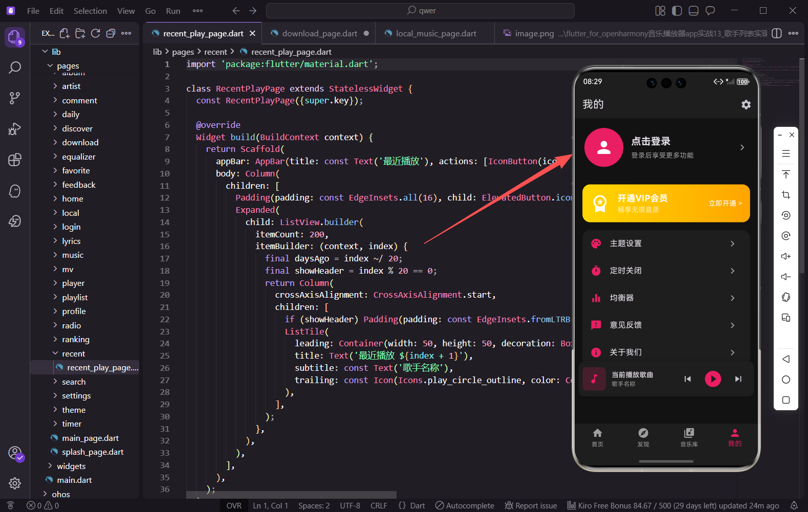
登录页面的入口在个人中心页面,用户点击头像区域即可进入:
GestureDetector(
  onTap: () => Get.to(() => const LoginPage()),
  child: Container(
    // 头像和"点击登录"文字
  ),
)
使用 Get.to() 进行页面跳转,这是GetX路由的标准用法。
小结
本篇我们实现了一个功能完整的登录页面,包含手机号验证码登录、第三方登录入口、用户协议提示等常见元素。渐变背景和统一的深色输入框让页面视觉效果更加协调。验证码倒计时功能通过递归调用 Future.delayed 实现,简单有效。在实际项目中,还需要对接后端接口完成真正的登录逻辑,并处理登录状态的持久化存储。
欢迎加入开源鸿蒙跨平台社区:https://openharmonycrossplatform.csdn.net

AtomGit 是由开放原子开源基金会联合 CSDN 等生态伙伴共同推出的新一代开源与人工智能协作平台。平台坚持“开放、中立、公益”的理念,把代码托管、模型共享、数据集托管、智能体开发体验和算力服务整合在一起,为开发者提供从开发、训练到部署的一站式体验。
更多推荐
 13
13 0
0- 0


 已为社区贡献30条内容

所有评论(0)