Flutter for OpenHarmony 微动漫App实战:设置实现
通过网盘分享的文件:flutter1.zip
链接: https://pan.baidu.com/s/1jkLZ9mZXjNm0LgP6FTVRzw 提取码: 2t97
设置页面是每个App的标配,用户在这里可以调整应用的行为和外观。对于微动漫App来说,最重要的设置就是主题切换——让用户可以选择浅色、深色或跟随系统。
这篇文章会完整实现设置功能,从主题配置文件到 Provider 状态管理,再到设置页面的 UI,最后讲讲主题是如何在整个 App 中生效的。代码都是项目里实际跑着的。
主题系统的整体架构
主题切换涉及多个文件的配合:
theme.dart:定义浅色和深色两套主题的具体样式,包括颜色、字体、组件样式等。
ThemeProvider:管理当前主题状态,提供切换方法,负责持久化存储。
MicroAnimeApp:应用的根组件,监听 ThemeProvider 并应用主题。
SettingsScreen:设置页面,提供主题切换的 UI。
这四个部分各司其职,通过 Provider 连接在一起。
主题配置文件
先看主题的具体定义:
import 'package:flutter/material.dart';

class AppTheme {
  static const Color primaryColor = Color(0xFFFF6B9D);
  static const Color secondaryColor = Color(0xFF9B59B6);
  static const Color accentColor = Color(0xFFFFB347);
  static const Color darkBg = Color(0xFF1A1A2E);
  static const Color darkCard = Color(0xFF16213E);
先定义几个常用颜色。primaryColor 是粉红色,作为 App 的主色调。secondaryColor 是紫色,用于渐变和强调。accentColor 是橙色,用于点缀。
深色模式有专门的背景色 darkBg 和卡片色 darkCard,都是深蓝色调,比纯黑色看起来更舒服。
浅色主题配置
  static ThemeData lightTheme = ThemeData(
    useMaterial3: true,
    brightness: Brightness.light,
    primaryColor: primaryColor,
    colorScheme: ColorScheme.light(
      primary: primaryColor,
      secondary: secondaryColor,
      tertiary: accentColor,
      surface: Colors.white,
      background: const Color(0xFFF8F9FA),
    ),
useMaterial3: true 启用 Material 3 设计语言,组件样式更现代。
ColorScheme 定义了一整套颜色,Flutter 的组件会自动使用这些颜色。surface 是卡片等表面的颜色,background 是页面背景色。
    scaffoldBackgroundColor: const Color(0xFFF8F9FA),
    appBarTheme: const AppBarTheme(
      backgroundColor: Colors.white,
      foregroundColor: Colors.black87,
      elevation: 0,
      centerTitle: true,
    ),
scaffoldBackgroundColor 设置 Scaffold 的背景色,用浅灰色而不是纯白,看起来更柔和。
AppBarTheme 配置所有 AppBar 的默认样式:白色背景、深色文字、无阴影、标题居中。
    cardTheme: CardTheme(
      elevation: 2,
      shape: RoundedRectangleBorder(borderRadius: BorderRadius.circular(16)),
    ),
    bottomNavigationBarTheme: const BottomNavigationBarThemeData(
      backgroundColor: Colors.white,
      selectedItemColor: primaryColor,
      unselectedItemColor: Colors.grey,
    ),
  );
CardTheme 设置卡片的阴影和圆角,16 像素的圆角让卡片看起来更圆润。
BottomNavigationBarTheme 设置底部导航栏的颜色,选中项用主色,未选中用灰色。
深色主题配置
  static ThemeData darkTheme = ThemeData(
    useMaterial3: true,
    brightness: Brightness.dark,
    primaryColor: primaryColor,
    colorScheme: ColorScheme.dark(
      primary: primaryColor,
      secondary: secondaryColor,
      tertiary: accentColor,
      surface: darkCard,
      background: darkBg,
    ),
深色主题的结构和浅色一样,只是颜色不同。brightness: Brightness.dark 告诉 Flutter 这是深色主题,一些组件会自动调整颜色。
注意 primaryColor 保持不变,这样 App 的品牌色在两种主题下都是一致的。
    scaffoldBackgroundColor: darkBg,
    appBarTheme: const AppBarTheme(
      backgroundColor: darkBg,
      foregroundColor: Colors.white,
      elevation: 0,
      centerTitle: true,
    ),
    cardTheme: CardTheme(
      color: darkCard,
      elevation: 2,
      shape: RoundedRectangleBorder(borderRadius: BorderRadius.circular(16)),
    ),
    bottomNavigationBarTheme: const BottomNavigationBarThemeData(
      backgroundColor: darkCard,
      selectedItemColor: primaryColor,
      unselectedItemColor: Colors.grey,
    ),
  );
}
深色主题的 AppBar 和卡片都用深色背景,文字用白色。底部导航栏的背景用卡片色,和页面背景有区分。
ThemeProvider 的实现
Provider 负责管理主题状态:
import 'package:flutter/material.dart';
import '../services/storage_service.dart';

class ThemeProvider extends ChangeNotifier {
  ThemeMode _themeMode = ThemeMode.system;

  ThemeMode get themeMode => _themeMode;
继承 ChangeNotifier 让这个类具备通知监听者的能力。_themeMode 存储当前主题模式,默认跟随系统。
ThemeMode 是 Flutter 内置的枚举,有三个值:light、dark、system。
构造函数中加载主题
  ThemeProvider() {
    _loadTheme();
  }

  Future<void> _loadTheme() async {
    try {
      print('🔄 ThemeProvider: 加载主题...');
      await StorageService.instance.init();
      final theme = StorageService.instance.getString('theme') ?? 'system';
      _themeMode = _getThemeMode(theme);
      print('✅ ThemeProvider: 已加载主题: $theme -> $_themeMode');
      notifyListeners();
    } catch (e) {
      print('❌ ThemeProvider: 加载主题错误: $e');
    }
  }
构造函数里调用 _loadTheme,从本地存储加载之前保存的主题设置。这样 App 重启后主题不会丢失。
?? 'system' 处理第一次启动没有保存过主题的情况,默认跟随系统。
切换主题
  void setTheme(String theme) {
    print('🔄 ThemeProvider: 设置主题为: $theme');
    _themeMode = _getThemeMode(theme);
    StorageService.instance.setString('theme', theme);
    print('✅ ThemeProvider: 主题已设置: $_themeMode');
    notifyListeners();
  }
这个方法做三件事:更新内存状态、保存到本地存储、通知监听者。调用后整个 App 的主题会立即切换。
  ThemeMode _getThemeMode(String theme) {
    switch (theme) {
      case 'light':
        return ThemeMode.light;
      case 'dark':
        return ThemeMode.dark;
      default:
        return ThemeMode.system;
    }
  }

  bool get isDark => _themeMode == ThemeMode.dark;
}
_getThemeMode 把字符串转成 ThemeMode 枚举。isDark 是个便捷属性,方便其他地方判断当前是否深色模式。
在 App 根组件应用主题
主题需要在 MaterialApp 上配置才能生效:
class MicroAnimeApp extends StatelessWidget {
const MicroAnimeApp({super.key});
Widget build(BuildContext context) {
return Consumer<ThemeProvider>(
builder: (context, themeProvider, child) {
return MaterialApp(
title: '微动漫',
debugShowCheckedModeBanner: false,
theme: AppTheme.lightTheme,
darkTheme: AppTheme.darkTheme,
themeMode: themeProvider.themeMode,
home: const SplashScreen(),
);
},
);
}
}
用 Consumer 监听 ThemeProvider,主题变化时 MaterialApp 会重建。
theme 是浅色主题,darkTheme 是深色主题,themeMode 决定用哪个。当 themeMode 是 system 时,Flutter 会根据系统设置自动选择。
Provider 的注册
Provider 需要在 App 启动时注册:
void main() {
  WidgetsFlutterBinding.ensureInitialized();
  runApp(
    MultiProvider(
      providers: [
        ChangeNotifierProvider(create: (_) => ThemeProvider()),
        ChangeNotifierProvider(create: (_) => FavoritesProvider()),
        ChangeNotifierProvider(create: (_) => HistoryProvider()),
        ChangeNotifierProvider(create: (_) => SearchProvider()),
      ],
      child: const MicroAnimeApp(),
    ),
  );
}
MultiProvider 可以同时注册多个 Provider。ChangeNotifierProvider 会在需要时创建 Provider 实例,并在 App 销毁时自动释放。
WidgetsFlutterBinding.ensureInitialized() 确保 Flutter 绑定初始化完成,在调用原生功能前必须调用。
设置页面的实现
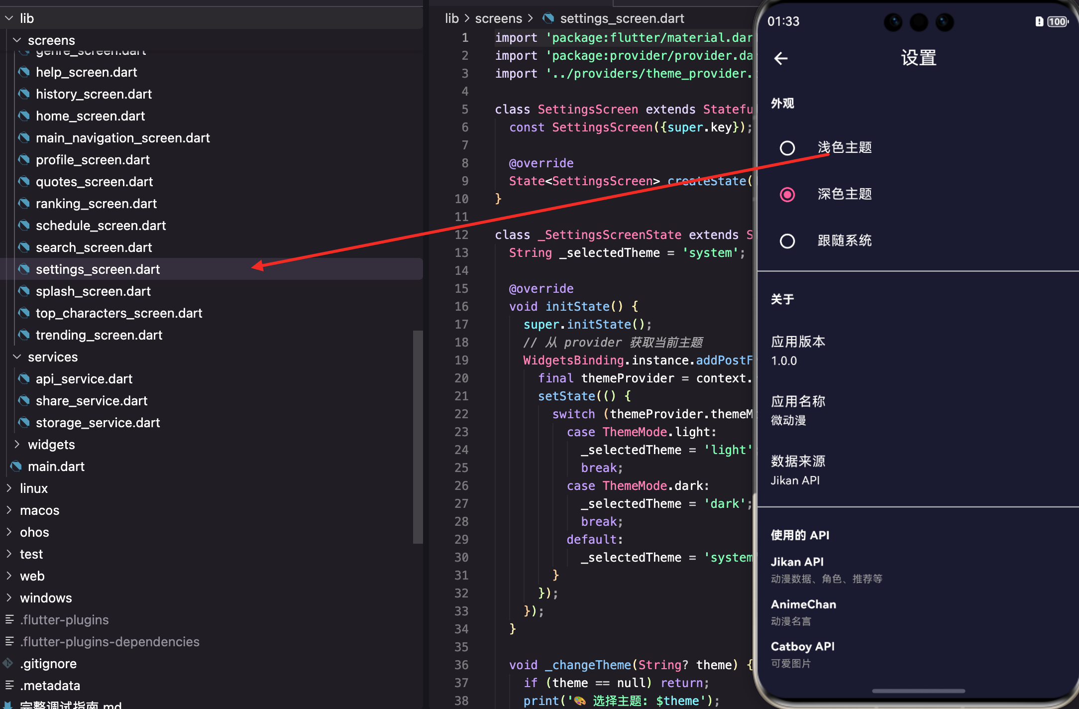
设置页面提供主题切换的 UI:
class SettingsScreen extends StatefulWidget {
const SettingsScreen({super.key});
State<SettingsScreen> createState() => _SettingsScreenState();
}
class _SettingsScreenState extends State<SettingsScreen> {
String _selectedTheme = 'system';
用 StatefulWidget 是因为需要维护当前选中的主题选项。_selectedTheme 用来控制 RadioListTile 的选中状态。
初始化时同步状态
void initState() {
super.initState();
WidgetsBinding.instance.addPostFrameCallback((_) {
final themeProvider = context.read<ThemeProvider>();
setState(() {
switch (themeProvider.themeMode) {
case ThemeMode.light:
_selectedTheme = 'light';
break;
case ThemeMode.dark:
_selectedTheme = 'dark';
break;
default:
_selectedTheme = 'system';
}
});
});
}
页面打开时从 Provider 获取当前主题,同步到本地状态。用 addPostFrameCallback 是因为 initState 里不能直接访问 context。
这样用户进入设置页面时,能看到当前选中的是哪个主题。
主题切换处理
void _changeTheme(String? theme) {
  if (theme == null) return;
  print('🎨 选择主题: $theme');
  setState(() {
    _selectedTheme = theme;
  });
  context.read<ThemeProvider>().setTheme(theme);
  print('✅ 主题已更改为: $theme');
}
先更新本地状态让 UI 立即响应,然后调用 Provider 的 setTheme 方法。Provider 会保存设置并通知 MaterialApp 切换主题。
设置页面的 UI
Widget build(BuildContext context) {
return Scaffold(
appBar: AppBar(title: const Text('设置')),
body: ListView(
children: [
const Padding(
padding: EdgeInsets.all(16),
child: Text(
'外观',
style: TextStyle(fontSize: 14, fontWeight: FontWeight.bold),
),
),
用 ListView 展示设置项,分组标题用 Padding 包裹的 Text。
        RadioListTile<String>(
          title: const Text('浅色主题'),
          value: 'light',
          groupValue: _selectedTheme,
          onChanged: _changeTheme,
        ),
        RadioListTile<String>(
          title: const Text('深色主题'),
          value: 'dark',
          groupValue: _selectedTheme,
          onChanged: _changeTheme,
        ),
        RadioListTile<String>(
          title: const Text('跟随系统'),
          value: 'system',
          groupValue: _selectedTheme,
          onChanged: _changeTheme,
        ),
RadioListTile 是带单选按钮的列表项。value 是这个选项代表的值,groupValue 是当前选中的值,两者相等时显示选中状态。
三个选项覆盖了用户的主要需求:强制浅色、强制深色、跟随系统。
应用信息展示
设置页面还展示一些应用信息:
        const Divider(),
        const Padding(
          padding: EdgeInsets.all(16),
          child: Text(
            '关于',
            style: TextStyle(fontSize: 14, fontWeight: FontWeight.bold),
          ),
        ),
        const ListTile(
          title: Text('应用版本'),
          subtitle: Text('1.0.0'),
        ),
        const ListTile(
          title: Text('应用名称'),
          subtitle: Text('微动漫'),
        ),
        const ListTile(
          title: Text('数据来源'),
          subtitle: Text('Jikan API'),
        ),
Divider 是分隔线,用来区分不同的设置分组。ListTile 的 subtitle 显示具体的值。
API 信息展示
        const Divider(),
        Padding(
          padding: const EdgeInsets.all(16),
          child: Column(
            crossAxisAlignment: CrossAxisAlignment.start,
            children: [
              const Text(
                '使用的 API',
                style: TextStyle(fontSize: 14, fontWeight: FontWeight.bold),
              ),
              const SizedBox(height: 12),
              _buildApiInfo('Jikan API', '动漫数据、角色、推荐等'),
              _buildApiInfo('AnimeChan', '动漫名言'),
              _buildApiInfo('Catboy API', '可爱图片'),
            ],
          ),
        ),
      ],
    ),
  );
}
展示 App 使用的 API 信息,让用户了解数据来源。
Widget _buildApiInfo(String name, String description) {
  return Padding(
    padding: const EdgeInsets.only(bottom: 12),
    child: Column(
      crossAxisAlignment: CrossAxisAlignment.start,
      children: [
        Text(
          name,
          style: const TextStyle(fontWeight: FontWeight.w600),
        ),
        const SizedBox(height: 2),
        Text(
          description,
          style: const TextStyle(fontSize: 12, color: Colors.grey),
        ),
      ],
    ),
  );
}
_buildApiInfo 是个辅助方法,用来构建 API 信息项。名称用粗体,描述用小号灰色字体。
主题切换的即时效果
主题切换后,整个 App 的颜色会立即变化,包括:
AppBar:背景色和文字颜色。
Scaffold:页面背景色。
Card:卡片背景色和阴影。
BottomNavigationBar:底部导航栏的颜色。
各种组件:按钮、输入框、对话框等都会自动适配。
这是因为我们在 ThemeData 里配置了这些组件的默认样式,Flutter 会自动应用。
深色模式的适配技巧
有些地方需要手动判断当前主题来调整样式:
final isDark = Theme.of(context).brightness == Brightness.dark;
final textColor = isDark ? Colors.white : Colors.black87;
final bgColor = isDark ? Colors.grey[800] : Colors.grey[200];
通过 Theme.of(context).brightness 判断当前是深色还是浅色模式,然后设置对应的颜色。
骨架屏组件就用了这个技巧:
final isDark = Theme.of(context).brightness == Brightness.dark;
final baseColor = isDark ? Colors.grey[800]! : Colors.grey[300]!;
final highlightColor = isDark ? Colors.grey[700]! : Colors.grey[100]!;
深色模式下用深灰色,浅色模式下用浅灰色,这样骨架屏在任何主题下都能和谐融入界面。
小结
设置功能涉及的知识点:ThemeData 配置、ColorScheme 颜色方案、Provider 状态管理、本地存储持久化、RadioListTile 单选列表、Consumer 监听状态变化、addPostFrameCallback 延迟执行。
主题系统的核心是 ThemeData,它定义了整个 App 的视觉风格。通过 Provider 管理主题状态,用户的选择可以持久化保存,App 重启后依然生效。
一个好的设置页面不仅要功能完善,还要让用户一眼就能找到想要的��项。主题切换放在最显眼的位置,应用信息放在下面,层次分明。
欢迎加入开源鸿蒙跨平台社区:https://openharmonycrossplatform.csdn.net

AtomGit 是由开放原子开源基金会联合 CSDN 等生态伙伴共同推出的新一代开源与人工智能协作平台。平台坚持“开放、中立、公益”的理念,把代码托管、模型共享、数据集托管、智能体开发体验和算力服务整合在一起,为开发者提供从开发、训练到部署的一站式体验。
更多推荐

 14
14 0
0- 0


 已为社区贡献30条内容

所有评论(0)