助力企业级应用开发不再头疼:DevUI组件库的实战秘籍 - 表单如何增加校验规则
DevUI 是一款面向企业中后台产品的开源前端解决方案,源自华为内部多年的业务沉淀,致力于通过组件库和设计体系提升开发效率与体验一致性。
-
核心定位与技术基础:基于 Angular 框架构建,提供开箱即用的 UI 组件库,强调“高效、开放、可信、乐趣”的设计价值观,适用于复杂的企业级应用开发。
-
关键特性:
- 组件库丰富性:涵盖表格(DTable)、表单、弹窗等高频组件,支持虚拟滚动、行展开、列拖拽等高级功能,优化大数据量场景下的性能。
- 自定义与扩展能力:允许开发者基于 DevUI 规范创建自定义组件,集成外部库(如 D3.js),并通过依赖注入确保可维护性。
- 主题定制化:通过 CSS 变量和 SCSS mixin 实现品牌主题与暗黑模式动态切换,支持多品牌系统响应式布局。
-
应用场景与实践:在云控制台、风控系统等大型项目中,通过模块化加载、组件复用(复用率达 85%)及性能监控工具,将页面加载时间优化至 800ms 以内。
-
生态整合与创新:与 AI 工具(如 MateChat)结合实现智能交互,并探索低代码化方向,通过可视化拖拽生成代码骨架。
DevUI 通过完整的开发工具链(如环境搭建指南和教程)降低上手门槛,适合需要快速构建高一致性企业应用的团队。
接下来我们可以通过表单的校验规则来验证表单是否输入,在前端的需求中常常会使用到。
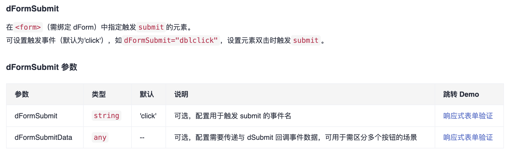
dValidateRules 表单验证
DevUI 表单验证基于Angular Form,完全兼容响应式表单与模板驱动表单。旨在封装与简化表单校验逻辑,你只需配置简单规则,验证消息与验证状态管理全交由 DevUI Form 自动完成。
如何使用表单校验
当你使用了响应式表单或模板驱动表单(均需在你的模块中引入Angular FormsModule):
import { FormsModule } from '@angular/forms';
在你的元素上绑定dValidateRules并传入你需要配置的规则即可(虽在模板中可直接使用字面量传入规则,但考虑了变更检测,我们推荐你在组件控制器中声明规则再绑定到模板中)。如:
<input [(ngModel)]="name" [dValidateRules]="yourRules" />
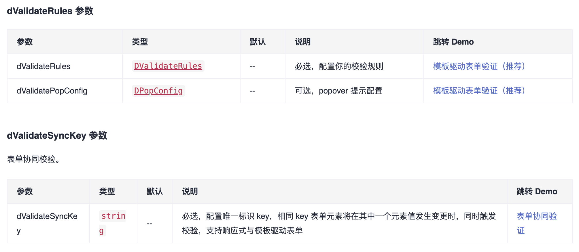
dActiveFormControl
给业务的自定义容器添加该 directive,可以获得与其他组件表单(如 text-input, select, cascader)同样的点击交互效果。
封装的校验规则
// 在 xxx.component.ts 中引入
import { DValidators } from 'ng-devui/form/validator-directive/validators';
import { DValidateRules } from 'ng-devui/form/validator-directive/validate.type';

const rules: DValidateRules = {
  validators: [
    { contains: DValidators.contains('abc'), message: '自定义提示信息', isNgValidator: true },
    { alphabet: DValidators.alphabet, message: '自定义提示信息', isNgValidator: true },
    { whitespace: true } // 因为 whitespace 已经注册到 Angular 中
    ...
  ],
};

// 自定义校验器的写法可以参考下方代码
public static contains(contain: string | number): ValidatorFn {
  return (control: AbstractControl): ValidationErrors | null => {
    if (DValidators.isEmptyInput(control.value) || DValidators.isEmptyInput(contain)) {
      return null;
    }
    return control.value.indexOf(contain) === -1 ? { contains: { requiredContains: contain,actualValue: control.value } } : null;
  };
}

public static alphabet(control: AbstractControl): ValidationErrors | null {
  if (DValidators.isEmptyInput(control.value)) {
    return null;
  }
  return DValidators.AlphabetPattern.test(control.value) ? null : { alphabet: true };
}
验证单个元素,使用内置校验器,配置error message
我们还内置了诸多校验器,可以前往 API 中查看更多信息。
当前DevUI支持的内置校验器有:required、minlength、maxlength、min、max、requiredTrue、email、pattern、whitespace。
若需限制用户输入不能全为空格,可使用whitespace内置校验器
若需限制用户输入长度,将最大限制设置为实际校验值+1是一个好的办法。
除pattern外,其他内置校验器我们也提供了内置的错误提示信息,在你未自定义提示消息时,我们将使用默认的提示信息。
message配置支持string与object两种形式(支持国际化词条配置,如’zh-cn’,默认将取’default’)。
验证单个元素,自定义校验器
一个校验器需要一个唯一的id标识,你可显式声明此id,也可声明一个与保留字不冲突的key,此key将被识别为id, 其value作为校验器。
自定义校验器,你可以简单返回true | false 来标识当前校验是否通过, 也可以返回string | null,来标识当前是否错误并返回错误消息,适用于动态错误提示。
如果是异步校验器,你需要将你的值以Observable对象方式返回。
更多地,DevUI兼容原生angular校验器, 你可将isNgValidator设置为true。
验证单个元素,配置错误更新策略errorStrategy、校验时机updateOn
设置errorStrategy元素初始化时若校验不通过,错误是否会进行提示, 默认配置为dirty,若需要在初始化时将错误抛出,可配置为pristine。
errorStrategy可继承。
设置updateOn,指定校验的时机。 校验器updateOn基于你绑定的模型的updateOn设置, 在模板中你可以通过ngModelOptions来指定, 默认为change,可选值还有blur、submit, 设置为submit,则当元素所在表单进行提交时将触发校验。
验证单个元素,自定义管理消息提示
配置messageShowType可选择消息自动提示的方式,默认为popover。
- 设置为popover错误信息将在元素聚焦时以popover形式呈现。
- 设置为text错误信息将自动以文本方式显示在元素下方(需要与表单控件容器配合使用)。
- 设置为none错误信息将不会自动呈现到视图, 可在模板中获取message或通过监听messageChange事件获取错误message, 或在模板中直接通过引用获取。
此配置可继承。
配置popPosition可在消息提示方式为popover时,自定义popover内容弹出方向。 默认为[‘right’, ‘bottom’]。
此配置可继承。
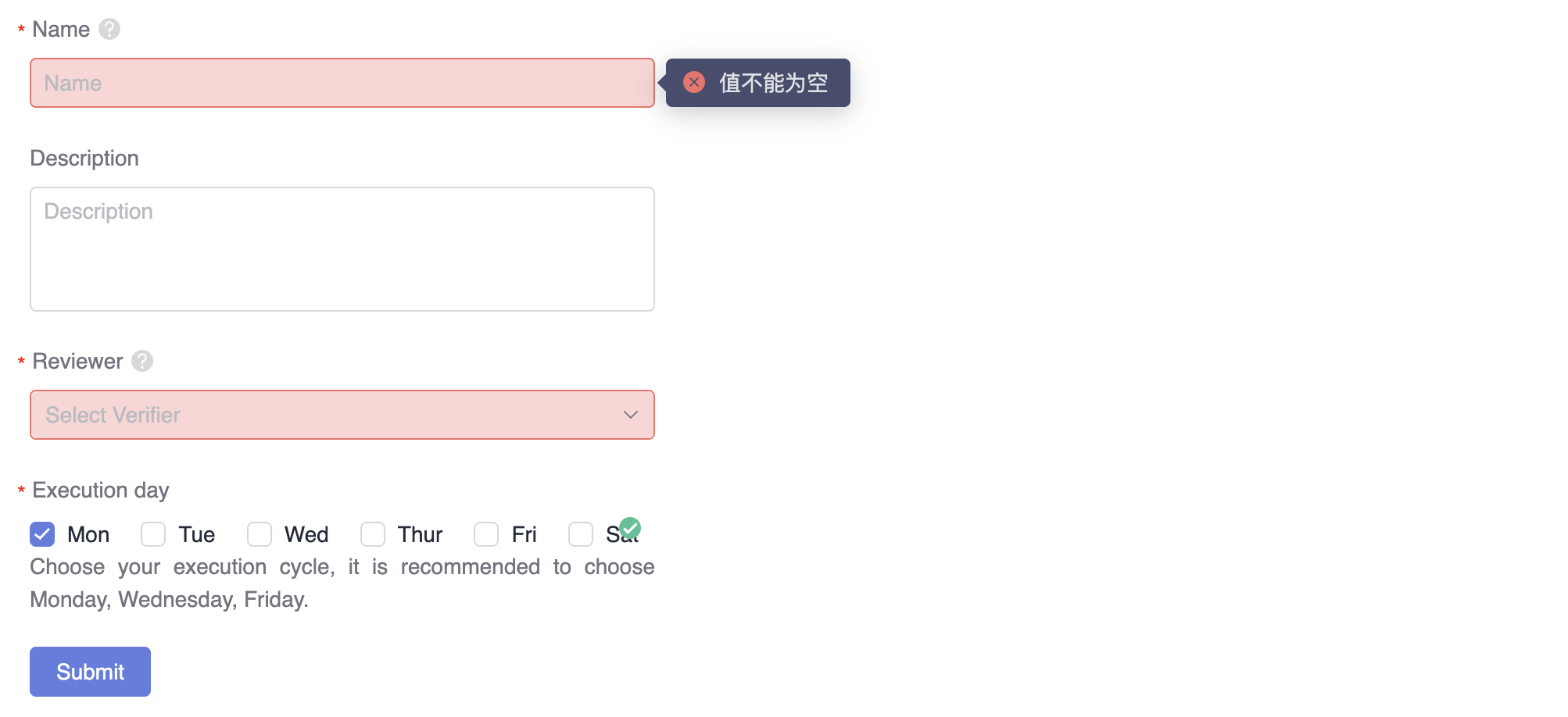
<section class="demo-section" style="width: 400px">
  <div>
    <form
      dForm
      ngForm
      [dValidateRules]="{ message: 'The form verification failed, please check.' }"
      [layout]="layoutDirection"
      #planForm="dValidateRules"
      (dSubmit)="submitPlanForm($event)"
    >
      <div [ngModelGroup]="'textGroup'">
        <d-form-item>
          <d-form-label [required]="true" [hasHelp]="true" [helpTips]="'This is the plan name.'">Name</d-form-label>
          <d-form-control>
            <input
              dTextInput
              autocomplete="off"
              name="planName"
              placeholder="Name"
              [(ngModel)]="planFormData.planName"
              [dValidateRules]="{
                validators: [{ required: true }],
                asyncValidators: [{ nameCheck: this.checkName.bind(this), message: temp }]
              }"
              [dValidatePopConfig]="{
                popMaxWidth: 400
              }"
            />
          </d-form-control>
        </d-form-item>
        <d-form-item>
          <d-form-label>Description</d-form-label>
          <d-form-control>
            <textarea
              dTextarea
              autocomplete="off"
              name="planDescription"
              placeholder="Description"
              [(ngModel)]="planFormData.planDescription"
              [dValidateRules]="[{ maxlength: 256 }]"
              style="height: 80px"
            ></textarea>
          </d-form-control>
        </d-form-item>
      </div>
      <d-form-item>
        <d-form-label [required]="true" [hasHelp]="true" [helpTips]="'Reviewer of each task execution.'">Reviewer</d-form-label>
        <d-form-control>
          <d-select
            [options]="verifierOptions"
            [(ngModel)]="planFormData.planVerifier"
            [name]="'planVerifier'"
            [placeholder]="'Select Verifier'"
            [filterKey]="'name'"
            [allowClear]="true"
            [dValidateRules]="[{ required: true }]"
          ></d-select>
        </d-form-control>
      </d-form-item>
      <d-form-item [dHasFeedback]="true">
        <d-form-label [required]="true">Execution day</d-form-label>
        <d-form-control [extraInfo]="customTemplate">
          <d-checkbox-group
            [options]="checkboxOptions"
            [(ngModel)]="planFormData.planExerciseDate"
            [name]="'planExerciseDate'"
            [direction]="'row'"
            [filterKey]="'label'"
            [isShowTitle]="true"
            [dValidateRules]="{
              validators: [{ required: true }],
              asyncValidators: [{ canChoose: validateDate }]
            }"
          ></d-checkbox-group>
        </d-form-control>
      </d-form-item>
      <d-form-operation>
        <d-button
          class="mr-element-spacing"
          [title]="planForm.errorMessage || ''"
          circled="true"
          style="margin-right: 8px"
          [showLoading]="planForm.pending"
          dFormSubmit
          [dFormSubmitData]="'submit-button'"
          >Submit</d-button
        >
      </d-form-operation>
    </form>
  </div>
  <ng-template #customTemplate>
    <span>Choose your execution cycle, it is recommended to choose Monday, Wednesday, Friday.</span>
  </ng-template>
</section>

<ng-template #temp>
  <div class="custom-tip">
    <p class="tip-item" [ngClass]="{ 'is-error': !nameValid.same }">
      <i class="icon-error" *ngIf="!nameValid.same"></i>
      <i class="icon-right" *ngIf="nameValid.same"></i>
      <span> No duplicate Name </span>
    </p>
    <p class="tip-item" [ngClass]="{ 'is-error': !nameValid.length }">
      <i class="icon-error" *ngIf="!nameValid.length"></i>
      <i class="icon-right" *ngIf="nameValid.length"></i>
      <span> Name should has 4-9 characters </span>
    </p>
  </div>
</ng-template>
摘要:
DevUI 提供基于 Angular 的表单验证方案 dValidateRules,支持响应式与模板驱动表单,简化校验逻辑。通过内置校验器(如 required、whitespace)和自定义校验器(支持同步/异步校验),结合动态错误提示(popover 或文本显示),实现高效验证。特性包括:
- 规则配置:通过 DValidators 快速定义校验规则(如内容包含、格式限制)。
- 灵活提示:支持自定义错误消息(字符串或对象)及国际化配置。
- 校验控制:可设置校验时机(change/blur/submit)和错误显示策略(dirty/pristine)。
- 集成扩展:兼容 Angular 原生校验器,支持表单容器交互指令 dActiveFormControl。
适用于企业级应用中复杂表单场景,如云控制台,显著提升开发效率与用户体验一致性。
参考链接:
MateChat:https://gitcode.com/DevCloudFE/MateChat
MateChat官网:https://matechat.gitcode.com
DevUI官网:https://devui.design/home

AtomGit 是由开放原子开源基金会联合 CSDN 等生态伙伴共同推出的新一代开源与人工智能协作平台。平台坚持“开放、中立、公益”的理念,把代码托管、模型共享、数据集托管、智能体开发体验和算力服务整合在一起,为开发者提供从开发、训练到部署的一站式体验。
更多推荐


 30
30 0
0- 0


 已为社区贡献4条内容

所有评论(0)