DevUI二次封装 Dialog 组件更容易上手
效果显示
前言
最近在做一个用户管理系统的时候,需要频繁使用 Dialog 来处理创建、编辑、删除等操作。一开始直接用 DevUI 的 Dialog 组件,但写到第三个对话框的时候,我就开始觉得这样做有点重复了。每次都要配置一堆参数、定义按钮、处理验证,代码看起来很冗长。
后来我想,既然这些逻辑都是重复的,为什么不把它们封装起来呢?于是就有了这个二次封装的 Dialog 组件。用了一段时间以后,感觉开发效率确实提高了不少。今天就把这个方案分享出来,希望对大家有帮助。
一、问题的根源
原生 Dialog 的几个痛点
用过 DevUI Dialog 的人应该都知道,每次打开一个对话框都需要做这些事:
首先要在组件里注入 DialogService,然后配置一堆参数——宽度、高度、标题、按钮、事件处理等等。如果对话框里还有表单,还要手动创建 FormGroup、定义验证规则、处理错误提示。最后还要处理数据的传递和回调。
写第一个对话框的时候还好,但写到第三个、第四个的时候,你就会发现自己在重复做同样的事情。而且因为每次都要手动配置,很容易出错。比如忘记处理某个验证规则,或者按钮事件没有正确绑定。
验证逻辑特别麻烦
表单验证是最烦人的。你需要:
- 定义每个字段的验证规则
- 写代码来显示错误信息
- 根据表单的有效性动态更新按钮状态
这些逻辑虽然不复杂,但是重复性很强。
数据处理也很繁琐
获取对话框中的数据,需要手动创建 FormGroup、实现数据获取方法、处理各种回调。如果有多个对话框,这些代码会重复很多次。
二、我的解决方案
想法很简单
既然每次都要做同样的事情,那就把这些重复的逻辑提取出来,做成一个可复用的服务。这样下次需要对话框的时候,就不用重复写那些配置代码了。
我的方案分为两层:
第一层是 SimpleDialogService,这是给日常使用的。它提供了三个简单的方法:openForm()、openConfirm() 和 openAlert()。用这个服务,打开一个对话框只需要一行代码。
第二层是 DialogWrapperService,这是给需要更多控制的场景用的。如果 SimpleDialogService 不够灵活,可以用这个来做更复杂的配置。
然后下面是两个内容组件:DialogFormComponent 用来渲染表单,DialogConfirmComponent 用来渲染确认信息。这两个组件负责处理所有的验证和错误提示。
最底层就是 DevUI 的原生 Dialog 组件,我们的所有东西都是基于它来构建的。
三、开始编码
先定义接口
首先要定义两个接口。一个是对话框的配置,一个是表单字段的配置。
对话框配置接口很直接,就是对话框需要的那些参数:
export interface DialogConfig {
  id?: string;
  title: string;
  width?: string;
  maxHeight?: string;
  backdropCloseable?: boolean;
  showCancelButton?: boolean;
  confirmButtonText?: string;
  cancelButtonText?: string;
  onConfirm?: (data: any) => void;
  onCancel?: () => void;
  onClose?: () => void;
}
这些字段都很好理解。title 是必填的,其他的都有默认值。比如宽度默认 600px,点击背景默认可以关闭对话框。
然后是表单字段的配置:
export interface FormFieldConfig {
  name: string;
  label: string;
  type: 'text' | 'textarea' | 'email' | 'password' | 'number';
  placeholder?: string;
  value?: any;
  required?: boolean;
  validators?: any[];
  maxLength?: number;
  helpTips?: string;
  rows?: number;
}
这个接口定义了表单字段需要的所有信息。name 和 label 是必填的,其他都是可选的。比如 required 表示这个字段是否必填,maxLength 表示最大长度,helpTips 是给用户的帮助提示。rows 是用来设置 textarea 的行数。
实现服务
现在来实现 SimpleDialogService。这是整个方案的核心。
@Injectable({
  providedIn: 'root'
})
export class SimpleDialogService {
  constructor(
    private dialogService: DialogService,
    private fb: FormBuilder
  ) {}

  openForm(
    title: string,
    fields: FormFieldConfig[],
    onConfirm?: (data: any) => void
  ): Promise<any> {
    return new Promise((resolve, reject) => {
      const formGroup = this.createFormGroup(fields);

      const results = this.dialogService.open({
        id: `form-dialog-${Date.now()}`,
        width: '600px',
        maxHeight: '600px',
        title,
        content: DialogFormComponent,
        backdropCloseable: true,
        buttons: [
          {
            cssClass: 'primary',
            text: '确定',
            disabled: !formGroup.valid,
            handler: () => {
              if (formGroup.valid) {
                const data = formGroup.value;
                onConfirm?.(data);
                results.modalInstance.hide();
                resolve(data);
              }
            },
          },
          {
            id: 'btn-cancel',
            cssClass: 'common',
            text: '取消',
            handler: () => {
              results.modalInstance.hide();
              reject(new Error('Cancelled'));
            },
          },
        ],
        data: {
          formGroup,
          fields,
          onFormChange: () => {
            results.modalInstance.updateButtonOptions([{ disabled: !formGroup.valid }]);
          }
        },
      });
    });
  }
}
这个 openForm 方法做的事情很多,但对外只暴露了三个参数:标题、字段配置和确认回调。
方法内部做了什么呢?首先根据字段配置自动创建 FormGroup,这样就不用手动定义验证规则了。然后配置对话框的各种参数——宽度、高度、按钮等等。最关键的是,当表单数据变化时,会自动更新确定按钮的禁用状态。如果表单无效,按钮就是禁用的;如果表单有效,按钮就是启用的。
最后返回一个 Promise,这样调用者可以用 .then() 或 async/await 来处理结果。
3.3 实现表单内容组件
@Component({
  selector: 'd-dialog-form',
  standalone: true,
  imports: [
    CommonModule,
    FormsModule,
    ReactiveFormsModule,
    TextInputModule,
    FormModule,
    TextareaModule
  ],
  template: `
    <div class="dialog-form-wrapper">
      <form [formGroup]="formGroup" (ngSubmit)="onSubmit()">
        <div *ngFor="let field of fields" class="form-field">
          <d-form-item>
            <d-form-label
              [required]="field.required || false"
              [hasHelp]="!!field.helpTips"
              [helpTips]="field.helpTips || ''">
              {{ field.label }}
            </d-form-label>
            <d-form-control>
              <div *ngIf="field.type === 'textarea'">
                <textarea
                  dTextarea
                  [formControlName]="field.name"
                  [placeholder]="field.placeholder || ''"
                  [maxlength]="field.maxLength || 9999"
                  [rows]="field.rows || 4"
                  (change)="onFieldChange()">
                </textarea>
              </div>
              <div *ngIf="field.type !== 'textarea'">
                <input
                  dTextInput
                  [type]="field.type"
                  [formControlName]="field.name"
                  [placeholder]="field.placeholder || ''"
                  [maxlength]="field.maxLength || 9999"
                  (change)="onFieldChange()"
                />
              </div>
              <div class="error-message" *ngIf="isFieldInvalid(field.name)">
                {{ getErrorMessage(field) }}
              </div>
            </d-form-control>
          </d-form-item>
        </div>
      </form>
    </div>
  `
})
export class DialogFormComponent {
  @Input() data: any;

  formGroup!: FormGroup;
  fields: FormFieldConfig[] = [];

  ngOnInit() {
    if (this.data) {
      this.formGroup = this.data.formGroup;
      this.fields = this.data.fields;
    }
  }

  onFieldChange() {
    this.data?.onFormChange?.();
  }

  isFieldInvalid(fieldName: string): boolean {
    const field = this.formGroup.get(fieldName);
    return !!(field && field.invalid && (field.dirty || field.touched));
  }

  getErrorMessage(field: FormFieldConfig): string {
    const control = this.formGroup.get(field.name);

    if (!control) return '';

    if (control.hasError('required')) {
      return `${field.label} 不能为空`;
    }

    if (control.hasError('email')) {
      return `${field.label} 格式不正确`;
    }

    if (control.hasError('maxlength')) {
      const maxLength = control.getError('maxlength').requiredLength;
      return `${field.label} 不能超过 ${maxLength} 个字符`;
    }

    return '字段验证失败';
  }
}
解释:DialogFormComponent 是对话框的内容组件。它的职责是:
- 根据
fields配置动态渲染表单字段 - 支持多种字段类型(text、email、password、number、textarea)
- 实时验证和显示错误信息
- 监听字段变化,触发回调更新按钮状态
这个组件完全通用,可以用于任何表单场景。
四、实际应用
现在来看看怎么用这个服务。我做了一个用户管理系统的例子。
在组件中注入服务
import { Component } from '@angular/core';
import { SimpleDialogService } from './shared/dialog-wrapper.service';
import { FormFieldConfig } from './shared/dialog-wrapper.component';

@Component({
  selector: 'app-root',
  standalone: true,
  providers: [SimpleDialogService],
  templateUrl: './app.component.html',
  styleUrl: './app.component.css'
})
export class AppComponent {
  users: any[] = [];

  constructor(private simpleDialogService: SimpleDialogService) {}
}
很简单,就是在 providers 数组里加上 SimpleDialogService。
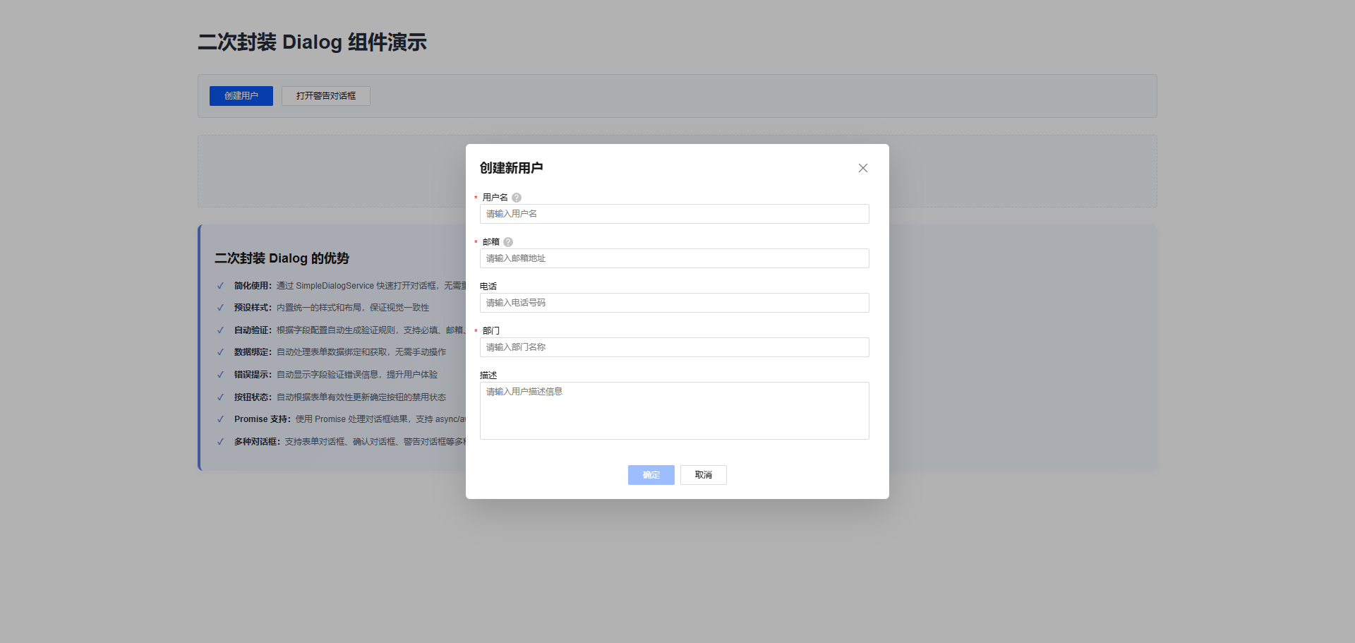
创建用户
openCreateUserDialog(): void {
  const fields: FormFieldConfig[] = [
    {
      name: 'username',
      label: '用户名',
      type: 'text',
      placeholder: '请输入用户名',
      required: true,
      maxLength: 50,
      helpTips: '用户名长度 3-50 个字符'
    },
    {
      name: 'email',
      label: '邮箱',
      type: 'email',
      placeholder: '请输入邮箱地址',
      required: true,
      helpTips: '请输入有效的邮箱地址'
    },
    {
      name: 'phone',
      label: '电话',
      type: 'text',
      placeholder: '请输入电话号码',
      required: false,
      maxLength: 20
    },
    {
      name: 'department',
      label: '部门',
      type: 'text',
      placeholder: '请输入部门名称',
      required: true,
      maxLength: 100
    },
    {
      name: 'description',
      label: '描述',
      type: 'textarea',
      placeholder: '请输入用户描述信息',
      required: false,
      maxLength: 500,
      rows: 4
    }
  ];

  this.simpleDialogService.openForm(
    '创建新用户',
    fields,
    (data) => {
      console.log('User created:', data);
      this.users.push(data);
    }
  ).catch(err => {
    console.log('Dialog cancelled:', err.message);
  });
}
看这个代码,定义好字段配置以后,就直接调用 openForm 方法。传三个参数:对话框标题、字段配置、和一个回调函数。回调函数在用户点击确定按钮时被调用,参数是用户填写的数据。
就这么简单。没有任何关于 Dialog 配置、按钮事件、验证规则的代码。所有这些复杂的东西都被隐藏在 openForm 方法里面了。
编辑用户
编辑用户和创建用户的代码很像,但有一个区别——用 value 字段来预填充现有的数据:
openEditUserDialog(index: number): void {
  const user = this.users[index];

  const fields: FormFieldConfig[] = [
    {
      name: 'username',
      label: '用户名',
      type: 'text',
      value: user.username,  // 这里预填充现有数据
      required: true,
      maxLength: 50
    },
    // ... 其他字段
  ];

  this.simpleDialogService.openForm(
    '编辑用户信息',
    fields,
    (data) => {
      this.users[index] = data;
    }
  );
}
这样用户打开对话框时,就能看到当前的值,可以直接修改。
删除确认
删除的时候需要一个确认对话框。用 openConfirm 方法:
openDeleteConfirmDialog(index: number): void {
  const user = this.users[index];

  this.simpleDialogService.openConfirm(
    '删除确认',
    `确定要删除用户 "${user.username}" 吗?此操作不可撤销。`
  ).then(confirmed => {
    if (confirmed) {
      this.users.splice(index, 1);
    }
  });
}
openConfirm 返回一个 Promise,如果用户点击确定就返回 true,点击取消就返回 false。
警告对话框
有时候只需要显示一个提示信息,用 openAlert 就可以了:
openAlertDialog(): void {
  this.simpleDialogService.openAlert(
    '提示',
    '这是一个警告对话框。点击确定关闭。'
  );
}
就这么简单。
五、模板和样式
5.1 HTML 模板
<div class="demo-container">
  <h1>二次封装 Dialog 组件演示</h1>

  <!-- 操作按钮 -->
  <div class="button-section">
    <d-button bsStyle="primary" (click)="openCreateUserDialog()">创建用户</d-button>
    <d-button bsStyle="common" (click)="openAlertDialog()">打开警告对话框</d-button>
  </div>

  <!-- 用户列表 -->
  <div class="users-section" *ngIf="users.length > 0">
    <div class="users-header">
      <h3>用户列表 ({{ users.length }})</h3>
    </div>
    <div class="users-table">
      <table>
        <thead>
          <tr>
            <th>用户名</th>
            <th>邮箱</th>
            <th>电话</th>
            <th>部门</th>
            <th>操作</th>
          </tr>
        </thead>
        <tbody>
          <tr *ngFor="let user of users; let i = index">
            <td>{{ user.username }}</td>
            <td>{{ user.email }}</td>
            <td>{{ user.phone || '-' }}</td>
            <td>{{ user.department }}</td>
            <td class="actions">
              <d-button bsStyle="text" size="sm" (click)="openEditUserDialog(i)">编辑</d-button>
              <d-button bsStyle="text" size="sm" (click)="deleteUser(i)">删除</d-button>
            </td>
          </tr>
        </tbody>
      </table>
    </div>
  </div>

  <!-- 空状态提示 -->
  <div class="empty-state" *ngIf="users.length === 0">
    <p>暂无用户数据,点击"创建用户"按钮添加新用户</p>
  </div>

  <!-- 二次封装 Dialog 的优势 -->
  <div class="feature-list">
    <h2>二次封装 Dialog 的优势</h2>
    <ul>
      <li><strong>简化使用:</strong>通过 SimpleDialogService 快速打开对话框,无需重复配置</li>
      <li><strong>预设样式:</strong>内置统一的样式和布局,保证视觉一致性</li>
      <li><strong>自动验证:</strong>根据字段配置自动生成验证规则,支持必填、邮箱、长度等验证</li>
      <li><strong>数据绑定:</strong>自动处理表单数据绑定和获取,无需手动操作</li>
      <li><strong>错误提示:</strong>自动显示字段验证错误信息,提升用户体验</li>
      <li><strong>按钮状态:</strong>自动根据表单有效性更新确定按钮的禁用状态</li>
      <li><strong>Promise 支持:</strong>使用 Promise 处理对话框结果,支持 async/await</li>
      <li><strong>多种对话框:</strong>支持表单对话框、确认对话框、警告对话框等多种类型</li>
    </ul>
  </div>
</div>
解释:模板非常简洁。主要包括:
- 操作按钮区域,用于打开各种对话框
- 用户列表,展示创建的用户和操作按钮
- 空状态提示,当没有用户时显示
- 功能说明区域,列出二次封装的优势
5.2 CSS 样式
.demo-container {
  padding: 20px;
  max-width: 1400px;
  margin: 0 auto;
}

h1 {
  color: #252b3a;
  margin-bottom: 24px;
  font-size: 28px;
}

/* 按钮部分 */
.button-section {
  margin-bottom: 24px;
  padding: 16px;
  background: #f8f9fa;
  border-radius: 4px;
  border: 1px solid #e1e5eb;
}

.button-section d-button {
  margin-right: 12px;
}

/* 用户列表样式 */
.users-section {
  margin-top: 20px;
}

.users-header h3 {
  color: #252b3a;
  font-size: 16px;
  margin: 0;
}

.users-table {
  overflow-x: auto;
  border: 1px solid #e1e5eb;
  border-radius: 4px;
}

.users-table table {
  width: 100%;
  border-collapse: collapse;
  font-size: 14px;
}

.users-table th {
  padding: 12px;
  text-align: left;
  color: #575d6c;
  font-weight: 600;
  border-bottom: 1px solid #e1e5eb;
  background: #f8f9fa;
}

.users-table td {
  padding: 12px;
  border-bottom: 1px solid #e1e5eb;
  color: #252b3a;
}

.users-table tbody tr:hover {
  background: #f8f9fa;
}

/* 空状态样式 */
.empty-state {
  padding: 40px 20px;
  text-align: center;
  color: #a8abb2;
  background: #f8f9fa;
  border-radius: 4px;
  border: 1px dashed #e1e5eb;
}

/* 功能说明 */
.feature-list {
  margin-top: 24px;
  padding: 20px;
  background: linear-gradient(135deg, #f0f6ff 0%, #f5f9ff 100%);
  border-radius: 8px;
  border-left: 4px solid #5e7ce0;
  box-shadow: 0 2px 8px rgba(94, 124, 224, 0.08);
}

.feature-list h2 {
  margin: 0 0 16px 0;
  color: #252b3a;
  font-size: 18px;
  font-weight: 700;
}

.feature-list ul {
  margin: 0;
  padding-left: 20px;
  list-style: none;
}

.feature-list li {
  margin-bottom: 10px;
  color: #575d6c;
  line-height: 1.8;
  position: relative;
  padding-left: 8px;
}

.feature-list li:before {
  content: "✓";
  position: absolute;
  left: -16px;
  color: #5e7ce0;
  font-weight: bold;
}
解释:样式遵循 DevUI 的设计规范,包括:
- 统一的颜色和间距
- 清晰的视觉层次
- 响应式设计
- 悬停效果和交互反馈
六、总结一下优势
代码量确实少了很多
用原生 Dialog,一个对话框需要 50+ 行代码。用我的方案,只需要 10 行左右。
维护也简单了
所有 Dialog 的逻辑都在一个服务里。如果要改样式或改行为,只需要改一个地方。不用在每个组件里都改一遍。
风格统一
所有对话框都用同样的样式和交互方式。用户不会看到风格不一致的对话框。
开发快
写对话框的时候,不用关心 Dialog 怎么配置,只需要定义字段就行。
容易扩展
如果要加新的字段类型或验证规则,只需要改一个地方。
七、一些小技巧
用 async/await 会更清爽
如果你喜欢 async/await 的写法,可以这样写:
async openCreateUserDialog(): Promise<void> {
  try {
    const data = await this.simpleDialogService.openForm(
      '创建新用户',
      fields
    );
    this.users.push(data);
  } catch (err) {
    console.log('用户取消了');
  }
}
这样看起来就像同步代码一样,更容易理解。
自定义验证规则
有时候需要更复杂的验证。比如年龄要在 18 到 100 之间:
import { Validators } from '@angular/forms';

const fields: FormFieldConfig[] = [
  {
    name: 'age',
    label: '年龄',
    type: 'number',
    required: true,
    validators: [
      Validators.min(18),
      Validators.max(100)
    ]
  }
];
系统会自动应用这些验证规则。
预填充数据
编辑的时候,可以用 value 字段来预填充现有的数据:
const fields: FormFieldConfig[] = [
  {
    name: 'username',
    label: '用户名',
    type: 'text',
    value: existingUser.username,
    required: true
  }
];
八、一些建议
字段配置可以复用
如果有多个地方用同样的字段,可以把它提取出来:
const userFields: FormFieldConfig[] = [
  {
    name: 'username',
    label: '用户名',
    type: 'text',
    required: true,
    maxLength: 50
  },
  // ... 其他字段
];

// 创建和编辑都用这个配置
this.simpleDialogService.openForm('创建用户', userFields);
this.simpleDialogService.openForm('编辑用户', userFields);
这样就不用重复定义字段了。
要处理取消的情况
用户可能会点击取消按钮,所以要处理这种情况:
this.simpleDialogService.openForm('标题', fields, (data) => {
  // 用户点击了确定
  this.users.push(data);
}).catch(err => {
  // 用户点击了取消
  console.log('用户取消了');
});
操作完成后给个反馈
用户操作完成后,最好给个提示,让他知道操作成功了:
this.simpleDialogService.openForm('创建用户', fields, (data) => {
  this.users.push(data);
  this.showSuccessMessage('用户创建成功');
});
九、常见问题
怎样改对话框的宽度?
SimpleDialogService 的宽度是固定的。如果要改,可以用 DialogWrapperService:
this.dialogWrapperService.openFormDialog(
  {
    title: '创建用户',
    width: '800px',
    maxHeight: '700px'
  },
  fields
);
怎样加新的字段类型?
比如要加一个日期选择器。首先在 FormFieldConfig 接口里加一个新的类型:
type: 'text' | 'textarea' | 'email' | 'password' | 'number' | 'date';
然后在 DialogFormComponent 的模板里加上对应的输入控件就行。
怎样写复杂的验证规则?
比如要验证两个密码是否相同。可以写一个自定义验证器:
function passwordMatchValidator(): ValidatorFn {
  return (control: AbstractControl): ValidationErrors | null => {
    // 验证逻辑
    return null;
  };
}

{
  name: 'password',
  label: '密码',
  type: 'password',
  validators: [passwordMatchValidator()]
}
十、最后说两句
这个方案用了一段时间,感觉效果不错。主要的好处就是:
- 代码少了很多,从 50+ 行减到 10 行
- 所有对话框的风格都一样,看起来更专业
- 改样式的时候,只需要改一个地方
- 开发新功能的时候,不用关心 Dialog 怎么配置,只需要定义字段就行
如果你的项目里有很多对话框,这个方案应该会很有帮助。
相关资源

AtomGit 是由开放原子开源基金会联合 CSDN 等生态伙伴共同推出的新一代开源与人工智能协作平台。平台坚持“开放、中立、公益”的理念,把代码托管、模型共享、数据集托管、智能体开发体验和算力服务整合在一起,为开发者提供从开发、训练到部署的一站式体验。
更多推荐


 17
17 0
0- 0


 已为社区贡献2条内容

所有评论(0)