
element-plus-自定义Dialog样式
element
A Vue.js 2.0 UI Toolkit for Web
项目地址:https://gitcode.com/gh_mirrors/eleme/element
 免费下载资源
·

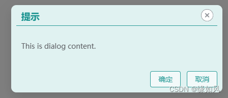
实现如下
<template>
    <h3>dialog3 test 全局</h3>
    <el-button type="primary" size="default" @click="show">全局弹窗</el-button>

    <div class="">
        <!-- 弹窗 -->
        <el-dialog v-model="visible" :show-close="false" append-to-body class="myDialogClass">
            <!--弹窗标题-->
            <template #header="{ close, titleId }">
                <div class="myDialogHeader">
                    <span :id="titleId" class="dlgTitleClass" style="margin: 10px 10px;">提示</span>
                    <el-button style="margin: 8px;" type="info" :icon="CircleCloseFilled" circle  @click="close" size="small">
                        <el-icon style="font-size: 26px;" color="#ffffff"><CircleCloseFilled /></el-icon>
                    </el-button>
                </div>
            </template>
            This is dialog content.

            <!--弹窗底部-->
            <template #footer>
                <span class="myDialogFooter">
                    <el-button type="primary" @click="visible = false">确定</el-button>
                    <el-button type="primary" @click="visible = false">取消</el-button>
                </span>
            </template>

        </el-dialog>

    </div>

</template>

<script>
import { ref } from 'vue'
export default {

    setup() {
        const visible = ref(false);

        function show() {
            //console.log('show',visible)
            visible.value = true;
        }

        return { show, visible}
    }


}
</script>

<style scoped>

.myDialogClass {
    /*scoped 模式下  background-color 不生效 直接写到style*/
    background-color: rgb(224,242,241) !important;
    border-radius: 10px;
}
.myDialogClass .dlgTitleClass
{
    color: rgb(26,147,144);
}

.el-dialog .el-dialog__header
{
    margin: 0px !important;
    padding: 0px !important;
    padding-left: 0px !important;
}
.el-dialog .myDialogHeader {
    display: flex;
    flex-direction: row;
    justify-content: space-between;
    height: 40px;
    /* background-color: #ff00ff; */
    border-bottom: 1px solid rgb(42,155,152);
    margin: 0px 10px;
    font-size: 18px;
    font-weight: bolder;
}

.el-dialog .el-dialog__footer
{
    padding: 10px;
}

.myDialogFooter .el-button
{
    border-color: rgb(42,155,152);
    background-color: rgb(242,249,249);
    color: rgb(42,155,152);
}


</style> GitHub 加速计划 / eleme / element
 54.06 K
 14.63 K
下载
14.63 K
下载
A Vue.js 2.0 UI Toolkit for Web
最近提交(Master分支:2 个月前 )
c345bb45
6 个月前
a07f3a59
* Update transition.md
* Update table.md
* Update transition.md
* Update table.md
* Update transition.md
* Update table.md
* Update table.md
* Update transition.md
* Update popover.md 6 个月前

旨在为数千万中国开发者提供一个无缝且高效的云端环境,以支持学习、使用和贡献开源项目。
更多推荐
 1
1 0
0- 0


 已为社区贡献7条内容

所有评论(0)