Vue - Vue3 封装组件(更新中...)
vue
vuejs/vue: 是一个用于构建用户界面的 JavaScript 框架,具有简洁的语法和丰富的组件库,可以用于开发单页面应用程序和多页面应用程序。
项目地址:https://gitcode.com/gh_mirrors/vu/vue
 免费下载资源
·
组件目录
1、穿梭框 DataTransfer
- 示例
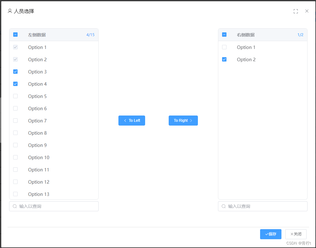
- 应用示例
<DataTransfer
v-model="value"
	:data="data"
	:titles="['左侧数据','右侧数据']"
	:buttonTexts="['To Left', 'To Right']"
	:search="true"/>
- 组件代码
<script setup>
import {ArrowLeft, ArrowRight, Search} from "@element-plus/icons-vue";
import {computed, getCurrentInstance, onMounted, ref, watch, watchEffect} from "vue";

const emit = defineEmits(["update:modelValue"])
const props = defineProps({
  data: {
    type: Array,
    default: []
  },
  titles: {
    type: Array,
    default: ['Source', 'Target']
  },
  modelValue: {
    type: Array,
    default: []
  },
  buttonTexts: {
    type: Array,
    default: ['', '']
  },
  search: {
    type: Boolean,
    default: false
  }
})
const {proxy} = getCurrentInstance()

/**目标数据*/
const targetValue = computed({
  get() {
    return props.data
        .filter(item => props.modelValue.includes(item.key))
        .filter(item => {
          if (targetSearchValue.value === '') return true
          return item.label.toLowerCase().includes(targetSearchValue.value.toLowerCase())
        })
        .filter(item => item !== '')
  },
  set(value) {
    emit("update:modelValue", value)
  }
})

/**源数据数据*/
const sourceData = computed(() => {
  if (sourceSearchValue.value !== '') {
    return props.data.filter(item => {
      return item.label.toLowerCase().includes(sourceSearchValue.value.toLowerCase())
    })
  } else {
    return props.data
  }
})

/**左表头统计数据*/
const sourceStatistics = computed(() => `${getSelectData()?.leftSelectData?.length}/${sourceData.value.length}`)

/**右表头统计数据*/
const targetStatistics = computed(() => `${getSelectData()?.rightSelectData?.length}/${targetValue.value.length}`)

const allData = ref()
const selectedData = ref()
const leftDisabled = ref(true)
const rightDisabled = ref(true)
const sourceSearchValue = ref('')
const targetSearchValue = ref('')

/**获取选择行数据
 * @return {Object}
 * */
const getSelectData = () => {
  const leftSelectData = allData.value?.getSelectionRows()
  const rightSelectData = selectedData.value?.getSelectionRows()
  return {leftSelectData, rightSelectData}
}

/**控制按钮禁用状态*/
watchEffect(() => {
  leftDisabled.value = getSelectData()?.rightSelectData?.length === 0
  rightDisabled.value = getSelectData()?.leftSelectData?.length === 0
      || getSelectData()?.leftSelectData?.filter(item => !props.modelValue.includes(item.key))?.length === 0
})


/**监控Target、Source数据,控制Source数据选中状态*/
watch([targetValue, sourceData], () => {
  Promise.resolve(1).then(() => {
    checkData()
  })
})

/**当页面初始加载时控制数据选中状态*/
onMounted(() => {
  // 禁止文字选中
  document.onselectstart = function () {
    return false
  }
  checkData()
})

/**选中Source当中与Target对应的数据*/
const checkData = () => {
  sourceData.value.filter(item => props.modelValue.includes(item.key)).forEach(i => {
    allData.value?.toggleRowSelection(i, true)
  })
}

/**Target 减少数据*/
const toLeft = () => {
  getSelectData().rightSelectData.map(item => item.key).forEach(i => {
    const _index = props.modelValue.indexOf(i)
    if (_index !== -1) props.modelValue.splice(_index, 1)
  })
}

/**Target 增加数据*/
const toRight = () => {
  getSelectData().leftSelectData.filter(item => !props.modelValue.includes(item.key)).forEach(i => {
    props.modelValue.push(i.key)
  })
  rightDisabled.value = true
}

/**根据Target数据判断Source对应数据是否可选中*/
const canSelectable = (row) => {
  return !props.modelValue.includes(row.key)
}

/**Source 行点击事件*/
const leftSourceRowClick = (row) => {
  if (!props.modelValue.includes(row.key)) {
    allData.value?.toggleRowSelection(row, undefined)
  }
}

/**Target 行点击事件*/
const rightTargetRowClick = (row) => {
  selectedData.value?.toggleRowSelection(row, undefined)
}

</script>

<template>
  <div class="transfer-area">
    <div class="source-area">
      <el-table ref="allData" :data="sourceData" @row-click="leftSourceRowClick" cell-mouse-enter="hover">
        <el-table-column type="selection" :selectable="canSelectable"/>
        <el-table-column>
          <template #header>
            <div class="table-head">
              <div>{{ titles[0] }}</div>
              <div class="statistics">{{ sourceStatistics }}</div>
            </div>
          </template>
          <template #default="scope"><p class="change-style">{{ scope.row.label }}</p></template>
        </el-table-column>
      </el-table>
      <el-input v-show="search" v-model="sourceSearchValue" class="input-with-select" placeholder="输入以查询"
                :prefix-icon="Search"
                clearable/>
    </div>

    <el-button type="primary" @click="toLeft" :disabled="leftDisabled">
      <el-icon class="el-icon--left">
        <ArrowLeft/>
      </el-icon>
      {{ buttonTexts[0] }}
    </el-button>
    <el-button type="primary" @click="toRight" :disabled="rightDisabled">
      {{ buttonTexts[1] }}
      <el-icon class="el-icon--right">
        <ArrowRight/>
      </el-icon>
    </el-button>

    <div class="target-area">
      <el-table ref="selectedData" :data="targetValue" @row-click="rightTargetRowClick">
        <el-table-column type="selection"/>
        <el-table-column>
          <template #header>
            <div class="table-head">
              <div>{{ titles[1] }}</div>
              <div class="statistics">{{ targetStatistics }}</div>
            </div>
          </template>
          <template #default="scope"><p class="change-style">{{ scope.row.label }}</p></template>
        </el-table-column>
      </el-table>
      <el-input v-show="search" v-model="targetSearchValue" class="input-with-select" placeholder="输入以查询"
                :prefix-icon="Search"
                clearable/>
    </div>
  </div>
</template>

<style scoped lang="less">
.transfer-area {
  width: 100%;
  display: flex;
  flex-direction: row;
  justify-content: space-between;
  align-items: center;
}

.source-area, .target-area {
  width: 30%;
}

.el-table {
  --el-table-border: none;
  border: #E6E8EB 1px solid;
  border-radius: 7px;
  width: 100%;
  height: 60vh;
}

.el-table::v-deep(th.el-table__cell) {
  background: #F5F7FA;
}

.el-table::v-deep(.el-table__header-wrapper) {
  background: #F5F7FA;
  border-bottom: #E6E8EB 1px solid;
}

.el-table::v-deep(.el-table__inner-wrapper::before) {
  background: none;
}

.input-with-select {
  margin: 5px 0 5px 0;
}

.change-style {
  cursor: pointer;
  padding: 0;
  margin: 0;
}

.change-style:hover {
  color: #409EFF;
}

.table-head {
  display: flex;
  flex-direction: row;
  justify-content: space-between;
}

.statistics {
  color: #409EFF;
  font-size: smaller;
  font-weight: lighter;
}
</style>
2、按钮组
- 示例
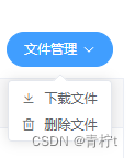
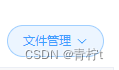
- 应用示例
<template>
<ButtonGroup :buttonArray="Buttons"/>
</template>
<script setup>
import {getCurrentInstance, ref} from "vue";
const {proxy} = getCurrentInstance()
const Buttons=ref([
	{
		name: '文件管理',
		    type: "primary",
		    plain: true,
		    round: false,
		    circle: false,
		    color: "#cb966a",
		    data: [
			    {
			    	text: '下载文件',
                    icon: 'el-icon-download',
                    onClick: () => {
                    	proxy.$message.warrning('下载文件')
					}
			    },
			    {
			    	text: '删除文件',
                    icon: 'el-icon-delete',
                    onClick: () => {
                    	proxy.$message.warrning('删除文件')
					}
				}
		    ]
	}
])
</script>
- 组件代码
<script setup>
import {ArrowDown} from "@element-plus/icons-vue";

const props = defineProps({
  buttonArray: {
    type: Array,
    default: []
  },
  style: {
    type: String,
    default: "margin-left:10px;"
  }
})

function onClick(callback) {
  callback()
}
</script>

<template>
  <el-dropdown size="small" v-for="buttonGroup in props.buttonArray" :style="props.style">
    <el-button :type="buttonGroup.type" :plain="buttonGroup.plain" :round="buttonGroup.round"
               :circle="buttonGroup.circle" :color="buttonGroup.color">{{ buttonGroup.name }}
      <el-icon class="el-icon--right">
        <arrow-down/>
      </el-icon>
    </el-button>
    <template #dropdown>
      <el-dropdown-menu>
        <el-dropdown-item v-for="button in buttonGroup.data">
          <div @click="onClick(button.onClick)">
            <i :class="button.icon"></i>
            {{ button.text }}
          </div>
        </el-dropdown-item>
      </el-dropdown-menu>
    </template>
  </el-dropdown>

</template>
3、顶部导航菜单
- 示例
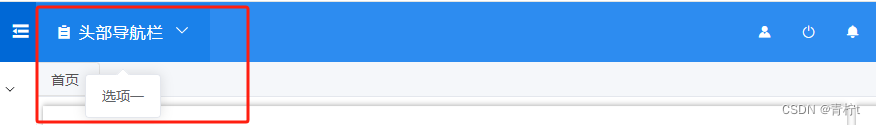
- 应用示例
<template>
	<HeaderMenu :menus="menus" class="header-class"/>
</template>
<script setup>
import {ref} from "vue";
const menus = ref([
      {
        text: '头部导航栏',
        icon:'el-icon-s-order',
        items: [
          {
            itemText: '选项一', onClick: () => toBacklogWorkFlow()
          }
        ]
      }
    ])
</script>
<style lang="less" scoped>
.header-class:hover{
  background: #1a81ea;
}
</style>
- 组件代码
<script setup>
import {ArrowDown} from "@element-plus/icons-vue";

const props = defineProps({
  menus: {
    type: Array,
    default: []
  },
  menuType: {
    type: String,
    default: "lineMenu"
  },
  style:{
    type: String,
    default: ""
  }
})
const itemClick = (onClick) => {
  onClick()
}
</script>

<template>
  <div v-if="menuType==='lineMenu'">
    <el-dropdown v-for="menu in props.menus" class="menu-class" :class="props.class" :style="props.style">
      <span>
        <i :class="menu.icon"></i>
        {{ menu.text }}
        <el-icon class="el-icon--right">
          <arrow-down/>
        </el-icon>
      </span>
      <template #dropdown>
        <el-dropdown-menu>
          <el-dropdown-item v-for="item in menu.items" @click="itemClick(item.onClick)">{{ item.itemText }}
          </el-dropdown-item>
        </el-dropdown-menu>
      </template>
    </el-dropdown>
  </div>
  <div v-else-if="menuType==='buttonMenu'">
    <el-dropdown v-for="menu in props.menus">
      <el-button :type="menu.buttonType">
        {{ menu.text }}
        <el-icon class="el-icon--right">
          <arrow-down/>
        </el-icon>
      </el-button>
      <template #dropdown>
        <el-dropdown-menu>
          <el-dropdown-item v-for="item in menu.items" @click="itemClick(item.onClick)">{{ item.text }}
          </el-dropdown-item>
        </el-dropdown-menu>
      </template>
    </el-dropdown>
  </div>
</template>

<style scoped lang="less">
.menu-class {
  color: white;
  height: 100%;
  line-height: 59px;
  padding: 0 20px;
  font-size: 16px;
}
</style>
4、弹窗组件
-
示例
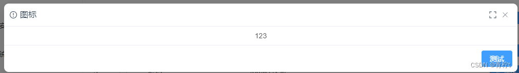
-
应用示例
<Dialog v-model="regExpModel" :lazy="true" title="图标" :width="1000" :mask="true" :draggable="false"
          icon="Warning" :footer="true" :on-close="onClose" @open="open">
    <div>
      123
    </div>
    <template #footer>
      <el-button type="primary">测试</el-button>
    </template>
  </Dialog>
- 组件代码
<script setup>
import {computed, onMounted, ref} from "vue";
import {FullScreen} from "@element-plus/icons-vue";

const emit = defineEmits(["update:modelValue", "open"])

const props = defineProps({
  modelValue: {
    type: Boolean,
    default: false
  },
  width: {
    type: Number,
    default: 500
  },
  height: {
    type: Number,
    default: 500
  },
  openDelay: {
    type: Number,
    default: 0
  },
  title: {
    type: String,
    default: 'Title'
  },
  icon: {
    type: String,
    default: 'Warning'
  },
  model: {
    type: Boolean,
    default: true
  },
  footer: {
    type: Boolean,
    default: false
  },
  draggable: {
    type: Boolean,
    default: false
  },
  onClose: {
    type: Function,
    default: () => {
    }
  }
})
const dialogModel = computed({
  get() {
    return props.modelValue
  },
  set(value) {
    emit("update:modelValue", value)
  }
})
const top = ref("15vh")
const clientHeight = document.body.clientHeight
const fullscreen = ref(false)
const handleFullScreen = () => {
  fullscreen.value = !fullscreen.value
}
const open = () => {
  emit("open")
}
const close = () => {
  emit("close")
}
const handleClose = () => {
  props.onClose()
  emit("update:modelValue", false)
}
const calcHeight = () => {
  return (clientHeight - props.height - 100) / 2 + 'px';
}

onMounted(() => {
  top.value = calcHeight()
})


</script>

<template>
  <div class="dialog">
    <el-dialog v-model="dialogModel" :width="width" :model="model" :fullscreen="fullscreen" :draggable="draggable"
               :open-delay="openDelay" :before-close="handleClose" @open="open" :top="top">
      <template #header>
        <div class="header flex">
          <div class="header-left flex">
            <el-icon>
              <component :is="icon"/>
            </el-icon>
            <span class="title">{{ title }}</span>
          </div>
          <div class="header-right flex">
            <el-icon>
              <FullScreen @click="handleFullScreen"/>
            </el-icon>
          </div>
        </div>
      </template>
      <el-scrollbar class="dialog-content" :max-height="height">
        <slot/>
      </el-scrollbar>
      <template #footer>
        <div class="footer flex" v-if="footer">
          <slot name="footer"/>
        </div>
      </template>
    </el-dialog>
  </div>

</template>

<style scoped>
.header {
  justify-content: space-between;

  .title {
    margin-left: 5px;
    line-height: 20px;
  }
}

.flex {
  display: flex;
  flex-direction: row;
  align-items: center;
}

.header-left {
  justify-content: flex-start;
}

.header-right {
  cursor: pointer;
  color: #909399;
}
.header-right:hover{
  color: #409EFF;
}

.footer {
  border-top: 1px solid #EBEEF5;
  justify-content: flex-end;
  padding: 10px;
}

.dialog :deep(.el-dialog) {
  padding: 0;
  border-radius: 9px;
}

.dialog :deep(.el-dialog__header) {
  padding: 12px 50px 12px 10px;
  border-bottom: 1px solid #EBEEF5;
}

.dialog :deep(.el-dialog__footer) {
  padding: 0;
}

.dialog-content {
  padding: 10px;
}
</style>
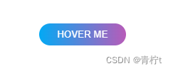
5、特色按钮
- 示例1
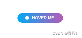
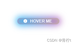
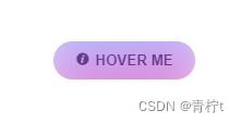
- 应用示例1
<ColorButton type="1" @click="" prefix_icon="el-icon-info">
  HOVER ME
</ColorButton>
<ColorButton type="2" @click="" prefix_icon="el-icon-info">
  HOVER ME
</ColorButton>
- 示例2
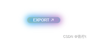
- 应用示例2
<ColorButton type="1" @click="">
  <template #visible>
    HOVER ME
  </template>
  <template #invisible>
    EXPORT
    <i class="el-icon-top-right"></i>
  </template>
</ColorButton>
- 组件代码
<script setup>
import {computed} from "vue";

defineEmits(['click'])
const props = defineProps({
  type: {
    type: String,
    default: '1'
  },
  suffix_icon: {
    type: String,
    default: ''
  },
  prefix_icon: {
    type: String,
    default: ''
  },
  doubleSided: {
    type: Boolean,
    default: false
  },
  round: {
    type: Boolean,
    default: false
  },
  circle: {
    type: Boolean,
    default: false
  }
})
const borderType = computed(() => {
  if (props.round) return 'round'
  if (props.circle) return 'circle'
  return 'normal'
})
</script>

<template>
  <div :class="['border-'+borderType]">
    <button v-if="type==='1'" class="button_1" @click="$emit('click')">
      <i v-if="prefix_icon" :class="prefix_icon" class="prefix_i"></i>
      <slot/>
      <i v-if="suffix_icon" :class="suffix_icon" class="suffix_i"></i>
      <span v-if="doubleSided" class="button_1__visible">
        <slot name="visible"/>
      </span>
      <span v-if="doubleSided" class="button_1__invisible">
        <div>
          <slot name="invisible"/>
        </div>
      </span>
    </button>

    <button v-if="type==='2'" class="button_2" @click="$emit('click')">
      <i v-if="prefix_icon" :class="prefix_icon" class="prefix_i"></i>
      <slot/>
      <i v-if="suffix_icon" :class="suffix_icon" class="suffix_i"></i>
      <div class="hoverEffect">
        <div></div>
      </div>
    </button>
  </div>
</template>

<style scoped lang="less">
.prefix_i {
  margin-right: 5px;
}

.suffix_i {
  margin-left: 5px;
}

.border-round {
  --border: 10rem;

  .button_1 {
    border-radius: var(--border);
  }

  .button_2 {
    border-radius: var(--border);
  }

  .button_1:before {
    border-radius: var(--border);
  }
}

.border-normal {
  --border: 5px;

  .button_1 {
    border-radius: var(--border);
  }

  .button_2 {
    border-radius: var(--border);
  }

  .button_1:before {
    border-radius: var(--border);
  }
}

.border-circle {
  --border: 50%;
  --size: 20px;
  --padding: 15px;

  .button_1 {
    border-radius: var(--border);
    padding: var(--padding);
    width: var(--size);
    height: var(--size);
  }

  .button_2 {
    border-radius: var(--border);
    padding: var(--padding);
    width: var(--size);
    height: var(--size);
  }

  .button_1:before {
    border-radius: var(--border);
    padding: var(--padding);
  }
}

// region button_1
.button_1 {
  text-decoration: none;
  position: relative;
  border: none;
  font-family: inherit;
  color: #fff;
  padding: 3px 20px 3px 20px;
  margin: 3px;
  text-align: center;
  background: linear-gradient(90deg, #03a9f4, #f441a5, #ffeb3b, #03a9f4);
  background-size: 300%;
  border-radius: 5px;
  z-index: 1;
}

.button_1 > * {
  display: inline-block;
  transition: all ease-in-out .5s;
}

.button_1__visible {
  text-align: center;
}

.button_1__invisible {
  width: 100%;
  margin: auto;
  position: absolute;
  display: flex;
  justify-content: center;
  align-items: center;
  left: 0;
  top: -200%;
}

.button_1:hover {
  animation: ani 8s linear infinite;
  border: none;
  opacity: 0.8;
}

.button_1:hover .button_1__visible {
  transform: translateY(200%);
  opacity: 0;
}

.button_1:hover .button_1__invisible {
  top: 0;
  bottom: 0;
}

.button_1:focus {
  outline: none;
}

@keyframes ani {
  0% {
    background-position: 0;
  }

  100% {
    background-position: 400%;
  }
}

.button_1:before {
  content: '';
  position: absolute;
  top: -5px;
  left: -5px;
  right: -5px;
  bottom: -5px;
  z-index: -1;
  background: linear-gradient(90deg, #03a9f4, #f441a5, #ffeb3b, #03a9f4);
  background-size: 400%;
  border-radius: 5px;
  transition: 1s;
}

.button_1:hover::before {
  filter: blur(10px);
}

.button_1:active {
  background: linear-gradient(32deg, #03a9f4, #f441a5, #ffeb3b, #03a9f4);
}

// endregion

// region button_2
.button_2 {
  display: inline-flex;
  align-items: center;
  justify-content: center;
  padding: 10px 20px;
  border: 0;
  position: relative;
  overflow: hidden;
  border-radius: 10rem;
  transition: all 0.02s;
  font-weight: bold;
  color: rgb(37, 37, 37);
  z-index: 0;
  box-shadow: 0 0 7px -5px rgba(0, 0, 0, 0.5);
}

.button_2:hover {
  background: rgb(193, 228, 248);
  color: rgb(33, 0, 85);
}

.button_2:active {
  transform: scale(0.97);
}

.hoverEffect {
  position: absolute;
  bottom: 0;
  top: 0;
  left: 0;
  right: 0;
  display: flex;
  align-items: center;
  justify-content: center;
  z-index: 1;
}

.hoverEffect div {
  background: rgb(222, 0, 75);
  background: linear-gradient(90deg, rgba(222, 0, 75, 1) 0%, rgba(191, 70, 255, 1) 49%, rgba(0, 212, 255, 1) 100%);
  border-radius: 40rem;
  width: 10rem;
  height: 10rem;
  transition: 0.4s;
  filter: blur(20px);
  animation: effect infinite 3s linear;
  opacity: 0.5;
}

.button_2:hover .hoverEffect div {
  width: 8rem;
  height: 8rem;
}

@keyframes effect {

  0% {
    transform: rotate(0deg);
  }

  100% {
    transform: rotate(360deg);
  }
}

// endregion
</style>
5、PDF Word Excel 预览插件
- 插件安装
npm install vue-demi vue-demi @vue-office/docx @vue-office/excel @vue-office/pdf
@vue-office插件安装方式详见博客Vue-Vue 集成 pdf word excel 预览功能
- 应用示例
<script setup>
import DocumentPreview from "@/components/DocumentPreview.vue";
import {ref} from "vue";
import {ElMessage} from "element-plus";

// 文件路径
const url = 'http://XXXXX.docx'

function onError(e) {
  ElMessage.warning(e)
}

function onRendered() {
  console.log('预览成功')
}

</script>

<template>
  <DocumentPreview :url="url" @onError="onError" @onRendered="onRendered"/>
</template>
- 组件代码
<script setup>
import VueOfficePdf from "@vue-office/pdf";
import VueOfficeExcel from "@vue-office/excel";
import VueOfficeDocx from "@vue-office/docx";
import {computed, getCurrentInstance, shallowRef} from "vue";
import * as url from "url";

const emit = defineEmits(['onRendered', 'onError'])
const props = defineProps({
  url: {
    type: String,
    default: ''
  }
})
const {proxy} = getCurrentInstance()
const componentMap = shallowRef({
  pdf: VueOfficePdf,
  xlsx: VueOfficeExcel,
  docx: VueOfficeDocx
})
const type = computed(() => {
  const documentType = props.url.split('.').pop()
  if (!componentMap.value[documentType]) {
    proxy.$message.warning('仅支持 pdf、xlsx、docx 格式的文件预览')
    return
  }
  return documentType
})

/** 文件预览成功时调用 * */
const onRendered = () => {
  emit('onRendered')
}

/** 文件预览失败时调用 **/
const onError = (e) => {
  emit('onError', e)
}

</script>

<template>
  <component :is="componentMap[type]" :src="url" @rendered="onRendered" @error="onError"/>
</template>

<style scoped lang="less">
</style>
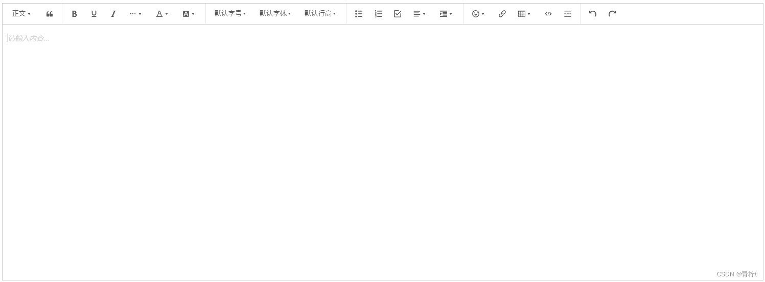
6、编辑器
- 示例
- 插件安装
npm install @wangeditor/editor @wangeditor/editor-for-vue@next --save
wangEditor 插件安装方式详见博客 Vue-Vue3 集成编辑器功能
-应用示例
<script setup>
import Editor from "@/components/Editor.vue";
import {ref} from "vue";

const editor = ref()
const editorValue = ref('')

const print = () => {
  console.log(editor.value.getHtml())
  console.log(editor.value.getText().split(/\n/))
}
</script>

<template>
  <el-button type="primary" @click="print">测试</el-button>
  <Editor ref="editor" v-model="editorValue" placeholder="请输入内容..."/>
</template>
- 组件代码
<script setup>
import '@wangeditor/editor/dist/css/style.css' // 引入 css
import {DomEditor} from '@wangeditor/editor'
import {computed, onBeforeUnmount, ref, shallowRef} from 'vue'
import {Editor, Toolbar} from '@wangeditor/editor-for-vue'

const emit = defineEmits(["update:modelValue"])
const props = defineProps({
  modelValue: {
    type: String,
    default: ''
  },
  placeholder: {
    type: String,
    default: '请输入...'
  }
})
const inputValue = computed({
  get() {
    return props.modelValue
  },
  set(value) {
    emit("update:modelValue", value)
  }
})
// 编辑器实例,必须用 shallowRef
const editorRef = shallowRef()
const mode = ref('default')
const test = ref(false)
const editorConfig = {placeholder: props.placeholder}
// 默认工具栏配置
const toolbarConfig = {}

/** 排除菜单组,写菜单组 key 的值即可 */
toolbarConfig.excludeKeys = [
  'group-image',
  'group-video',
  'fullScreen'
]

/** 组件销毁时,也及时销毁编辑器 */
onBeforeUnmount(() => {
  const editor = editorRef.value
  if (editor == null) return
  editor.destroy()
})

/** 记录 editor 实例,重要!*/
const handleCreated = (editor) => {
  editorRef.value = editor
}

/** 获取HTML格式内容方法 */
const getHtml = () => {
  return editorRef.value.getHtml()
}

/** 获取原始文本内容方法 */
const getText = () => {
  return editorRef.value.getText()
}

/** 暴露方法 */
defineExpose({getHtml, getText})
</script>

<template>
  <div style="border: 1px solid #ccc">
    <Toolbar
        style="border-bottom: 1px solid #ccc"
        :editor="editorRef"
        :defaultConfig="toolbarConfig"
        :mode="mode"
    />
    <Editor
        style="height: 500px; overflow-y: hidden;"
        v-model="inputValue"
        :defaultConfig="editorConfig"
        :mode="mode"
        @onCreated="handleCreated"
    />
  </div>
</template>

<style scoped lang="less">
</style>
7、鼠标景深效果
这次封装一个高级的东西,很炫,哈哈哈哈哈哈哈请看示例:
- 示例
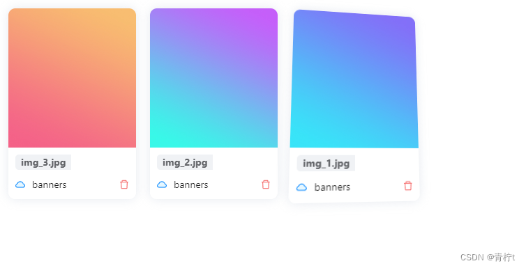
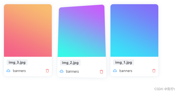
鼠标放上去有景深变换效果
上代码!!!!!!
- 应用示例
<template>
  <HoverModel>
    <a-card class="card">
      <div class="img-container">
        <a-image width="100%" :height="200" :src="url"/>
      </div>
      <div class="operation-area">
        <div class="img-name"><span>{{ name }}</span></div>
        <div class="operation-bottom">
          <div>
            <CloudTwoTone/>
            <span class="file-dir">{{ directory }}</span>
          </div>
          <DeleteOutlined class="delete" @click="deleteImage"/>
        </div>
      </div>
    </a-card>
  </HoverModel>
</template>
组件为<HoverModel>,将你自己的组件放入<HoverModel></HoverModel>即可实现效果
(注:a-card是我自己的内容,请忽略)
- 组件代码
<template>
  <div ref="cardRef" class="model-container" @mousemove="onMouseMove" @mouseout="onMouseLeave">
    <slot/>
  </div>
</template>

<script setup lang="ts">
import useSetCardHover from './hooks/useSetModelHover';
import {ref} from 'vue';

const cardRef = ref()
const {onMouseMove, onMouseLeave} = useSetCardHover(cardRef)
</script>

<style scoped lang="less">
.model-container {
  width: 100%;
  overflow: hidden;
  border-radius: 10px;
  box-shadow: 0 0 15px #d1d8e28e;
  transform: perspective(500px) rotateX(var(--rx, 0deg)) rotateY(var(--ry, 0deg));
  transition: 0.3s;
}
</style>
export default function (cardRef) {
    const yRange = [-10, 10]
    const xRange = [-10, 10]

    function getRotateDeg(range: number[], value: number, length: number) {
        return value / length * (range[1] - range[0]) + range[0]
    }

    function onMouseMove(e: any) {
        const {offsetX, offsetY} = e
        const {offsetWidth, offsetHeight} = cardRef.value
        const ry = getRotateDeg(yRange, offsetX, offsetWidth)
        const rx = -getRotateDeg(xRange, offsetY, offsetHeight)
        cardRef.value.style.setProperty('--rx', `${rx}deg`)
        cardRef.value.style.setProperty('--ry', `${ry}deg`)
    }

    function onMouseLeave() {
        cardRef.value.style.setProperty('--rx', 0)
        cardRef.value.style.setProperty('--ry', 0)
    }

    return {onMouseMove, onMouseLeave}
}
别问我为什么把 js 提取出来这么写,因为显得高级 !
闲得蛋疼,再来一个,高级的!!!!!!!!!!!!!!!!!!!!!
8、滚动缓慢载入滚动效果
这次是一个指令,效果自己试,我懒得录屏
- 应用示例
<template>
  <div class="img-container">
    <div class="img-item">
      <slot/>
    </div>
    <div v-slide-in v-for="img in imgs" :key="img.id" class="img-item">
      <CardImage v-bind="img" @delete="onDelete"/>
    </div>
  </div>
</template>
<script setup lang="ts">
import type {PropType} from 'vue';
import vSlideIn from '/@/utils/vSlideIn'// 重点是这一句引入
import {CardImage} from '/@/components/CardImage';
import {imgType} from '/@/components/CardImage/src/types';
import useHandleIngForm from './hooks/useHandleIngForm';
import {computed} from "vue";

const props = defineProps({
  images: {
    type: Array as PropType<imgType[]>,
    default: []
  }
})

const imgs = computed(() => {
  console.log('----=----=-=', props.images)
  return props.images
})

const {onDelete} = useHandleIngForm(imgs)

</script>
- 指令代码
const DISTANCE = 100
const DURATION = 500
const map = new WeakMap()
const ob = new IntersectionObserver(entries => {
  for (const entry of entries) {
    if (entry.isIntersecting) {
      const animation = map.get(entry.target)
      animation && animation.play()
      ob.unobserve(entry.target)
    }
  }
})

function isBelowViewport(el) {
  const rect = el.getBoundingClientRect()
  return rect.top - window.innerHeight > 0
}

export default {
  mounted(el, bindings) {
    if (!isBelowViewport(el)) {
      return
    }
    const animation = el.animate(
      [
        {
          transform: `translateY(${DISTANCE}px)`,
          opacity: 0.5
        },
        {
          transform: `translateY(0)`,
          opacity: 1
        }
      ],
      {
        duration: DURATION,
        easing: 'cubic-bezier(0,0,0,1)', // 'ease-out' | 'cubic-bezier(0,0,0,1)'
        fill: 'forwards'
      }
    )
    animation.pause()
    map.set(el, animation)
    ob.observe(el)
  },
  unmounted(el) {
    ob.unobserve(el)
  }
}
9、颜色提取器
- 示例
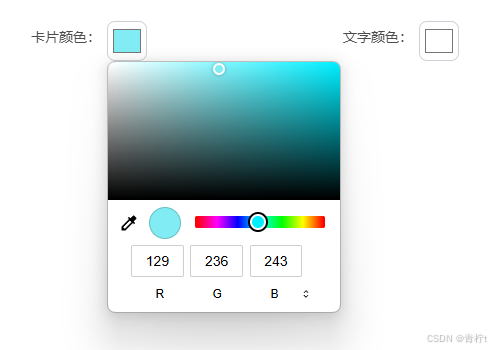
- 应用示例
<ColorPicker colorType="rgb" size="15" value="#4032FF" @onChange="onChange" />
- 代码
<template>
  <input type="color" v-model="color" @change="onChange" class="colorPicker"/>
</template>

<script setup lang="ts">
import {nextTick, onMounted, ref, watch} from 'vue';

const model = defineModel('value')

const emit = defineEmits(['onChange', 'change'])
const props = defineProps({
  colorType: {
    validator(value, props) {
      return ['rgb', 'hex'].includes(<string>value)
    }
  },
  size: {
    type: [Number, String],
    default: 10
  },
  value: {
    type: String,
    default: '#409EFF'
  }
})

onMounted(() => {
  watch(() => props.value, (value) => {
    nextTick(() => {
      color.value = value || '#409EFF'
    })
  })
})

const color = ref<string>('#409EFF')

const onChange = () => {
  if (props.colorType) {
    if (props.colorType === 'rgb') {
      const RGBColor = getRGBColor(color.value)
      emit('onChange', RGBColor)
      emit('change', RGBColor)
      model.value = RGBColor
    } else if (props.colorType === 'hex') {
      model.value = color.value
      emit('onChange', color.value)
      emit('change', color.value)
    } else {
      console.error('colorType error')
    }
  }
}

const getRGBColor = (color: string) => {
  const colorValue = color.slice(1)
  const R = hexToDecimal(colorValue.slice(0, 2))
  const G = hexToDecimal(colorValue.slice(2, 4))
  const B = hexToDecimal(colorValue.slice(4, 6))
  return `rgb(${R}, ${G}, ${B})`
}

const hexToDecimal = (hex: string) => {
  return parseInt(hex, 16);
}

defineExpose({model})
</script>

<style scoped lang="less">
.colorPicker {
  width: 40px;
  height: auto;
  aspect-ratio: 1/1;
  border: 1px solid #CDD0D6;
  border-radius: 20%;
  background: none;
  padding: 3px;
}
</style>
10、苹果手机模型
- 示例
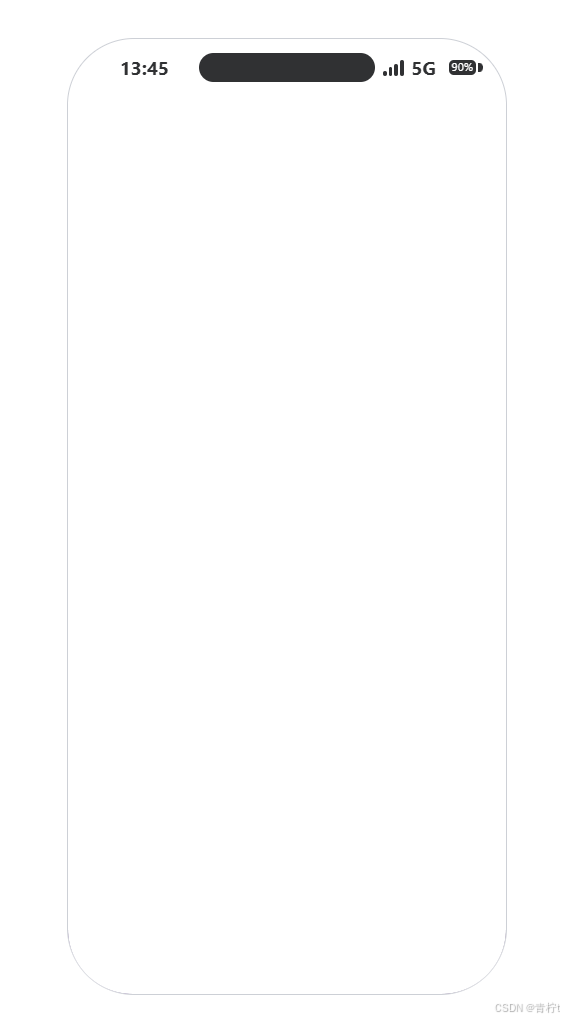
- 说明
注意:需要安装依赖包less,若不安装需要自行将 css 改成普通格式
屏幕适配可能会出现一些问题,如果不能很好适配可适当调整代码样式,具体调整哪里,emmmmm,时间太长忘了。。。。。。自己看着改吧
- 代码
<template>
  <div class="phone">
    <div class="phone-header">
      <div class="time"><span>13:45</span></div>
      <div class="capsule"></div>
      <div class="right-container">
        <div class="electric-quantity-container">
          <span></span>
          <span></span>
          <span></span>
          <span></span>
        </div>
        <div class="net-type">5G</div>
        <div class="signal-container">
          <span>
            <span class="residual-electricity">90%</span>
          </span>
          <span></span>
        </div>
      </div>
    </div>
    <div class="title-container">
      <div class="left-back"></div>
      <div class="center-title">
        <span>{{ title }}</span>
      </div>
      <div class="right-option">
        <div class="option">
          <div>
            <span></span>
            <span></span>
            <span></span>
          </div>
          <div></div>
          <div>
            <span class="big-circle">
              <span class="small-circle"></span>
            </span>
          </div>
        </div>
      </div>
    </div>
    <div class="content">
      <div class="option-line"></div>
      <slot/>
    </div>
  </div>
</template>

<script setup lang="ts">
defineProps({
  title: {
    type: String,
    default: '标题'
  }
})
</script>

<style scoped lang="less">
.phone {

  --phone-height: calc((100vh + 100vw) * 0.25);
  --background-color: #303133;
  --height-header: 6%;
  --height-title-container: 8%;


  width: calc(var(--phone-height) * 0.46);
  height: var(--phone-height);
  border: 1px solid #CDD0D6;
  border-radius: calc(var(--phone-height) * 0.07);
  overflow: hidden;


  .phone-header {
    --item-width: 25%;
    color: #303133;
    font-weight: bold;
    font-size: calc(var(--phone-height) * 0.02);

    width: 100%;
    height: var(--height-header);
    display: flex;
    flex-direction: row;
    justify-content: center;
    align-items: center;

    .capsule {
      width: 40%;
      height: 50%;
      border-radius: 20vh;
      background-color: var(--background-color);
    }

    .time {
      height: 40%;
      width: var(--item-width);
      display: flex;
      flex-direction: row;
      justify-content: center;
      align-items: center;
    }

    .right-container {

      --right-item-width: 33%;

      height: 40%;
      width: var(--item-width);
      display: flex;
      flex-direction: row;
      align-items: center;
      justify-content: center;

      .electric-quantity-container {
        width: var(--right-item-width);
        height: 80%;
        display: flex;
        flex-direction: row;
        align-items: flex-end;
        justify-content: center;

        span {
          width: 10%;
          border-radius: 50px;
          margin: 0 3%;
          background-color: var(--background-color);

          &:nth-child(1) {
            height: 30%;
          }

          &:nth-child(2) {
            height: 50%;
          }

          &:nth-child(3) {
            height: 70%;
          }

          &:nth-child(4) {
            height: 90%;
          }
        }
      }

      .net-type {
        width: var(--right-item-width);
      }

      .signal-container {
        width: var(--right-item-width);
        height: 80%;
        display: flex;
        flex-direction: row;
        justify-content: center;
        align-items: center;

        span {
          background-color: var(--background-color);

          &:nth-child(1) {
            width: 75%;
            height: 80%;
            border-radius: calc(var(--phone-height) * 0.005);
            font-size: calc(var(--phone-height) * 0.012);
            font-weight: normal;
            color: white;

            display: flex;
            flex-direction: row;
            justify-content: center;
            align-items: center;
          }

          &:nth-child(2) {
            margin-left: 6%;
            width: 12%;
            height: 50%;
            border-radius: 0 calc(var(--phone-height) * 0.005) calc(var(--phone-height) * 0.005) 0;
          }
        }
      }
    }
  }

  .title-container {
    width: 100%;
    height: var(--height-title-container);
    display: flex;
    flex-direction: row;
    justify-content: space-evenly;
    align-items: center;

    .left-back, .center-title, .right-option, .option {
      display: flex;
      justify-content: center;
      align-items: center;
    }

    .left-back {
      height: 100%;
      flex: 1
    }

    .center-title {
      height: 100%;
      flex: 2;
      font-size: calc(var(--phone-height) * 0.025);
    }

    .right-option {
      height: 100%;
      flex: 1;

      .option {
        width: 80%;
        height: 50%;
        border-radius: 100px;
        border: 1px solid rgba(96, 98, 102, 0.06);
        background-color: rgba(12, 12, 12, 0.1);

        div {
          height: 100%;

          &:nth-child(odd) {
            width: 40%;
          }

          &:nth-child(even) {
            width: 1px;
            height: 70%;
            background-color: rgba(0, 0, 0, 0.2);
            margin: 0 2%;
          }

          &:first-child {
            display: flex;
            flex-direction: row;
            justify-content: space-evenly;
            align-items: center;

            span {

              --big-point-size: calc(var(--phone-height) * 0.011);
              --small-point-size: calc(var(--phone-height) * 0.0076);

              box-sizing: border-box;
              background-color: var(--background-color);
              border-radius: 50%;

              &:nth-child(odd) {
                width: var(--small-point-size);
                height: var(--small-point-size);
              }

              &:nth-child(even) {
                width: var(--big-point-size);
                height: var(--big-point-size);
              }

            }
          }

          &:last-child {

            --big-circle-size: calc(var(--phone-height) * 0.02);
            --small-circle-size: calc(var(--phone-height) * 0.01);

            display: flex;
            justify-content: center;
            align-items: center;

            .big-circle {
              width: var(--big-circle-size);
              height: var(--big-circle-size);
              border: calc(var(--phone-height) * 0.003) solid #303133;
              border-radius: 50%;
              display: flex;
              justify-content: center;
              align-items: center;
            }

            .small-circle {
              width: var(--small-circle-size);
              height: var(--small-circle-size);
              background-color: var(--background-color);
              border-radius: 50%;
            }
          }

        }
      }
    }
  }

  .content {
    width: 100%;
    height: calc(100% - var(--height-title-container) - var(--height-header));
    background-color: #f2f1f6;
    position: relative;

    display: flex;
    flex-direction: column;
    justify-content: flex-start;
    align-items: center;

    .option-line {
      position: absolute;
      margin: auto;
      left: 0;
      right: 0;
      bottom: 2%;
      width: 35%;
      height: 0.5%;
      border-radius: 20vh;
      background-color: var(--background-color);
      opacity: 0.5;
    }
  }
}
</style>
 GitHub 加速计划 / vu / vue
 109
109
 19
下载
19
下载
vuejs/vue: 是一个用于构建用户界面的 JavaScript 框架,具有简洁的语法和丰富的组件库,可以用于开发单页面应用程序和多页面应用程序。
最近提交(Master分支:4 个月前 )
9e887079
[skip ci] 1 年前
73486cb5
* chore: fix link broken
Signed-off-by: snoppy <michaleli@foxmail.com>
* Update packages/template-compiler/README.md [skip ci]
---------
Signed-off-by: snoppy <michaleli@foxmail.com>
Co-authored-by: Eduardo San Martin Morote <posva@users.noreply.github.com> 1 年前

AtomGit 是由开放原子开源基金会联合 CSDN 等生态伙伴共同推出的新一代开源与人工智能协作平台。平台坚持“开放、中立、公益”的理念,把代码托管、模型共享、数据集托管、智能体开发体验和算力服务整合在一起,为开发者提供从开发、训练到部署的一站式体验。
更多推荐

 35
35 0
0- 0


 已为社区贡献2条内容

所有评论(0)