
labelimg如何调整框的颜色_4个技巧,教你如何用excel绘制出高大上的图表
转载自:可乐的数据分析之路
原文地址:如何制作高大上的图表
为什么你的报告中的图老板总是瞧不上,为什么我们觉得这图可以了,老板却总是不满意,不要你觉得,要老板觉得。

很多人有一个误区,就是分析很重要,展示不重要,这就好比你有满腔的热血、满腹的才华,却茶壶里煮饺子——肚里有货倒不出。光埋头苦干有什么用,要懂得展示,懂得在合适的时机外露,你不表现,谁知道你干活了,你不表现,总有技术不如你的表现的比你好,这就是职场,残酷却现实。
这一小节内容告诉你图表美化的技巧,让你的图和别人家报告中的图一样好看。
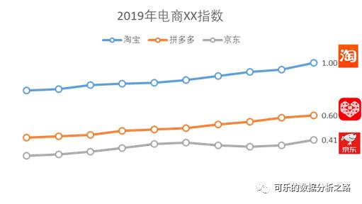
1、重点突出:添加背景浅色块
在看别人家的分析报告时,经常能看见以下这种为了重点突出某个指标而背景被加深的图。其实就是在折线图上添加了一个长方形的形状,并调整该形状的透明程度。
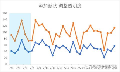
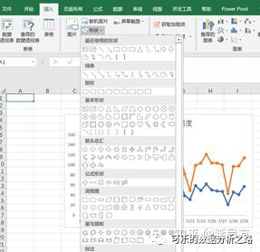
在【插入】——【形状】中选择矩形,在空白处随意画一个矩形。
右键矩形【设置对象格式】,设置填充颜色,并调整填充颜色的透明度,调到一个自己喜欢的效果即可。
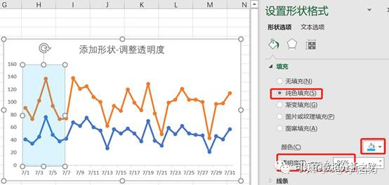
最后再把这张图和透明色块组合在一起就好了。
2、折线图美化
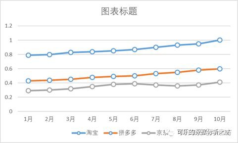
你的折线图可能是这样的:
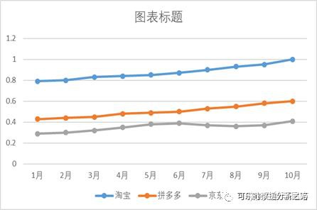
而别人家的折线图是这样的:

明明结果是一样的,却输在了展示上,如果这是两个人竞争一个岗位呢,细思极恐,细节也是很重要的。不过也没什么,不会创新,难道还不会模仿吗?照着第二张图改就好了。
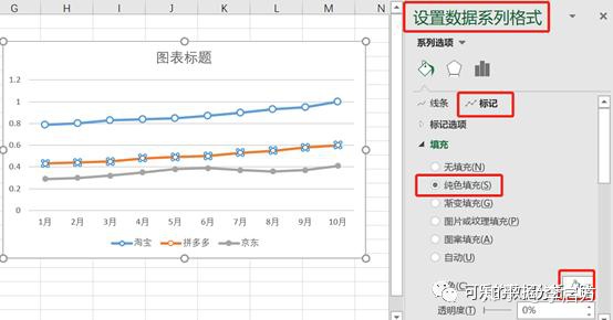
Step1:首先右键【设置数据系列格式】,在【标记】——【填充】中选择纯色填充,将填充颜色选择为白色,这样做的目的是使线条不至于穿过空心标记。
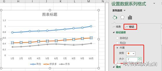
Step2:这时标记有点小,调大一些。在【标记】——【标记选项】中,选择【内置】大小改为7。
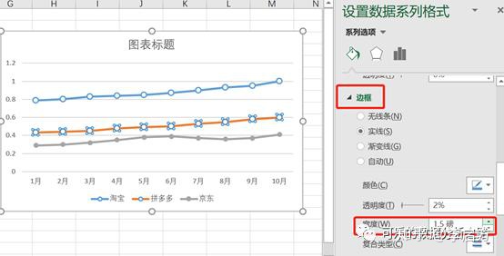
Step3:这时感觉标记有点浅,可以把标记的线条调粗一些。在【标记】的【边框】中,将宽度调整为1.5磅。
标记改好后是这样子,感觉好看很多,大差不差了。
Step4:去掉网格线和坐标轴,右键图例,【设置图例格式】,选择图例的位置为【靠上】,在显示图例,但不与图表重叠那个选框不要勾。

对每一个类别的最后一个数值添加数据标签。

Step5:对比一下目标图,还差个各app的图标,把从网上找的图标粘贴到图表旁

看着还是有点变扭,没关系。选择图表,在上方的【格式】处,将形状填充选择为无填充,形状轮廓选择为无轮廓,再选择图表和3个图标,把它们组合到一起。
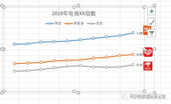
再复制粘贴到word或ppt中,完美!

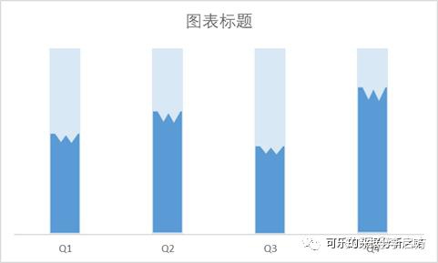
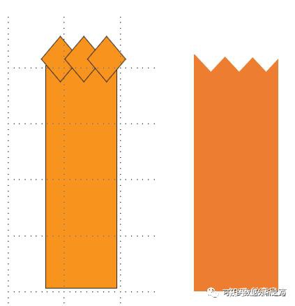
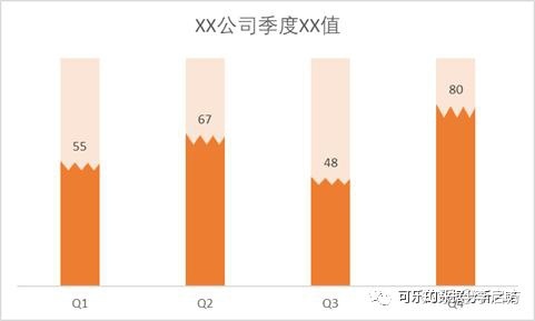
3、柱形图填充美化
很多PPT图表模板里会有这样的带背景框的柱形图表,在Excel里做法其实也很简单
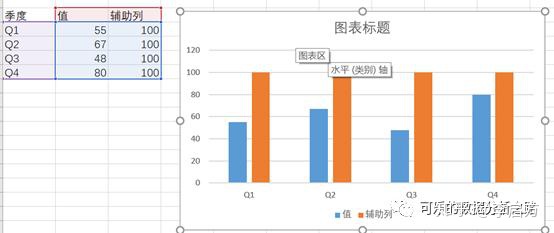
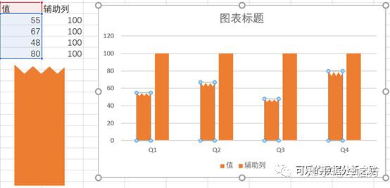
Step1:对原数据添加一列辅助列,辅助列的值是100,也就是背景框的值
Step2:在PPT里用【形状】画了1个柱形和3个菱形,将它们叠加成如图所示,注:要在PPT里做哦。选择这几个形状,在【格式】——【合并形状】中选择剪除,就得到了右图所示的图形了。
Step3:将做好的图形复制粘贴到图表中较低的柱子中。
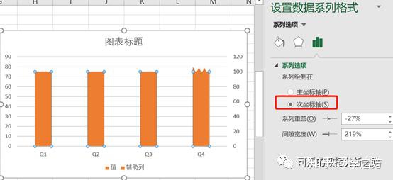
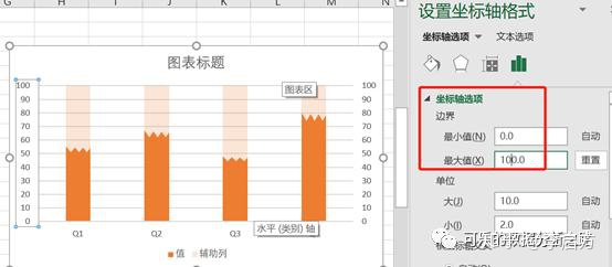
Step4:将辅助列设置为次坐标轴,并将填充色的透明度调整为80%。
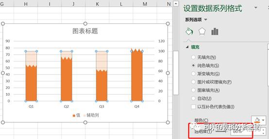
Step5:设置主次纵坐标轴的边界在[0,100],再去掉网格线、坐标轴,得到最终的结果。
4、仪表盘制作
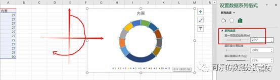
经常在动态图表或报告中看到如下这种仪表盘,用Excel也是可以仿制的,具体一点,是用圆环图做的。

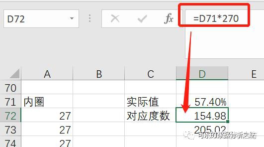
Step1:先制作内圈(透明圈),观察要仿制的图,发现它不是一个半圆,而是一个3/4圆,也就是270度,又观察到它的刻度实际上是10个,做一道数学题,10乘以多少等于270,因此每一个刻度应该是27度,所以内圈的刻度数就可以按照图示的写,并对其插入一个圆环图,右键【设置数据系列格式】将第一扇区起始角度改为225度,为什么是225度,因为这样对称。
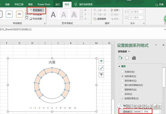
Step2:对圆环的颜色设置为橙色,并调整填充色透明度为80%,再将最下边的圆环填充色设置为白色,假装它没有了。
Step3:实际值是57.4%,那么这个值对应的刻度应该是57.4%*270,也可以理解为57.4%占270度圆环的多少,D73单元格是D72单元格的闭环值,即360-D72。
Step4:把对D72和D73两个单元格中的值添加到刚做好的圆环图中,D73单元格中的值对应的圆环设置填充色为白色,D72为橙色。

Step5:在【插入】——【形状】中插入一个圆形,并将圆形链接到实际值,这样实际值改变的时候,图就也变了。
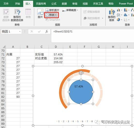
再调整一下圆形的填充色和字体就好了。

所以图表美化就一个技巧,照着老板说好看的那个图往死里模仿,先模仿再创新,不要你觉得好看,要老板觉得好看。

旨在为数千万中国开发者提供一个无缝且高效的云端环境,以支持学习、使用和贡献开源项目。
更多推荐


 0
0 0
0- 0


 已为社区贡献1条内容

所有评论(0)