
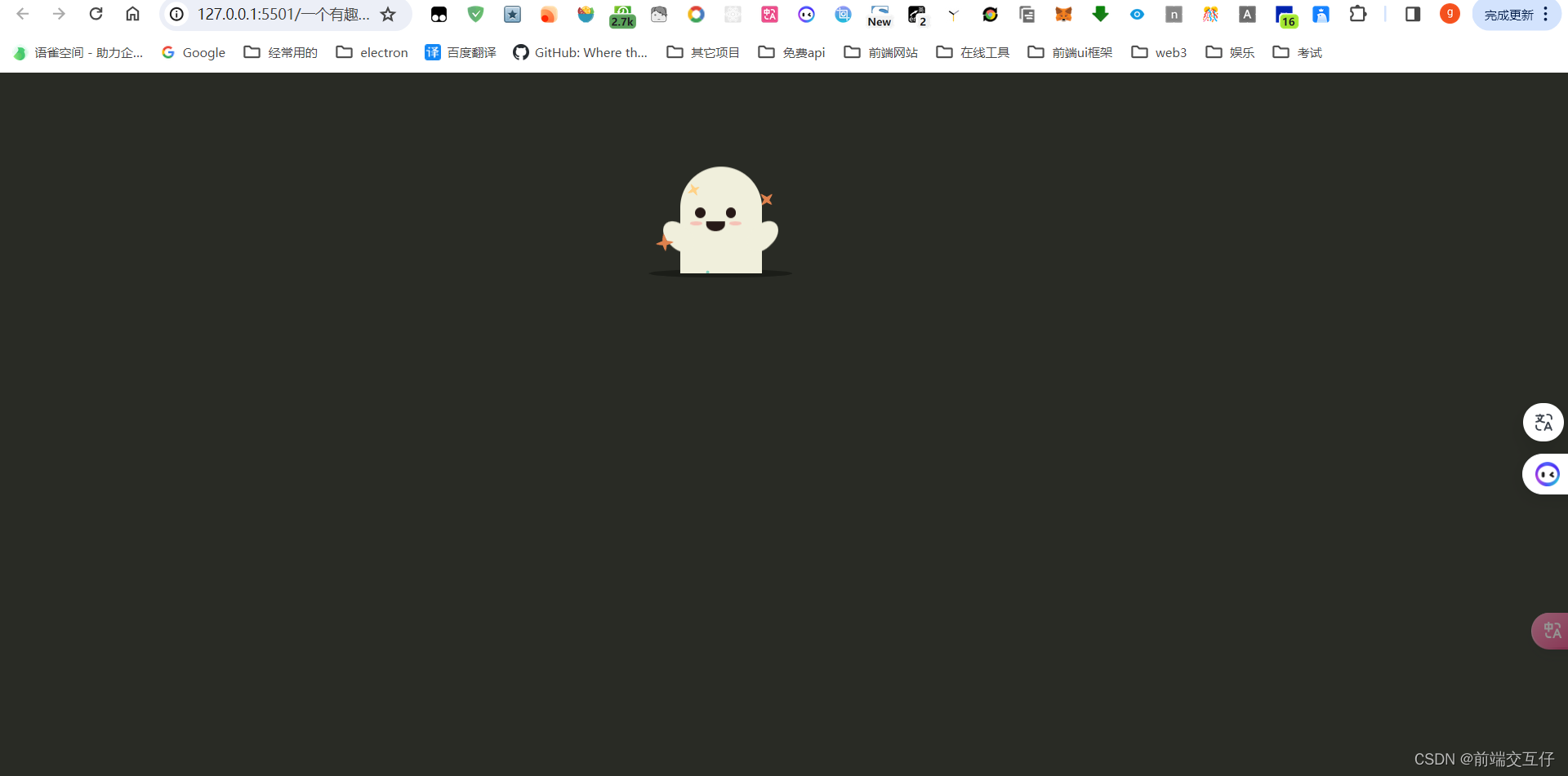
用html写一个有趣的鬼魂动画
<!DOCTYPE html><html lang="en" ><head><meta charset="UTF-8"><title>一个有趣的鬼魂动画</title><link rel="stylesheet" href="https://cdnjs.cloudflare.com/ajax/libs/meyer-res
 文章共11,903字 · 阅读需要大约40分钟
一键AI生成摘要,助你高效阅读
问答
·
<!DOCTYPE html>
<html lang="en" >
<head>
  <meta charset="UTF-8">
  <title>一个有趣的鬼魂动画</title>
  <link rel="stylesheet" href="https://cdnjs.cloudflare.com/ajax/libs/meyer-reset/2.0/reset.min.css">
<link rel="stylesheet" href="./style.css">

</head>
<body>
<div class="scene-container stars-out" tabindex="1">
  <div class="ghost-container">
    <div class="ghost">
      <!-- 鬼魂的头部、眼睛、嘴、腮红 -->
      <div class="ghost-head">
        <div class="ghost-face">
          <div class="eyes-row">
            <div class="eye left"></div>
            <div class="eye right"></div>
          </div>
          <div class="mouth-row">
            <div class="cheek left"></div>
            <div class="mouth">
              <div class="mouth-top"></div>
              <div class="mouth-bottom"></div>
            </div>
            <div class="cheek right"></div>
          </div>
        </div>
      </div>

      <!-- 鬼魂的身体 -->
      <div class="ghost-body">
        <div class="ghost-hand hand-left"></div>
        <div class="ghost-hand hand-right"></div>
        <div class="ghost-skirt">
          <div class="pleat down"></div>
          <div class="pleat up"></div>
          <div class="pleat down"></div>
          <div class="pleat up"></div>
          <div class="pleat down"></div>
        </div>
      </div>
    </div>

    <!-- 装饰部分 -->
    <div class="stars">
      <div class="star orange pointy star-1"><div class="star-element"></div></div>
      <div class="star orange pointy star-2"><div class="star-element"></div></div>
      <div class="star yellow pointy star-3"><div class="star-element"></div></div>
      <div class="star yellow pointy star-4"><div class="star-element"></div></div>
      <div class="star blue round star-5"><div class="star-element"></div></div>
      <div class="star blue round star-6"><div class="star-element"></div></div>
    </div>
  </div>

  <!-- 阴影 -->
  <div class="shadow-container">
    <div class="shadow"></div>
    <div class="shadow-bottom"></div>
  </div>
</div>
<!-- partial -->
  <script src="./script.js"></script>

</body>
</html>
/*
动画原型参看https://dribbble.com/shots/3055734-Have-a-Happy-Halloween 和 https://dribbble.com/shots/3878696-Happy-Halloween!
*/

// 设定参数
class Ghost {
    constructor(el) {
      this.scene = el;
      this.clone = el.cloneNode(true);
      this.isEscaping = false;
      this.ghost = el.querySelector('.ghost');
      this.face = el.querySelector('.ghost-face');
      this.eyes = el.querySelector('.eyes-row');
      this.leftEye = this.eyes.querySelector('.left');
      this.rightEye = this.eyes.querySelector('.right');
      this.mouth = el.querySelector('.mouth');
      this.mouthState = 'neutral';
      this.shadow = el.querySelector('.shadow-container');
      this.leftCheek = el.querySelector('.left.cheek');
      this.leftCheek = el.querySelector('.right.cheek');
      this.leftHand = el.querySelector('.hand-left');
      this.rightHand = el.querySelector('.right-hand');
      this.activityInterval = null;
    }

    reset() {
      this.scene.remove();
      this.scene = this.clone.cloneNode(true);
      this.resetRefs();
      this.scene.classList.remove('stars-out');
      this.scene.style.position = 'absolute';
      this.scene.style.left = Math.floor(Math.random() * (document.querySelector('body').getBoundingClientRect().width - 140)) + 'px';
      this.scene.style.top = Math.floor(Math.random() * (document.querySelector('body').getBoundingClientRect().height - 160)) + 'px';
      this.scene.classList.add('descend');
      this.shadow.classList.add('disappear');
      document.querySelector('body').append(this.scene);
      this.enter();
    }

    resetRefs() {
      this.ghost = this.scene.querySelector('.ghost');
      this.face = this.scene.querySelector('.ghost-face');
      this.eyes = this.scene.querySelector('.eyes-row');
      this.leftEye = this.eyes.querySelector('.left');
      this.rightEye = this.eyes.querySelector('.right');
      this.mouth = this.scene.querySelector('.mouth');
      this.mouthState = 'neutral';
      this.isEscaping = false;
      this.shadow = this.scene.querySelector('.shadow-container');
      this.leftCheek = this.scene.querySelector('.left.cheek');
      this.leftCheek = this.scene.querySelector('.right.cheek');
      this.leftHand = this.scene.querySelector('.hand-left');
      this.rightHand = this.scene.querySelector('.right-hand');
    }

    // 眨眼睛
    blink() {
      this.leftEye.classList.add('blink');
      this.rightEye.classList.add('blink');
      setTimeout(() => {
        this.leftEye.classList.remove('blink');
        this.rightEye.classList.remove('blink');
      }, 50)
    }

    // 挥手动作
    wave() {
      this.leftHand.classList.add('waving');
      setTimeout(() => {
        this.leftHand.classList.remove('waving');
      }, 500);
    }

    // 嘴
    openMouth() {
      this.mouth.classList.remove('closed');
      this.mouth.classList.add('open');
      this.mouthState = 'open';
    }

    closeMouth() {
      this.mouth.classList.remove('open');
      this.mouth.classList.add('closed');
      this.mouthState = 'closed';
    }

    neutralMouth() {
      this.mouth.classList.remove('open');
      this.mouth.classList.remove('closed');
      this.mouthState = 'neutral';
    }

    // 鼠标放上时的状态
    hover() {
      this.ghost.classList.add('hover');
    }

    surprise() {
      this.face.classList.add('surprised');
    }

    // 逃离状态
    runAway() {
      clearInterval(this.activityInterval);
      if (!this.isEscaping) {
        this.isEscaping = true;
        this.scene.classList.add('run-away', 'move-stars-in');
        this.scene.classList.remove('stars-out');
        setTimeout(() => {
          this.shadow.classList.add('disappear');
          setTimeout(() => {
            this.reset();
          }, Math.floor(Math.random()*1000) + 500);
        }, 450);
      }
    }

    // 回来时状态
    enter() {
      setTimeout(() => {
        this.shadow.classList.remove('disappear');
      }, 5);
      setTimeout(() => {
        this.scene.classList.remove('descend');
        this.scene.classList.add('stars-out', 'move-stars-out');
      }, 600);
      setTimeout(() => {
        this.hover();
        this.prepareEscape();
        this.startActivity();
      }, 1200)
    }

    startActivity() {
      this.activityInterval = setInterval(() => {
        switch (Math.floor(Math.random()*4)) {
          case 0:
            this.blink();
            setTimeout(() => { this.blink() }, 400);
            setTimeout(() => { this.blink() }, 1300);
            break;
          case 1:
            this.wave();
            break;
          default:
            break;
        }
      }, 7000);
    }

    prepareEscape() {
      this.scene.addEventListener('click', () => { this.runAway() }, false);
      this.scene.addEventListener('mouseover', () => { this.runAway() }, false);
      this.scene.addEventListener('focus', () => { this.runAway() }, false);
    }
  }

  let ghost = new Ghost(document.querySelector('.scene-container'));

  ghost.hover();
  ghost.startActivity();
  ghost.prepareEscape();
html {
    height: 100%;
}

body {
    height: 100%;
    position: relative;
    display: flex;
    align-items: center;
    justify-content: center;
    background-color: #292B25;
}

.scene-container {
    position: relative;
    width: 140px;
    height: 160px;
}

.scene-container:focus {
    outline: none;
}

.scene-container.run-away .ghost {
    transform: rotateX(-10deg) scale3d(1.4, 4, 1) translate3d(0, 130%, -30px);
    transition: transform 800ms ease;
}

.scene-container.descend .ghost {
    transform: translate3d(0, 130%, 0);
}

.ghost-container {
    position: relative;
    width: 80px;
    height: 140px;
    padding: 20px 30px 0 30px;
    overflow: hidden;
    perspective: 30px;
}

.ghost {
    position: relative;
    height: 115px;
    z-index: 1;
    transition: transform 2000ms ease-out;
}

.ghost.hover {
    -webkit-animation: hover 600ms ease-in-out infinite alternate;
    animation: hover 600ms ease-in-out infinite alternate;
}

.ghost-head {
    position: relative;
    width: 80px;
    height: 0;
    padding-top: 100%;
    border-radius: 100%;
    background-color: #F0EFDC;
}

.ghost-head .ghost-face {
    position: absolute;
    bottom: 10px;
    left: 10px;
    width: 50px;
    height: 30px;
    z-index: 1;
}

.eyes-row, .mouth-row {
    position: relative;
    height: 10px;
}

.mouth-row {
    margin-top: 3px;
}

.eye {
    height: 10px;
    width: 10px;
    background-color: #271917;
    border-radius: 100%;
    position: absolute;
    bottom: 0;
    transition: height 50ms ease;
}

.eye.left {
    left: 5px;
}

.eye.right {
    right: 5px;
}

.eye.blink {
    height: 0;
}

.mouth {
    position: absolute;
    left: 50%;
    top: 0;
    height: 10px;
    transform: translate3d(-50%, 0, 0);
}

.mouth .mouth-top {
    width: 18px;
    height: 2px;
    border-radius: 2px 2px 0 0;
    background-color: #271917;
}

.mouth .mouth-bottom {
    position: absolute;
    width: 18px;
    height: 8px;
    bottom: 0;
    overflow: hidden;
    transition: height 150ms ease;
}

.mouth .mouth-bottom:after {
    content: "";
    display: block;
    position: absolute;
    left: 0;
    bottom: 0;
    width: 18px;
    height: 16px;
    border-radius: 100%;
    background-color: #271917;
}

.mouth.open .mouth-bottom {
    height: 16px;
}

.mouth.closed .mouth-bottom {
    height: 0;
}

.cheek {
    position: absolute;
    top: 0;
    width: 12px;
    height: 4px;
    background-color: #F5C1B6;
    border-radius: 100%;
}

.cheek.left {
    left: 0;
}

.cheek.right {
    right: 0;
}

.ghost-body {
    position: absolute;
    top: 40px;
    height: 0;
    width: 80px;
    padding-top: 85%;
    background-color: #F0EFDC;
}

.ghost-hand {
    height: 36px;
    width: 22px;
    background: #F0EFDC;
    border-radius: 100%/90%;
    position: absolute;
}

.ghost-hand.hand-left {
    left: -12px;
    top: 10px;
    transform: rotateZ(-45deg);
    left: 0;
    top: 5px;
    transform-origin: bottom center;
}

.ghost-hand.hand-left.waving {
    -webkit-animation: waving 400ms linear;
    animation: waving 400ms linear;
}

.ghost-hand.hand-right {
    right: -12px;
    top: 10px;
    transform: rotateZ(45deg);
}

.ghost-skirt {
    position: absolute;
    left: 0;
    bottom: 0;
    width: 100%;
    display: flex;
    transform: translateY(50%);
}

.ghost-skirt .pleat {
    width: 20%;
    height: 8px;
    border-radius: 100%;
}

.ghost-skirt .pleat.down {
    background-color: #F0EFDC;
}

.ghost-skirt .pleat.up {
    background-color: #292B25;
    position: relative;
    top: 1px;
}

.shadow-container {
    transition: transform 800ms ease;
}

.shadow-container.disappear {
    transform: scale3d(0, 1, 1);
    transition: transform 400ms ease;
}

.shadow {
    position: absolute;
    top: calc(100% - 4px);
    left: 0;
    width: 100%;
    height: 8px;
    background-color: #1B1D18;
    border-radius: 100%;
    z-index: -1;
}

.shadow-bottom {
    position: absolute;
    top: 100%;
    left: 0;
    height: 4px;
    width: 100%;
    overflow: hidden;
}

.shadow-bottom:after {
    content: "";
    display: block;
    width: 100%;
    position: absolute;
    height: 8px;
    left: 0;
    bottom: 0;
    border-radius: 100%;
    background-color: #1B1D18;
    z-index: 2;
}

.star {
    position: absolute;
    -webkit-animation: twinkle 2s infinite linear;
    animation: twinkle 2s infinite linear;
    transition: top 400ms ease-out, left 400ms ease-out;
}

.star.round .star-element {
    height: 9px;
    width: 9px;
    border-radius: 100%;
}

.star.pointy {
    transform: rotate(-15deg);
}

.star.pointy .star-element {
    height: 6px;
    width: 6px;
}

.star.pointy .star-element:before, .star.pointy .star-element:after {
    content: "";
    display: block;
    position: absolute;
    background: green;
    border-radius: 6px;
}

.star.pointy .star-element:before {
    height: 6px;
    width: 12px;
    left: -3px;
    top: 0;
    transform: skewX(60deg);
}

.star.pointy .star-element:after {
    height: 12px;
    width: 6px;
    right: 0;
    bottom: -3px;
    transform: skewY(-60deg);
}

.star.orange .star-element, .star.orange .star-element:before, .star.orange .star-element:after {
    background-color: #DF814D;
}

.star.yellow .star-element, .star.yellow .star-element:before, .star.yellow .star-element:after {
    background-color: #FFD186;
}

.star.blue .star-element, .star.blue .star-element:before, .star.blue .star-element:after {
    background-color: #83D0BC;
}

.star-1 {
    top: 130%;
    left: 40%;
    transition-delay: 200ms;
    -webkit-animation-delay: 0ms;
    animation-delay: 0ms;
    z-index: 2;
}

.star-2 {
    top: 130%;
    left: 44%;
    transition-delay: 250ms;
    -webkit-animation-delay: 200ms;
    animation-delay: 200ms;
}

.star-3 {
    top: 130%;
    left: 48%;
    transition-delay: 300ms;
    -webkit-animation-delay: 400ms;
    animation-delay: 400ms;
    z-index: 2;
}

.star-4 {
    top: 130%;
    left: 52%;
    transition-delay: 350ms;
    -webkit-animation-delay: 600ms;
    animation-delay: 600ms;
}

.star-5 {
    top: 130%;
    left: 56%;
    transition-delay: 400ms;
    -webkit-animation-delay: 800ms;
    animation-delay: 800ms;
    z-index: 2;
}

.star-6 {
    top: 130%;
    left: 60%;
    transition-delay: 450ms;
    -webkit-animation-delay: 1000ms;
    animation-delay: 1000ms;
}

.move-stars-out .star-element {
    -webkit-animation: star-entrance 1500ms;
    animation: star-entrance 1500ms;
}

.stars-out .star {
    transition: top 1500ms ease-out, left 1500ms ease-out;
}

.stars-out .star-1 {
    top: 75%;
    left: 6%;
}

.stars-out .star-2 {
    top: 35%;
    left: 88%;
}

.stars-out .star-3 {
    top: 8%;
    left: 20%;
}

.stars-out .star-4 {
    top: 70%;
    left: 92%;
}

.stars-out .star-5 {
    top: 35%;
    left: 4%;
}

.stars-out .star-6 {
    top: 2%;
    left: 70%;
}

.stars-out .star-1 {
    transition-delay: 0ms, 0ms;
}

.stars-out .star-1 .star-element {
    -webkit-animation-delay: 0ms;
    animation-delay: 0ms;
}

.stars-out .star-2 {
    transition-delay: 200ms, 200ms;
}

.stars-out .star-2 .star-element {
    -webkit-animation-delay: 200ms;
    animation-delay: 200ms;
}

.stars-out .star-3 {
    transition-delay: 400ms, 400ms;
}

.stars-out .star-3 .star-element {
    -webkit-animation-delay: 400ms;
    animation-delay: 400ms;
}

.stars-out .star-4 {
    transition-delay: 600ms, 600ms;
}

.stars-out .star-4 .star-element {
    -webkit-animation-delay: 600ms;
    animation-delay: 600ms;
}

.stars-out .star-5 {
    transition-delay: 800ms, 800ms;
}

.stars-out .star-5 .star-element {
    -webkit-animation-delay: 800ms;
    animation-delay: 800ms;
}

.stars-out .star-6 {
    transition-delay: 1000ms, 1000ms;
}

.stars-out .star-6 .star-element {
    -webkit-animation-delay: 1000ms;
    animation-delay: 1000ms;
}

.move-stars-in .star-element {
    -webkit-animation: star-exit 400ms linear;
    animation: star-exit 400ms linear;
}

.move-stars-in .star-1 .star-element {
    -webkit-animation-delay: 100ms;
    animation-delay: 100ms;
}

.move-stars-in .star-2 .star-element {
    -webkit-animation-delay: 150ms;
    animation-delay: 150ms;
}

.move-stars-in .star-3 .star-element {
    -webkit-animation-delay: 200ms;
    animation-delay: 200ms;
}

.move-stars-in .star-4 .star-element {
    -webkit-animation-delay: 250ms;
    animation-delay: 250ms;
}

.move-stars-in .star-5 .star-element {
    -webkit-animation-delay: 300ms;
    animation-delay: 300ms;
}

.move-stars-in .star-6 .star-element {
    -webkit-animation-delay: 350ms;
    animation-delay: 350ms;
}

/* 动画部分 */

@-webkit-keyframes hover {
    0% {
        top: 0;
    }
    100% {
        top: 8px;
    }
}

@keyframes hover {
    0% {
        top: 0;
    }
    100% {
        top: 8px;
    }
}

@-webkit-keyframes star-entrance {
    0% {
        transform: rotate(-735deg) scale(0, 0);
    }
    100% {
        transform: rotate(0) scale(1, 1);
    }
}

@keyframes star-entrance {
    0% {
        transform: rotate(-735deg) scale(0, 0);
    }
    100% {
        transform: rotate(0) scale(1, 1);
    }
}

@-webkit-keyframes star-exit {
    0% {
        transform: rotate(0) scale(1, 1);
    }
    100% {
        transform: rotate(360deg) scale(0, 0);
    }
}

@keyframes star-exit {
    0% {
        transform: rotate(0) scale(1, 1);
    }
    100% {
        transform: rotate(360deg) scale(0, 0);
    }
}

@-webkit-keyframes twinkle {
    0% {
        transform: rotate(0deg) scale(1, 1);
    }
    25% {
        transform: rotate(10deg) scale(0.8, 0.8);
    }
    50% {
        transform: rotate(0deg) scale(0.9, 0.9);
    }
    75% {
        transform: rotate(-20deg) scale(0.6, 0.6);
    }
    100% {
        transform: rotate(0deg) scale(1, 1);
    }
}

@keyframes twinkle {
    0% {
        transform: rotate(0deg) scale(1, 1);
    }
    25% {
        transform: rotate(10deg) scale(0.8, 0.8);
    }
    50% {
        transform: rotate(0deg) scale(0.9, 0.9);
    }
    75% {
        transform: rotate(-20deg) scale(0.6, 0.6);
    }
    100% {
        transform: rotate(0deg) scale(1, 1);
    }
}

@-webkit-keyframes waving {
    0% {
        transform: rotate(-45deg);
    }
    25% {
        transform: rotate(-55deg);
    }
    50% {
        transform: rotate(-45deg);
    }
    75% {
        transform: rotate(-55deg);
    }
    100% {
        transform: rotate(-45deg);
    }
}

@keyframes waving {
    0% {
        transform: rotate(-45deg);
    }
    25% {
        transform: rotate(-55deg);
    }
    50% {
        transform: rotate(-45deg);
    }
    75% {
        transform: rotate(-55deg);
    }
    100% {
        transform: rotate(-45deg);
    }
}

旨在为数千万中国开发者提供一个无缝且高效的云端环境,以支持学习、使用和贡献开源项目。
更多推荐


 15
15 0
0- 0


 已为社区贡献7条内容

所有评论(0)