
css伪类元素实现小圆点效果
使用伪类元素 ::before,::after 来实现 小圆点效果。
 文章共1,024字 · 阅读需要大约4分钟
一键AI生成摘要,助你高效阅读
问答
·
前言:
使用伪类元素 ::before,::after 来实现 小圆点效果。
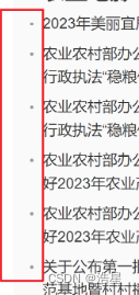
效果图:
实现方式:
1、父级元素
postion:relative; //定位属性,可为absolute  //必须
padding-left:10px ;//因为伪类样式一般是在父级附近,根据情况填写padding //非必须
2、伪类元素样式
//li或者其他标签,你想给谁加,谁就是附近
li::before {
    content: "";
    display: block;
    width:4px;
    height:4px;
    background-color: #B82C22;
    position: absolute;
    left: 0;
    top:14px;
    border-radius: 50%;
}
在界面上具体展示:
主体内容为空,设置宽高,背景样式,定位属性,圆形

伪类的具体介绍与api
如下图所示,before就是给元素前加一个内容,after是给元素后加内容,两者用法都是一样的,只是一前一后的区别

1、content 伪类的内容支持
::before{
    //1、支持字符串,如果是特殊形状,就是空内容
    content: "《";
    content: "》";
    //2、支持链接的方式
    content: ' → ' attr(href); //显示出来是一个箭头带href的内容
    //3、支持图片
    content: url("img/baidu_jgylogo3.gif"); //显示出来是图片
}
2、伪类增加一个背景图片
/*伪元素添加图片:*/
.wrap:after{
    /*内容置为空*/
    content:"";
    /*设置背景图,并拉伸*/
    background:url("img/06.png") no-repeat center;
    /*必须设置此伪元素display*/
    display:inline-block;
    /*必须设置此伪元素大小(不会被图片撑开)*/
    background-size:100%;
    width:100px;
    height:100px;
}
3、使用quotes 来给他加个括号

//1、加括号
h1{
    quotes:"(" ")";  /*利用元素的quotes属性指定文字符号*/
}
h1::before{
    content:open-quote;
}
h1::after{
    content:close-quote;
}

<h1>给标题加括号</h1>

//2、加引号
h2{
    quotes:"\"" "\"";  /*添加双引号要转义*/
}
h2::before{
    content:open-quote;
}
h2::after{
    content:close-quote;
}

<h2>给标题加引号</h2>

//3、默认
h3::before{
    content:open-quote;
}
h3::after{
    content:close-quote;
}

<h3>不设置quotes</h3>
4、装饰标题

h1 {
    display: grid;
    grid-template-columns: minmax(50px, 1fr) auto minmax(50px, 1fr);
    align-items: center;
    text-align: center;
    gap: 40px;
}

h1::before, h1::after {
    content: '';
    border-top: 6px double;
}

<h1>标题</h1>
5、彩带标题

 h1 {
    position: relative;
    margin: 0 auto 20px;
    padding: 10px 40px;
    text-align: center;
    background-color: #875e46;
}

h1::before, h1::after {
    content: '';
    width: 80px;
    height: 100%;
    background-color: #724b34;

    /* 定位彩带两端形状的位置,并且放在最底层 */
    position: absolute;
    z-index: -1;
    top: 20px;

    /* 彩带两端的形状 */
    clip-path: polygon(0 0, 100% 0, 100% 100%, 0 100%, 25% 50%);

    /* 绘制并定位彩带的阴影三角形 */
    background-image: linear-gradient(45deg, transparent 50%, #5d3922 50%);
    background-size: 20px 20px;
    background-repeat: no-repeat;
    background-position: bottom right;
}

h1::before {
    left: -60px;
}

h1::after {
    right: -60px;
    transform: scaleX(-1); /* 水平翻转 */
}
---------------------------
 <h1>标题</h1>
6、逼真的阴影

.box{
    margin:10px;
    width:300px;
    height:100px;
    border-radius:10px;
    background:#ccc
}
.shadow{
    position:relative;
    max-width:270px;
    box-shadow:0 1px 4px rgba(0,0,0,.3),0 0 20px rgba(0,0,0,.1) inset
}
.shadow::after,
.shadow::before{
    position:absolute;
    z-index:-1;
    content:""
}
.shadow::after,
.shadow::before{
    position:absolute;
    bottom:15px;left:10px;
    z-index:-1;
    width:50%;
    height:20%;
    content:""
}
.shadow::after,
.shadow::before{
    position:absolute;
    bottom:15px;
    left:10px;
    z-index:-1;
    width:50%;
    height:20%;
    box-shadow:0 15px 10px rgba(0,0,0,.7);
    content:"";
    transform:rotate(-3deg)
}
.shadow::after{
    right:10px;
    left:auto;
    transform:rotate(3deg)
}


<div class="box shadow"></div>
更多相关资料:

旨在为数千万中国开发者提供一个无缝且高效的云端环境,以支持学习、使用和贡献开源项目。
更多推荐


 4
4 0
0- 0


 已为社区贡献21条内容

所有评论(0)