
底部菜单控件BottomNavigationView的使用
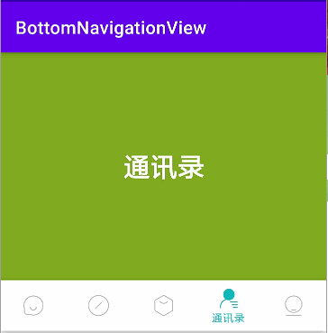
BottomNavigationView实现底部导航栏的整体效果如下图所示:

BottomNavigationView
引入包最新
implementation 'com.google.android.material:material:1.2.0-alpha06'
基本使用
<com.google.android.material.bottomnavigation.BottomNavigationView
android:id="@+id/bottom_navigation_1"
android:layout_width="match_parent"
android:layout_height="wrap_content"
app:itemBackground="@color/white"
app:itemIconTint="@color/sl_color_green_grey"
app:itemTextColor="@color/sl_color_green_grey"
app:menu="@menu/menu_navigation_fix" />
BottomNavigationView控件的主要属性含义:
- app:iteamBackground 指的是底部导航栏的背景颜色,默认是主题的颜色
- app:itemIconTint 指的是底部导航栏中图片的颜色
- app:itemTextColor 指的是底部导航栏文字的颜色
- app:menu 指的是菜单布局(文字和图片都写在这个里面)
app:menu="@menu/menu_navigation_fix"中的界面
<?xml version="1.0" encoding="utf-8"?>
<menu xmlns:android="http://schemas.android.com/apk/res/android"
xmlns:app="http://schemas.android.com/apk/res-auto">
<item
android:id="@+id/action_message"
android:checked="true"
android:icon="@mipmap/icon_message"
android:title="@string/message" />
<item
android:id="@+id/action_find"
android:icon="@mipmap/icon_find"
android:title="@string/find" />
<item
android:id="@+id/action_circle"
android:icon="@mipmap/icon_circle"
android:title="@string/circle" />
</menu>
控件点击时候颜色选择@color/sl_color_green_grey
<?xml version="1.0" encoding="utf-8"?>
<selector xmlns:android="http://schemas.android.com/apk/res/android">
<item android:color="#b8b9bd" android:state_checked="false" />
<item android:color="#0fbbbb" android:state_checked="true" />
</selector>
完整的MainActivity代码
public class MainActivity extends AppCompatActivity {
private FrameLayout mainFrame;
private BottomNavigationView bottomNavigation;
private MyFragment messageFragment, findFragment, circleFragment;
private Fragment[] fragments;
@Override
protected void onCreate(Bundle savedInstanceState) {
super.onCreate(savedInstanceState);
setContentView(R.layout.activity_main);
initView();
}
private void initView() {
messageFragment = new MyFragment();
messageFragment.setMessage(getResources().getString(R.string.message));
findFragment = new MyFragment();
findFragment.setMessage(getResources().getString(R.string.find));
circleFragment = new MyFragment();
circleFragment.setMessage(getResources().getString(R.string.circle));
fragments = new Fragment[]{messageFragment, findFragment, circleFragment};
mainFrame = findViewById(R.id.mainContainer);
//设置fragment到布局
getSupportFragmentManager()
.beginTransaction()
.replace(R.id.mainContainer, messageFragment)
.commit();
bottomNavigation = findViewById(R.id.navigation);
//这里是bottomnavigationview的点击事件
bottomNavigation.setOnNavigationItemSelectedListener(listener);
}
private BottomNavigationView.OnNavigationItemSelectedListener listener
= new BottomNavigationView.OnNavigationItemSelectedListener() {
@Override
public boolean onNavigationItemSelected(@NonNull MenuItem item) {
int id = item.getItemId();
if (id == R.id.action_message) switchFragment(fragments[0]);
else if (id == R.id.action_find) switchFragment(fragments[1]);
else if (id == R.id.action_circle) switchFragment(fragments[2]);
return true;
}
};
// 切换fragment
private void switchFragment(Fragment fragment) {
FragmentManager fm = getSupportFragmentManager();
FragmentTransaction transaction = fm.beginTransaction();
transaction.replace(R.id.mainContainer, fragment);
transaction.commitAllowingStateLoss();
}
}
运行的效果图如下:

app:labelVisibilityMode=""属性
item多的时候,指的是item非选中状态显示文字,有以下几个值:
- labeled 图标文字都显示
- selected
- auto
- unlabeled 文字不显示
它们依次运行如下图所示

auto和select和i 属性sShifting有关
此时isShifting=true;你会发现auto和 selected的效果是一样的效果;
当isShifting=false时候,auto和lable是一样的效果;
关键是这个isShift属性没法设置,目前只有设置2个item的时候它们才好区别;感觉auto这个属性有点鸡肋;下面贴一下关键的源码:
switch (labelVisibilityMode) {
case LabelVisibilityMode.LABEL_VISIBILITY_AUTO:
if (isShifting) {
if (checked) {
setViewLayoutParams(icon, defaultMargin, Gravity.CENTER_HORIZONTAL | Gravity.TOP);
setViewValues(largeLabel, 1f, 1f, VISIBLE);
} else {
setViewLayoutParams(icon, defaultMargin, Gravity.CENTER);
setViewValues(largeLabel, 0.5f, 0.5f, INVISIBLE);
}
smallLabel.setVisibility(INVISIBLE);
} else {
if (checked) {
setViewLayoutParams(
icon, (int) (defaultMargin + shiftAmount), Gravity.CENTER_HORIZONTAL | Gravity.TOP);
setViewValues(largeLabel, 1f, 1f, VISIBLE);
setViewValues(smallLabel, scaleUpFactor, scaleUpFactor, INVISIBLE);
} else {
setViewLayoutParams(icon, defaultMargin, Gravity.CENTER_HORIZONTAL | Gravity.TOP);
setViewValues(largeLabel, scaleDownFactor, scaleDownFactor, INVISIBLE);
setViewValues(smallLabel, 1f, 1f, VISIBLE);
}
}
break;
字体的style-可以设置字体大小

app:itemTextAppearanceActive="@style/selectText"//选中字体大小风格,
app:itemTextAppearanceInactive="@style/unSelectText"//未选中字体大小风格
<?xml version="1.0" encoding="utf-8"?>
<resources>
<style name="selectText">
<item name="android:textSize">20sp</item>
<item name="android:drawablePadding">8dp</item>
</style>
<style name="unSelectText">
<item name="android:textSize">14sp</item>
<item name="android:drawablePadding">4dp</item>
</style>
</resources>
导航栏高度和文字和图片之间的间距
<!-- 导航栏高度 -->
<dimen name="design_bottom_navigation_height">80dp</dimen>
设置了这个之后导航栏高度就变高了,同时图片和文字之间的距离就变大了,具体是多少我也不清楚
其他的设置都是瞎搞;

设置水波纹效果 app:itemRippleColor

先说一下这里的 app:itemBackground 和app:itemRippleColor都是设置给到导航栏的背景
如果要设置水波纹有有效果,那么必须不设置背景:
app:itemBackground="@null"
app:itemRippleColor="@color/design_default_color_primary"
只有这样才会有效果;否则无效;
这是在其源码里面发现的:
int itemBackground = a.getResourceId(R.styleable.BottomNavigationView_itemBackground, 0);
if (itemBackground != 0) {
menuView.setItemBackgroundRes(itemBackground);
} else {
ColorStateList itemRippleColor =
MaterialResources.getColorStateList(
context, a, R.styleable.BottomNavigationView_itemRippleColor);
setItemRippleColor(itemRippleColor);
}
再看看 setItemRippleColor(itemRippleColor);方法,最后还是把水波纹效果设置给了 menuView.setItemBackgroundRes();
public void setItemRippleColor(@Nullable ColorStateList itemRippleColor) {
if (this.itemRippleColor == itemRippleColor) {
// Clear the item background when setItemRippleColor(null) is called for consistency.
if (itemRippleColor == null && menuView.getItemBackground() != null) {
menuView.setItemBackground(null);
}
return;
}
this.itemRippleColor = itemRippleColor;
if (itemRippleColor == null) {
menuView.setItemBackground(null);
} else {
ColorStateList rippleDrawableColor =
RippleUtils.convertToRippleDrawableColor(itemRippleColor);
if (VERSION.SDK_INT >= VERSION_CODES.LOLLIPOP) {
menuView.setItemBackground(new RippleDrawable(rippleDrawableColor, null, null));
} else {
GradientDrawable rippleDrawable = new GradientDrawable();
// TODO: Find a workaround for this. Currently on certain devices/versions, LayerDrawable
// will draw a black background underneath any layer with a non-opaque color,
// (e.g. ripple) unless we set the shape to be something that's not a perfect rectangle.
rippleDrawable.setCornerRadius(0.00001F);
Drawable rippleDrawableCompat = DrawableCompat.wrap(rippleDrawable);
DrawableCompat.setTintList(rippleDrawableCompat, rippleDrawableColor);
menuView.setItemBackground(rippleDrawableCompat);
}
}
}
切换自己设定选中图片和未选中图片
想要切换自己UI设计师给的两种不同的Ui图片;
除去自带着色效果
navigation.setItemIconTintList(null) 除去自带着色效果 (在XML中app:itemIconTint=@null无效,需要代码设置)
创建一个drawable选择器
有几个item就创建几个,比如sl_drawable_circle.xml
<?xml version="1.0" encoding="utf-8"?>
<selector xmlns:android="http://schemas.android.com/apk/res/android">
<item android:state_checked="false" android:drawable="@mipmap/icon_circle"/>
<item android:state_checked="true" android:drawable="@mipmap/icon_circle_focus"/>
</selector>
设置相应item中android:icon属性
找到相应item中 android:icon属性
<?xml version="1.0" encoding="utf-8"?>
<menu xmlns:android="http://schemas.android.com/apk/res/android"
xmlns:app="http://schemas.android.com/apk/res-auto">
<item
android:id="@+id/action_circle"
android:icon="@drawable/sl_drawable_circle"
android:title="@string/circle" />
</menu>

第二个中的切换都是原始图片的切换;
以上就是总结的全部内容了;欢迎评论和点赞,交流,互相学习了!
添加一个消息提示红色点
第一种方式粗略的添加方式

//获取整个的NavigationView
BottomNavigationMenuView menuView = (BottomNavigationMenuView) navigation.getChildAt(0);
//这里就是获取所添加的每一个Tab(或者叫menu),
View tab = menuView.getChildAt(0);
BottomNavigationItemView itemView = (BottomNavigationItemView) tab;
//加载我们的角标View,新创建的一个布局
View badge = LayoutInflater.from(this).inflate(R.layout.item_red_dot, menuView, false);
//添加到Tab上
FrameLayout.LayoutParams lp = new FrameLayout.LayoutParams(badge.getLayoutParams());
lp.gravity = Gravity.TOP | Gravity.END;
itemView.addView(badge, lp);
第二种(消息红色的中心放在图片右上角顶点)

//添加消息红点第二种方式
BottomNavigationMenuView menuView = (BottomNavigationMenuView) navigation.getChildAt(0);
View tab = menuView.getChildAt(0);
BottomNavigationItemView itemView = (BottomNavigationItemView) tab;
//从系统里面获取图标的ImageView
ImageView iv = itemView.findViewById(R.id.icon);
//加载我们的角标View,新创建的一个布局
final View badge = LayoutInflater.from(this).inflate(R.layout.item_red_dot, menuView, false);
final FrameLayout.LayoutParams lp = new FrameLayout.LayoutParams(badge.getLayoutParams());
//等到有高度以后在布局
iv.post(new Runnable() {
@Override
public void run() {
lp.gravity = Gravity.TOP | Gravity.CENTER_HORIZONTAL;
lp.topMargin = iv.getTop() - lp.height / 2;//图片top - 消息点的高度一半
lp.leftMargin = iv.getWidth() / 2;//图片的宽度的一半
itemView.addView(badge, lp);
}
});

旨在为数千万中国开发者提供一个无缝且高效的云端环境,以支持学习、使用和贡献开源项目。
更多推荐


 35
35 0
0- 0


 已为社区贡献2条内容
 105
35
9
105
35
9

所有评论(0)