
❤echarts柱状图详细配置(竖向横向柱状图)
❤echarts柱状图使用和配置
一键AI生成摘要,助你高效阅读
问答
·
❤ echarts柱状图的使用及详细配置 (源码地址:给个star如果还有用的话)
源码地址
https://gitee.com/NexusLinNoa/Lintaibai
一、Echarts 柱形图详细配置
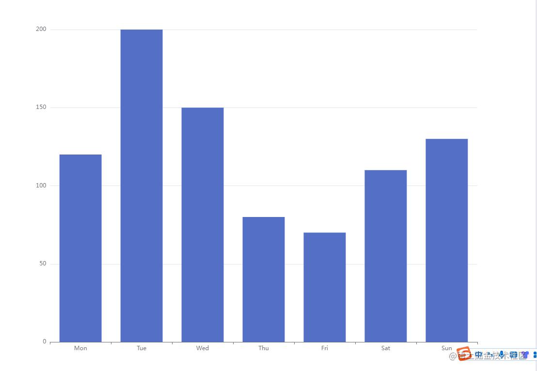
1、 简单使用
import * as echarts from 'echarts';// 5.4区别4引入方式
// 1结构
<div id="echartzhu" style="width: 100%;height: 200px;"></div>

// 2渲染
this.echartzhu('echartzhu');

// 3方法渲染
echartzhu(id){
      let myChart = echarts.init(document.getElementById(id));
      let option = {
          xAxis: {
            type: 'category',
            data: ['Mon', 'Tue', 'Wed', 'Thu', 'Fri', 'Sat', 'Sun']
          },
          yAxis: { type: 'value'},
          series: [
            {
              data: [120, 200, 150, 80, 70, 110, 130],
              type: 'bar',
            }
          ]
        };
      myChart.setOption(option);
},
二、详细参数配置
1、控制柱状图颜色
① 柱子渐变 series -> color
通过series中的color进行更改
// 线性渐变,前四个参数分别是 x0, y0, x2, y2, 范围从 0 - 1,相当于在图形包围盒中的百分比,如果 globalCoord 为 `true`,则该四个值是绝对的像素位置
 color: {
        type: 'linear',
        x: 0,
        y: 0,
        x2: 0,
        y2: 1,
        colorStops: [
          {
            offset: 0,
            color: 'red' // 0% 处的颜色
          },
          {
            offset: 1,
            color: 'blue' // 100% 处的颜色
          }
        ],
   global: false // 缺省为 false
}
效果
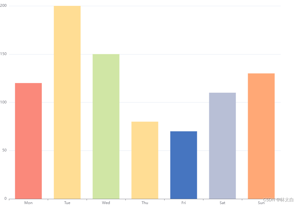
② 五个柱子分别显示不同颜色
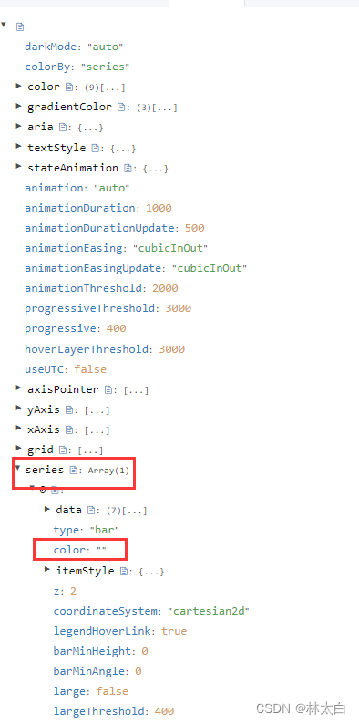
在series中有itemStyle属性,该属性支持使用回调函数,使用echarts中自带的渐变色对象返回相关对象
利用series中的itemStyle参数
LinearGradient中的参数前四个参数分别代表
x : 从左向右 1 ——> 0
y:从上向下 1 ——> 0
x2:从右向左 1 ——> 0
y2:从下向上 1 ——> 0
如果想要左右效果的渐变,那么只需修改x->x2即可
return new echarts.graphic.LinearGradient(0, 0, 1, 0, [{ // x->x2
      offset: 0,
            color: colorItem[0]
        },
        {
            offset: 1,
            color: colorItem[1]
        }
   ], false);
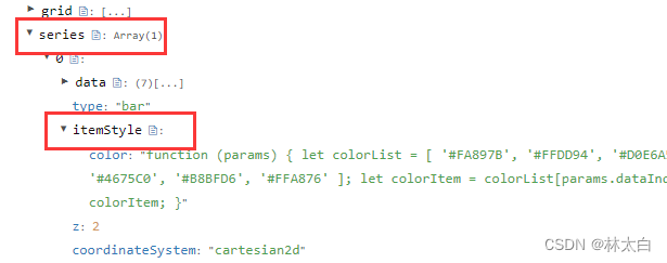
  itemStyle: {
        normal: {
          color: function (params) {
            let colorList = [
              '#FA897B',
              '#FFDD94',
              '#D0E6A5',
              '#FFDD94',
              '#4675C0',
              '#B8BFD6',
              '#FFA876'
            ];
            let colorItem = colorList[params.dataIndex];
            return colorItem;
          }
        }
      }
效果
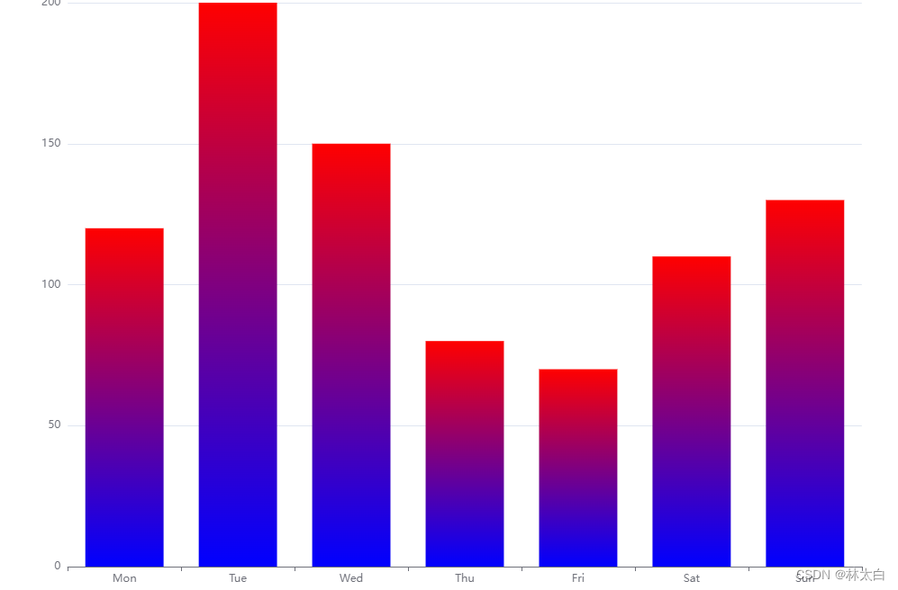
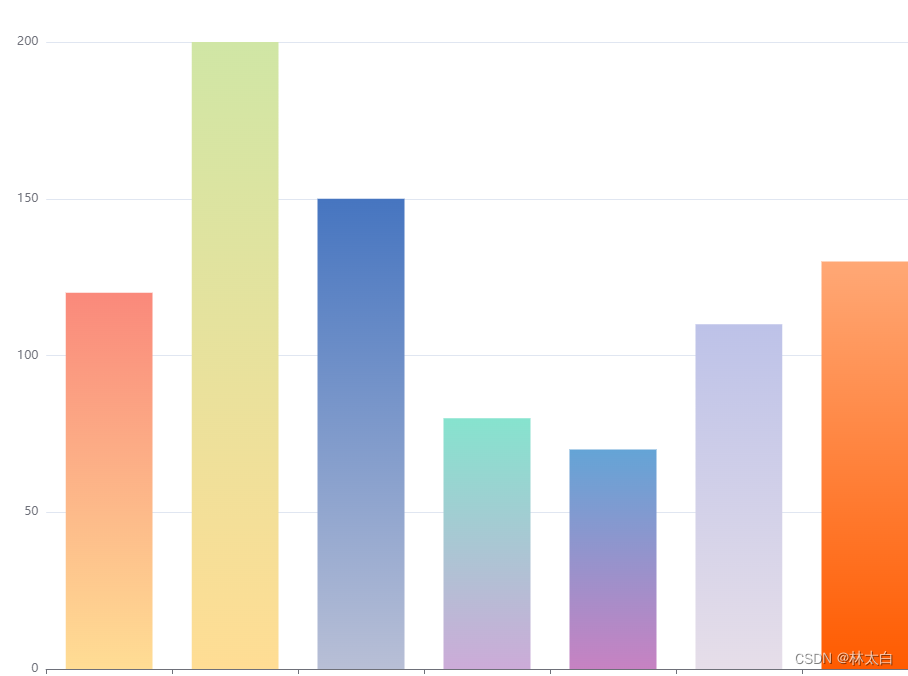
③分别显示不同的渐变色柱子
利用itemStyle中的normal color回调函数返回一个渐变色
 itemStyle: {
        normal: {
          color: function (params) {
            let colorList = [
              ['#FA897B', '#FFDD94'],
              ['#D0E6A5', '#FFDD94'],
              ['#4675C0', '#B8BFD6'],
              ['#86E3CE', '#CCABD8'],
              ['#64A4D6', '#C782C2'],
              ['#bdc2e8', '#e6dee9'],
              ['#FFA876', '#FF5B00']
            ];
            let colorItem = colorList[params.dataIndex];
            return new echarts.graphic.LinearGradient(0,0,0,1, //y->y2
              [
                {
                  offset: 0,
                  color: colorItem[0]
                },
                {
                  offset: 1,
                  color: colorItem[1]
                }
              ],
              false
            );
          }
        }
      }
效果
④ 改变分类类型
yAxis: [
        {
            type: 'category',
            axisTick: {
                show: false
            },
            data: ['周一', '周二', '周三', '周四', '周五', '周六', '周日'],
            axisLabel:{
                fontSize: 100,  //控制字体大小
            },
        }
    ],
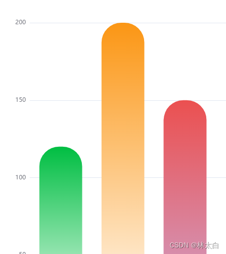
⑤ 设置四个圆角的半径
设置 barBorderRadius 属性,可以分别设置四个圆角的半径。
在数组中,依次表示左上角、右上角、右下角、左下角的圆角半径。通过调整这些数值,可以达到自定义圆角样式的效果。
option = {
    // 其他配置项...
    series: [{
        type: 'bar',
        data: [10, 20, 30, 40, 50],
        itemStyle: {
            borderRadius: [5, 5, 0, 0] // 设置四个圆角的半径,顺序为左上、右上、右下、左下
        }
    }]
};
效果
2、设置柱状图顶部显示数字
通过设置 label 属性来实现柱状图内部显示数值的效果
option = {
    // 其他配置项...
    series: [{
        type: 'bar',
        data: [10, 20, 30, 40, 50],
        label: {
            show: true, // 显示数值
            position: 'inside' // 设置显示位置为柱状图内部
        }
    }]
};
3、设置柱状图顶部显示数字位置
支持:top / left / right / bottom / inside / insideLeft / insideRight / insideTop / insideBottom / insideTopLeft / insideBottomLeft / insideTopRight / insideBottomRight
也可以用一个数组表示相对的百分比或者绝对像素值表示标签相对于图形包围盒左上角的位置
// 绝对的像素值
  position: [10, 10],
  // 相对的百分比
  position: ['50%', '50%']
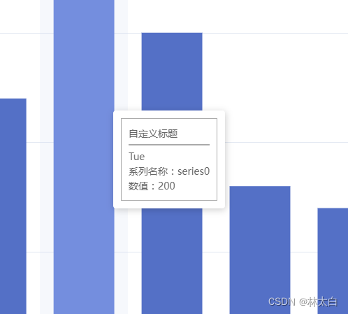
4、设置柱状图顶部提示tooltip
自定义提示tooltip样式
  tooltip: {
        trigger: 'axis',
        axisPointer: {
            type: 'shadow'
        },
        // 自定义tooltip样式
        formatter: function (params) {
            var tooltipHtml = '';
            tooltipHtml += '<div style="background-color:rgba(255,255,255,0.8);border:1px solid #aaa;padding:10px;">';
            tooltipHtml += '<p style="margin:0;">自定义标题</p>';
            tooltipHtml += '<hr style="border:0.5px solid #aaa;margin:5px 0;">';
            tooltipHtml += '<p style="margin:0;">' + params[0].axisValue + '</p>';
            tooltipHtml += '<p style="margin:0;">系列名称:' + params[0].seriesName + '</p>';
            tooltipHtml += '<p style="margin:0;">数值:' + params[0].value + '</p>';
            tooltipHtml += '</div>';
            return tooltipHtml;
        }
    },
效果
自定义提示tooltip多类型柱子显示
tooltip: {
        trigger: 'axis',
        axisPointer: {
            type: 'shadow'
        },
        // 自定义tooltip样式
        formatter: function (params) {
            var tooltipHtml = '';
            tooltipHtml += '<div style="background-color:rgba(255,255,255,0.8);border:1px solid #aaa;padding:10px;">';
            tooltipHtml += '<p style="margin:0;">自定义标题</p>';
            tooltipHtml += '<hr style="border:0.5px solid #aaa;margin:5px 0;">';
            for (var i = 0; i < params.length; i++) {
                tooltipHtml += '<p style="margin:0;">' + params[i].name + ':' + params[i].value + '</p>';
            }
            tooltipHtml += '</div>';
            return tooltipHtml;
        }
},
四、完整案例
1. echarts柱状图示例图
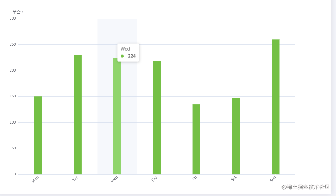
- echarts柱状图代码
option = {

        // title: {
        //   text: '您的疾病风险排名',
        //   left: 'center',
        //   textStyle: { //标题内容的样式
        //     color: '#000', //
        //     fontStyle: 'normal', //lic主标题文字字体风格,默认normal,有italic(斜体),oblique(斜体)
        //     fontWeight: "bold", //可选normal(正常),bold(加粗),bolder(加粗),lighter(变细),100|200|300|400|500...
        //     fontFamily: "PingFangSC-Regular, PingFang SC", //主题文字字体,默认微软雅黑
        //     fontSize: 20 //主题文字字体大小,默认为18px
        //   },
        // },
        // legend: {
        //   top: '10%',
        //   x: 'center',
        //   textStyle: {
        //     fontSize: 10
        //   },
        //   data:['低危','高位']
        // },

        color: '#74C045',
        tooltip: {
          trigger: 'axis',
          axisPointer: {
            type: 'shadow'
          },
          // formatter: function(params) {
          //   var relVal = params[0].name
          //   for (var i = 0, l = params.length; i < l; i++) {
          //     relVal += '<br/>' + params[i].marker + params[i].seriesName + params[i].value + '%'
          //   }
          //   return relVal
          // }
        },

        grid: {
          top: '16%',
          left: '3%',
          right: '10%',
          bottom: '3%',
          containLabel: true
        },
        xAxis: [{
          type: 'category',
          data:  ['Mon', 'Tue', 'Wed', 'Thu', 'Fri', 'Sat', 'Sun'],
          axisLabel: { //展示角度
            rotate: 45,
            // color: function(value, index) {
            //     return xFontcolor[index]
            //   },
          },
          axisLine: { //y轴线的配置
            show: false, //是否展示
          },
          axisTick: {
            alignWithLabel: true,
            lineStyle: { color: '#fff' }
          },
        }],
        yAxis: [{
          name:'单位:%',
          type: 'value',
          axisLine: { //y轴线的配置
            show: false, //是否展示
          },
          axisTick: { lineStyle: { color: '#fff' } }
        }],
        series: [{
          name: '',
          type: 'bar',
          barWidth: '20%',
          data: [150, 230, 224, 218, 135, 147, 260],
        }]
};
//  ------  X轴 ------

  xAxis: {

    show: true,  // 是否显示

    position: 'bottom',  // x轴的位置

    offset: 0, // x轴相对于默认位置的偏移

    type: 'category',   // 轴类型, 默认为 'category'

    name: '月份',    // 轴名称

    nameLocation: 'end',  // 轴名称相对位置

    nameTextStyle: {   // 坐标轴名称样式

      color: 'red',

      padding: [5, 0, 0, -5]

    },
    `series : [`

`          ``{`

`            ``name:``'销量'``,`

`            ``type:``'bar'``,`

`            ``stack: ``'总量'``,`

`            ``barWidth : 40, ``//柱图宽度`

`           ``}`

`         ``]`

    nameGap: 15, // 坐标轴名称与轴线之间的距离

    nameRotate: 0,  // 坐标轴名字旋转

    axisLine: {       // 坐标轴 轴线

      show: true,  // 是否显示

      symbol: ['none', 'arrow'],  // 是否显示轴线箭头

      symbolSize: [8, 8], // 箭头大小

      symbolOffset: [0, 7],  // 箭头位置

      // ------   线 ---------

      lineStyle: {

        color: 'blue',

        width: 1,

        type: 'solid'

      }

    },

    axisTick: {    // 坐标轴 刻度

      show: true,  // 是否显示

      inside: true,  // 是否朝内

      length: 3,     // 长度

      lineStyle: {   // 默认取轴线的样式

        color: 'red',

        width: 1,

        type: 'solid'

      }

    },

    axisLabel: {    // 坐标轴标签

      show: true,  // 是否显示

      inside: false, // 是否朝内

      rotate: 0, // 旋转角度

      margin: 5, // 刻度标签与轴线之间的距离

      color: 'red'  // 默认取轴线的颜色

    },
2. 横向柱状图数据配置
效果图

option = {
  color: ['#1890FF'],

  textStyle: {
    fontSize: 14,
    fontStyle: 'normal',
    fontWeight: 'bold'
  },
  grid: {
    top: '5%',
    left: '20%',
    right: '4%',
    bottom: '16%',
    containLabel: true,
    borderWidth: 0,
    y: 80,
    y2: 60
  },
  xAxis: {
    type: 'value',
    // max:50,
    axisLine:{
      show:true,
      lineStyle: {
       color: '#fefef',
      },
    },
    axisLabel: {
      show: true,
      interval: 0,
      formatter: '{value} %' // 给每个数值添加%
    }
  },
  yAxis: {
     axisLine:{
      show:true,
      lineStyle: {
       color: '#fefef',
      },
    },
    type: 'category',
    data: [
      'A、价格过高',
      'B、品牌不了解',
      'B、品牌不了解品牌不了解',
      'B、品牌不了解',
      'B、品牌不了解',
      'B、品牌不了解',
      'B、品牌不了解'
    ]
  },
  series: [
    {
      itemStyle: {
        normal: {
          color: function (params) {
            // build a color map as your need.
            var colorList = [
              '#C1232B',
              '#B5C334',
              '#FCCE10',
              '#E87C25',
              '#27727B',
              '#FE8463',
              '#9BCA63',
              '#FAD860',
              '#F3A43B',
              '#60C0DD',
              '#D7504B',
              '#C6E579',
              '#F4E001',
              '#F0805A',
              '#26C0C0'
            ];
            return colorList[params.dataIndex];
          },
          label: {
            show: true,
            position: 'right',
            formatter: '{c}%' //这是关键,在需要的地方加上就行了
          },
          //设置柱子圆角
          barBorderRadius: [0, 20, 20, 0]
        },
        backgroundStyle: {
          color: '#EBEEF5'
        }
      },
      data: [20, 200, 150, 80, 70, 110, 130],
      type: 'bar',
      barWidth: 30 //柱图宽度
    }
  ]
};
(源码地址:求star)

旨在为数千万中国开发者提供一个无缝且高效的云端环境,以支持学习、使用和贡献开源项目。
更多推荐


 4
4 0
0- 0


 已为社区贡献13条内容

所有评论(0)