

SVG基本使用(四、动画、动画常用属性、复合动画/往返动画/形变动画/路径动画、脚本编程
一、动画1.SVG动画在SVG中提供了三种常用动画标记animate:基础动画animateTransform:形变动画animateMotion:路径动画2.SVG动画属性attributeType: CSS/XML 规定的属性值的名称空间attributeName: 规定元素的哪个属性会产生动画效果from/to: 从哪到哪dur: 动画时长fill: 动画结束之后的状态 保持freeze结束
 文章共3,712字 · 阅读需要大约13分钟
一、动画
1.SVG动画
在SVG中提供了三种常用动画标记
animate:基础动画
animateTransform:形变动画
animateMotion:路径动画
2.SVG动画属性
attributeType: CSS/XML 规定的属性值的名称空间
attributeName: 规定元素的哪个属性会产生动画效果
from/to: 从哪到哪
dur: 动画时长
fill: 动画结束之后的状态 保持freeze结束状态/remove恢复初始状态(默认值)
3.SVG动画使用方式
3.1、创建动画, 告诉动画标记哪个元素需要执行动画
   <svg width="500" height="500">
    <circle id="myCircle" cx="100" cy="100" r="50" fill="#7fd"></circle>
    <animate
        attributeName="r"
        from="50"
        to="100"
        dur="5s"
        xlink:href="#myCircle"
    ></animate>
</svg>
3.2、创建元素, 在元素中说明需要执行什么动画
  <svg width="500" height="500">
      <circle cx="100" cy="300" r="50" fill="#7fd">
       	 <animate attributeName="r" from="50" to="100" dur="5s" fill="freeze"></animate>
  	  </circle>
	</svg>
二、动画常用属性
SVG常用动画属性
repeatCount:动画重复执行次数
repeatDur:动画重复执行总时间
begin:规定动画开始的时间/什么时间触发了再执行动画
begin=“1s”:1s后开始执行动画
begin=“click”:click触发事件执行了再执行动画
begin=“click + 1s”:点击之后,等两秒再执行动画
restart: 规定元素开始动画之后,是否可以被重新开始执行
always:动画可以在任何时候被重置。这是默认值。
whenNotActive:只有在动画没有被激活的时候才能被重置,例如在动画结束之后,才能再执行。
never:在整个SVG执行的过程中,元素动画不能被重置。
calcMode: 规定每一个动画片段的动画表现
linear:默认属性值, 匀速动画
discrete: 非连续动画, 没有动画效果瞬间完成
paced: 规定整个动画效果始终以相同的速度进行,设置keyTimes属性无效
spline: 配合keySplines属性来定义各个动画过渡效, 自定义动画
keyTimes:
划分动画时间片段, 取值0-1
values:
划分对应取值片段的值
更多: www.w3.org/TR/SVG/animate.html
<svg width="500" height="500">
    <circle cx="100" cy="100" r="50" fill="#7fd">
        <animate
                attributeName="r"
                from="50" to="100"
                dur="2s"
                fill="freeze"
                repeatCount="2"
                repeatDur="6s"
                begin="click+2s"
                calcMode="linear"
                keyTimes="0;0.5;1"
                values="10;50;20"
        ></animate>
    </circle>
</svg>
三、常用动画
复合动画:
一个元素的多个属性执行动画
<svg width="500" height="500">
    <circle cx="100" cy="100" r="50" fill="#7fd">
        <animate
                attributeName="r"
                from="50"
                to="100"
                dur="2s"
                fill="freeze"
                begin="click+1s"
        ></animate>
        <animate
                attributeName="fill"
                from="#afe"
                to="#f3c"
                dur="2s"
                fill="freeze"
                begin="click+1s"
        ></animate>
    </circle>
</svg>
往返动画:
沿直线来回走
开始时,添加begin=“0;toLeft.end”:0表示第一次直接执行,toLeft.end表示之后的每一次toLeft这个动画执行完毕后再执行。
返回时,添加begin=“toRight.end”:表示toRight这个动画执行完毕后再执行。
<svg width="500" height="500">
    <circle cx="100" cy="100" r="50" fill="#7fd">
        <animate
                id="toRight"
                attributeName="cx"
                from="100"
                to="300"
                dur="2s"
                begin="0;toLeft.end"
                fill="freeze"
        ></animate>
        <animate
                id="toLeft"
                attributeName="cx"
                from="300"
                to="100"
                dur="2s"
                begin="toRight.end + 1s"
                fill="freeze"
        ></animate>
    </circle>

</svg>
形变动画:
形变动画注意点:
1.attributeName属性的值永远是transform
2.type属性说明做什么形变(平移、缩放、旋转)
- 1.平移:from=“0 0” to=“100 0”,是坐标系x往右平移了100
<svg width="500" height="500">
    <rect x="100" y="100" width="300" height="200" fill="#a4d">
        <animateTransform
            attributeName="transform"
            type="translate"
            from="0 0"
            to="100 0"
            dur="2s"
            begin="1s"
            fill="freeze"
        ></animateTransform>
    </rect>
</svg>
- 旋转:from=“0” to=“45”,是整个坐标系旋转45度
<svg width="500" height="500">
   <rect x="100" y="100" width="300" height="200" fill="#a4d">
       <animateTransform
               attributeName="transform"
               type="rotate"
               from="0"
               to="45"
               dur="2s"
               begin="1s"
               fill="freeze"
       ></animateTransform>
   </rect>
</svg>
- 旋转:from=“0 100 100” to=“45 100 100”,是以100 100为原点旋转45度
<svg width="500" height="500">
   <rect x="100" y="100" width="300" height="200" fill="#a4d">
   		<animateTransform
               attributeName="transform"
               type="rotate"
               from="0 100 100"
               to="45 100 100"
               dur="2s"
               begin="1s"
               fill="freeze"
      		 ></animateTransform>
   </rect>
</svg>
- 缩放 :from=“1 1” to="0.5 1"宽度缩小一半
<svg width="500" height="500">
   <rect x="100" y="100" width="300" height="200" fill="#a4d">
   	 <animateTransform
               attributeName="transform"
               type="scale"
               from="1 1"
               to="0.5 1"
               dur="2s"
               begin="1s"
               fill="freeze"
       ></animateTransform>
   </rect>
</svg>
路径动画
路径动画:可以让某一元素沿着某一路径运动,使用animateMotion标签
注意点:
path属性:指定元素按照哪一路径执行。path中的M起点是相对于矩形位置的。
rotate=“auto”:是动画沿着路径自动旋转
本例:不按照path路径执行,因为path中的M起点是相对于矩形位置的
<svg width="500" height="500">
    <path d="M 100 100 C 100 300 300 300 300 100" stroke="#4a6" stroke-width="2" fill="none"></path>
    <rect x="100" y="100" width="40" height="40" fill="rgba(255,0,0,0.5)">
        <animateMotion
                path="M 100 100 C 100 300 300 300 300 100"
                dur="5s"
                begin="1s"
                fill="freeze"
        ></animateMotion>
    </rect>
    </rect>
</svg>
本例:正确执行
<svg width="500" height="500" viewBox="-100 -100 500 500">
    <path d="M 0 0 C 0 300 300 300 300 0" stroke="#4a6" stroke-width="2" fill="none"></path>
    <rect x="0" y="0" width="40" height="40" fill="rgba(255,0,0,0.5)">
        <animateMotion
                path="M 0 0 C 0 300 300 300 300 0"
                dur="5s"
                begin="1s"
                fill="freeze"
                rotate="auto"
        ></animateMotion>
    </rect>
</svg>
路径path的详细用法
path路径是svg中最强大的图形
一、path路径是什么?
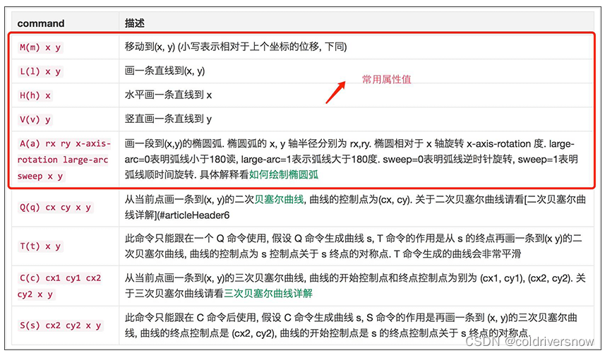
路径是由一系列命令所组成。 包括以下基本指令:
命令 名称 参数
M moveto 移动到 (x y)
Z closepath 关闭路径 (none)
L lineto 画线到 (x y)
H horizontal lineto 水平线到 x
V vertical lineto 垂直线到 y
A elliptical arc椭圆弧 (rx ry x-axis-rotation large-arc-flag sweep-flag x y)
C curveto 三次贝塞尔曲线到 (x1 y1 x2 y2 x y)
S smooth curveto光滑三次贝塞尔曲线到 (x2 y2 x y)
Q Bézier curveto二次贝塞尔曲线到 (x1 y1 x y)
T smooth Bézier curveto光滑二次贝塞尔曲线到 (x y)
PS:如果指令字母是大写的,例如M, 则表示坐标位置是绝对位置;如果指令字母小写的,例如m, 则表示坐标位置是相对位置。
二、基本用法
<path d="M150 0 L75 200 L225 200 Z" />
<!-- d属性中包含所有路径的点,最后起点和终点连接起来形成闭合图形 -->
<path d="M150 0 L75 200 L225 200 Z"
fill="red" stroke="blue" stroke-width="10"/>三、高阶用法
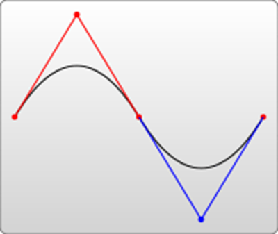
1.三次贝塞尔曲线
参数: Cx1 y1, x2 y2, x y
x1,y1 和x2,y2分别为控制点1和2,而x,y为曲线上的关键点
下面为曲线上的点随着时间的变化而变化的过程。
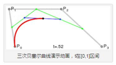
举个栗子:
<path d="M20 20 C90 140,130 140,200 25" stroke="#000000"
      fill="none" style="stroke-width: 2px;"/>

<!-- P0为起点,P1 P2 P3 为决定三元贝塞尔曲线的点,如下图所示 -->
2.光滑三次贝塞尔曲线
参数: Sx2 y2, x y
S指令跟在C指令或S指令后面补刀,它会自动在C、S基础上生成一个对称点,所以S指令只需要两个点就可以。

举个栗子:
<path d="M20 80 C90 140, 130 140, 180 80 S250 60, 280 120"
    stroke="#000000" fill="none" style="stroke-width: 2px;"/>
<!-- 试着自己画画下面这两个曲线吧 -->

<path d="M20 80 C90 140, 130 140, 180 80 S250 60, 280 120 S380 150, 450 80"
    stroke="#000000" fill="none" style="stroke-width: 2px;"/>
<path d="M20 80 S80 150, 150 80" stroke="#000000"
fill="none" style="stroke-width: 2px;"/>3.二次贝塞尔曲线
参数: Qx1 y1, x y
x1, y1是控制点,x, y表示的是曲线的终点。
下面为曲线上的点随着时间的变化而变化的过程。
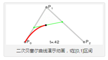
举个栗子:
<path d="M20 80 Q90 140, 130 80" stroke="#000000"
fill="none" style="stroke-width: 2px;"/> 
4.光滑二次贝塞尔曲线
参数: Tx y
T指令和S指令类似,是给Q、T指令补刀的
T指令只有一个曲线终点,没有控制点(由Q的对称点自动生成)
也可以单独使用,当单独使用时,是一条直线
举个栗子:
<path d="M20 80 Q90 140, 130 80 T250 140 T350 40 "
    stroke="#000000" fill="none" style="stroke-width: 2px;"/>
<path d="M20 80 T350 140 " stroke="#000000"
    fill="none" style="stroke-width: 2px;"/>
5.圆弧
参数: A rx ry x-deg large-arc sweep-flag x yrx ry表示x轴半径和y轴半径
x-deg表示x轴旋转角度,large-arc表示大于180度还是小于180度(0为小,1为大)
sweep-flag表示弧线方向(0为沿逆时针,1为沿顺时针),x y为最终坐标
举个栗子:
<path d="M80 80 A45 45, 0, 0, 0, 125 125" fill="green" />
一、path 路径详解
1.1、path 命令
path 用于定义一个路径,其中命令就是控制这条路径的,以下命令就是可用于路径数据:
注:以上所有命令大小写都可以,区别是大写命令表示绝对定位,小写表示相对定位。
1.2、path 使用
使用语法:<path d=" M x1 y1 L x2 y2 H x3.... " stroke="red"></path>
d:引出路径,d 中的值由多条命令组合而成。
圆弧在实际场景中应用非常广泛,A 命令中参数较多,large-arc 和 sweep 较难理解,详细介绍下。
使用语法:<path d="M x y A rx ry x-axis-rotation large-arc sweep x y"></path>
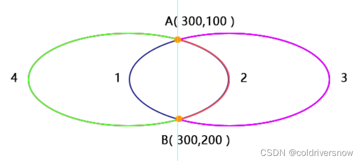
如上图所示,A 到 B 两个点再加半径,可以绘制出 4 条弧线,具体选哪一条呢?就是由 large-arc (是否是大弧)和 sweep(是否逆时针旋转) 两个参数决定。
large-arc = 1 表示弧度大于等于180,反之就是小于180。
sweep = 0 表示逆时针旋转,反正顺时针旋转。
所以上述 4 条弧线分别对应的两个参数为:
- 1:(0 0)
- 2:(0,1)
- 3:(1,1)
- 4:(1,0)
eg:使用 path 绘制一条直线、半圆、直线,连接起来形成一个拱桥,代码如下:
<svg  version="1.1" height="400" width="550">
 <path d="
  M 0 100  //(0,100)是起点
  L 100 100  // 画一条直接到 (100,100)
  A 100 100 0 1 1 300 100  // 画一段圆弧
  L 400 100 //画一条直线到 (400,100)
" stroke="black" stroke-width="1" fill="none"></path>
</svg>
运行结果如下:
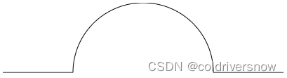
可以自己修改上述 A 中 参数观察半圆的变化。

旨在为数千万中国开发者提供一个无缝且高效的云端环境,以支持学习、使用和贡献开源项目。
更多推荐

 2
2 0
0- 0


 已为社区贡献5条内容

所有评论(0)