

css之定位属性(相对、绝对、固定、粘性)
2)可以使用 left、right、 top 、 bottom 四个属性调整位置,不过最常用的是 top 值.5)粘性定位和相对定位的特点基本一致,不同的是:粘性定位可以在元素到达某个位置时将其固定。都发生定位的两个元素,后写的元素会盖在先写的元素之上。5)无论是什么元素(行内、行内块、块级)设置为绝对定位之后,都变成了定位元素.5)无论是什么元素(行内、行内块、块级) 设置为固定定位之后,都变成
 文章共2,329字 · 阅读需要大约8分钟
相对定位(relative)
1、如何设置相对定位?
1)给元素设置 position:relative 即可实现相对定位,需配合上下左右定位属性才能生效。
2) 使用 left、 right 、 top、bottom 四个属性调整位置。
2、相对定位的参考点在哪里?
相对自己原来的位置
3、相对定位的特点:
1)不会脱离文档流,元素位置的变化,只是视觉效果上的变化,不会对其他元素产生任何影响。
2)定位元素的显示层级比普通元素高,无论什么定位,显示层级都是一样的。默认规则是:
定位的元素会盖在普通元素之上;都发生定位的两个元素,后写的元素会盖在先写的元素之上
3)relative相对的是容器自身的屏幕坐标0,0点,容器发生位移后,原来占据的空间依然存在。
4)left 不能和 right 一起设置,top 和 bottom 不能一起设置
5)相对定位的元素,也能继续浮动,但不推荐这样做。
6)相对行为的元素,也能通过 margin 调整位置,但不推荐这样做
【注意:绝大多数情况下,相对定位,会与绝对定位配合使用】
绝对定位(absolute)
1、如何设置绝对定位?
1)给元素设置position: absolute 即可实现绝对定位
2)可以使用 left、right 、 top 、 bottom 四个属性调整位置。
2、绝对定位的参考点在哪里?
参考它的包含块。
什么是包含块:
1)对于没有脱离文档流的元素:包含块就是父元素
2)对于脱离文档流的元素:包含块是第一个拥有定位属性的祖先元素(如果所有祖先都没定位,那包含块就是整个页面。
3、绝对定位元素的特点:
1)它的参照点为有定位设置的离它最近的祖先元素的0,0坐标(不再占有原来的位置),脱离文档流,会对后面的兄弟元素、父元素有影响。
2)left 不能和right 一起设置,top 和bottom 不能一起设置
3)绝对定位、浮动不能同时设置,如果同时设置,浮动失效,以定位为主
4)绝对定位的元素,也能通过margin 调整位置,但不推荐这样做。
5)无论是什么元素(行内、行内块、块级)设置为绝对定位之后,都变成了定位元素.
【何为定位元素?--默认宽、高都被内容所撑开,且能自由设置宽高】
固定定位(fixed)
1、如何设置为固定定位?
1)给元素设置 position: fixed ,上下左右定位属性不必需
2)可以使用 left、 right 、 top 、 bottom 四个属性调整位置
2、固定定位的参考点在哪里?
参考它的视口
什么是视口?--对于PC 浏览器来说,视口就是我们看网页的那扇“窗户”
3、固定定位元素的特点:
1)相对于浏览器视口定位的,这意味着即使页面发生滚动,他也始终保持在同一个位置,脱离文档流,会对后面的兄弟元素、父元素有影响。
2)left 不能和 right 一起设置,top 和 bottom 不能一起设置。
3)固定定位和浮动不能同时设置,如果同时设置,浮动失效,以固定定位为主。
4)固定定位的元素,也能通过margin 调整位置,但不推荐这样做
5)无论是什么元素(行内、行内块、块级) 设置为固定定位之后,都变成了定位元素
粘性定位(sticky)
1、如何设置为粘性定位?
1)给元素设置 position:sticky ,上下左右定位属性必须声明一个定位才能生效
2)可以使用 left、right、 top 、 bottom 四个属性调整位置,不过最常用的是 top 值.
2、粘性定位的参考点在哪里?
离它最近的一个拥有“滚动机制”的祖先元素,即便这个祖先不是最近的真实可滚动祖先。.
3、粘性定位元素的特点:
1)不会脱离文档流,它是一种专门用于窗口滚动时的新的定位方式。
2)最常用的值是 top 值。
3)粘性定位和浮动可以同时设置,但不推荐这样做。
4)粘性定位的元素,也能通过margin 调整位置,但不推荐这样做。
5)粘性定位和相对定位的特点基本一致,不同的是:粘性定位可以在元素到达某个位置时将其固定。
4、实例:

 <style>
    * {
      margin: 0;
      padding: 0;
    }

    body {
      height: 2000px;
    }

    .page-header {
      height: 100px;
      width: 100%;
      text-align: center;
      line-height: 50px;
      background-color: orange;
      position: sticky;
      top: 0px;
    }

    .item {
      background-color: gray;
    }

    .content {
      height: 250px;
      overflow: scroll;
    }

    .first {
      background-color: skyblue;
      font-size: 40px;
      position: sticky;
      top: 0px;
    }
  </style>
</head>

<body>
  <div class="page-header">头部</div>
  <!-- 内容区 -->
  <div class="content">
    <div class="item">
      <div class="first">A</div>
      <!-- 快捷键:h2*7{A$} + enter -->
      <h2>A1</h2>
      <h2>A2</h2>
      <h2>A3</h2>
      <h2>A4</h2>
      <h2>A5</h2>
      <h2>A6</h2>
      <h2>A7</h2>
    </div>
    <div class="item">
      <div class="first">B</div>
      <h2>B1</h2>
      <h2>B2</h2>
      <h2>B3</h2>
      <h2>B4</h2>
      <h2>B5</h2>
      <h2>B6</h2>
      <h2>B7</h2>
    </div>
    <div class="item">
      <div class="first">C</div>
      <h2>C1</h2>
      <h2>C2</h2>
      <h2>C3</h2>
      <h2>C4</h2>
      <h2>C5</h2>
      <h2>C6</h2>
      <h2>C7</h2>
    </div>
  </div>
</body>
定位层级:
1,定位元素的显示层级比普通元素高,无论什么定位,显示层级都是一样的。
2,如果位置发生重叠,默认情况是:后面的元素,会显示在前面元素之上
3,可以通过 css 属性 z-index 调整元素的显示层级。z-index : (正、负、0、auto(默认))控制盒子的前后顺序,值越大 越靠前。
4、z-index的属性值是数字,没有单位,值越大显示层级越高
5,只有定位的元素设置zindex 才有效
6.如果z-index 值大的元素,依然没有覆盖掉 z-index 值小的元素,那么请检查其包含块的层级
定位特殊应用:
1、让定位元素的宽充满包含块:
1)宽度想与包含块一致,可以给定位元素同时设置left 和right 为0
2)高度想与包含块一致,可以给定位元素同时设置top 和bottom 为0

<style>
    .outer {
      height: 400px;
      background-color: #888;
      position: relative;
    }

    .inner {
      background-color: orange;
      font-size: 20px;
      padding: 20px;
      position: absolute;
      left: 0;
      right: 0;
      border: 10px solid black;
    }
  </style>
</head>

<body>
  <div class="outer">
    <div class="inner">linsir!!</div>
  </div>
</body>
2、让定位的元素在包含块中居中:
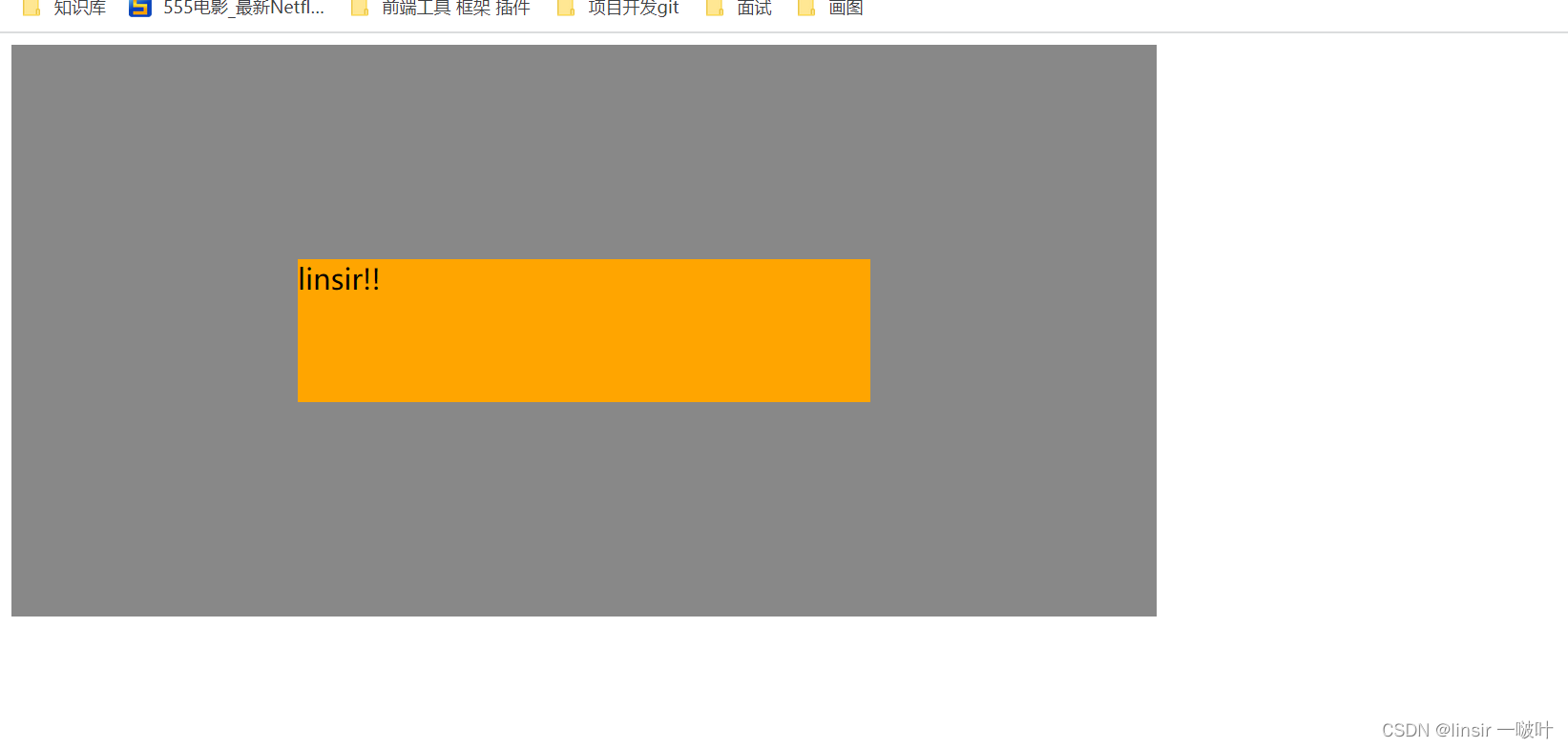
1)方法一:
 <style>
    .outer {
      width: 800px;
      height: 400px;
      background-color: #888;
      position: relative;
    }

    .inner {
      width: 400px;
      height: 100px;
      background-color: orange;
     font-size: 20px;
     position: absolute;
     top: 0;
     bottom: 0;
     left: 0;
     right: 0;
     margin: auto;
    }
  </style>
</head>

<body>
  <div class="outer">
    <div class="inner">linsir!!</div>
  </div>
</body>
2)方法二:(不推荐)
 <style>
    .outer {
      width: 800px;
      height: 400px;
      background-color: #888;
      position: relative;
    }

    .inner {  //必须设置宽高
      width: 400px;
      height: 100px;
      background-color: orange;
      font-size: 20px;
      position: absolute;
      left: 50%;
      top: 50%;
      margin-left: -200px;
      margin-top: -50px;
    }
  </style>
</head>

<body>
  <div class="outer">
    <div class="inner">linsir!!</div>
  </div>
</body>
旨在为数千万中国开发者提供一个无缝且高效的云端环境,以支持学习、使用和贡献开源项目。
更多推荐

 3
3 0
0- 0


 已为社区贡献1条内容

所有评论(0)