
Vue3多选框(Checkbox)
整体样式功能与ant design保持一致的多选框组件,用于在一组可选项中进行多项选择。
 文章共1,721字 · 阅读需要大约6分钟
一键AI生成摘要,助你高效阅读
问答
·
可自定义设置以下属性:
-
复选元素数据(options),类型:Array<{label: string, value: any, disabled?: boolean}>,默认 []
-
是否禁用所有复选框(disabled),类型:boolean,默认 false
-
是否垂直排列(vertical),类型:boolean,默认 false
-
当前选中的值(v-model:value),类型:Array<any>,默认 []
-
多个单选框之间的间距(gap),类型:number,单位px,默认 8px,垂直排列时,间距即垂直间距
-
复选区域最大展示宽度,超出后折行(width),类型:string|number,默认 'auto'
-
复选区域最大展示高度,超出后滚动(height),类型:string|number,默认 'auto'
-
全选时的样式控制(indeterminate),类型:boolean,默认 false
-
是否全选(v-model:checked),类型:boolean,默认 false
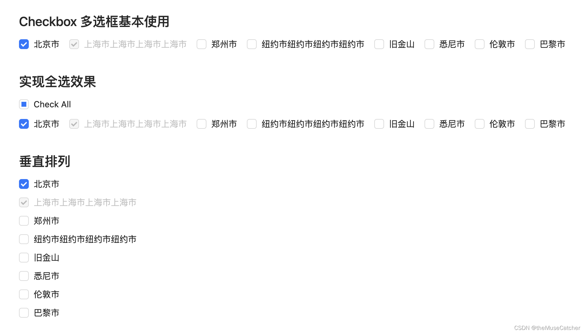
效果如下图:在线预览

①创建多选框组件Checkbox.vue
<script setup lang="ts">
import { ref, computed, watchEffect } from 'vue'
interface Option {
  label: string // 选项名
  value: any // 选项值
  disabled?: boolean // 是否禁用选项
}
interface Props {
  options?: Array<Option> // 复选元素数据
  disabled?: boolean // 是否禁用所有复选框
  vertical?: boolean // 是否垂直排列
  value?: any[] // 当前选中的值(v-model)
  gap?: number // 多个单选框之间的间距,单位px,垂直排列时,间距即垂直间距
  width?: string|number, // 复选区域最大展示宽度,超出后折行
  height?: string|number, // 复选区域最大展示高度,超出后滚动
  indeterminate?: boolean // 全选时的样式控制
  checked?: boolean // 是否全选(v-model)
}
const props = withDefaults(defineProps<Props>(), {
  options: () => [],
  disabled: false,
  vertical: false,
  value: () => [],
  gap: 8,
  width: 'auto',
  height: 'auto',
  indeterminate: false,
  checked: false
})
const sum = computed(() => { // 选项总数
  return props.options.length
})
const maxWidth = computed(() => { // 选项总数
  if (typeof props.width === 'number') {
    return props.width + 'px'
  } else {
    return props.width
  }
})
const maxHeight = computed(() => { // 选项总数
  if (typeof props.height === 'number') {
    return props.height + 'px'
  } else {
    return props.height
  }
})
const styleObject = computed(() => {
  if (props.vertical) {
    return {
      marginBottom: props.gap + 'px'
    }
  } else {
    return {
      marginRight: props.gap + 'px'
    }
  }
})
const checkedValue = ref<any[]>([])
watchEffect(() => {
  checkedValue.value = props.value
})
const emits = defineEmits(['update:value', 'update:checked', 'change'])
function onClick (value: any) {
  if (props.value.includes(value)) { // 已选中
    const newVal = checkedValue.value.filter(target => target !== value)
    emits('update:value', newVal)
    emits('change', newVal)
  } else { // 未选中
    const newVal = [...checkedValue.value, value]
    emits('update:value', newVal)
    emits('change', newVal)
  }
}
function onCheckAll () { // 全选切换
  emits('update:checked', !props.checked)
}
</script>
<template>
  <div class="m-checkbox" :style="`max-width: ${maxWidth}; max-height: ${maxHeight};`">
    <template v-if="sum">
      <div
        class="m-checkbox-wrap"
        :class="{'vertical': vertical}"
        :style="sum !== index + 1 ? styleObject: ''"
        v-for="(option, index) in options" :key="index">
        <div class="m-box" :class="{'disabled': disabled || option.disabled}" @click="(disabled || option.disabled) ? () => false : onClick(option.value)">
          <span class="u-checkbox" :class="{'u-checkbox-checked': checkedValue.includes(option.value) }"></span>
          <span class="u-label">
            <slot :label="option.label">{{ option.label }}</slot>
          </span>
        </div>
      </div>
    </template>
    <div v-else class="m-checkbox-wrap">
      <div class="m-box" :class="{'disabled': disabled}" @click="onCheckAll">
        <span class="u-checkbox" :class="{'u-checkbox-checked': checked && !indeterminate, 'indeterminate': indeterminate }"></span>
        <span class="u-label">
          <slot>Check all</slot>
        </span>
      </div>
    </div>
  </div>
</template>
<style lang="less" scoped>
.m-checkbox {
  display: inline-block;
  color: rgba(0, 0, 0, .88);
  font-size: 14px;
  line-height: 1;
  overflow: auto;
  .m-checkbox-wrap {
    display: inline-block;
    .m-box {
      height: 100%;
      display: inline-flex; // 设置为flex布局后,所有的子元素都会变成行内块元素
      align-items: flex-start;
      cursor: pointer;
      &:hover {
        .u-checkbox {
          border-color: @themeColor;
        }
      }
      .u-checkbox {
        position: relative;
        /*
          如果所有项目的flex-shrink属性都为1,当空间不足时,都将等比例缩小
          如果一个项目的flex-shrink属性为0,其他项目都为1,则空间不足时,前者不缩小。
        */
        flex-shrink: 0; // 默认 1.即空间不足时,项目将缩小
        margin-top: 3px;
        width: 16px;
        height: 16px;
        background: transparent;
        border: 1px solid #d9d9d9;
        border-radius: 4px;
        transition: all .3s;
        &::after {
          box-sizing: border-box;
          position: absolute;
          top: 50%;
          inset-inline-start: 21.5%;
          display: table;
          width: 5.7142857142857135px;
          height: 9.142857142857142px;
          border: 2px solid #fff;
          border-top: 0;
          border-inline-start: 0;
          transform: rotate(45deg) scale(0) translate(-50%,-50%);
          opacity: 0;
          content: "";
          transition: all .1s cubic-bezier(0.71, -0.46, 0.88, 0.6), opacity .1s;
        }
      }
      .u-checkbox-checked {
        background-color: @themeColor;
        border-color: @themeColor;
        &::after {
          opacity: 1;
          transform: rotate(45deg) scale(1) translate(-50%,-50%);
          transition: all .2s cubic-bezier(0.12, 0.4, 0.29, 1.46) .1s;
        }
      }
      .indeterminate {
        &::after {
          top: 50%;
          left: 50%;
          width: 8px;
          height: 8px;
          background-color: @themeColor;
          border: 0;
          transform: translate(-50%, -50%) scale(1);
          opacity: 1;
        }
      }
      .u-label {
        word-break: break-all;
        padding: 0 8px;
        font-size: 14px;
        line-height: 22px;
      }
    }
    .disabled {
      color: rgba(0, 0, 0, .25);
      cursor: not-allowed;
      &:hover {
        .u-checkbox {
          border-color: #d9d9d9;
        }
      }
      .u-checkbox {
        border-color: #d9d9d9;
        background-color: rgba(0, 0, 0, .04);
        &::after {
          border-color: rgba(0, 0, 0, .25);
          animation-name: none;
        }
      }
    }
  }
  .vertical {
    display: block;
  }
}
</style>
②在要使用的页面引入:
<script setup lang="ts">
import Checkbox from './Checkbox.vue'
import { ref, watch, watchEffect, computed } from 'vue'

const options = ref([
      {
        label: '北京市',
        value: 1
      },
      {
        label: '上海市',
        value: 2,
        disabled: true
      },
      {
        label: '纽约市',
        value: 3
      },
      {
        label: '旧金山',
        value: 4
      },
      {
        label: '布宜诺斯艾利斯',
        value: 5
      },
      {
        label: '伊斯坦布尔',
        value: 6
      },
      {
        label: '拜占庭',
        value: 7
      },
      {
        label: '君士坦丁堡',
        value: 8
      }
    ])

const value = ref([2]) // 多选框v-model
watchEffect(() => {
  console.log('value:', value.value)
})
function onChange (value: any[]) {
  console.log('change:', value)
}

const checkAll = ref(false) // 全选v-model
const indeterminate = computed(() => { // 全选样式控制
  if (value.value.length > 0 && value.value.length < options.value.length) {
    return true
  } else {
    return false
  }
})
watch(checkAll, (to) => {
  console.log('checkAll:', to)
  if (to) {
    value.value = options.value.map(option => option.value)
  } else {
    value.value = []
  }
})
</script>
<template>
  <div>
    <h2 class="mb10">Checkbox 多选框基本使用</h2>
    <Checkbox
      :options="options"
      @change="onChange"
      v-model:value="value" />
    <h2 class="mt30 mb10">实现全选效果</h2>
    <Checkbox
      class="mb10"
      :indeterminate="indeterminate"
      v-model:checked="checkAll">
      Check All
    </Checkbox>
    <br/>
    <Checkbox
      :options="options"
      @change="onChange"
      v-model:value="value" />
    <h2 class="mt30 mb10">垂直排列</h2>
    <Checkbox
      :options="options"
      vertical
      @change="onChange"
      v-model:value="value" />
    <h2 class="mt30 mb10">自定义展示区域宽高</h2>
    <Checkbox
      :options="options"
      vertical
      :width="120"
      :height="160"
      @change="onChange"
      v-model:value="value" />
  </div>
</template>

旨在为数千万中国开发者提供一个无缝且高效的云端环境,以支持学习、使用和贡献开源项目。
更多推荐

 1
1 0
0- 0


 已为社区贡献15条内容

所有评论(0)