
Vue3进度条(Progress)
用于展示操作的当前进度组件,整体样式与ant design风格保持一致。
 文章共2,169字 · 阅读需要大约8分钟
一键AI生成摘要,助你高效阅读
问答
·
可自定义设置以下属性:
-
进度条总宽度(width),类型:number|string,默认 '100%'
-
当前进度百分比(percent),类型:number,默认 '0'
-
进度条的色彩,传入 string 时为纯色,传入 object 时为渐变,进度圈不支持渐变(strokeColor),类型:string | {'0%'?: string, '100%'?: string, from?: string, to?: string, direction?: 'left'|'right'},默认 '#1677FF'
-
进度条线的宽度(strokeWidth),类型:number,单位px,默认 8
-
是否显示进度数值或状态图标(showInfo),类型:boolean,默认 true
-
内容的模板函数(format),类型:function | slot,默认:(percent: number) => percent + '%'
-
进度条类型(type),类型:string,默认 'line',可选 'line' 'circle'
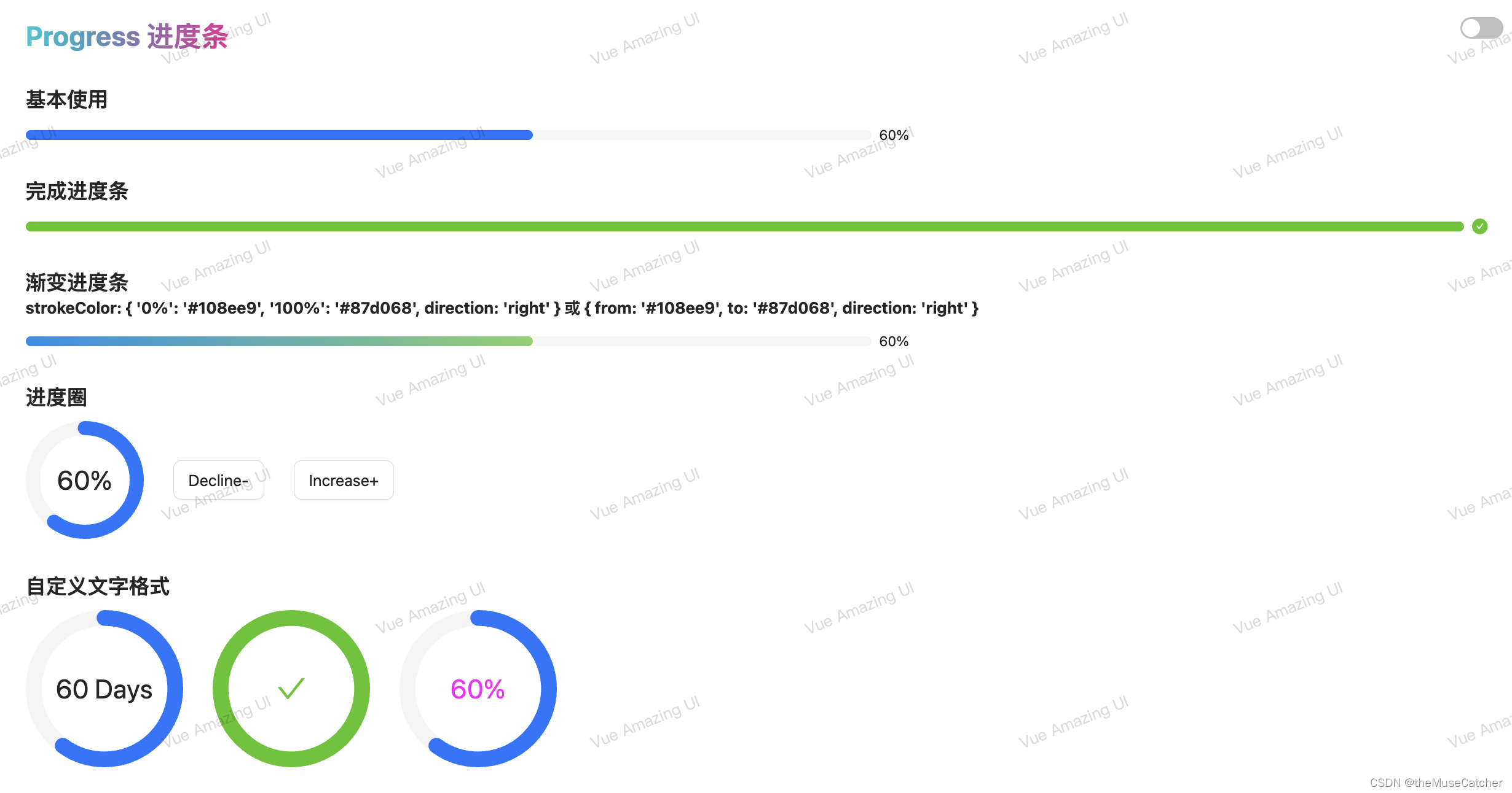
效果如下图:在线预览
①创建进度条组件Progress.vue:
<script setup lang="ts">
import { computed } from 'vue'
interface Gradient {
  '0%'?: string
  '100%'?: string
  from?: string
  to?: string
  direction?: 'right'|'left'
}
interface Props {
  width?: number|string // 进度条总宽度
  percent?: number // 当前进度百分比
  strokeColor?: string|Gradient // 进度条的色彩,传入 string 时为纯色,传入 object 时为渐变
  strokeWidth?: number // 进度条线的宽度,单位px
  showInfo?: boolean // 是否显示进度数值或状态图标
  format?: Function // 内容的模板函数 function | slot
  type?: 'line'|'circle' // 进度条类型
}
const props = withDefaults(defineProps<Props>(), {
  width: '100%',
  percent: 0,
  strokeColor: '#1677FF',
  strokeWidth: 8,
  showInfo: true,
  format: (percent: number) => percent + '%',
  type: 'line'
})
const totalWidth = computed(() => { // 进度条总宽度
  if (typeof props.width === 'number') {
    return props.width + 'px'
  } else {
    return props.width
  }
})
const perimeter = computed(() => { // 圆条周长
  return (100 - props.strokeWidth) * Math.PI
})
const path = computed(() => { // 圆条轨道路径指令
  const long = (100 - props.strokeWidth)
  return `M 50,50 m 0,-${(long / 2)}
   a ${(long / 2)},${(long / 2)} 0 1 1 0,${long}
   a ${(long / 2)},${(long / 2)} 0 1 1 0,-${long}`
})
const lineColor = computed(() => {
  if (typeof props.strokeColor === 'string') {
    return props.strokeColor
  } else {
    return `linear-gradient(to ${props.strokeColor.direction || 'right'}, ${props.strokeColor['0%'] || props.strokeColor.from}, ${props.strokeColor['100%'] || props.strokeColor.to})`
  }
})
const showPercent = computed(() => {
  return props.format(props.percent > 100 ? 100 : props.percent)
})
</script>
<template>
  <div v-if="type==='line'" class="m-progress-line" :style="`width: ${totalWidth}; height: ${strokeWidth < 24 ? 24 : strokeWidth}px;`">
    <div class="m-progress-inner">
      <div :class="['u-progress-bg', {'u-success-bg': percent >= 100}]" :style="`background: ${lineColor}; width: ${percent >= 100 ? 100 : percent}%; height: ${strokeWidth}px;`"></div>
    </div>
    <template v-if="showInfo">
      <Transition mode="out-in">
        <span v-if="percent >= 100" class="m-success">
          <svg focusable="false" class="u-icon" data-icon="check-circle" width="1em" height="1em" fill="currentColor" aria-hidden="true" viewBox="64 64 896 896"><path d="M512 64C264.6 64 64 264.6 64 512s200.6 448 448 448 448-200.6 448-448S759.4 64 512 64zm193.5 301.7l-210.6 292a31.8 31.8 0 01-51.7 0L318.5 484.9c-3.8-5.3 0-12.7 6.5-12.7h46.9c10.2 0 19.9 4.9 25.9 13.3l71.2 98.8 157.2-218c6-8.3 15.6-13.3 25.9-13.3H699c6.5 0 10.3 7.4 6.5 12.7z"></path></svg>
        </span>
        <p class="u-progress-text" v-else>
          <slot name="format" :percent="percent">{{ showPercent }}</slot>
        </p>
      </Transition>
    </template>
  </div>
  <div v-else class="m-progress-circle" :style="`width: ${totalWidth}; height: ${totalWidth};`">
    <svg class="u-progress-circle" viewBox="0 0 100 100">
      <path :d="path" stroke-linecap="round" class="u-progress-circle-trail" :stroke-width="strokeWidth" :style="`stroke-dasharray: ${perimeter}px, ${perimeter}px;`" fill-opacity="0"></path>
      <path :d="path" stroke-linecap="round" class="u-progress-circle-path" :class="{success: percent >= 100}" :stroke-width="strokeWidth" :stroke="lineColor" :style="`stroke-dasharray: ${(percent / 100) * perimeter}px, ${perimeter}px;`" :opacity="percent === 0 ? 0 : 1" fill-opacity="0"></path>
    </svg>
    <template v-if="showInfo">
      <Transition mode="out-in">
        <svg v-if="percent >= 100" class="u-icon" focusable="false" data-icon="check" width="1em" height="1em" fill="currentColor" aria-hidden="true" viewBox="64 64 896 896"><path d="M912 190h-69.9c-9.8 0-19.1 4.5-25.1 12.2L404.7 724.5 207 474a32 32 0 00-25.1-12.2H112c-6.7 0-10.4 7.7-6.3 12.9l273.9 347c12.8 16.2 37.4 16.2 50.3 0l488.4-618.9c4.1-5.1.4-12.8-6.3-12.8z"></path></svg>
        <p class="u-progress-text" v-else>
          <slot name="format" :percent="percent">{{ showPercent }}</slot>
        </p>
      </Transition>
    </template>
  </div>
</template>
<style lang="less" scoped>
.v-enter-active,
.v-leave-active {
  transition: opacity 0.2s;
}
.v-enter-from,
.v-leave-to {
  opacity: 0;
}
@success: #52C41A;
.m-progress-line {
  display: flex;
  align-items: center;
  .m-progress-inner {
    width: 100%;
    background: #f5f5f5;
    border-radius: 100px;
    .u-progress-bg {
      position: relative;
      background-color: @themeColor;
      border-radius: 100px;
      transition: all .3s cubic-bezier(0.78, 0.14, 0.15, 0.86);
      &::after {
        content: "";
        background-image: linear-gradient(90deg, rgba(255, 255, 255, .3) 0%, rgba(255, 255, 255, .5) 100%);
        animation: progressRipple 2s cubic-bezier(.4, 0, .2, 1) infinite;
      }
      @keyframes progressRipple {
        0% {
          position: absolute;
          inset: 0;
          right: 100%;
          opacity: 1;
        }
        66% {
          position: absolute;
          inset: 0;
          opacity: 0;
        }
        100% {
          position: absolute;
          inset: 0;
          opacity: 0;
        }
      }
    }
    .u-success-bg {
      background: @success !important;
    }
  }
  .m-success {
    width: 40px;
    text-align: center;
    display: inline-flex;
    align-items: center;
    padding-left: 8px;
    flex-shrink: 0; // 默认 1.即空间不足时,项目将缩小
    .u-icon {
      display: inline-block;
      width: 16px;
      height: 16px;
      fill: @success;
    }
  }
  .u-progress-text {
    /*
      如果所有项目的flex-shrink属性都为1,当空间不足时,都将等比例缩小
      如果一个项目的flex-shrink属性为0,其他项目都为1,则空间不足时,前者不缩小。
    */
    flex-shrink: 0; // 默认 1.即空间不足时,项目将缩小
    width: 40px;
    font-size: 14px;
    padding-left: 8px;
    color: rgba(0, 0, 0, .88);
  }
}
.m-progress-circle {
  display: inline-block;
  position: relative;
  .u-progress-circle {
    .u-progress-circle-trail {
      stroke: #f5f5f5;
      stroke-dashoffset: 0;
      transition: stroke-dashoffset .3s ease 0s, stroke-dasharray .3s ease 0s, stroke .3s ease 0s, stroke-width .06s ease .3s, opacity .3s ease 0s;
    }
    .u-progress-circle-path {
      stroke-dashoffset: 0;
      transition: stroke-dashoffset .3s ease 0s, stroke-dasharray .3s ease 0s, stroke .3s ease 0s, stroke-width .06s ease .3s, opacity .3s ease 0s;
    }
    .success {
      stroke: @success !important;
    }
  }
  .u-icon {
    position: absolute;
    top: 50%;
    left: 50%;
    transform: translate(-50%, -50%);
    display: inline-block;
    width: 30px;
    height: 30px;
    fill: @success;
  }
  .u-progress-text {
    position: absolute;
    top: 50%;
    left: 50%;
    transform: translate(-50%, -50%);
    width: 100%;
    font-size: 27px;
    line-height: 1;
    text-align: center;
    color: rgba(0, 0, 0, .85);
  }
}
</style>
②在要使用的页面引入:
<script setup lang="ts">
import Progress from './Progress.vue'
import { ref } from 'vue'

const percent = ref(60)

function onIncrease (scale: number) {
  const res = percent.value + scale
  if (res > 100) {
    percent.value = 100
  } else {
    percent.value = res
  }
}
function onDecline (scale: number) {
  const res = percent.value - scale
  if (res < 0) {
    percent.value = 0
  } else {
    percent.value = res
  }
}
</script>
<template>
  <div>
    <h1>Progress 进度条</h1>
    <h2 class="mt30 mb10">基本使用</h2>
    <Progress :width="900" :percent="percent" :stroke-width="10" />
    <h2 class="mt30 mb10">完成进度条</h2>
    <Progress width="100%" :percent="100" :stroke-width="10" />
    <h2 class="mt30">渐变进度条</h2>
    <h3 class="mb10">strokeColor: { '0%': '#108ee9', '100%': '#87d068', direction: 'right' } 或 { from: '#108ee9', to: '#87d068', direction: 'right' }</h3>
    <Progress
      :width="900"
      :percent="percent"
      :stroke-width="10"
      :stroke-color="{
        '0%': '#108ee9',
        '100%': '#87d068',
        direction: 'right'
      }" />
    <h2 class="mt30 mb10">进度圈</h2>
    <Space align="center" :size="30">
      <Progress
        type="circle"
        :width="120"
        :stroke-width="12"
        :percent="percent" />
      <Button @click="onDecline(5)" size="large">Decline-</Button>
      <Button @click="onIncrease(5)" size="large">Increase+</Button>
    </Space>
    <h2 class="mt30 mb10">自定义文字格式</h2>
    <Space align="center" :size="30">
      <Progress
        type="circle"
        :width="160"
        :stroke-width="10"
        :percent="percent"
        :format="(percent: number) => `${percent} Days`" />
      <Progress
        type="circle"
        :width="160"
        :stroke-width="10"
        :percent="100"
        :format="() => 'Done'" />
      <Progress type="circle" :width="160" :stroke-width="10" :percent="percent">
        <template #format="{ percent }">
          <span style="color: magenta">{{ percent }}%</span>
        </template>
      </Progress>
    </Space>
    <h2 class="mt30 mb10">Ant Design Vue 进度圈</h2>
    <a-progress
      type="circle"
      :width="120"
      :percent="percent"
      :stroke-width="12" />
  </div>
</template>
旨在为数千万中国开发者提供一个无缝且高效的云端环境,以支持学习、使用和贡献开源项目。
更多推荐


 4
4 0
0- 0


 已为社区贡献15条内容

所有评论(0)